
Sử dụng thành phần Button (Nút) cho các thao tác mà người dùng hiểu rõ và không cần có nhãn văn bản. Các nút được phân biệt với khối theo hình tròn.
Phân tích
A. Nội dung
Các nút có một khe duy nhất dành riêng cho biểu tượng hoặc văn bản. Chọn một biểu tượng liên quan đến hành động mà nút thực hiện. Bạn có thể sử dụng tối đa 3 ký tự cho văn bản nếu một biểu tượng không thể mô tả hành động liên quan. Hãy cân nhắc việc sử dụng thành phần Khối nếu một biểu tượng không thể mô tả rõ ràng thao tác
B. Vùng chứa
Các vùng chứa của nút bị giới hạn ở một màu đồng nhất.
Các loại nút
Các nút thu gọn
Các nút thu gọn hiển thị nhỏ hơn nhưng có vùng nhấn lớn hơn. Vùng nhấn mặc định là 48x48 dp.
Hệ phân cấp
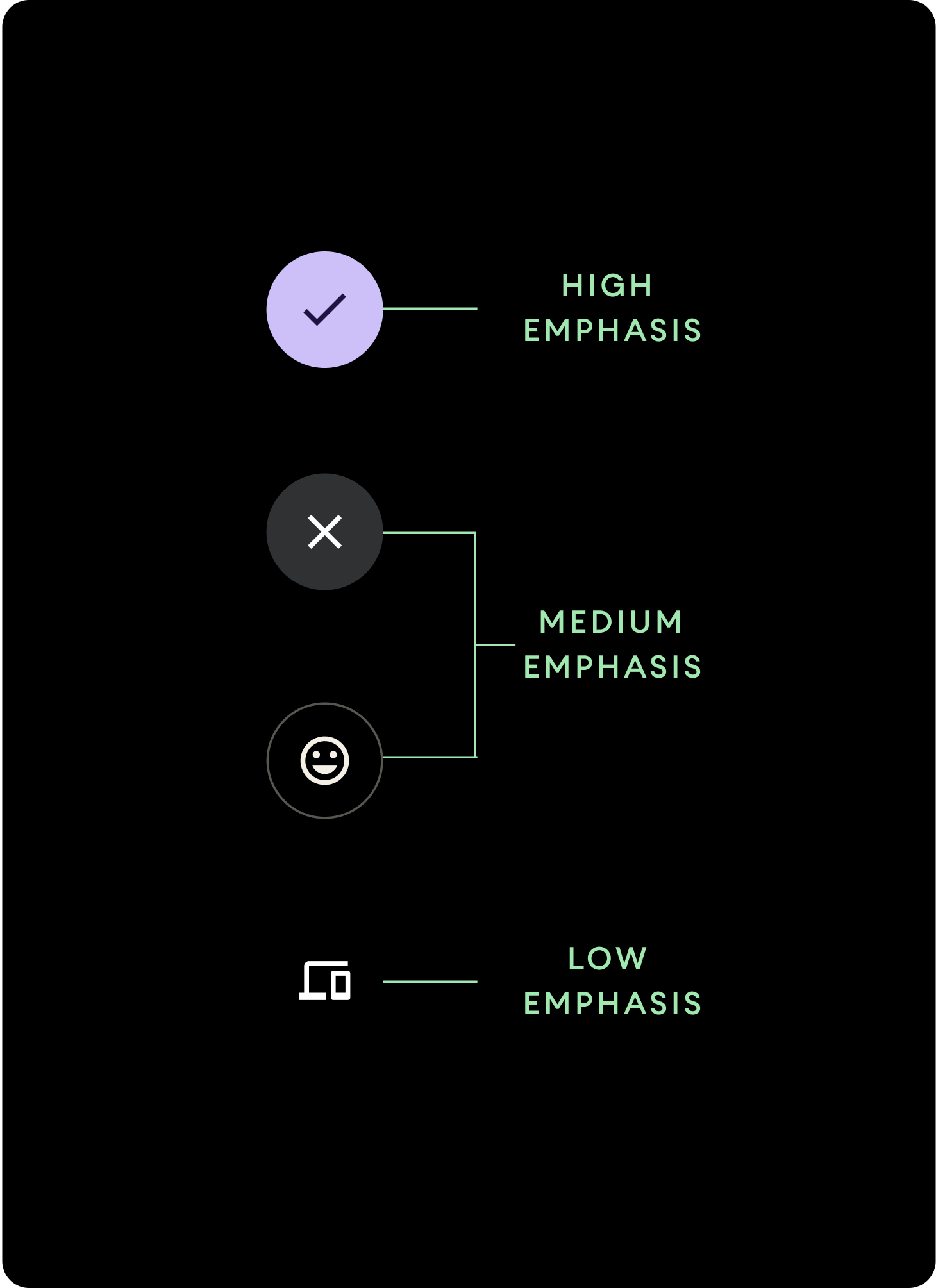
Dùng màu tô khác nhau để biểu thị hệ phân cấp nút.
Nhấn mạnh
Các nút nhấn mạnh chứa những thao tác chính dành cho ứng dụng. Đối với các nút nhấn mạnh, hãy sử dụng màu Primary (màu chính) hoặc Secondary (màu phụ) cho vùng chứa, đồng thời sử dụng màu On Primary (màu cơ bản) và màu On Secondary (màu thứ cấp) cho nội dung. Để biết thêm thông tin, hãy xem bài viết Sắp xếp theo chủ đề Material cho Wear.
Nhấn trung bình
Các nút nhấn trung bình được phân biệt bằng màu tô ít tương phản hơn. Các khối này chứa các thao tác ít quan trọng hơn các thao tác chính. Hãy sử dụng màu Surface cho vùng chứa và màu On Surface cho nội dung.
Ngoài ra, hãy sử dụng thành phần OutlinedButton tuỳ chỉnh cho nút nhấn trung bình. Thành phần này có nền trong suốt, nét vẽ màu biến thể chính có độ mờ 60% và nội dung được tô màu chính.
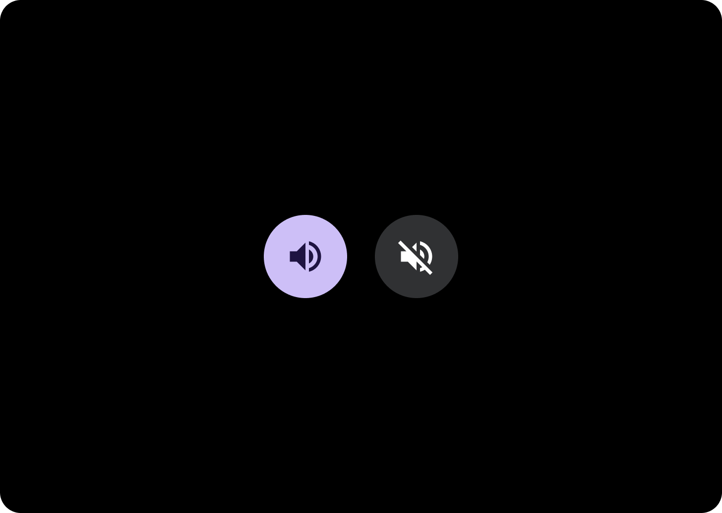
Nhấn thấp (chỉ dùng cho biểu tượng)Các nút nhấn thấp được phân biệt bằng cách không tô màu. Các nút này phù hợp nhất với những khu vực nhỏ trên mặt đồng hồ, nơi cần được sắp xếp gọn gàng. Sử dụng màu On Surface cho nội dung.
Kích thước
Hãy sử dụng các nút có kích thước khác nhau để nhấn mạnh hoặc giảm nhẹ các hành động.
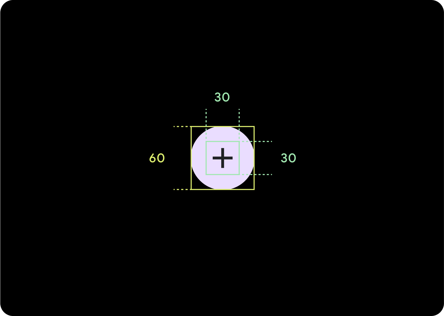
Lớn
Biểu tượng (30 x 30 dp)
Vùng chứa (60 x 60 dp)
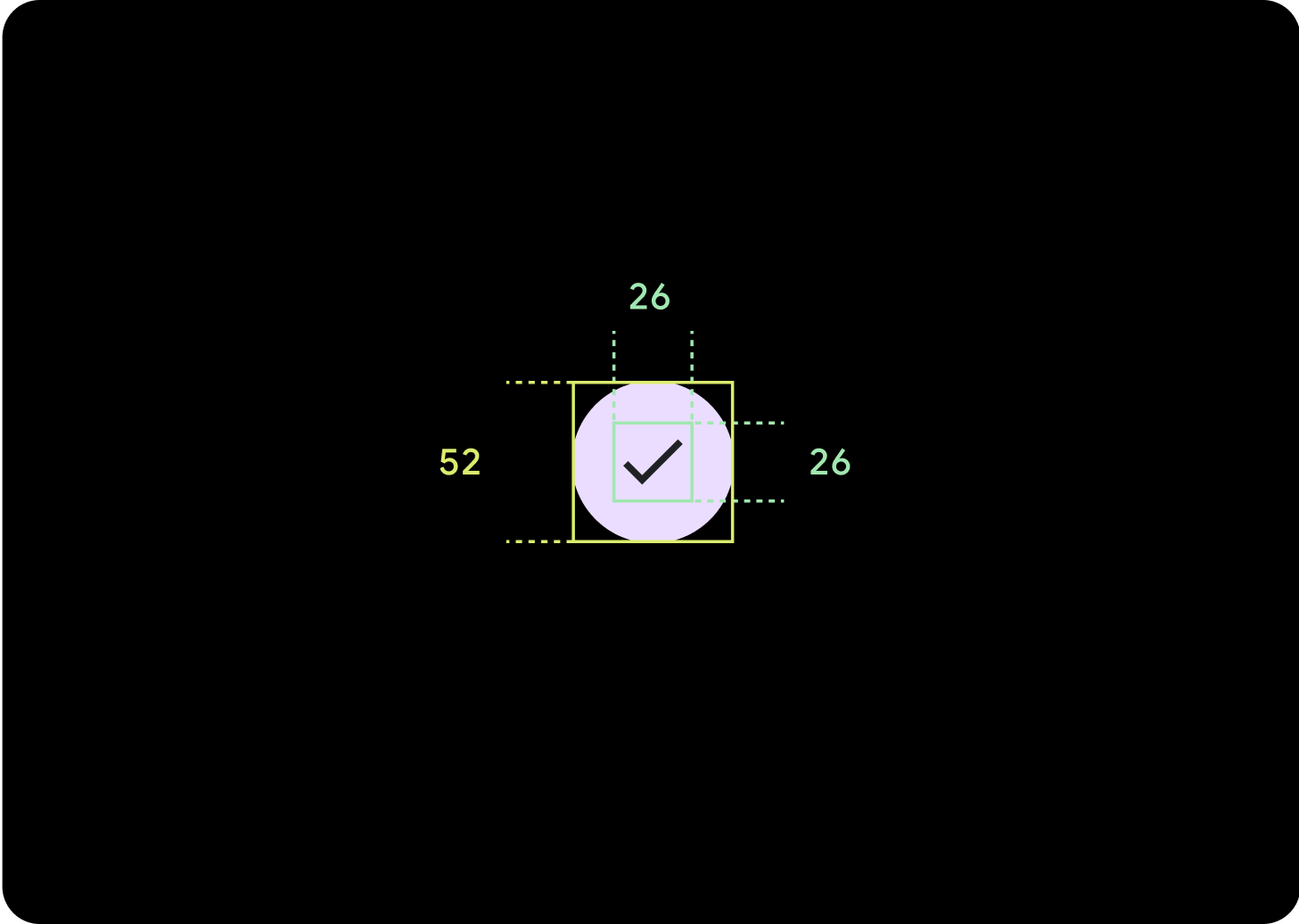
Mặc định
Biểu tượng (26 x 26 dp)
Vùng chứa (52 x 52 dp)
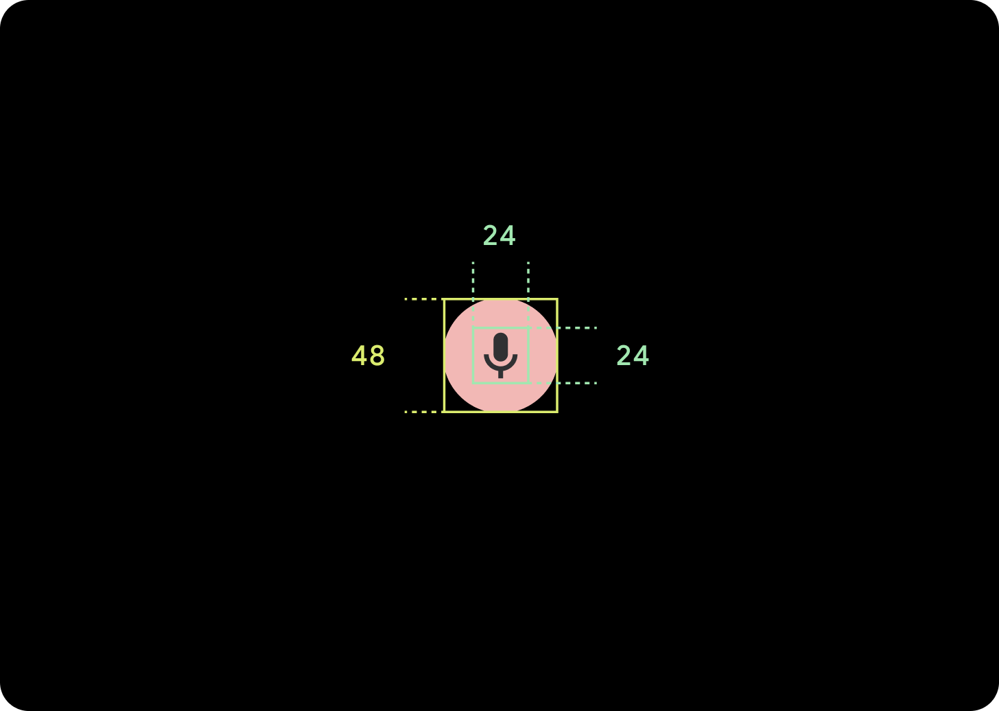
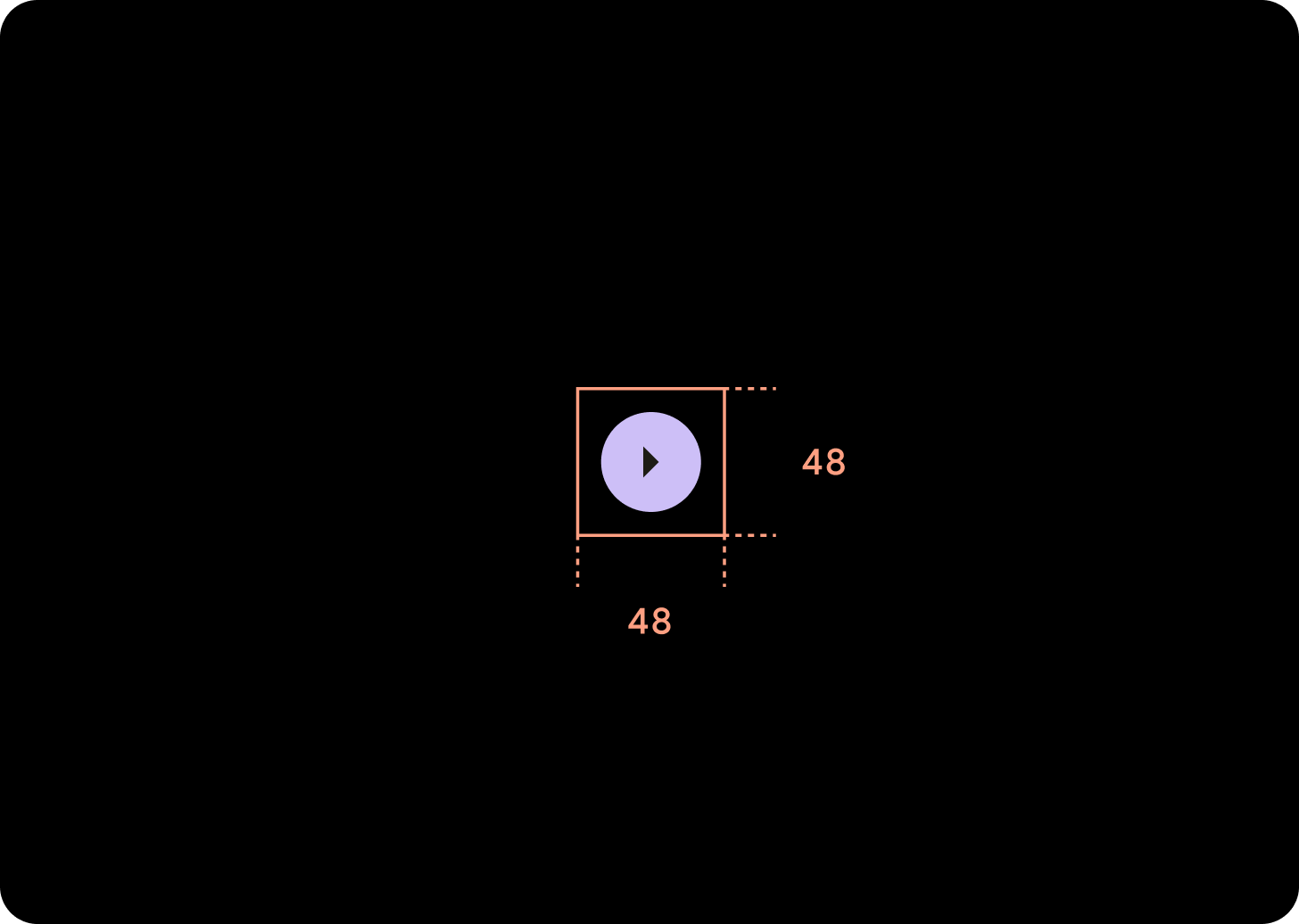
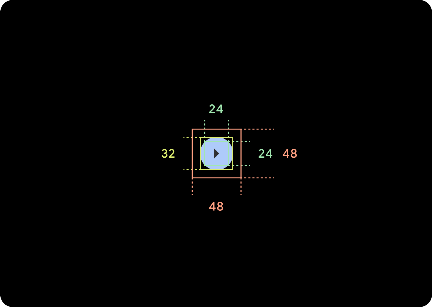
Nhỏ
Biểu tượng (24 x 24 dp)
Vùng chứa (48 x 48 dp)
Rất nhỏ
Biểu tượng (24 x 24 dp)
Vùng chứa (32 x 32 dp)
Bạn nên thêm khoảng đệm xung quanh nút này để tạo mục tiêu nhấn có kích thước tối thiểu là 48 dp. Đây là kích thước mục tiêu nhấn tối thiểu của chúng tôi để hỗ trợ tiếp cận.
Cách sử dụng
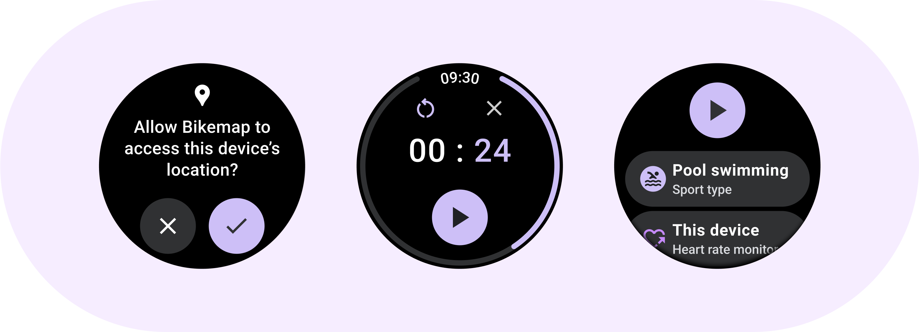
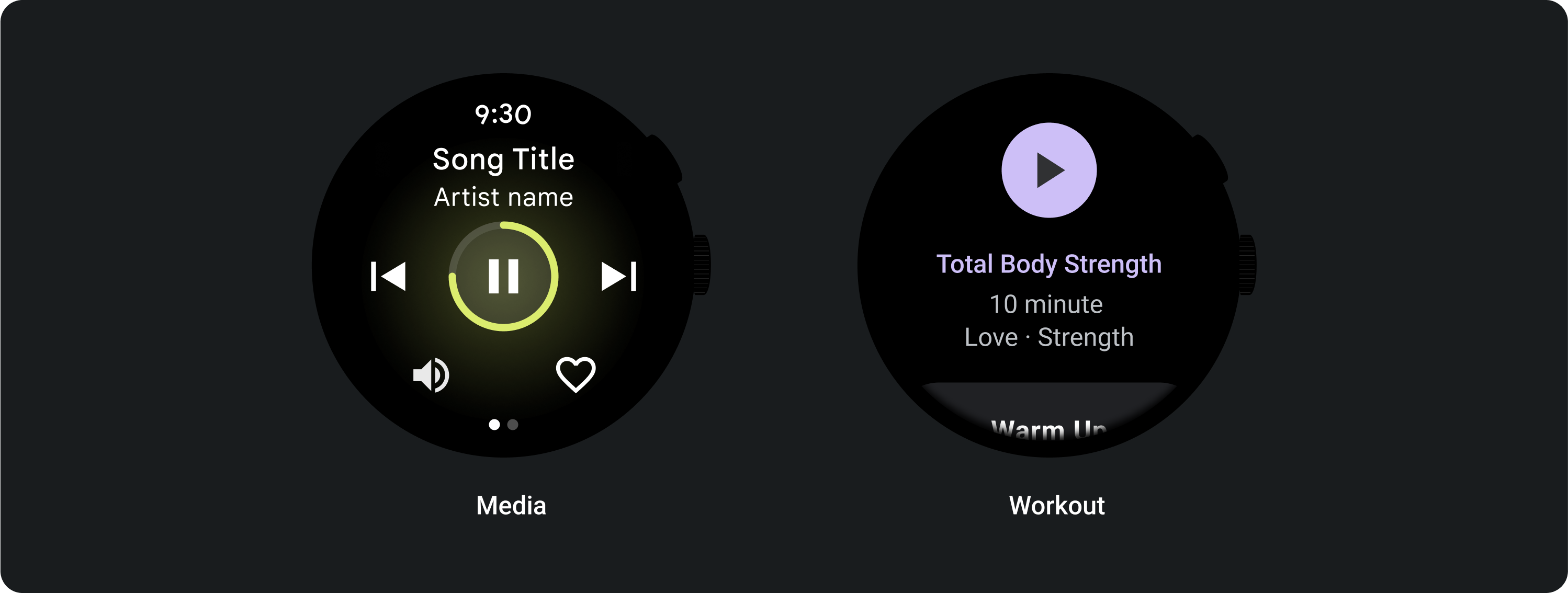
Sử dụng các nút tiêu chuẩn để cho phép người dùng thực hiện một thao tác đơn lẻ như chấp nhận hoặc từ chối một cuộc gọi, hoặc bắt đầu hẹn giờ.
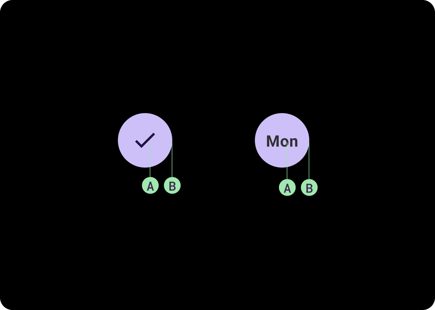
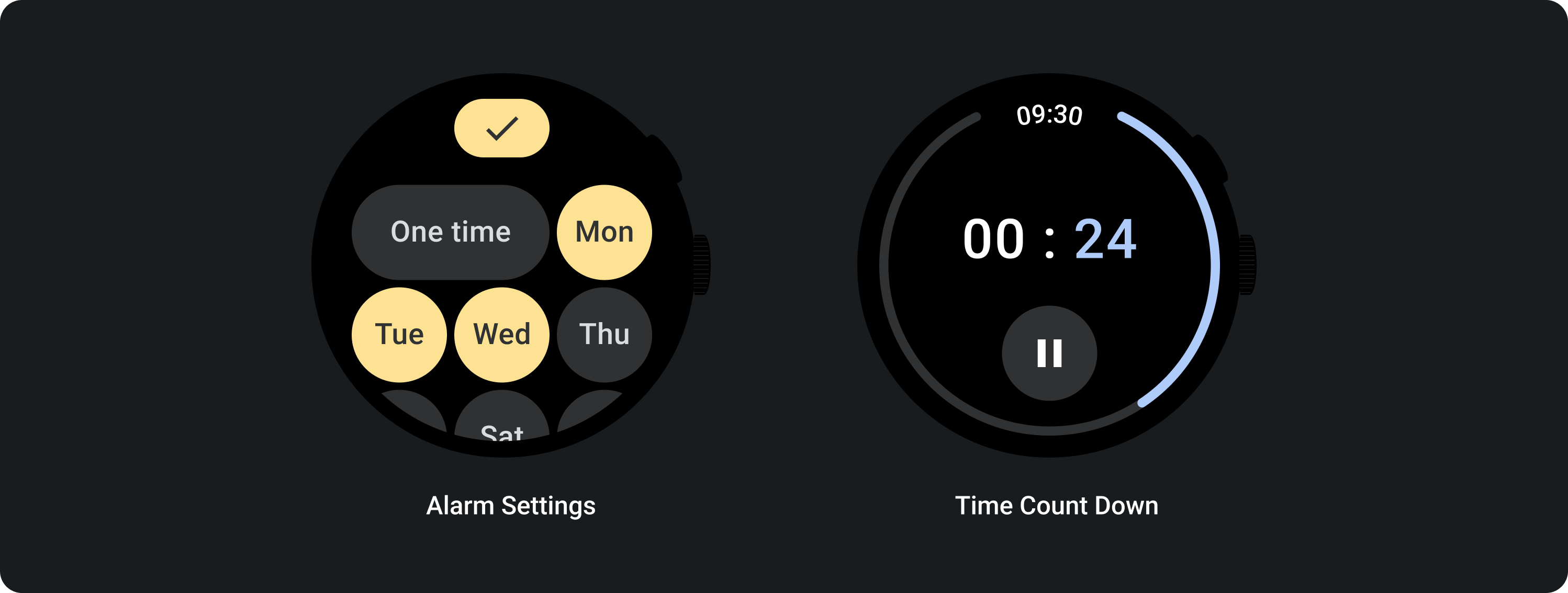
Sử dụng các nút bật/tắt để cho phép người dùng bật hoặc tắt một lựa chọn, chẳng hạn như chọn và bỏ chọn các ngày trong tuần, hoặc tạm dừng và khởi động lại bộ hẹn giờ.
Bố cục thích ứng (Adaptive Layouts)
Hành vi thích ứng
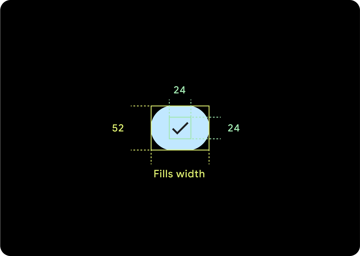
1 nút
Khoảng đệm nội bộ sẽ giữ nguyên và lề phải là tỷ lệ phần trăm để ngăn các nút bị kéo giãn quá xa và giữ kích thước tương đối.
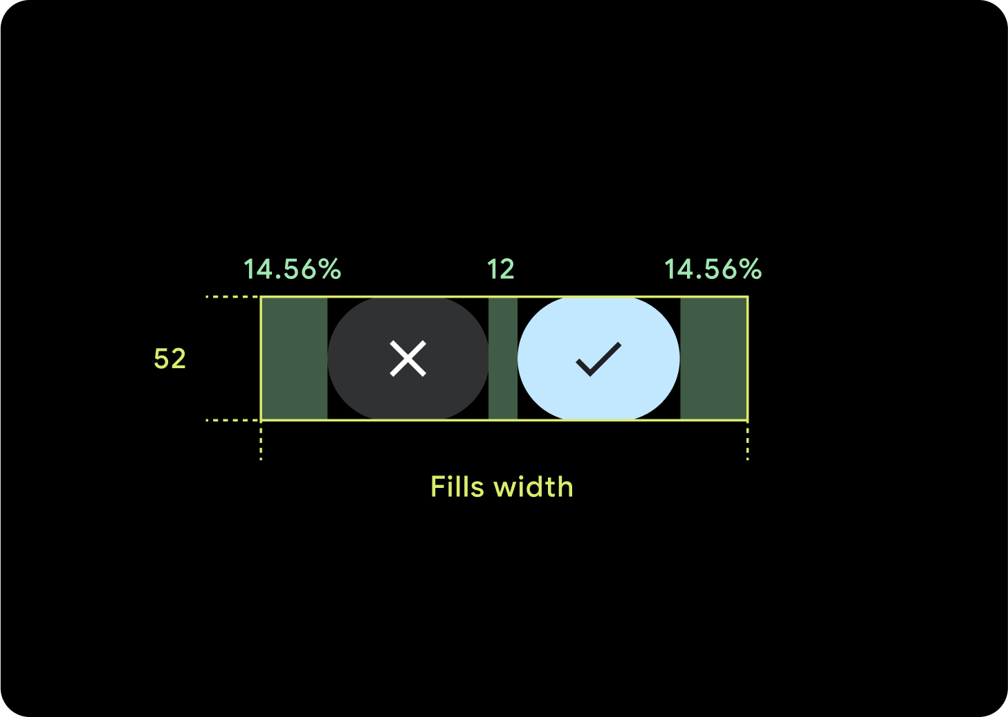
2 nút
Khi có 2 nút, hệ thống sẽ thêm tỷ lệ phần trăm lề nội bộ để ngăn các nút bị kéo giãn quá xa và giữ kích thước tương đối.
IME
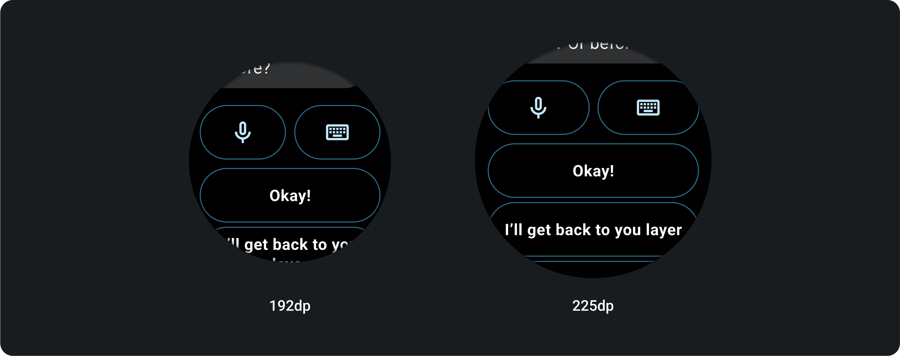
1 hoặc 2 nút
IME có 2 hoặc 1 nút khoá luôn kéo giãn đến lề bên bất kể kích thước màn hình.
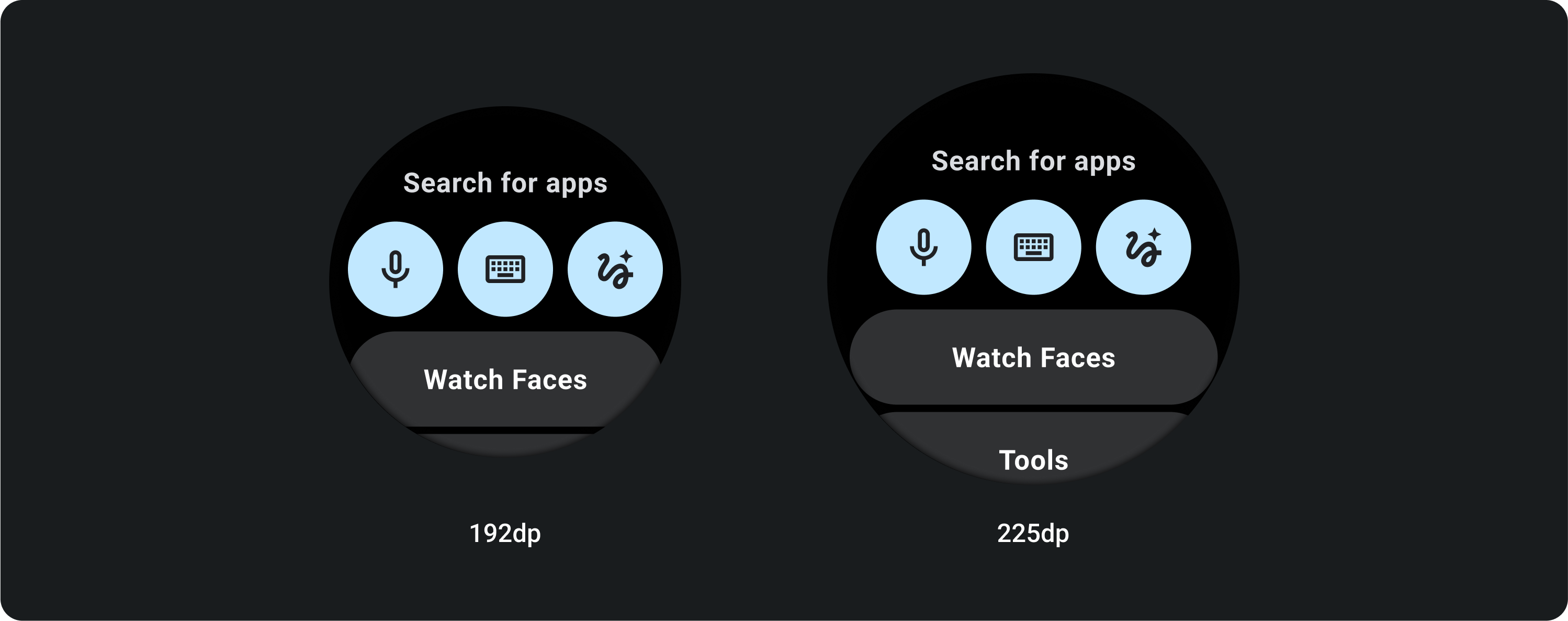
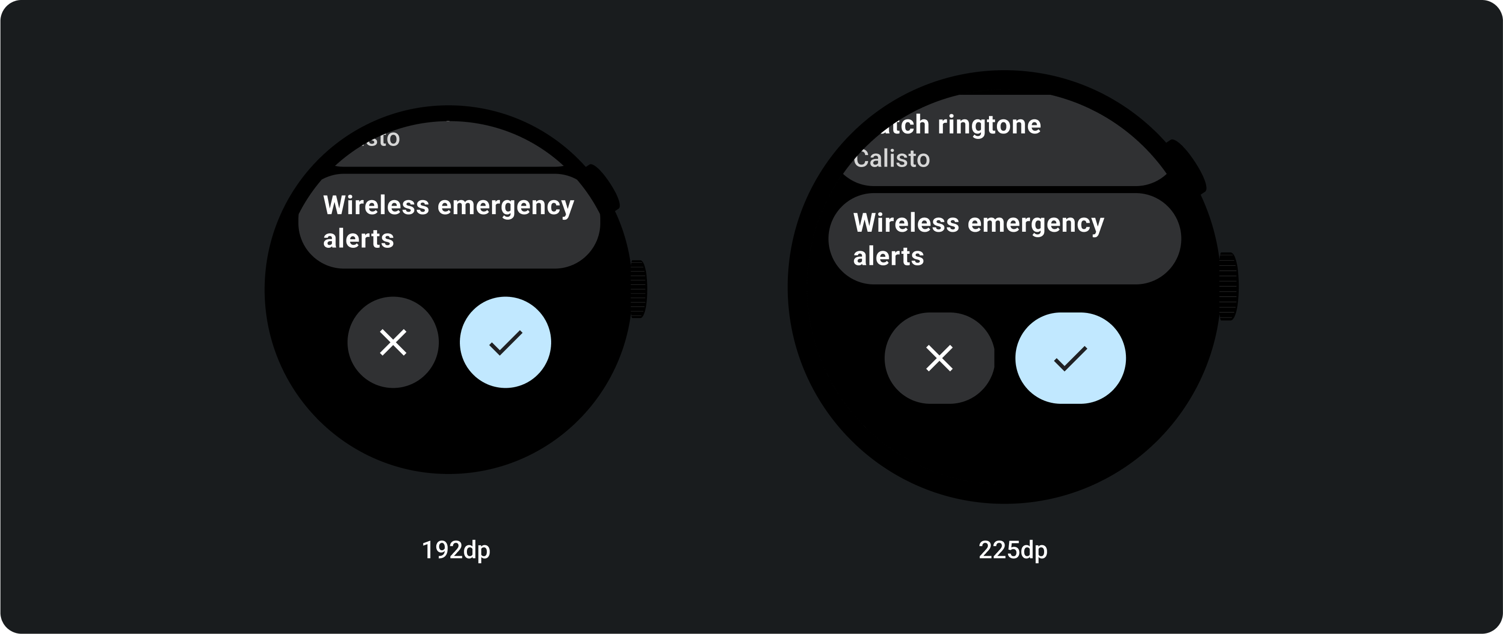
3 nút
Trên màn hình nhỏ hơn 225 dp, các nút vẫn giữ nguyên hình tròn và không bị kéo giãn. Trên màn hình lớn hơn, từ 225 dp trở lên, các nút sẽ kéo giãn đến tận lề bên.