
Wear OS のアプリは、他の Android デバイスと同じレイアウト手法を使用しますが、スマートウォッチ固有の制約を考慮して設計する必要があります。
注: モバイルアプリの機能と UI を Wear OS にそのまま移植しても、優れたユーザー エクスペリエンスは期待できません。
長方形のハンドヘルド デバイス向けにアプリを設計すると、円形のスマートウォッチでは、画面の隅付近に配置されたコンテンツが切り取られる可能性があります。スクロール可能な縦方向のリストを使用している場合は、ユーザーがコンテンツを中央にスクロールできるため、このことが問題となる可能性は低くなります。ただし、単一画面ではユーザー エクスペリエンスが低下する可能性があります。
レイアウトに次の設定を使用すると、円形の画面を備えたデバイスではテキストが正しく表示されません。
<androidx.constraintlayout.widget.ConstraintLayout
    xmlns:android="http://schemas.android.com/apk/res/android"
    xmlns:app="http://schemas.android.com/apk/res-auto"
    xmlns:tools="http://schemas.android.com/tools"
    android:layout_width="match_parent"
    android:layout_height="match_parent">

    <TextView
        android:id="@+id/text"
        android:layout_width="0dp"
        android:layout_height="0dp"
        android:text="@string/very_long_hello_world"
        app:layout_constraintBottom_toBottomOf="parent"
        app:layout_constraintEnd_toEndOf="parent"
        app:layout_constraintStart_toStartOf="parent"
        app:layout_constraintTop_toTopOf="parent" />

</androidx.constraintlayout.widget.ConstraintLayout>
この問題を解決するには、円形デバイスをサポートする Wear OS UI ライブラリのレイアウトを使用します。
BoxInsetLayoutを使用すると、円形の画面の端でビューが切り取られないようにすることができます。WearableRecyclerViewを使用すると、円形の画面向けに最適化された縦方向のアイテムリストを表示および操作する場合に、曲線レイアウトを作成できます。
アプリの設計について詳しくは、Wear OS のデザイン ガイドラインをご覧ください。
BoxInsetLayout を使用する
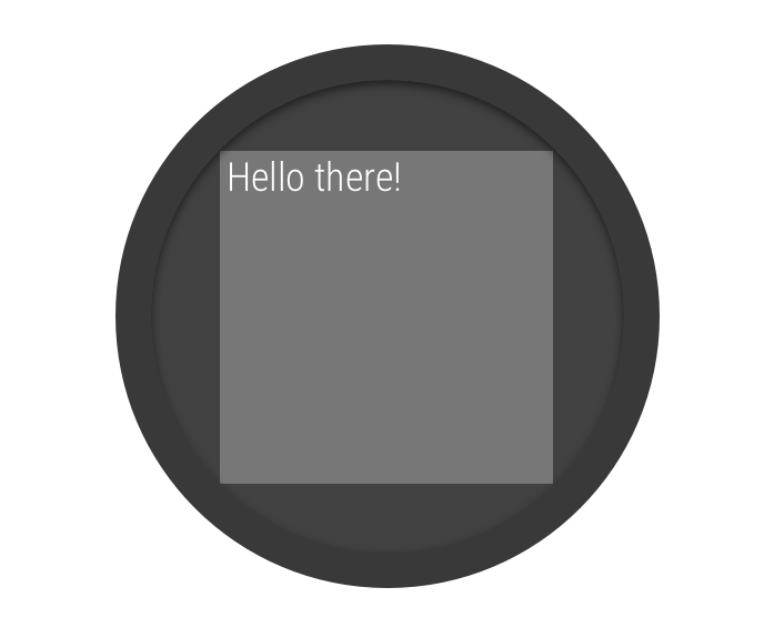
図 2. 円形の画面上のウィンドウ インセット
Wear OS UI ライブラリの BoxInsetLayout クラスを使用すると、円形の画面に対応したレイアウトを定義できます。このクラスを使用すると、画面の中央や端にビューを簡単に配置できます。
図 2 のグレーの正方形は、BoxInsetLayout が必要なウィンドウ インセットを適用した後に、円形の画面上に子ビューを自動的に配置できる領域を示しています。この領域内に表示するために、子ビューは次の値が設定された layout_boxedEdges 属性を指定します。
top、bottom、left、rightの組み合わせ。たとえば、値"left|top"は、子の左端と上端を図 2 のグレーの正方形内に配置します。- 値
"all"は、子のすべてのコンテンツを図 2 のグレーの正方形内に配置します。これは、内部にConstraintLayoutを使用する最も一般的な方法です。
図 2 のレイアウトでは <BoxInsetLayout> 要素が使用されています。このレイアウトは円形の画面に対応しています。
<androidx.wear.widget.BoxInsetLayout
    xmlns:android="http://schemas.android.com/apk/res/android"
    xmlns:app="http://schemas.android.com/apk/res-auto"
    android:layout_height="match_parent"
    android:layout_width="match_parent"
    android:padding="15dp">

    <androidx.constraintlayout.widget.ConstraintLayout
        android:layout_width="match_parent"
        android:layout_height="match_parent"
        android:padding="5dp"
        app:layout_boxedEdges="all">

        <TextView
            android:layout_height="wrap_content"
            android:layout_width="match_parent"
            android:text="@string/sometext"
            android:textAlignment="center"
            app:layout_constraintEnd_toEndOf="parent"
            app:layout_constraintStart_toStartOf="parent"
            app:layout_constraintTop_toTopOf="parent" />

        <ImageButton
            android:background="@android:color/transparent"
            android:layout_height="50dp"
            android:layout_width="50dp"
            app:layout_constraintBottom_toBottomOf="parent"
            app:layout_constraintStart_toStartOf="parent"
            android:src="@drawable/cancel" />

        <ImageButton
            android:background="@android:color/transparent"
            android:layout_height="50dp"
            android:layout_width="50dp"
            app:layout_constraintBottom_toBottomOf="parent"
            app:layout_constraintEnd_toEndOf="parent"
            android:src="@drawable/ok" />

    </androidx.constraintlayout.widget.ConstraintLayout>

</androidx.wear.widget.BoxInsetLayout>
レイアウトのうち、太字でマークした部分に注目してみましょう。
-
android:padding="15dp"この行では、
<BoxInsetLayout>要素にパディングを割り当てています。 -
android:padding="5dp"この行では、内部の
ConstraintLayout要素にパディングを割り当てています。 -
app:layout_boxedEdges="all"この行により、円形の画面のウィンドウ インセットによって定義されている領域内で
ConstraintLayout要素とその子がボックス化されます。
曲線レイアウトを使用する
Wear OS UI ライブラリの
WearableRecyclerView クラスを使用すると、円形の画面向けに最適化された曲線レイアウトを有効にすることができます。アプリでスクロール可能なリストの曲線レイアウトを有効にするには、Wear OS でリストを作成するをご覧ください。