Apps on Wear OS use the same layout techniques as other Android devices but need to be designed with watch-specific constraints.
Note: Don't port the exact functionality and UI from a mobile app to Wear OS and expect a good user experience.
If you design your app for a square watch, content near the corners of the screen might be cropped on round watches. If you are using a scrollable vertical list, this is less of an issue, as the user can scroll to center the content. However, for single screens, it can provide a bad user experience.
Figure 1 shows how one layout looks on square and round screens:

Figure 1. A layout designed for square screens might not work well on round screens.
If you use the following settings for your layout, text displays incorrectly on devices with round screens:
<androidx.constraintlayout.widget.ConstraintLayout xmlns:android="http://schemas.android.com/apk/res/android" xmlns:app="http://schemas.android.com/apk/res-auto" xmlns:tools="http://schemas.android.com/tools" android:layout_width="match_parent" android:layout_height="match_parent"> <TextView android:id="@+id/text" android:layout_width="0dp" android:layout_height="0dp" android:text="@string/very_long_hello_world" app:layout_constraintBottom_toBottomOf="parent" app:layout_constraintEnd_toEndOf="parent" app:layout_constraintStart_toStartOf="parent" app:layout_constraintTop_toTopOf="parent" /> </androidx.constraintlayout.widget.ConstraintLayout>
There are two approaches to solving this problem, which are described in the sections that follow:
- Use layouts in the
Wear OS UI Library for both square and round devices.
- You can use a
BoxInsetLayout
to apply different window insets depending on the shape of the device screen. Use this approach when you want a similar layout on both screen shapes without having views cropped near the edges of round screens. - You can use a
WearableRecyclerView
to create a curved layout when you want to display and manipulate a vertical list of items optimized for round screens.
- You can use a
- Provide alternative layout resources for square and round devices as described in the Providing alternative resources guide. At runtime, Wear OS detects the shape of the device screen and loads the correct layout.
For more information about designing apps, read the Wear OS design guidelines.
Use a BoxInsetLayout

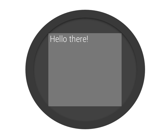
Figure 2. Window insets on a round screen.
The
BoxInsetLayout
class in the Wear OS UI Library lets
you define a single layout that
works for both square and round screens. This class applies the required
window insets depending on the screen shape and lets you easily align
views on the center or near the edges of the screen.
The gray square in figure 2 shows the area where the BoxInsetLayout
can automatically place its child views on round screens after applying
the required window insets. To be displayed inside this area, child
views specify the layout_boxedEdges
attribute with the following values:
- A combination of
top
,bottom
,left
, andright
. For example, a"left|top"
value positions the child's left and top edges inside the gray square in figure 2. - The
"all"
value positions all the child's content inside the gray square in figure 2. This is the most common approach with aConstraintLayout
inside.
On square screens, the window insets are zero, and the
layout_boxedEdges
attribute is ignored.

Figure 3. A layout definition that works on both square and round screens.
The layout shown in figure 3 uses the
<BoxInsetLayout>
element and works on square and round screens:
<androidx.wear.widget.BoxInsetLayout xmlns:android="http://schemas.android.com/apk/res/android" xmlns:app="http://schemas.android.com/apk/res-auto" android:layout_height="match_parent" android:layout_width="match_parent" android:padding="15dp"> <androidx.constraintlayout.widget.ConstraintLayout android:layout_width="match_parent" android:layout_height="match_parent" android:padding="5dp" app:layout_boxedEdges="all"> <TextView android:layout_height="wrap_content" android:layout_width="match_parent" android:text="@string/sometext" android:textAlignment="center" app:layout_constraintEnd_toEndOf="parent" app:layout_constraintStart_toStartOf="parent" app:layout_constraintTop_toTopOf="parent" /> <ImageButton android:background="@android:color/transparent" android:layout_height="50dp" android:layout_width="50dp" app:layout_constraintBottom_toBottomOf="parent" app:layout_constraintStart_toStartOf="parent" android:src="@drawable/cancel" /> <ImageButton android:background="@android:color/transparent" android:layout_height="50dp" android:layout_width="50dp" app:layout_constraintBottom_toBottomOf="parent" app:layout_constraintEnd_toEndOf="parent" android:src="@drawable/ok" /> </androidx.constraintlayout.widget.ConstraintLayout> </androidx.wear.widget.BoxInsetLayout>
Notice the parts of the layout marked in bold:
-
android:padding="15dp"
This line assigns padding to the
<BoxInsetLayout>
element. -
android:padding="5dp"
This line assigns padding to the inner
ConstraintLayout
element. -
app:layout_boxedEdges="all"
This line ensures that the
ConstraintLayout
element and its children are boxed inside the area defined by the window insets on round screens. This line has no effect on square screens.
Use a curved layout
The
WearableRecyclerView
class in the Wear OS UI Library
lets you opt-in to a curved layout optimized for round screens.
To enable a curved layout for scrollable lists in your
app, see
Create lists on Wear OS.
Use different layouts for square and round screens
Another approach to supporting both square and round screens is to provide
alternative resources for different screen shapes. Set a resource qualifier to
round
or notround
on layouts,
dimensions, or other resource types.
For example, consider organizing your layouts as follows:
-
Use the
layout/
directory for layouts that work for both circular and square watches. -
Use the
layout-round/
andlayout-notround/
directories for layouts that are specific to the shape of a screen.
You can also use the res/values
, res/values-round
, and
res/values-notround
resource directories. By organizing resources in
this way, you can share a single layout while changing only specific attributes
based on the device type.
Vary the values
One way to build for round and square watches is by using
values/dimens.xml
and values-round/dimens.xml
. By
specifying different padding settings, you can create the following layout with
a single layout.xml
file and the two dimens.xml
files:
Experiment with different values to see what works best.
Use XML to compensate for the chin
Some watches have an inset, also known as a “chin,” in an otherwise circular screen. If you don't compensate for the chin, some of your design may be obscured by it.
For example, suppose you have the following design:

Figure 6. Basic heart design.
This activity_main.xml
snippet defines its layout:
<FrameLayout ... <androidx.wear.widget.RoundedDrawable android:id="@+id/androidbtn" android:src="@drawable/ic_android" .../> <ImageButton android:id="@+id/lovebtn" android:src="@drawable/ic_favorite" android:paddingTop="5dp" android:paddingBottom="5dp" android:layout_gravity="bottom" .../> </FrameLayout>
If you do nothing, part of the design will disappear behind the chin:

Figure 7. No fix applied.
You can use the
fitsSystemWindows
attribute to set the padding to avoid the chin. The following
activity_main.xml
snippet shows the use of fitsSystemWindows
:
<ImageButton android:id="@+id/lovebtn" android:src="@drawable/ic_favorite" android:paddingTop="5dp" android:paddingBottom="5dp" android:fitsSystemWindows="true" .../>

Figure 8. Using the fitsSystemWindows
attribute.
The top and bottom padding values that you defined are now overridden
to make everything fit in the system window. To fix this,
replace the padding values using an
InsetDrawable
.
Create an inset_favorite.xml
file to define the padding values:
<inset xmlns:android="http://schemas.android.com/apk/res/android" android:drawable="@drawable/ic_favorite" android:insetTop="5dp" android:insetBottom="5dp" />
Remove the padding from the activity_main.xml
file:
<ImageButton android:id="@+id/lovebtn" android:src="@drawable/inset_favorite"android:paddingTop="5dp"android:paddingBottom="5dp"android:fitsSystemWindows="true" .../>

Figure 9. Using an InsetDrawable
.
Manage the chin programmatically
If you require more control than what is possible declaratively using XML, you can
programmatically adjust your layout. To obtain the size of the chin, attach
a
View.OnApplyWindowInsetsListener
to the outermost view of your layout.
Add the following to your activity_main.xml
file:
Kotlin
private var chinSize: Int = 0 override fun onCreate(savedInstanceState: Bundle?) { super.onCreate(savedInstanceState) setContentView(R.layout.activity_main) // Find the outermost element findViewById<View>(R.id.outer_container).apply { // Attach a View.OnApplyWindowInsetsListener setOnApplyWindowInsetsListener { v, insets -> chinSize = insets.systemWindowInsetBottom // The following line is important for inner elements that react to insets v.onApplyWindowInsets(insets) insets } } }
Java
private int chinSize; protected void onCreate(Bundle savedInstanceState) { super.onCreate(savedInstanceState); setContentView(R.layout.activity_main); // Find the outermost element final View container = findViewById(R.id.outer_container); // Attach a View.OnApplyWindowInsetsListener container.setOnApplyWindowInsetsListener(new View.OnApplyWindowInsetsListener() { @Override public WindowInsets onApplyWindowInsets(View v, WindowInsets insets) { chinSize = insets.getSystemWindowInsetBottom(); // The following line is important for inner elements that react to insets v.onApplyWindowInsets(insets); return insets; } }); }