
Lists let users select an item from a set of choices easily on Wear OS devices.
The Wearable UI Library includes the
WearableRecyclerView class, which is a
RecyclerView
implementation for creating lists optimized for wearable devices. You can use this
interface in your wearable app by creating a new WearableRecyclerView container.
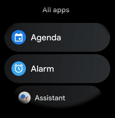
Use a WearableRecyclerView for a
long list of simple items, such as an application launcher or a list of contacts. Each item might
have a short string and an associated icon. Alternatively, each item might have only a string
or an icon.
Note: Avoid complex layouts. Users should only need to glance at an item to understand what it is, especially with wearables' limited screen size.
By extending the existing RecyclerView class, WearableRecyclerView
APIs display a vertically scrollable list of items in a straight list by default. You can also use
the WearableRecyclerView APIs to opt-in for a curved layout and
a circular scrolling gesture
in your wearable apps.
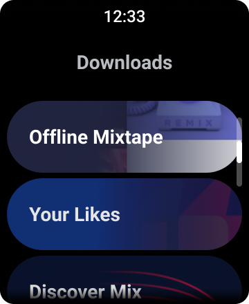
Figure 1. Default list view on Wear OS.
This guide shows you how to use the WearableRecyclerView class to create
lists in your Wear OS apps, how to opt-in for a curved layout
for your scrollable items, and how to customize the appearance of
the children while scrolling.
Add WearableRecyclerView to an activity using XML
The following layout adds a WearableRecyclerView to an activity:
<androidx.wear.widget.WearableRecyclerView
    xmlns:android="http://schemas.android.com/apk/res/android"
    xmlns:tools="http://schemas.android.com/tools"
    android:id="@+id/recycler_launcher_view"
    android:layout_width="match_parent"
    android:layout_height="match_parent"
    android:scrollbars="vertical" />
The following example shows the WearableRecyclerView
applied to an activity:
Kotlin
class MainActivity : Activity() {

    override fun onCreate(savedInstanceState: Bundle?) {
        super.onCreate(savedInstanceState)
        setContentView(R.layout.activity_main)
    }
    ...
}
Java
public class MainActivity extends Activity {
    @Override
    public void onCreate(Bundle savedInstanceState) {
        super.onCreate(savedInstanceState);
        setContentView(R.layout.activity_main);
    }
    ...
}
Create a curved layout
To create a curved layout for scrollable items in your wearable app, do the following:
-
Use
WearableRecyclerViewas your main container in the relevant XML layout. -
Set the
setEdgeItemsCenteringEnabled(boolean)method totrue. This vertically centers the first and last items on the list on the screen. -
Use the
WearableRecyclerView.setLayoutManager()method to set the layout of the items on the screen.
Kotlin
wearableRecyclerView.apply {
    // To align the edge children (first and last) with the center of the screen.
    isEdgeItemsCenteringEnabled = true
    ...
    layoutManager = WearableLinearLayoutManager(this@MainActivity)
}
Java
// To align the edge children (first and last) with the center of the screen.
wearableRecyclerView.setEdgeItemsCenteringEnabled(true);
...
wearableRecyclerView.setLayoutManager(
                new WearableLinearLayoutManager(this));
If your app has specific requirements to customize the appearance of the children while scrolling—for example,
scaling the icons and text while the items scroll away from the center—extend
the
WearableLinearLayoutManager.LayoutCallback class and override the
onLayoutFinished method.
The following code snippets show an example of customizing the scrolling of items to scale
farther away from the center by extending the
WearableLinearLayoutManager.LayoutCallback class:
Kotlin
/** How much icons should scale, at most.  */
private const val MAX_ICON_PROGRESS = 0.65f

class CustomScrollingLayoutCallback : WearableLinearLayoutManager.LayoutCallback() {

    private var progressToCenter: Float = 0f

    override fun onLayoutFinished(child: View, parent: RecyclerView) {
        child.apply {
            // Figure out % progress from top to bottom.
            val centerOffset = height.toFloat() / 2.0f / parent.height.toFloat()
            val yRelativeToCenterOffset = y / parent.height + centerOffset

            // Normalize for center.
            progressToCenter = Math.abs(0.5f - yRelativeToCenterOffset)
            // Adjust to the maximum scale.
            progressToCenter = Math.min(progressToCenter, MAX_ICON_PROGRESS)

            scaleX = 1 - progressToCenter
            scaleY = 1 - progressToCenter
        }
    }
}
Java
public class CustomScrollingLayoutCallback extends WearableLinearLayoutManager.LayoutCallback {
    /** How much icons should scale, at most. */
    private static final float MAX_ICON_PROGRESS = 0.65f;

    private float progressToCenter;

    @Override
    public void onLayoutFinished(View child, RecyclerView parent) {

        // Figure out % progress from top to bottom.
        float centerOffset = ((float) child.getHeight() / 2.0f) / (float) parent.getHeight();
        float yRelativeToCenterOffset = (child.getY() / parent.getHeight()) + centerOffset;

        // Normalize for center.
        progressToCenter = Math.abs(0.5f - yRelativeToCenterOffset);
        // Adjust to the maximum scale.
        progressToCenter = Math.min(progressToCenter, MAX_ICON_PROGRESS);

        child.setScaleX(1 - progressToCenter);
        child.setScaleY(1 - progressToCenter);
    }
}
Kotlin
wearableRecyclerView.layoutManager =
        WearableLinearLayoutManager(this, CustomScrollingLayoutCallback())
Java
CustomScrollingLayoutCallback customScrollingLayoutCallback =
                new CustomScrollingLayoutCallback();
wearableRecyclerView.setLayoutManager(
                new WearableLinearLayoutManager(this, customScrollingLayoutCallback));