
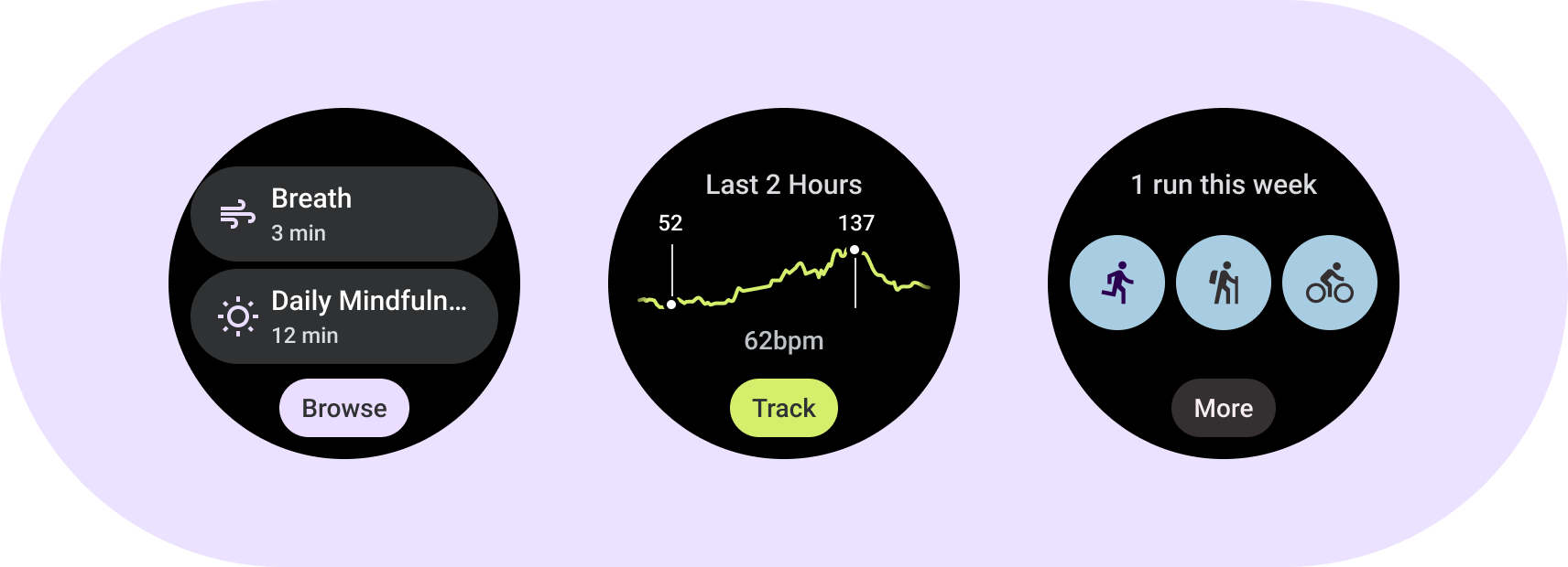
Tìm hiểu các phần tử cơ bản của thẻ thông tin. Sử dụng các mẫu, bố cục và thành phần thẻ thông tin để thiết kế và tạo thẻ thông tin độc đáo cho ứng dụng của bạn.
Các phần tử cơ bản
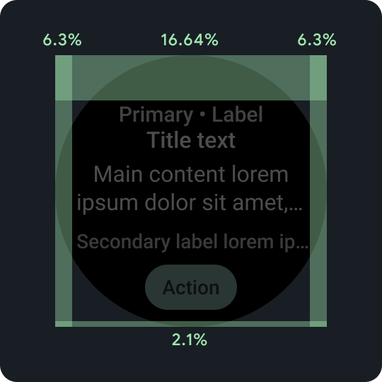
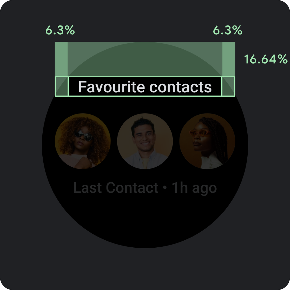
Tỷ lệ phần trăm khoảng đệm
Lề trên, dưới và bên đều sử dụng tỷ lệ phần trăm, thay vì số lượng biên cố định, để đạt được tỷ lệ theo tỷ lệ.
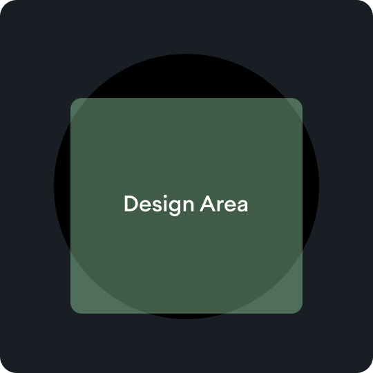
Khu vực thiết kế
Mỗi loại mẫu thẻ thông tin có quy tắc riêng trong vùng nội dung chính. Hãy tham khảo hướng dẫn về bố cục để biết thêm thông tin.
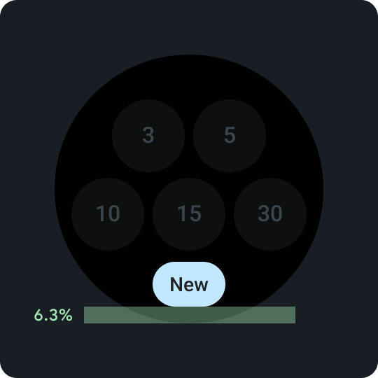
Khối thu gọn ở dưới cùng
Lưu ý quan trọng khi bật thao tác phụ trên thẻ thông tin. Luôn đặt ở mức cao hơn phía dưới cùng là 6,3%.
Khối thu gọn ở dưới cùng
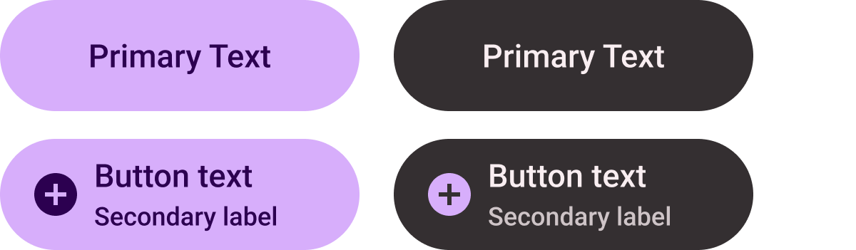
Trong nút, hãy sử dụng một từ ngắn nhưng dành riêng cho một hành động hoặc đích đến cụ thể. Bản dịch của văn bản lời kêu gọi hành động này phải phù hợp với giới hạn số lượng ký tự. Bạn có thể sử dụng giá trị mặc định hoặc giá trị dự phòng là "Lựa chọn khác" dưới dạng văn bản lời kêu gọi hành động.
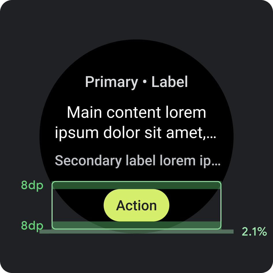
Vị trí
- Lề: 2,1% tính từ cuối thẻ
- Khoảng đệm bên trong: 8 dp trên và dưới
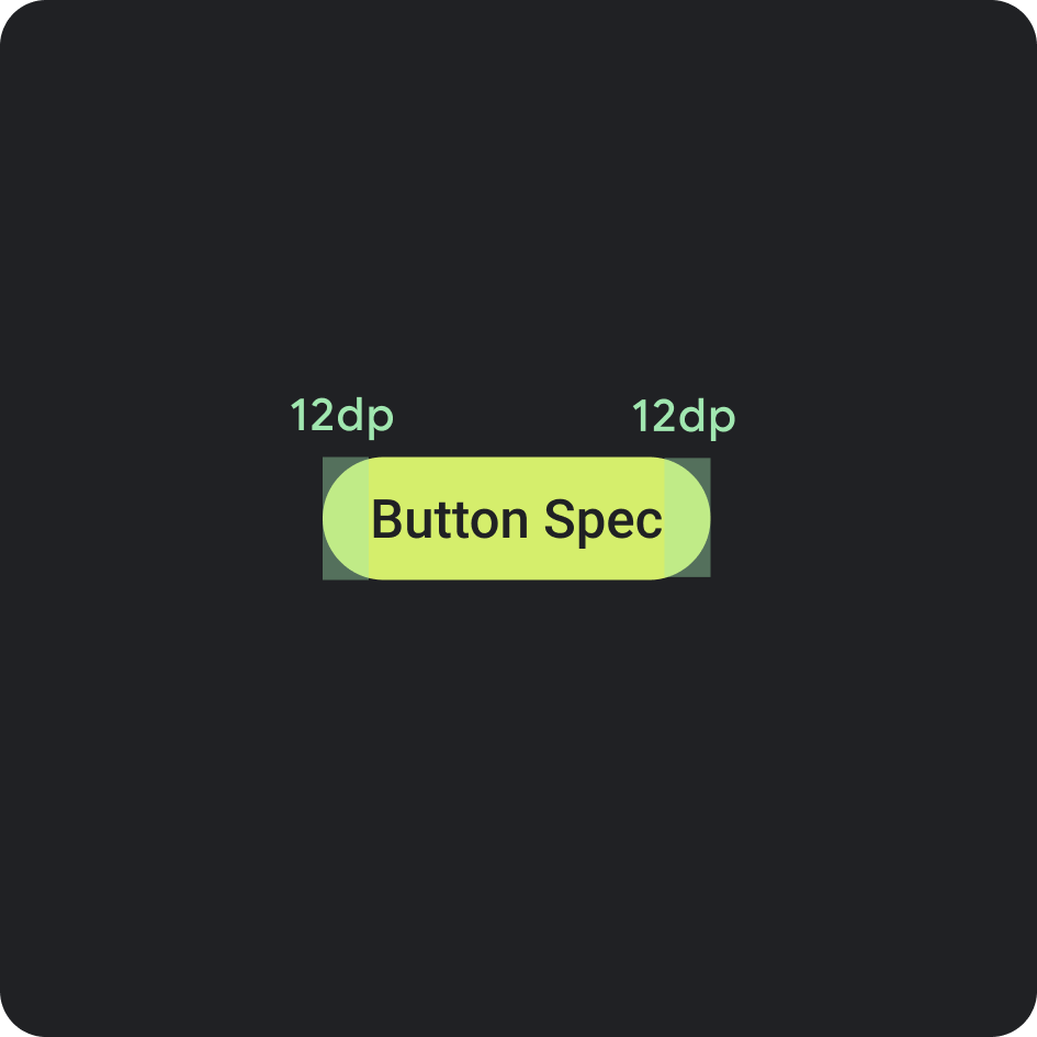
Thông số kỹ thuật của nút
- Khoảng đệm bên trong: 12 dp ở cả hai bên
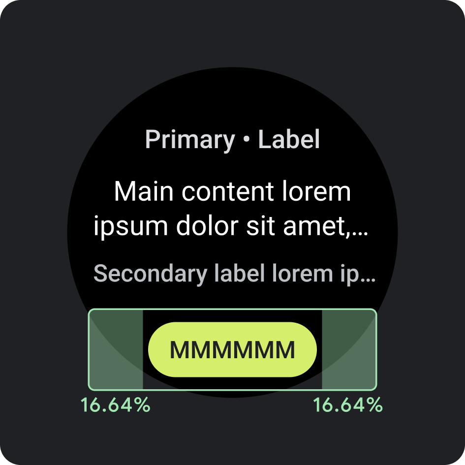
Khoảng đệm/lề trong bên
- 16,64%
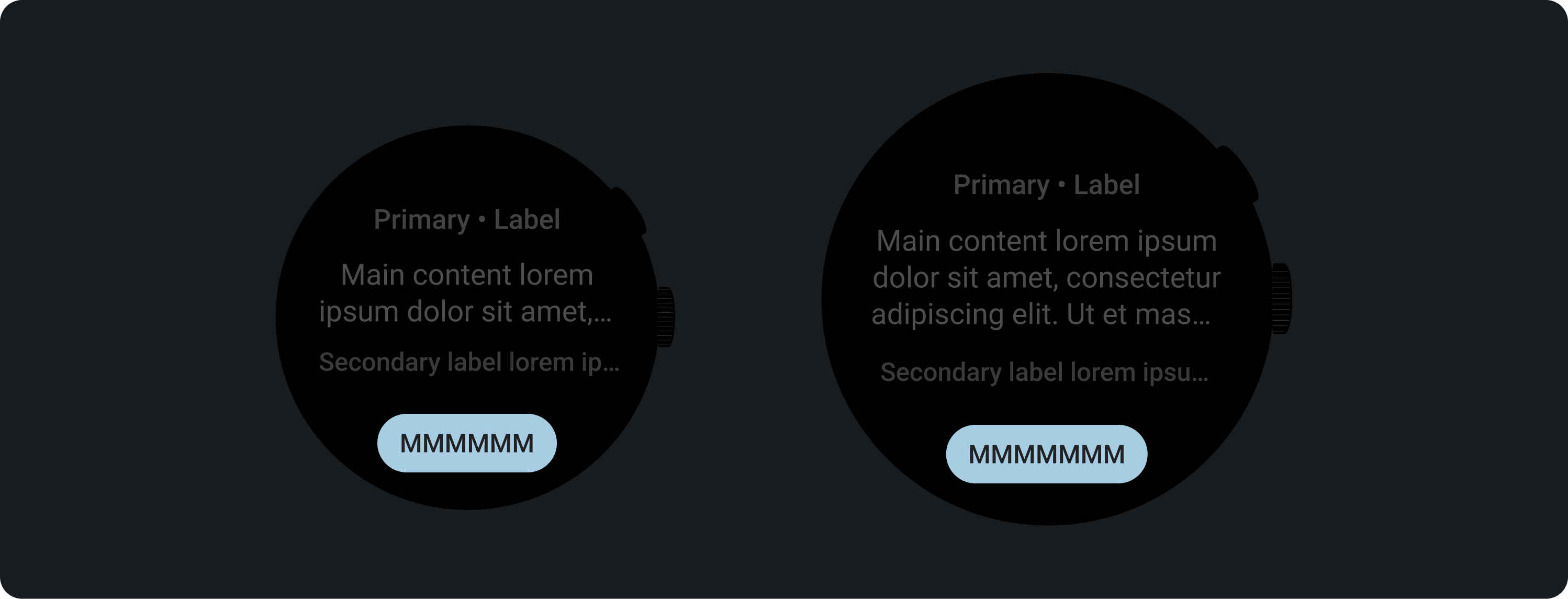
Giới hạn ký tự nên dùng < 225 dp
- Số dòng tối đa: 1
- Giới hạn ký tự tối đa: 8
- Giới hạn ký tự nên dùng: 6
- Rút ngắn: Không
Giới hạn th đề xuất > 225 dp
- Số dòng tối đa: 1
- Giới hạn ký tự tối đa: 9
- Giới hạn ký tự nên dùng: 7
- Rút ngắn: Không
Màu
Áp dụng chủ đề của thương hiệu
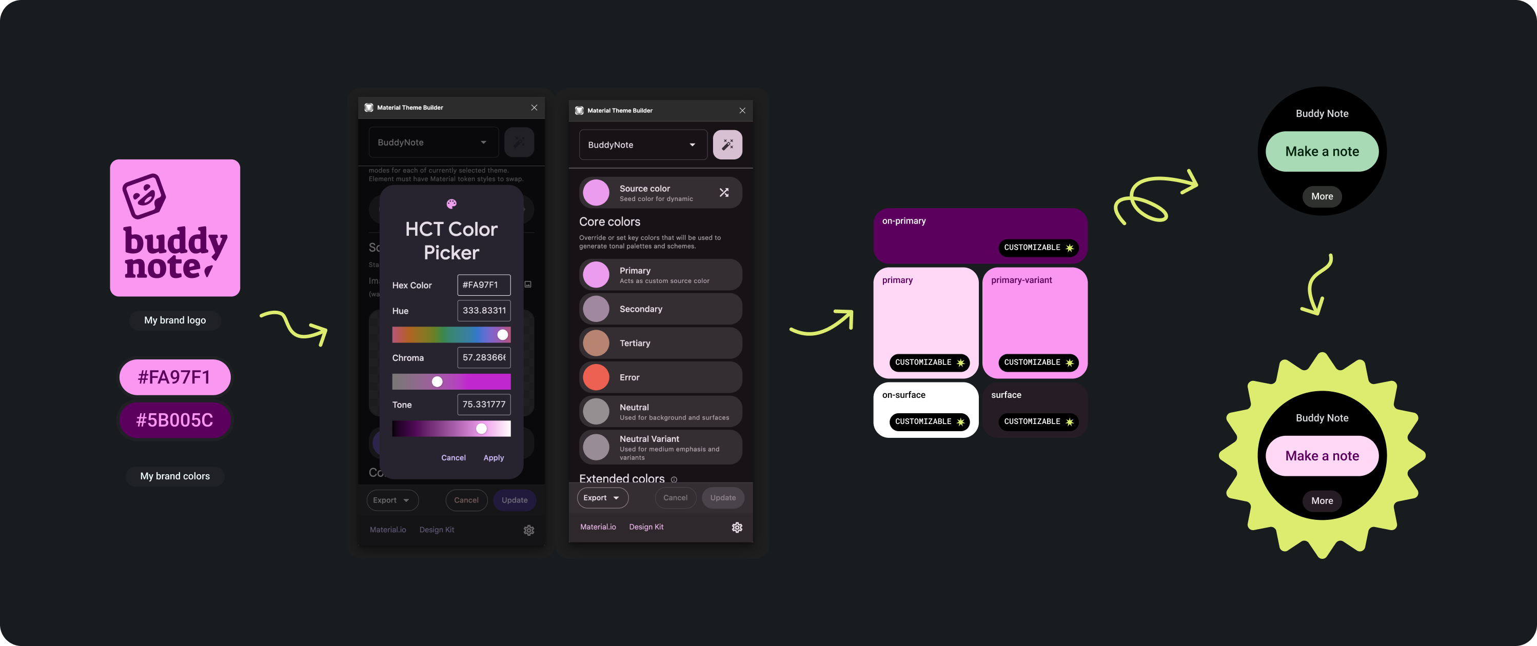
Có một số màu sắc của thương hiệu để lựa chọn. Bạn cũng có thể tuỳ chỉnh và thay đổi các thành phần này cho phù hợp với giao diện của ứng dụng.
Sử dụng Công cụ và hướng dẫn về giao diện Material để tạo màu có mức độ tương phản màu phù hợp, dùng màu chính làm màu nguồn. Sử dụng bảng màu đã tạo để thay thế màu chính, biến thể chính, màu trên chính, màu cho vùng hiển thị và màu trên bề mặt trong bảng màu của bạn trong Figma nhằm tạo giao diện chính xác cho thẻ thông tin. Bạn không thể tuỳ chỉnh tất cả các màu khác để tạo sự nhất quán trên các thẻ thông tin.
Các công cụ tạo giao diện Material khác:
- Web của Material Theme Builder (Trình tạo giao diện Material)
- Trình bổ trợ Figma trong Material Theme Builder (Trình tạo giao diện Material)
Ứng dụng màu
Luôn đặt màu nền thành đen.
Nên
Không đặt nền ở dạng hình ảnh tràn lề hoặc màu khối.
Không nên
Kiểu chữ
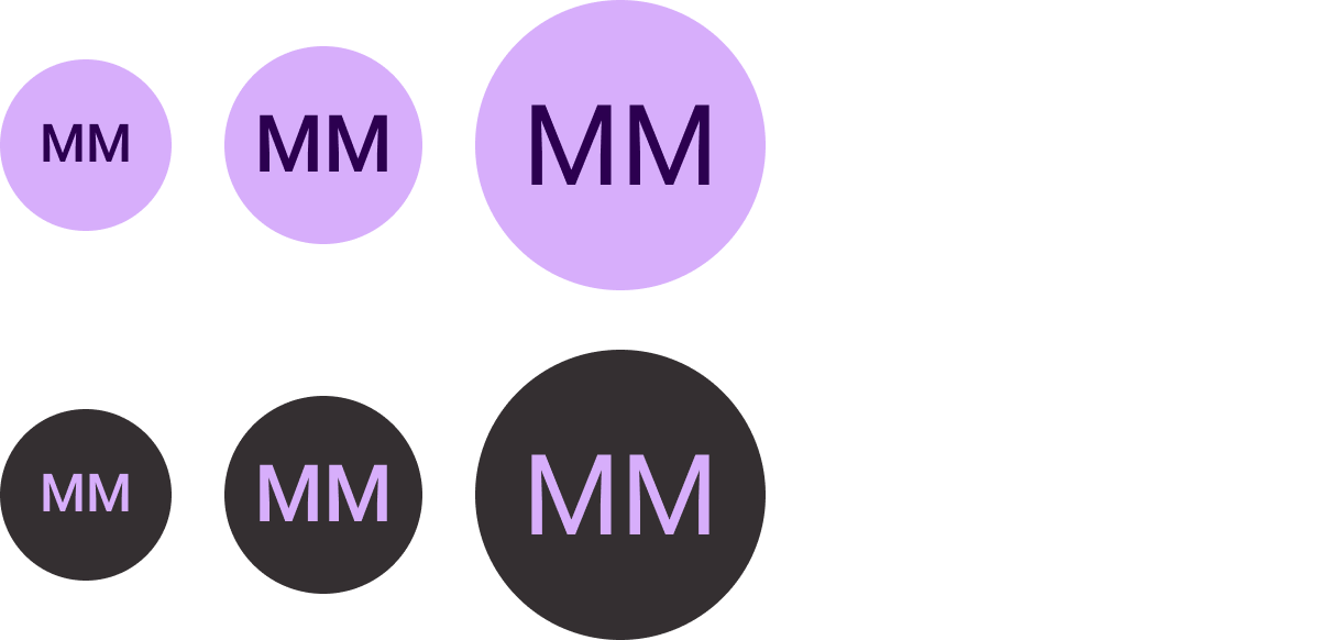
Roboto là phông chữ chính được sử dụng trong Wear OS. Nội dung 2 được đề xuất làm cỡ chữ mặc định và nhỏ nhất, trong khi Hiển thị 2 là kiểu chữ lớn nhất có sẵn cho thẻ thông tin.
Nhãn chính
Văn bản nhãn chính luôn nằm cách cạnh trên cùng 16,64% và có khoảng đệm bên trong là 6,3%. Màu sắc và phông chữ cũng phải nhất quán xuyên suốt.
Khoảng đệm bên trong
Lề trên: 16,64%
Lề bên: 6,3%
Màu
Biến thể chạy trong nền (300 màu xám)
Loại
Tiles3P (Roboto) / Button – 15S Bold
Để biết thêm thông tin về phông chữ, độ đậm và kích thước, hãy xem phần Kiểu chữ.
Thành phần
Có một số thành phần để tạo thẻ thông tin của ứng dụng. Các thành phần này phù hợp với Material Design.
Nút biểu tượng
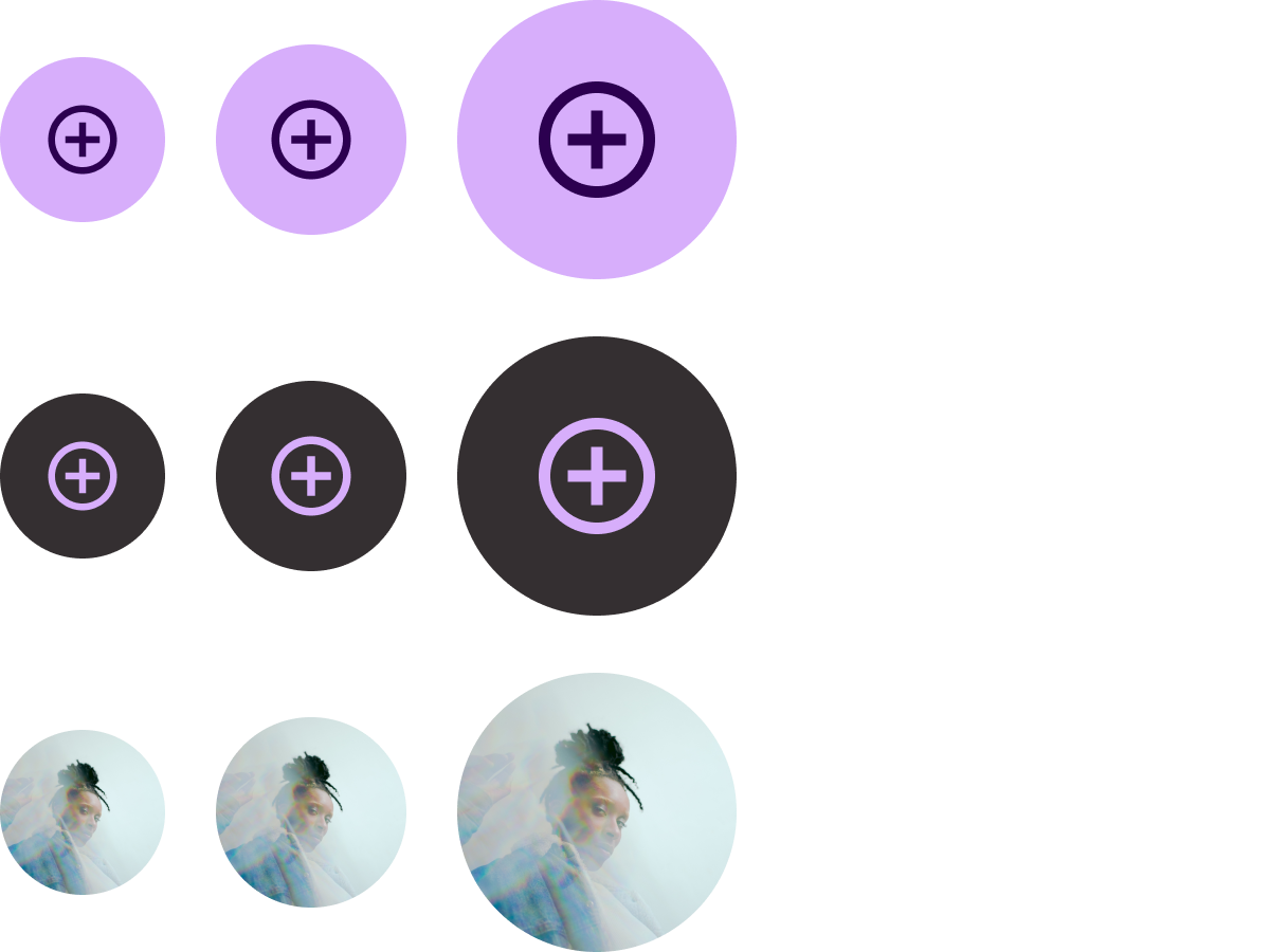
Tuỳ chọn: Nút hoặc nút bật tắt
Kích thước: Chuẩn, XS, S, L
Loại: Màu nền, tô màu và hình ảnh
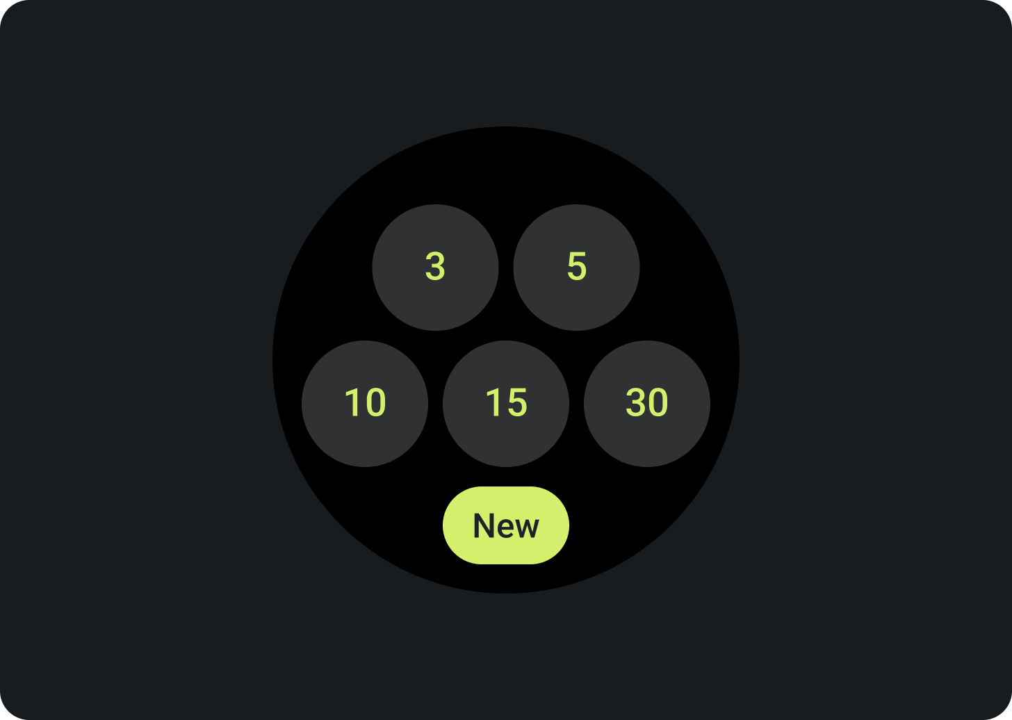
Liệt kê tối đa 7 lựa chọn.
Nút văn bản
Tuỳ chọn: Nút hoặc Nút bật tắt
Kích thước: Chuẩn, XS, S, L
Loại: Có màu nền và tô màu
Liệt kê tối đa 7 lựa chọn.
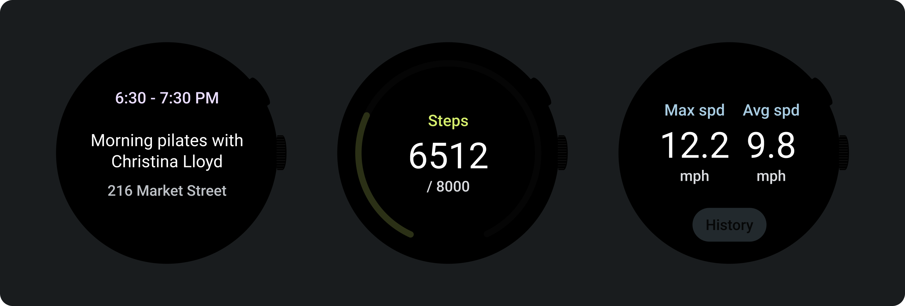
Khối tiêu chuẩn
Tuỳ chọn: Biểu tượng, nhãn phụ và căn chỉnh văn bản
Liệt kê tối đa 2 lựa chọn.
Khối tiêu đề (chỉ điền chính)

Căn giữa văn bản
Tạo một CTA nổi bật.
Khối thu gọn

Loại: Có tô màu nền và có nhiều sắc độ
Tuỳ chọn: Biểu tượng hoặc không có biểu tượng
Sử dụng trong vùng nút dưới cùng.
Chỉ báo tiến trình
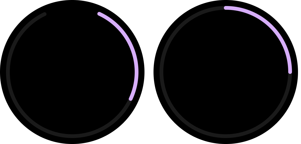
Loại: Chiều rộng nét vẽ có thể tuỳ chỉnh
(Kích thước mặc định: 8 dp và 5 dp)
Tuỳ chọn: Khoảng trống ở dưới cùng hoặc toàn bộ
Cho biết tiến độ và mức độ hoàn thành việc cần làm.
Bộ công cụ thiết kế Figma
Tải bộ thiết kế Thẻ thông tin trên Wear OS xuống để bắt đầu sử dụng bố cục thiết kế thẻ thông tin có các thành phần, tuỳ chọn và đề xuất tích hợp sẵn nhằm tạo ra nhiều bố cục phù hợp với nhu cầu của bạn, đồng thời vẫn tuân thủ các nguyên tắc trong mẫu ProtoLayout.