每個人都是財富的關鍵 | Futubull 提供無障礙的使用者體驗
透過集合功能整理內容
你可以依據偏好儲存及分類內容。
許多財富管理應用程式的使用者都使用標準的 Red Up Green Down 色彩配置,對色盲使用者和色覺障礙者來說是一大問題。Futubull 團隊致力改善各項資源,讓所有人都能瞭解財富的關鍵。
Futubull 不僅提供豐富的投資資訊/分析/決策服務,以及免費的教育訓練內容,還可透過一個活躍的財富管理社群,為全球超過 1900 萬名使用者創造更好的交易體驗。Futubull 應用程式目前與 Android、iOS、Windows、Macs、平板電腦 (iPadOS 和 ChromeOS) 使用者相容,並為每位客戶提供完善的使用自然 API。
「Red Up Green 下降」(Red Up Green 降低) 的問題則是指投資應用程式最常見的色彩配置。這種色彩配置對使用者而言,是相當艱鉅的綠色研究。然而,這種色彩配置的使用率非常高,不利於投資人,因為我們經常在研究過程中發現,不利於進行紅色盲點/色彩組合管理。
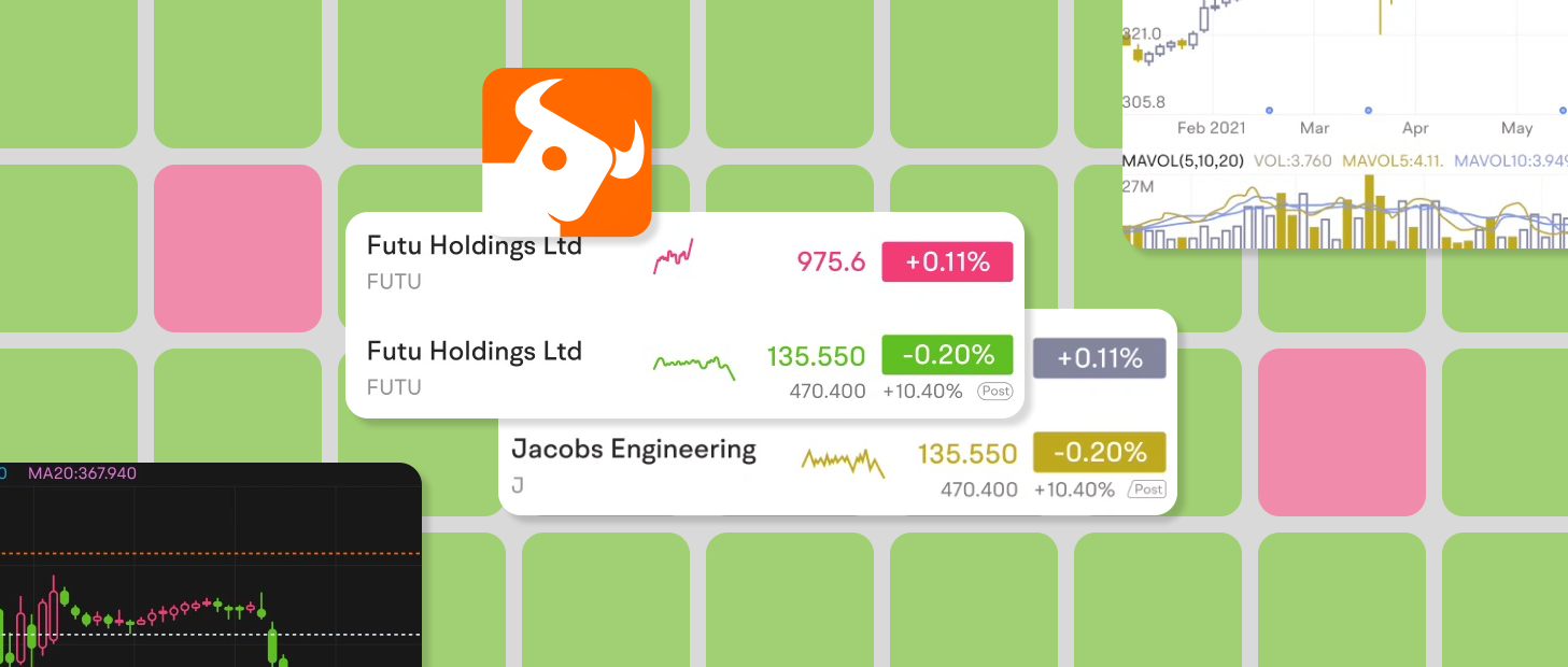
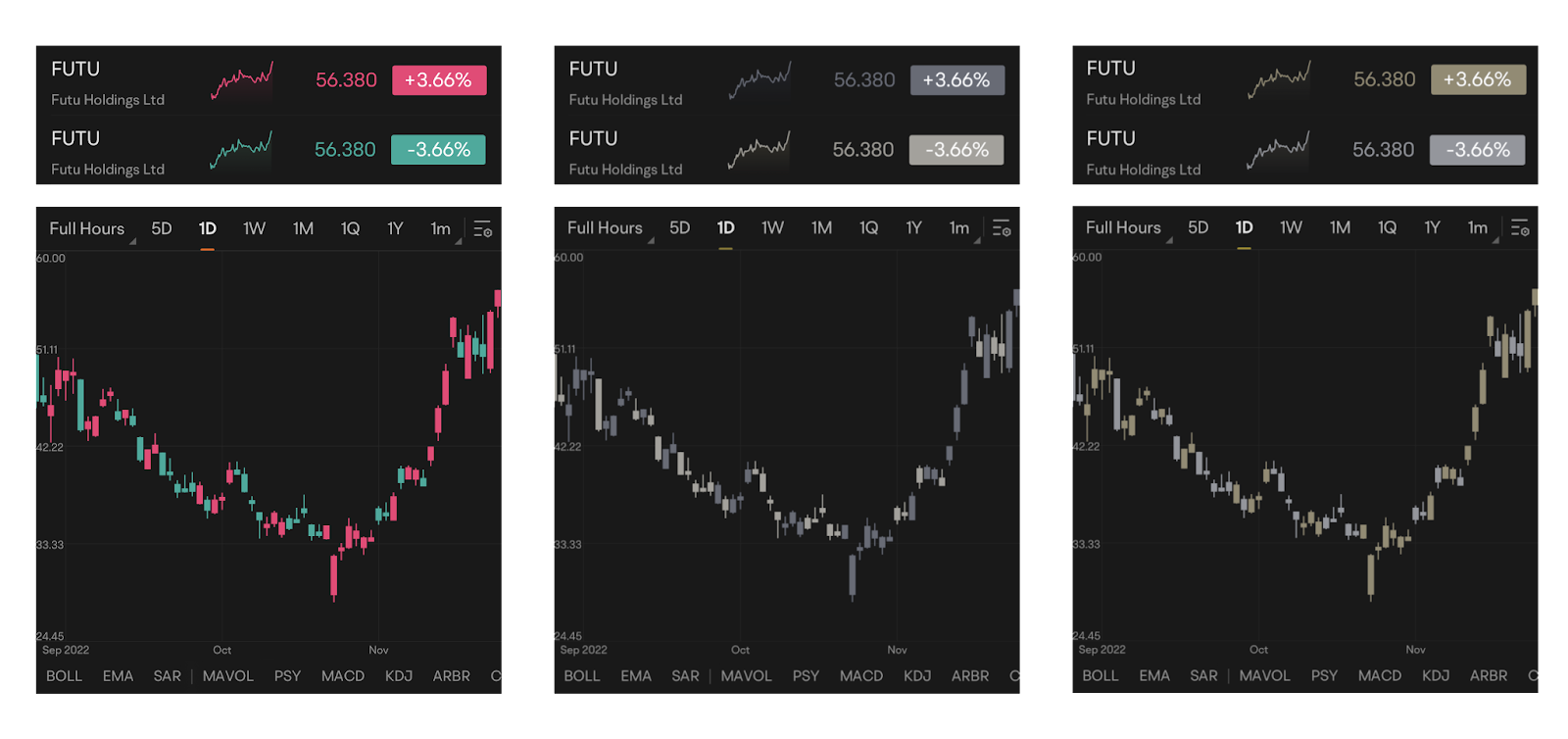
△ The Red Up Green Down 色彩配置,如常視覺 (左側)、色盲使用者 (中間) 和綠色盲人 (右) 的使用者所看到的
紅與綠的不同陰影
Futubull 應用程式所用的紅色和綠色調色盤最初是為有一般色盲使用者設計,因此對色盲使用者需要投注大量心力,例如藉由解讀符號或資料來識別上漲/下價格變化。這種色彩配置對這些使用者來說非常不方便。
由於生存偏見,造成紅綠盲的人口比例可能會高於許多人所知的人口比例。根據統計資料,約有 5% 到 8% 的男性和 0.5% 的女性色彩視覺障礙 (即色盲)。考慮到富圖布爾擁有 1,900 萬人龐大的使用者族群,這並不是一個微小的比例。
我們一直很重視使用者的語音品質,並從多個管道中學到,有些使用者會因為色盲問題而無法順利使用。紅綠盲的投資人絕對無法察覺紅色和綠色的差異,因此在投資過程中,絕對會減緩他們需要調整的色彩配置。為此,我們導入了全新的色彩色彩組合,藉此針對色彩配對功能進行最佳化,滿足所有使用者的色彩配置。—— Garit,Futubull 應用程式使用者體驗總監
設計出方便使用的色彩配置時,該團隊使用 Google 的無障礙功能檢查工具應用程式評估了現有應用程式,這些應用程式可以錄製頁面、擷取介面每個元素,並提供改善建議 (例如字型大小、觸控目標大小、顏色對比等) 的建議。這些意見對我們的團隊非常有幫助。
- 無障礙功能檢查工具
https://developer.android.google.cn/guide/topics/ui/accessibility/testing#accessibility-scanner
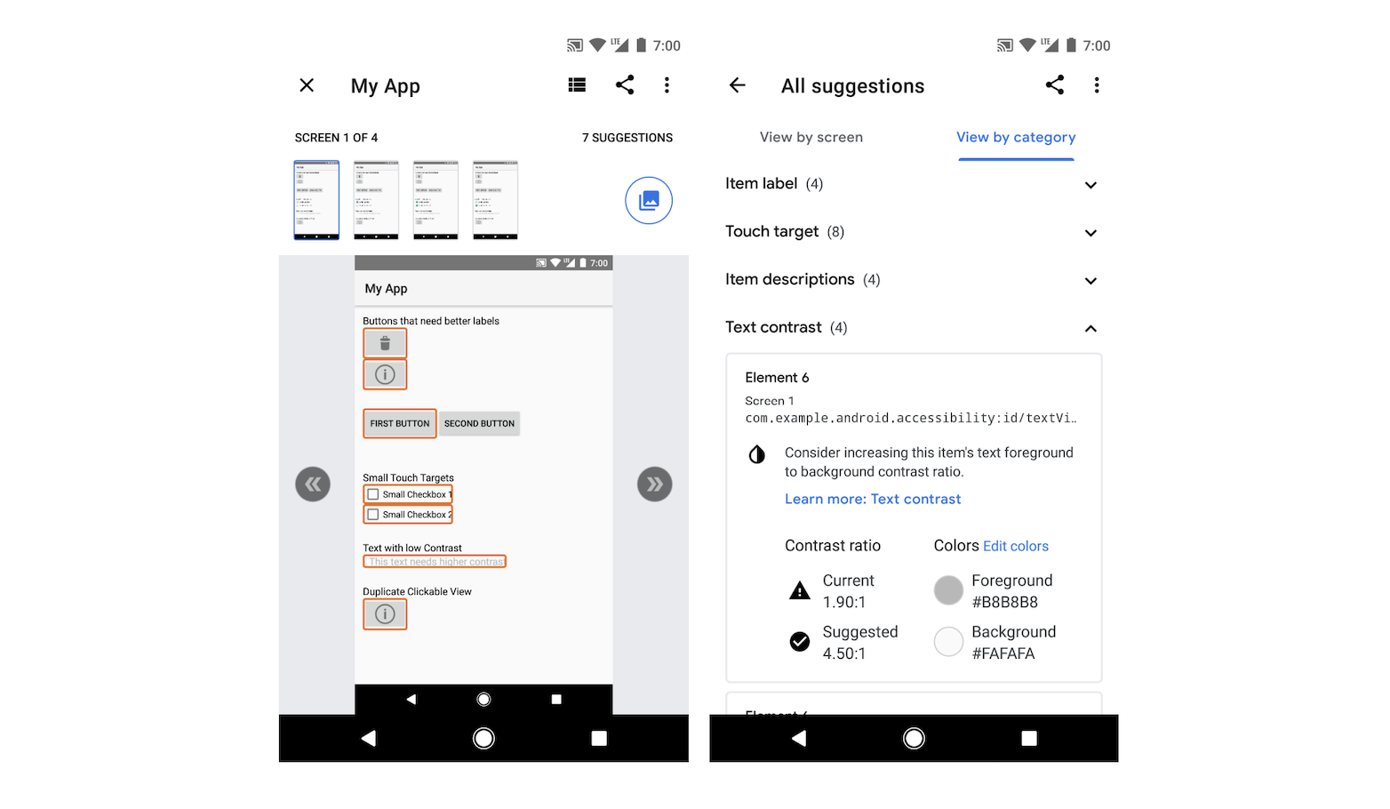
△ 無障礙功能檢查工具為每個控制項/元素提供無障礙功能最佳化建議,適合開發人員參考
在敲定無障礙調色盤的過程中,團隊也向有色覺障礙的使用者進行問卷調查,他們透過官方管道與您聯絡,要求測試無障礙色彩配置,並針對他們的使用經驗提供詳細意見回饋,以及最佳化建議。團隊根據這些意見設計出整體的改善計畫。
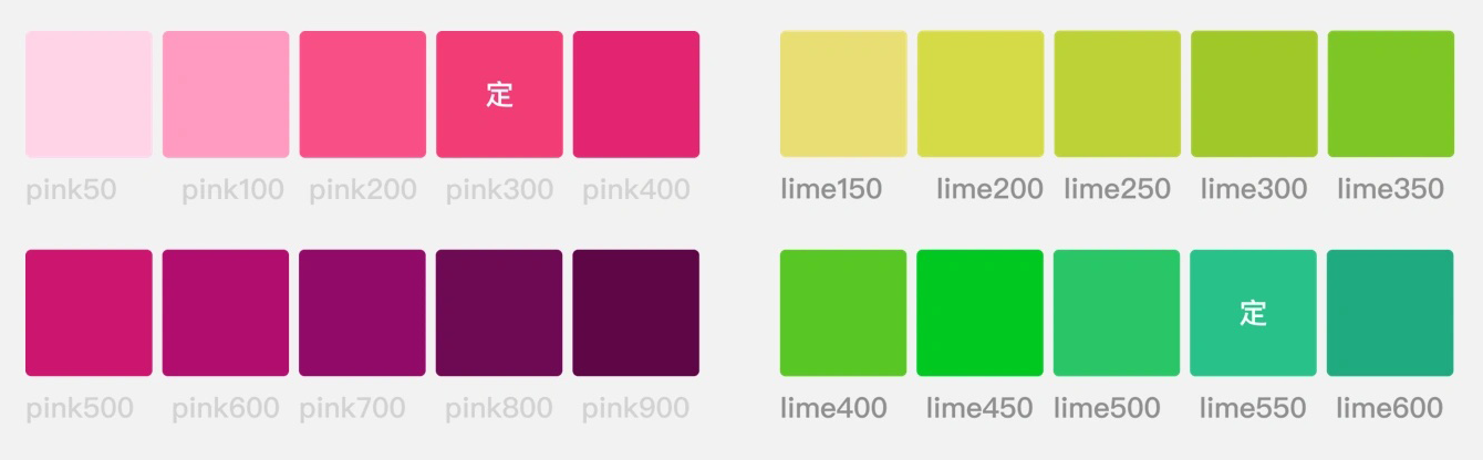
新的粉紅色/綠色配置會保留相同的雙色調系統,同時嚴格遵循無障礙功能檢查工具提供的
色彩對比建議 ,適用於一般視覺、植物和戀童癖,因此將一般視覺和盲人人士的視覺體驗納入考量。
- Material Design:色彩與對比
https://m3.material.io/foundations/Accessibility-design/overview
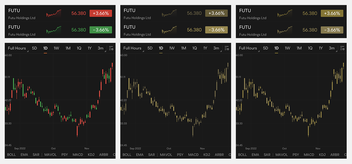
△ (左) 粉紅色-綠色色彩配置,可由正常色盲使用者 (左) 、有紅色盲 (中間) 和綠色盲 (右側) 使用者看到的畫面
讓團隊擁有無障礙體驗
我們的團隊目前有超過 1,000 名人員 (包括色盲人士) 提供服務。打造無障礙體驗,不僅為我們的使用者提供服務,也幫助我們自己。
—— Futubull Android 研發工程師 Zed
決定好新的調色盤後,團隊在新功能推出前,與內部產品和研發團隊共同進行了一系列內部測試。在新功能推出前,團隊團隊、自主測試以及測試工程師的協助,確保許多新配色的調色盤只有線上視覺障礙團隊能滿足到更廣泛的色彩障礙 1。
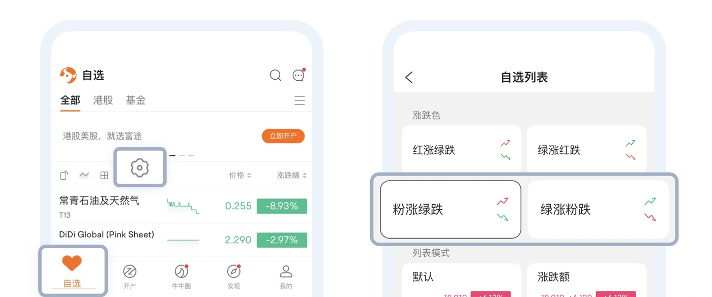
△ 切換色彩配置也非常簡單。只要輕觸應用程式首頁上的「待觀看影劇清單設定」圖示即可
不過,這只是 Futubull 產品無障礙改善計畫的一部分。
超越紅光譜
Futubull 的產品研究與開發理念是簡化投資程序,而不是獨自運作。這個目標適用於所有使用者。
—— Garit,Futubull 應用程式使用者體驗總監
建立無障礙調色盤的過程中,團隊對視覺能力各有不同的使用者俱有更同理心。在設計出粉綠色、色調較深的色彩配置後,該團隊為了滿足使用者對紅綠視覺障礙/色盲使用者的需求,進一步開發出擁有獨特顏色的彩色 K 線。
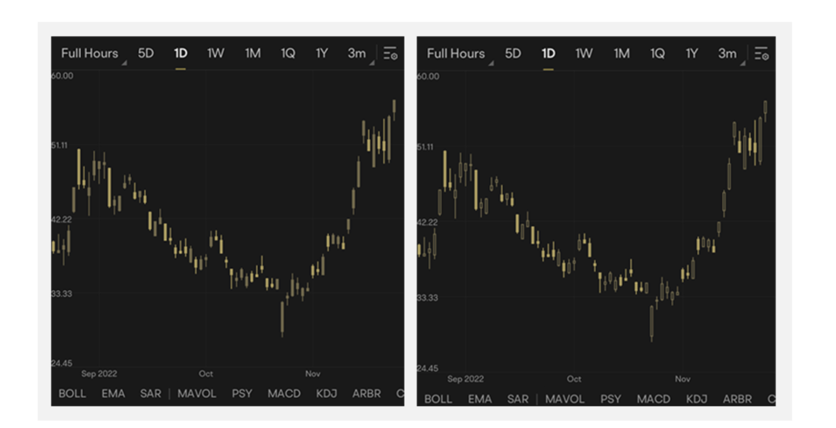
△ Solid K K 線 (左側) 和中空蠟燭 (右)。兩種螢幕截圖示範了螢幕呈現方式,供黃體素食者使用
對於因視覺品質不佳而難以閱讀文字的使用者,該團隊也提供字型大小設定功能,讓使用者可以放大文字,方便使用者閱讀。對於應用程式特定部分/功能需要特定字型大小的使用者,團隊也會考慮提供本地化的調整選項。
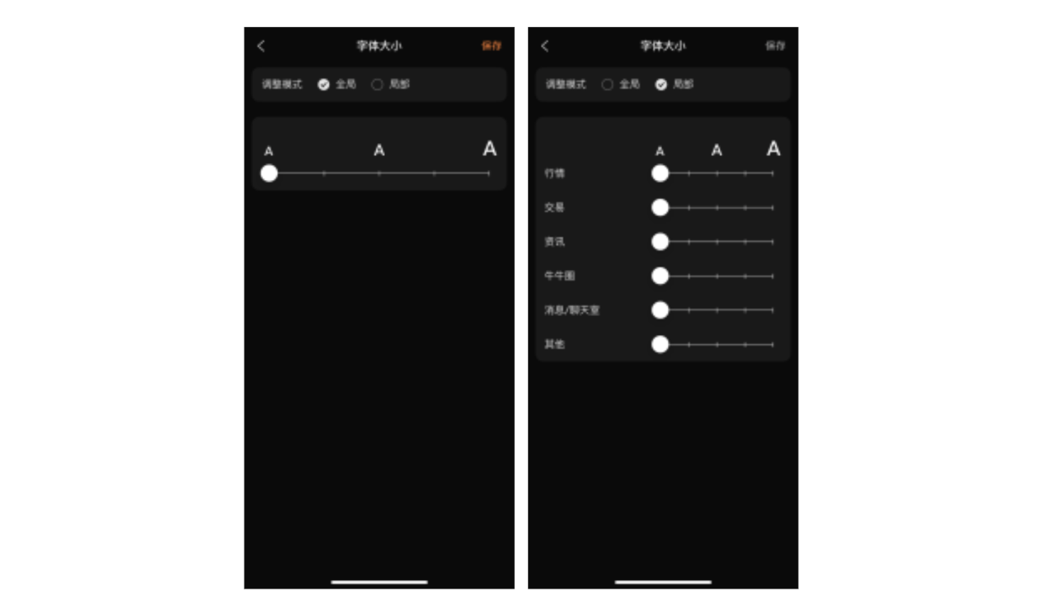
△此外還有適用於字型大小調整的本地化和全域選項,使用者可以視需要選取
我們的團隊目前仍在循序漸進地進一步瞭解無障礙功能。我們聘請了一位產品經理,負責追蹤無障礙體驗,找出可能會妨礙使用者體驗的應用程式歷程,然後協調最佳化作業。
—— Garit,Futubull 應用程式使用者體驗總監
人人都能獲益
在今年 6 月 16 日,該公司推出了全新的無障礙調色盤,大大引起消費者評論。
△">為什麼好評是好的,但正面的意見回饋的數量卻非常令人驚訝
這項成果也大幅提升了團隊的信心,進一步改善產品的無障礙功能。舉例來說,該團隊正打算將 Android 和 iOS 裝置的調色盤從 Android 和 iOS 裝置擴展到「網路」
瀏覽器和電腦平台。我們也正在為視障使用者開發文字轉語音功能。只要實作這些無障礙功能,更多使用者能夠順利使用 Futubull。
- 使用 Lighthouse 檢查網路用戶端的無障礙體驗
https://developer.chrome.com/docs/lighthouse/overview/
投資更輕鬆,不想孤軍奮戰。Futubull 團隊以具體行動為每位使用者提供支援,讓他們知道自己的需求將及時回應,讓他們能用自己的手掌握財富的關鍵。
我們也期望更多開發人員積極改進產品,打造更無障礙的體驗、吸引更多使用者,進而邁向成功。
這個頁面中的內容和程式碼範例均受《內容授權》中的授權所規範。Java 與 OpenJDK 是 Oracle 和/或其關係企業的商標或註冊商標。
上次更新時間:2023-01-11 (世界標準時間)。
[[["容易理解","easyToUnderstand","thumb-up"],["確實解決了我的問題","solvedMyProblem","thumb-up"],["其他","otherUp","thumb-up"]],[["缺少我需要的資訊","missingTheInformationINeed","thumb-down"],["過於複雜/步驟過多","tooComplicatedTooManySteps","thumb-down"],["過時","outOfDate","thumb-down"],["翻譯問題","translationIssue","thumb-down"],["示例/程式碼問題","samplesCodeIssue","thumb-down"],["其他","otherDown","thumb-down"]],["上次更新時間:2023-01-11 (世界標準時間)。"],[],[],null,["# The Key to Wealth for Everyone | Futubull Delivers an Accessible User Experience\n\nThe standard Red Up Green Down color scheme that many wealth management app users take for granted can be very problematic for colorblind users and those with color vision deficiency.The Futubull team is embracing users' needs by making concrete improvements so that everyone can grasp the key to wealth.\n\n\n*Futubull creates a better trading experience for more than 19 million users worldwide, by offering extensive investment information/analysis/decision-making services and free-for-life training content, in addition to a vibrant wealth management chat community.The Futubull app is currently compatible with Android, iOS, Windows, Macs, tablets (iPadOS and ChromeOS), Web browsers, and Tencent in-vehicle apps, as well as offering comprehensive API functionality.The Futubull team is committed to providing warm service to every customer, which naturally includes users with differing accessibility needs.*\n\nRed Up Green Down (or vice versa) is the most common color scheme used in investment apps, where every upward and downward price movement of an investment is a big deal for users.But the widespread use of this color scheme is leaving investors who suffer from red-green color blindness/color vision deficiency in the dark.Like any investors, these users work hard to accumulate funds and carefully research wealth management product combinations in an effort to grasp the key to wealth, but when they open the trading page, they find it impossible to identify upward and downward price movements, because they have difficulty distinguishing red from green.\n\n\u003cbr /\u003e\n\n\n*△ The Red Up Green Down color scheme, as seen by users with normal vision (left), users with protanopia (center), and users with deuteranopia (right)*\n\n\u003cbr /\u003e\n\nDifferent Shades of Red and Green\n---------------------------------\n\nThe red and green color palette used in the Futubull app was originally designed for users with normal color vision, so those with a color vision impairment need to expend a lot of extra effort when using the app, such as by interpreting symbols or data to identify upward and downward price movements. Such a color scheme is very inconvenient for these users.\n\nDue to survivorship bias, the proportion of the population with red-green color blindness may be higher than many people realize. According to statistics, around 5%--8% of men and 0.5% of women have a color vision deficiency (i.e., color blindness).This is not an insignificant proportion when you consider Futubull's huge user base of 19 million people. \n\n*We have always valued the voices of our users and have learned through various channels that some of them are having troubles because of color vision impairment..Investors with red-green color blindness cannot perceive the difference between red and green, will definitely be slowed down during investment process.To this end, we have introduced a new color scheme, optimized for color vision impairments, that encompasses all visual elements of the app, enabling users to adjust the display according to their needs.\n------ Garit, Futubull App User Experience Director*\n\n\u003cbr /\u003e\n\n\nIn designing an accessible color scheme, the team evaluated existing apps using Google's [Accessibility Scanner](https://developer.android.google.cn/guide/topics/ui/accessibility/) app, which can record pages, capturing each element of the interface and providing suggestions for improvement such as font size, touch target size, color contrast, and so on. This input was immensely helpful for the team.\n\n- Accessibility Scanner \n https://developer.android.google.cn/guide/topics/ui/accessibility/testing#accessibility-scanner\n\n\n*△ Accessibility Scanner gives accessibility optimization suggestions for each control/element, which is a good reference for developers*\n\nIn the process of finalizing the accessible color palette, the team also surveyed users with color vision impairments, who were contacted through official channels and asked to test accessible color schemes, then provide detailed feedback on their experience, as well as suggestions for optimization. Based on this feedback, the team formulated an overall improvement plan.\n\n\u003cbr /\u003e\n\n\n*△ The new red and green.*\n\nThe new pink-green scheme retains the same two-tone system while strictly adhering to the [color contrast recommendations](https://m3.material.io/foundations/accessible-design/overview) provided by Accessibility Scanner for normal vision, protanopia, and deuteranopia, thereby taking into consideration the visual experience of both users with normal vision and those with red-green color blindness.\n\n\u003cbr /\u003e\n\n- Material Design: Color and Contrast \n https://m3.material.io/foundations/accessible-design/overview\n\n\n*△ (Left) The pink-green color scheme, as seen by users with normal color vision (left), users with protanopia (center), and users with deuteranopia (right)*\n\n\u003cbr /\u003e\n\nAn Accessible Experience is a Team Effort\n-----------------------------------------\n\n\n*Our team currently numbers over 1,000 people, including colorblind members.Creating an accessible experience is not only serving our users, but also helping ourselves.\n------ Zed, Futubull Android R\\&D Engineer*\n\n\u003cbr /\u003e\n\n\nAfter determining the new accessible color palette, the team subjected it to a series of internal tests in conjunction with the internal product and R\\&D teams, before the new features were launched.By collating the evaluation of team members, self-testing, and with the help of test engineers, the team ensured that the newly introduced color palette could meet the experience of a much wider range of users with color vision deficiency.It only took the team just 15 man-days to go live with the new color scheme.\n\n\n*△ Switching color schemes is also very easy. Simply tap the Watchlist Settings icon on the app's home page*\n\nBut, this is only part of Futubull's product accessibility improvement plan.\n\n\u003cbr /\u003e\n\nAnother Step Beyond the Red-Green Spectrum\n------------------------------------------\n\n\n*Futubull's product research and development philosophy is to make investing easier and not alone.That goal is applied to all of our users.\n------ Garit, Futubull App User Experience Director*\n\n\u003cbr /\u003e\n\nThe process of creating an accessible color palette also gave the team greater empathy with users who have different visual abilities.So, after devising the pink-green color scheme to meet the needs of users with red-green color vision deficiency/color blindness, the team then proceeded to develop a hollow candlestick design that uses hollow and solid candles to indicate upward and downward price movements respectively, thereby convincing a wider range of visually impaired groups.Even in the design of some of the app's main activity pages, blue and orange colors that can be differentiated by colorblind users are used as much as possible.\n\n\n*△ Solid candles (left) and hollow candles (right).Both screenshots demonstrate how the display appears to users with protanopia*\n\nFor people who have difficulty reading text due to poor eyesight, the team also provided a font size setting function, which enables users to increase the size of text to facilitate reading.For users who require a certain font size for specific sections/functions of the app, the team also considerately provided the option of localized adjustment.\n\n\u003cbr /\u003e\n\n\n*△ There are also localized and global options for font size adjustment, which users can select as needed*\n\n\n*Our team is still progressively learning more about accessibility. We have a product manager dedicated to following up on accessibility experiences,who identifies app journeys that may constitute barriers to a good user experience, then coordinates their optimization.*\n\n*------ Garit, Futubull App User Experience Director*\n\n\u003cbr /\u003e\n\nHanding Everyone the Key to Wealth\n----------------------------------\n\nOn June 16 this year, Futubull's new accessible color palette was officially launched to rave reviews.\n\n\n*△ Although good reviews were expected, the amount of positive feedback was surprising*\n\nThis undoubtedly strengthened the team's confidence to further improve the product's accessibility. For example, the team is planning to expand the accessible color palette from Android and iOS devices to [Web](https://developer.chrome.com/docs/lighthouse/overview/) browsers and PC platforms. A text-to-speech function is also being developed for vision impaired users.With the implementation of these accessible features, more users will be able to use Futubull smoothly.\n\n\u003cbr /\u003e\n\n- Use of Lighthouse to check the web client accessibility experience \n https://developer.chrome.com/docs/lighthouse/overview/\n\nMaking investing easier and not alone. The Futubull team supports each of its users with concrete actions, letting them know that their needs will be responded to in a timely manner so that they can grasp the key to wealth with their own hands.\n\nWe also look forward to more developers actively improving their products to [create a more accessible experience](https://mp.weixin.qq.com/s/9oL9XW2K3TJLkr-w08hRJg), embrace more users, and thereby pave the way to greater success."]]