
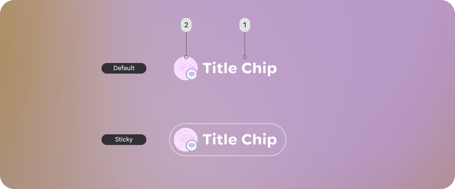
在 Jetpack Compose Glimmer 中,TitleChip 元件是不具互動性的元件,可為相關聯的內容提供簡要的脈絡或標籤,例如 Card 或 VerticalList。
使用標題資訊方塊顯示簡潔的資訊,例如簡短名稱、類別名稱或狀態指標。一般來說,您應將標題晶片放在所描述內容的上方,建立清楚的結構關係。
基本範例:建立簡短名稱方塊
下列程式碼會建立基本標題資訊方塊:
@Composable fun TitleChipSample() { TitleChip { Text("Messages") } }
Example: Create a title chip with a card
To use a title chip with another component, place the title chip
TitleChipDefaults.associatedContentSpacing above the other component in
the composable. The following code creates a title chip with a card:
@Composable fun TitleChipWithCardSample() { Column(horizontalAlignment = Alignment.CenterHorizontally) { TitleChip { Text("Title Chip") } Spacer(Modifier.height(TitleChipDefaults.associatedContentSpacing)) Card( title = { Text("Title") }, subtitle = { Text("Subtitle") }, leadingIcon = { Icon(FavoriteIcon, "Localized description") }, ) { Text("Card Content") } } }
程式碼重點
- 標題晶片會水平置中,這是放置在資訊卡上方的標題晶片通常會採用的對齊方式。
Spacer的高度固定,可確保兩個元件之間有適當的垂直間距。這是使用TitleChipDefaults.associatedContentSpacing定義的。- 使用選用的
leadingIcon在文字內容前加入額外的視覺背景資訊。 - 標題資訊方塊會自動為文字套用
caption樣式。 - 標題資訊方塊無法互動,如需可點選的標籤,請使用
Button或其他互動式元件。