
In Jetpack Compose Glimmer, surfaces use shapes to define their visual
boundaries and roundedness. The Shapes class provides different levels of
roundedness intended for various types of components.
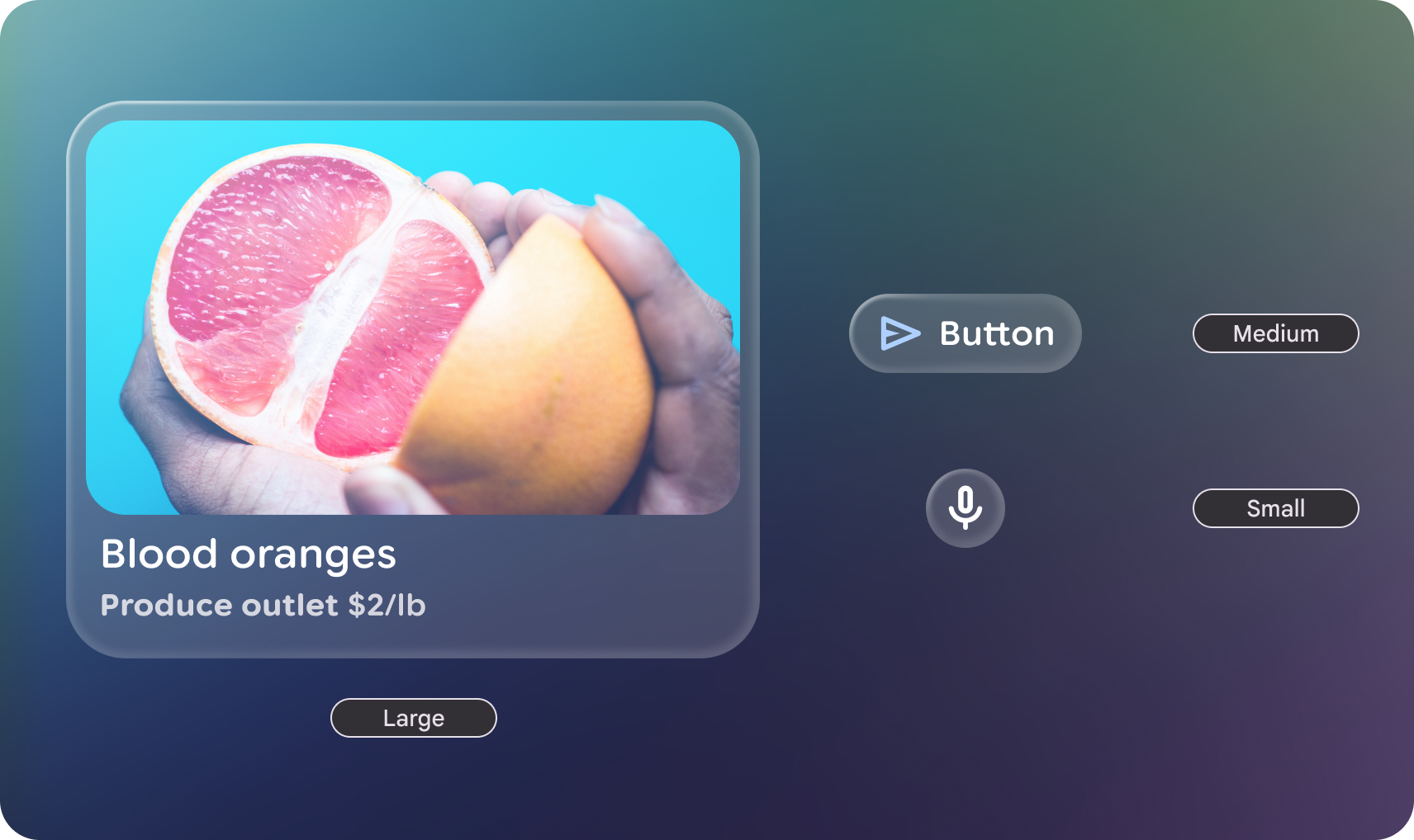
Shape categories
The GlimmerTheme class defines three standard shape sizes:
- Small: A shape with four same-sized corners. It is used for components
such as cards. By default, this is a
RoundedCornerShapeof 24.dp. - Medium: A shape with four same-sized corners sized between small and
large. This is the most commonly used shape and is the default used in
surface. By default, this is a
RoundedCornerShapeof 36.dp. - Large: A shape with four fully rounded corners. This shape is used for
components such as buttons. By default, this is a
CircleShape.
Example: Get shapes from GlimmerTheme and apply them to components
First, get the defined the defined shapes from GlimmerTheme.shapes:
@Composable fun ShapesSample() { val shapes = GlimmerTheme.shapes GlimmerLazyColumn { item { ShapeItem("small", shape = shapes.small) } item { ShapeItem("medium", shape = shapes.medium) } item { ShapeItem("large", shape = shapes.large) } } }
Next, you can apply these shapes to some components:
@Composable private fun ShapeItem(name: String, shape: Shape, modifier: Modifier = Modifier) { Box( modifier.aspectRatio(2.5f).fillMaxWidth().surface(shape = shape), contentAlignment = Alignment.Center, ) { Text(name) } }
Customize shapes
The Shapes class is @Immutable. You can create a copy of the existing theme
shapes and override specific values using the copy function. Do this to maintain
the theme's structure while adjusting specific radii for your app's brand.
Example: Override specific shape values
The following code overrides specific shape values:
val customShapes = GlimmerTheme.shapes.copy(
    small = RoundedCornerShape(12.dp),
    medium = RoundedCornerShape(20.dp)
)
Default values
If not otherwise specified in the GlimmerTheme, the system defaults to the
following values:
| Token | Default shape | Size or radius |
|---|---|---|
|
|
24.dp |
|
|
36.dp |
|
|
Fully Rounded |