In Jetpack Compose Glimmer, the TitleChip component is designed to
provide brief, non-interactive label for associated content, such as a Card. Use
title chips to display concise information like a short title, a name, or a
status. Since title chips are not focusable or interactive, they serve a purely
informational role within the a Jetpack Compose Glimmer UI. For example, you
might provide a title chip labeled "Ingredients" next to a scrollable list of
ingredients.

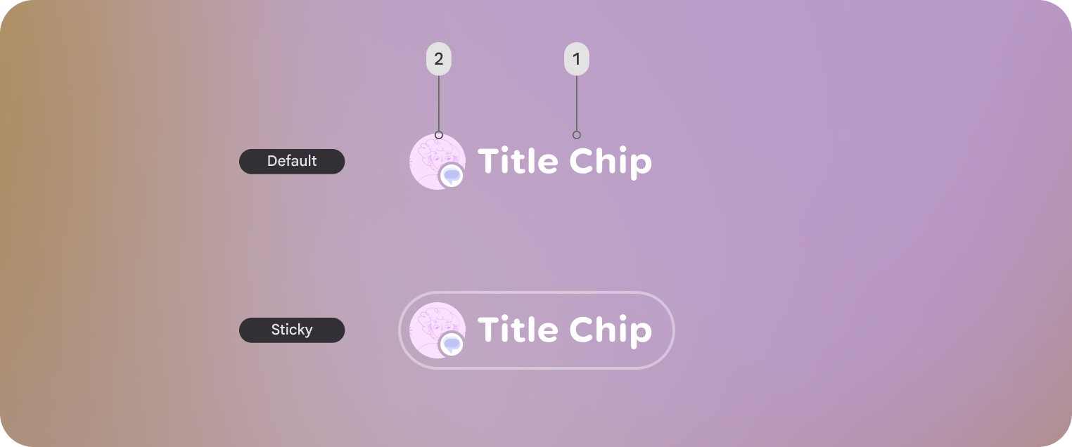
Default title chip and Sticky title chip shown. Sticky title chips are displayed with an outline.
- Title chips label
- Optional leading icon or entity
Basic example: Display a short title chip
You can create a short title chip with very little code:
TitleChip { Text("Messages") }
Detailed example: Display a title chip with a card
To use a title chip with another component, place the title chip
TitleChipDefaults.AssociatedContentSpacing above the other component in
the composable. The following code shows how to use a title chip with a card:
@Composable
fun TitleChipExample() {
    Column(horizontalAlignment = Alignment.CenterHorizontally) {
        TitleChip { Text("Title Chip") }
        Spacer(Modifier.height(TitleChipDefaults.AssociatedContentSpacing))
        Card(
            title = { Text("Title") },
            subtitle = { Text("Subtitle") },
            leadingIcon = { Icon(FavoriteIcon, "Localized description") },
        ) {
            Text("Card Content")
        }
    }
}
Key points about the code
- The
Spacerhas a fixed height to provide the correct vertical spacing, defined byTitleChipDefaults.AssociatedContentSpacing, between the two components.

