
Applicable XR devices
This guidance helps you build experiences for these types of XR devices.
In Jetpack Compose Glimmer, an IconButton is a compact, interactive
component used for exposing supplementary actions with a single tap.
Icon buttons appear smaller than standard buttons, but they maintain a physical boundary to ensure ease of interaction on display glasses.
For other use cases, there are also standard buttons and toggle buttons.
Sizes and dimensions
| Element | Dimension |
|---|---|
Minimum container size |
48 x 48 dp |
Internal icon size |
32 x 32 dp |
Default content padding |
States
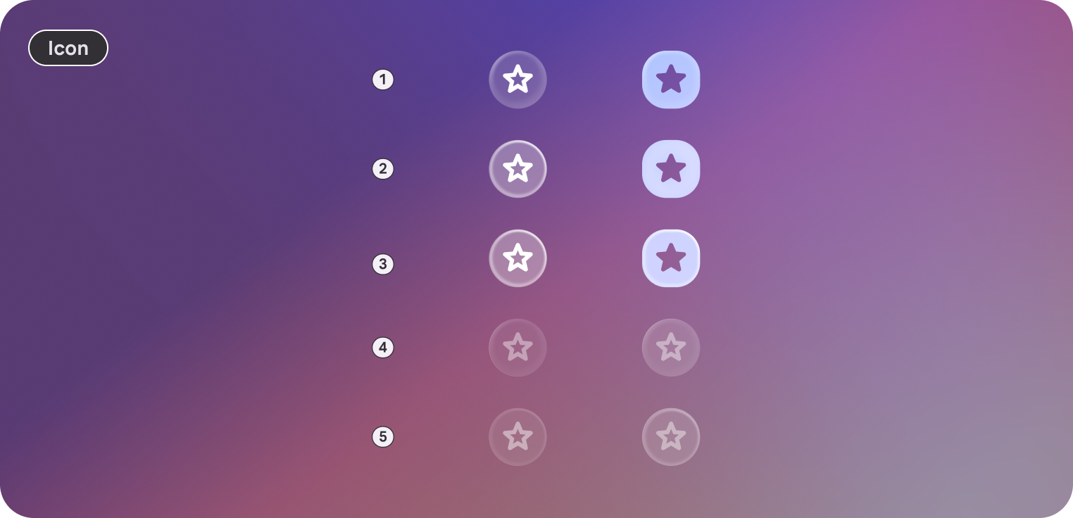
Icon buttons in Jetpack Compose Glimmer change their appearance to communicate their state.
- Enabled: The default interactive state.
- Focused: Applies
GlimmerTheme.depthEffectLevels.level1and a focused border highlight. - Pressed: Applies a semi-transparent white overlay to the surface.
- Disabled: The button is non-interactive and visual feedback is removed.
Icon button defaults
The following defaults apply to icon buttons:
- Shape: Defaults to
GlimmerTheme.shapes.large(typically circular). - Color: Defaults to
GlimmerTheme.colors.surface. - Content color: Automatically calculated from the background color unless explicitly provided.
- Content padding: Provides the default spacing between the icon and the container edge.
- Minimum size: A fixed
48.dpvalue to prevent buttons from becoming too small to interact with. - Icon size: Defaults to
GlimmerTheme.iconSizes.small(32.dp).
Example: Icon button
The following code creates an icon button with default characteristics:
@Composable fun IconButtonSample() { IconButton(onClick = {}) { Icon(FavoriteIcon, "Localized description") } }