
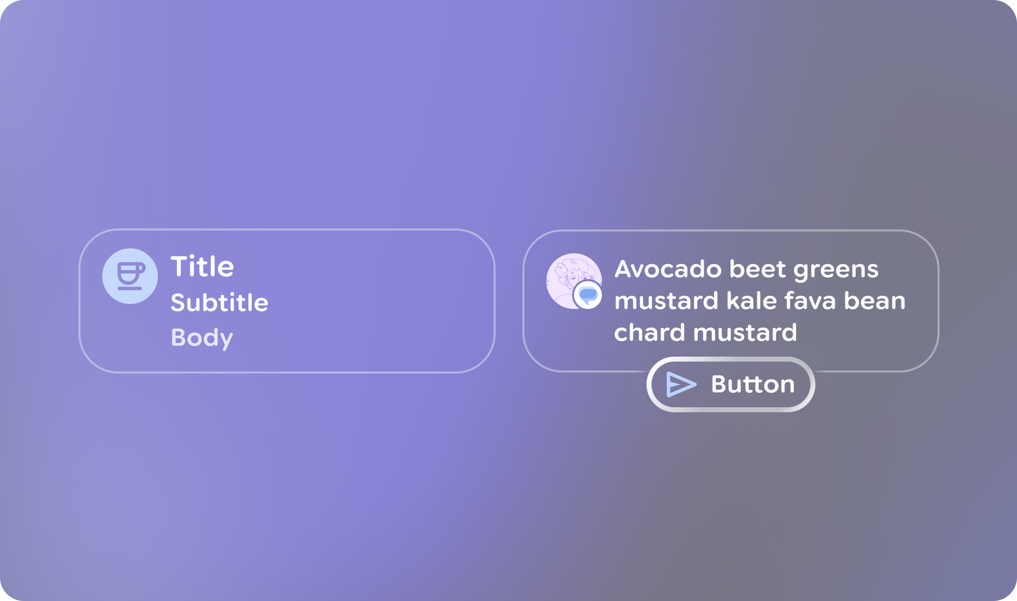
在 Jetpack Compose Glimmer 中,Card 元件是相關內容的主要容器,可為容易理解的資訊單元建立清楚的視覺界線。資訊卡具有高度適應性,可支援主要內容、選用標題、副標題,以及開頭或結尾圖示的組合。資訊卡預設會填滿可用的最大寬度,且可成為焦點,您也可以讓資訊卡可供點選。資訊卡支援直向排列,標題圖片位於最上方,接著是標題、副標題和內文。
資訊卡是以 Jetpack Compose Glimmer 表面系統為基礎建構,因此會沿用深度效果、剪裁和一致的邊框醒目顯示等實體屬性。
結構和插槽
Jetpack Compose 閃爍效果資訊卡是由多個專用元素建構而成,可供您自訂內容和版面配置。
| 運算單元 | 說明 |
|---|---|
標題 |
卡片的頂端部分,用於放置圖片。 |
標題和副標題 |
這些文字欄位會提供資訊卡的標籤 (主要和次要)。標題會顯示在子標題上方。 |
前置圖示 |
顯示在卡片內容區域開頭的選用圖示 (通常為 |
尾端圖示 |
顯示在資訊卡內容區域結尾處的選用圖示。 |
動作 |
主要互動元素的插槽,例如 |
主要內容 |
主要 |
資訊卡預設值
資訊卡適用下列預設值:
- 寬度:資訊卡會填滿螢幕可用的最大寬度,以利在螢幕眼鏡上閱讀。
- 最低高度:
80.dp - 文字垂直間距:
3.dp - 標題形狀:使用
RoundedCornerShape,並設定24.dp個角 - 內容邊框間距:預設為
GlimmerTheme.componentSpacingValues.medium。這會影響標題圖片和內容容器周圍最外層的邊框間距。 - 形狀:預設為
GlimmerTheme.shapes.medium。 文字算繪:針對下列插槽使用
GlimmerTheme.typography的預設值:- 標題:
bodyMedium - 子標題:
caption - 主要內容:
bodySmall
- 標題:
範例:基本資訊卡
下列程式碼會建立基本資訊卡:
@Composable fun CardSample() { Card { Text("This is a card") } }
範例:含有多個位置的複雜資訊卡
下列程式碼顯示如何一併使用多個 slot 建構資訊卡。
@Composable fun CardWithTitleAndLeadingIconAndHeaderAndAction() { Card( action = { Button(onClick = {}, trailingIcon = { Icon(FavoriteIcon, "Localized description") }) { Text("Send") } }, title = { Text("Title") }, leadingIcon = { Icon(FavoriteIcon, "Localized description") }, header = { Image(MyHeaderImage, "Localized description", contentScale = ContentScale.FillWidth) }, ) { Text("This is a card with a title, leading icon, header image, and action") } }
程式碼重點
- 說明如何運用
header、title、leadingIcon和action等各種資訊卡元素,自訂資訊卡的內容和結構。 - 使用標準
Card多載,並搭配動作,因為只有資訊卡 (或其內部動作) 需要可聚焦。如要讓整個資訊卡介面具備互動性,請改用onClick的Card多載。 - 這張資訊卡使用動作插槽,因此資訊卡介面無法成為焦點,焦點會改為指向動作按鈕。