

本頁說明如何使用現有的「資訊一覽」元件處理大小,並提供彈性且回應式的「資訊一覽」版面配置。
使用 Box、Column 和 Row
Glance 有三種主要的可組合項版面配置:
Box:將元素疊放在另一個元素上方。這會轉譯為RelativeLayout。Column:在垂直軸上依序放置元素。這會轉換為直向的LinearLayout。Row:在水平軸上依序放置元素。這會轉換為橫向的LinearLayout。
Glance 支援 Scaffold 物件。將 Column、Row 和 Box 可組合函式放在指定的 Scaffold 物件中。
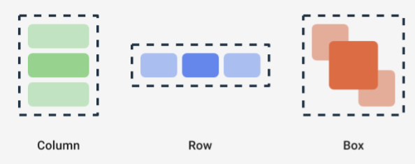
您可以使用修飾符,透過這些可組合函式定義內容的垂直和水平對齊方式,以及寬度、高度、權重或邊框間距限制。此外,每個子項都可以定義自己的修飾符,變更父項內的空間和位置。
以下範例說明如何建立 Row,使其子項在水平方向平均分布,如圖 1 所示:
Row(modifier = GlanceModifier.fillMaxWidth().padding(16.dp)) { val modifier = GlanceModifier.defaultWeight() Text("first", modifier) Text("second", modifier) Text("third", modifier) }
Row 會填滿可用的最大寬度,且由於每個子項的權重相同,因此會平均分配可用空間。您可以定義不同的權重、大小、邊框間距或對齊方式,以配合需求調整版面配置。
使用可捲動的版面配置
提供回應式內容的另一種方式是讓內容可捲動。這時就會用到 LazyColumn 可組合函式。這個可組合函式可讓您定義一組項目,在應用程式小工具的可捲動容器內顯示。
下列程式碼片段顯示在 LazyColumn 中定義項目的不同方式。
你可以提供商品數量:
// Remember to import Glance Composables // import androidx.glance.appwidget.layout.LazyColumn LazyColumn { items(10) { index: Int -> Text( text = "Item $index", modifier = GlanceModifier.fillMaxWidth() ) } }
提供個別項目:
LazyColumn { item { Text("First Item") } item { Text("Second Item") } }
提供項目清單或陣列:
LazyColumn { items(peopleNameList) { name -> Text(name) } }
您也可以結合使用上述範例:
LazyColumn { item { Text("Names:") } items(peopleNameList) { name -> Text(name) } // or in case you need the index: itemsIndexed(peopleNameList) { index, person -> Text("$person at index $index") } }
請注意,先前的程式碼片段並未指定 itemId。指定 itemId 有助於提升效能,並在 Android 12 以上版本中,透過清單和 appWidget 更新作業 (例如新增或移除清單中的項目) 維持捲動位置。以下範例說明如何指定 itemId:
items( items = peopleList, itemId = { person -> person.id.hashCode().toLong() }) { person -> Text(person.name) }
貼齊捲動
「快速捲動」是一種動畫,可讓可捲動的內容快速捲動至小工具容器頂端。
如要實作快速捲動,請確認符合下列條件:
- 將 Glance 依附元件更新至 1.3.0-alpha02 以上版本。
- 將
compileSdk設為 37 以上,因為搭載 Android 17 以上版本的裝置支援快速捲動。 - 使用
VerticalScrollMode設定LazyColumn。如果裝置支援快速捲動,請使用SnapScrollMatchHeight。否則請使用Normal。
如果使用圖片搭配快速捲動功能,請參閱「全出血圖片」標準版面配置。
@Composable fun SnapScrollLayout() { val height = LocalSize.current.height val items = listOf( ColorItem(Color.Red, "Red"), ColorItem(Color.Yellow, "Yellow"), ColorItem(Color.Blue, "Blue") ) val scrollMode = if (Build.VERSION.SDK_INT >= 37) { VerticalScrollMode.SnapScrollMatchHeight(height) } else { VerticalScrollMode.Normal } LazyColumn( verticalScrollMode = scrollMode ) { items(items) { item -> ColorCard(item, height) } } } @Composable private fun ColorCard(item: ColorItem, height: Dp) { Box( modifier = GlanceModifier .background(item.color) .fillMaxWidth() .height(height), contentAlignment = Alignment.Center ) { Text( text = item.name, modifier = GlanceModifier.background(Color.White) ) } }
定義 SizeMode
AppWidget 大小可能因裝置、使用者選擇或啟動器而異,因此請務必提供彈性版面配置,如「提供彈性的小工具版面配置」頁面所述。Glance 會使用 SizeMode 定義和 LocalSize 值簡化這項作業。以下各節說明這三種模式。
SizeMode.Single
預設模式為 SizeMode.Single。這表示系統只提供一種內容類型,也就是說,即使 AppWidget 的可用大小有所變更,內容大小也不會變更。
class MyAppWidget : GlanceAppWidget() { override val sizeMode = SizeMode.Single override suspend fun provideGlance(context: Context, id: GlanceId) { // ... provideContent { MyContent() } } @Composable private fun MyContent() { // Size will be the minimum size or resizable // size defined in the App Widget metadata val size = LocalSize.current // ... } }
使用這個模式時,請確認:
- 根據內容大小,正確定義大小下限和上限中繼資料值。
- 內容在預期大小範圍內具有足夠的彈性。
一般而言,在下列情況下,您應使用這個模式:
a) AppWidget 的大小固定,或
b) 調整大小時不會變更內容。
SizeMode.Responsive
這個模式等同於提供回應式版面配置,可讓 GlanceAppWidget 定義一組受特定大小限制的回應式版面配置。建立或更新 AppWidget 時,系統會為每個定義的大小建立內容,並對應至特定大小。系統會根據可用大小選取最合適的選項。
舉例來說,在目的地 AppWidget 中,您可以定義三種大小及其內容:
class MyAppWidget : GlanceAppWidget() { companion object { private val SMALL_SQUARE = DpSize(100.dp, 100.dp) private val HORIZONTAL_RECTANGLE = DpSize(250.dp, 100.dp) private val BIG_SQUARE = DpSize(250.dp, 250.dp) } override val sizeMode = SizeMode.Responsive( setOf( SMALL_SQUARE, HORIZONTAL_RECTANGLE, BIG_SQUARE ) ) override suspend fun provideGlance(context: Context, id: GlanceId) { // ... provideContent { MyContent() } } @Composable private fun MyContent() { // Size will be one of the sizes defined above. val size = LocalSize.current Column { if (size.height >= BIG_SQUARE.height) { Text(text = "Where to?", modifier = GlanceModifier.padding(12.dp)) } Row(horizontalAlignment = Alignment.CenterHorizontally) { Button() Button() if (size.width >= HORIZONTAL_RECTANGLE.width) { Button("School") } } if (size.height >= BIG_SQUARE.height) { Text(text = "provided by X") } } } }
在前一個範例中,provideContent 方法會呼叫三次,並對應至定義的大小。
- 在第一次呼叫中,大小會評估為
100x100。內容不包含額外按鈕,也不含頂端和底部的文字。 - 在第二次呼叫中,大小會評估為
250x100。內容包括額外按鈕,但不包括頂端和底部的文字。 - 在第三次呼叫中,大小評估為
250x250。內容包括額外按鈕和兩個文字。
SizeMode.Responsive 是其他兩種模式的組合,可讓您在預先定義的界線內定義回應式內容。一般來說,這個模式的效能較佳,且在調整 AppWidget 大小時,可實現更流暢的轉場效果。
下表顯示大小值,取決於 SizeMode 和 AppWidget 的可用大小:
| 可用大小 | 105 x 110 | 203 x 112 | 72 x 72 | 203 x 150 |
|---|---|---|---|---|
SizeMode.Single |
110 x 110 | 110 x 110 | 110 x 110 | 110 x 110 |
SizeMode.Exact |
105 x 110 | 203 x 112 | 72 x 72 | 203 x 150 |
SizeMode.Responsive |
80 x 100 | 80 x 100 | 80 x 100 | 150 x 120 |
| * 確切值僅供示範。 |
SizeMode.Exact
SizeMode.Exact 等於「提供確切的版面配置」,每次可用 AppWidget 大小變更時 (例如使用者在主畫面中調整 AppWidget 大小時),都會要求 GlanceAppWidget 內容。
舉例來說,如果可用寬度大於特定值,目的地小工具中可以新增額外按鈕。
class MyAppWidget : GlanceAppWidget() { override val sizeMode = SizeMode.Exact override suspend fun provideGlance(context: Context, id: GlanceId) { // ... provideContent { MyContent() } } @Composable private fun MyContent() { // Size will be the size of the AppWidget val size = LocalSize.current Column { Text(text = "Where to?", modifier = GlanceModifier.padding(12.dp)) Row(horizontalAlignment = Alignment.CenterHorizontally) { Button() Button() if (size.width > 250.dp) { Button("School") } } } } }
這個模式比其他模式更具彈性,但有幾項注意事項:
- 每次大小變更時,都必須完全重新建立
AppWidget。如果內容複雜,可能會導致效能問題和 UI 跳動。 - 可用大小可能因啟動器的實作方式而異。 舉例來說,如果啟動器未提供大小清單,系統會使用最小可能的大小。
- 在 Android 12 之前的裝置上,大小計算邏輯可能無法在所有情況下運作。
一般來說,如果無法使用 SizeMode.Responsive (也就是無法採用一小組回應式版面配置),就應使用這個模式。
取得實用資源
使用 LocalContext.current 存取任何 Android 資源,如下列範例所示:
LocalContext.current.getString(R.string.glance_title)
建議直接提供資源 ID,以縮減最終 RemoteViews 物件的大小,並啟用動態資源,例如動態顏色。
可組合函式和方法會使用「供應器」接受資源,例如 ImageProvider,或使用超載方法,例如 GlanceModifier.background(R.color.blue)。例如:
Column( modifier = GlanceModifier.background(R.color.default_widget_background) ) { /**...*/ } Image( provider = ImageProvider(R.drawable.ic_logo), contentDescription = "My image", )
處理文字
Glance 1.1.0 包含可設定文字樣式的 API。使用 TextStyle 類別的 fontSize、fontWeight 或 fontFamily 屬性設定文字樣式。
fontFamily 支援所有系統字型,如以下範例所示,但不支援應用程式中的自訂字型:
Text( style = TextStyle( fontWeight = FontWeight.Bold, fontSize = 18.sp, fontFamily = FontFamily.Monospace ), text = "Example Text" )
新增複合按鈕
Android 12 導入複合按鈕,Glance 支援下列複合按鈕類型的回溯相容性:
這些複合按鈕各自顯示可點選的檢視畫面,代表「已勾選」狀態。
var isApplesChecked by remember { mutableStateOf(false) } var isEnabledSwitched by remember { mutableStateOf(false) } var isRadioChecked by remember { mutableIntStateOf(0) } CheckBox( checked = isApplesChecked, onCheckedChange = { isApplesChecked = !isApplesChecked }, text = "Apples" ) Switch( checked = isEnabledSwitched, onCheckedChange = { isEnabledSwitched = !isEnabledSwitched }, text = "Enabled" ) RadioButton( checked = isRadioChecked == 1, onClick = { isRadioChecked = 1 }, text = "Checked" )
狀態變更時,系統會觸發提供的 lambda。您可以儲存勾選狀態,如以下範例所示:
class MyAppWidget : GlanceAppWidget() { override suspend fun provideGlance(context: Context, id: GlanceId) { val myRepository = MyRepository.getInstance() provideContent { val scope = rememberCoroutineScope() val saveApple: (Boolean) -> Unit = { scope.launch { myRepository.saveApple(it) } } MyContent(saveApple) } } @Composable private fun MyContent(saveApple: (Boolean) -> Unit) { var isAppleChecked by remember { mutableStateOf(false) } Button( text = "Save", onClick = { saveApple(isAppleChecked) } ) } }
你也可以提供 colors 屬性給 CheckBox、Switch 和 RadioButton,自訂這些屬性的顏色:
CheckBox( // ... colors = CheckboxDefaults.colors( checkedColor = ColorProvider(day = colorAccentDay, night = colorAccentNight), uncheckedColor = ColorProvider(day = Color.DarkGray, night = Color.LightGray) ), checked = isChecked, onCheckedChange = { isChecked = !isChecked } ) Switch( // ... colors = SwitchDefaults.colors( checkedThumbColor = ColorProvider(day = Color.Red, night = Color.Cyan), uncheckedThumbColor = ColorProvider(day = Color.Green, night = Color.Magenta), checkedTrackColor = ColorProvider(day = Color.Blue, night = Color.Yellow), uncheckedTrackColor = ColorProvider(day = Color.Magenta, night = Color.Green) ), checked = isChecked, onCheckedChange = { isChecked = !isChecked }, text = "Enabled" ) RadioButton( // ... colors = RadioButtonDefaults.colors( checkedColor = ColorProvider(day = Color.Cyan, night = Color.Yellow), uncheckedColor = ColorProvider(day = Color.Red, night = Color.Blue) ), )
附加元件
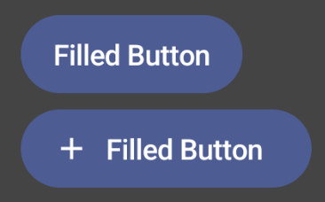
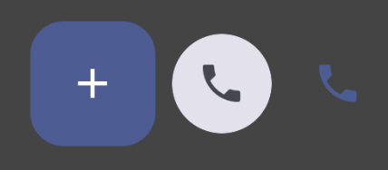
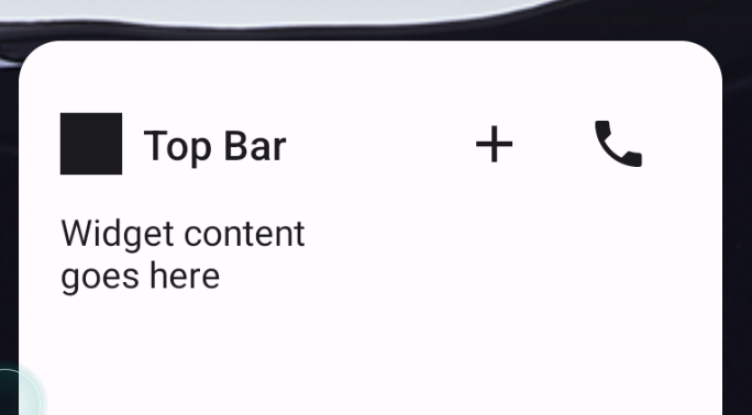
Glance 1.1.0 包含其他元件,詳情請參閱下表:
| 名稱 | 圖片 | 參考資料連結 | 其他注意事項 |
|---|---|---|---|
| 填滿型按鈕 |
|
構成要素 | |
| 外框按鈕 |

|
構成要素 | |
| 圖示按鈕 |
|
構成要素 | 主要 / 次要 / 僅限圖示 |
| 標題列 |
|
構成要素 | |
| Scaffold | Scaffold 和 Title bar 位於同一個範例中。 |
如要進一步瞭解設計細節,請參閱 Figma 上的設計套件中的元件設計。
如要進一步瞭解標準版面配置,請參閱「標準小工具版面配置」。