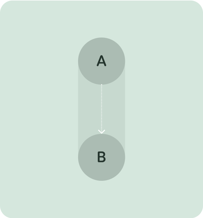
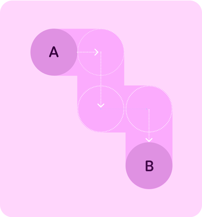
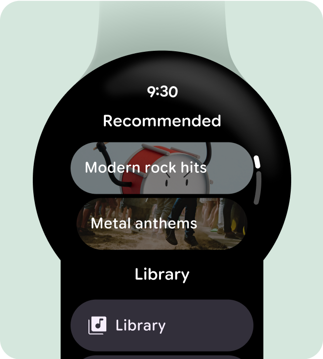
Optimize for vertical layouts
Simplify your app’s design by using vertical layouts, which allow users to scroll in a single direction to traverse content.
Do this
Don't do this
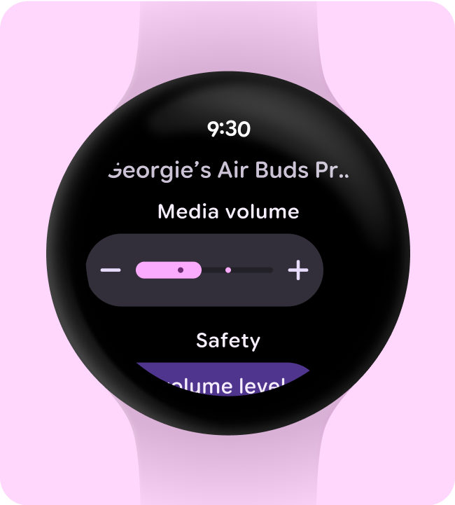
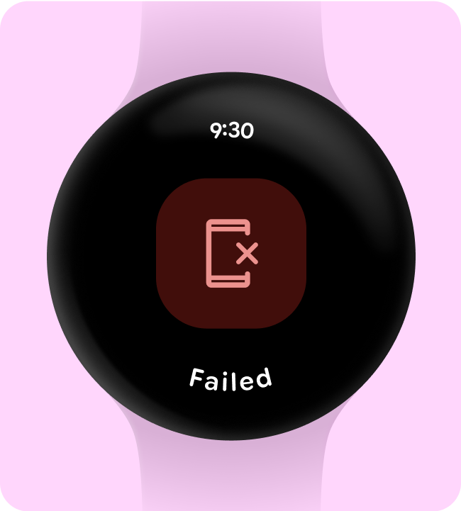
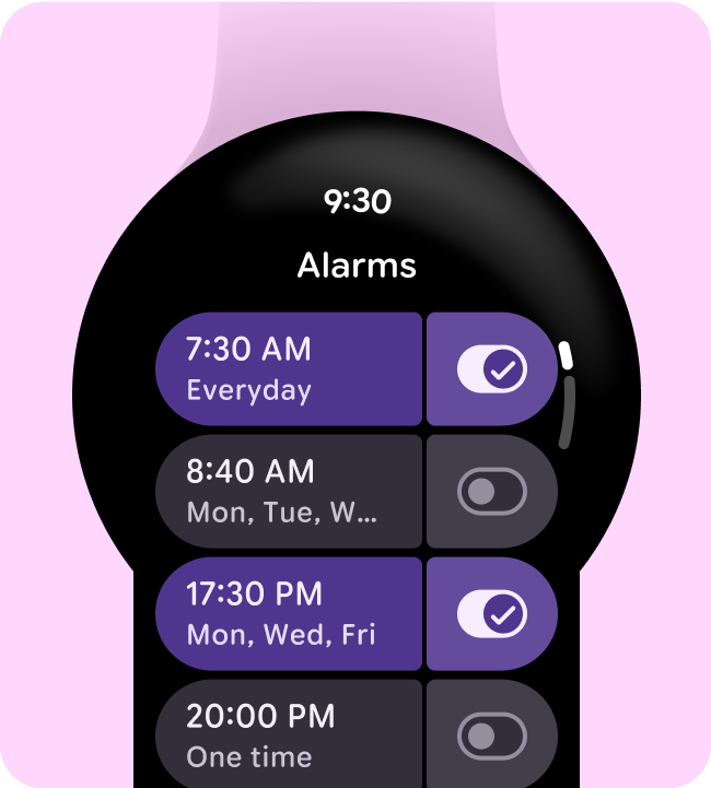
Show the time
Display the time (overlay) at the top, as this provides a consistent place for the user to view the time.
Do this
Don't do this
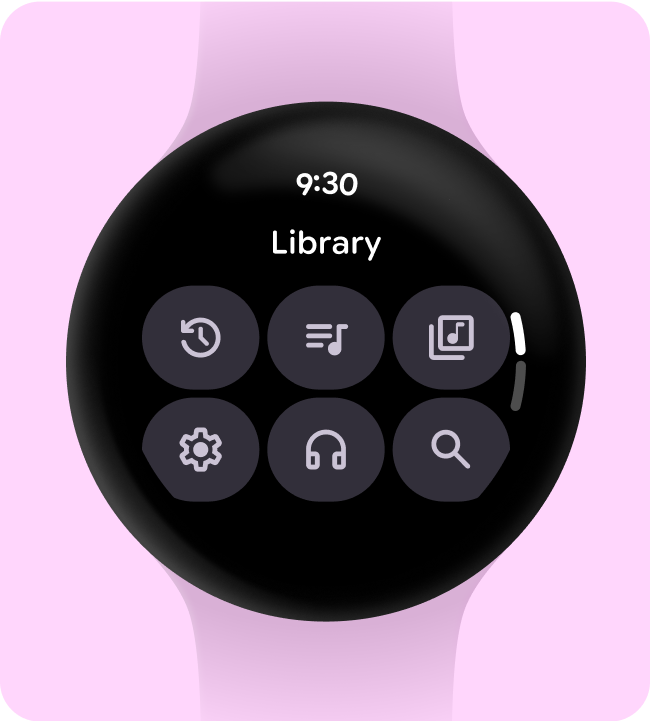
Accessible inline entry points
Ensure all actions are displayed inline, using clear iconography and labels for accessibility. This includes entry points to settings and preferences.
Do this
Don't do this
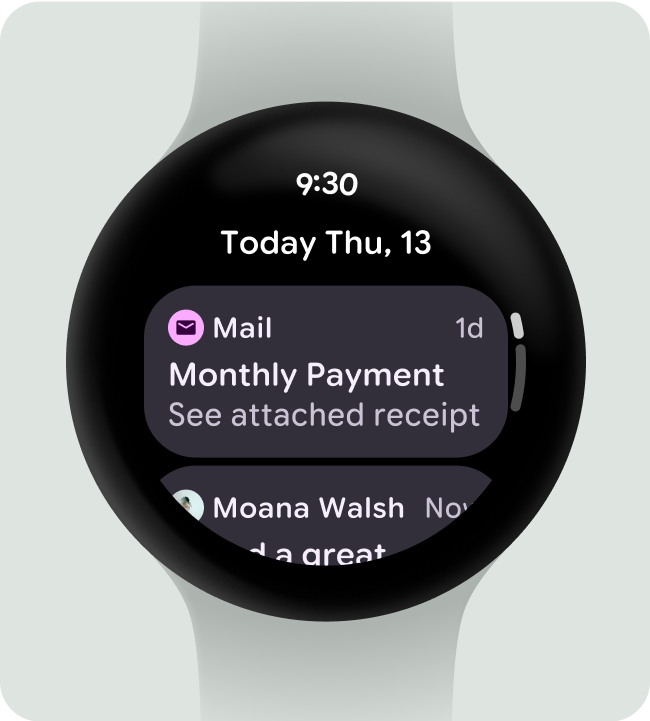
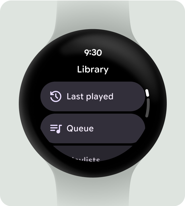
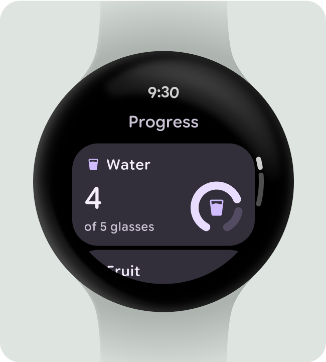
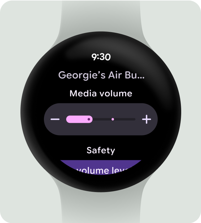
Use labels to orient users
For longer dialogs, help orient the user with labels as they scroll through the content.
Do this
Don't do this
Elevate primary actions
Make it easy for users to take action in your app by pulling primary actions to the top of the overlay.
Do this
Don't do this
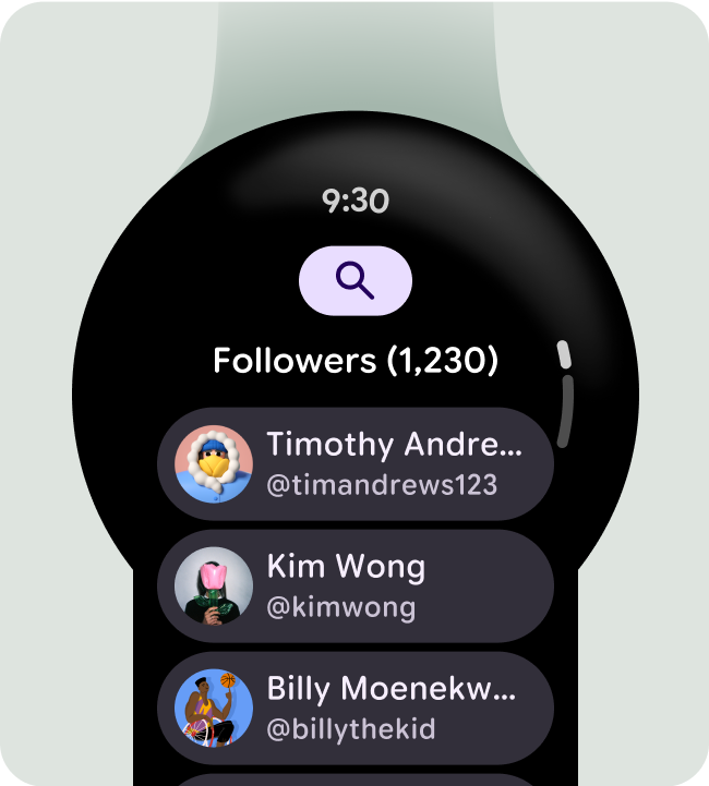
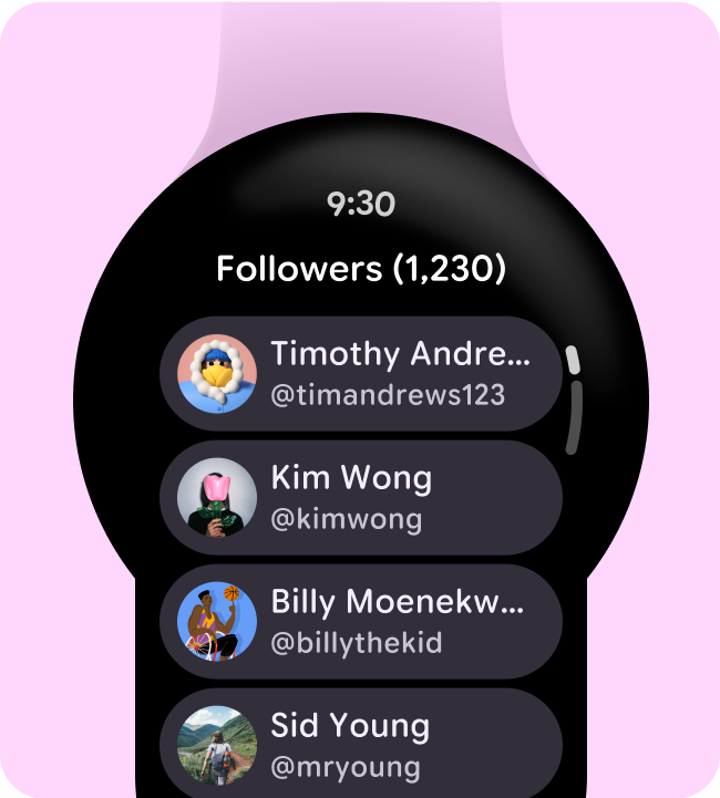
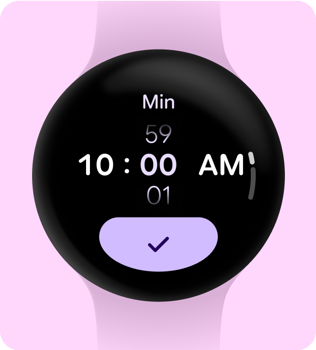
Show the scrollbar on scrolling screens
Only use the scroll-indicator on scrolling screens to avoid the wrong interaction expectation. Similarly, remember to add the scroll-indicator on scrolling screens to indicate at what point of the screen you're viewing.
Do this
Don't do this
Design responsively for larger screen sizes
Ensure the components you use fill the available width and consider the height on non-scrolling layouts.
All Compose components are build responsively, but any customization to elevate your design and add additional value on larger displays is encouraged.
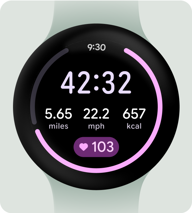
Do this
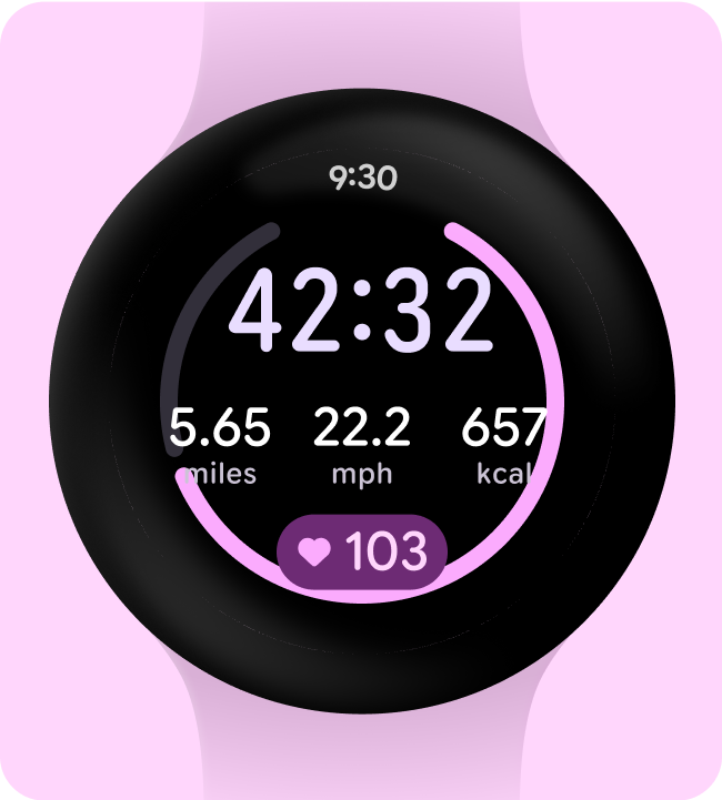
Don't do this
Use responsive (percentage) margins
We recommend using percentage margins so the size of the margins adapts to the growing curve of the display.
Do this