
When designing apps for Wear OS, be intentional about the layouts you choose for each experience. Because Wear OS runs on circular displays and clipping is more common than on handheld devices, there are two categories of canonical layouts that you should consider when designing your app.
Non-scrolling app layouts
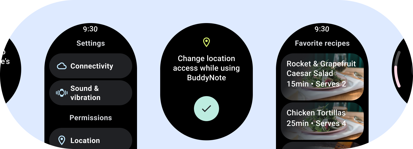
Non-scrolling layouts focus on glanceable information and offer users value with little or no interaction. Because of that, it can be challenging to build responsive behavior into these layouts:
Build for responsive non-scrolling views
- Test on a combination of languages, font scaling, devices, and variable content.
- Use non-scrollable layouts only when the content is known or controlled ahead of time, or if you must use a specific design.
- Apply the recommended top, bottom, and side margins to the layout.
- Define margins in percentage values in places where content might otherwise be clipped.
- Arrange elements to make the best possible use of the space within the screen and maintain balance across different device sizes.
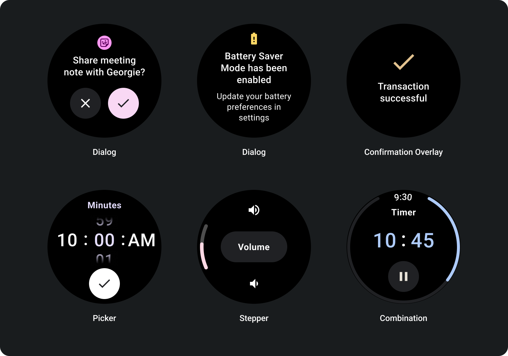
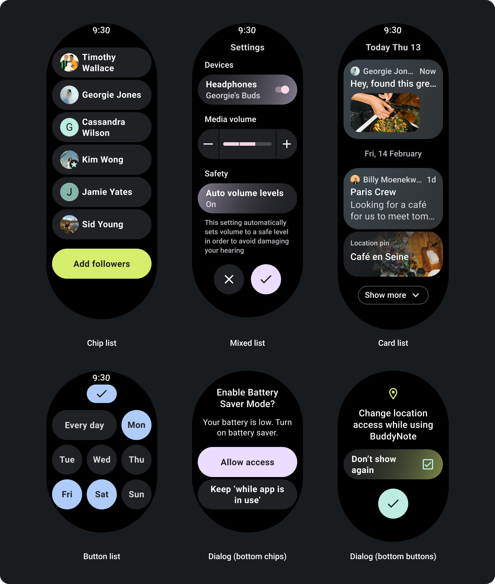
Scrolling app layouts
For pages that contain more information than can fit on a single screen, or which are required to support longer and more immersive journeys, use a scroll view.
Build for responsive scroll views
- Apply the recommended top, bottom, and side margins.
- Define outer margins in percentage values to prevent clipping at the beginning and end of the scrollable container.
- Apply margins in fixed DP values between UI elements.
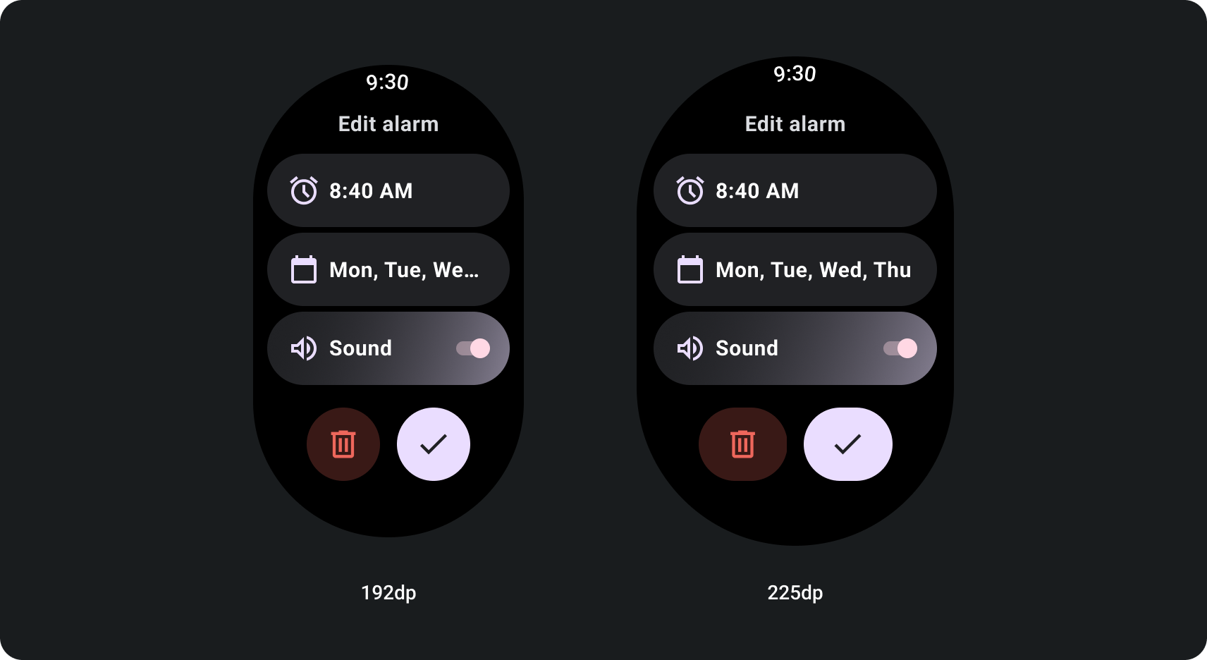
How to build for adaptive scroll views using a screen size breakpoint
Scroll views that use responsive design practices usually adapt to a range of screen sizes. However, in some special cases, you can use a breakpoint to override dimensions and augment layouts which show additional options, improve glanceability, or make content fit better on screen. The following example shows how, on larger screens, the bottom two buttons are widened:
Figma design kits
Visit the design kit downloads page to explore design layouts with built-in components, options, and recommendations to create different app and tile designs that follow best practices.