
Material 3 Expressive has been shown to produce desirable and more accessible products, support a seamless cross-product experience, and increase team velocity. Build a product your users will love.

Better, easier, emotional UX
The research behind Google's bold new direction for design
Material 3 Expressive is the most researched update to Google's design system, ever. Here, Material Design researchers share the data behind the designs and new insights into users' preference for emotion-driven UX.
Material 3 Expressive was born out of research—not in the 41 shades of blue kind of way, which delegated design decisions to data—but in a collaborative inquiry spanning research, design, and engineering. Back in 2022, our research intern was studying user sentiment toward Material Design in Google apps. After mentioning her initial findings to colleagues, a team-wide design debate began: Why did all these apps look so similar? So boring? Wasn't there room to dial up the feeling?
Over the past three years, we've explored the implications of this conversation, iterating through dozens of rounds of design and research to find the next evolution of Material Design. Through dozens of separate research studies with hundreds of designs, and tens of thousands of participants from around the world, we've fine-tuned a system that's both beautiful and highly usable.
Material 3 Expressive principles are rooted in solid research and are built on long-standing usability best practices. Designers can confidently apply these components and principles knowing they're building something that users can connect with.
Researching Material 3 Expressive
As the design team created initial concepts and explored how a more expressive design ethos could work across Google products, we embarked on a series of research studies using a variety of methods, including:
- Eye tracking: Analyzing where users focused their attention.
- Surveys and focus groups: Gauging emotional responses to different designs.
- Experiments: Gathering sentiment and preferences.
- Usability: Seeing how quickly participants could understand and use an interface.
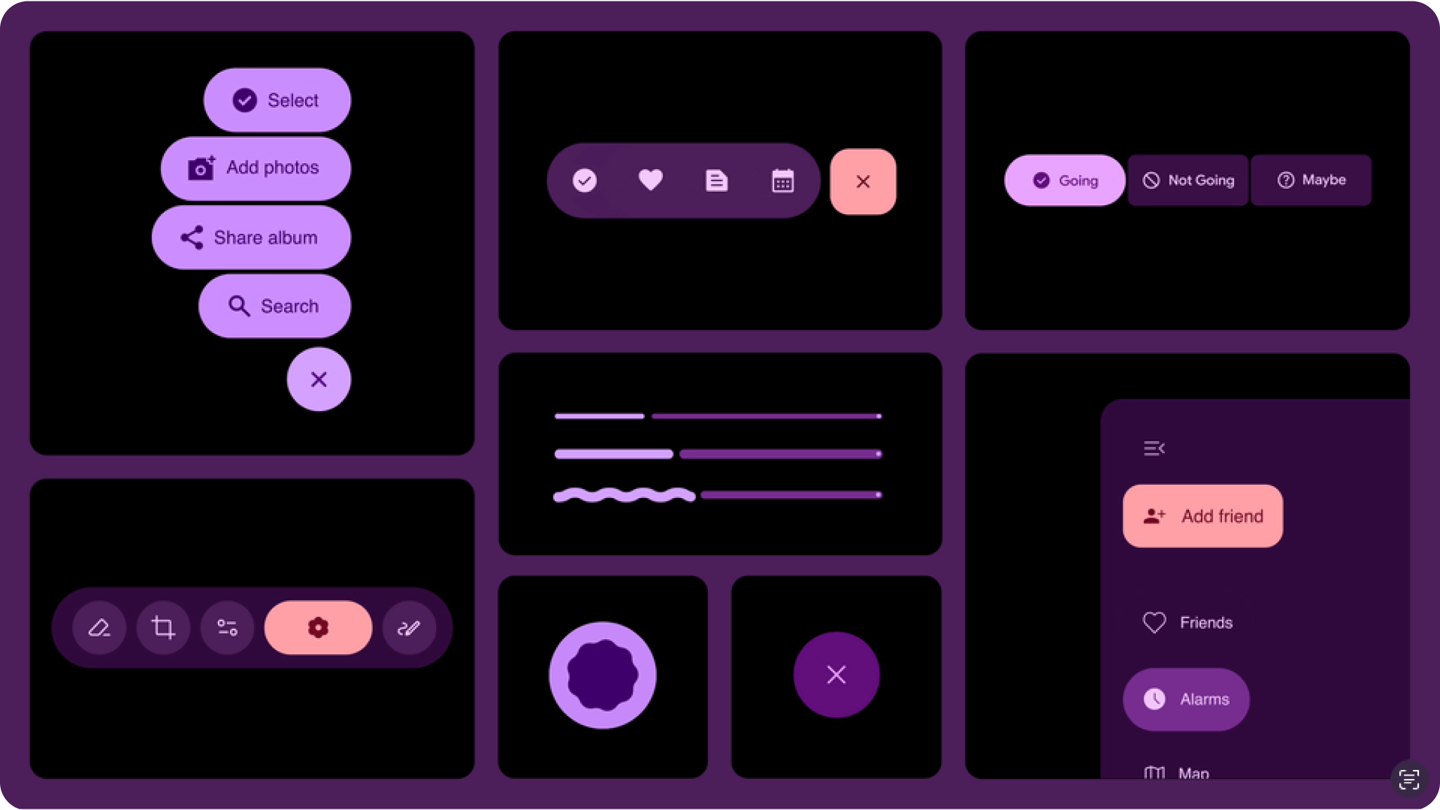
To build a solid foundation, we started with research on individual components. Several examples:
- We evaluated options for progress indicators, assessing which made waiting time feel faster while also looking like it belonged on a premium phone.
- We studied how big a button can be, seeking improvements in tap time without overwhelming other items on the screen.
- We ran several studies on the new floating toolbar, optimizing for designs perceived as modern, clean, and energetic as well as noticeable and usable.
Through this research, we took care to follow accessibility requirements and best practices. In many cases, we chose to exceed existing standards for tap target size, color contrast, and other important aspects that can make interfaces easier to use. This research helped us create the building blocks and guidelines needed for this new evolution of Material Design.
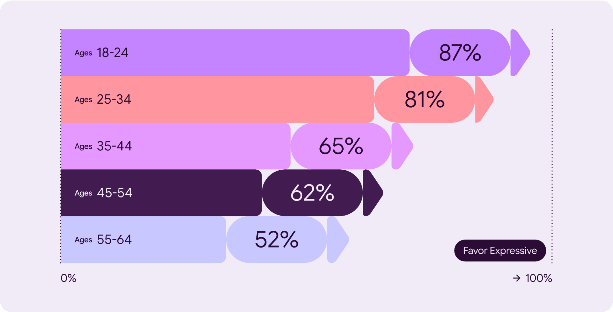
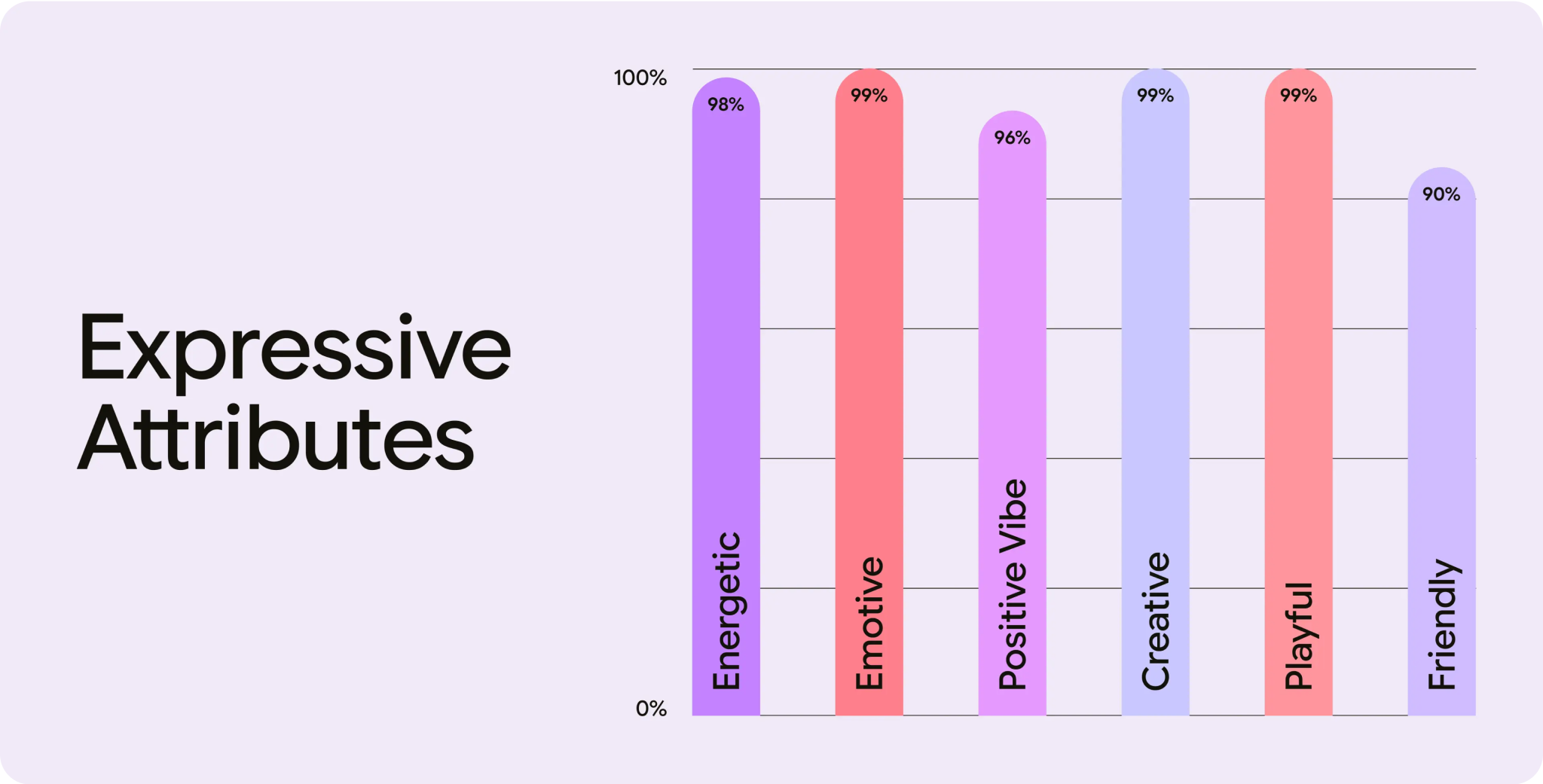
But top-level preference can only tell us so much. We wanted to dive into the design aspects that led to this preference.
At last year's Google I/O, we introduced a set of attributes that the Material Design team uses to compare designs. Maybe you noticed that many of these were emotional words? "Playful," "energetic," "creative," "friendly," and "positive vibe" are some examples.
As we've been developing Material 3 Expressive, our researchers have worked with designers to iteratively test new screen designs against these attributes, helping to optimize the designs for a desired emotional reaction. In addition, we've sought to ensure that designs created with this new system are seen as more modern and visually appealing.
User research findings
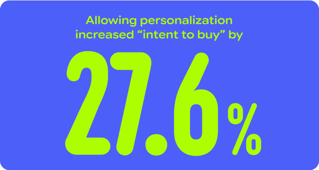
Research shows that Google users view their mobile devices and software experiences as an extension of themselves and that there is a user expectation for app experiences to reflect individual user preferences for style—color, type, and contrast—and behaviors, such as prioritizing frequently used apps and actions. This demand is especially prevalent with younger generations' dynamic tastes and expectations.
On average, the more expressive design variants outperformed the baseline in terms of preference (~100% increase) and aesthetics (up to 170% increase).
Make desirable and more accessible products
Add user-coveted features like personalization, expressive components, and new color algorithms.
Make your product accessible-by-default using Material 3 Expressive styles and components.
Get started
It's time to move beyond "clean" and "boring" designs to create interfaces that connect with people on an emotional level. Ready to try it out for yourself? We have a few tips:
- Start experimenting: Dive into the updated Material 3 Expressive design kit for Figma and start playing with the expressive design options.
- Try the tactics: Explore using the Material 3 Expressive design tactics, while also tailoring your UI to support core user journeys.
- Be intentional and start from user need: While there was broad appeal for vibrant, expressive design, a strong minority of users preferred calmer, less intense versions. Always start with what your users need. Understand their requirements and critical user journeys before determining the right choice of tactics and components.
- Prioritize functionality: Don't compromise your product's core functionality for visual flourishes. No amount of emotion can compensate for a lack of clarity.
- Follow accessibility standards: Adhere to established guidelines for color contrast, screen reader compatibility, navigation, and other best practices for accessibility.
- Iterate, iterate, iterate: Use research to find the right balance between freshness and familiarity, playfulness, and professionalism. Our design scales can give you a head start. And don't forget to conduct usability research to verify that you haven't gone too far.