Apps that employ responsive layouts and automatically adapt to different screen sizes offer additional value to users and provide more productive, engaging user experiences.
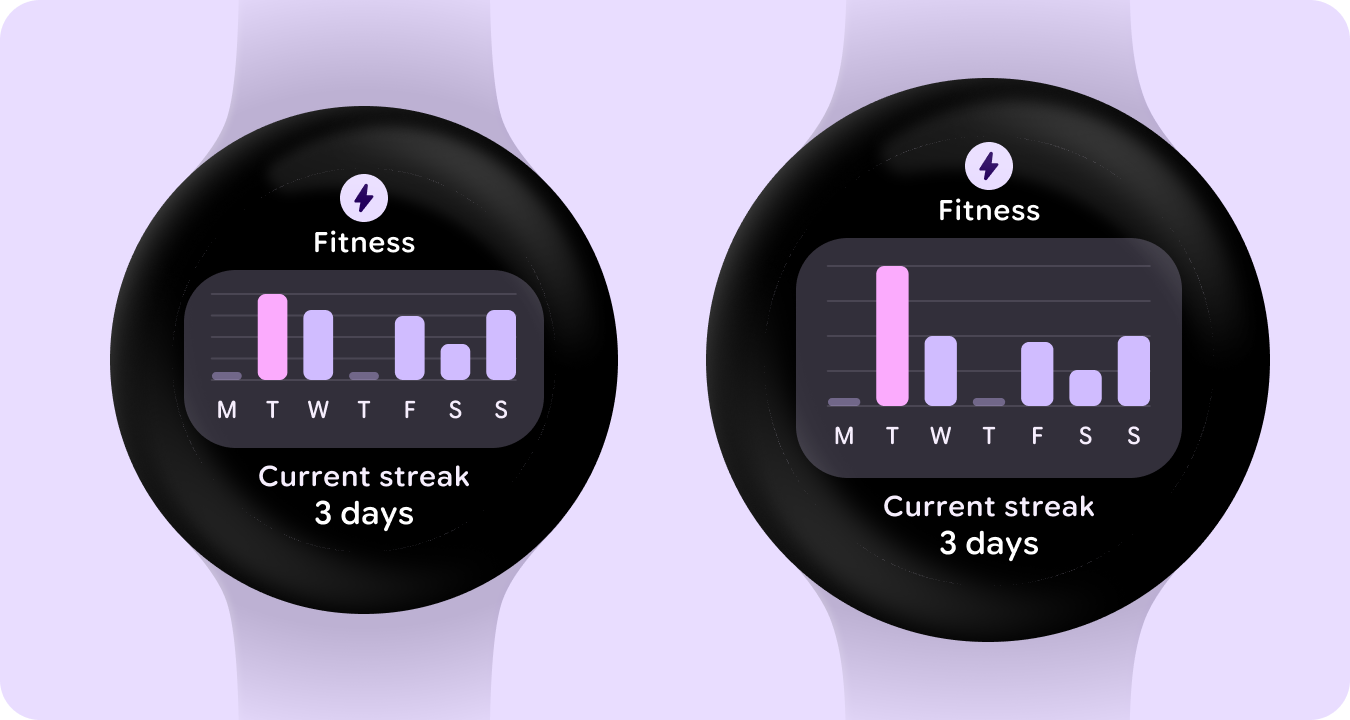
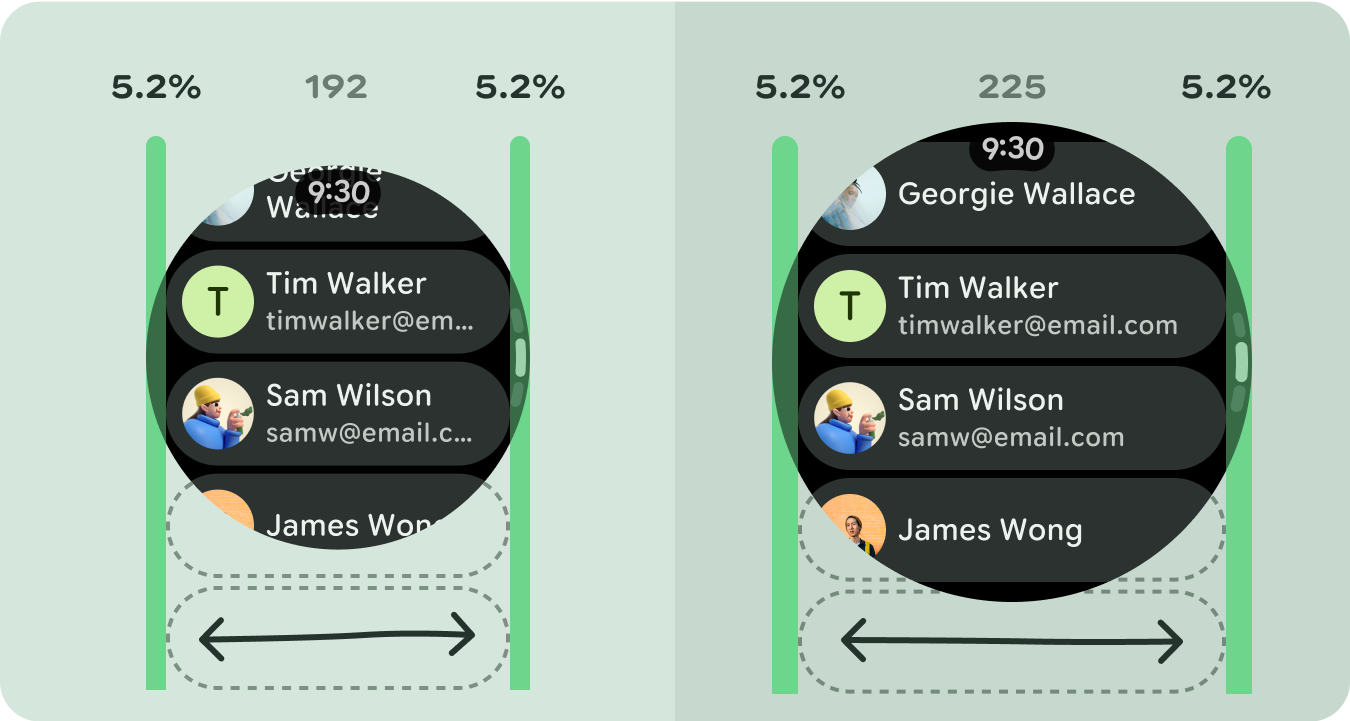
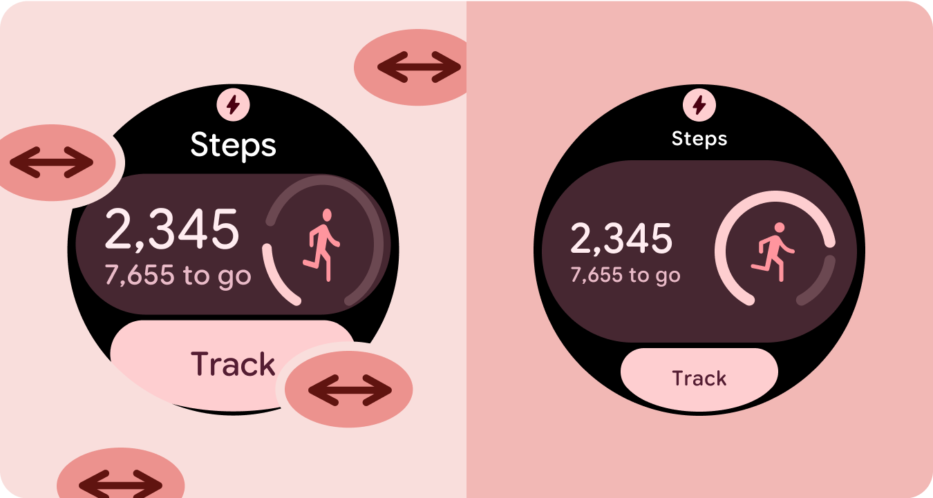
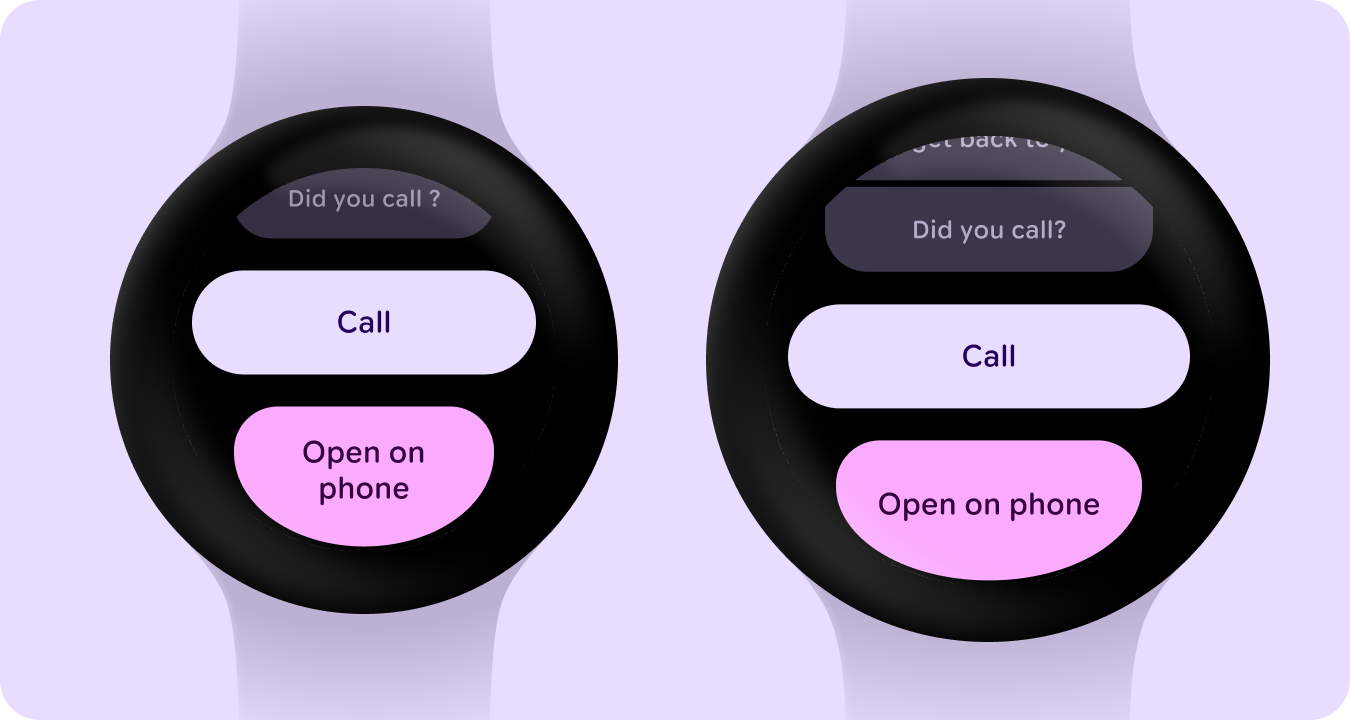
Responsive layouts dynamically format and position elements such as buttons, text fields, and dialogs for an optimal user experience. Automatically offer users of your app additional value on larger screens by utilizing responsive design practices. Whether it's more text visible at a glance, more actions on screen, or larger, more accessible tap targets, responsive practices provide an enhanced experience for users of larger screens.
Add value through responsive design
Do
- Use the M3 Compose component library which has built-in responsive and adaptive behavior.
- Utilize responsive layouts, which automatically and smoothly adjust to fill the available space across screen sizes.
Don't
- Stretch UI elements—including text fields, buttons, dialogs—to fill extra space.
- Increase the sizes of fonts, unless they're serving a primarily graphic purpose.
Examples
The following images show examples of apps that are responsive and optimized.
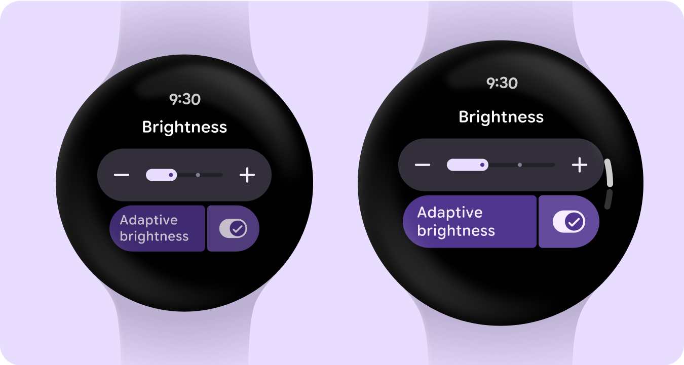
Edge-hugging buttons
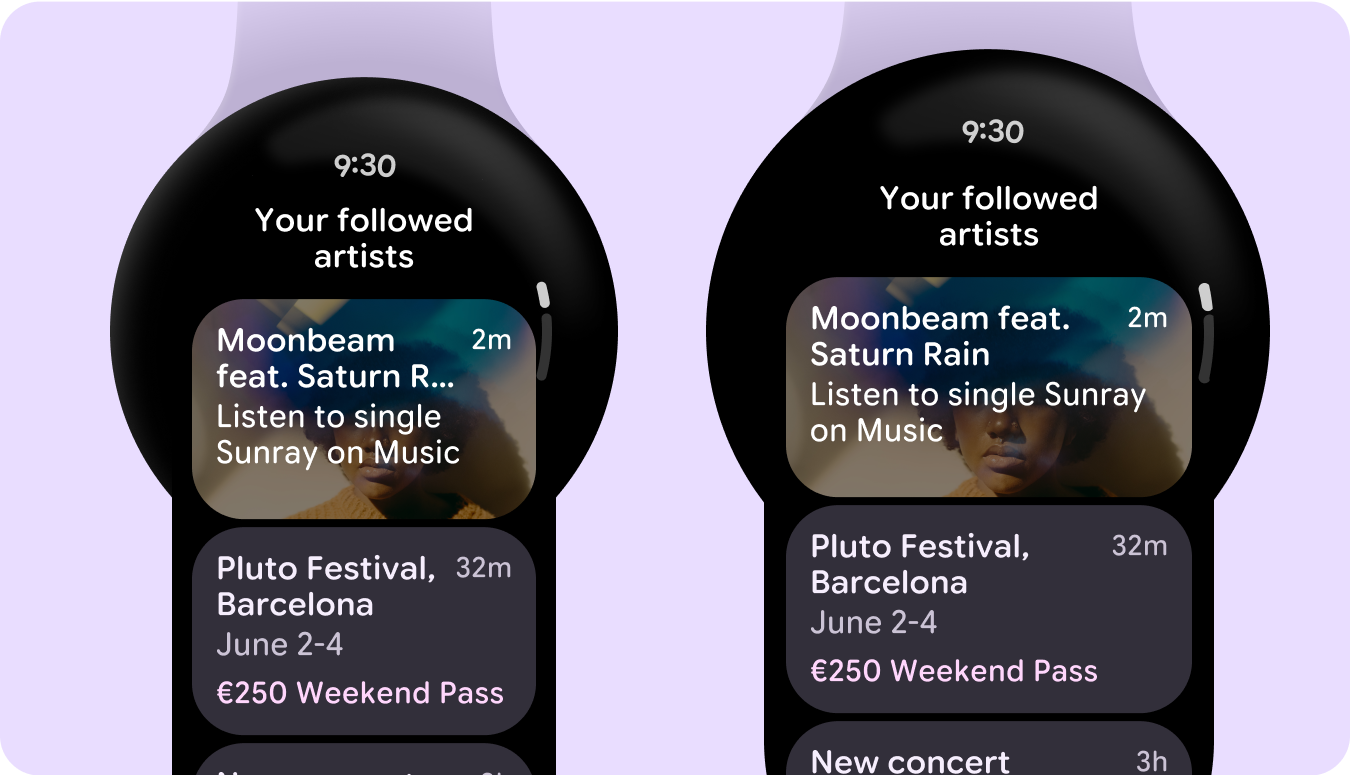
List of cards
List of switchers and buttons
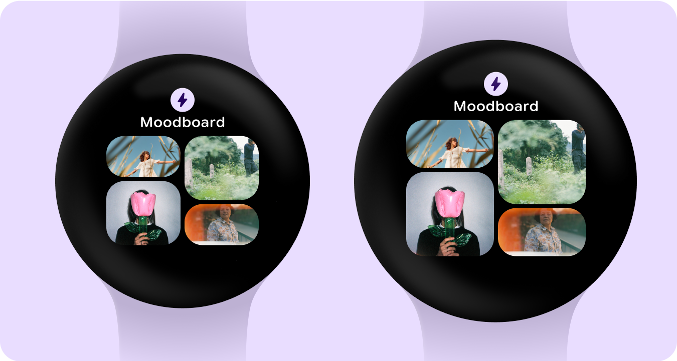
Tile with image cards
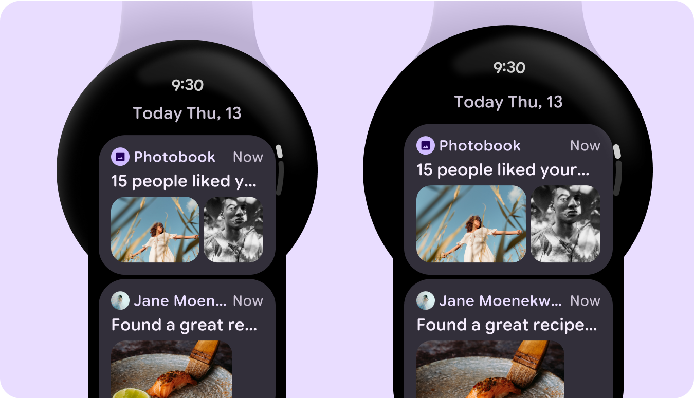
List of cards with images
Tile with graph