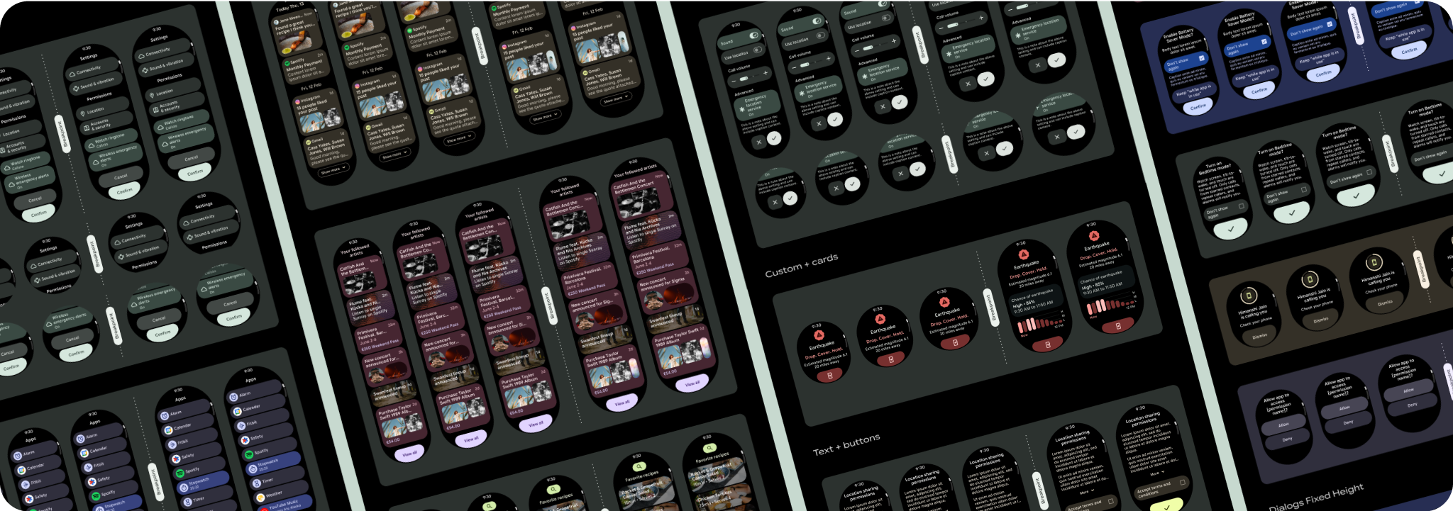
Scrolling app view layouts include lists (TransformingLazyColumn) and dialogs.
These layouts make up the majority of app screens, and they represent a
collection of components which need to adapt to larger screen sizes. Check that
the components are responsive—that is, that they fill the available width and
adopt the TransformingLazyColumn adjustments when more of the screen's height
is available. These layouts are built responsively already, and we have some
additional recommendations to take further advantage of the expanded real
estate.
Build responsive and optimized designs
To help your design layouts adapt to larger screen sizes, we have updated the behavior of our layouts and components to have built-in responsive behavior, including percentage-based margins and padding. To address this, we have updated our Android UI library layouts and components with built-in responsive behavior, including percentage-based margins and padding. If you're utilizing our Compose components, you can automatically inherit this responsiveness.
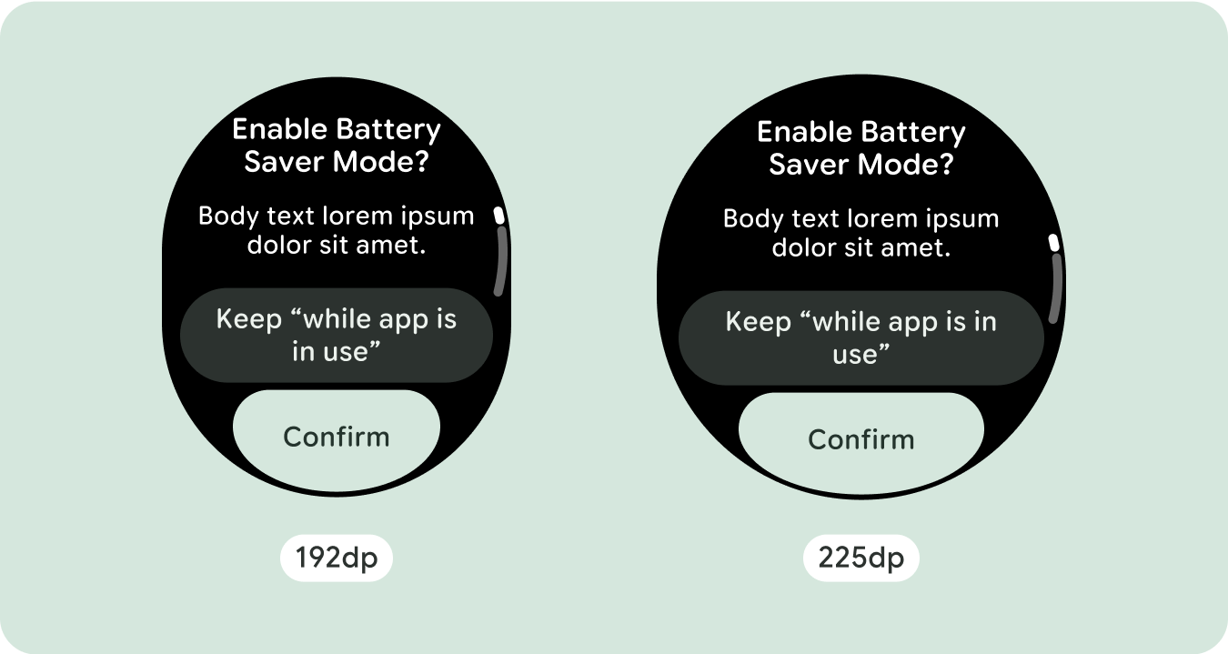
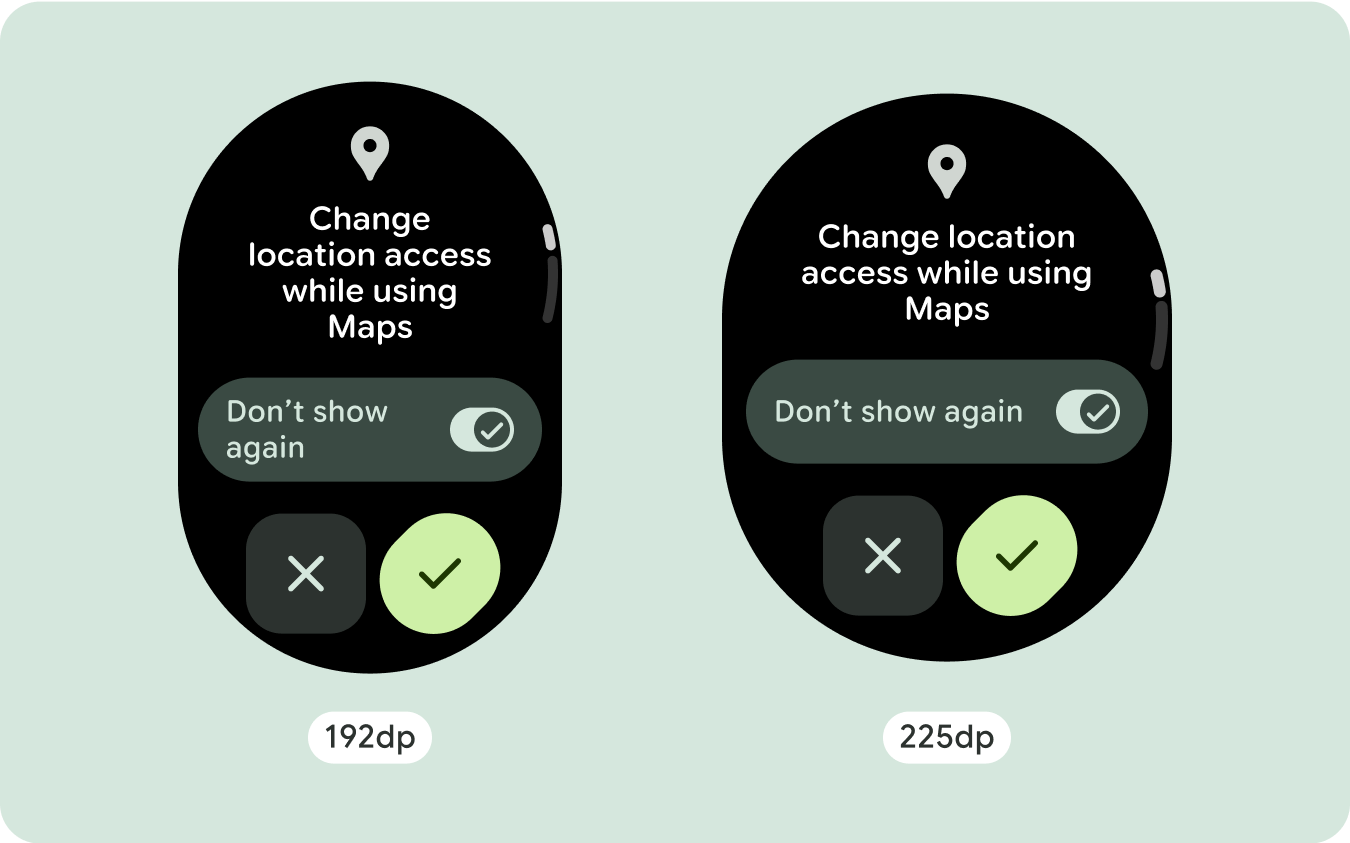
For unique screen designs, thoroughly test across a variety of screen sizes, ensuring components and elements adapt smoothly and avoid content clipping. Our percentage margins help spacers scale effectively, and we recommend using a breakpoint at 225dp to introduce additional information and enhanced functionality on larger watch screens.
Check that components fill the available width
All components are built responsively, meaning they fill the available width and height. Make sure you have the necessary margins to ensure content doesn't get clipped by the rounding screen.
Show additional text characters
Most components have text boxes which fill the available width. This means that they automatically gain character counts as the screen width increases.
Build adaptive and differentiated designs
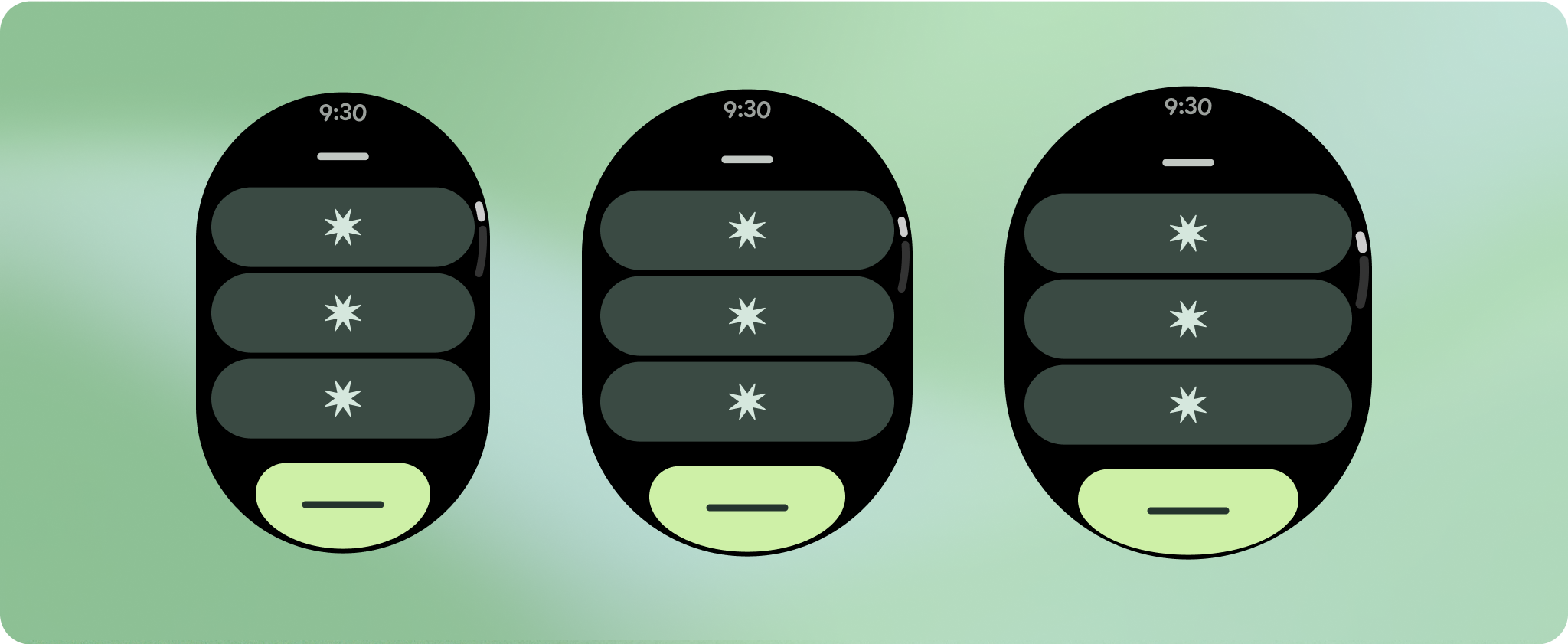
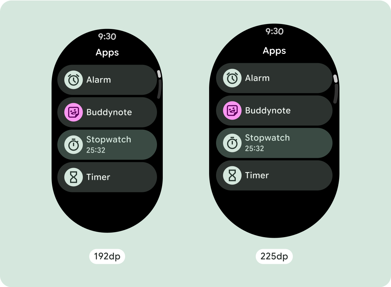
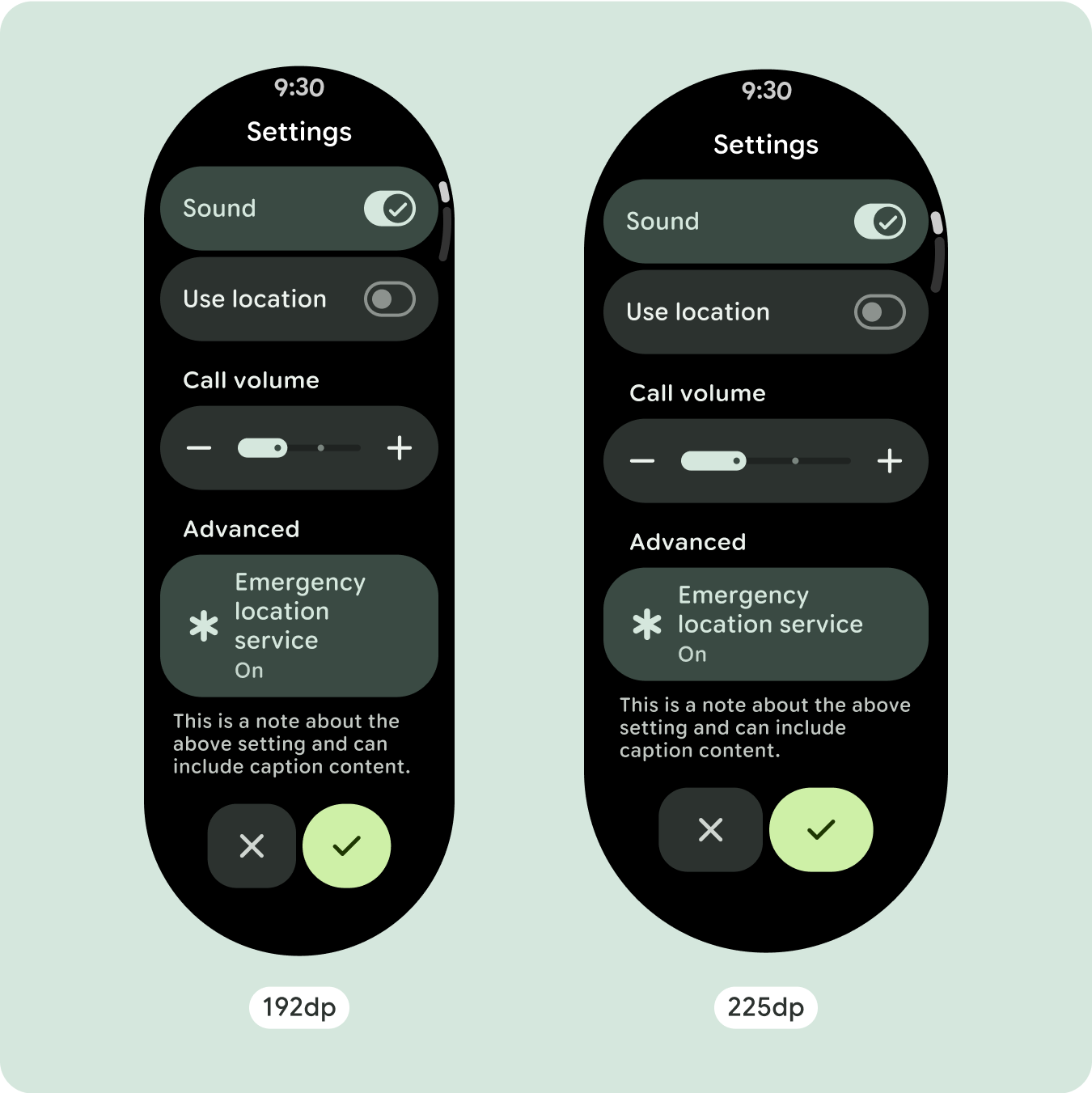
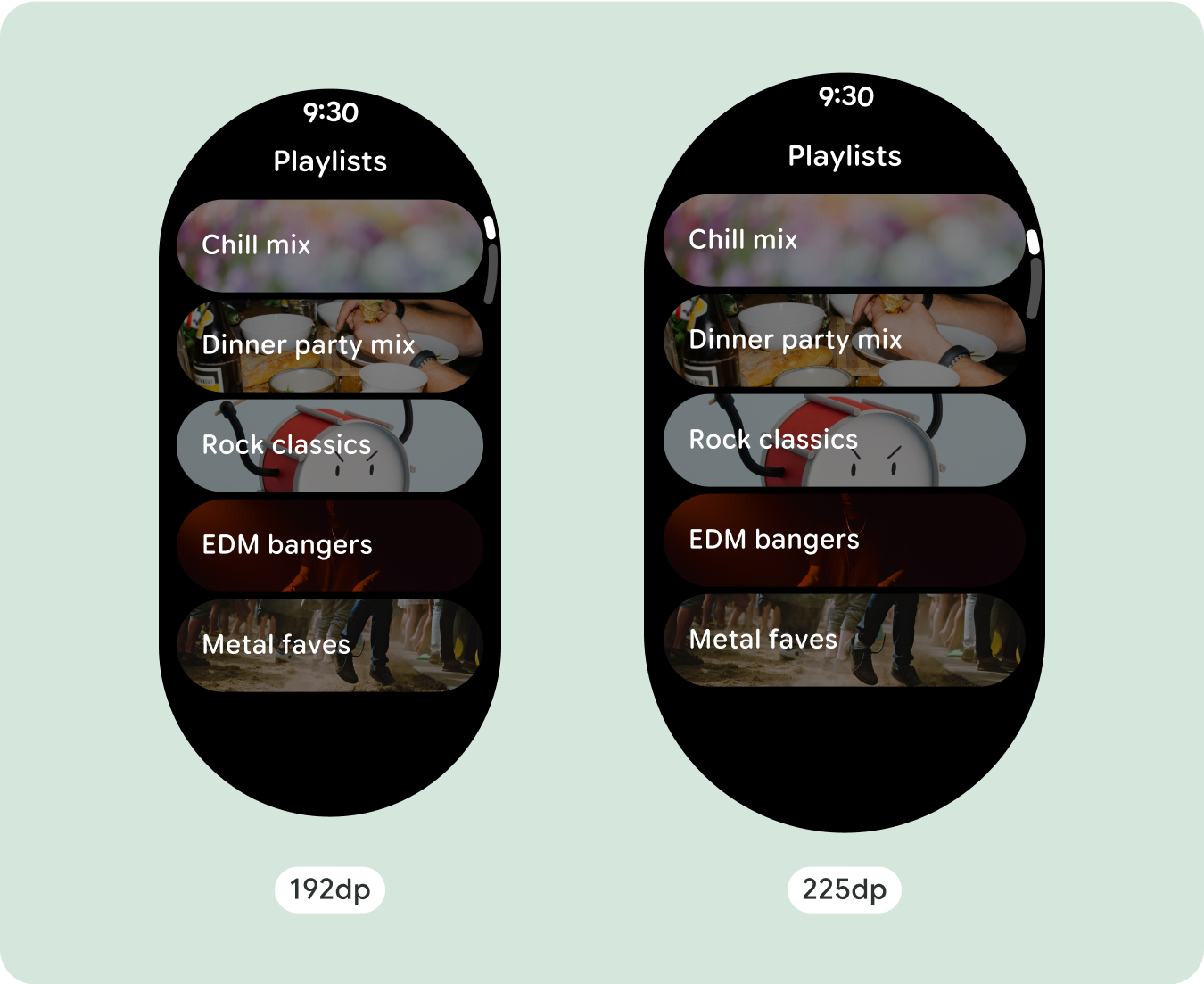
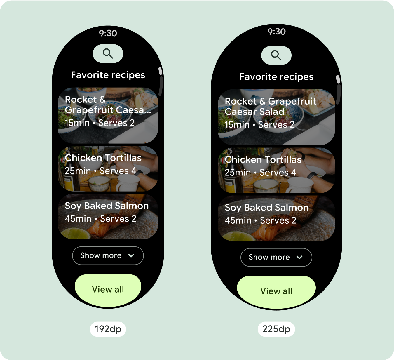
As scrolling layouts will automatically show more of what was previously hidden below the screen fold, there isn't much you need to do to add value. Each component fills the available width, and in some cases, a component might gain additional rows of text (such as cards), or components stretch to fill the available width (such as icon buttons).
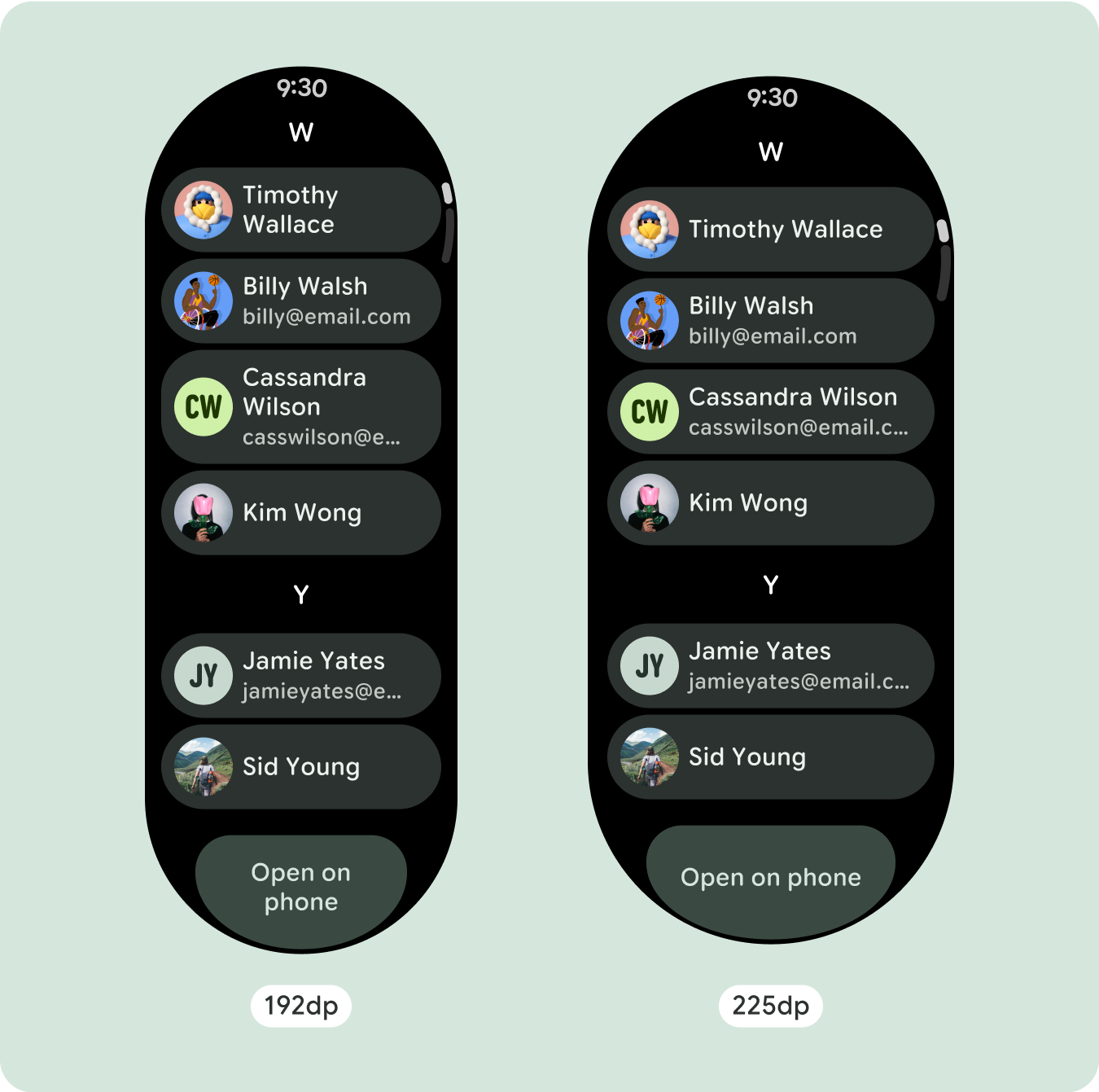
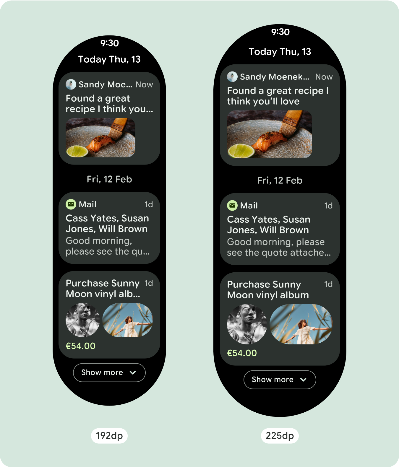
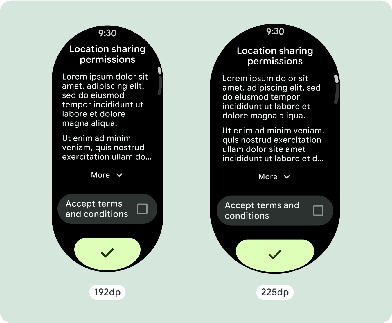
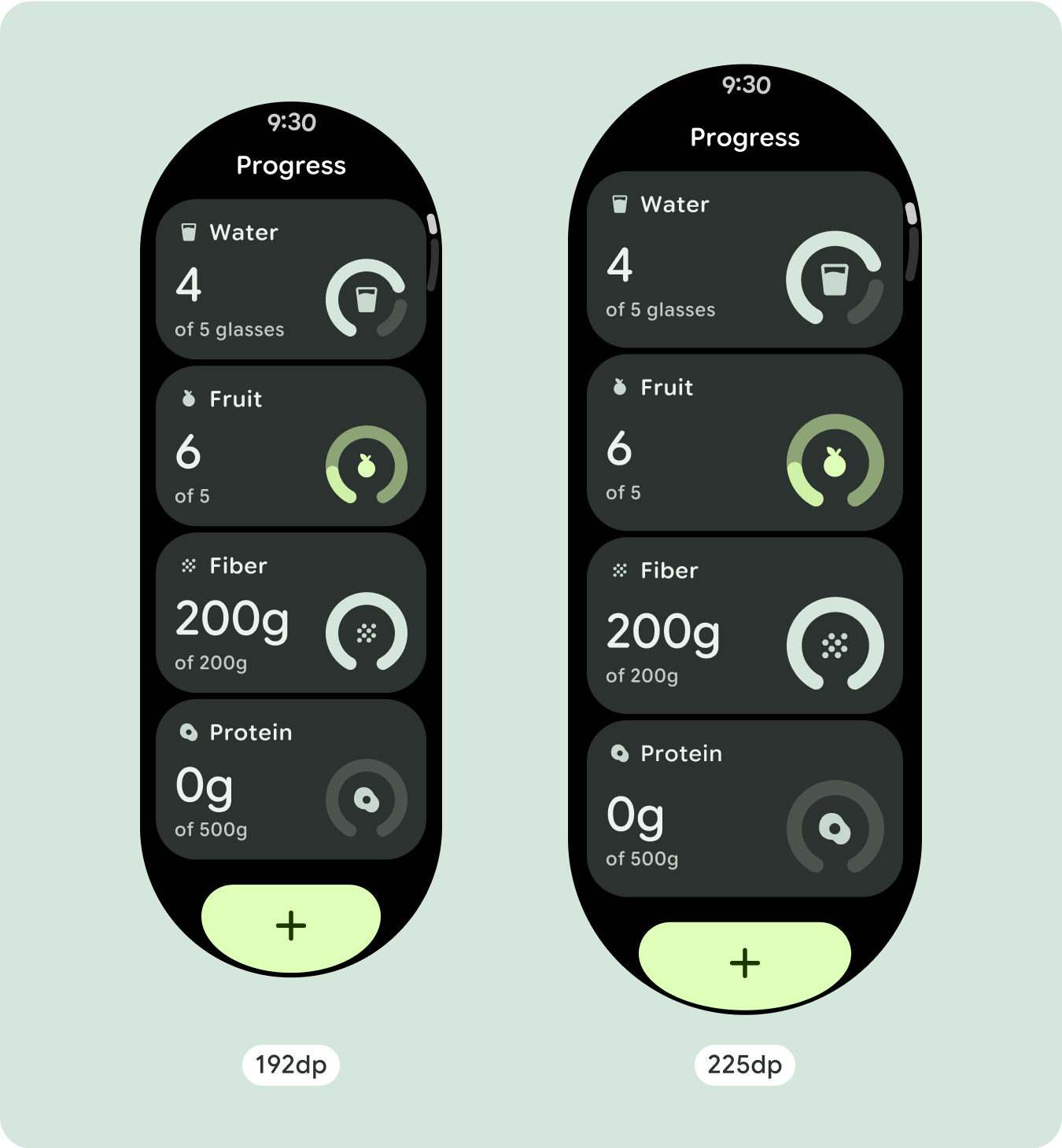
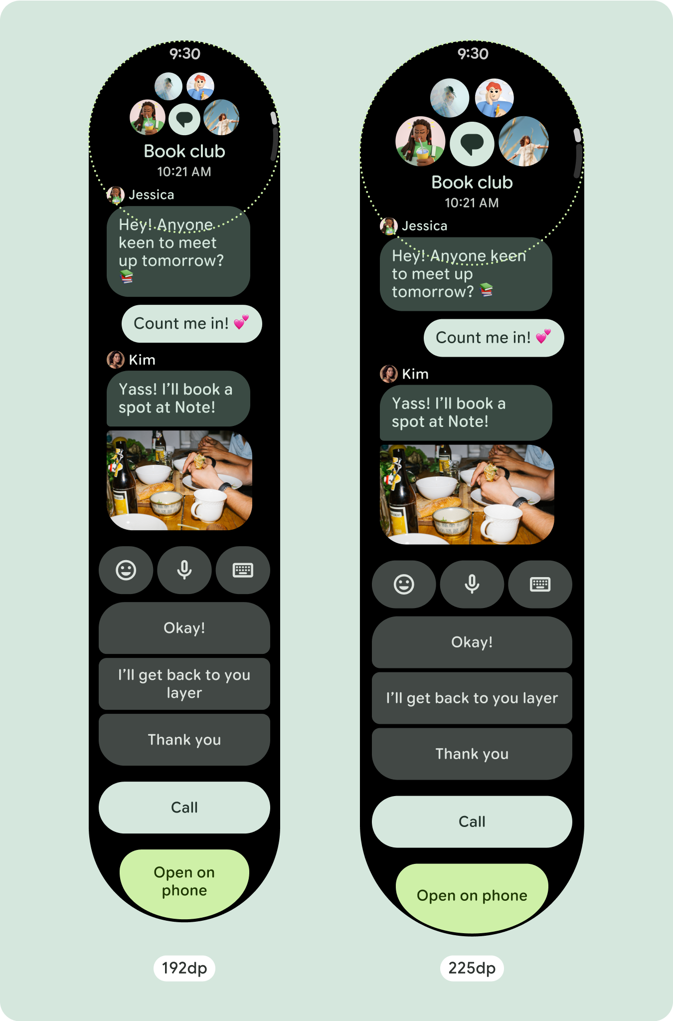
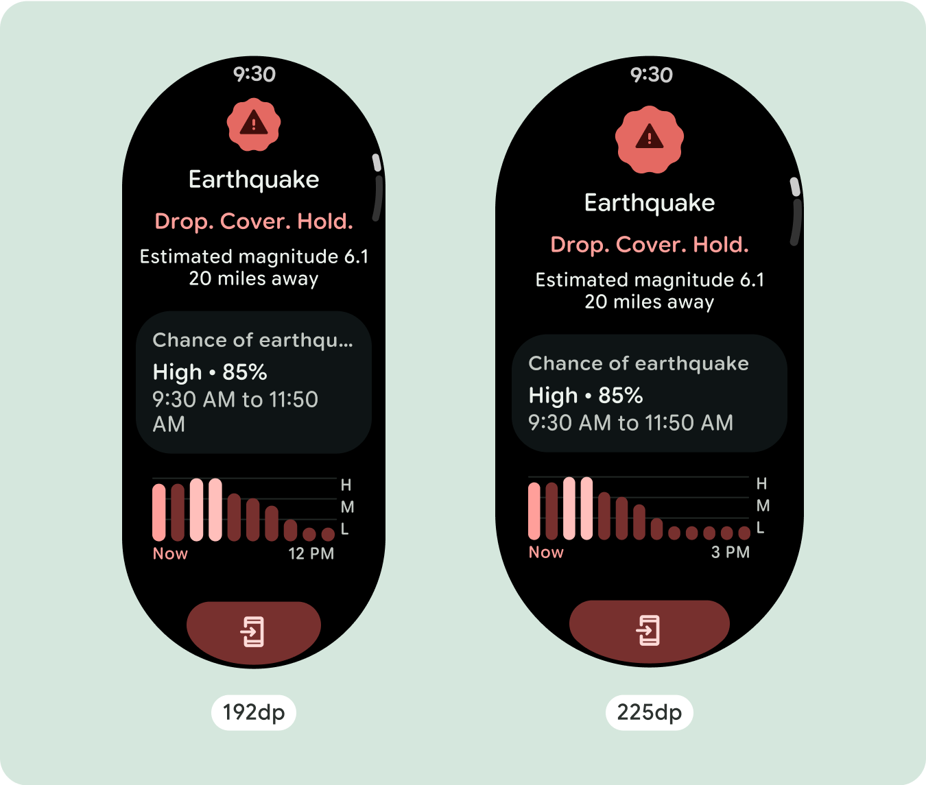
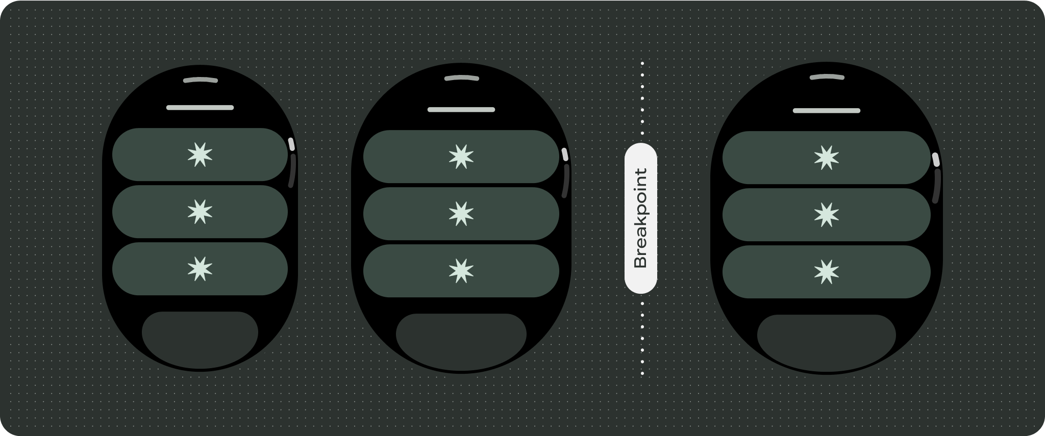
To best use the additional space on larger screen sizes, add a size breakpoint at 225dp. This breakpoint makes it possible to reveal additional content, include more buttons or data, or change the layout to better suit the larger screen. This requires a different design for each breakpoint. The larger screen design (225+) could include the following additional elements:
Increase the size or change the state of the existing components
This could be done in order to show more detail or make the content more glanceable.
Optimized and differentiated layouts
The layout can alter slightly after the 225dp breakpoint, so that the content above the fold in the default view is optimized, however all of the same content below the fold should still be available regardless of screen size.
Responsive and adaptive behavior
All components in the Compose library will automatically adapt to the wider screen size, and gain width and height. Scroll views that use responsive design practices usually adapt to a range of screen sizes. However, in some special cases, you can use a breakpoint to override dimensions and augment layouts which expand functionality, improve glanceability, or make content fit better on screen.
All top, bottom, and side margins should be defined in percentages to avoid
clipping and provide proportional scaling of elements. Consider that the
PositionIndicator appears when the user scrolls, and it automatically hugs the
screen's bezel no matter its size.
Checklist
- Apply the recommended top, bottom, and side margins.
- Define outer margins in percentage values to prevent clipping at the beginning and end of the scrollable container.
- Apply margins in fixed DP values between UI elements.
- Consider applying a breakpoint at 225dp to introduce additional content or make existing content more glanceable when on bigger screen sizes.
Create differentiated experiences
Scrolling views are highly customizable, with the ability to add any combination of components in any order. The top and bottom margins can change depending on which components sit at the top and bottom. This is to prevent content from being clipped by the growing curve of the screen.