Organiza tus páginas con colecciones
Guarda y categoriza el contenido según tus preferencias.
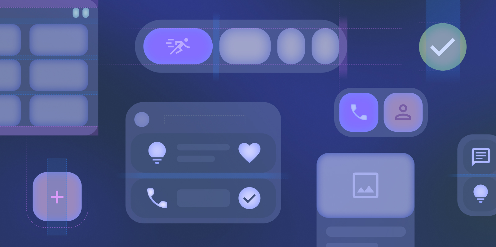
Los widgets son elementos personalizables de la pantalla principal que muestran una vista clara y práctica del contenido o las acciones de una app. Este contenido se puede actualizar periódicamente.
Los widgets ayudan a los usuarios a completar sus objetivos, ya sea interactuando con el contenido de tu app directamente en el widget o abriendo la experiencia completa de la app.
Comenzar
Cuando crees tu widget, sigue estos pasos:
Elige un solo caso de uso principal para destacar en tu widget.
Los diseños determinan cómo se organizan la información y los elementos interactivos dentro de tu widget. Obtén más información sobre los diseños precompilados para widgets de texto, lista y cuadrícula.
Obtén más información para diseñar widgets que se ajusten sin problemas a varios tamaños. Consulta los tamaños predeterminados de los widgets y aprende a usar por completo el espacio de la cuadrícula.
El contenido y las muestras de código que aparecen en esta página están sujetas a las licencias que se describen en la Licencia de Contenido. Java y OpenJDK son marcas registradas de Oracle o sus afiliados.
Última actualización: 2025-07-26 (UTC)
[[["Fácil de comprender","easyToUnderstand","thumb-up"],["Resolvió mi problema","solvedMyProblem","thumb-up"],["Otro","otherUp","thumb-up"]],[["Falta la información que necesito","missingTheInformationINeed","thumb-down"],["Muy complicado o demasiados pasos","tooComplicatedTooManySteps","thumb-down"],["Desactualizado","outOfDate","thumb-down"],["Problema de traducción","translationIssue","thumb-down"],["Problema con las muestras o los códigos","samplesCodeIssue","thumb-down"],["Otro","otherDown","thumb-down"]],["Última actualización: 2025-07-26 (UTC)"],[],[],null,["# Widgets are customizable home screen elements that display a clear and\nactionable view of an app's content or actions. This content can periodically\nrefresh.\n\nWidgets help users complete their goals, either by interacting with your app's\ncontent directly in the widget or by opening your full app experience.\n\nGet started\n-----------\n\nWhen creating your widget, complete the following steps:\n\n1. Choose a single primary user case to highlight in your widget.\n2. Check out the [Widget template examples](https://www.figma.com/community/file/1237551184114564748/android-ui-kit) on Figma.\n3. Design the UI within the [sizing](/design/ui/mobile/guides/widgets/sizing) guidelines.\n4. Test for multiple screen sizes.\n5. Ensure your widget meets the [Widget quality guides](/docs/quality-guidelines/widget-quality).\n\n### Canonical widget layouts\n\nLayouts dictate how information and interactive elements are organized within your widget. Learn more about prebuilt layouts for text, list \\& grid-type widgets. \n[Learn more](/design/ui/mobile/guides/widgets/layouts) \n\n### Sizing\n\nLearn more about designing widgets that scale seamlessly to multiple sizes. See the default widget sizes and learn how to fully use the grid space given. \n[Learn more](/design/ui/mobile/guides/widgets/sizing) \n\n### Style\n\nLearn how to style your widget to enhance your widget's visual impact and to fit with the user's device theme. \n[Learn more](/design/ui/mobile/guides/widgets/style) \n\n### Discovery and promotion\n\nLearn to promote your widget on the widget picker through appropriate sizing and information shown. \n[Learn more](/design/ui/mobile/guides/widgets/discovery-promotion)"]]