本頁說明錶面設計工具的進階用途,包括如何新增對子錶面、小工具和色彩主題的支援。如要進一步瞭解如何開始使用,請參閱基礎指南。
子錶盤
您可以建立在錶面子區段內旋轉的類比指針,就像實體手錶上的子錶盤一樣。
若要這樣做,請完成下列步驟:
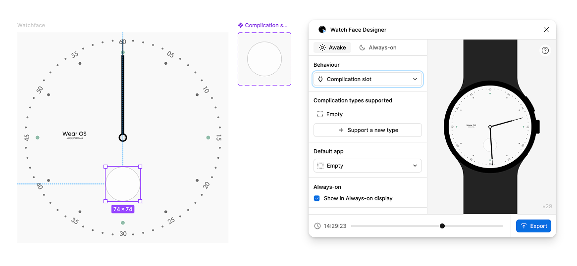
建立空白影格,涵蓋設計中放置子錶面的區域:
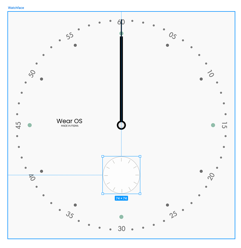
圖 1:覆蓋子錶面插槽的空白框架 在這個影格內設計秒針:
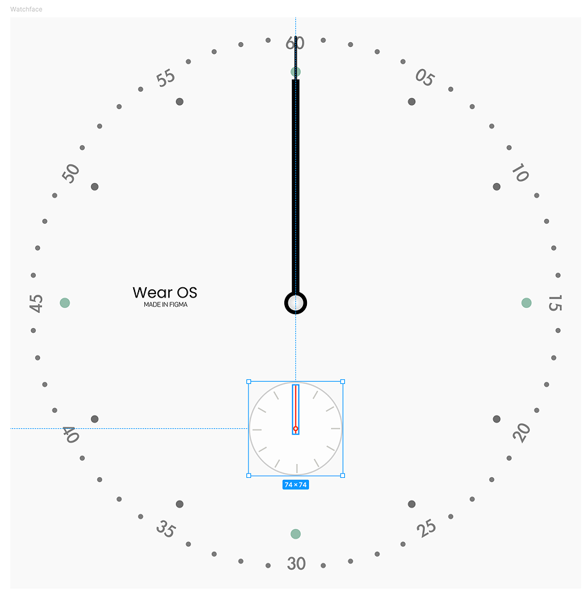
圖 2:位於容器影格中的秒針設計 選取包含秒針的子錶盤框架。接著,在錶面設計工具中,將「Rotate around」設為「Layer center:」。
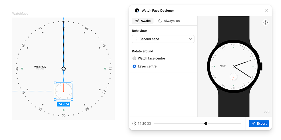
圖 3:選取含有影格的畫面 (左側) 後,選擇秒針旋轉行為 (右側)
小工具
如要新增小工具位置,請在錶面中新增影格。 在這個影格內,設計小工具插槽空白時的樣貌。這會形成其他類型小工具 (例如圖示和文字) 的基本設計。
小工具的種類繁多,錶面會提供每種型態的範本,使用者手錶上的應用程式則會決定要使用哪個範本,以及要自行提供哪些資料。使用者可以選擇要在哪個小工具位置顯示哪個應用程式。
選取含有複雜功能插槽設計的影格。接著,在「Watch Face Designer」中,將「Behavior」變更為「Complication slot」。這個程序會建立元件,其中包含一個變體 (空白設計)。
套用小工具版位類型
因為如果複雜功能插槽只支援「空白」類型,就沒有什麼用處,因此請新增其他類型。在「Watch Face Designer」視窗中,按下「+ Support a new type」並選取「Short text」。簡短文字是大多數應用程式支援的小工具類型,會顯示兩個小標籤和一個圖示。
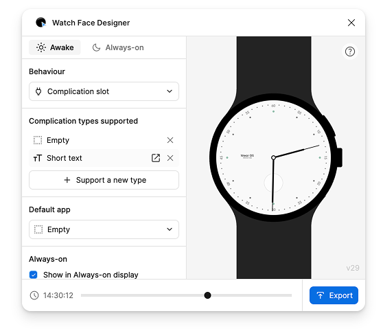
這個步驟會建立另一個變體,代表這個複雜功能類型的設計。選取「簡短文字」列即可跳至該列。
編輯複雜功能範本中的圖層時,會顯示「行為」選項。 這個選項與錶面上的選項類似,但您可以在這裡選取特定行為,這些行為與您編輯的小工具類型相關。
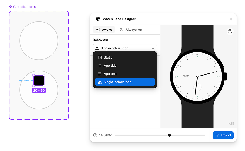
以這個範例來說,簡短文字小工具中的圖層可以是應用程式的標題、文字或單色圖示。單色表示圖示會沿用你在 Figma 中設定的顏色。
在要顯示應用程式圖示的錶面位置繪製矩形,然後前往「Watch Face Designer」視窗,將「Behavior」設為「Single-color icon」(單色圖示):
接著,建立兩個文字圖層。這些圖層代表另外兩個「短文字」位置:一個用於標題,另一個用於文字:
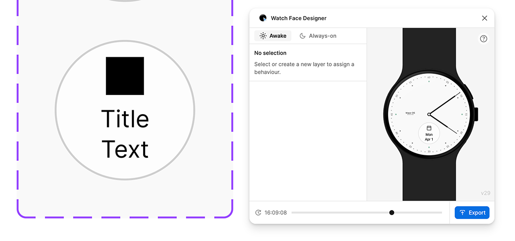
預覽畫面會顯示錶面資訊的組合方式。這個範例顯示如果將日曆應用程式指派給這個時段,複雜功能可能會呈現的樣貌。
如要讓文字全以大寫字元顯示 (如下圖所示),請使用 Figma「Typography」(排版) 選單中的「text case」(文字大小寫) 功能。
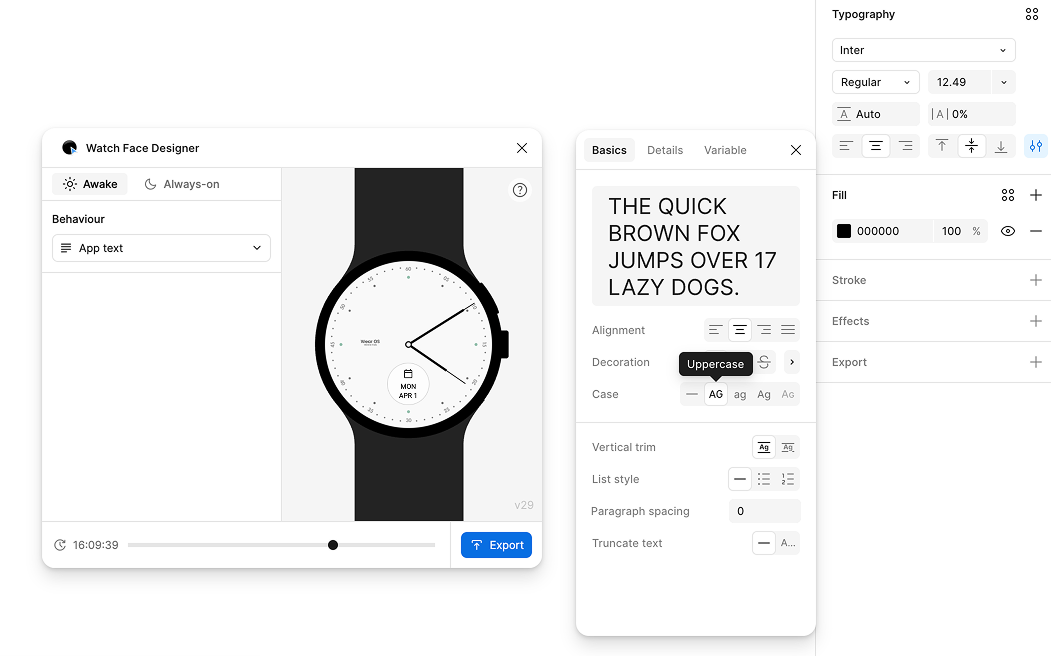
請注意,與數位時間不同,複雜功能文字沒有任意字型匯出功能。小工具一律會使用 Wear OS 裝置的系統字型繪製,這類字型可能有所不同,但通常是 Roboto。
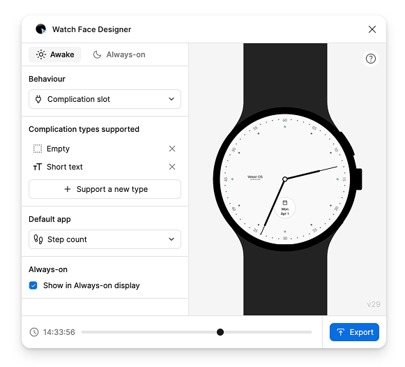
如要新增其他類型的小工具支援,或自訂相關設定 (例如「預設應用程式」,或手錶處於微光模式時是否顯示小工具位置),請在錶面中選取小工具位置:
顏色主題
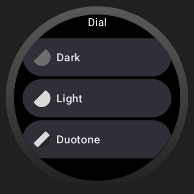
你可以在錶面中加入多個色彩主題選項。使用者接著就能在手錶上使用錶面選取器,選擇所需的主題。
錶面設計工具支援使用 Figma 樣式設定顏色主題。
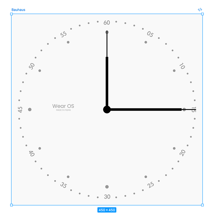
假設您想讓使用者自訂錶面指針和錶盤的顏色,請參考下列錶面:
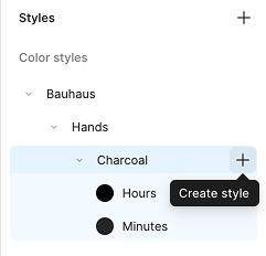
建立第一個樣式
如要建立可在手錶上自訂的顏色樣式,請建立新樣式:
- 取消選取畫布上的所有內容。
- 在右側邊欄中,選取「樣式」旁邊的「+」按鈕。
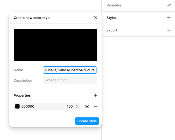
名稱必須符合特定格式:
Watch Face Name/Element Family Name/Descriptive Color Name/Specific Element Name
在本例中,範例錶面的名稱為 Bauhaus,因此顏色會從該名稱開始,後面接著 Hands,這是使用者可自訂的元素。然後提供描述性的顏色名稱 (例如 Charcoal),並指定要變更哪個特定元素 (時針) 的顏色。
綜合以上資訊,最終名稱為:Bauhaus/Hands/Charcoal/Hours:
按照類似程序,為分針建立自訂顏色主題:
最後,將這些顏色指派給錶面上顯示的實際指針:
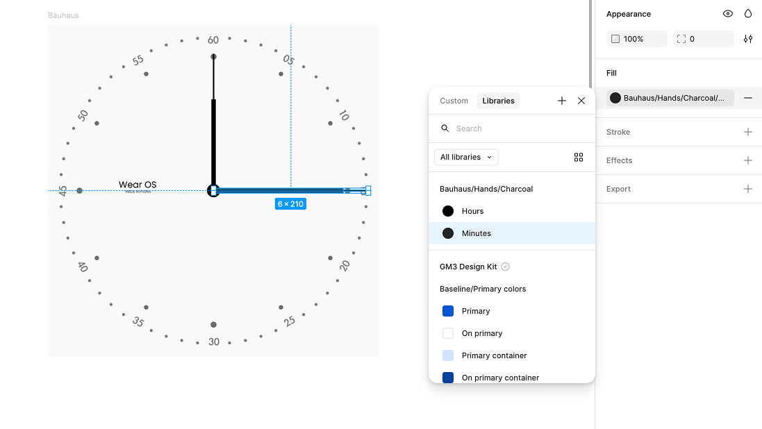
Bauhaus/Hands/Charcoal/Minutes 主題指派給錶面的分針新增其他樣式
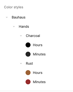
變更樣式的 Theme Name 部分,即可建立新樣式。以下範例會新增名為 Rust (Bauhaus/Hands/Rust/Hours) 的樣式:
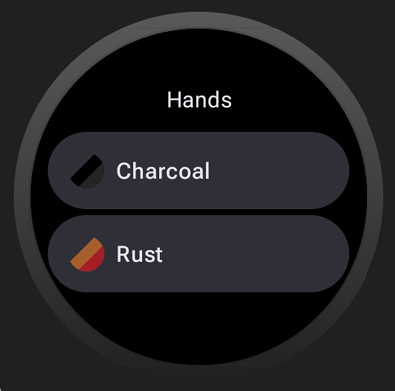
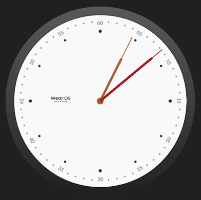
使用者可以在裝置上切換「木炭」和「鐵鏽」顏色主題,錶面的時針和分針也會相應變色:
套用至其他元素
按照類似步驟,讓錶面的其他元素也能套用主題。您可以混搭這些主題,並使用任意數量的顏色樣式建立可替換的複雜主題:
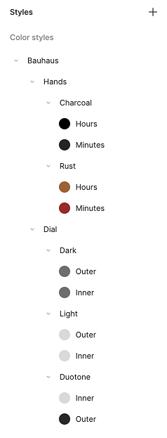
使用上述樣式集,您已為指標提供兩個選項 (Rust 和 Charcoal),並為錶面提供三個選項 (Light、Dark 和 Duotone):