
Android users engage with different media types, including audiobooks, music, podcasts, and radio. It's important to design apps that allow users to conveniently access media content on their watch. The watch is a unique surface on which ease and speed of interactions is a high priority, as users spend much less time interacting with their watch than their phone or tablet.
For more information, see the Media Toolkit on GitHub.
Media app architecture
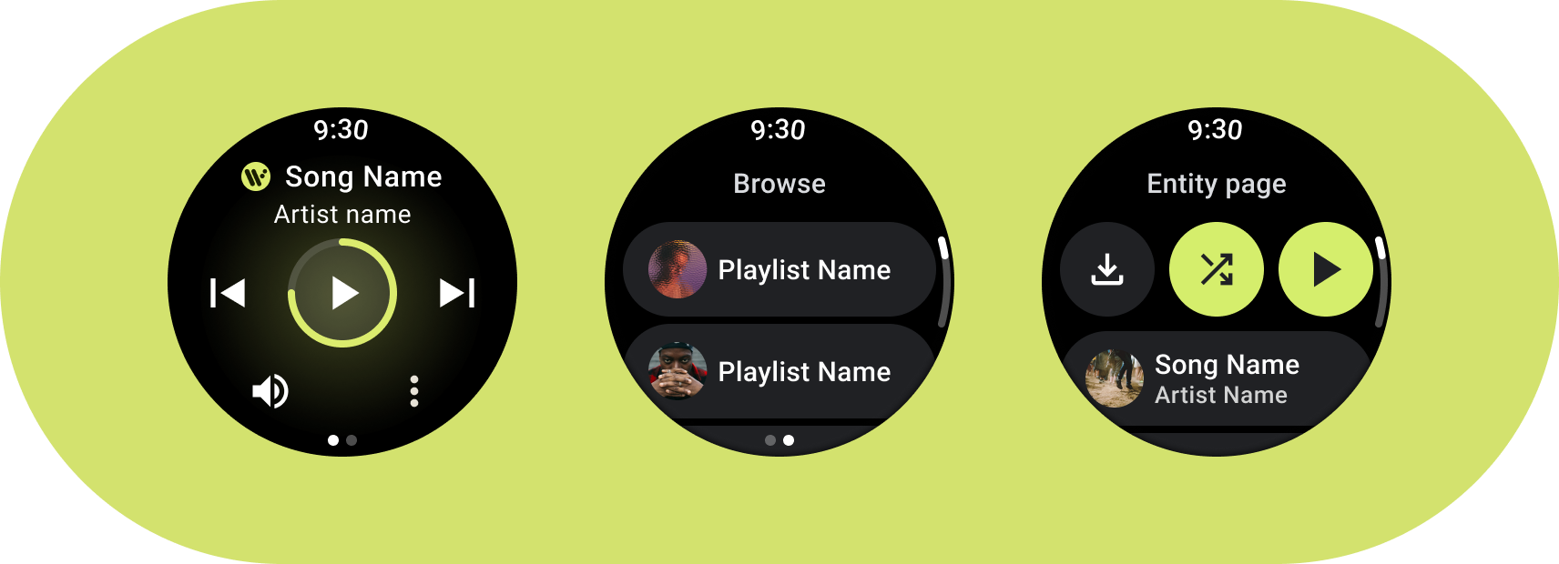
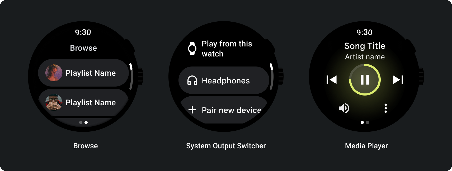
Create media apps that satisfy Wear OS's design requirements. Media apps often include Browse and Entity pages.
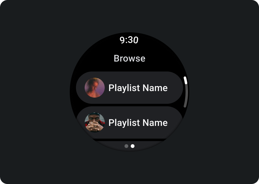
Browse
Lets users find media to play. Prioritize downloaded items to help users quickly start or resume playback.
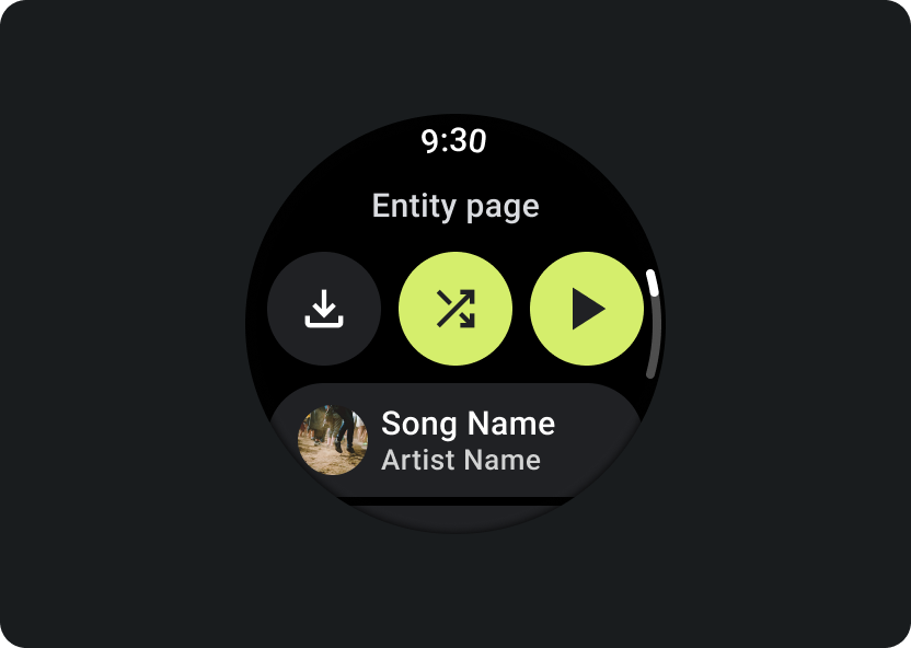
Entity
Gives users more information about a specific media item. Important context and key actions should be readily available, such as download, play, or shuffle.
Reduce your app hierarchy and expose media for the user. Design with a flat information architecture that allows users to quickly access lists and showcase thumbnails for users. Consider using custom design components for Wear OS. For more information, check out design recommendations for Chips and Cards.
Media control screens
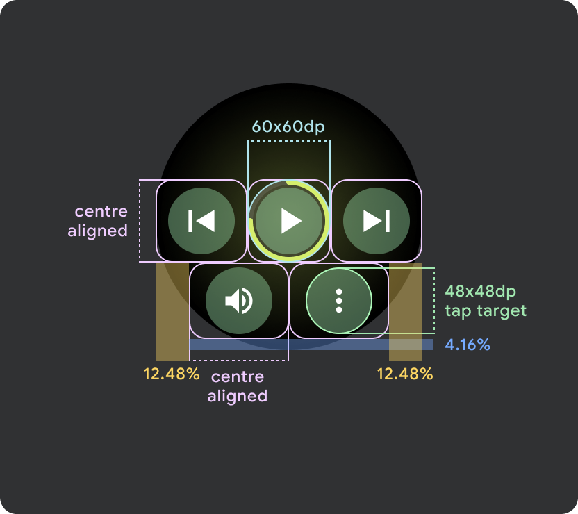
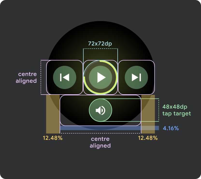
Media apps should also include media control screens. Create media controls using a 5-button layout. This is to ensure that minimum tap targets are met. The following are examples of media controls for a music app and a podcast app:
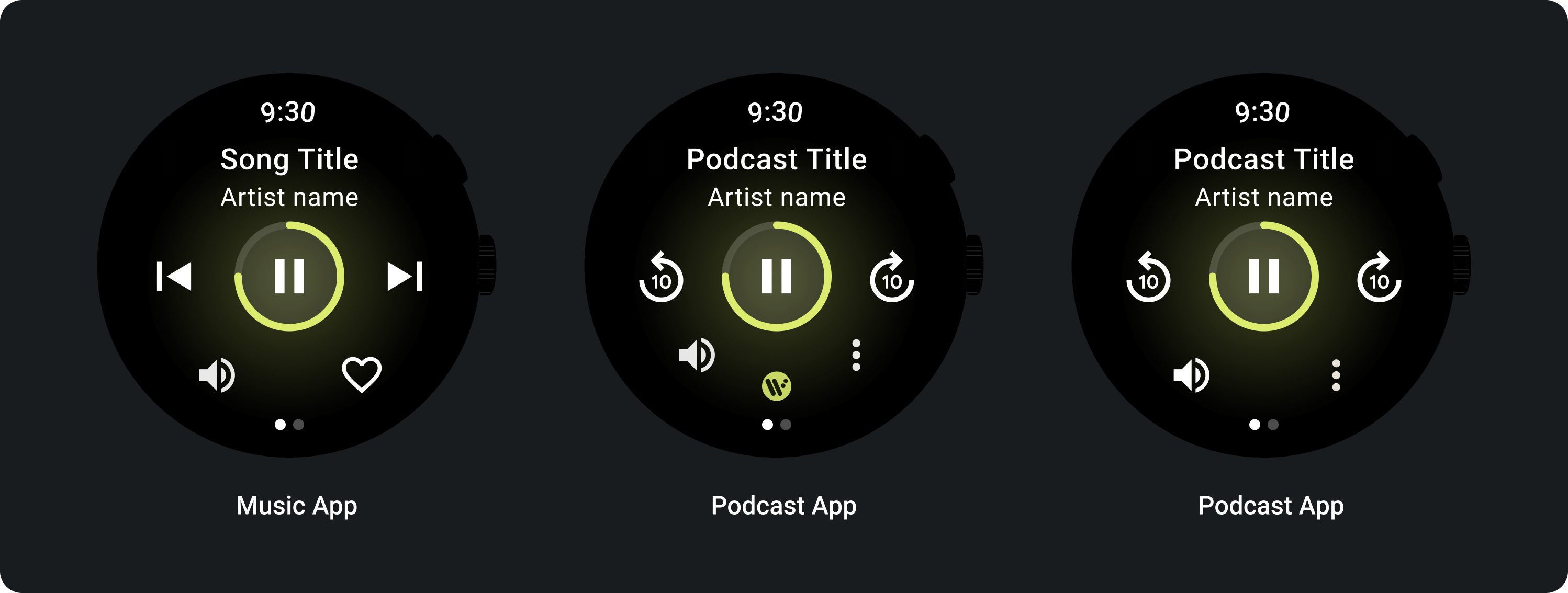
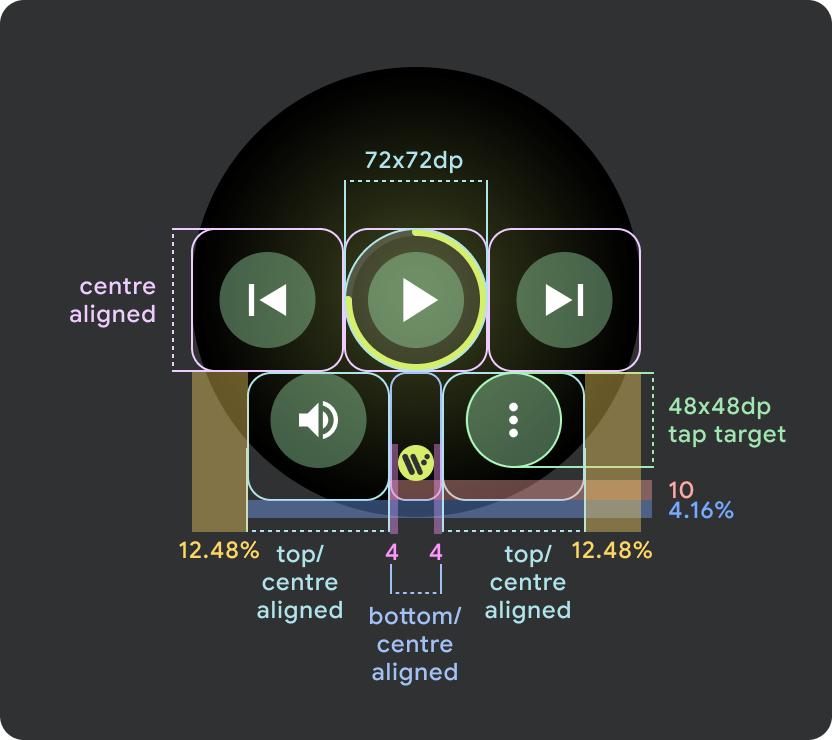
Adapt the media controls that you display, depending on the type of content. Use a three-dot overflow icon to take users to an additional page if you want to include more than 5 actions. You can use custom icons and fonts for your app.
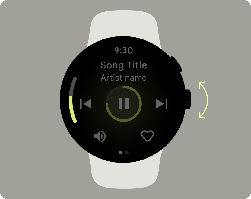
Control the volume
Volume controls are one of the most important media controls for users on the watch. Media controls should include a volume button to enter the volume controls screen.
Most Wear OS devices have a rotating side button (RSB) or a bezel. Some Wear OS devices also have additional hardware buttons to control volume. Use the RSB, bezel, or the additional button to control the volume. Show the indicator only when the RSB or bezel is rotated, as shown in the example.
Common use cases
When designing media apps, be sure that you prioritize the following important use cases:
- Listen to downloaded media
- Stream music from the watch
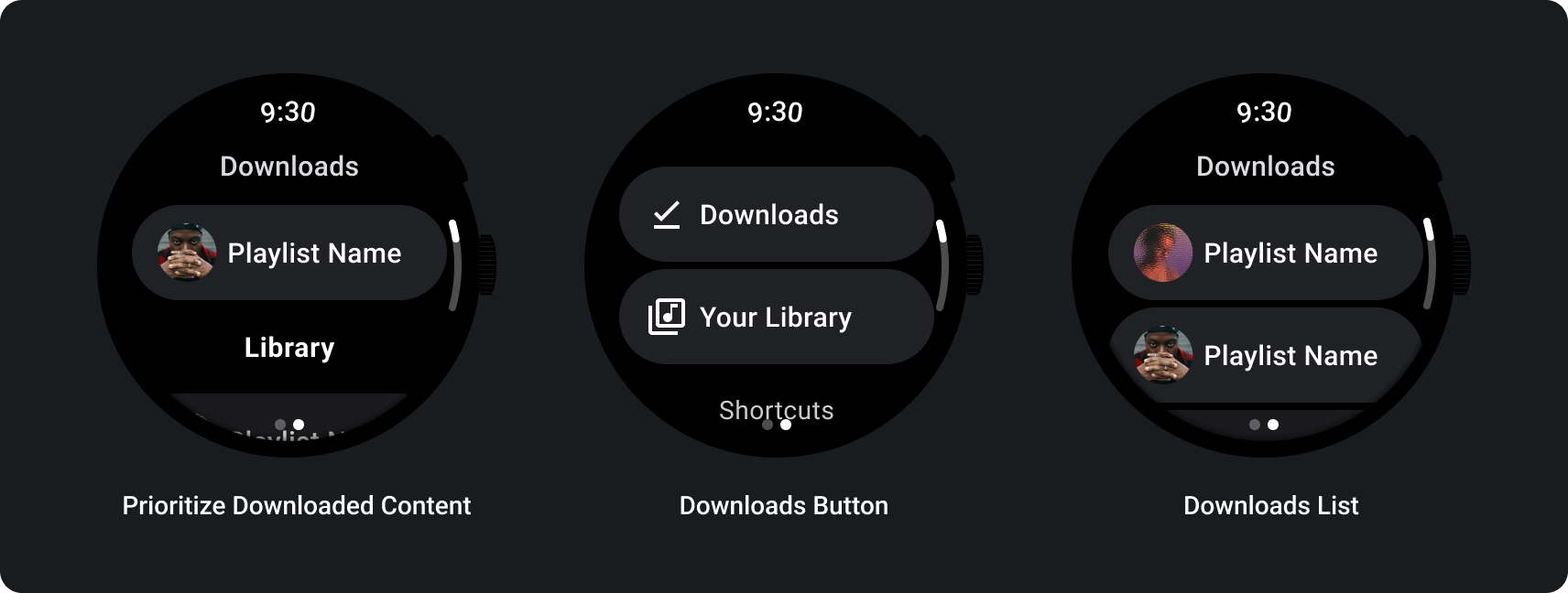
Listen to downloaded media
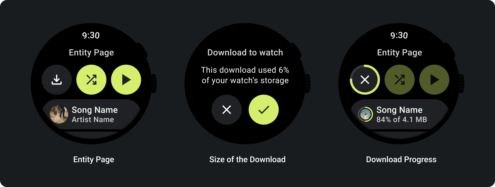
Users should be able to manually download media items from an entity page.
Communicate to the user where they are downloading content, the progress of the download, the time it takes, and the size of the download, as shown in the following example:
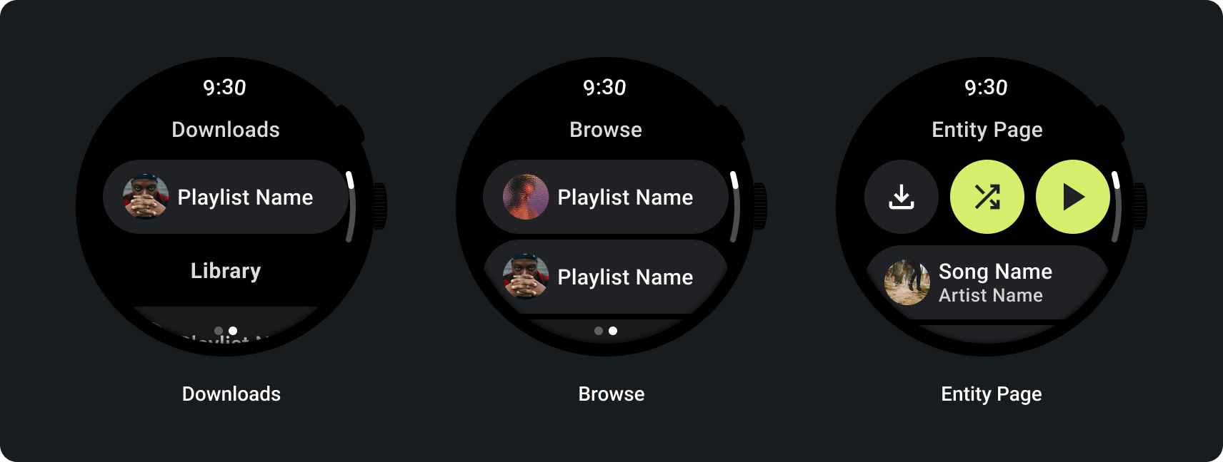
When the user browses media, display the most recently downloaded media:
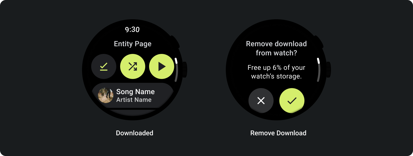
If content is already downloaded, make this clear by showing an action to remove the download from the watch. In this case, you must also show how much space the download is taking up on the watch, as shown in the following image:
If the source device is the watch, prompt users to connect a headset before they begin listening to music. Once a headset is connected, play the media and open media controls.
Stream music from the watch
Streaming media from the watch has a significant effect on a Wear OS device's battery. Prioritize downloaded content when users choose to listen on their Wear OS device by exposing recently used downloads on the browse list. Consider adding a button that takes them to a full list of downloads, as shown in the following images:
For more information, see the Media Toolkit on GitHub.
Adaptive layouts
The larger screen adaptations for media apps are solely focused on the media player experience. All other elements are captured in Chips, Buttons, Dialogs, and Lists pages that describe proper app behavior to accommodate larger screens.
Button configuration
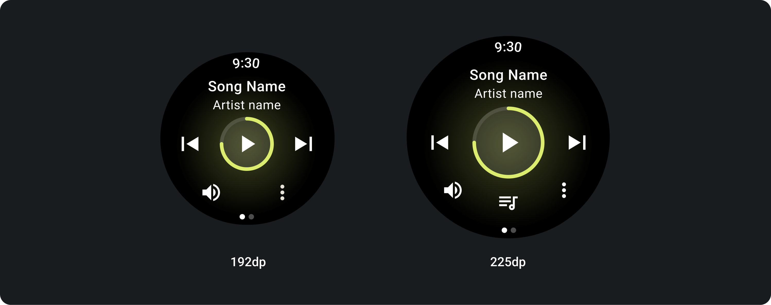
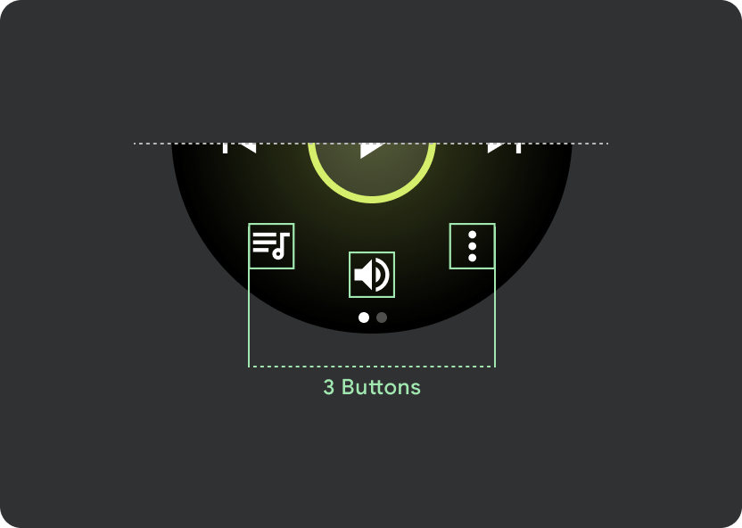
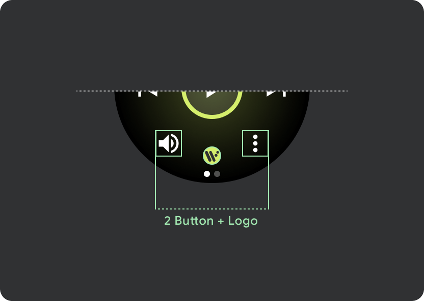
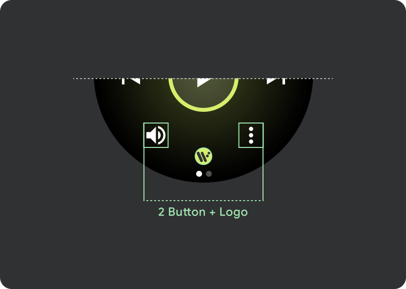
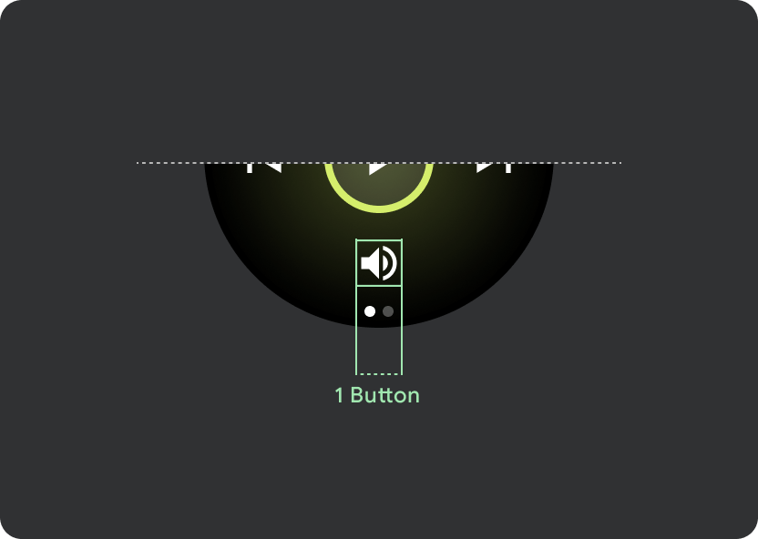
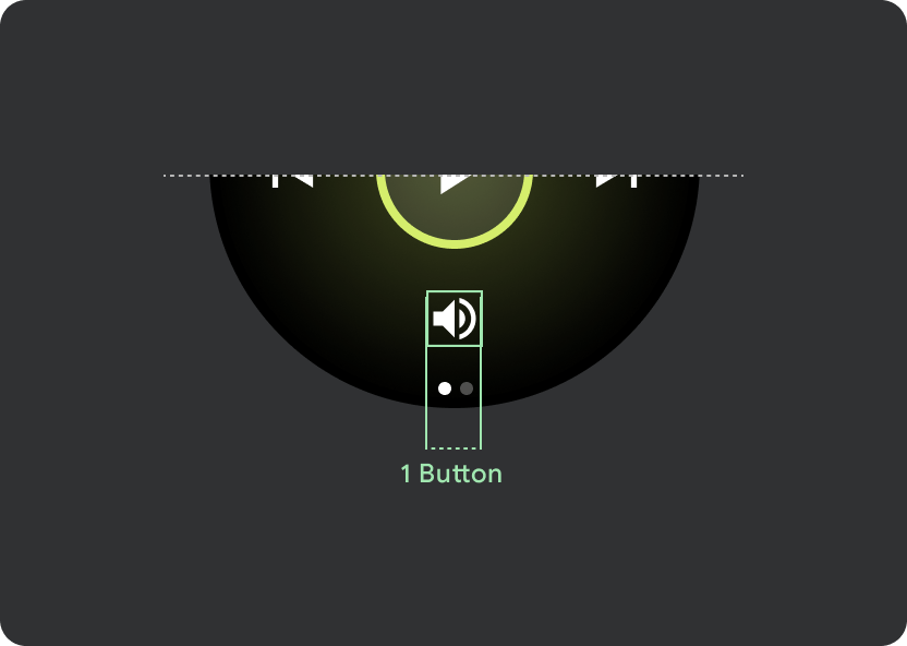
To follow touch target sizing principles, show a 2-button layout on Wear OS devices that are smaller than 225 dp, and a 3-button layout on devices with larger screens. The following images outline additional examples, such as a 1-button layout, and a 2-button layout with a logo:
Responsive control button
Main control (Play/Pause) scales from 60 dp to 72 dp on Wear OS devices larger than 225 dp, making the middle section 72 dp high, and therefore increasing tap targets for all controls within it. This is built in responsive behavior which you will inherit from the Media Player template.
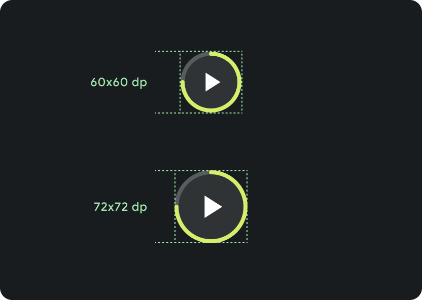
Scaling on different screen sizes:
< 225 dp: 60 dp x 60 dp
> 225 dp: 72 dp x 72 dp
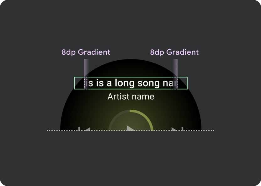
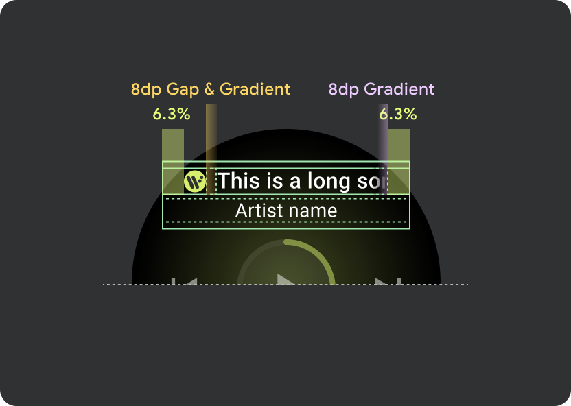
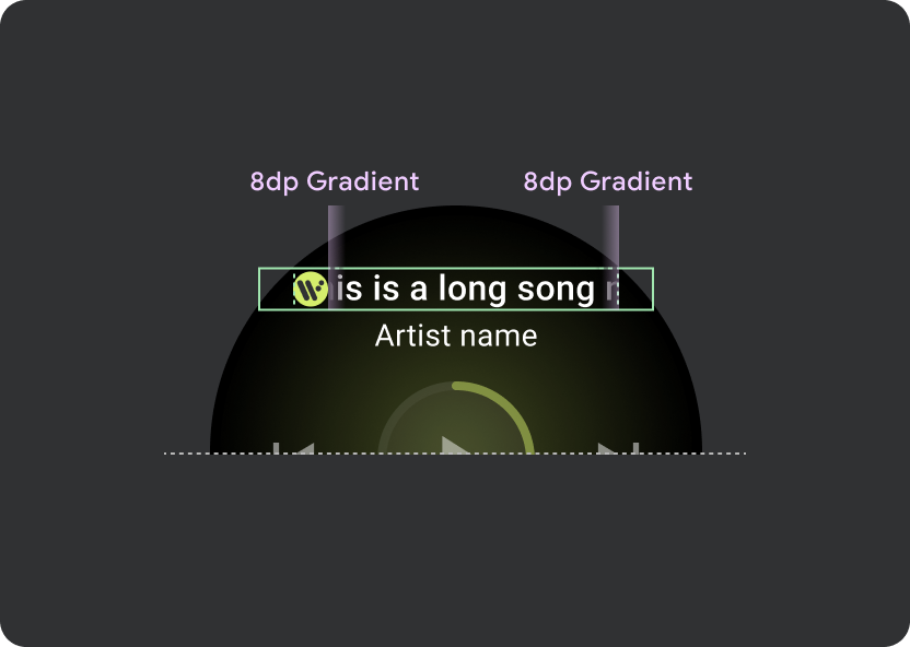
Marquee behavior
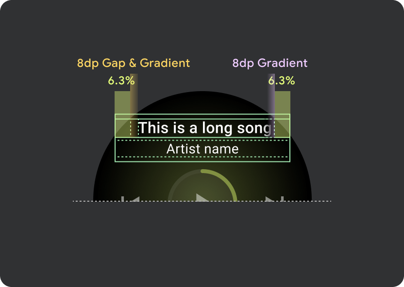
Within the header, use a universal margin of 9.38%, with an additional Song title margin of 6.3%. Use 8dp gradient for scrolling titles, and an additional 8dp gap (with 8dp gradient) when an icon is present. Include any marquee scrolling transitions underneath the icon, whose position remains fixed.
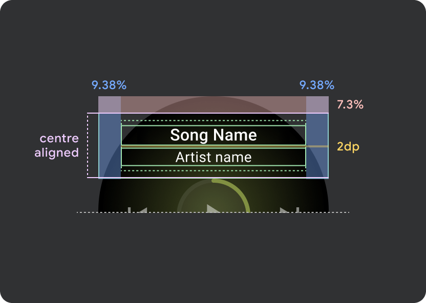
Header atom margins
9.38%
Song title internal margin
6.3%
Gradients
8 dp bleed
Additional 8dp left padding (to accommodate app icon)
Icon gap
8 dp
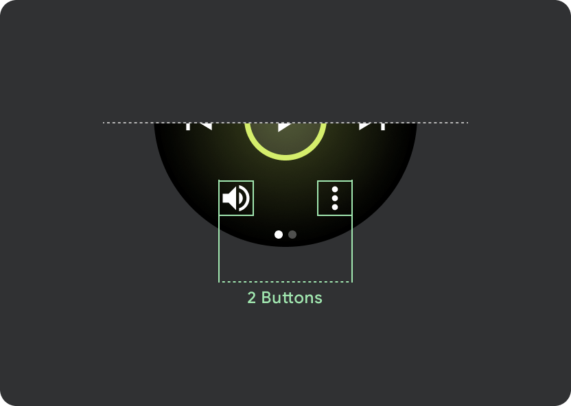
Tap targets
On Wear OS devices with larger screens, the icons in the middle and footer sections take advantage of the extra space to increase tap target sizes. This means that, aside from a fixed control atom, the "fill available space" properties are applied to icon containers:

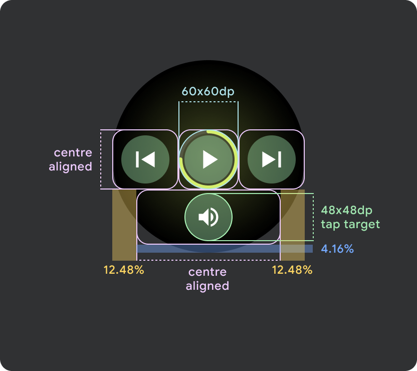
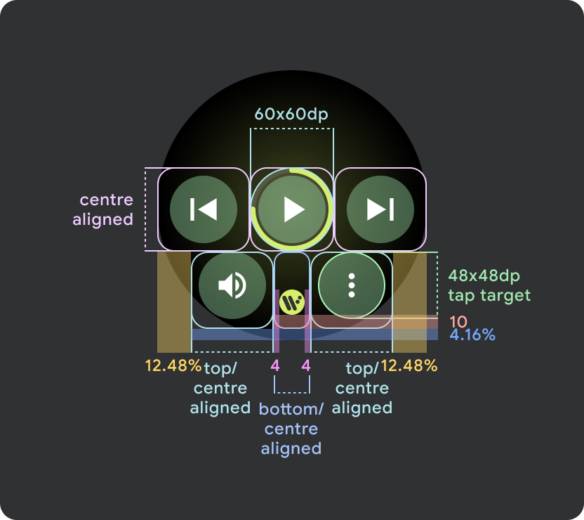
Small Wear OS screens (<225dp)
- Recommended to have maximum 2 buttons on smaller screens with 2 buttons on the smallest screen size
- The minimum tap target for the bottom buttons must be 48dp (H) x 48dp (W)
- Icons should sit in the middle area of the tap target
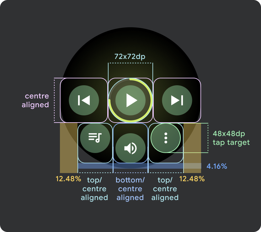
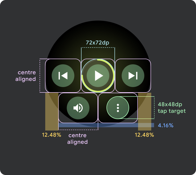
Larger Wear OS screens / breakpoint (>225dp)
- Recommended to have maximum 3 buttons aon larger screens with 3 buttons on the smallest of these "larger screens"
- The minimum tap target for the bottom buttons must be 48dp (H) x 48dp (W)
- Icons should sit in the middle area of the tap target (but have top/bottom alignment and internal padding to create a rounded effect)