
The Wear Material 3 Expressive color system employs three accent layers (primary, secondary, tertiary) for key components and two neutral surface layers. Each role offers a range of values with consistent contrast, enabling expressive yet accessible color combinations for a unified experience across any theme.
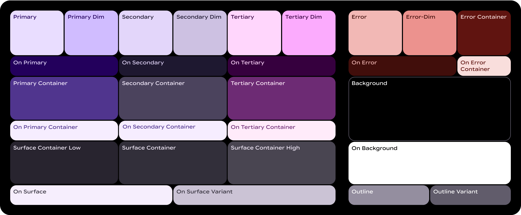
What are color roles?
Color roles are like the "numbers" in a paint-by-number canvas. They're the connective tissue between elements of the UI and what color goes where.
- Color roles are mapped to Material components: You'll use these color roles whether you're using the static baseline scheme or dynamic color. If your product contains custom components, they'll need to be properly mapped to this set of color roles.
- Color roles support accessibility: The color system is built on more accessible color pairings. These color pairs provide a minimum of 3:1 color contrast.
- Color roles are tokenized: Roles are implemented in design and code through tokens. A design token represents a small, reusable design decision that's part of a design system's visual style.
Essential terms
Here are key terms you'll see in the names of color roles:
- Surface: A role used for backgrounds and large, low-emphasis areas of the screen.
- Primary, Secondary, Tertiary: Accent color roles used to emphasize or de-emphasize foreground elements.
- Container: Roles used as a fill color for foreground elements like buttons. They shouldn't be used for text or icons.
- On: Roles starting with this term indicate a color for text or icons on top of its paired parent color. For example, on primary is used for text and icons against the primary fill color.
- Variant: Roles ending with this term offer a lower-emphasis alternative to its non-variant pair. For example, outline variant is a less emphasized version of the outline color.
Primary roles
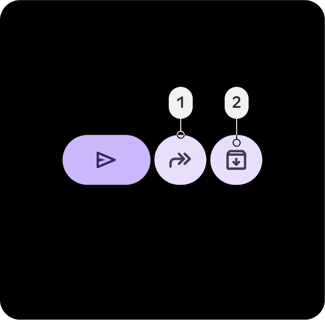
Primary roles are used for key components across the UI, such as the Edge Hugging buttons, prominent buttons, active states, and icons on the tonal button styles.

Primary
- Primary
- On-Primary
Use the Primary role for the most important actions in the UI, like primary buttons or calls to action. This color should stand out and be instantly recognizable to guide the user toward key interactions.
Primary-Dim
- Primary-Dim
- On-Primary
Dim roles are typically used for elements that need to be visually distinct from the primary action but don't require immediate user attention or interaction.
Primary-Container
- Primary-Container
- On-Primary-Container
Apply Primary Container for background elements like cards or modals to highlight sections or selected states. It helps draw attention to important content or ongoing activities within the UI.
Secondary roles
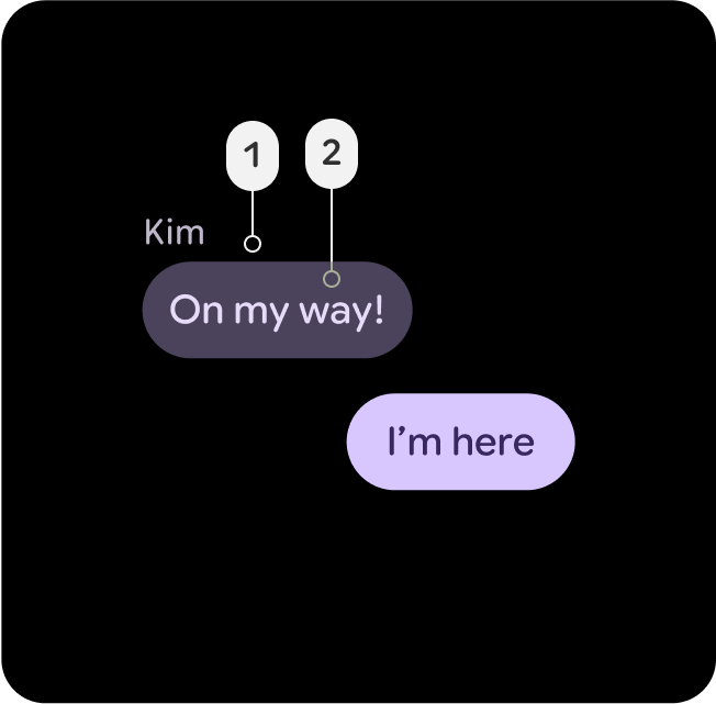
Secondary roles are used for key components across the UI, which are not as important as the primary role, but still need to stand out. Primary and secondary can be used together in layouts to create differentiation and focus.

Secondary
- Secondary
- On-Secondary
Use the Secondary role for supporting actions in areas with dense UI, such as secondary buttons or complementary actions. It maintains visibility without overshadowing primary elements in complex layouts.
Secondary-Dim
- Secondary-Dim
- Secondary
The Secondary-Dim role offers a muted contrast for passive elements in dense areas. It complements the secondary color while adding subtle depth, keeping the UI clean and helping users navigate.
Secondary-Container
- Secondary-Container
- On-Secondary-Container
Apply Secondary-Container for organizing secondary elements in dense layouts. It creates structure and separation, ensuring secondary content is distinguishable but not dominant.
Tertiary roles
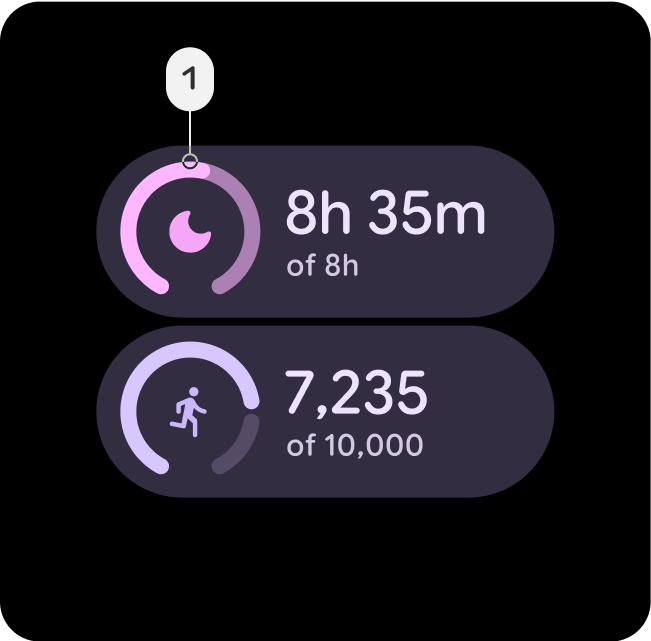
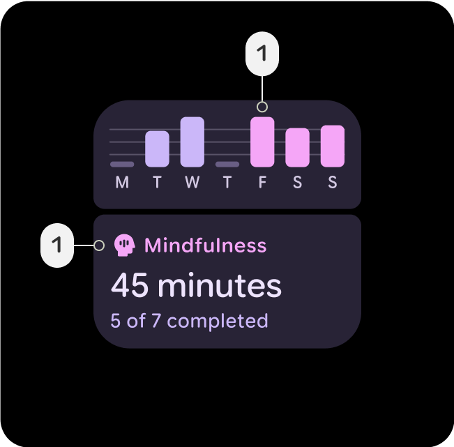
Tertiary roles are used for contrasting accents to balance primary and secondary colors or bring heightened attention to an element such as an input field. Tertiary roles can also help indicate when content changes or should stand out, such as a goal being reached.
Tertiary
- Tertiary
- On-Tertiary
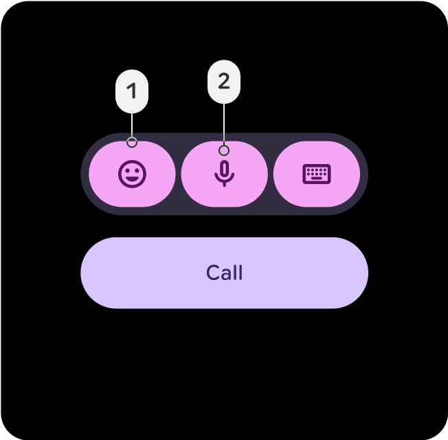
The Tertiary role is used for drawing attention to key elements. Tertiary roles are particularly effective for components that need to stand out, such as badges, stickers, or special action elements.
Tertiary-Dim
- Tertiary-Dim
- Tertiary
Use the Tertiary Dim role for buttons or actions that are related to tertiary actions yet don't require immediate focus.
Tertiary-Container
- Tertiary-Container
- On-Tertiary-Container
Apply Tertiary-Container for backgrounds that group tertiary-related content, like collections of badges or stickers. It emphasizes tertiary elements while maintaining balance and structure in the UI.
Semantic roles
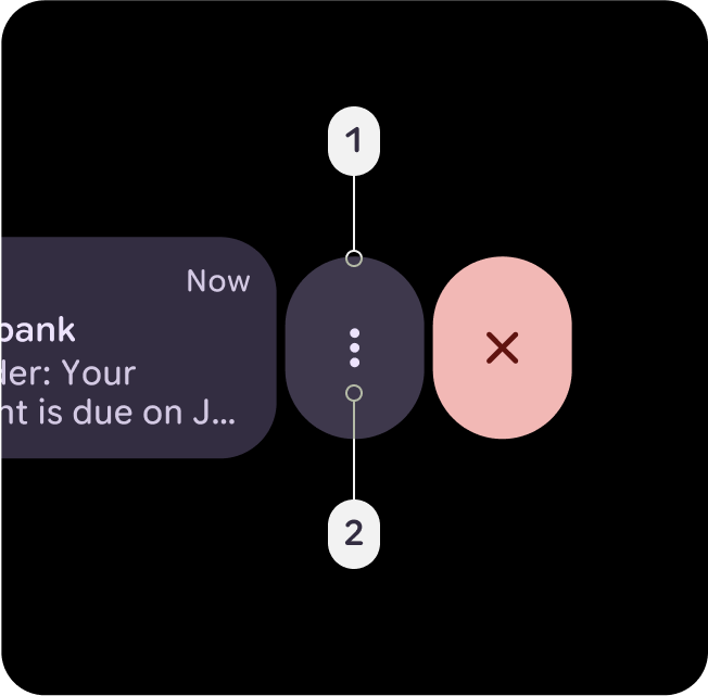
Error-Red is used to indicate critical issues as error, delete, and anything related to emergency. It is designed to draw immediate attention to problems or warnings, ensuring users can quickly identify areas that need corrective action. The tone of Error-Red should maintain sufficient contrast against backgrounds to meet accessibility standards, ensuring it is clearly visible and is distinguishable from other status colors like warnings or success messages.
Error
- Error
- On-Error
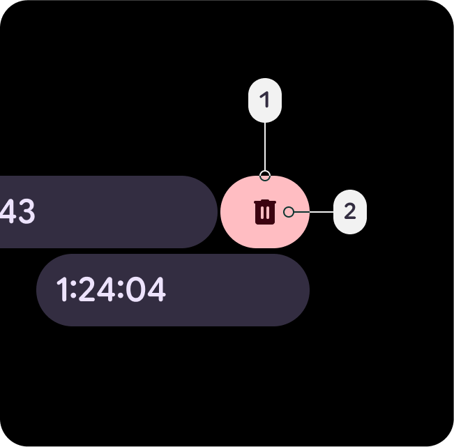
A semantic, yet slightly theme-tinted red, which indicates remove, delete, close or dismiss actions, such as Swipe to Reveal. Added as a container alternative that is slightly less alarming and urgent than the error-dim color.
Error-Dim
- Error-Dim
- On-Error
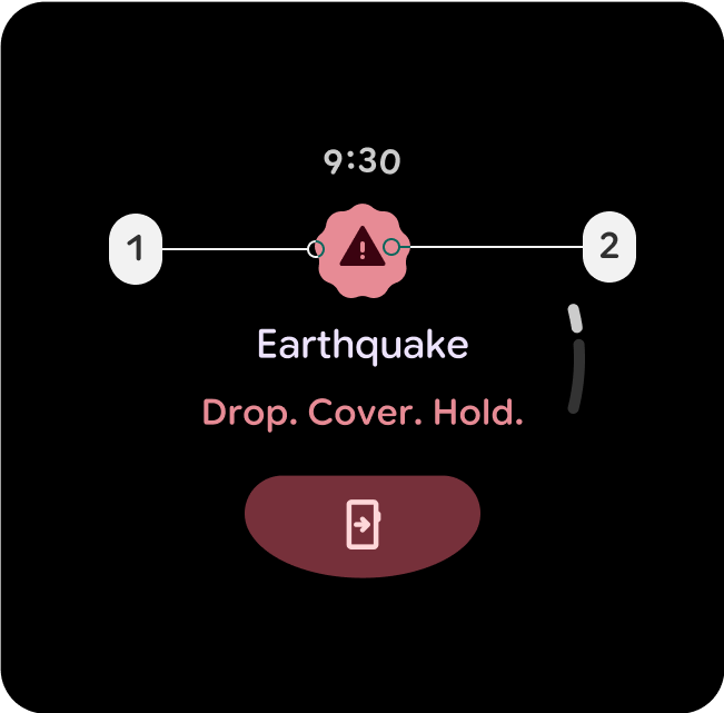
A semantic, yet slightly theme-tinted red, which indicates high priority errors or emergency actions, such as safety alerts, failed dialog overlays or stop buttons.
Error-Container
- Error-Container
- On-Error-Container
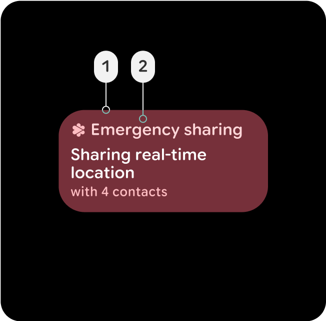
Less prominent container color, for components using the error state. Can also indicate an active error state which feels less interactive than a filled state, such as an active emergency sharing button or card, or on a failed overlay dialog.
Surface containers and elevation
Surface containers are key in defining depth and elevation within the UI, providing structure and hierarchy through color, helping to differentiate components based on their importance and interaction.
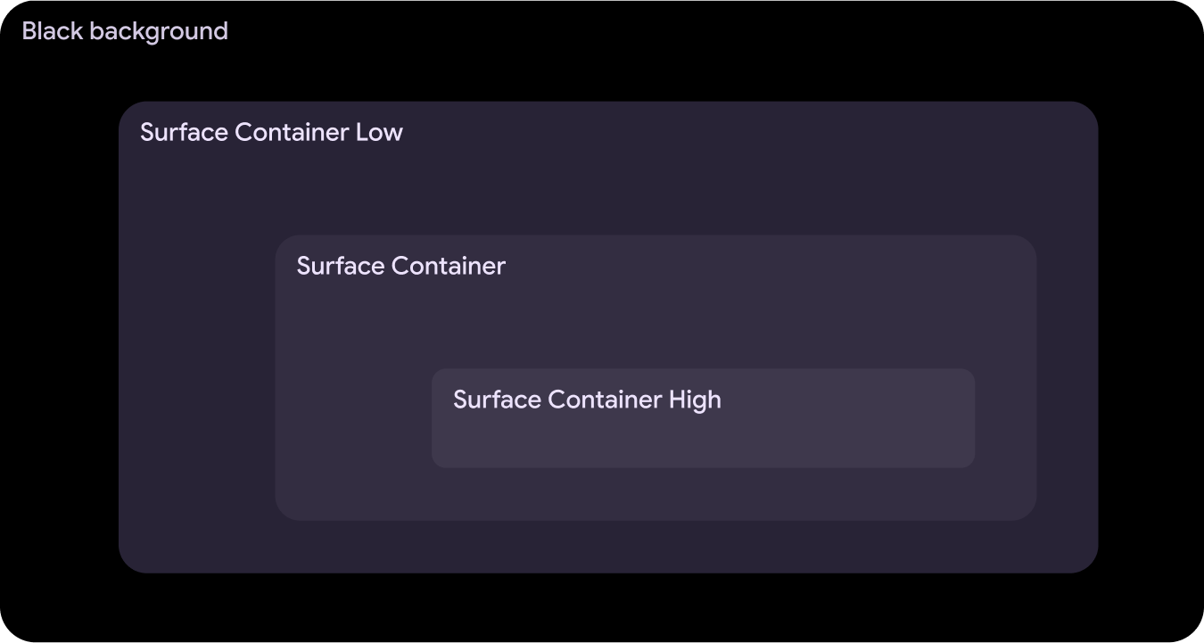
Surface-Container-Low
- Surface-Container-Low
- On-Surface
- On-Surface-Variant
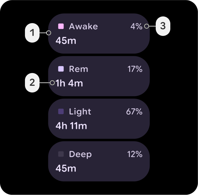
Great for an expanded container that needs to sit below Surface-Container, such as an expanded card in the Notification. Can also be used for non-interactive cards, where content still benefits from containment.
Surface-Container
- Surface-Container
- On-Surface
- On-Surface-Variant
The default container color for most elements. It provides a neutral, moderate elevation, making it suitable for general UI components.
Surface-Container-High
- Surface-Container-High
- On-Surface
- On-Surface-Variant
Ideal for high-emphasis components that need to sit on top of, or in combination with Surface-Container. This color helps bring focus and hierarchy to critical areas in the UI.