Stay organized with collections
Save and categorize content based on your preferences.
Design adaptable Android widgets that scale seamlessly. Use our recommended
default sizes as a starting point, and test your layouts across different
dimensions to ensure optimal readability and user experience.
Default sizes
Deliver a polished widget experience by optimizing your layout for at least one
of our recommended sizes. Ensure correct placement and visibility in the widget
picker by defining targetCellWidth and targetCellHeight attributes for both
handheld and tablet devices.
These values are based off Pixel devices. Use these sizes as a starting point
for your widget design. Thoroughly test your widget at different sizes and on
various devices to ensure a quality user experience.
Handheld
Sizes
Min width
Max width
Min height
Max height
2x1
109
306
56
130
2x2
109
306
115
276
2x3
109
306
185
422
4x1
245
624
56
130
4x2
245
624
115
276
4x3
245
624
185
422
Tablet
Sizes
Min width
Max width
Min height
Max height
2x1
180
304
64
120
2x2
180
304
184
304
2x3
180
304
304
488
3x1
328
488
64
120
3x2
298
488
184
304
3x3
298
488
304
488
3x4
298
488
424
672
Breakpoints
Breakpoints are essential for crafting adaptable, user-friendly resizable
widgets. By testing your design, you can pinpoint size thresholds where layout
adjustments are necessary. Implement breakpoints to trigger these changes,
ensuring your widget maintains visual appeal and functionality at any size.
Breakpoints also offer the flexibility to conditionally include or exclude
supplemental content, optimizing space utilization based on the widget's
dimensions.
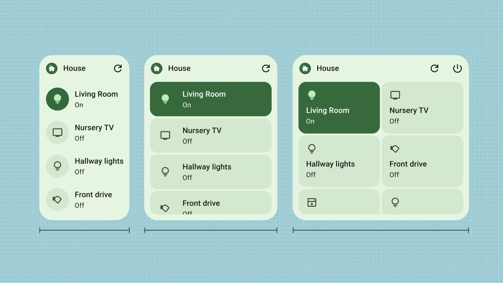
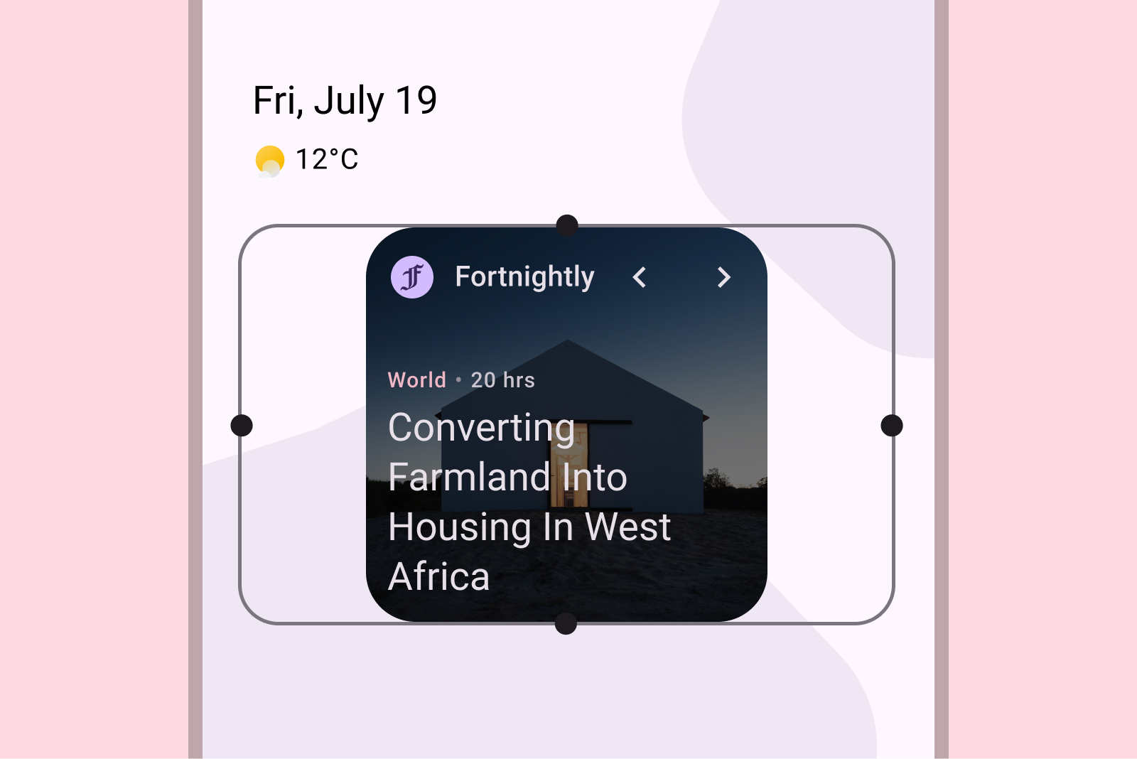
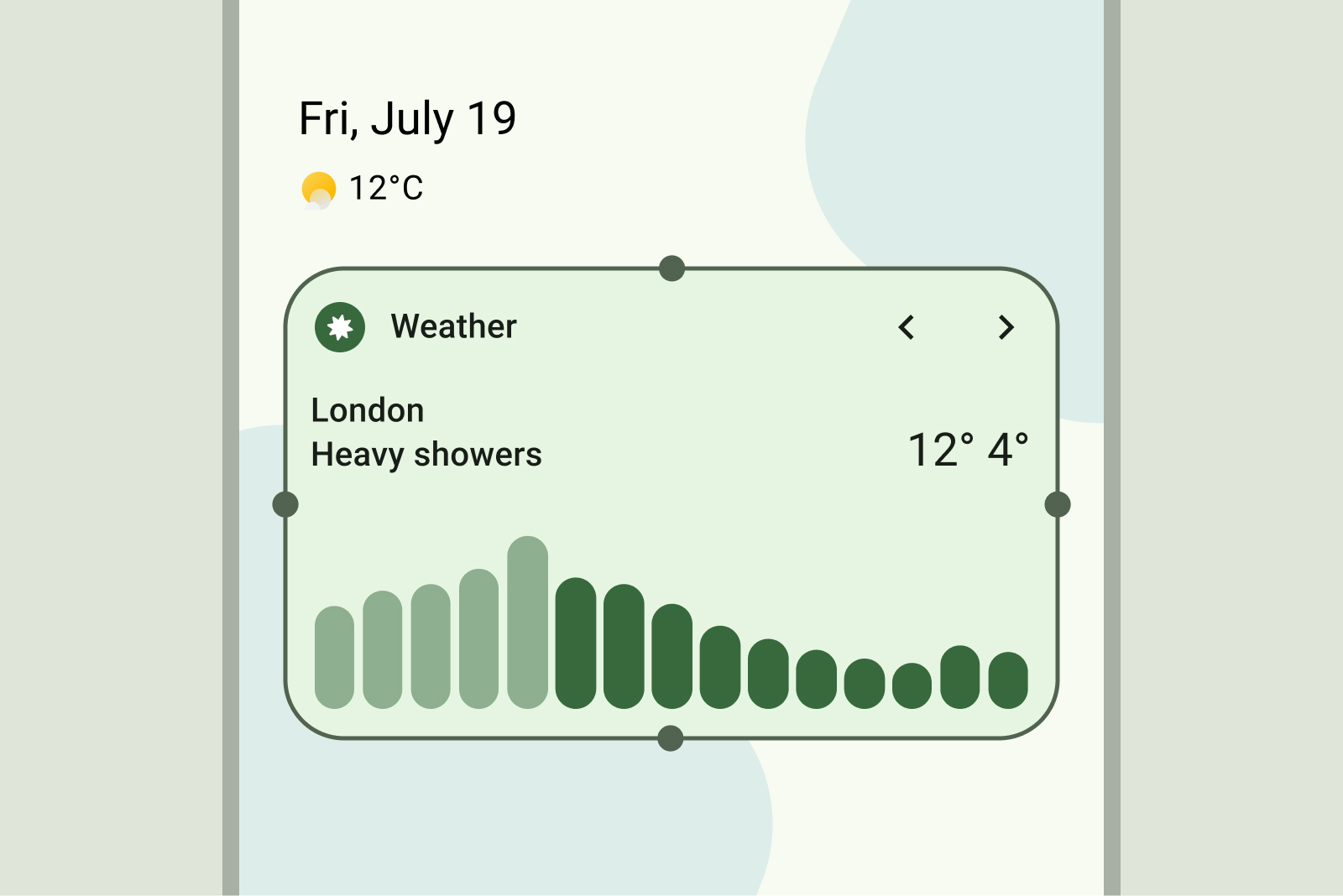
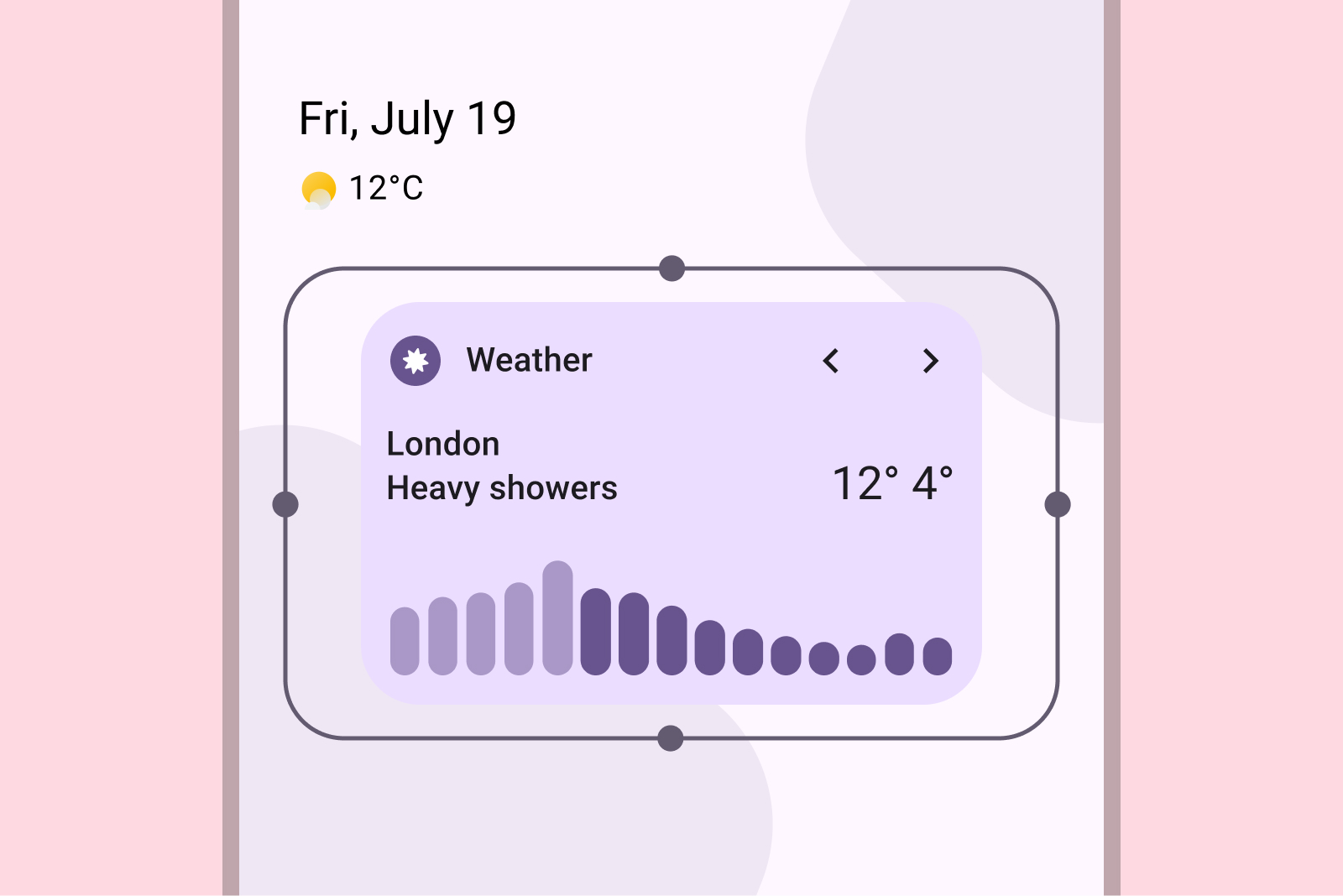
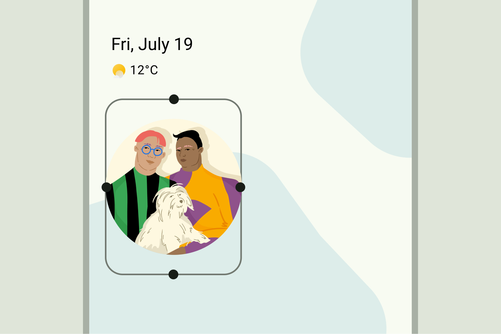
Figure 1: Use breakpoints to make layout changes at different sizes.
Fill the bounds
One of the primary reasons users remove widgets is due to misalignment with
other home screen elements. To prevent this, ensure your widget always fills its
allocated grid space completely.
check_circle
Do
Make sure the container stretches edge-to-edge at all sizes.
cancel
Don't
Add custom padding. Your widget should go seamlessly edge-to-edge.
check_circle
Do
Ensure your non-rectangular shape touches the grid on either the vertical or horizontal axis for visual consistency.
cancel
Don't
Use fixed square shapes. Instead, use responsive rectangular containers that adapt to various grid dimensions.
Content and code samples on this page are subject to the licenses described in the Content License. Java and OpenJDK are trademarks or registered trademarks of Oracle and/or its affiliates.
Last updated 2024-12-09 UTC.
[[["Easy to understand","easyToUnderstand","thumb-up"],["Solved my problem","solvedMyProblem","thumb-up"],["Other","otherUp","thumb-up"]],[["Missing the information I need","missingTheInformationINeed","thumb-down"],["Too complicated / too many steps","tooComplicatedTooManySteps","thumb-down"],["Out of date","outOfDate","thumb-down"],["Samples / code issue","samplesCodeIssue","thumb-down"],["Other","otherDown","thumb-down"]],["Last updated 2024-12-09 UTC."],[],[],null,["# Sizing\n\nDesign adaptable Android widgets that scale seamlessly. Use our recommended\ndefault sizes as a starting point, and test your layouts across different\ndimensions to ensure optimal readability and user experience.\n\nDefault sizes\n-------------\n\nDeliver a polished widget experience by optimizing your layout for at least one\nof our recommended sizes. Ensure correct placement and visibility in the widget\npicker by defining `targetCellWidth` and `targetCellHeight` attributes for both\nhandheld and tablet devices.\n\nThese values are based off Pixel devices. Use these sizes as a starting point\nfor your widget design. Thoroughly test your widget at different sizes and on\nvarious devices to ensure a quality user experience. \n\n### Handheld\n\n\n| Sizes | Min width | Max width | Min height | Max height |\n|-------|-----------|-----------|------------|------------|\n| 2x1 | 109 | 306 | 56 | 130 |\n| 2x2 | 109 | 306 | 115 | 276 |\n| 2x3 | 109 | 306 | 185 | 422 |\n| 4x1 | 245 | 624 | 56 | 130 |\n| 4x2 | 245 | 624 | 115 | 276 |\n| 4x3 | 245 | 624 | 185 | 422 |\n\n\u003cbr /\u003e\n\n### Tablet\n\n\n| Sizes | Min width | Max width | Min height | Max height |\n|-------|-----------|-----------|------------|------------|\n| 2x1 | 180 | 304 | 64 | 120 |\n| 2x2 | 180 | 304 | 184 | 304 |\n| 2x3 | 180 | 304 | 304 | 488 |\n| 3x1 | 328 | 488 | 64 | 120 |\n| 3x2 | 298 | 488 | 184 | 304 |\n| 3x3 | 298 | 488 | 304 | 488 |\n| 3x4 | 298 | 488 | 424 | 672 |\n\n\u003cbr /\u003e\n\n| **Note:** Widget dimensions in the table encompass all device orientations, including landscape mode on phones, to ensure optimal functionality in a variety of scenarios.\n\nBreakpoints\n-----------\n\nBreakpoints are essential for crafting adaptable, user-friendly resizable\nwidgets. By testing your design, you can pinpoint size thresholds where layout\nadjustments are necessary. Implement breakpoints to trigger these changes,\nensuring your widget maintains visual appeal and functionality at any size.\n\nBreakpoints also offer the flexibility to conditionally include or exclude\nsupplemental content, optimizing space utilization based on the widget's\ndimensions.\n**Figure 1:** Use breakpoints to make layout changes at different sizes.\n\nFill the bounds\n---------------\n\nOne of the primary reasons users remove widgets is due to misalignment with\nother home screen elements. To prevent this, ensure your widget always fills its\nallocated grid space completely. \ncheck_circle\n\n### Do\n\nMake sure the container stretches edge-to-edge at all sizes. \ncancel\n\n### Don't\n\nAdd custom padding. Your widget should go seamlessly edge-to-edge. \ncheck_circle\n\n### Do\n\nEnsure your non-rectangular shape touches the grid on either the vertical or horizontal axis for visual consistency. \ncancel\n\n### Don't\n\nUse fixed square shapes. Instead, use responsive rectangular containers that adapt to various grid dimensions."]]