텔레비전 화면은 일반적으로 멀리서 볼 수 있으므로 큰 서체를 사용하는 인터페이스는 사용자가 더 읽기 쉽고 편안합니다. TV 디자인의 기본 서체 스케일에는 대비되는 유연한 서체 스타일이 포함되어 있어 다양한 사용 사례를 지원합니다.
하이라이트
- TV 화면에서 더 편안하게 볼 수 있도록 큰 서체를 우선적으로 사용합니다.
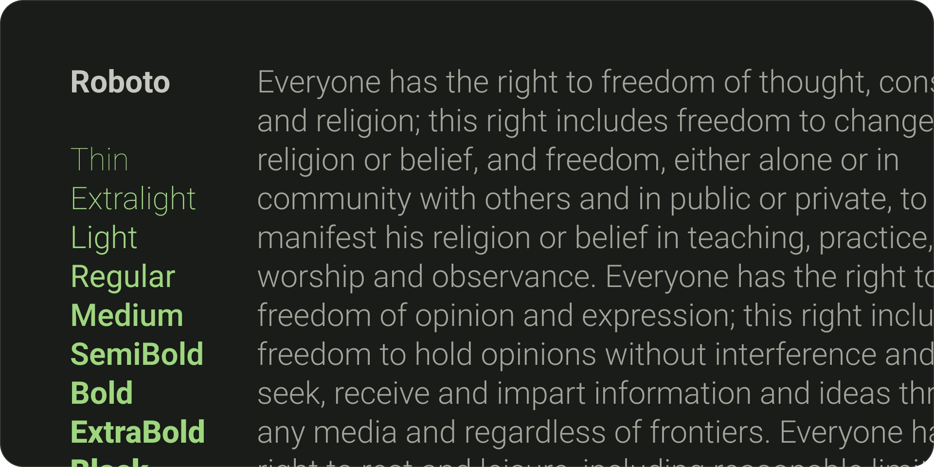
- Android TV의 기본 글꼴은 Roboto입니다.
- 브랜드 스타일을 가장 잘 반영하는 뚜렷하고 읽기 쉬운 글꼴을 선택합니다.
- 적절한 너비와 광학 크기를 통해 글꼴을 한눈에 읽을 수 있도록 합니다.
- 보조 글꼴을 페어링합니다. 예를 들어 본문 텍스트와 라벨에 sans-serif를 사용하세요.
- 장식용 글꼴을 피하여 가독성을 극대화합니다.
글꼴
기본 서체
Android TV에는 가독성과 명확성에 최적화된 자체 시스템 서체인 Roboto가 있습니다. 네이티브 플랫폼 환경을 사용할 때 가장 적합한 실용적이고 브랜드가 없는 UI 요소에는 Roboto를 사용하세요.
차별화된 서체
필요한 경우 브랜드 스타일을 반영하는 고유한 글꼴을 사용합니다. 글꼴을 선택할 때 고려해야 할 주요 사항은 다음과 같습니다.
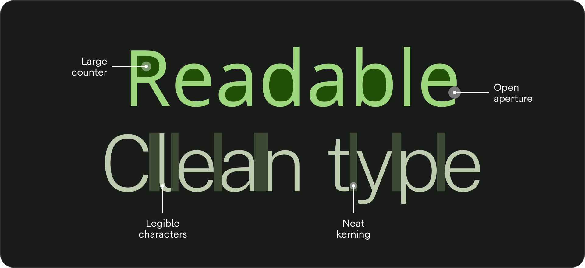
- 가독성 - 거리에서 더 나은 가독성을 위해 카운터가 큰 글꼴과 적절한 광학 크기를 사용하세요. 문자가 서로 구별되는지 확인합니다.
- 한눈에 읽기 가능 - 얇은 선을 즉시 인식할 수 없으므로 TV에 있는 모든 텍스트는 읽을 수 있는 글꼴 너비가 있어야 합니다.
- 보완 글꼴 페어링 - 여러 글꼴을 사용하려면 본문 텍스트와 라벨에 Sans Serif 서체를 사용합니다.
- 가능하면 장식형 글꼴은 사용하지 마세요. TV의 글꼴 크기는 다른 디스플레이 크기보다 크지만 UI 텍스트 가독성이 우선순위입니다. 본문 텍스트로 사용할 수 없는 글꼴을 사용하지 마세요.
서체 스케일
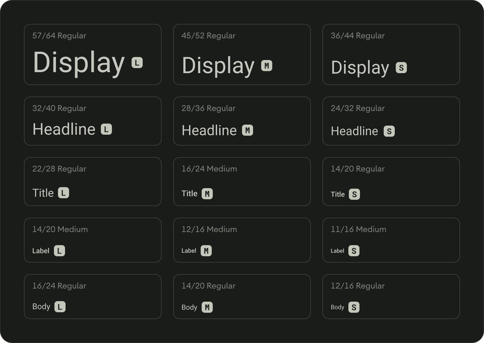
서체 스케일은 앱 전체에서 사용할 수 있는 글꼴 스타일 모음입니다. 유연하면서도 일관된 스타일을 보장해 다양한 목적을 수용할 수 있습니다. TV 디자인 서체 스케일은 각각 의도한 애플리케이션과 의미가 있는 15가지 스타일로 구성됩니다. '디스플레이' 또는 '헤드라인'과 같은 사용 기준으로 할당되며 크기 (대형 또는 소형)에 따라 카테고리로 그룹화됩니다. TV Design의 기본 서체 스케일은 모든 제목, 라벨, 본문 텍스트에 Roboto를 사용하여 통합된 서체 환경을 만듭니다.
서체 토큰 및 서체 맞춤설정에 관한 자세한 내용은 Material Design 3을 참고하세요.
유형 역할
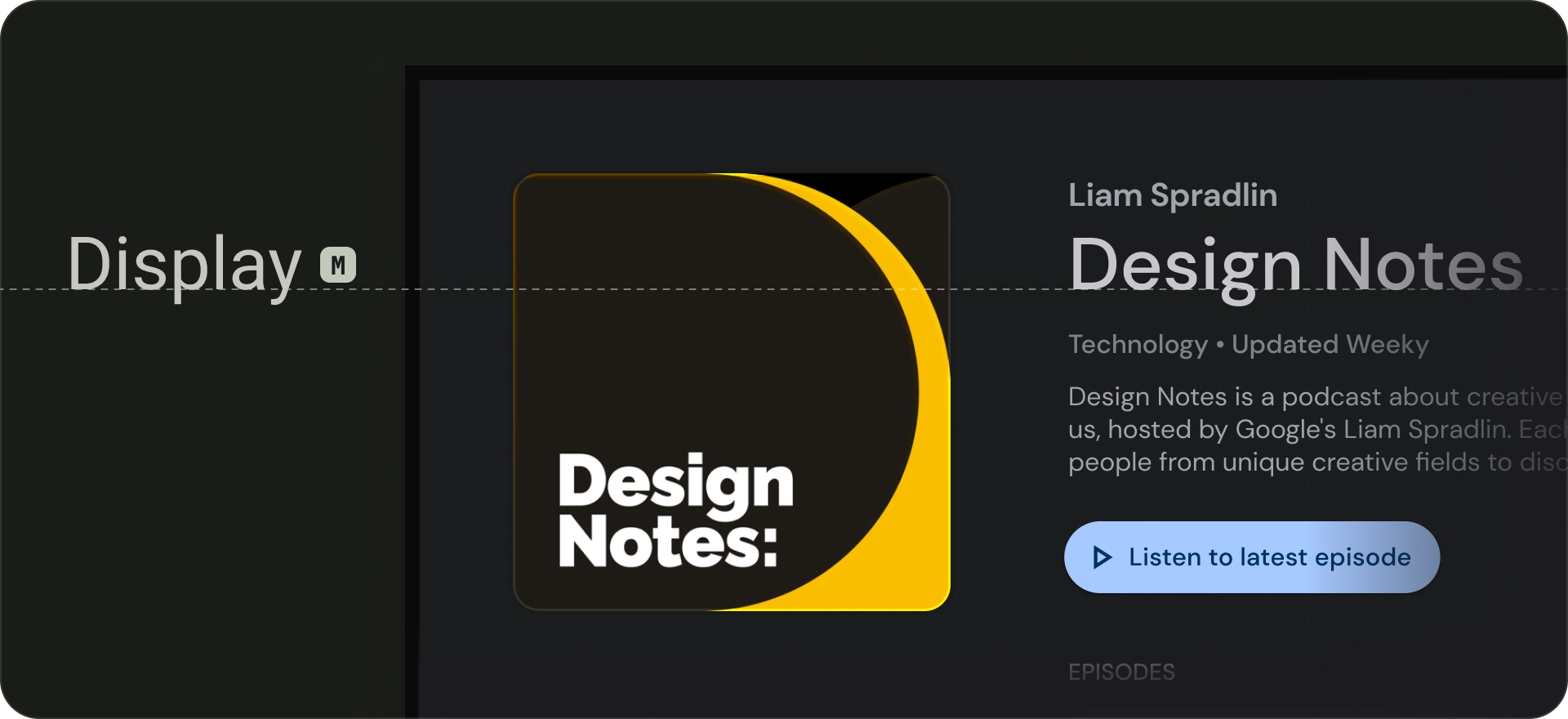
디스플레이
기본 서체 배율에는 대형, 중형, 소형의 세 가지 디스플레이 스타일이 있습니다. 화면에서 가장 큰 텍스트인 대형 디스플레이 스타일은 짧고 중요한 텍스트 문구 또는 숫자용으로 예약됩니다. 화면의 기본 제목으로 사용할 수 있습니다. 섹션 또는 클러스터 제목에 큰 표시 스타일을 사용하지 마세요.
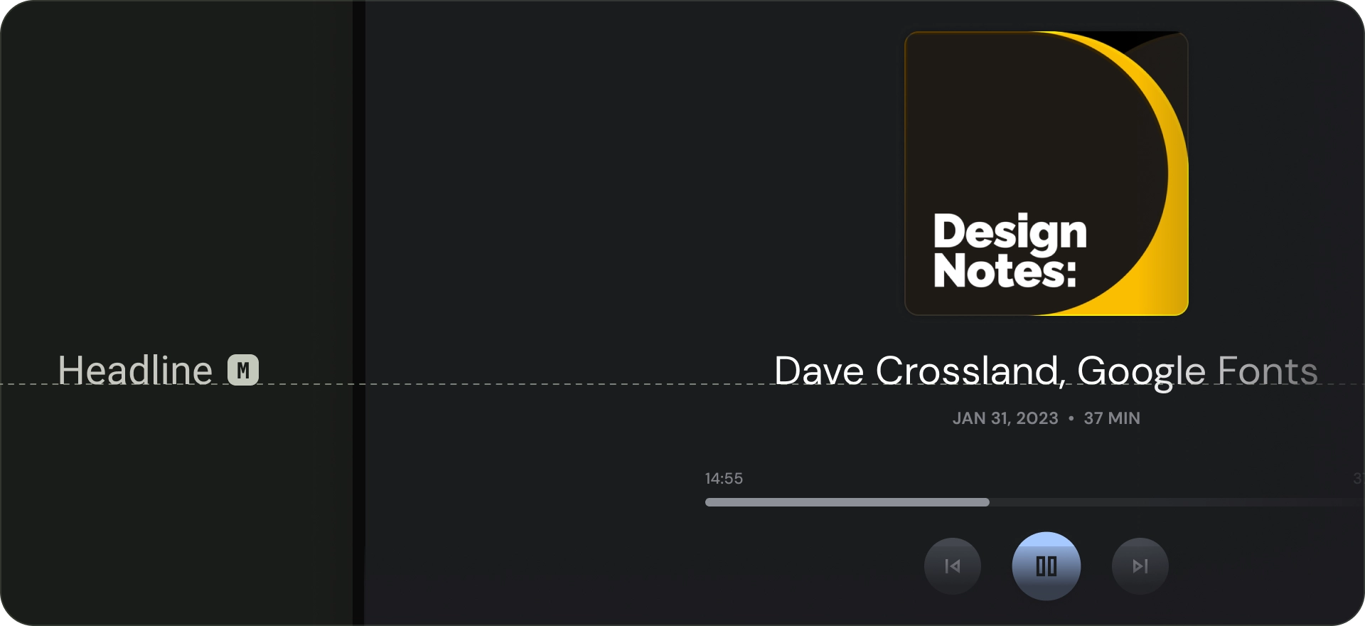
Headline
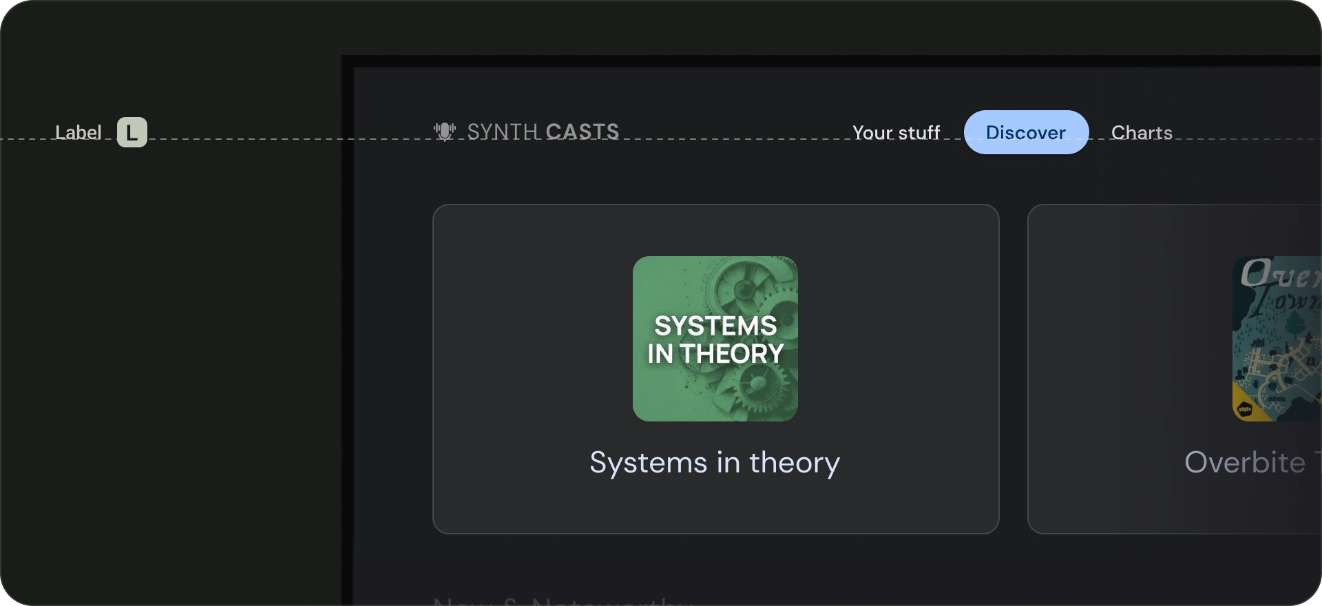
헤드라인은 강조되는 내용의 짧은 텍스트에 적합합니다. 이러한 스타일은 텍스트의 주요 구절이나 콘텐츠의 중요한 영역을 표시하는 데 적합합니다. 추천 캐러셀 및 몰입형 클러스터의 제목에 사용됩니다. 적절한 줄 높이와 문자 간격을 사용하면 가독성을 유지하는 데 도움이 되는 경우 헤드라인에서 생생한 서체를 사용할 수도 있습니다.
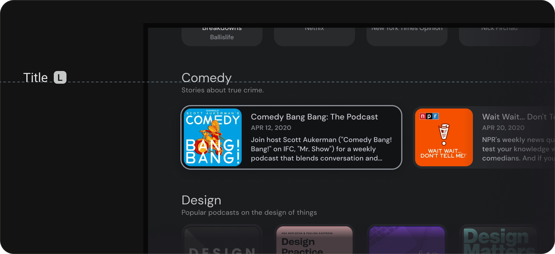
제목
제목 스타일은 제목 스타일보다 작습니다. 제목은 짧고 중간 강조의 텍스트에 사용하세요. 예를 들어 제목을 사용하여 텍스트의 보조 문구 또는 콘텐츠의 보조 부분을 나누는 것이 좋습니다.
카드나 목록과 같은 UI 요소에 제목을 사용합니다. 제목 크기는 작지만 유용한 수준의 가시도와 가독성을 제공합니다.
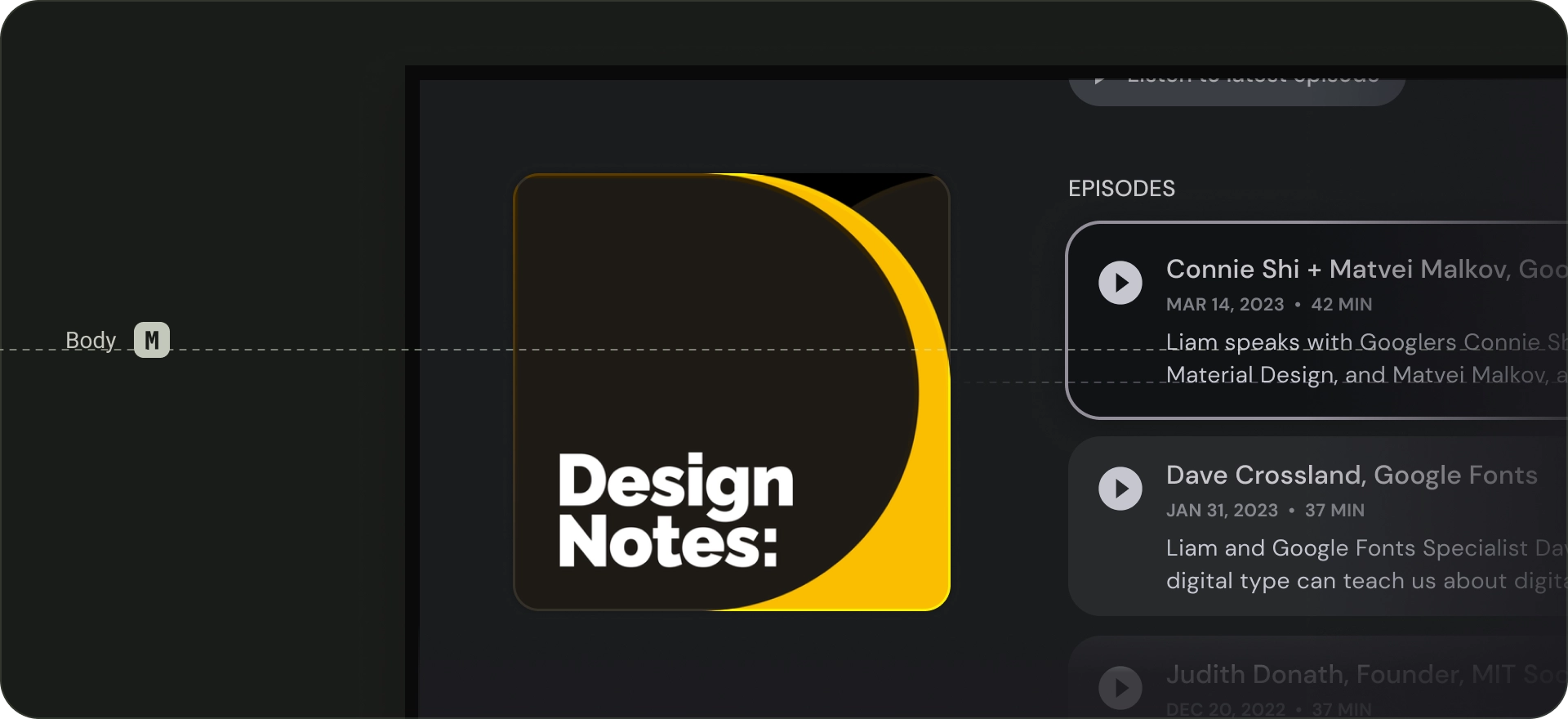
본문
본문 스타일은 앱에서 긴 텍스트 문구에 사용됩니다. 작은 크기에서도 읽을 수 있고 긴 문구에서도 편안하게 읽을 수 있는 서체를 사용하세요. 본문 텍스트에 장식용 글꼴은 멀리서 읽기 어려울 수 있으므로 피합니다.
라벨
라벨 스타일은 구성요소 내부의 텍스트 또는 콘텐츠 본문의 매우 작은 텍스트(예: 캡션)에 사용되는 작고 실용적인 스타일입니다. 예를 들어 버튼에는 큰 라벨 스타일을 사용합니다.