목록
컬렉션을 사용해 정리하기
내 환경설정을 기준으로 콘텐츠를 저장하고 분류하세요.
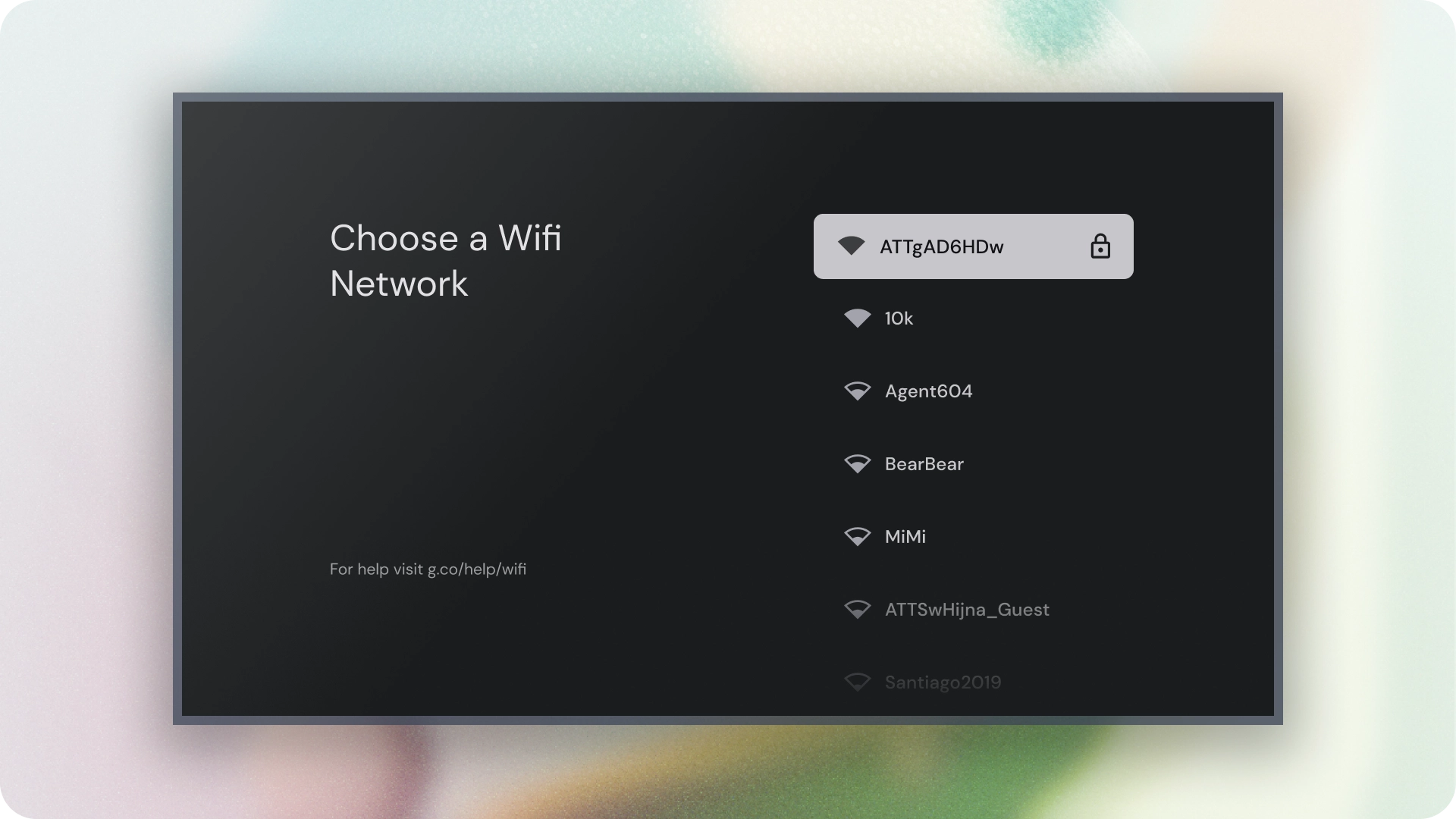
목록은 하나 이상의 관련 항목을 시각적으로 나타낸 것입니다.
옵션 모음을 표시하는 데 일반적으로 사용됩니다.

리소스
하이라이트
- 목록은 텍스트 또는 이미지의 연속된 모음입니다.
- 목록은 자연스러워야 하며 한눈에 파악할 수 있어야 합니다.
- 목록은 아이콘과 텍스트로 표시되는 기본 작업과 보조 작업이 포함된 항목으로 구성됩니다.
변형
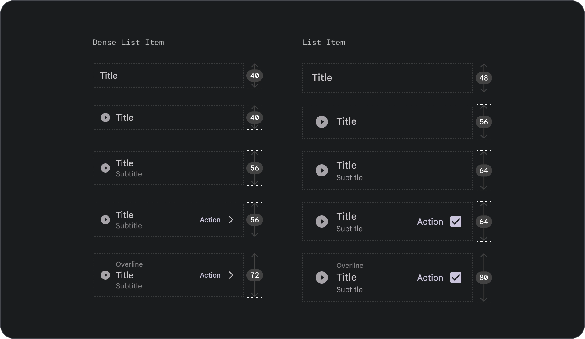
목록에는 한 줄 목록, 두 줄 목록, 세 줄 목록의 세 가지 유형이 있습니다.

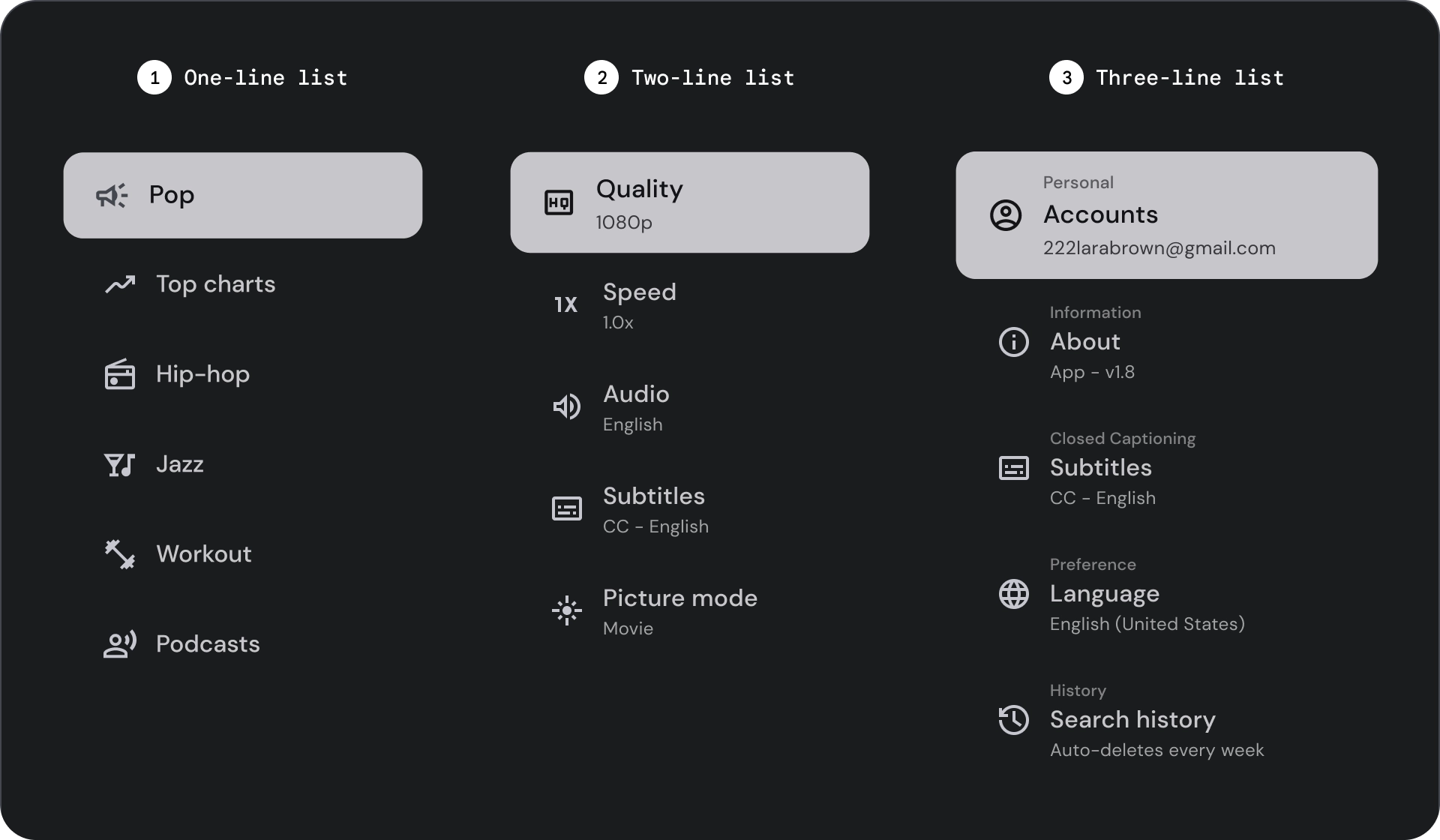
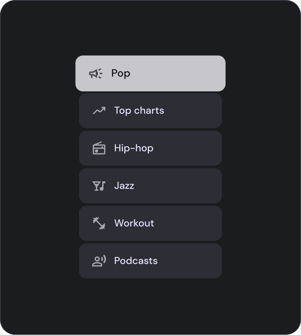
- 한 줄 목록: 각 항목을 전달하는 한 줄입니다. 이 간단한 디자인을 사용하면 각 항목을 다른 항목과 명확하게 구분할 수 있습니다.
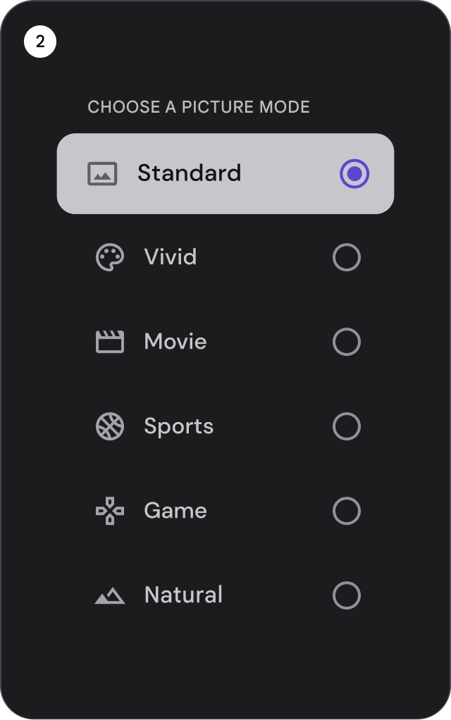
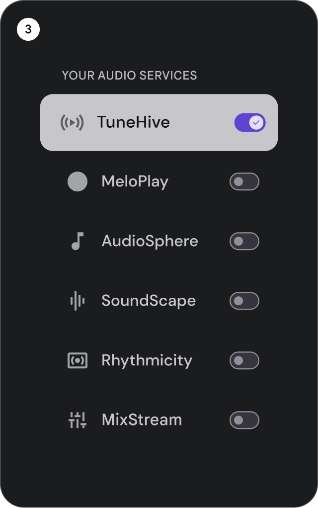
- 2줄 목록: 두 개의 평행선을 사용하여 각 항목을 전달합니다.
이러한 구조화된 디자인은 자연스러운 가독성을 보장하고 인지 부하를 방지합니다.
- 3줄 목록: 세 개의 평행선을 사용하여 각 항목을 나타냅니다.
이 장식용 디자인은 시각적으로 눈에 띄게 합니다.
분석

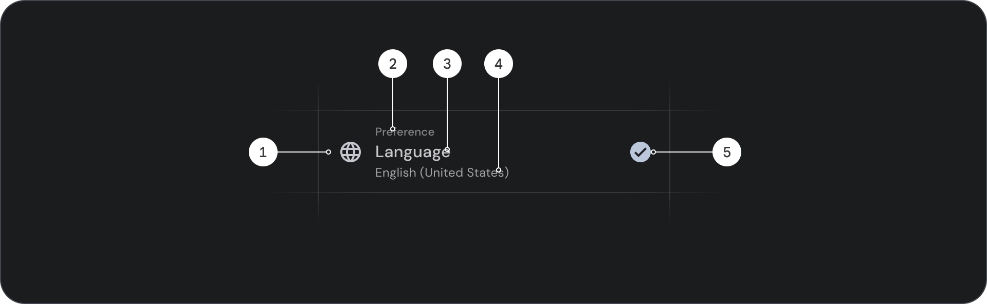
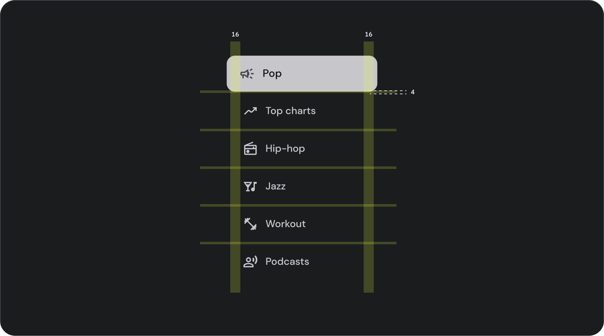
- 아이콘: 특정 객체나 작업을 나타내는 작은 그래픽으로, 아이디어나 개념을 시각적으로 전달하는 데 자주 사용됩니다.
- 오버라인: 제목이나 부제목 위에 표시되는 짧은 텍스트 줄로, 추가 맥락이나 강조를 제공하는 데 자주 사용됩니다.
- 제목: 디자인 요소 또는 페이지의 기본 제목 역할을 하는 굵은 대형 텍스트 줄입니다.
- 부제목: 기본 제목 아래에 추가 정보나 맥락을 제공하는 더 작은 텍스트 줄입니다.
- 컨트롤: 사용자가 결정을 입력할 수 있는 양방향 요소입니다.
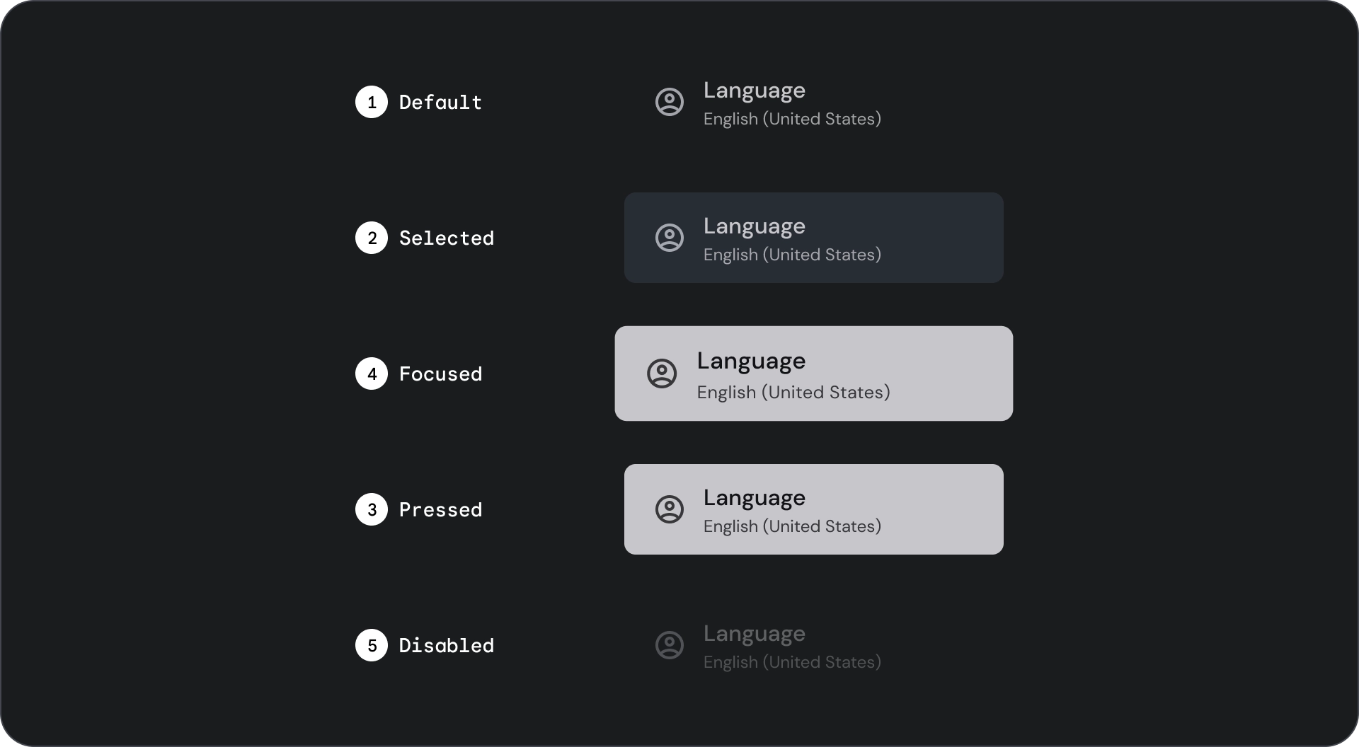
상태

사양


사용
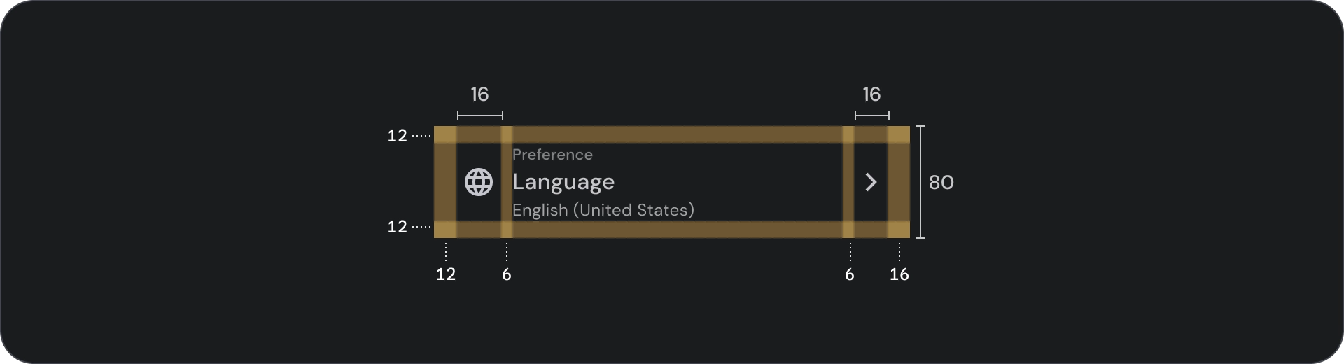
목록은 텍스트와 이미지의 그룹으로 세로로 정렬됩니다.
읽기 이해에 최적화된 목록은 항목의 연속된 단일 열로 구성됩니다.
목록 항목에는 아이콘과 텍스트로 표시되는 기본 작업과 보조 작업이 포함될 수 있습니다.
check_circle
권장사항
목록 항목은 버튼이 아닙니다. 항목에 컨테이너가 없습니다. 목록 항목은 기본적으로 선택되지 않고 포커스가 설정되지 않습니다.
warning
주의
목록 항목에는 필요한 경우에만 컨테이너 배경을 사용합니다.
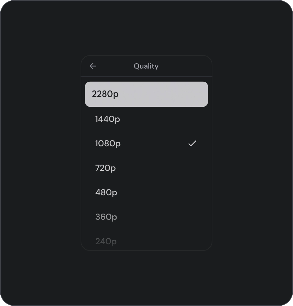
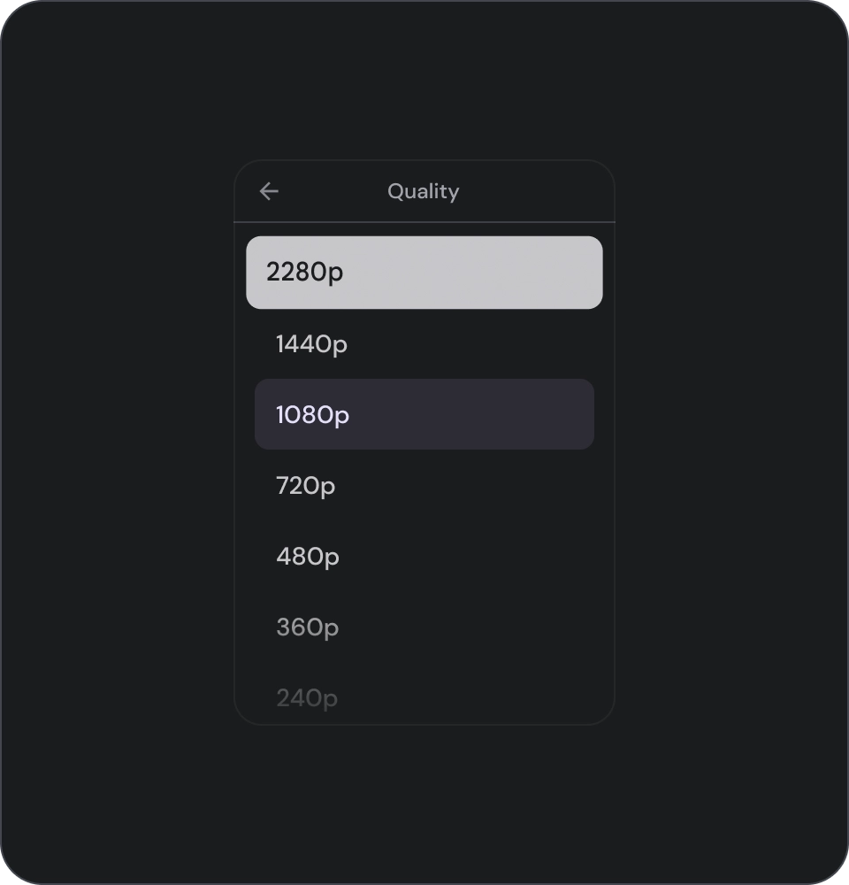
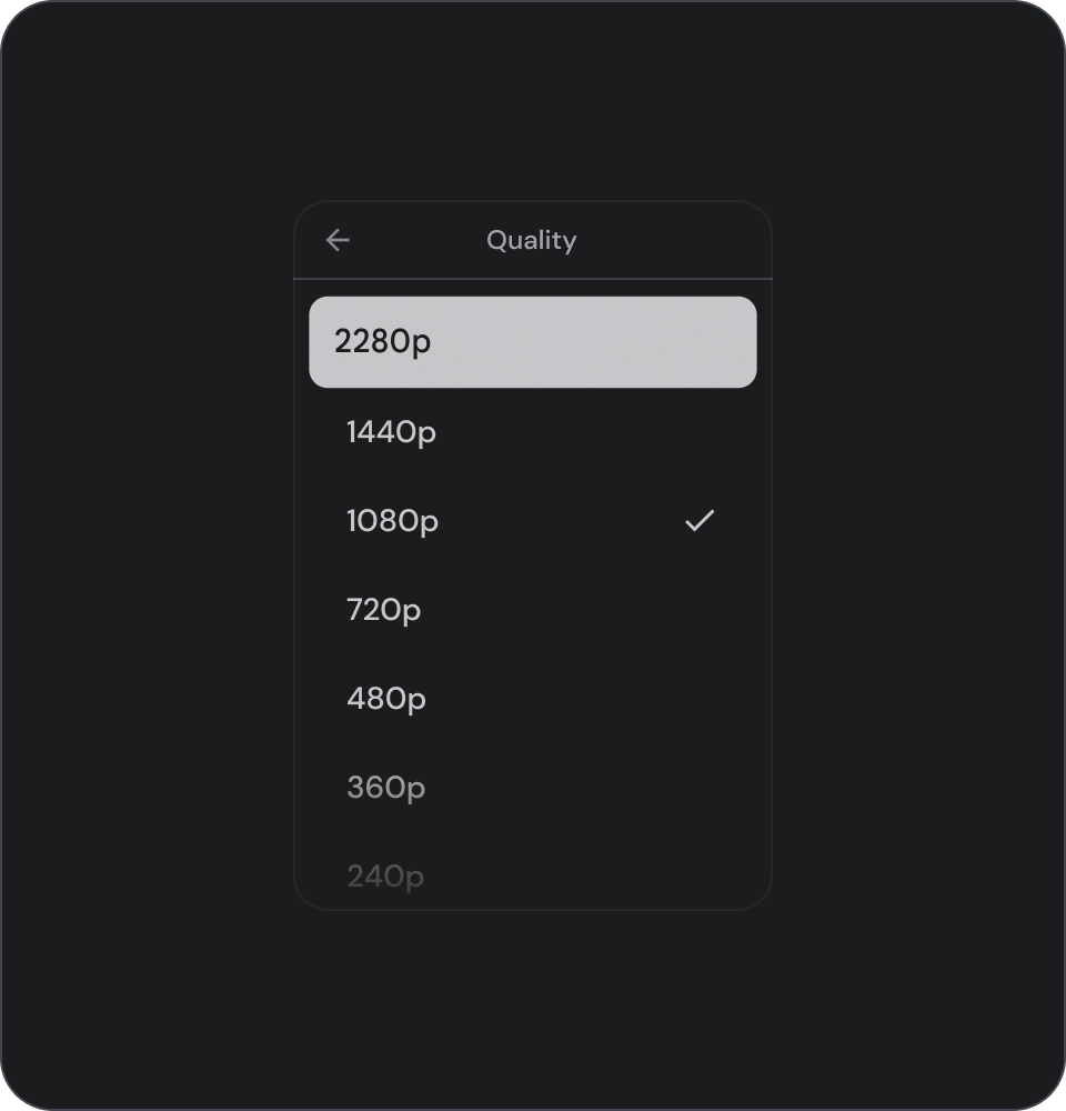
선택 컨트롤
컨트롤은 목록 항목의 정보와 작업을 표시합니다. 목록 항목의 앞쪽 또는 뒤쪽 가장자리에 정렬할 수 있습니다.
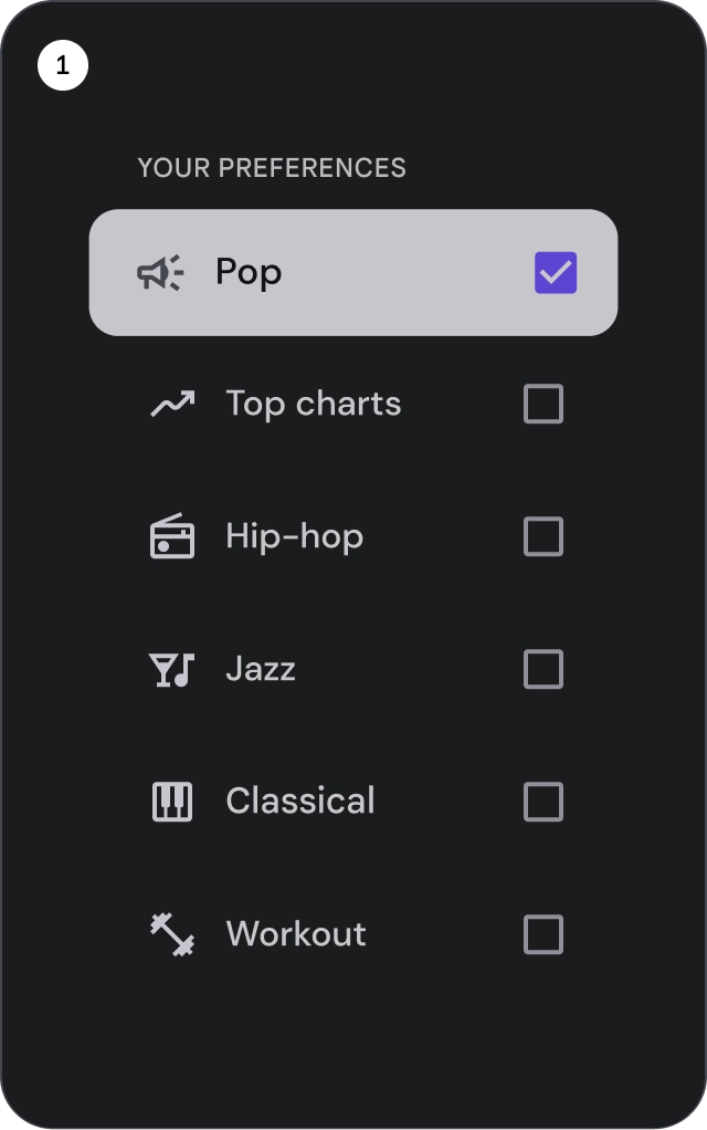
- 체크박스: 목록 항목을 하나 이상 선택합니다.
- 라디오 버튼: 목록에서 항목을 하나만 선택합니다.
- 스위치: 컨트롤을 켜거나 끕니다.
check_circle
권장사항
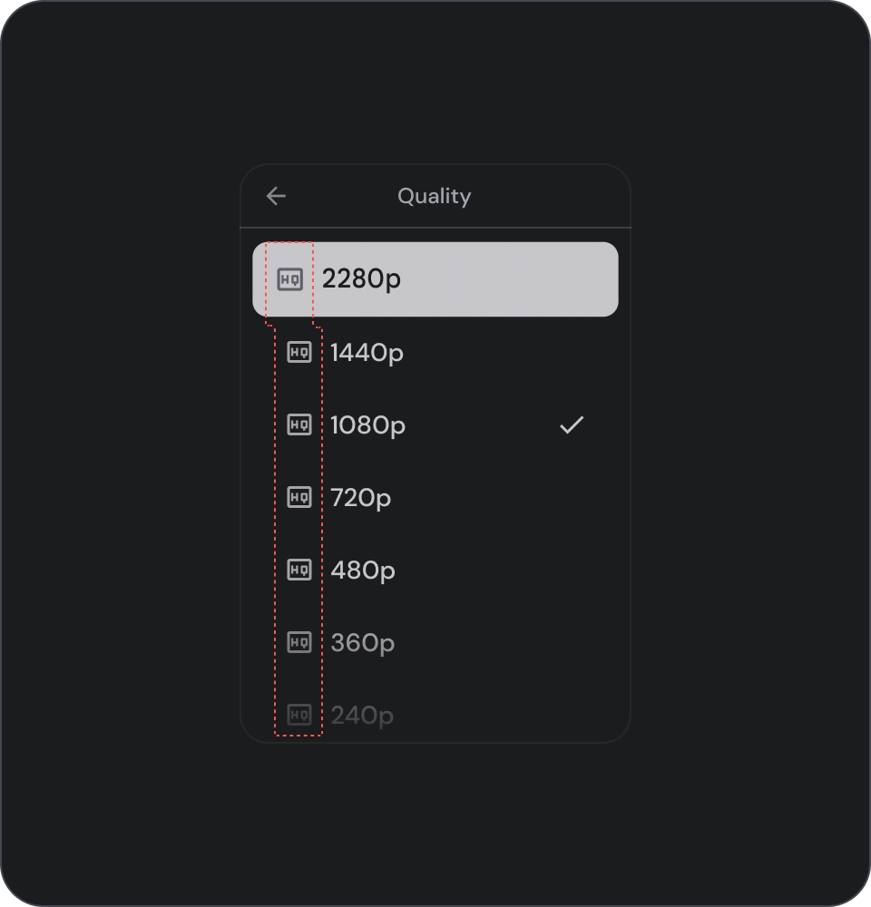
아이콘 선택 표시기는 목록에서 선택한 항목을 명확하게 표시하는 데 사용합니다. 이렇게 하면 사용자가 선택한 항목을 쉽게 식별하고 전반적인 사용자 환경을 개선할 수 있습니다.
cancel
금지사항
목록에서 선택을 나타내는 데 배경 색상만 사용하지 마세요.
cancel
금지사항
목록 항목 내에 버튼을 배치하면 현재 포커스가 있는 요소에 대한 혼란이 야기될 수 있으므로 주의하세요.
아이콘
check_circle
권장사항
목록에 동일한 유형의 콘텐츠를 표시하는 경우 아이콘을 생략하여 시각적 노이즈를 줄이고 사용자 환경을 개선하세요. 목록에서 아이콘이 목적을 달성하지 못하거나 추가 정보를 제공하지 않는 경우에는 아이콘을 사용하지 마세요.
cancel
금지사항
목록의 모든 항목에 동일한 아이콘을 사용하지 마세요. 이렇게 하면 시각적으로 사용자에게 부담을 주고 혼란을 줄 수 있습니다. 대신 아이콘이 가치를 더하거나 추가 정보를 제공하는 경우에만 사용하세요.
아바타 및 이미지
목록 항목에는 사람 또는 항목을 나타내는 원형 자르기 이미지가 포함될 수 있습니다.

이 페이지에 나와 있는 콘텐츠와 코드 샘플에는 콘텐츠 라이선스에서 설명하는 라이선스가 적용됩니다. 자바 및 OpenJDK는 Oracle 및 Oracle 계열사의 상표 또는 등록 상표입니다.
최종 업데이트: 2025-07-27(UTC)
[[["이해하기 쉬움","easyToUnderstand","thumb-up"],["문제가 해결됨","solvedMyProblem","thumb-up"],["기타","otherUp","thumb-up"]],[["필요한 정보가 없음","missingTheInformationINeed","thumb-down"],["너무 복잡함/단계 수가 너무 많음","tooComplicatedTooManySteps","thumb-down"],["오래됨","outOfDate","thumb-down"],["번역 문제","translationIssue","thumb-down"],["샘플/코드 문제","samplesCodeIssue","thumb-down"],["기타","otherDown","thumb-down"]],["최종 업데이트: 2025-07-27(UTC)"],[],[],null,["# Lists are a visual representation of one or more related items.\nThey are commonly used to display a collection of options.\n\nResources\n---------\n\n| Type | Link | Status |\n|----------------|----------------------------------------------------------------------------------------------------------------------------------------------------------------------------------------------------------------------------------------------------------------------------------------------------------------------------------------------------------------------------------------------------------------------------------------------------------------------------------------------------------------------------------------------------------|-----------|\n| Design | [Design source (Figma)](https://goo.gle/tv-desing-kit) | Available |\n| Implementation | [Jetpack Compose](/reference/kotlin/androidx/tv/material3/package-summary#ListItem(kotlin.Boolean,kotlin.Function0,kotlin.Function0,androidx.compose.ui.Modifier,kotlin.Boolean,kotlin.Function0,kotlin.Function0,kotlin.Function0,kotlin.Function1,kotlin.Function0,androidx.compose.ui.unit.Dp,androidx.tv.material3.ListItemShape,androidx.tv.material3.ListItemColors,androidx.tv.material3.ListItemScale,androidx.tv.material3.ListItemBorder,androidx.tv.material3.ListItemGlow,androidx.compose.foundation.interaction.MutableInteractionSource)) | Available |\n\nHighlights\n----------\n\n- Lists are a continuous collection of text or images.\n- Lists should feel natural and be scannable.\n- Lists are made up of items containing primary and supplemental actions represented by icons and text.\n\nVariants\n--------\n\nThere are three types of lists: one-line list, two-line list, and\nthree-line list.\n\n1. **One-line list**: A single line to communicate each item. This simple design ensures each item is clearly distinct from the other.\n2. **Two-line list**: Uses two parallel lines to communicate each item. This structured design ensures natural readability and avoids cognitive overload.\n3. **Three-line list**: Uses three parallel lines to represent each item. This decorative design creates a high level of visual prominence.\n\nAnatomy\n-------\n\n1. **Icon**: A small graphic that represents a specific object or action, often used to visually communicate an idea or concept.\n2. **Overline**: A short line of text that appears above title or subtitle, often used to provide additional context or emphasis.\n3. **Title**: A large, bold line of text that serves as the main heading of a design element or page.\n4. **Subtitle**: A smaller line of text that provides additional information or context below a main title.\n5. **Control**: An interactive element that allows the user to input a decision.\n\nStates\n------\n\nSpec\n----\n\nUsage\n-----\n\nLists are vertically organized groups of text and images.\nOptimized for reading comprehension, a list consists of a single\ncontinuous column of items.\nList items can contain primary and supplemental actions represented\nby icons and text. \ncheck_circle\n\n### Do\n\nList items are not buttons. The items don't have containers. List items are, by default, unselected and unfocused. \nwarning\n\n### Caution\n\nUse container background for list items only when necessary.\n\n### Selection controls\n\nControls display information and actions for list items. They can be aligned\nto the leading or trailing edge of the list item.\n\n\n\u003cbr /\u003e\n\n1. **Checkboxes**: Select one or more list items.\n2. **Radio buttons**: Select exactly one item in the list.\n3. **Switches**: Toggle a control on or off.\n\ncheck_circle\n\n### Do\n\nUse an icon selection indicator to clearly show the selected item in a list. This will help users easily identify which item they have selected and improve the overall user experience. \ncancel\n\n### Don't\n\nAvoid relying solely on the background color to indicate selection in a list. \ncancel\n\n### Don't\n\nAvoid placing buttons inside a list item as it can cause confusion about which element is currently in focus.\n\n### Icons\n\ncheck_circle\n\n### Do\n\nIf you're showing the same type of content in the list, omit icons to reduce visual noise and improve the user experience. Avoid using icons in a list when they serve no purpose and don't provide additional information. \ncancel\n\n### Don't\n\nAvoid using the same icon for all items in a list. This can be visually overwhelming and confusing for users. Instead, use icons only when they add value or provide additional information.\n\n### Avatars and images\n\nList items can include images in a circular crop to represent a\nperson or entity."]]