위젯을 효과적으로 스타일링하는 것은 시각적으로 매력적이고 일관된 사용자 환경을 구현하는 데 매우 중요합니다. 이 섹션에서는 가장 유용하고 매력적인 Android 위젯을 만들기 위해 색상과 서체를 정의하는 주요 개념과 기법을 자세히 알아봅니다.
색상
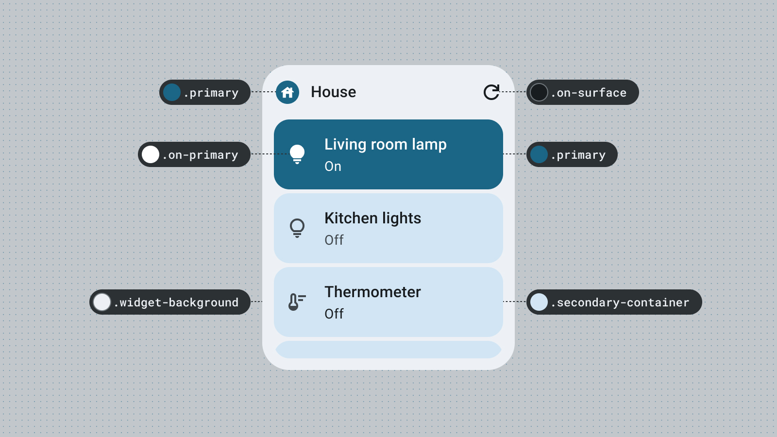
색상을 사용하여 스타일을 표현하고 의미를 전달합니다. 위젯 색상에 적절한 색상을 설정하는 것은 가독성, 맞춤설정, 앱의 브랜드 정체성 표현에 매우 중요합니다.
Material 색상 역할과 토큰을 사용하여 접근성 대비 가이드라인을 충족하고 사용자 생성 색상, 어두운 테마 또는 밝은 테마와 같은 동적 색상 기능을 지원합니다.
강조 역할을 통해 시각적 계층 구조를 탐색하여 요소에 생생한 대비를 만들거나 브랜드에 어울리는 더 재미있는 맞춤 테마를 탐색하세요.
색상 역할에 관해 자세히 알아보려면 Material Design 색상 안내를 참고하세요.
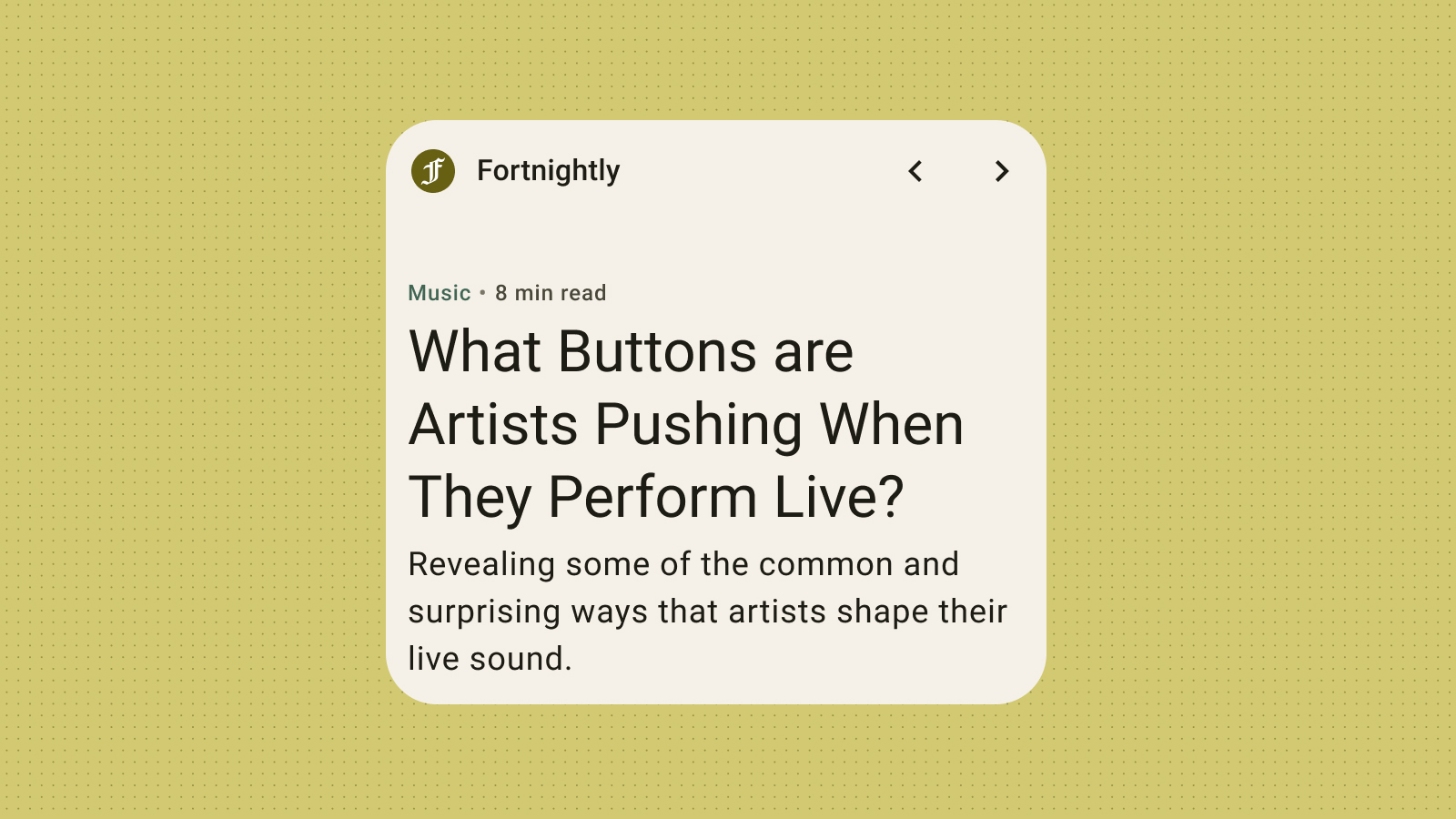
도형
위젯의 모양은 위젯의 분위기를 설정합니다. 직사각형 위젯의 경우 시스템 모서리 반경 속성을 사용합니다. 이 속성은 여러 기기에서 일관성을 유지하고 위젯 콘텐츠가 잘리는 것을 방지하는 데 도움이 됩니다.
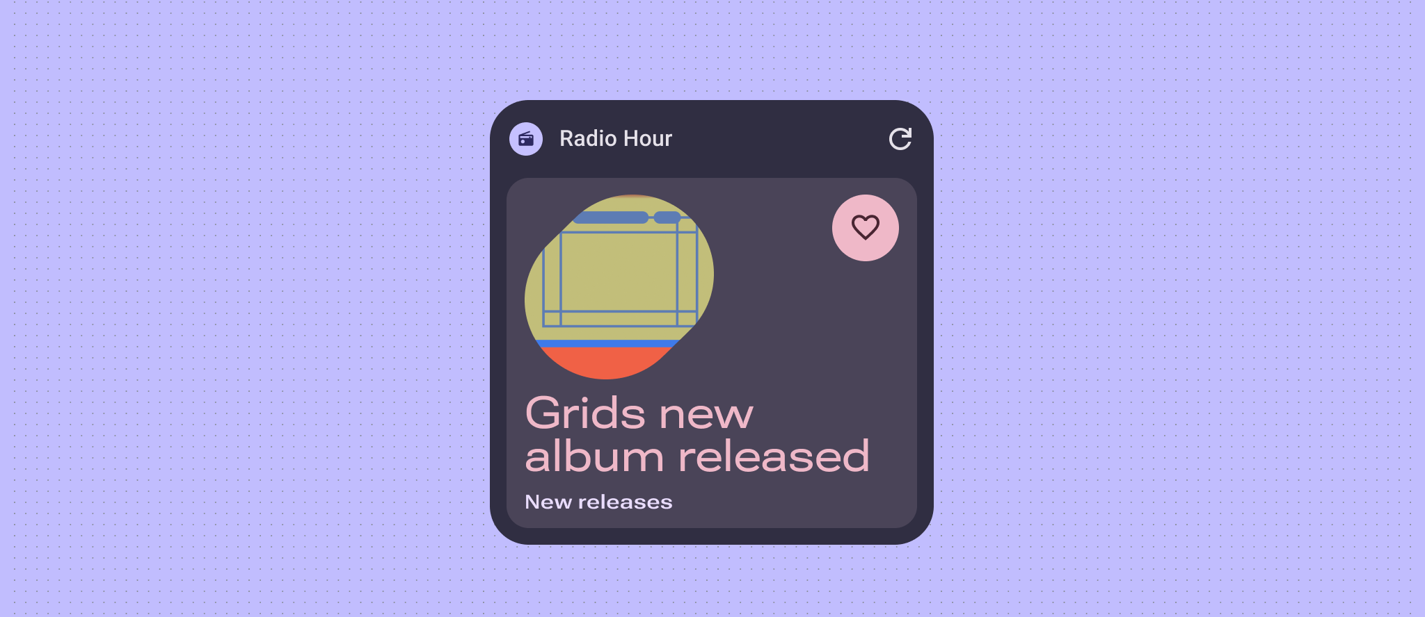
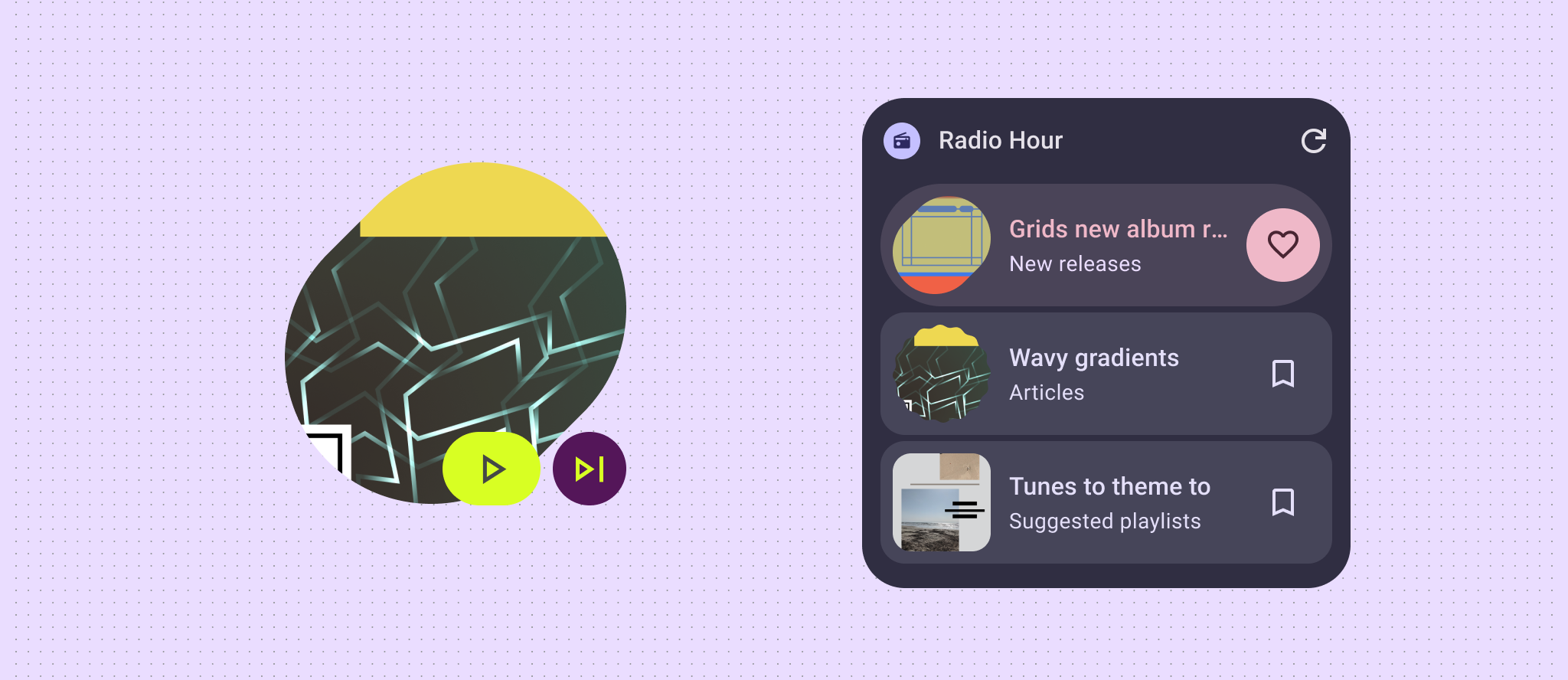
위젯에 사진, 날씨, 현재 재생 중인 노래와 같은 최소한의 데이터 콘텐츠가 표시되는 경우 위젯 전체를 표현력이 풍부한 모양으로 만들어 사용자 홈 화면에 흥미로운 에너지를 불어넣어 보세요. 레이아웃과 데이터가 더 복잡한 경우 시각적 계층 구조를 위해 표현력이 풍부한 도형을 사용하거나 새 콘텐츠 또는 클릭 유도 문구를 강조하는 것이 좋습니다.
자세한 내용은 둥근 모서리 구현을 참고하세요.
동적 테마
Android 12부터 위젯은 버튼과 배경, 기타 구성요소에 기기 테마 색상을 사용할 수 있습니다. 이를 통해 다양한 위젯, 홈 화면 아이콘, 배경화면에서 시각적 일관성을 제공하여 Android 사용자에게 더 응집력 있는 사용자 환경을 제공합니다. 제공된 색상 토큰을 사용하면 다양한 기기 제조업체에서 제공하는 기기 테마와 사용자가 설정한 동적 테마에서 위젯이 통합된 것처럼 보입니다.
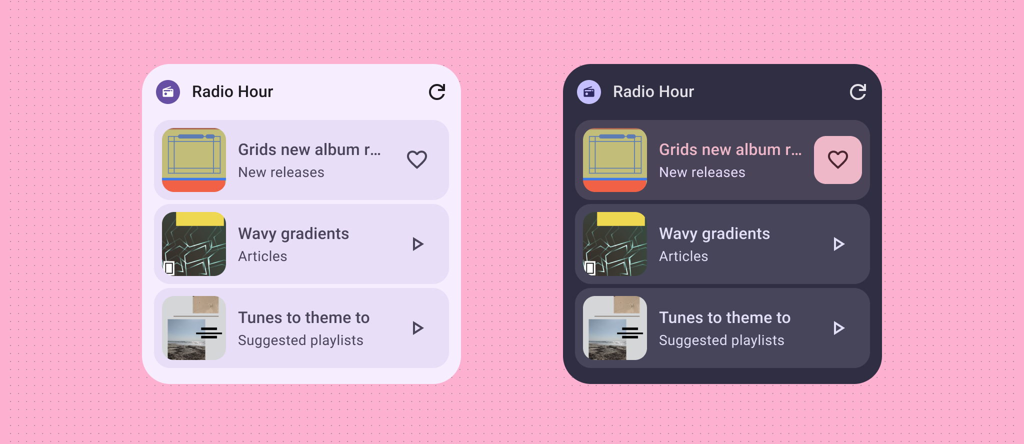
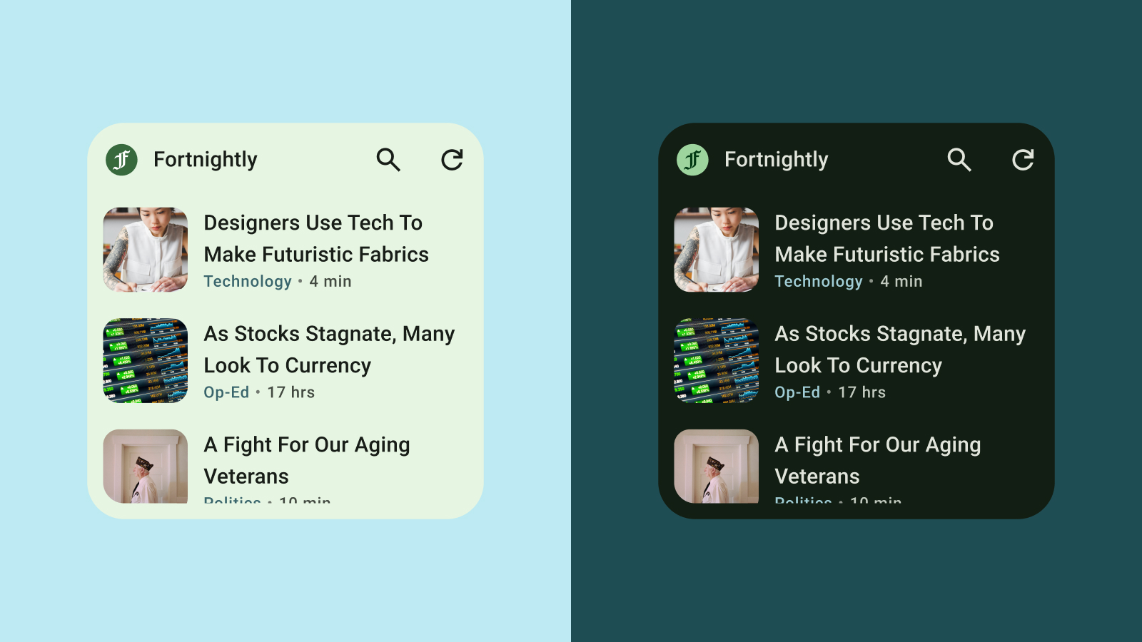
밝은 테마 및 어두운 테마
어두운 테마는 주로 어두운 노출 영역 색상을 표시하는 기기 UI의 어두운 버전입니다. 배터리 수명과 눈의 편안함을 위해 어두운 테마로 전환하는 사용자가 늘고 있습니다. 위젯이 어두운 테마에 적응하지 않으면 어색해 보이고 사용자에게 불편을 줄 수 있습니다.
서체
타이포그래피는 글을 읽기 쉽고 아름답게 만드는 데 도움이 됩니다. 글꼴 크기와 가중치를 활용하여 명확한 계층 구조를 설정하고 사용자의 시선을 가장 중요한 요소로 유도합니다. 특히 위젯의 제한된 공간 내에서 작은 텍스트를 표시할 때는 가독성을 높이기 위해 줄 간격과 글자 간격 (커닝)에 주의하세요.
계층 구조
계층 구조는 글꼴 두께, 크기, 행 높이, 문자 간격의 차이를 통해 커뮤니케이션됩니다. 업데이트된 서체 스케일은 텍스트 스타일을 용도를 설명하는 이름이 지정된 5가지 역할로 구분합니다. 텍스트 스타일은 디스플레이, 헤드라인, 제목, 부제목, 본문의 5가지입니다. 새로운 역할은 기기 제약이 없기 때문에 다양한 사용 사례에 손쉽게 적용할 수 있습니다.
위젯은 시스템 글꼴을 사용하지만 극적인 타입 스케일로 표현력 있는 세부정보를 추가할 수 있습니다. 제목, 라벨, 데이터로 더 대담해지세요.