人人皆宜的财富钥匙 | Futubull 提供无障碍用户体验
使用集合让一切井井有条
根据您的偏好保存内容并对其进行分类。
许多财富管理应用用户认为理所当然的标准配色方案是色盲用户和色盲用户和有色觉障碍的用户。Futubull 团队通过进行切实的改进来满足用户的需求,让每个人都可以掌握财富之门。
Futubull 通过提供丰富多样的投资信息/分析/决策服务,提供免费的培训内容,以及充满活力的财富管理聊天社区,为全球超过 1900 万用户打造了更好的交易体验。Futubull 应用目前兼容 Android、iOS、Windows、Mac、平板电脑(iPadOS 和 ChromeOS)、网络浏览器和腾讯客户且提供全方位的无障碍 API。
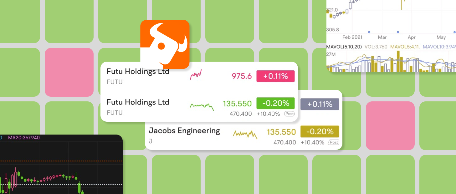
红绿配色方案(或红绿配色方案)是投资应用中最常见的配色方案,在这类方案中,投资的每次上涨和下跌对用户来说都是一件大事。但是,由于红绿盲/色盲,主要是在深陷投资管理方面难以辨别的投资者在深层努力中,将投资者在深层投资中费力、难以辨别。
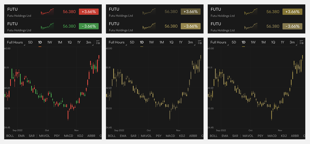
△ 视力正常用户(左)、红色盲用户(中间)和绿色盲用户(右)看到的红色、向上、绿色和向下的配色方案
不同的红色和绿色阴影
Futubull 应用中使用的红色和绿色调色板最初是为色觉正常的用户设计的,因此有色觉障碍的用户在使用该应用时需要耗费大量的额外精力,例如通过解析符号或数据来识别价格上调和下调的变动。这样的配色方案对这些用户来说非常不便。
由于幸存者偏差,红绿色盲人群所占的比例可能高于许多人意识到的。根据统计数据,约有 5%–8% 的男性和 0.5% 的女性有色觉缺陷(即色盲)。考虑到 Futubull 庞大的用户群(1,900 万人),这一比例并不是很小的比例。
我们始终重视用户的反馈,并通过各种渠道了解到,有些人因色觉障碍而遇到问题。- Garit,Futubull 应用用户体验总监
在设计方便易用的配色方案时,该团队使用 Google 的无障碍功能扫描仪应用对现有应用进行了评估。该应用可以记录页面,捕捉界面的每个元素,并提供改进建议(例如字体大小、触摸目标大小、色彩对比度等)。这些意见和建议对我们的团队有极大的帮助。
- 无障碍功能扫描仪
https://developer.android.google.cn/guide/topics/ui/accessibility/testing#accessibility-scanner
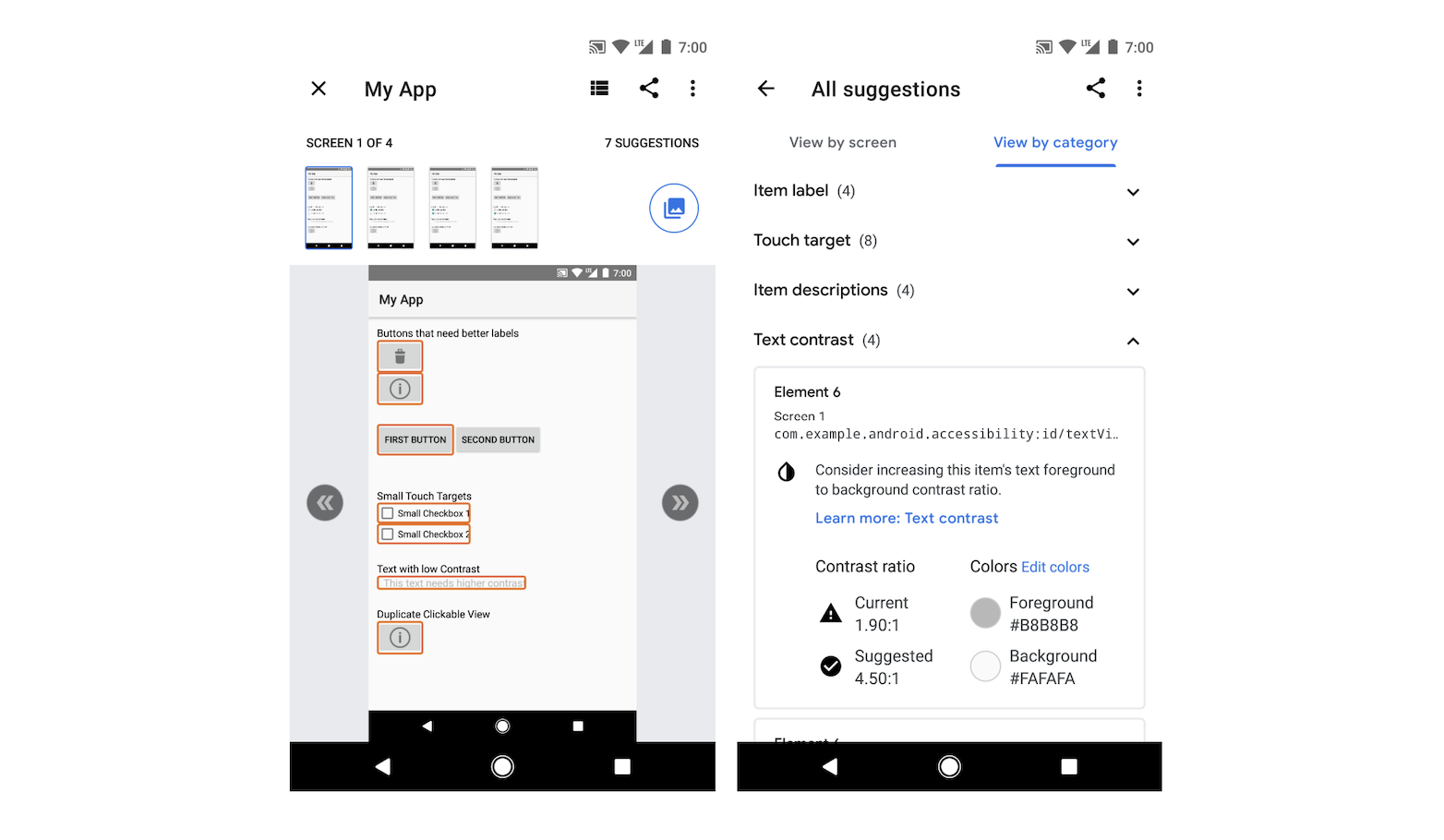
△ 无障碍功能扫描仪会针对每个控件/元素提供无障碍功能优化建议,可为开发者提供很好的参考
在最终确定无障碍调色板的过程中,该团队还对有色觉障碍的用户进行了问卷调查,这些用户通过官方渠道联系,并请他们测试易用的配色方案,然后针对他们的使用体验提供详细反馈,并提出优化建议。根据这些反馈,团队制定了整体改进计划。
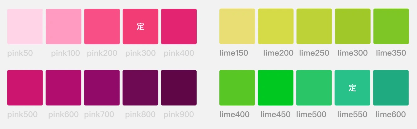
新的粉绿色方案保留了相同的双色调系统,同时严格遵守无障碍功能扫描仪针对正常视力、红色盲和绿色盲的用户提供的
色彩对比度建议 ,因此将视力正常的用户和红绿色盲用户的视觉体验都考虑在内。
- Material Design:颜色和对比度
https://m3.material.io/foundations/accessibility-design/overview
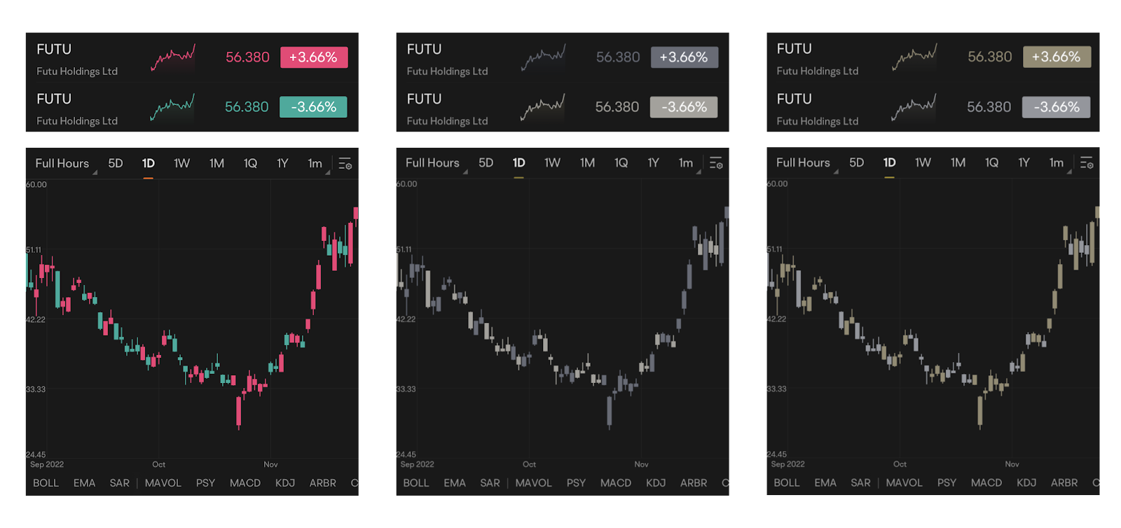
△(左):色觉正常的用户(左)、有红色盲的用户(中间)和绿色盲用户(右)看到的粉绿色配色方案
无障碍体验需要团队努力
我们团队目前拥有超过 1,000 人,其中包括色盲。打造无障碍体验不仅是为用户服务,也是为我们自己提供帮助。
- Zed, Futubull Android 研发工程师
在确定新的可供访问的调色板后,在新功能发布之前,该团队与内部产品和研发团队一起进行了一系列内部测试。通过整理团队成员的评估、自测,以及测试工程师的帮助,该团队确保了新的调色板可以满足更广大的色觉缺陷用户的体验。1
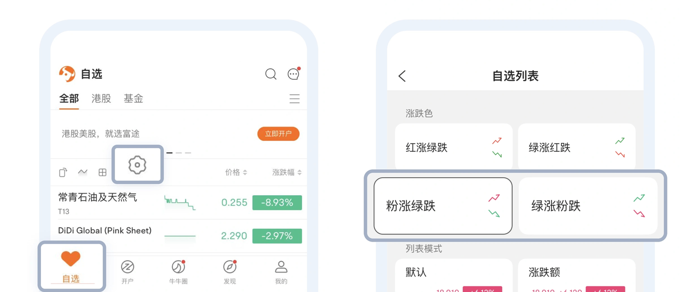
△ 切换配色方案也非常简单。只需点按应用首页上的“观看列表设置”图标即可
但这只是 Futubull 产品无障碍功能改进计划的一部分。
超越红绿光谱的又一步
Futubull 的产品研发理念是让投资变得更加轻松,而不是孤军奋战。这个目标适用于所有用户。
- Garit,Futubull 应用用户体验总监
创建易于访问的调色板的过程也让该团队对具有不同视觉能力的用户的感同身受。因此,在设计了粉绿色配色方案来满足红绿色视觉缺陷/色盲用户的需求后,该团队继续开发了一种空心 K 线设计,这种设计既使用空心的 K 线图,又能使用颜色不一的纯色颜色,从而在视觉上和纯色之间形成颜色差异。
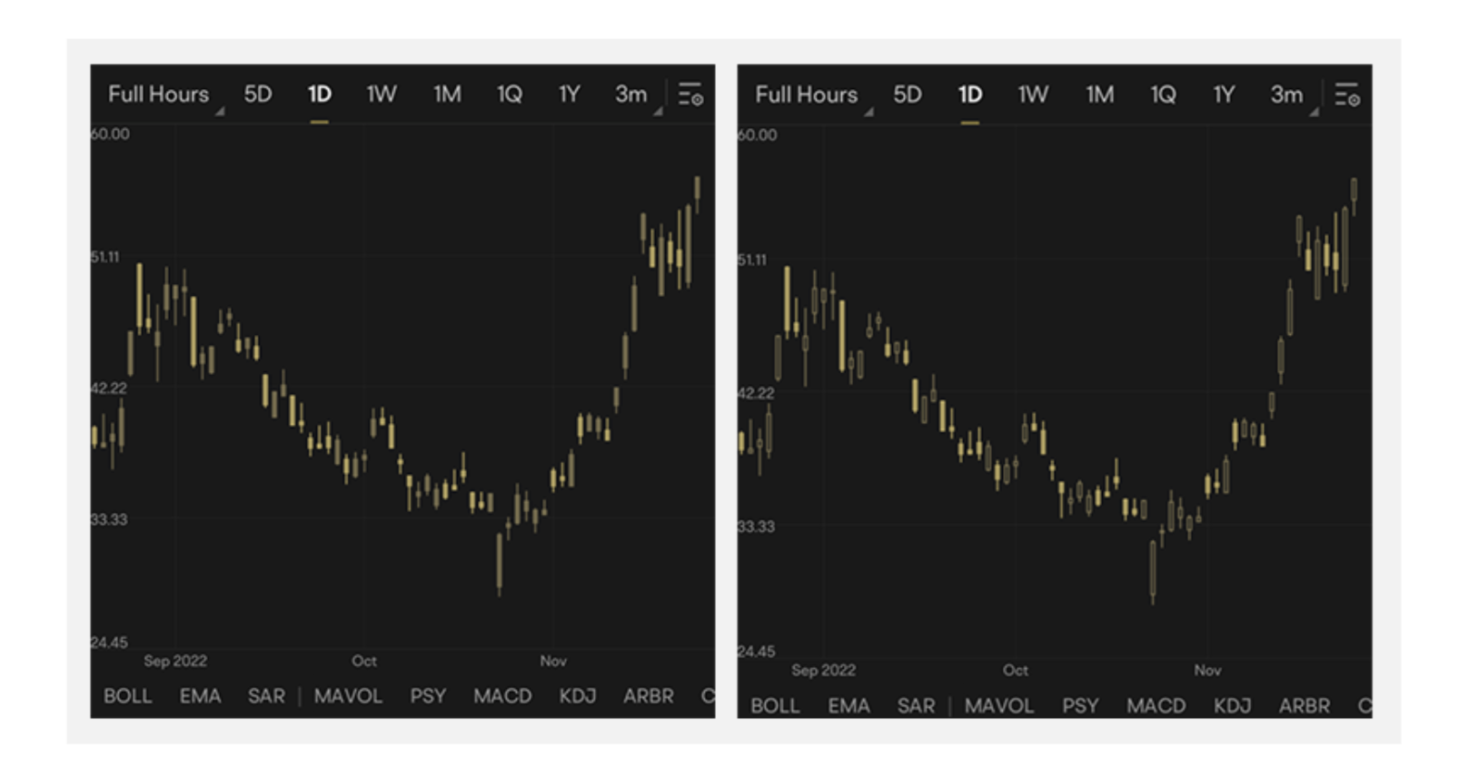
△ 纯色蜡烛(左侧)和空心蜡烛(右侧)。这两张屏幕截图都展示了显示屏在红色盲用户眼中的样子
对于因视力不佳而难以阅读文字的用户,该团队还提供了字体大小设置功能,让用户能够放大文字以方便阅读。如果用户需要对应用的特定部分/功能使用特定字体大小,该团队还特意提供了本地化调整选项。
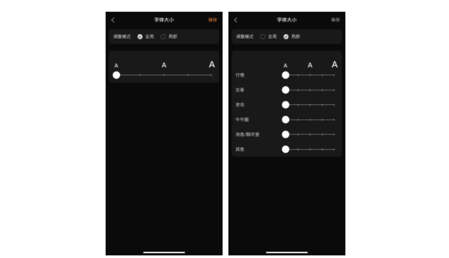
△ 还提供了用于调整字体大小的本地化和全局选项,用户可根据需要进行选择
我们的团队仍在不断详细了解无障碍功能。我们有一位专门负责跟进无障碍体验的产品经理,负责找出可能会阻碍良好用户体验的应用历程,然后协调他们的优化工作。
—— Garit, Futubull 应用用户体验总监
让每个人都获得财富
今年 6 月 16 日,Futubull 的全新无障碍调色板正式推出,让大家好评如潮。
毫无疑问,这增强了团队信心,让他们得以进一步改进产品的无障碍功能。例如,该团队计划将无障碍调色板从 Android 和 iOS 设备扩展到
网页浏览器和 PC 平台。我们正在为有视力障碍的用户开发文字转语音功能。实施这些无障碍功能后,更多用户就能够顺畅地使用 Futubull。
- 使用 Lighthouse 检查 Web 客户端无障碍功能体验
https://developer.chrome.com/docs/lighthouse/overview/
让投资变得更简单,不会孤军奋战。Futubull 团队通过切实行动为每位用户提供支持,让他们知道他们的需求将得到及时回应,以便他们能够用自己的双手掌握财富的关键。
我们也期待有更多开发者积极改进产品,打造更符合无障碍体验的体验,吸引更多用户,为取得更大的成功铺平道路。
本页面上的内容和代码示例受内容许可部分所述许可的限制。Java 和 OpenJDK 是 Oracle 和/或其关联公司的注册商标。
最后更新时间 (UTC):2023-01-11。
[[["易于理解","easyToUnderstand","thumb-up"],["解决了我的问题","solvedMyProblem","thumb-up"],["其他","otherUp","thumb-up"]],[["没有我需要的信息","missingTheInformationINeed","thumb-down"],["太复杂/步骤太多","tooComplicatedTooManySteps","thumb-down"],["内容需要更新","outOfDate","thumb-down"],["翻译问题","translationIssue","thumb-down"],["示例/代码问题","samplesCodeIssue","thumb-down"],["其他","otherDown","thumb-down"]],["最后更新时间 (UTC):2023-01-11。"],[],[],null,["# The Key to Wealth for Everyone | Futubull Delivers an Accessible User Experience\n\nThe standard Red Up Green Down color scheme that many wealth management app users take for granted can be very problematic for colorblind users and those with color vision deficiency.The Futubull team is embracing users' needs by making concrete improvements so that everyone can grasp the key to wealth.\n\n\n*Futubull creates a better trading experience for more than 19 million users worldwide, by offering extensive investment information/analysis/decision-making services and free-for-life training content, in addition to a vibrant wealth management chat community.The Futubull app is currently compatible with Android, iOS, Windows, Macs, tablets (iPadOS and ChromeOS), Web browsers, and Tencent in-vehicle apps, as well as offering comprehensive API functionality.The Futubull team is committed to providing warm service to every customer, which naturally includes users with differing accessibility needs.*\n\nRed Up Green Down (or vice versa) is the most common color scheme used in investment apps, where every upward and downward price movement of an investment is a big deal for users.But the widespread use of this color scheme is leaving investors who suffer from red-green color blindness/color vision deficiency in the dark.Like any investors, these users work hard to accumulate funds and carefully research wealth management product combinations in an effort to grasp the key to wealth, but when they open the trading page, they find it impossible to identify upward and downward price movements, because they have difficulty distinguishing red from green.\n\n\u003cbr /\u003e\n\n\n*△ The Red Up Green Down color scheme, as seen by users with normal vision (left), users with protanopia (center), and users with deuteranopia (right)*\n\n\u003cbr /\u003e\n\nDifferent Shades of Red and Green\n---------------------------------\n\nThe red and green color palette used in the Futubull app was originally designed for users with normal color vision, so those with a color vision impairment need to expend a lot of extra effort when using the app, such as by interpreting symbols or data to identify upward and downward price movements. Such a color scheme is very inconvenient for these users.\n\nDue to survivorship bias, the proportion of the population with red-green color blindness may be higher than many people realize. According to statistics, around 5%--8% of men and 0.5% of women have a color vision deficiency (i.e., color blindness).This is not an insignificant proportion when you consider Futubull's huge user base of 19 million people. \n\n*We have always valued the voices of our users and have learned through various channels that some of them are having troubles because of color vision impairment..Investors with red-green color blindness cannot perceive the difference between red and green, will definitely be slowed down during investment process.To this end, we have introduced a new color scheme, optimized for color vision impairments, that encompasses all visual elements of the app, enabling users to adjust the display according to their needs.\n------ Garit, Futubull App User Experience Director*\n\n\u003cbr /\u003e\n\n\nIn designing an accessible color scheme, the team evaluated existing apps using Google's [Accessibility Scanner](https://developer.android.google.cn/guide/topics/ui/accessibility/) app, which can record pages, capturing each element of the interface and providing suggestions for improvement such as font size, touch target size, color contrast, and so on. This input was immensely helpful for the team.\n\n- Accessibility Scanner \n https://developer.android.google.cn/guide/topics/ui/accessibility/testing#accessibility-scanner\n\n\n*△ Accessibility Scanner gives accessibility optimization suggestions for each control/element, which is a good reference for developers*\n\nIn the process of finalizing the accessible color palette, the team also surveyed users with color vision impairments, who were contacted through official channels and asked to test accessible color schemes, then provide detailed feedback on their experience, as well as suggestions for optimization. Based on this feedback, the team formulated an overall improvement plan.\n\n\u003cbr /\u003e\n\n\n*△ The new red and green.*\n\nThe new pink-green scheme retains the same two-tone system while strictly adhering to the [color contrast recommendations](https://m3.material.io/foundations/accessible-design/overview) provided by Accessibility Scanner for normal vision, protanopia, and deuteranopia, thereby taking into consideration the visual experience of both users with normal vision and those with red-green color blindness.\n\n\u003cbr /\u003e\n\n- Material Design: Color and Contrast \n https://m3.material.io/foundations/accessible-design/overview\n\n\n*△ (Left) The pink-green color scheme, as seen by users with normal color vision (left), users with protanopia (center), and users with deuteranopia (right)*\n\n\u003cbr /\u003e\n\nAn Accessible Experience is a Team Effort\n-----------------------------------------\n\n\n*Our team currently numbers over 1,000 people, including colorblind members.Creating an accessible experience is not only serving our users, but also helping ourselves.\n------ Zed, Futubull Android R\\&D Engineer*\n\n\u003cbr /\u003e\n\n\nAfter determining the new accessible color palette, the team subjected it to a series of internal tests in conjunction with the internal product and R\\&D teams, before the new features were launched.By collating the evaluation of team members, self-testing, and with the help of test engineers, the team ensured that the newly introduced color palette could meet the experience of a much wider range of users with color vision deficiency.It only took the team just 15 man-days to go live with the new color scheme.\n\n\n*△ Switching color schemes is also very easy. Simply tap the Watchlist Settings icon on the app's home page*\n\nBut, this is only part of Futubull's product accessibility improvement plan.\n\n\u003cbr /\u003e\n\nAnother Step Beyond the Red-Green Spectrum\n------------------------------------------\n\n\n*Futubull's product research and development philosophy is to make investing easier and not alone.That goal is applied to all of our users.\n------ Garit, Futubull App User Experience Director*\n\n\u003cbr /\u003e\n\nThe process of creating an accessible color palette also gave the team greater empathy with users who have different visual abilities.So, after devising the pink-green color scheme to meet the needs of users with red-green color vision deficiency/color blindness, the team then proceeded to develop a hollow candlestick design that uses hollow and solid candles to indicate upward and downward price movements respectively, thereby convincing a wider range of visually impaired groups.Even in the design of some of the app's main activity pages, blue and orange colors that can be differentiated by colorblind users are used as much as possible.\n\n\n*△ Solid candles (left) and hollow candles (right).Both screenshots demonstrate how the display appears to users with protanopia*\n\nFor people who have difficulty reading text due to poor eyesight, the team also provided a font size setting function, which enables users to increase the size of text to facilitate reading.For users who require a certain font size for specific sections/functions of the app, the team also considerately provided the option of localized adjustment.\n\n\u003cbr /\u003e\n\n\n*△ There are also localized and global options for font size adjustment, which users can select as needed*\n\n\n*Our team is still progressively learning more about accessibility. We have a product manager dedicated to following up on accessibility experiences,who identifies app journeys that may constitute barriers to a good user experience, then coordinates their optimization.*\n\n*------ Garit, Futubull App User Experience Director*\n\n\u003cbr /\u003e\n\nHanding Everyone the Key to Wealth\n----------------------------------\n\nOn June 16 this year, Futubull's new accessible color palette was officially launched to rave reviews.\n\n\n*△ Although good reviews were expected, the amount of positive feedback was surprising*\n\nThis undoubtedly strengthened the team's confidence to further improve the product's accessibility. For example, the team is planning to expand the accessible color palette from Android and iOS devices to [Web](https://developer.chrome.com/docs/lighthouse/overview/) browsers and PC platforms. A text-to-speech function is also being developed for vision impaired users.With the implementation of these accessible features, more users will be able to use Futubull smoothly.\n\n\u003cbr /\u003e\n\n- Use of Lighthouse to check the web client accessibility experience \n https://developer.chrome.com/docs/lighthouse/overview/\n\nMaking investing easier and not alone. The Futubull team supports each of its users with concrete actions, letting them know that their needs will be responded to in a timely manner so that they can grasp the key to wealth with their own hands.\n\nWe also look forward to more developers actively improving their products to [create a more accessible experience](https://mp.weixin.qq.com/s/9oL9XW2K3TJLkr-w08hRJg), embrace more users, and thereby pave the way to greater success."]]