

In Jetpack Compose Glimmer, the Card component serves as the primary
container for related content, creating a clear visual boundary for digestible
units of information. Cards are highly adaptable, supporting combinations of
main content, optional titles, subtitles, and leading or trailing icons. Cards
fill the maximum available width by default, are focusable, and you can also
make them clickable. Cards support a vertical arrangement where the header image
is top-most, followed by the title, subtitle, and body content.
Cards are built on the Jetpack Compose Glimmer surface system, so they inherit physical properties like depth effects, clipping, and consistent border highlights.
Anatomy and slots
A Jetpack Compose Glimmer Card is built from several specialized elements that let you customize its content and layout.
| Slot | Description |
|---|---|
Header |
The top section of the card, designed to hold an image. |
Title and subtitle |
These text fields provide the main and secondary labels for the card. The title is placed above the subtitle. |
Leading icon |
An optional icon (typically an |
Trailing icon |
An optional icon that appears at the end of the card's content area. |
Main content |
The core body of the card for primary |
Card defaults
The following defaults apply to cards:
- Width: Cards fill the maximum available width of the display to optimize legibility on display glasses.
- Minimum height:
80.dp - Text vertical spacing:
3.dp - Header shape: Uses
RoundedCornerShapewith24.dpcorners - Content padding: Defaults to
GlimmerTheme.componentSpacingValues.medium. This affects the outermost padding around header images and the content container. - Shape: Defaults to
GlimmerTheme.shapes.medium. Text rendering: Uses the default values from
GlimmerTheme.typographyfor the following slots:- Title:
bodyMedium - Subtitle:
caption - Main content:
bodySmall
- Title:
Example: Basic card
The following code shows the minimal code needed to build a card:
Card { Text("This is a card") }
Example: Card with multiple slots
The following code shows how to use multiple slots together to build a card:
Card( title = { Text("Card Title", style = GlimmerTheme.typography.titleMedium) }, subtitle = { Text("Sub-heading text", style = GlimmerTheme.typography.titleSmall) }, leadingIcon = { Icon(FavoriteIcon, contentDescription = "Favorite") }, trailingIcon = { Icon(BookmarkIcon, contentDescription = "Bookmark") } ) { Text("This is a complete card") }
Key points about the code
- Shows how to use various card elements, such as
title,subtitle, andleadingIcon, to customize the card's content and structure. - Uses the
Cardoverload withonClickto make the entire card surface interactive.
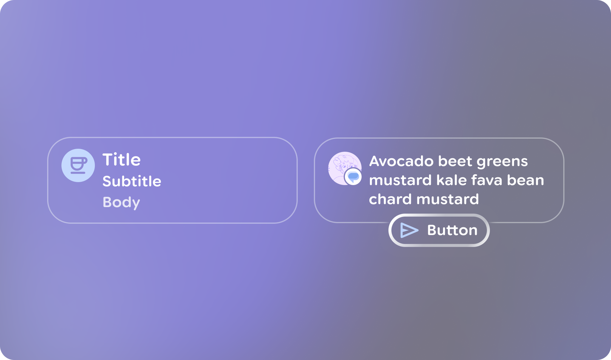
Action cards
If you want to include an action button with a card, use an
ActionCard. Action cards have the same elements as standard cards and
also include an additional action parameter that defines the bottom button.

ActionCard in Jetpack Compose Glimmer.Example: Basic action card
This code shows how to create an ActionCard:
ActionCard( action = { Button(onClick = {}, trailingIcon = { Icon(FavoriteIcon, "Localized description") }) { Text("Send") } } ) { Text("This is a card with a title, leading icon, header image, and action") }
Example: Action card with an icon
This code shows how to create a more complex ActionCard with icons:
ActionCard( title = { Text("Card Title", style = GlimmerTheme.typography.titleMedium) }, subtitle = { Text("Sub-heading text", style = GlimmerTheme.typography.titleSmall) }, leadingIcon = { Icon(FavoriteIcon, contentDescription = "Favorite") }, action = { Button(onClick = { /* Handle action */ }) { Text("Action") } } ) { Text( "This is the main body content of the card, utilizing theme-tokens for consistent styling.", style = GlimmerTheme.typography.bodyMedium ) }