ナビゲーション ドロワー コンポーネントを使用してスライドイン メニューを作成する
コレクションでコンテンツを整理
必要に応じて、コンテンツの保存と分類を行います。
ナビゲーション ドロワー コンポーネントは、ユーザーがアプリのさまざまなセクションに移動できるようにするスライドイン メニューです。ユーザーは、横からスワイプするか、メニューアイコンをタップしてアクティブにできます。
ナビゲーション ドロワーを実装する際は、次の 3 つのユースケースを検討してください。
- コンテンツの整理: ニュースアプリやブログアプリなど、ユーザーがさまざまなカテゴリを切り替えられるようにします。
- アカウント管理: ユーザー アカウントを使用するアプリのアカウント設定セクションとプロフィール セクションへのクイックリンクを提供します。
- 機能の検出: 複数の機能と設定を 1 つのメニューに整理して、複雑なアプリでユーザーが見つけやすく、アクセスしやすくします。
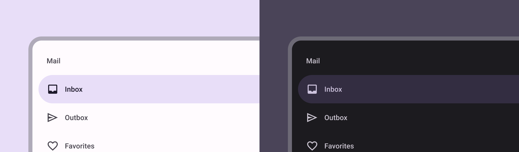
マテリアル デザインでは、ナビゲーション ドロワーには次の 2 種類があります。
- 標準: 画面内のスペースを他のコンテンツと共有します。
- モーダル: 画面内の他のコンテンツの上に表示されます。
バージョンの互換性
この実装では、プロジェクトの minSDK を API レベル 21 以上に設定する必要があります。
依存関係
ナビゲーション ドロワーを実装する
ModalNavigationDrawer
コンポーザブルを使用して、ナビゲーション ドロワーを実装できます。
要点
ナビゲーション ドロワーの動作を制御する
引き出しの開閉方法を制御するには、DrawerState
を使用します。
要点
drawerState
パラメータを使用して、DrawerState
を ModalNavigationDrawer
に渡します。
DrawerState
は、現在のドロワーの状態に関連するプロパティだけでなく、open
関数と close
関数へのアクセスを提供します。これらの suspend 関数は CoroutineScope
を必要とし、これは rememberCoroutineScope
を使用してインスタンス化できます。UI イベントに応じて停止関数を呼び出すこともできます。
結果
図 1. 標準のナビゲーション ドロワー(左)とモーダル ナビゲーション ドロワー(右)。
このガイドを含むコレクション
このガイドは、Android 開発の幅広い目標を網羅する、厳選されたクイックガイド コレクションの一部です。
インタラクティブなコンポーネントを表示する
コンポーズ可能な関数を使用して、マテリアル デザインのデザイン システムに基づいて美しい UI コンポーネントを簡単に作成する方法を学びます。
このページのコンテンツやコードサンプルは、コンテンツ ライセンスに記載のライセンスに従います。Java および OpenJDK は Oracle および関連会社の商標または登録商標です。
最終更新日 2025-02-06 UTC。
[[["わかりやすい","easyToUnderstand","thumb-up"],["問題の解決に役立った","solvedMyProblem","thumb-up"],["その他","otherUp","thumb-up"]],[["必要な情報がない","missingTheInformationINeed","thumb-down"],["複雑すぎる / 手順が多すぎる","tooComplicatedTooManySteps","thumb-down"],["最新ではない","outOfDate","thumb-down"],["翻訳に関する問題","translationIssue","thumb-down"],["サンプル / コードに問題がある","samplesCodeIssue","thumb-down"],["その他","otherDown","thumb-down"]],["最終更新日 2025-02-06 UTC。"],[],[],null,["# Create a slide-in menu with the navigation drawer component\n\n\u003cbr /\u003e\n\nThe [navigation drawer](https://material.io/components/navigation-drawer) component is a slide-in menu that lets users navigate\nto various sections of your app. Users can activate it by swiping from the side\nor tapping a menu icon.\n\nConsider these three use cases for implementing a navigation drawer:\n\n- **Content organization:** Enable users to switch between different categories, such as in news or blogging apps.\n- **Account management:** Provide quick links to account settings and profile sections in apps with user accounts.\n- **Feature discovery:** Organize multiple features and settings in a single menu to facilitate user discovery and access in complex apps.\n\nIn Material Design, there are two types of navigation drawers:\n\n- **Standard:** Share space within a screen with other content.\n- **Modal:** Appears over the top of other content within a screen.\n\nVersion compatibility\n---------------------\n\nThis implementation requires that your project minSDK be set to API level 21 or\nhigher.\n\n### Dependencies\n\n### Kotlin\n\n\u003cbr /\u003e\n\n```kotlin\n implementation(platform(\"androidx.compose:compose-bom:2025.08.00\"))\n \n```\n\n\u003cbr /\u003e\n\n### Groovy\n\n\u003cbr /\u003e\n\n```groovy\n implementation platform('androidx.compose:compose-bom:2025.08.00')\n \n```\n\n\u003cbr /\u003e\n\nImplement a navigation drawer\n-----------------------------\n\nYou can use the [`ModalNavigationDrawer`](/reference/kotlin/androidx/compose/material3/package-summary#ModalNavigationDrawer(kotlin.Function0,androidx.compose.ui.Modifier,androidx.compose.material3.DrawerState,kotlin.Boolean,androidx.compose.ui.graphics.Color,kotlin.Function0)) composable to implement a\nnavigation drawer:\n\n\u003cbr /\u003e\n\n```kotlin\nModalNavigationDrawer(\n drawerContent = {\n ModalDrawerSheet {\n Text(\"Drawer title\", modifier = Modifier.padding(16.dp))\n HorizontalDivider()\n NavigationDrawerItem(\n label = { Text(text = \"Drawer Item\") },\n selected = false,\n onClick = { /*TODO*/ }\n )\n // ...other drawer items\n }\n }\n) {\n // Screen content\n}\n \n https://github.com/android/snippets/blob/dd30aee903e8c247786c064faab1a9ca8d10b46e/compose/snippets/src/main/java/com/example/compose/snippets/layouts/MaterialLayoutSnippets.kt#L290-L305\n \n```\n\n\u003cbr /\u003e\n\n### Key points\n\n- Use the `drawerContent` slot to provide a [`ModalDrawerSheet`](/reference/kotlin/androidx/compose/material3/package-summary#ModalDrawerSheet(androidx.compose.ui.Modifier,androidx.compose.ui.graphics.Shape,androidx.compose.ui.graphics.Color,androidx.compose.ui.graphics.Color,androidx.compose.ui.unit.Dp,androidx.compose.foundation.layout.WindowInsets,kotlin.Function1)) and\n provide the drawer's contents.\n\n- `ModalNavigationDrawer` accepts a number of additional drawer parameters.\n For example, you can toggle whether or not the drawer responds to drags with\n the `gesturesEnabled` parameter as in the following example:\n\n \u003cbr /\u003e\n\n ```kotlin\n ModalNavigationDrawer(\n drawerContent = {\n ModalDrawerSheet {\n // Drawer contents\n }\n },\n gesturesEnabled = false\n ) {\n // Screen content\n }\n \n https://github.com/android/snippets/blob/dd30aee903e8c247786c064faab1a9ca8d10b46e/compose/snippets/src/main/java/com/example/compose/snippets/layouts/MaterialLayoutSnippets.kt#L312-L321\n \n ```\n\n \u003cbr /\u003e\n\nControl navigation drawer behavior\n----------------------------------\n\nTo control how the drawer opens and closes, use [`DrawerState`](/reference/kotlin/androidx/compose/material3/DrawerState):\n\n\u003cbr /\u003e\n\n```kotlin\nval drawerState = rememberDrawerState(initialValue = DrawerValue.Closed)\nval scope = rememberCoroutineScope()\nModalNavigationDrawer(\n drawerState = drawerState,\n drawerContent = {\n ModalDrawerSheet { /* Drawer content */ }\n },\n) {\n Scaffold(\n floatingActionButton = {\n ExtendedFloatingActionButton(\n text = { Text(\"Show drawer\") },\n icon = { Icon(Icons.Filled.Add, contentDescription = \"\") },\n onClick = {\n scope.launch {\n drawerState.apply {\n if (isClosed) open() else close()\n }\n }\n }\n )\n }\n ) { contentPadding -\u003e\n // Screen content\n }\n}\n \n https://github.com/android/snippets/blob/dd30aee903e8c247786c064faab1a9ca8d10b46e/compose/snippets/src/main/java/com/example/compose/snippets/layouts/MaterialLayoutSnippets.kt#L328-L356\n \n```\n\n\u003cbr /\u003e\n\n### Key points\n\n- Pass a `DrawerState` to `ModalNavigationDrawer` using the `drawerState` parameter.\n- `DrawerState` provides access to the [`open`](/reference/kotlin/androidx/compose/material3/DrawerState#open) and [`close`](/reference/kotlin/androidx/compose/material3/DrawerState#close) functions, as well as properties related to the current drawer state. These suspending functions require a `CoroutineScope`, which you can instantiate using [`rememberCoroutineScope`](/reference/kotlin/androidx/compose/runtime/package-summary#remembercoroutinescope). You can also call the suspending functions in response to UI events.\n\nResults\n-------\n\n\n**Figure 1.** A standard navigation drawer (left) and a modal navigation drawer (right).\n\n\u003cbr /\u003e\n\nCollections that contain this guide\n-----------------------------------\n\nThis guide is part of these curated Quick Guide collections that cover\nbroader Android development goals: \n\n### Display interactive components\n\nLearn how composable functions can enable you to easily create beautiful UI components based on the Material Design design system. \n[Quick guide collection](/develop/ui/compose/quick-guides/collections/display-interactive-components) \n\nHave questions or feedback\n--------------------------\n\nGo to our frequently asked questions page and learn about quick guides or reach out and let us know your thoughts. \n[Go to FAQ](/quick-guides/faq) [Leave feedback](https://issuetracker.google.com/issues/new?component=1573691&template=1993320)"]]