
Verwenden Sie die Komponente Schaltfläche für Aktionen, die für Nutzer leicht verständlich sind und kein Textlabel benötigen. Schaltflächen unterscheiden sich von Chips durch ihre kreisförmige Form.
Anatomie
A. Inhalt
Schaltflächen haben einen einzelnen Steckplatz für ein Symbol oder Text. Wählen Sie ein Symbol aus, das für die Aktion der Schaltfläche relevant ist. Wenn ein Symbol die entsprechende Aktion nicht beschreiben kann, können Sie Text mit maximal drei Zeichen verwenden. Verwenden Sie eine Chip-Komponente, wenn ein Symbol die Aktion nicht klar beschreiben kann.
B. Container
Schaltflächencontainer sind auf eine einzige durchgehende Füllung beschränkt.
Schaltflächentypen
Kompakte Schaltflächen
Kompakte Schaltflächen erscheinen kleiner, haben aber eine größere berührbare Fläche. Die Standardgröße des berührbaren Bereichs ist 48 × 48 dp.
Hierarchiediagramm
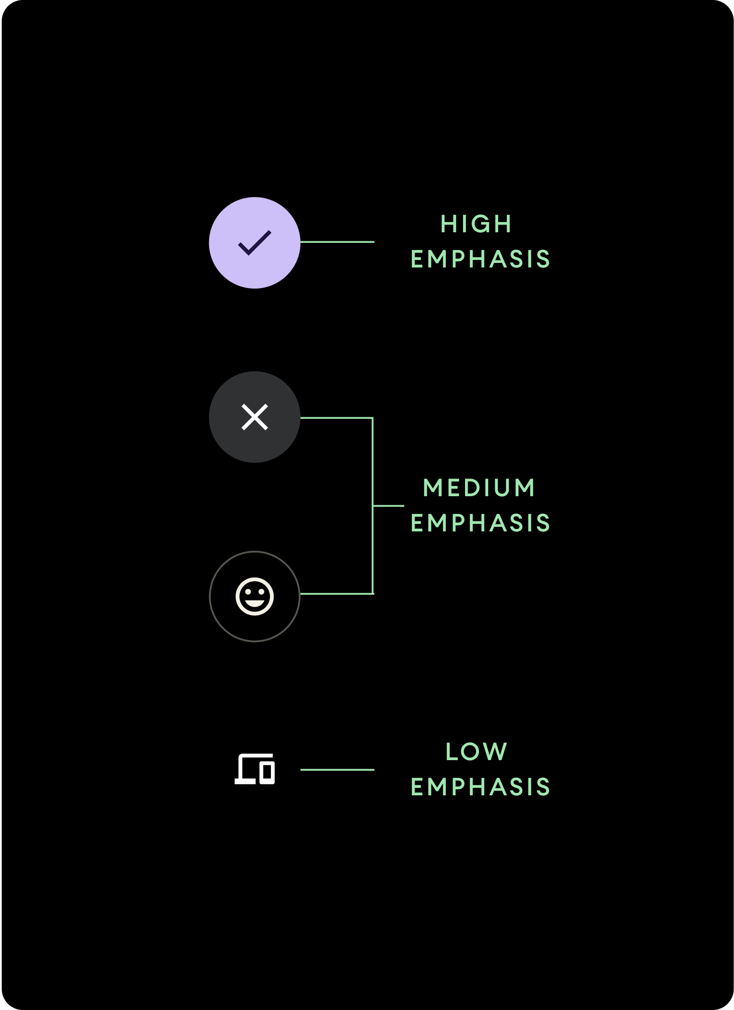
Verwenden Sie unterschiedliche Farbfüllungen, um die Schaltflächenhierarchie zu kennzeichnen.
Hohe Betonung
Schaltflächen mit starker Betonung enthalten Aktionen, die für die App von primärer Bedeutung sind. Verwenden Sie für Schaltflächen mit starker Betonung Primär- oder Sekundärfarben für den Container und On Primary- und On Secondary-Farben für den Inhalt. Weitere Informationen finden Sie unter Wear OS-Designthemen.
Mittelste Betonung
Schaltflächen mit mittlerer Betonung zeichnen sich durch eine weniger kontrastreiche Farbfüllung aus. Sie enthalten Aktionen, die weniger wichtig sind als die primären Aktionen. Verwenden Sie die Farbe „Oberfläche“ für den Container und die Farbe „Auf Oberfläche“ für den Inhalt.
Alternativ können Sie die benutzerdefinierte Komponente OutlinedButton für eine Schaltfläche mit mittlerer Betonung verwenden. Diese hat einen transparenten Hintergrund, einen farbigen Strich mit einer Deckkraft von 60% und primärfarbenen Inhalt.
Geringe Betonung (nur Symbol)Schaltflächen mit geringer Betonung haben keine Füllung. Sie eignen sich am besten für kleinere Bereiche auf dem Zifferblatt, in denen eine kompakte Anordnung erforderlich ist. Verwenden Sie die Farbe „Auf Oberfläche“ für den Inhalt.
Größen
Verwenden Sie Schaltflächen unterschiedlicher Größe, um Aktionen hervorzuheben oder weniger hervorzuheben.
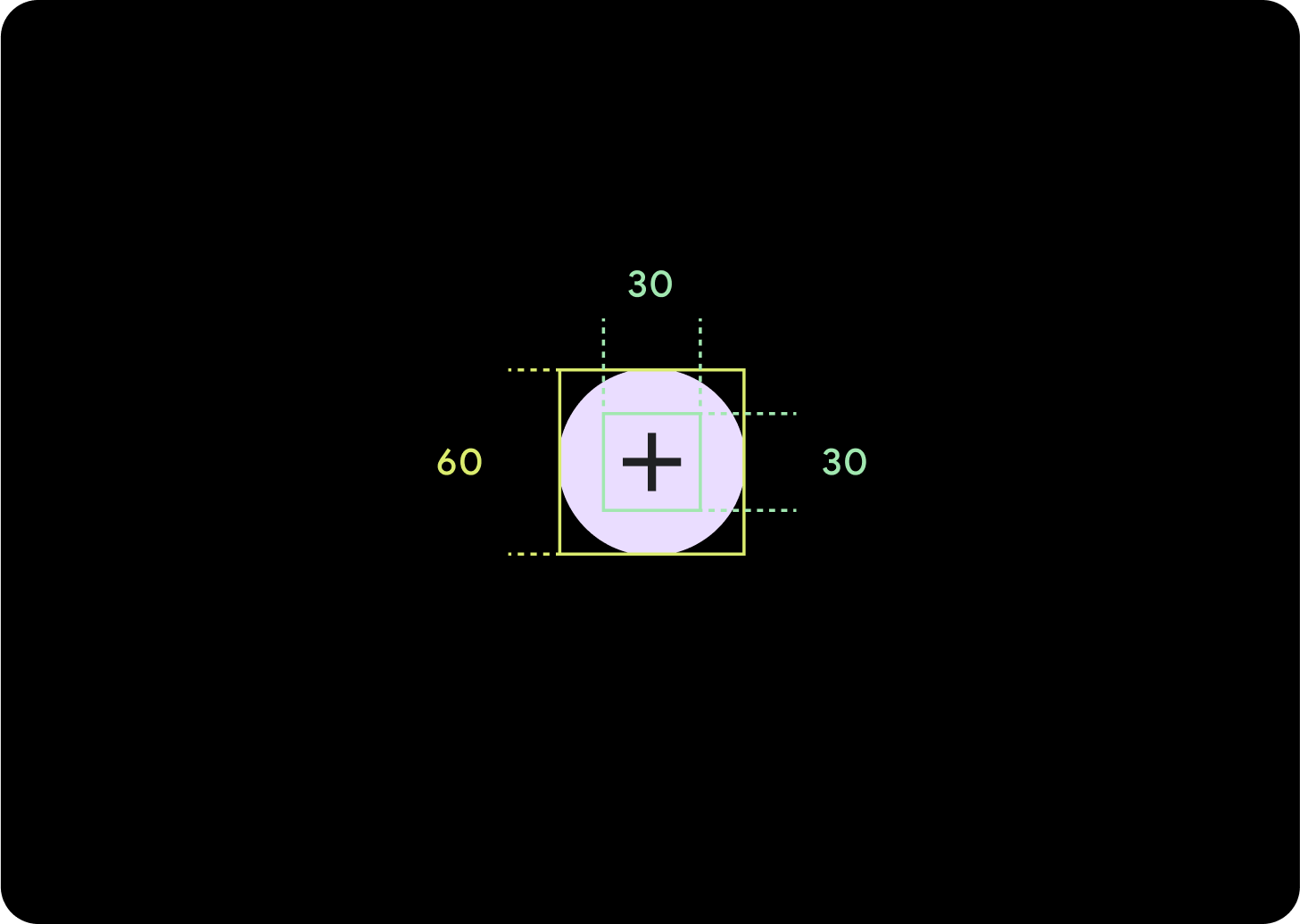
Groß
Symbol (30 × 30 dp)
Container (60 × 60 dp)
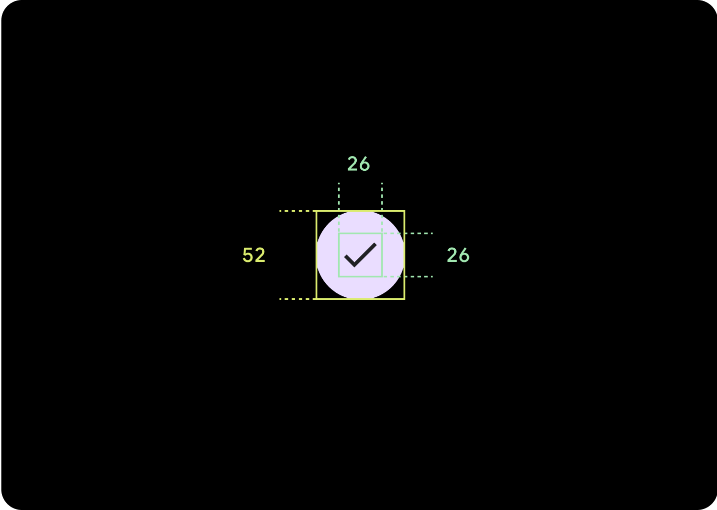
Standard
Symbol (26 × 26 dp)
Container (52 × 52 dp)
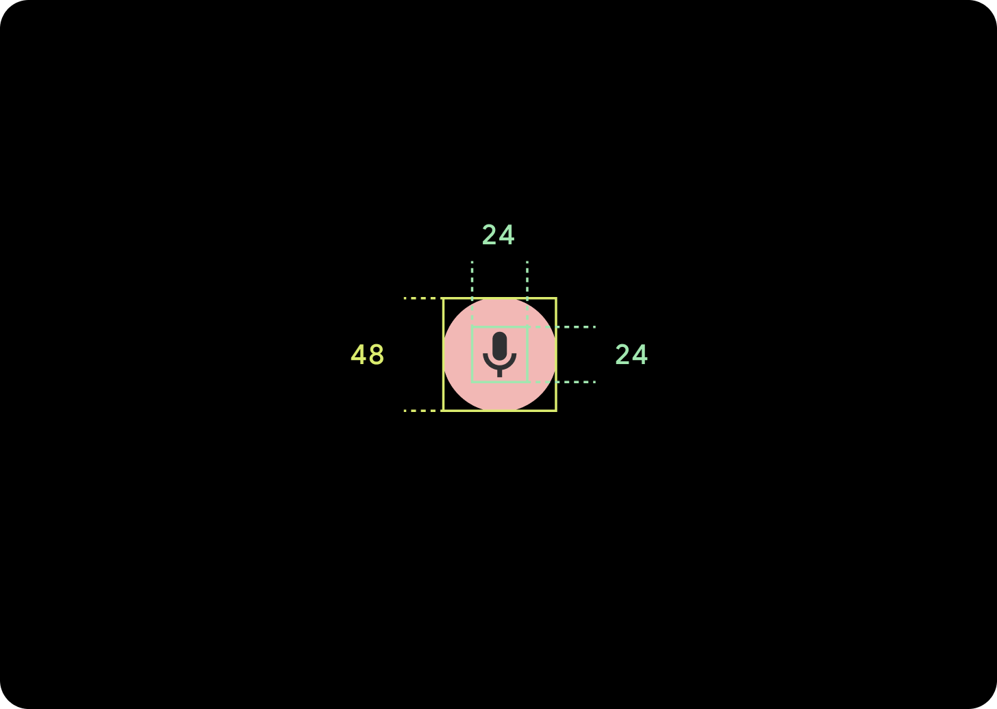
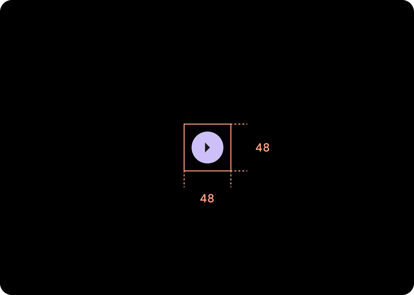
Klein
Symbol (24 × 24 dp)
Container (48 × 48 dp)
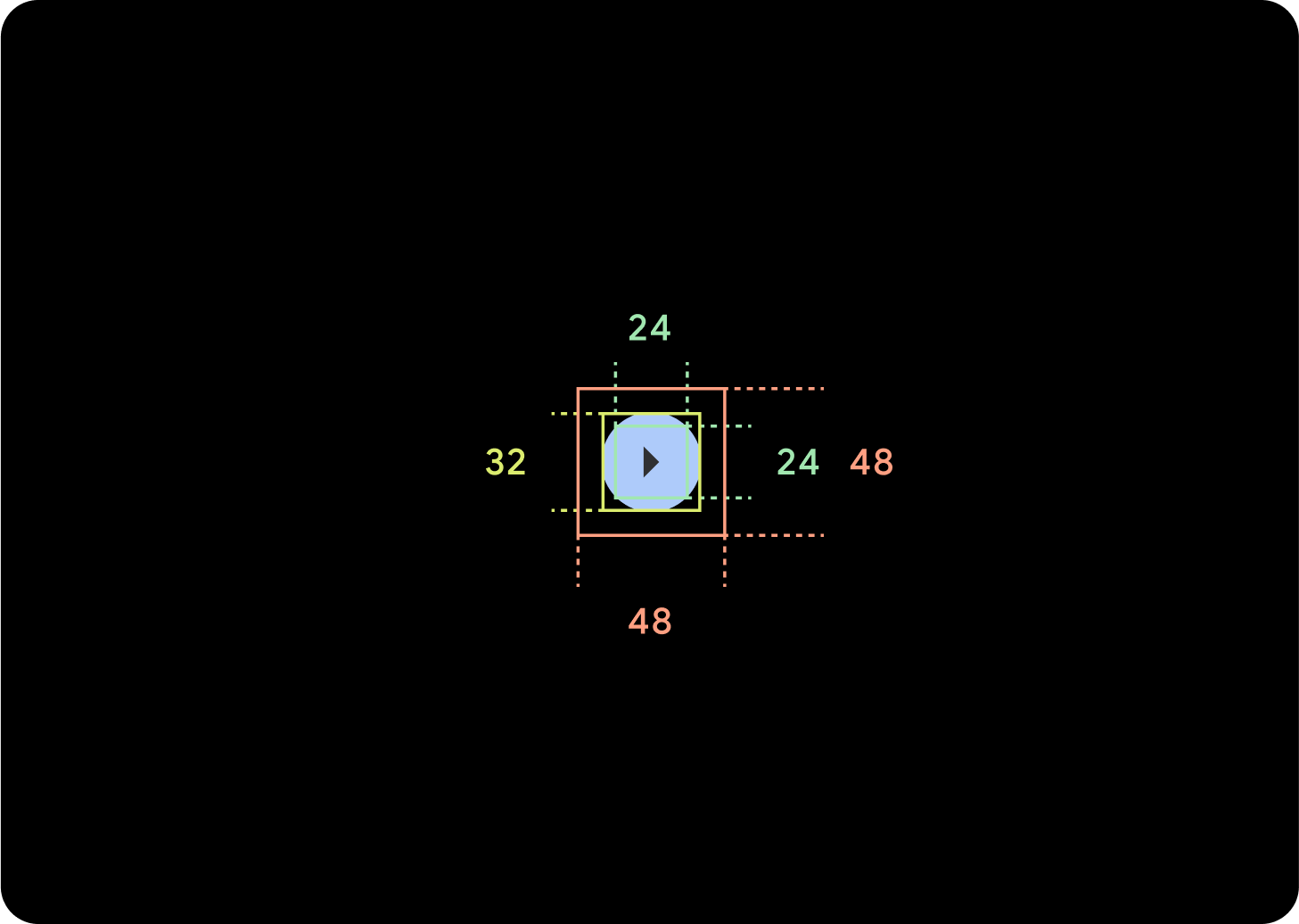
Extraklein
Symbol (24 × 24 dp)
Container (32 × 32 dp)
Wir empfehlen, um diese Schaltfläche herum zusätzlichen Abstand hinzuzufügen, um ein Tippziel von mindestens 48 dp zu schaffen. Das ist die Mindestgröße für Berührungsziele aus Gründen der Barrierefreiheit.
Nutzung
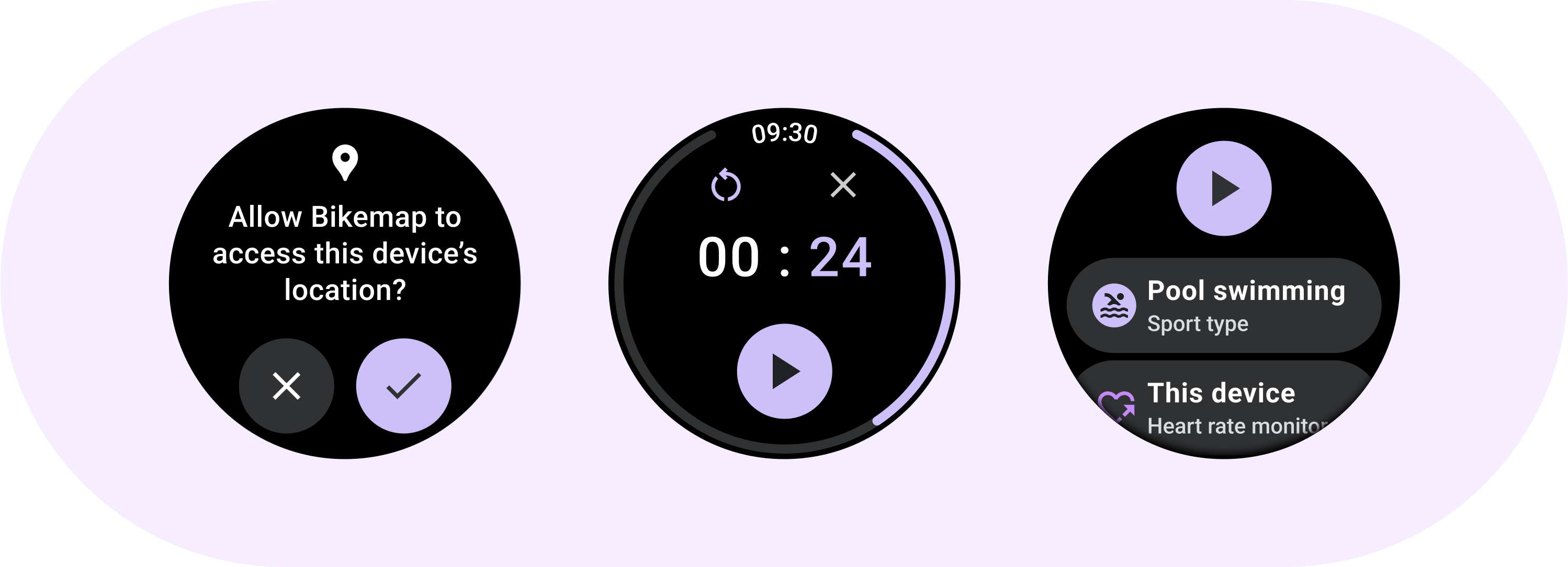
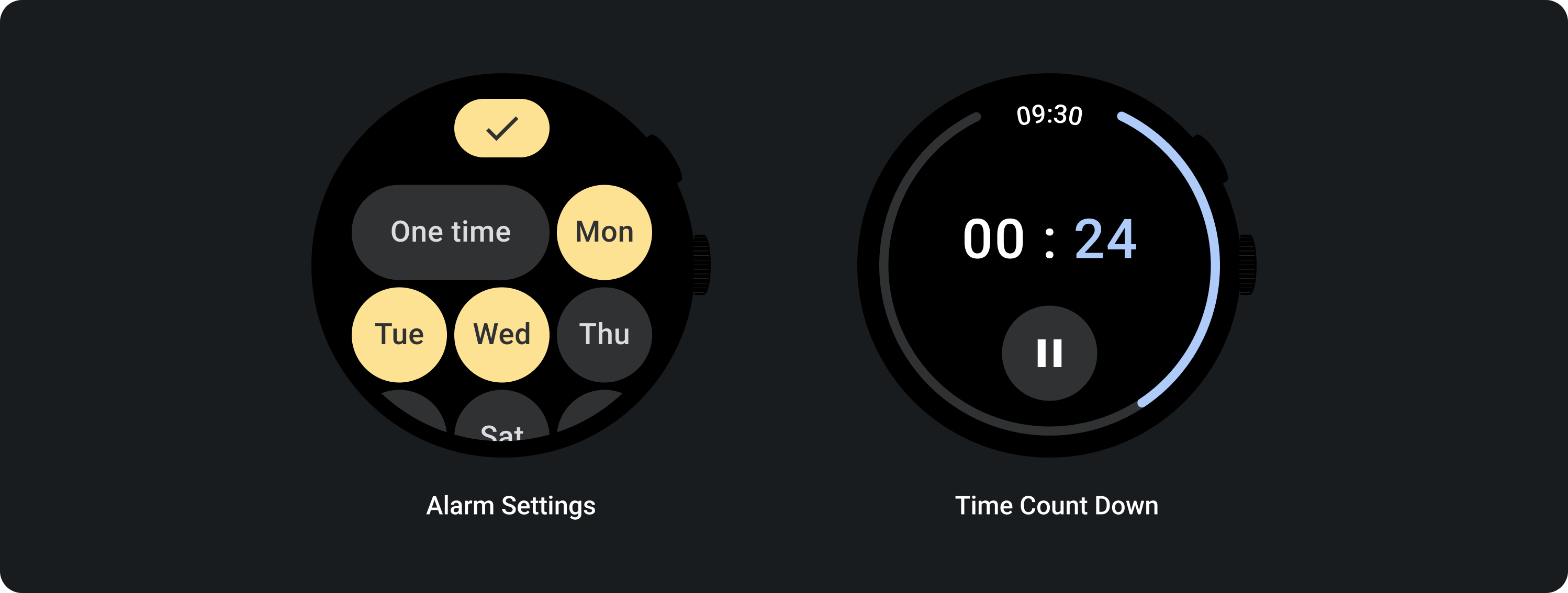
Verwenden Sie Standardschaltflächen, damit Nutzer eine einzelne Aktion ausführen können, z. B. einen Anruf annehmen oder ablehnen oder einen Timer starten.
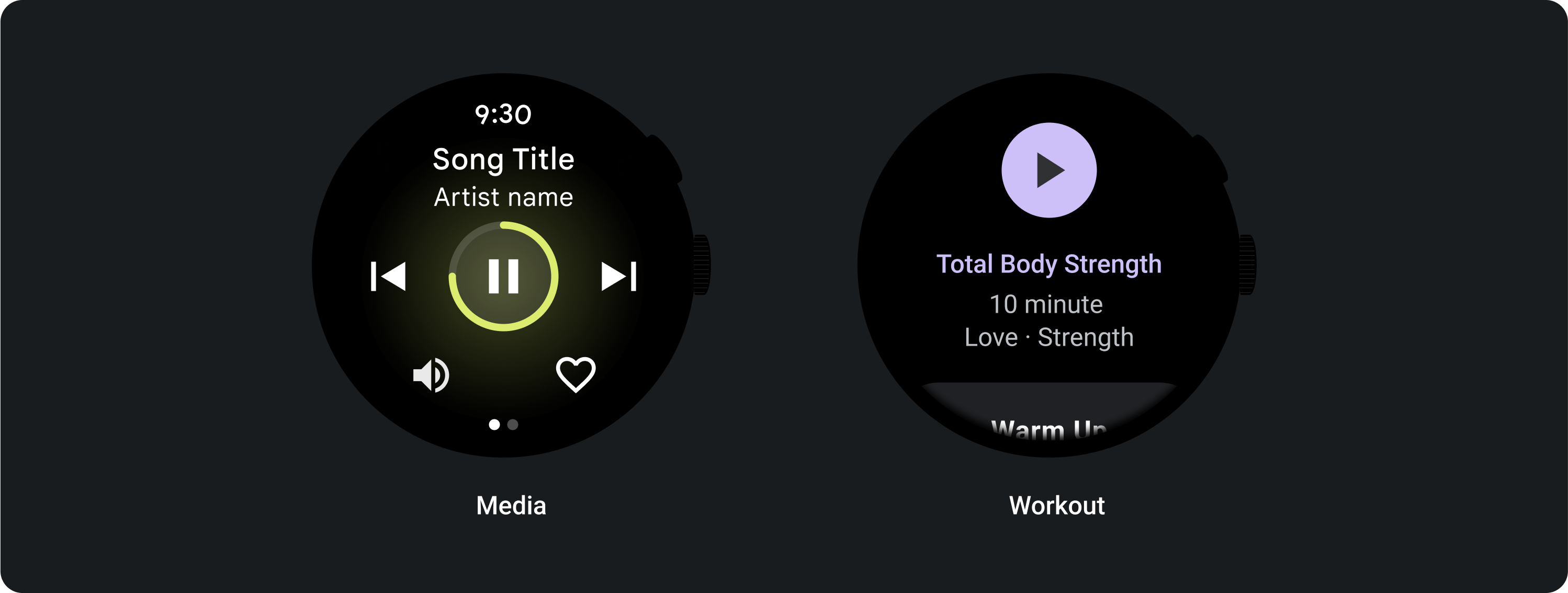
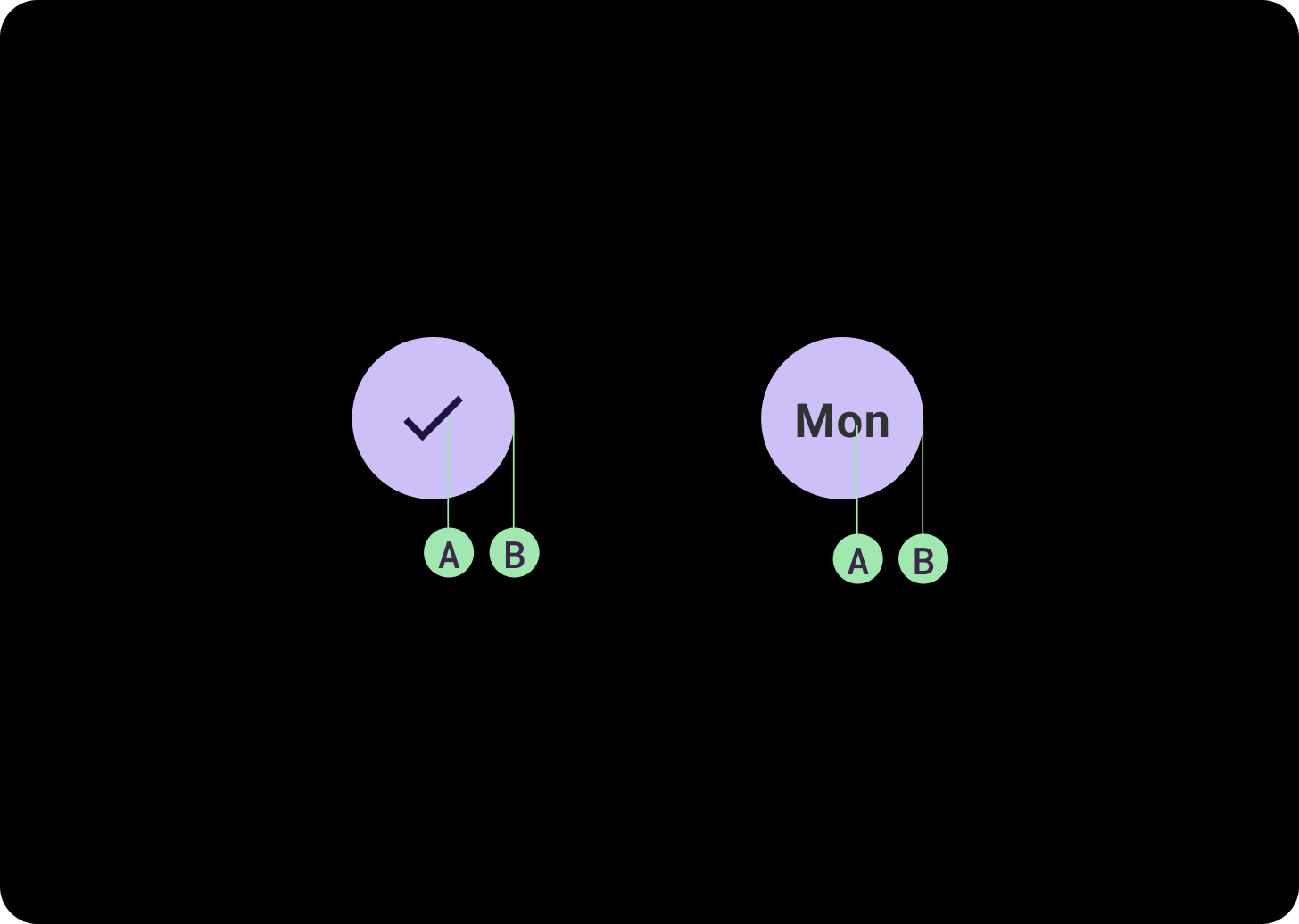
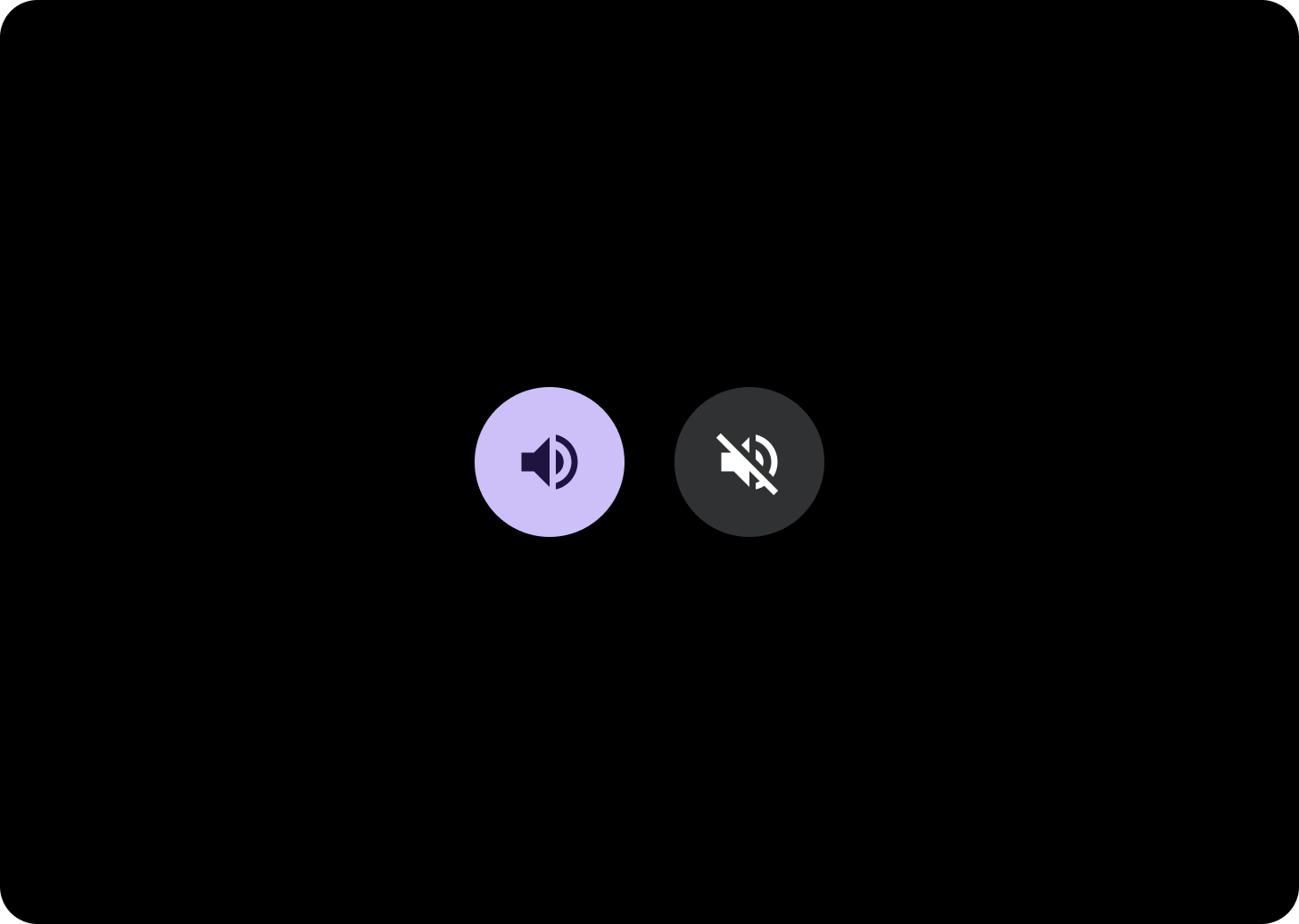
Mit Ein/Aus-Schaltflächen können Nutzer eine Option aktivieren oder deaktivieren, z. B. Wochentage auswählen oder deaktivieren oder einen Timer pausieren und wieder starten.
Adaptive Layouts
Responsives Verhalten
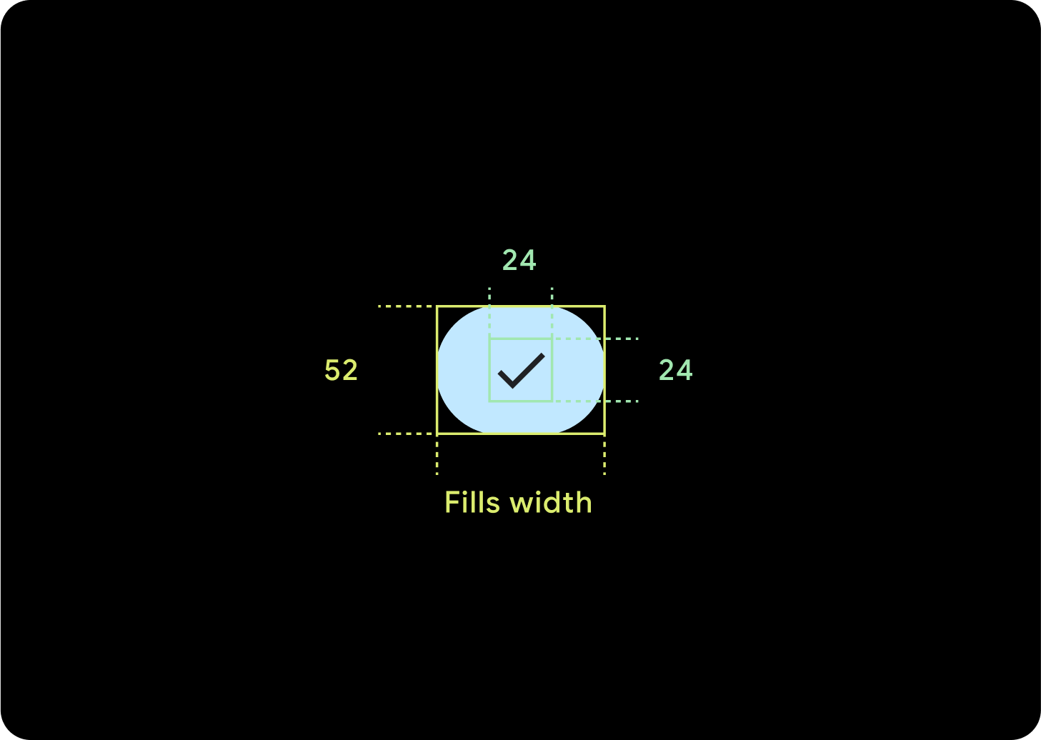
1 Taste
Die internen Abstände bleiben gleich und die Ränder sollten in Prozent angegeben werden, damit sich die Schaltflächen nicht zu weit dehnen und eine relative Größe beibehalten.
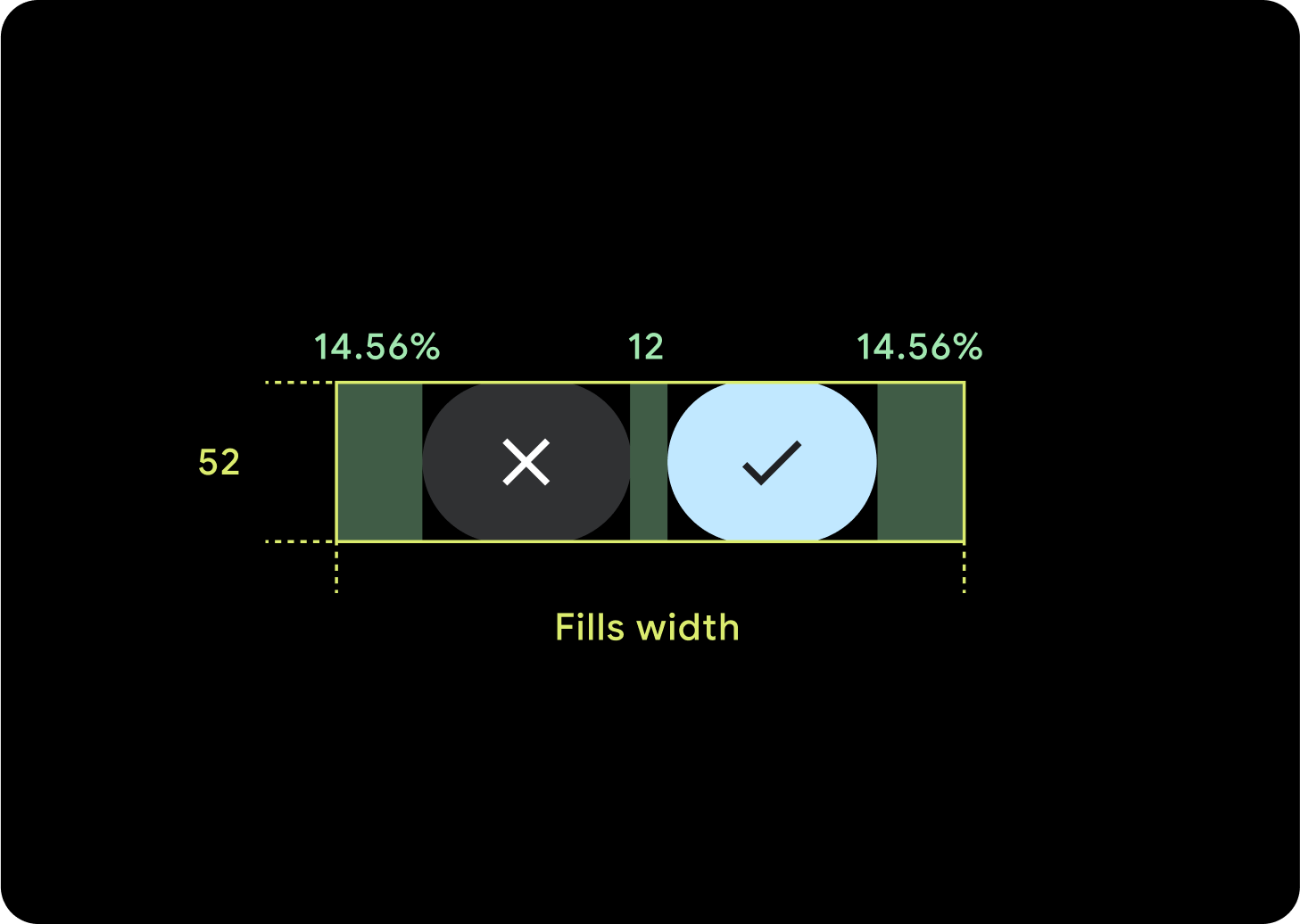
2 Tasten
Bei zwei Schaltflächen werden prozentuale interne Ränder hinzugefügt, damit sich die Schaltflächen nicht zu weit dehnen und eine relative Größe beibehalten.
IMEs
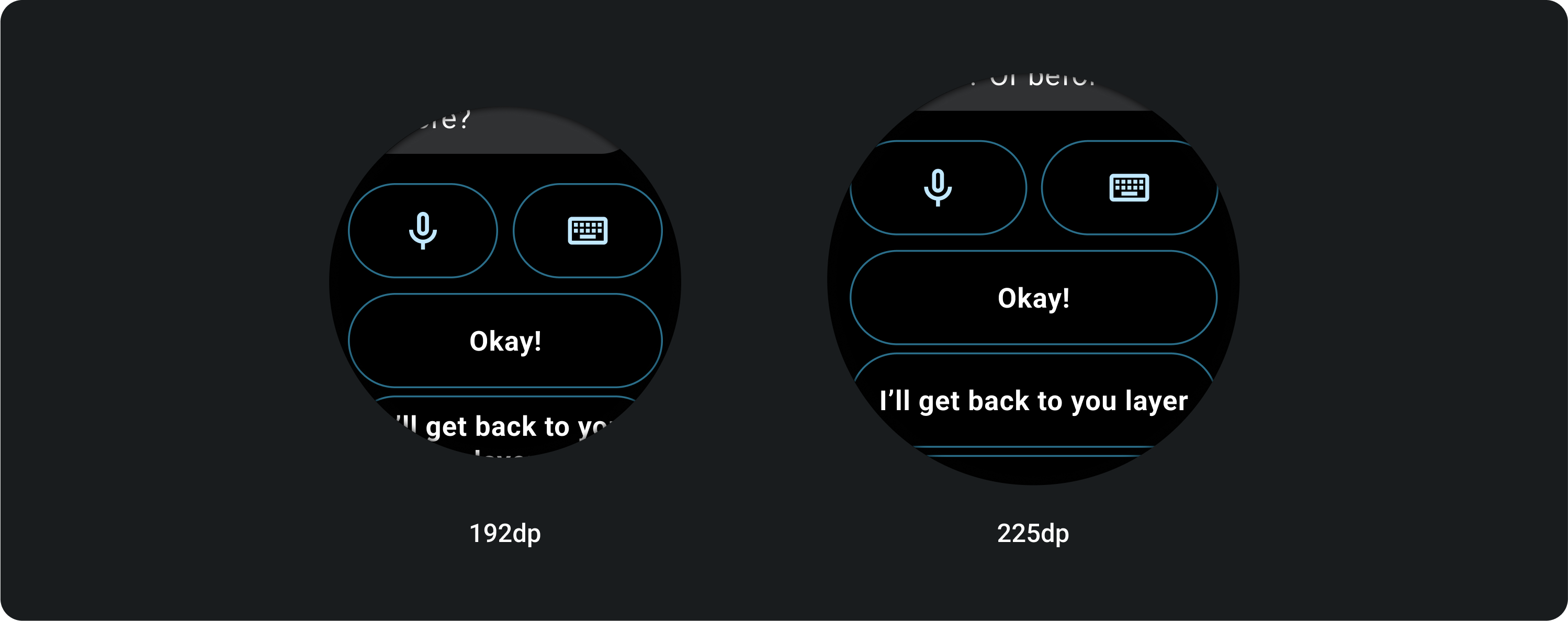
1 oder 2 Tasten
IMEs mit zwei oder einer einzigen Tastensperre erstrecken sich unabhängig von der Bildschirmgröße immer bis zu den Seitenrändern.
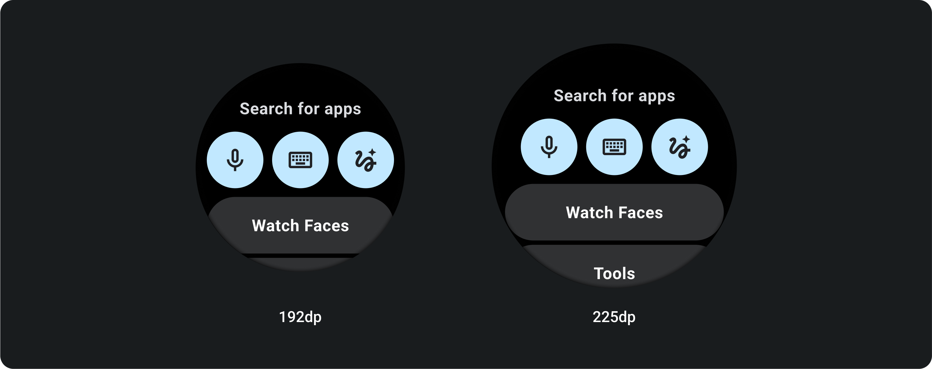
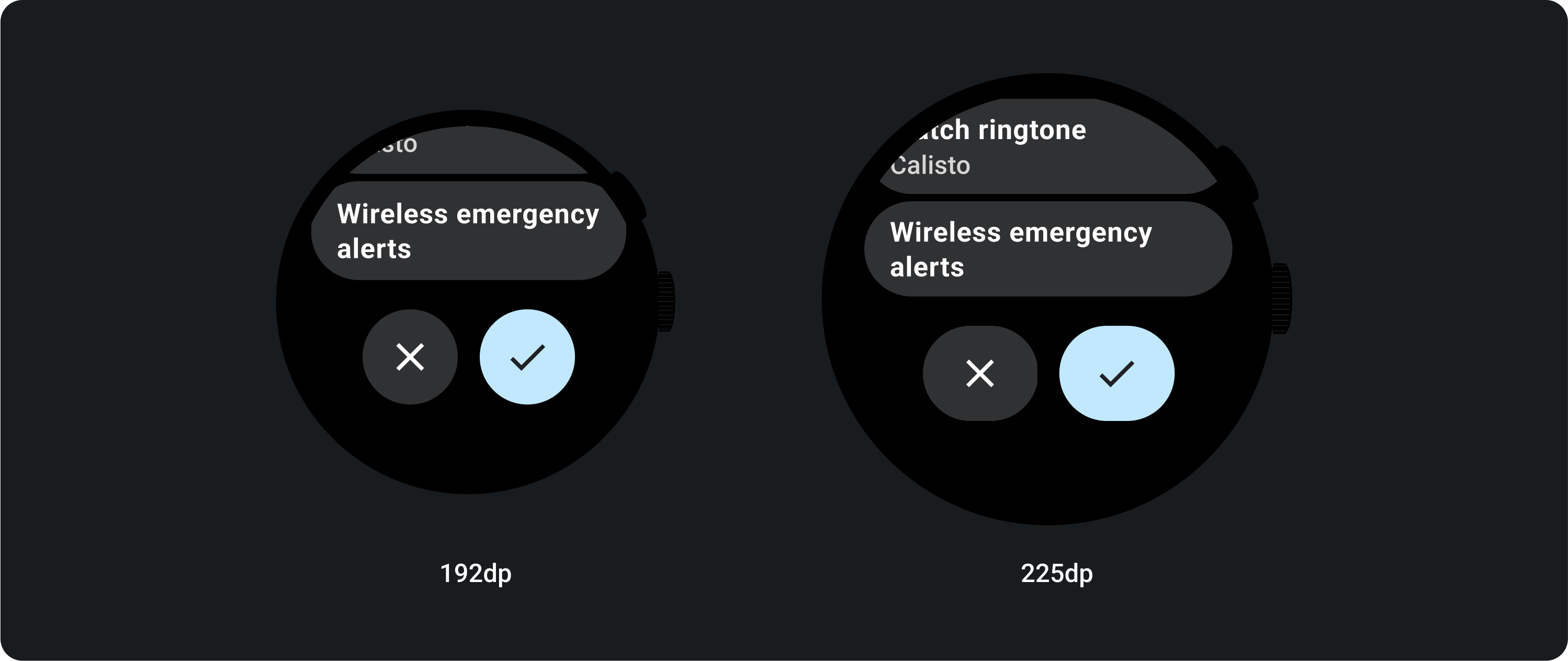
3 Schaltflächen
Auf Bildschirmen mit weniger als 225 dp bleiben die Schaltflächen rund und werden nicht gedehnt. Auf größeren Bildschirmen mit mindestens 225 dp erstrecken sich die Schaltflächen bis zu den seitlichen Rändern.