
يُعدّ تصميم الأدوات بشكل فعّال أمرًا بالغ الأهمية لتحقيق تجربة مستخدم جذابة بصريًا ومتسقة. يتناول هذا القسم المفاهيم والأساليب الأساسية لتحديد الألوان وأسلوب الخط من أجل إنشاء أدوات Android الأكثر فائدة وجاذبية.
اللون
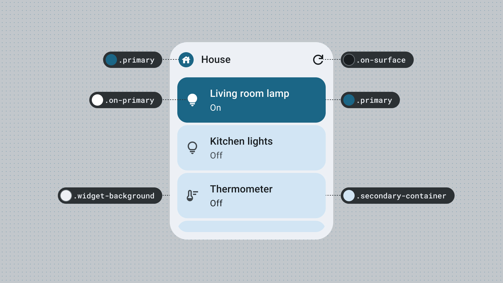
استخدِم الألوان للتعبير عن الأسلوب ونقل المعنى. يُعدّ ضبط الألوان المناسبة لعناصر واجهة المستخدم أمرًا بالغ الأهمية لضمان سهولة القراءة والتخصيص والتعبير عن هوية علامتك التجارية.
استخدِم أدوار وأدوات Material للألوان للتوافق مع إرشادات تباين الألوان الخاصة بتسهيل الاستخدام ودعم ميزات الألوان الديناميكية، مثل الألوان التي يحدّدها المستخدم والمظاهر الداكنة أو الفاتحة.
استكشِف التسلسل الهرمي المرئي من خلال أدوار التمييز لإنشاء تباين حيوي في العناصر أو استكشِف مظهرًا مخصّصًا أكثر مرحًا يعبّر عن علامتك التجارية.
يمكنك الرجوع إلى إرشادات الألوان في Material Design لمعرفة المزيد عن أدوار الألوان.
الشكل
يحدّد شكل التطبيق المصغّر مظهره. بالنسبة إلى التطبيقات المصغّرة المستطيلة، استخدِم سمة نصف قطر الزاوية في النظام. تساعد هذه السمة في توفير تجربة متسقة على جميع الأجهزة وتجنُّب اقتصاص محتوى التطبيق المصغّر.
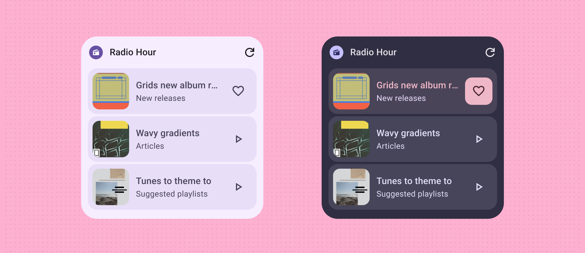
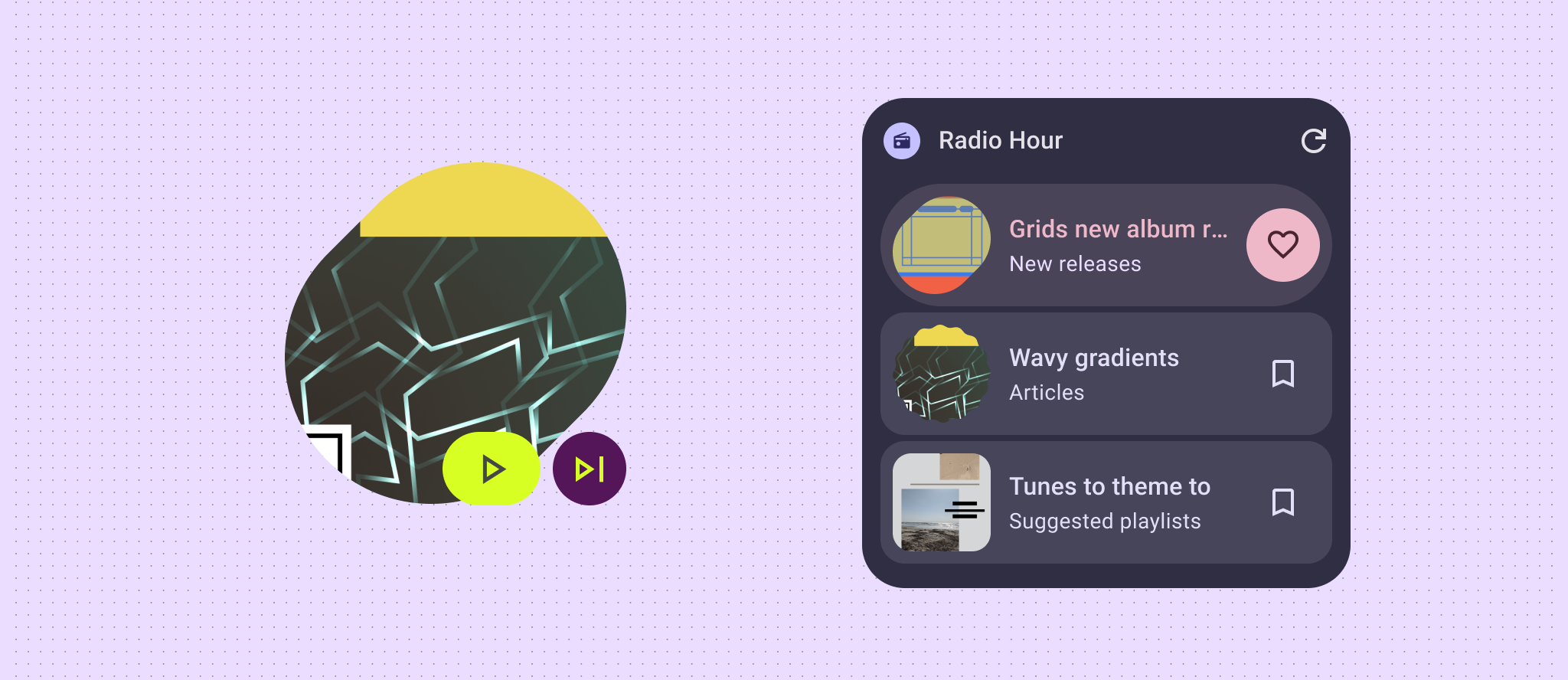
إذا كانت أداتك تعرض الحد الأدنى من محتوى البيانات، مثل صورة أو حالة الطقس أو الأغنية التي يتم تشغيلها حاليًا، يمكنك تجربة جعل الأداة بأكملها شكلًا معبّرًا لإضافة لمسة من الحيوية إلى الشاشة الرئيسية للمستخدم. إذا كانت لديك تنسيقات وبيانات أكثر تعقيدًا، ننصحك باستخدام أشكال معبّرة للتسلسل الهرمي المرئي، مع إبراز المحتوى الجديد أو عبارة الحث على اتخاذ إجراء.
لمزيد من المعلومات، يُرجى الاطّلاع على تنفيذ الزوايا الدائرية.
المظاهر الديناميكية
بدءًا من الإصدار 12 من نظام التشغيل Android، يمكن أن يستخدم التطبيق المصغّر ألوان مظهر الجهاز للأزرار والخلفيات والمكوّنات الأخرى. ويوفّر ذلك اتساقًا مرئيًا على مستوى التطبيقات المصغّرة المختلفة ورموز الشاشة الرئيسية والخلفيات، ما يتيح لمستخدمي Android تجربة استخدام أكثر تكاملاً. يساعد استخدام رموز الألوان المتوفّرة في دمج مظهر التطبيق المصغّر مع مظاهر الأجهزة التي يوفّرها مصنّعو الأجهزة المختلفون والمظاهر الديناميكية التي يضبطها المستخدم.
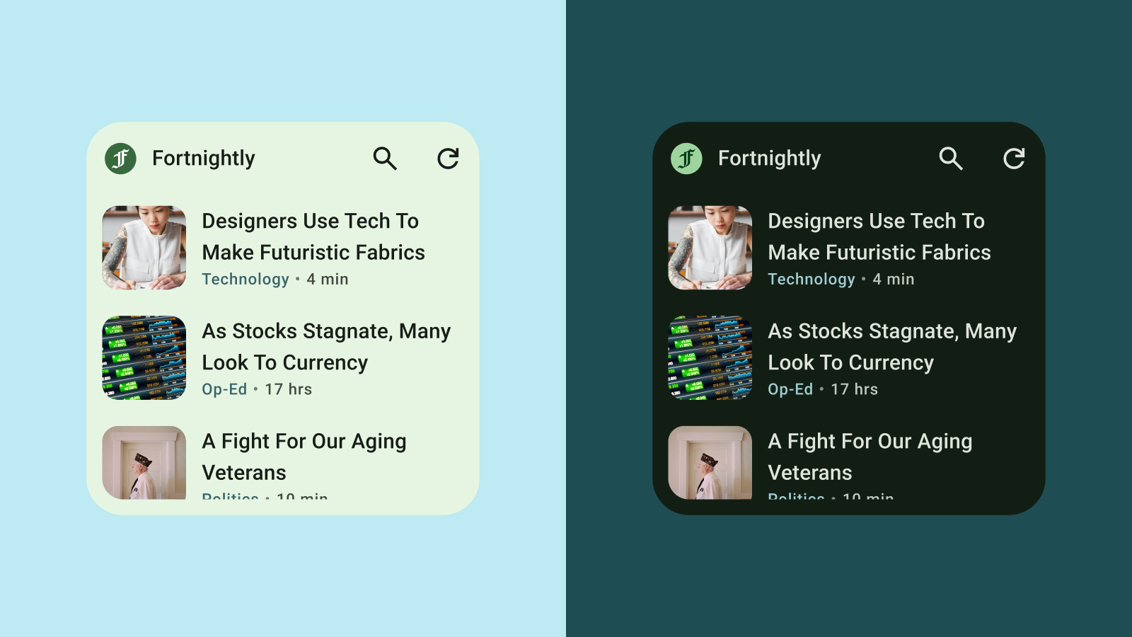
المظهر الفاتح والداكن
المظهر الداكن هو نسخة منخفضة الإضاءة من واجهة مستخدم الجهاز تعرض ألوانًا داكنة في الغالب. يتزايد عدد المستخدمين الذين يفضّلون المظهر الداكن للاستفادة من عمر بطارية أطول ولراحة العين. إذا لم يتكيّف تطبيقك المصغّر مع المظهر الداكن، سيبدو غير ملائم وقد يزعج المستخدمين.
أسلوب الخط
يساعد أسلوب الخط في جعل الكتابة سهلة القراءة وجميلة. استخدِم أحجام الخطوط ودرجاتها لإنشاء تسلسل هرمي واضح، وتوجيه نظر المستخدم إلى العناصر الأكثر أهمية. انتبه إلى تباعد الأسطر والمسافة بين الأحرف (تعديل المسافة بين الأحرف) لتحسين قابلية القراءة، خاصةً بالنسبة إلى النصوص الصغيرة المعروضة في المساحة المحدودة للأداة.
تسلسل هرمي
يتم توضيح التسلسل الهرمي من خلال الاختلافات في سُمك الخط وحجمه وارتفاع السطر والمسافة بين الأحرف. يصنّف مقياس الكتابة المعدَّل أنماط النصوص إلى خمسة أدوار تمت تسميتها لوصف أغراضها. أنواع النصوص الخمسة هي: نص العرض، والعنوان الرئيسي، والعنوان، والعنوان الفرعي، والنص الأساسي. لا ترتبط الأدوار الجديدة بأي جهاز، ما يتيح تطبيقها بسهولة في مجموعة متنوعة من حالات الاستخدام.
على الرغم من أنّ التطبيقات المصغّرة تستخدم خطوط النظام، يمكنك إضافة تفاصيل معبّرة باستخدام أحجام كتابة جذابة: يمكنك استخدام خطوط أكثر جرأة للعناوين والتصنيفات والبيانات.
