
بحسب تقرير صادر عن منظمة الصحة العالمية (WHO) والبنك الدولي في العام 2011، يعاني حوالي 15% من سكان العالم، أي حوالي شخص من كل ستة أشخاص، من عجز شديد أو مؤقت طوال حياته. إذن، تعتبر سهولة الوصول في التصميم أمرًا أساسيًا لإنشاء تطبيق شامل وسهل الاستخدام وعالي الجودة، حيث يؤدي ذلك إلى تحقيق أفضل النتائج للمستخدمين ويمكن أن يحول دون تكرار العمليات المكلفة. يأتي Android مزوّدًا بمجموعة متنوعة من الميزات لمساعدتك في إنشاء تطبيقك لدعم خيارات إمكانية الوصول تلقائيًا.
تصميم للرؤية
يُرجى التأكّد من أنّ محتوى تطبيقك سهل القراءة قدر الإمكان عن طريق التحقّق من تباين الألوان وحجم النص، وأنّ المكونات مفهومة بصريًا ويسهل تمييزها عن بعضها البعض.
اتبع هذه الإرشادات للتصميم لسهولة الوصول.
- للسماح للمستخدمين بضبط حجم الخط، حدِّد حجم الخط في وحدات البكسل القابلة للتوسع (sp)
- يجب ألّا يقل حجم الجسم عن 12 وحدة sp، لأنّ هذه الإرشادات تتوافق مع مقياس أنواع المواد كإعداد تلقائي.
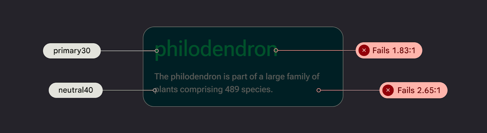
- التأكّد من أنّ نسبة التباين بين الخلفية والنص 4.5:1 على الأقل تعرَّف على كيفية التحقق من تباين الألوان.
- استخدام نسبة 3:1 بين الأسطح والعناصر غير النصية على سبيل المثال، ستكون نسبة الخلفية إلى الأيقونة 3:1.
- استخدِم أكثر من عنصر مرئي واحد لتنفيذ إجراءات مثل الروابط.
استخدِم نظام الألوان الذي يسهل الوصول إليه . يعتمد نظام الألوان هذا على لوحات الألوان، وهو مركزي لجعل أنظمة الألوان سهلة الوصول بشكل افتراضي.
تصميم يتناسب مع الصوت
TalkBack هي قارئ شاشة من Google تم تضمينه في أجهزة Android، ويمنح المستخدمين إمكانية التحكم بدون النظر إلى الشاشة. يمكنك اختبار ذلك يدويًا من خلال استكشاف تطبيقك باستخدام TalkBack أو باستخدام الماسح الضوئي A11y.
اتبع هذه الإرشادات لضمان إعداد تطبيقك لأجهزة قراءة الشاشة:
- وصف عناصر واجهة المستخدم في التعليمات البرمجية. يستخدم Compose خصائص الدلالات لإبلاغ خدمات تسهيل الاستخدام بالمعلومات المعروضة في عناصر واجهة المستخدم.
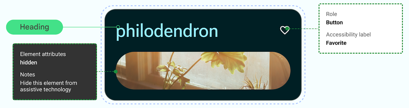
- لاستيفاء متطلبات إطار عمل Android، يُرجى تقديم وصف نصي إضافي للرموز والصور.
- اضبط أوصاف العناصر الزخرفية على قيمة فارغة.
- للسماح بالتخطي بين مجموعات الإجراءات والمحتوى، ضع في اعتبارك دقة واجهة المستخدم وعناصر واجهة المستخدم الجماعية..
اطلع على مسار التصميم لتنفيذ التنفيذ، الذي يرشدك عبر اعتبارات سهولة الوصول والترميز باستخدام إرشادات إتاحة محتوى الويب (WCAG).
تصميم لتناسب الصوت
يوفر Android ميزات لتمكين المستخدمين من التفاعل مع أجهزتهم من خلال مجموعة متنوعة من الأوامر الصوتية وطلبات البحث.
يتيح لك تطبيق Voice Access لأجهزة Android التحكّم في جهازك باستخدام الطلبات الصوتية. ويمكنك استخدام صوتك لفتح التطبيقات والتنقّل وتعديل النصوص بدون لمس الجهاز.
تصميم للمهارات الحركية
تتيح ميزة الوصول عبر مفتاح تحكّم للمستخدمين التفاعل مع جهاز Android الخاص بك باستخدام جهاز واحد أو أكثر، ما يكون مفيدًا للمستخدمين ذوي المهارة المحدودة الذين يواجهون صعوبة في التفاعل مباشرةً مع الشاشة التي تعمل باللمس.
نفِّذ اختبارًا يدويًا عن طريق استكشاف الوصول عبر مفتاح تحكّم.
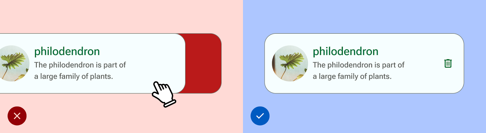
- لا تعتمد على الإيماءات لإكمال جميع الإجراءات؛ أنشئ إجراءات إمكانية الوصول لدعم جميع تدفقات المستخدمين في تطبيقك.
- تأكَّد من أنّ جميع مساحات اللمس لا تقل عن 48 وحدة بكسل مستقلة الكثافة، حتى إذا تخطّت نطاق العناصر المرئية لعنصر واجهة المستخدم.
- ضع في اعتبارك الملاحظات الحسّية لمساعدة المستخدم على الإبلاغ عن طريق مدخلات حسية إضافية في الوقت الفعلي.