
Wear OS 應用程式使用與其他 Android 裝置相同的版面配置技巧,但必須根據手錶專屬的限制來設計。
注意:請勿將行動應用程式的功能和 UI 原封不動轉移至 Wear OS,這個方法不太可能提供良好的使用者體驗。
如果您是針對矩形手持裝置設計應用程式,那麼螢幕角落的內容可能會在圓形手錶上遭到裁切。如果您使用可捲動的垂直清單,那麼受到的影響可能會較小,因為使用者能夠捲動畫面將內容置中。不過,如果是單螢幕畫面,可能會導致使用者體驗不佳。
如果您為版面配置使用下列設定,文字會無法在圓形螢幕的裝置上正確顯示:
<androidx.constraintlayout.widget.ConstraintLayout
    xmlns:android="http://schemas.android.com/apk/res/android"
    xmlns:app="http://schemas.android.com/apk/res-auto"
    xmlns:tools="http://schemas.android.com/tools"
    android:layout_width="match_parent"
    android:layout_height="match_parent">

    <TextView
        android:id="@+id/text"
        android:layout_width="0dp"
        android:layout_height="0dp"
        android:text="@string/very_long_hello_world"
        app:layout_constraintBottom_toBottomOf="parent"
        app:layout_constraintEnd_toEndOf="parent"
        app:layout_constraintStart_toStartOf="parent"
        app:layout_constraintTop_toTopOf="parent" />

</androidx.constraintlayout.widget.ConstraintLayout>
為解決這個問題,請使用支援圓形裝置的 Wear OS UI 程式庫中的版面配置。
- 您可以使用
BoxInsetLayout,避免圓形螢幕邊緣附近的內容遭到裁切。 - 如果您想要顯示並操控針對圓形螢幕進行最佳化的項目垂直清單,可以使用
WearableRecyclerView建立曲線版面配置。
如要進一步瞭解如何設計應用程式,請參閱 Wear OS 設計指南。
使用 BoxInsetLayout
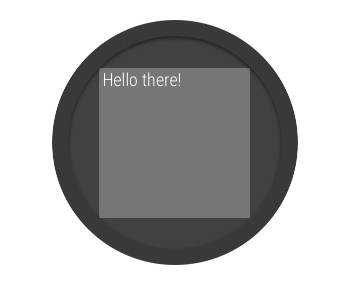
圖 2. 圓形螢幕上的視窗插邊。
您可以使用 Wear OS UI 程式庫中的 BoxInsetLayout 類別,定義圓形螢幕適用的版面配置。這個類別可輕鬆將畫面置中對齊或靠近螢幕邊緣。
在套用所需的視窗插邊後,BoxInsetLayout 可將子檢視區塊自動顯示在圓形螢幕上,如圖 2 中的灰色正方形所示。為了要在這個區域中顯示,子檢視區塊會使用下列值指定 layout_boxedEdges 屬性:
top、bottom、left和right的組合。例如,"left|top"值會將子項的左側和頂端邊緣置於圖 2 的灰色正方形中。"all"值會將所有子項內容置於圖 2 的灰色正方形中。這是內含ConstraintLayout最常見的做法。
圖 2 所示的版面配置使用 <BoxInsetLayout> 元素,適用於圓形螢幕:
<androidx.wear.widget.BoxInsetLayout
    xmlns:android="http://schemas.android.com/apk/res/android"
    xmlns:app="http://schemas.android.com/apk/res-auto"
    android:layout_height="match_parent"
    android:layout_width="match_parent"
    android:padding="15dp">

    <androidx.constraintlayout.widget.ConstraintLayout
        android:layout_width="match_parent"
        android:layout_height="match_parent"
        android:padding="5dp"
        app:layout_boxedEdges="all">

        <TextView
            android:layout_height="wrap_content"
            android:layout_width="match_parent"
            android:text="@string/sometext"
            android:textAlignment="center"
            app:layout_constraintEnd_toEndOf="parent"
            app:layout_constraintStart_toStartOf="parent"
            app:layout_constraintTop_toTopOf="parent" />

        <ImageButton
            android:background="@android:color/transparent"
            android:layout_height="50dp"
            android:layout_width="50dp"
            app:layout_constraintBottom_toBottomOf="parent"
            app:layout_constraintStart_toStartOf="parent"
            android:src="@drawable/cancel" />

        <ImageButton
            android:background="@android:color/transparent"
            android:layout_height="50dp"
            android:layout_width="50dp"
            app:layout_constraintBottom_toBottomOf="parent"
            app:layout_constraintEnd_toEndOf="parent"
            android:src="@drawable/ok" />

    </androidx.constraintlayout.widget.ConstraintLayout>

</androidx.wear.widget.BoxInsetLayout>
請注意版面配置中以粗體標示的部分:
-
android:padding="15dp"此行會將邊框間距指派給
<BoxInsetLayout>元素。 -
android:padding="5dp"此行會將邊框間距指派給內部
ConstraintLayout元素。 -
app:layout_boxedEdges="all"此行可確保
ConstraintLayout元素及其子項位於圓形螢幕上視窗插邊所定義的區域內。
使用曲線版面配置
Wear OS UI 程式庫中的
WearableRecyclerView 類別可讓您選擇採用曲線版面配置,並針對圓形螢幕進行最佳化調整。如要為應用程式中的可捲動清單啟用曲線版面配置,請參閱「在 Wear OS 上建立清單」。