
In Jetpack Compose Glimmer, the Card component is designed to group and
display related information in a single unit. Cards are highly adaptable,
supporting combinations of main content, optional titles and subtitles, and
leading or trailing icons. Cards fill the maximum full width of the AI glasses
display by default, are focusable, and can also be made clickable.
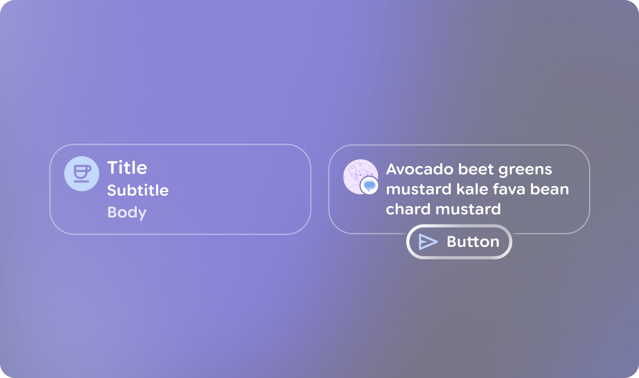
Card Anatomy and Slots
A Jetpack Compose Glimmer Card is built from several specialized elements, allowing you to customize its content and layout.
Header: The top section of the card, designed to hold an image.
Title and Subtitle: These text fields provide the main and secondary labels for the card.
Leading Icon: An optional icon that appears at the beginning of the card's content area.
Trailing Icon: An optional icon that appears at the end of the card's content area.
Action: A slot for a primary interactive element, such as a Button. This allows users to perform an action directly from the card. The slot is available on a separate overload of the Card composable.
Main Content: The core body of the card, where you place the primary Text or other content.
Basic example: Create a basic card
You can create a very basic card with very little code:
Card { Text("This is a card") }
Detailed example: Display a complex card
The following code shows how to use multiple slots together to build a card. It
also shows how to pair a Card with a TitleChip.
@Composable
fun SampleGlimmerCard() {
    val myHeaderImage = painterResource(id = R.drawable.header_image)
    Column(horizontalAlignment = Alignment.CenterHorizontally) {
        TitleChip { Text("Title Chip") }
        Spacer(Modifier.height(TitleChipDefaults.AssociatedContentSpacing))
        Card(
            action = {
                Button(onClick = {}) {
                    Text("Action Button")
                }
            },
            header = {
                Image(
                    painter = myHeaderImage,
                    contentDescription = "Header image for the card",
                    contentScale = ContentScale.FillWidth
                )
            },
            title = { Text("Card Title") },
            subtitle = { Text("Card Subtitle") },
            leadingIcon = { FavoriteIcon, "Localized description" },
            trailingIcon = { FavoriteIcon, "Localized description" }
        ) {
            Text("A Jetpack Compose Glimmer Card using all available slots")
        }
    }
}
Key points about the code
- Shows how to utilize various card elements, such as
header,title,subtitle,leadingIcon, andaction, to customize the card's content and structure. - Shows an example of how to place a
TitleChipand use aSpacer.