إنّ أدراج التنقّل هي مكوّنات أساسية في أي تطبيق تلفزيوني، لأنّها تسمح للمستخدمين بالوصول إلى وجهات وميزات مختلفة. يشكّل درج التنقّل العمود الفقري لبنية المعلومات في التطبيق، إذ يقدّم طريقة واضحة وسهلة للتنقل في التطبيق.
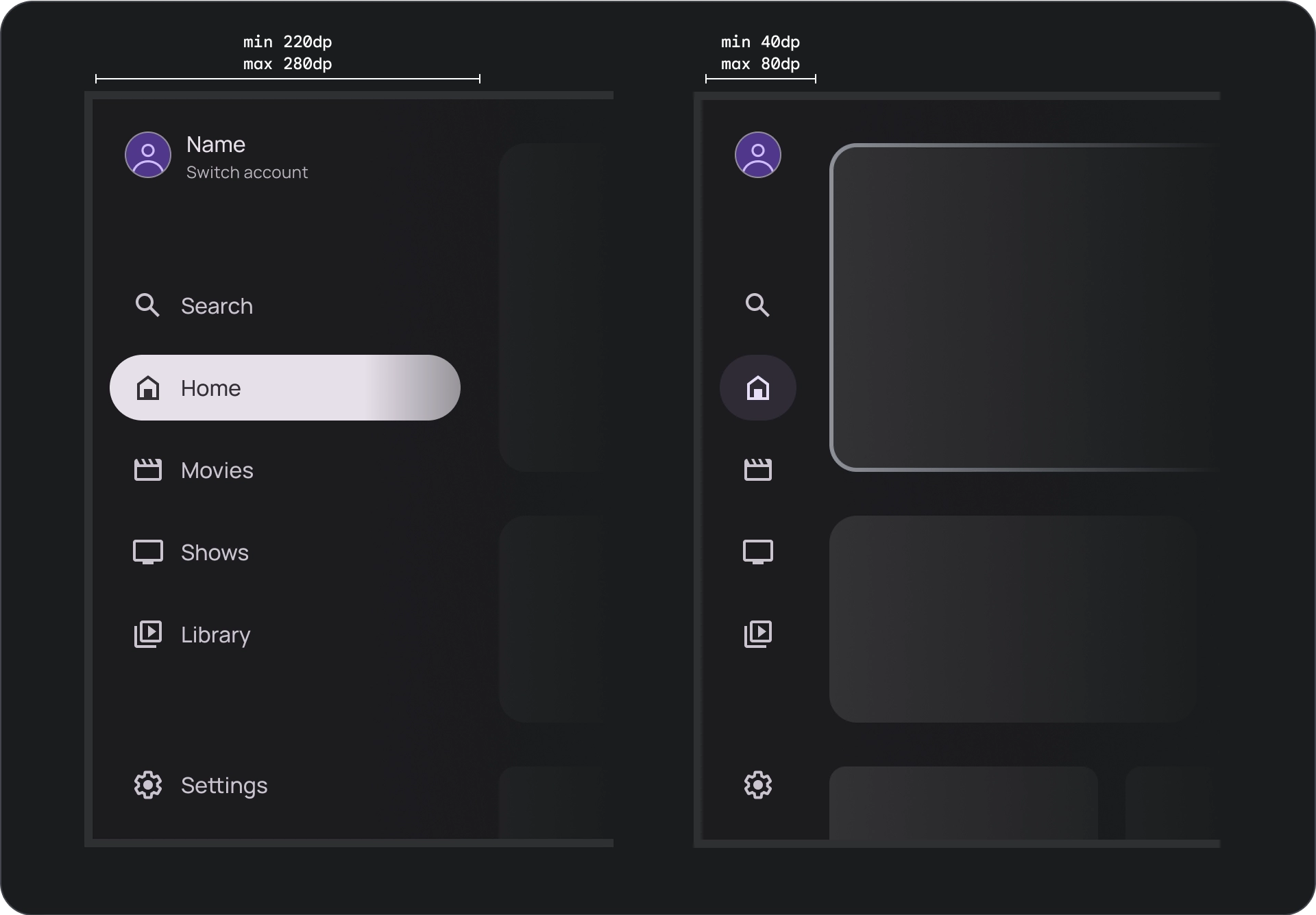
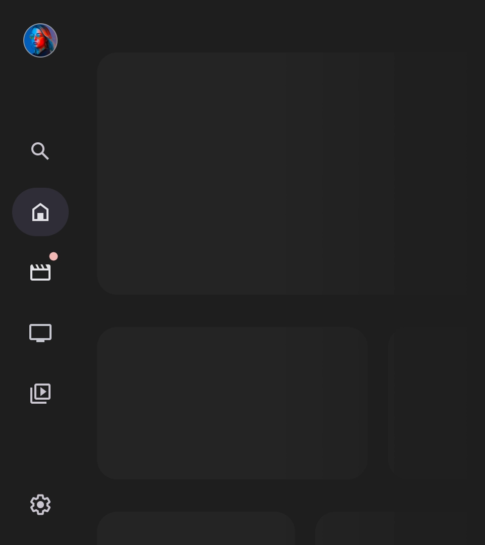
على عكس أدراج التنقّل على الأجهزة الجوّالة، يعرض درج التنقّل على التلفزيون حالتَي التوسيع والانكماش للمستخدم.
المراجع
| النوع | رابط | الحالة |
|---|---|---|
| التصميم | مصدر التصميم (Figma) | متاح |
| التنفيذ |
Jetpack Compose (NavigationDrawer)
Jetpack Compose (ModalNavigationDrawer) |
متاح |
أهم التفاصيل
- يتم ترتيب الوجهات حسب أهميتها بالنسبة إلى المستخدم، مع عرض الوجهات التي يقصدها كثيرًا أولاً وتجميع الوجهات ذات الصلة معًا.
- يجب توفير شريط تنقّل لكل من أدراج التنقّل العادية وتلك التي تتضمّن وضعًا مشروطًا عند تصغيرها.
المتغيرات
هناك نوعان من أنماط أدراج التنقّل:
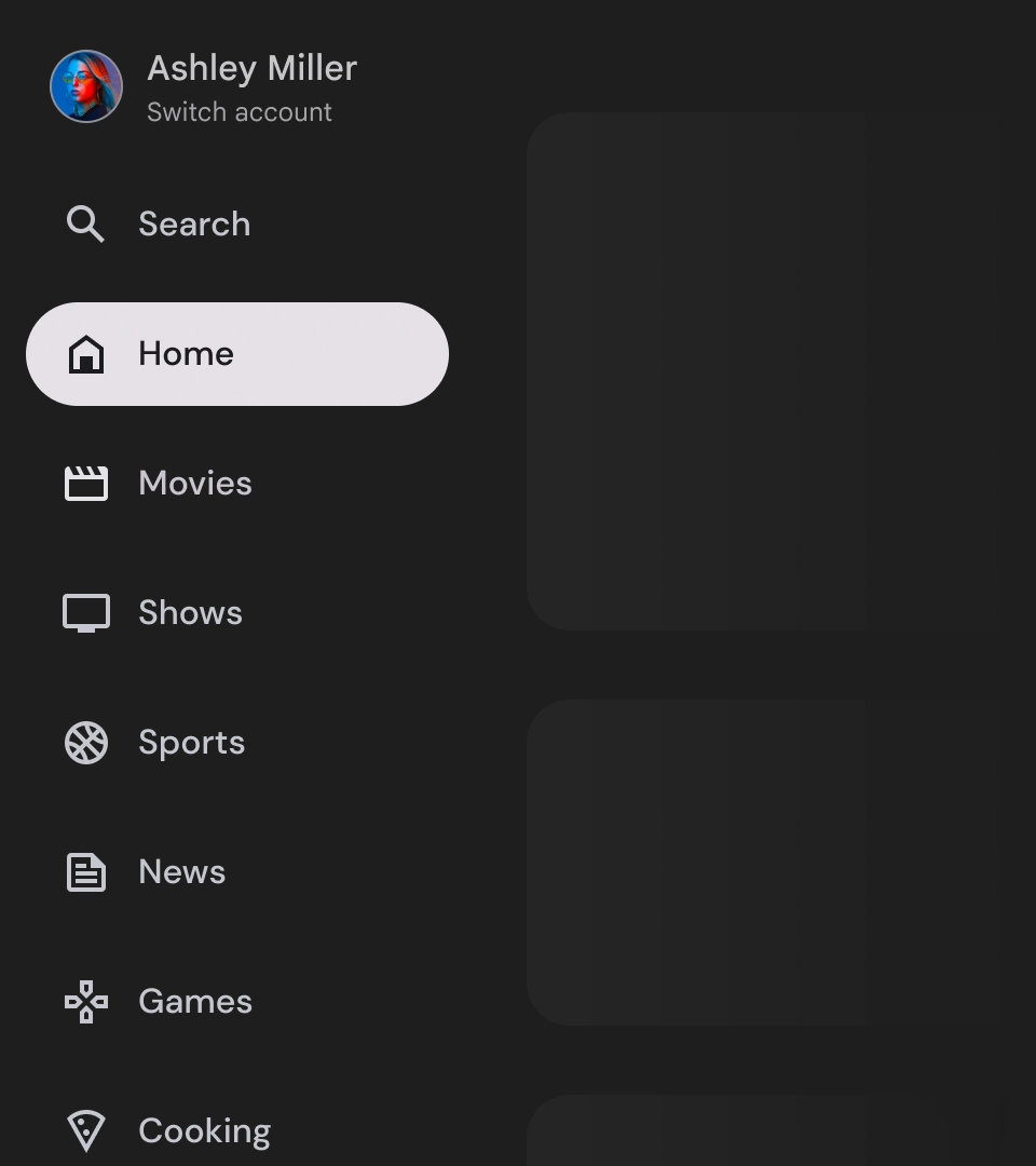
- لائحة التنقّل العادية: يتم توسيعها لتوفير مساحة إضافية للتنقّل، ما يؤدي إلى إزاحة محتوى الصفحة.
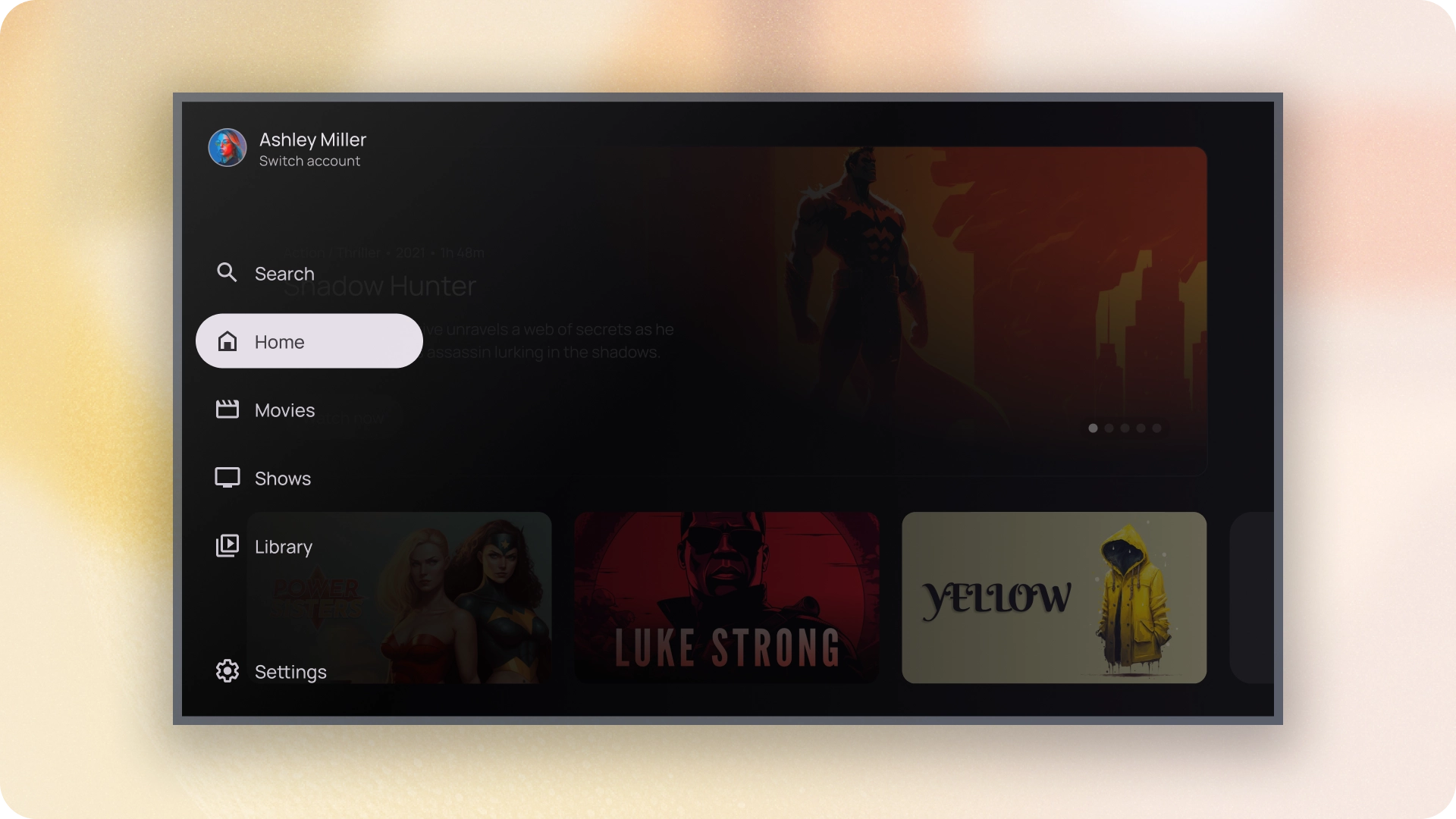
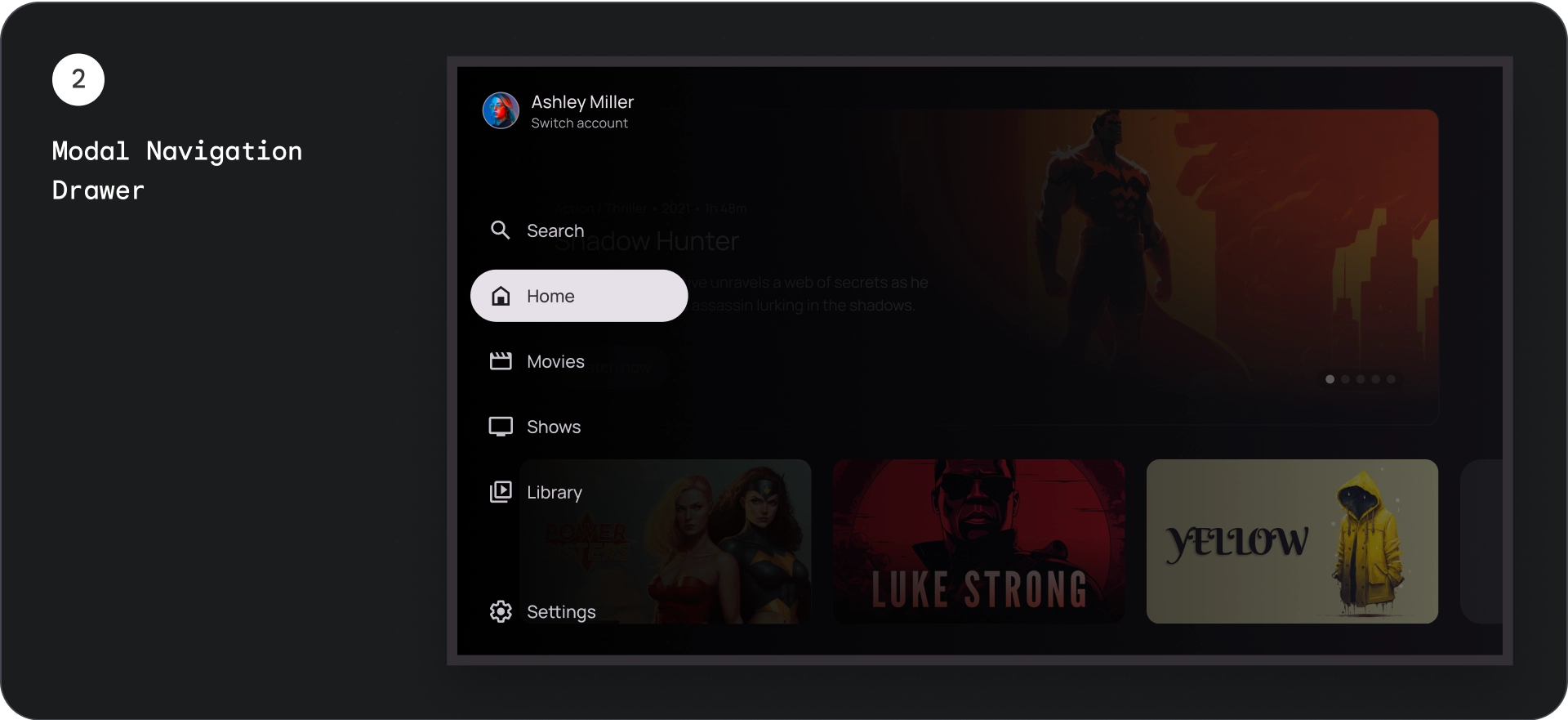
- درج التنقّل في وضع النافذة المنبثقة: يظهر كأحد عناصر التداخل فوق محتوى التطبيق مع شاشة تمويه تساعد في تحسين إمكانية القراءة عند توسيع الدرج.
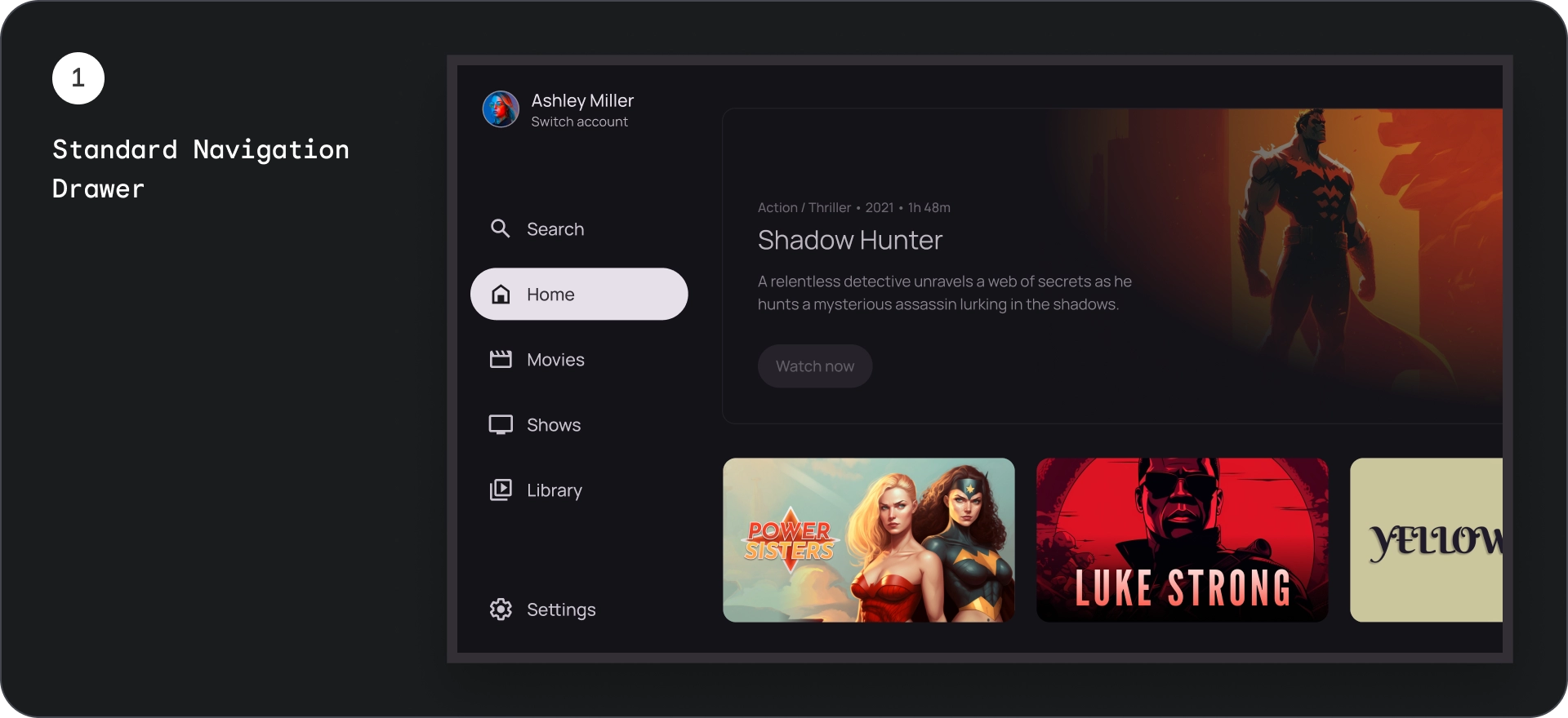
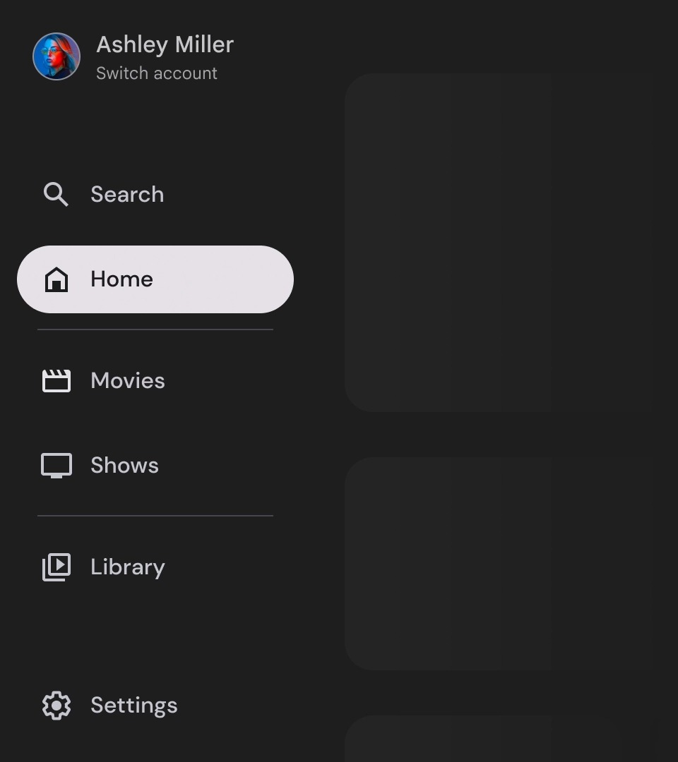
لائحة التنقّل العادية
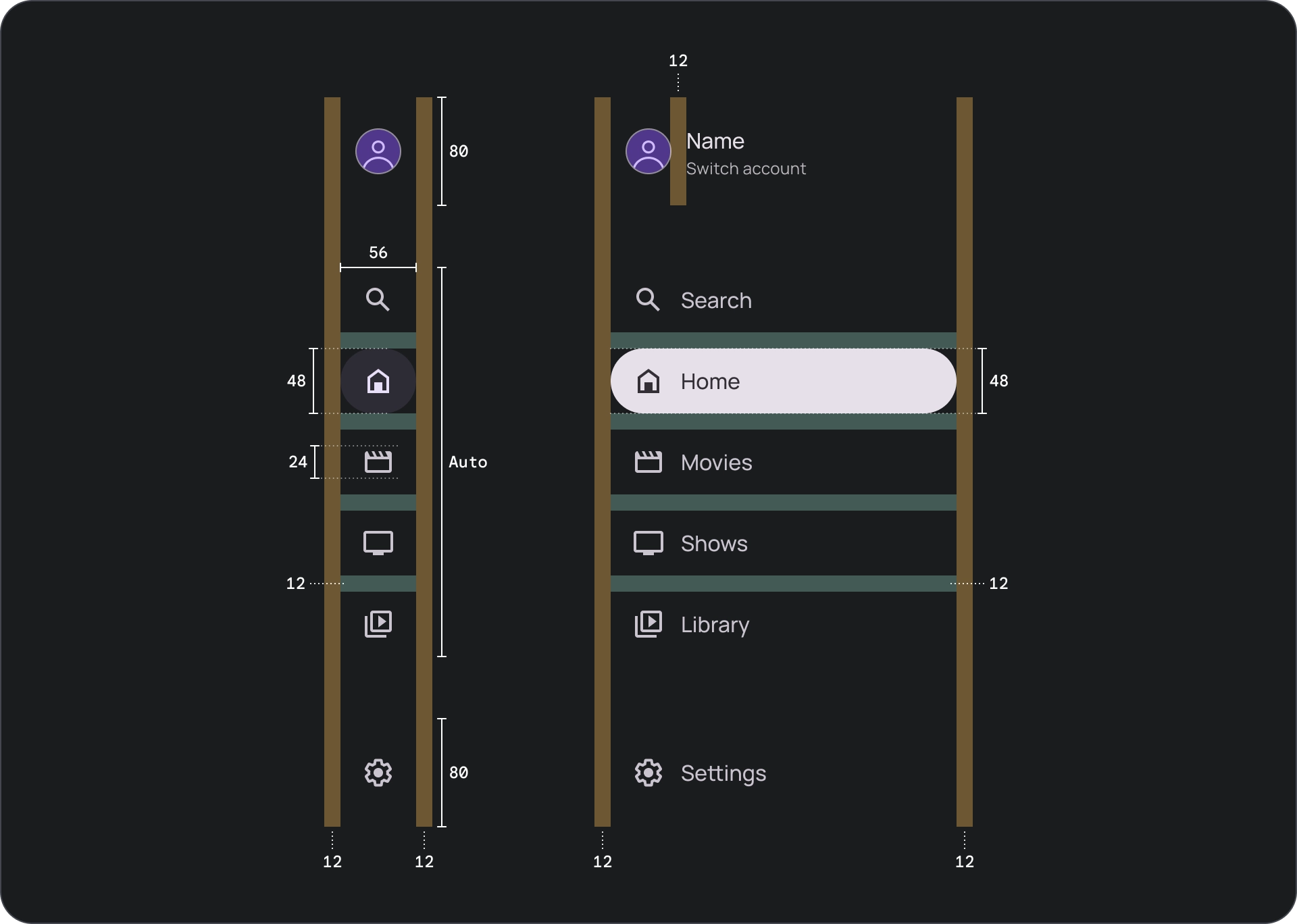
علم التشريح
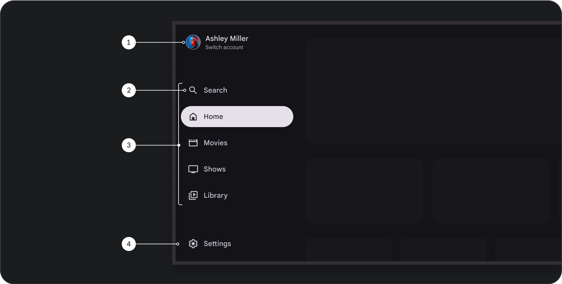
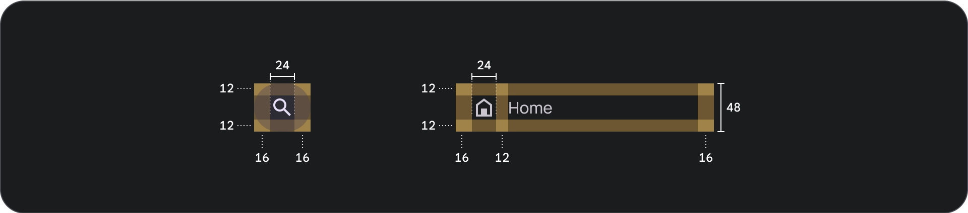
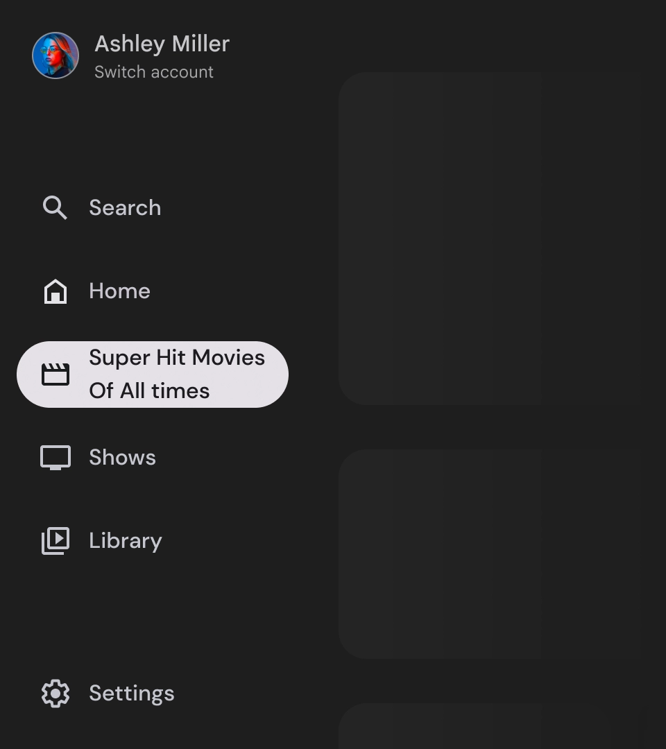
- القسم العلوي: يعرض شعار التطبيق. تُستخدَم كزر ل تبديل الملفات التجارية أو لبدء إجراء البحث. في الحالة المُدمجة، يبقى الرمز فقط مرئيًا في الحاوية العلوية.
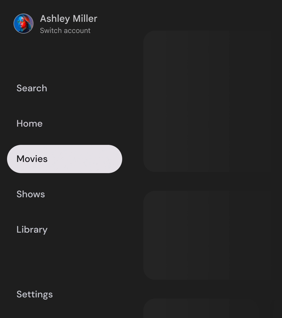
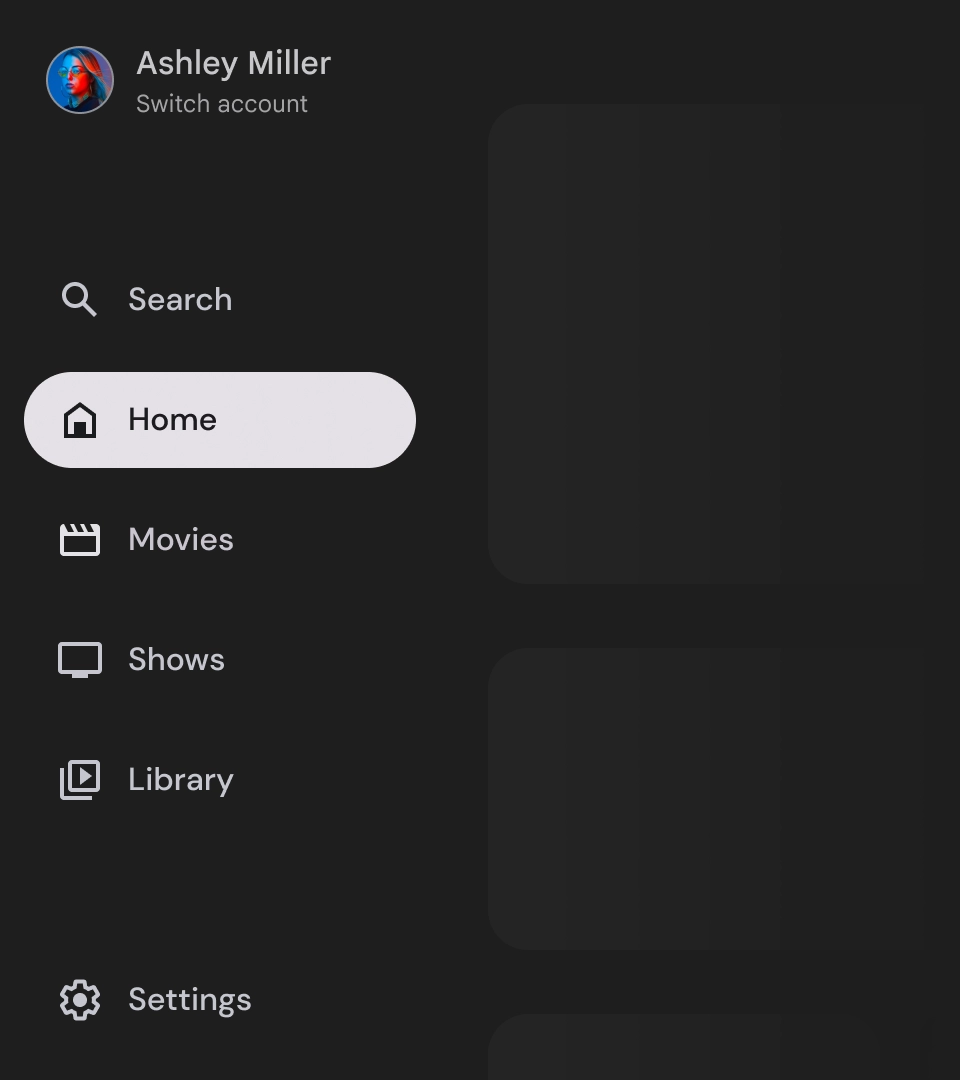
- عنصر التنقّل: يعرض كل عنصر في شريط التنقّل مزيجًا من رمز ونص، ولا يظهر سوى الرمز في الحالة المصغّرة.
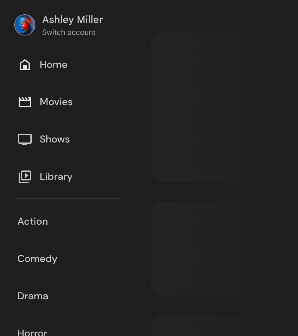
- شريط التنقّل: شريط التنقّل هو عمود يُظهر من 3 إلى 7 وجهات للتطبيق، ويعمل كقائمة رئيسية. تحتوي كل وجهة على تصنيف نصي ورمز اختياري، مع خيار تجميع عناصر قائمة لتحسين السياق.
- القسم السفلي: يمكن أن يتضمّن زرّ إجراء واحدًا أو ثلاثة، وهو مثالي للصفحات مثل الإعدادات أو المساعدة أو الملف الشخصي.
السُلوك
- توسيع درج التنقّل: عند توسيع أدراج التنقّل العادية، يتم دفع محتوى الصفحة لتوفير مساحة للإصدار الموسّع من درج التنقّل.
- تعديلات التنقّل: عند الانتقال من عنصر تنقّل إلى آخر، يتم تعديل الصفحة تلقائيًا لتظهر الوجهة الجديدة.
لائحة التنقّل المقيّدة
علم التشريح
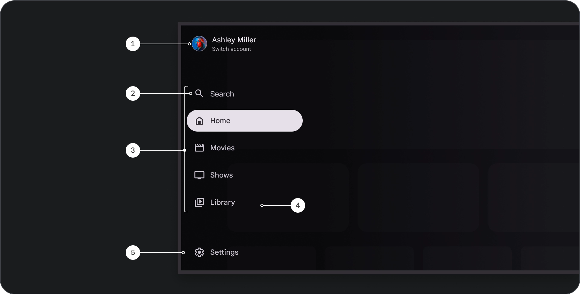
- القسم العلوي: يعرض شعار التطبيق. يُستخدَم كزر للتبديل بين الملفات الشخصية أو لبدء إجراء بحث. في الحالة المُدمجة، سيظل رمز مرئيًا فقط في الحاوية العلوية.
- عنصر التنقّل: يعرض كل عنصر في شريط التنقّل مزيجًا من رمز ونص، ولا يظهر سوى الرمز في الحالة المصغّرة.
- شريط التنقّل: عمود يعرض من ثلاثة إلى سبعة وجهات للتطبيق، ويعمل كقائمة رئيسية. تحتوي كل وجهة على تصنيف نصي ورمز اختياري، مع خيار تجميع عناصر القائمة لتحسين السياق.
- الشبكة: لتحسين إمكانية قراءة نص عناصر التنقّل
- القسم السفلي: يمكن أن يتضمّن زرّ إجراء واحدًا أو ثلاثة، وهو مثالي للصفحات مثل الإعدادات أو المساعدة أو الملف الشخصي.
السُلوك
- توسيع الدرج: يظهر كعنصر تراكبي فوق محتوى التطبيق، مع شاشة تمويهية تُحسِّن من سهولة القراءة عند توسيع الدرج.
- تعديلات التنقّل: تحدث عندما يحدد المستخدِم عنصر تنقّل.
تمويه
بالنسبة إلى مربّع التنقّل في النافذة المشروطة، يضمن الظلّ الذي يظهر خلف المربّع إمكانية قراءة محتوى المربّع. يمكنك استخدام سطح متدرّج أو صلب خلف لوحة التنقّل لإنشاء اختلافات مختلفة لواجهة المستخدم.
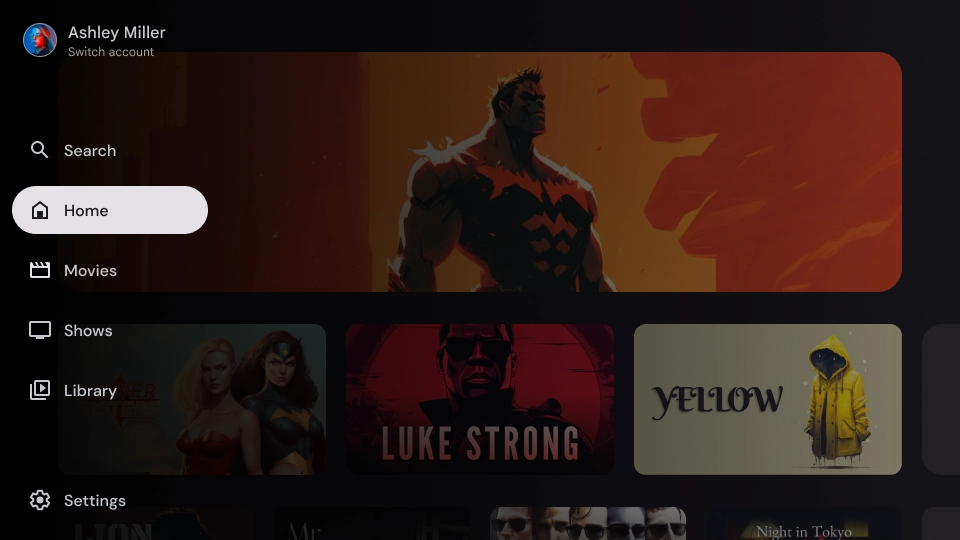
حاجب متدرّج
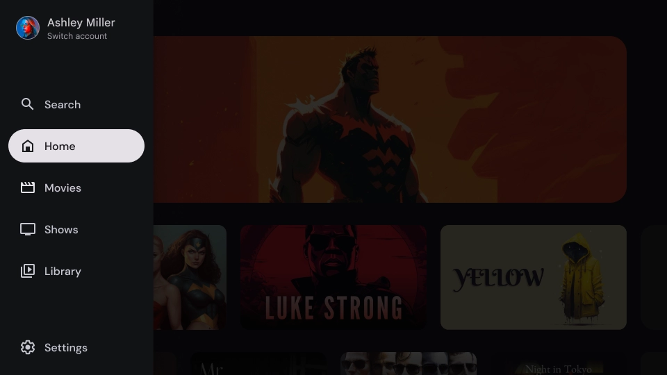
حاجب صلب
المواصفات
الاستخدام
مؤشر النشاط
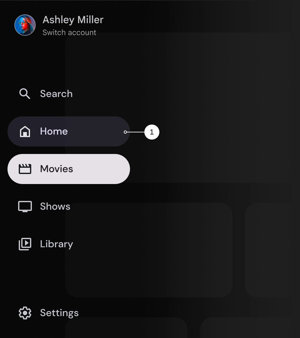
المؤشر النشط هو إشارة مرئية تُبرز وجهة درج التنقّل المعروضة. يتم عادةً تمثيل المؤشر باستخدام شكل خلفي يختلف بشكلٍ مرئي عن العناصر الأخرى في الدرج. يساعد المؤشر النشط المستخدمين في معرفة مكانهم في التطبيق ومقدّمة المحتوى التي يتصفّحونها. تأكَّد من أنّ المؤشر النشط مرئي بوضوح ومن السهل تمييزه عن العناصر الأخرى في مربّع التنقّل.
الفواصل (اختيارية)
يمكن استخدام أدوات تقسيم الشاشة لفصل مجموعات من الوجهات ضمن أدراج التنقّل لتنظيمها بشكل أفضل. ومع ذلك، من المهم استخدامها باعتدال لأنّه يمكن أن يؤدي استخدام عدد كبير جدًا من الفواصل إلى تشويش الرؤية وزيادة العبء المعرفي غير الضروري على المستخدمين.
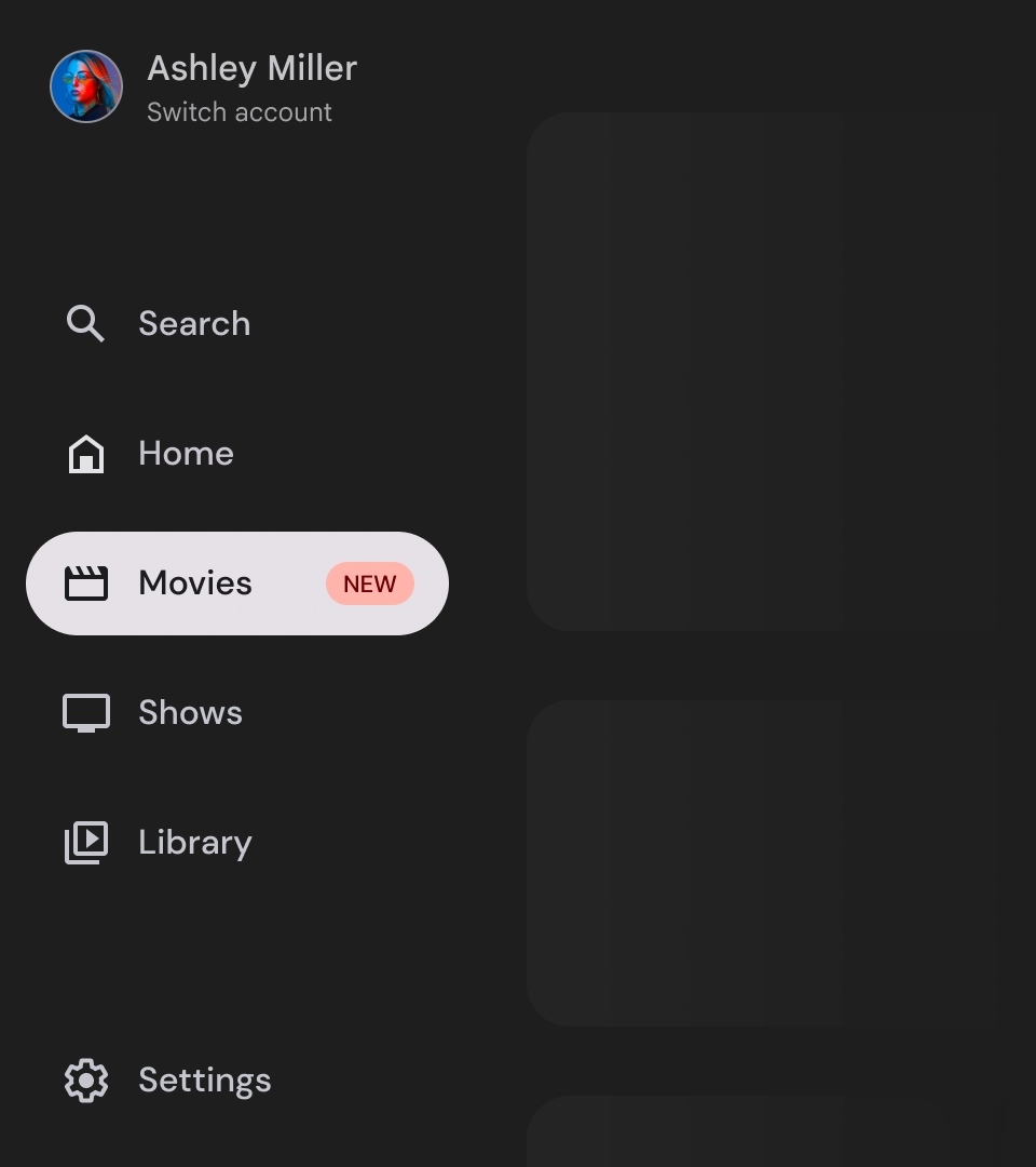
الشارات
الشارات هي إشارات مرئية يمكن إضافتها إلى عناصر التنقّل لتقديم معلومات إضافية. على سبيل المثال، يمكن استخدام شارة لتحديد عدد الأفلام الجديدة المتوفّرة في تطبيق بث. استخدِم الشارات باعتدال وعند الضرورة فقط، لأنّها يمكن أن تجعل واجهة المستخدم تبدو مزدحمة ومكتظة. عند استخدام الشارات، تأكَّد من أنّها واضحة وسهلة الفهم وأنّها لا تؤثر في قدرة المستخدم على التنقّل في التطبيق.
الشارة الموسّعة
الشارة مصغّرة
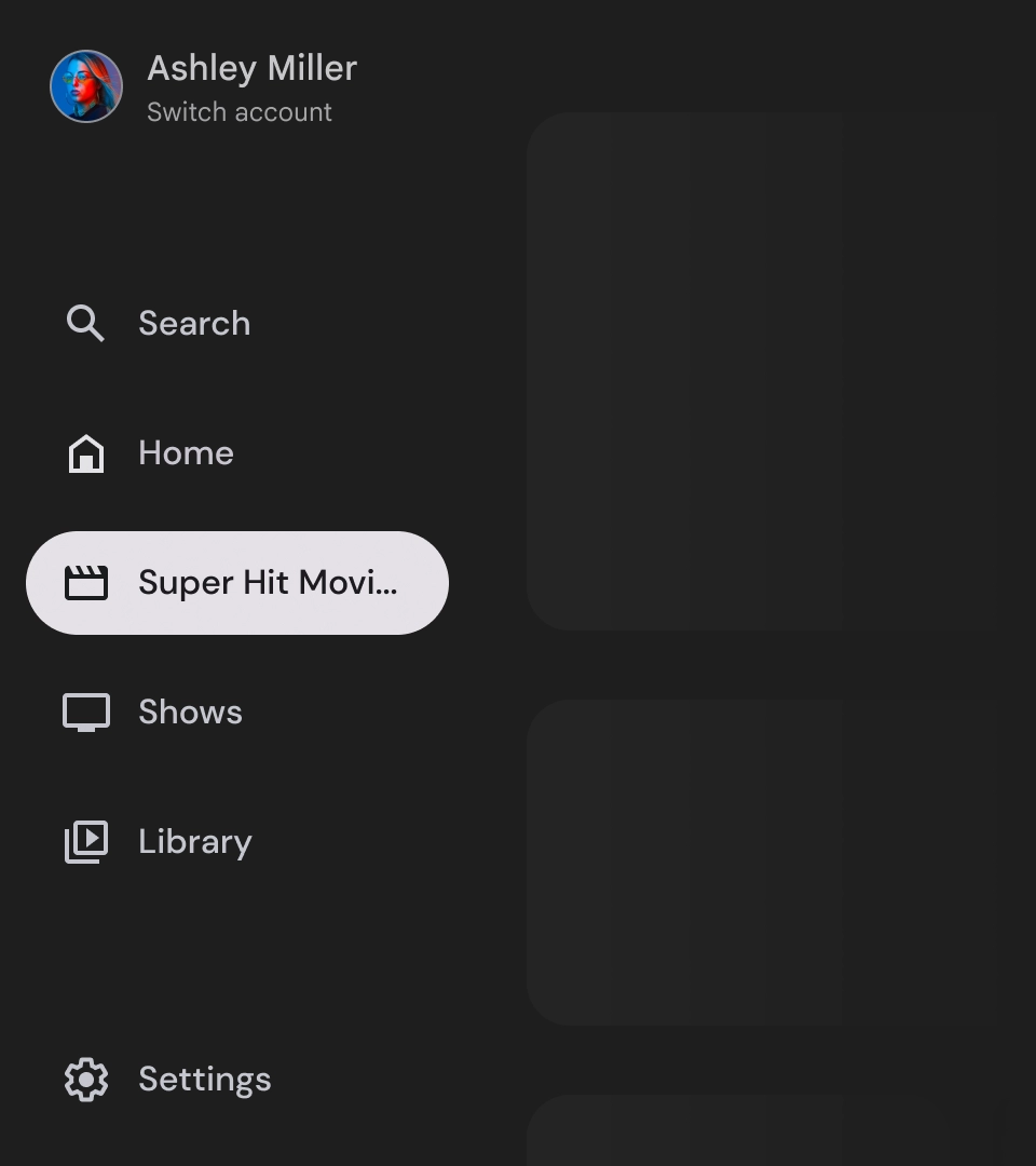
التصنيفات
يجب أن تكون التصنيفات في مربّع التنقّل واضحة وموجزة لكي يسهل قراءتها.
تنبيه
الإجراءات غير المُوصى بها
الإجراءات غير المُوصى بها
الإجراءات غير المُوصى بها
أدراج التنقّل هي عناصر أساسية تمثّل التسلسل الهرمي لتطبيقك، ويجب استخدامها لعرض خمسة إلى ستة وجهات تنقّل أساسية فقط.
الإجراءات التي يُنصح بها