تضم القائمة الشاملة مزيجًا من صف من المحتوى معاينة العنصر المحدد. وتعرض المحتوى في إطار عرض أكبر.
المراجع
| النوع | رابط | الحالة |
|---|---|---|
| التصميم | مصدر التصميم (Figma) | متاح |
| التنفيذ | نموذج | لا ينطبق |
أهم التفاصيل
- معاينة المحتوى الديناميكي. عندما يتنقل المستخدم عبر صف المحتوى، يتم تحديث منطقة المعاينة تلقائيًا لعرض العنصر الحالي محل التركيز.
- يتميز مكوِّن القائمة المجسَّمة بإطار عرض أكبر عرض المحتوى، ما يسهِّل على المستخدمين عرض المحتوى وتقديره التفاصيل المرئية للعنصر الذي تم التركيز عليه.
- توفّر القوائم التفاعلية معلومات ذات صلة وسياقية حول العنصر الذي تم التركيز عليه، مما يساعد المستخدمين على اتخاذ قرارات مستنيرة دون مغادرة تجربة التصفح.
- يستخدم مكون القائمة المجسَّمة الإفصاح التدريجي للكشف المزيد من التفاصيل حول المحتوى أثناء تنقل المستخدمين، مما يقلل من التحميل والحفاظ على تفاعل المستخدم.
- يضمن مكون القائمة الشاملة تفاعلات متسقة عبر التطبيق، بتزويد المستخدمين بتجربة مألوفة ويمكن التنبؤ بها.
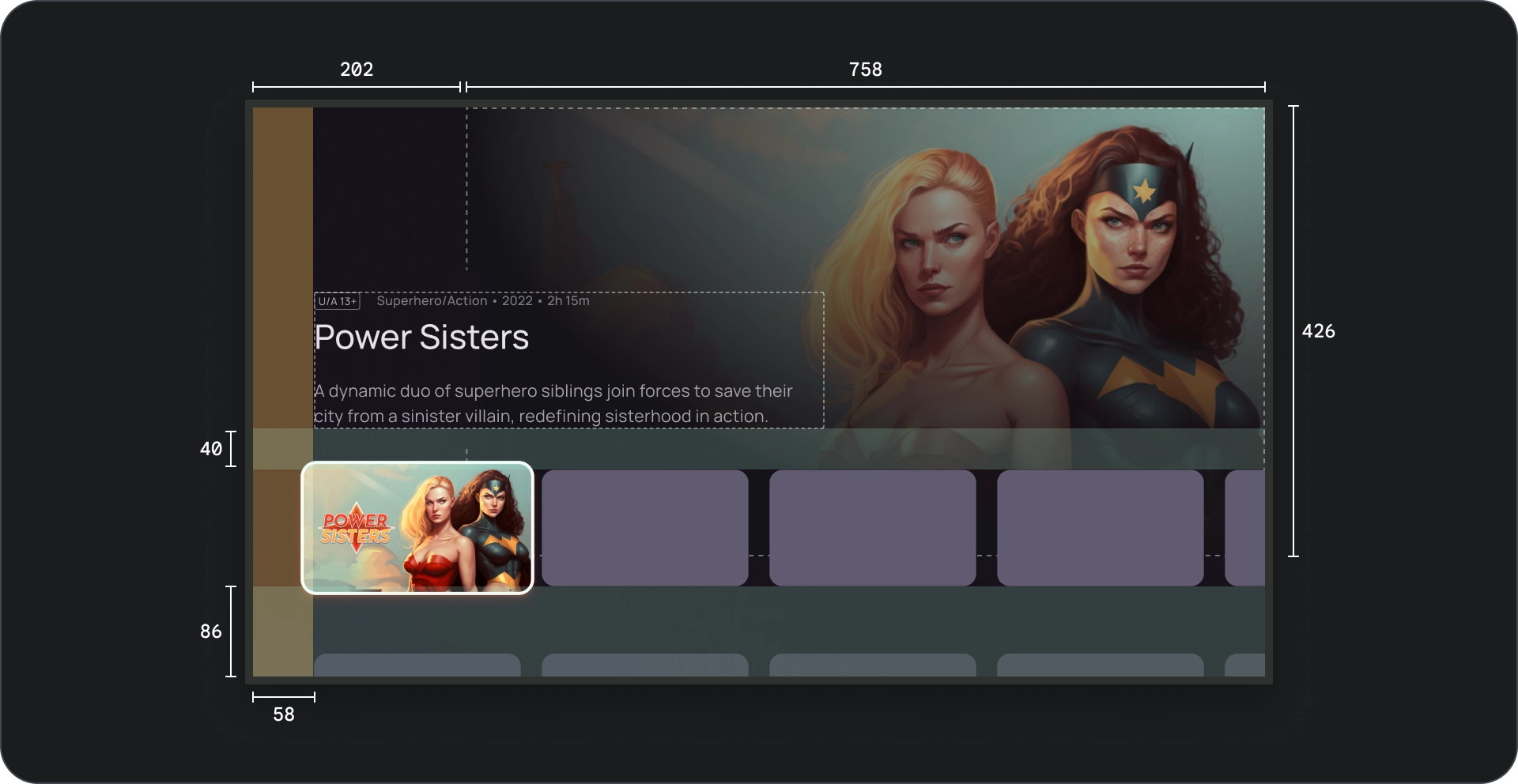
علم التشريح
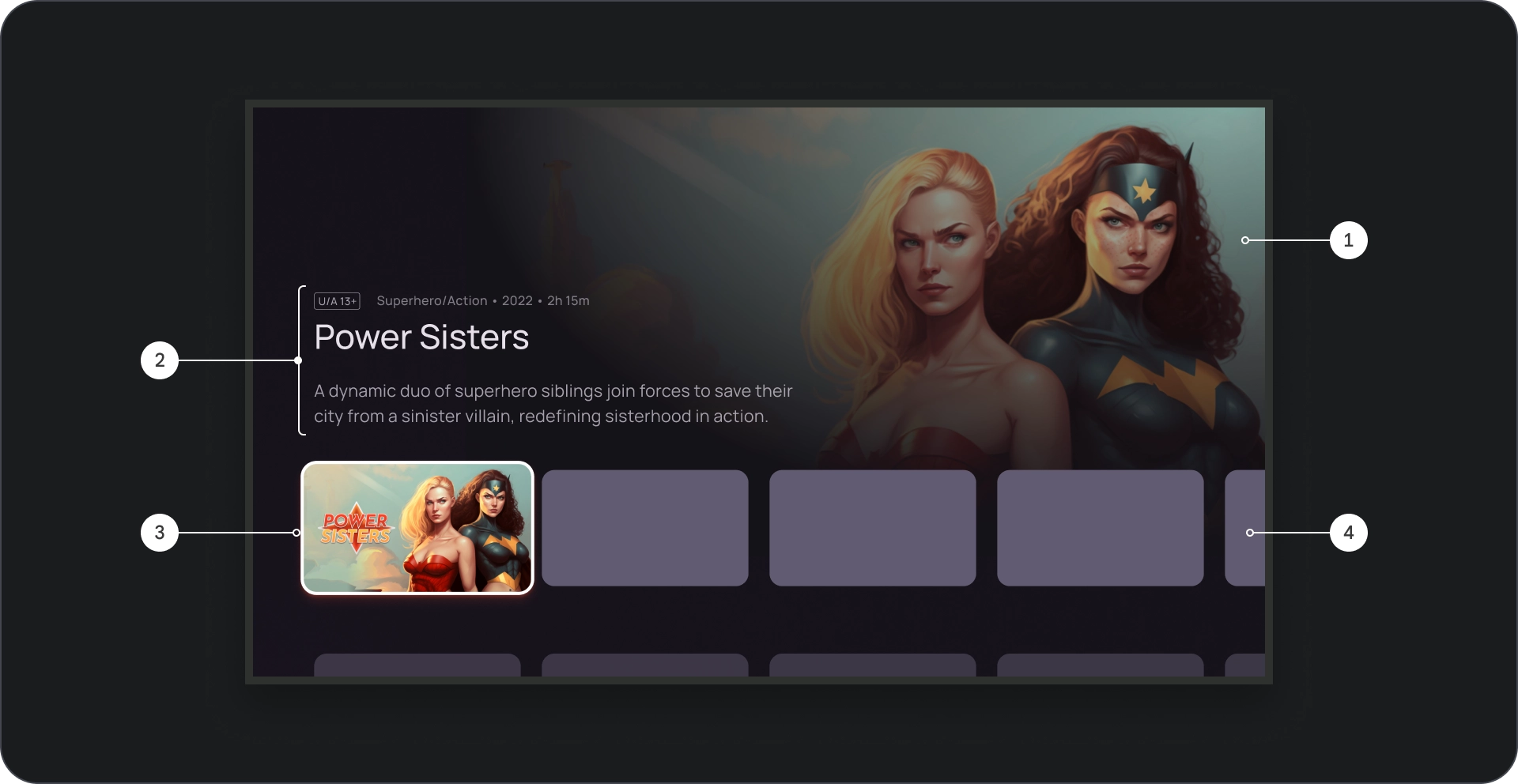
- خلفية الصورة
- حظر المحتوى
- البطاقة محل التركيز
- شبكة المحتوى
- حاجب سينمائي
- الملصق
- لون الخلفية
المواصفات
السُلوك
عند التنقل بين البطاقات في القائمة المجسّمة، تظهر تفاصيل يتم إظهار البطاقة المحددة تدريجيًا في الخلفية.
عندما تكون القائمة المجسَّمة في بؤرة التركيز، يزداد ارتفاعها لإظهار لمزيد من المعلومات، مثل عنوان الخلفية كما هو موضح في الفيديو التالي.
الاستخدام
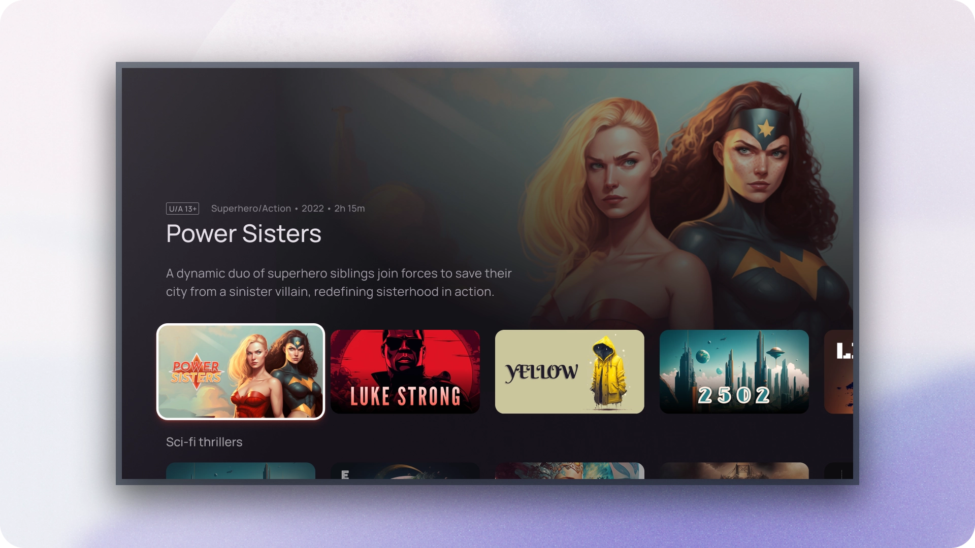
يمكنك استخدام لوحات العرض الدوّارة الغامرة للفت الانتباه إلى المحتوى المميز أو مثل الإصدارات الجديدة أو البرامج الرائجة أو المحتوى الحصري العناوين. يساعد إطار العرض الأكبر والمعاينة الديناميكية في إضفاء طابع جذاب على لعرض هذه العناصر ذات الأولوية العالية.
عرض الصورة
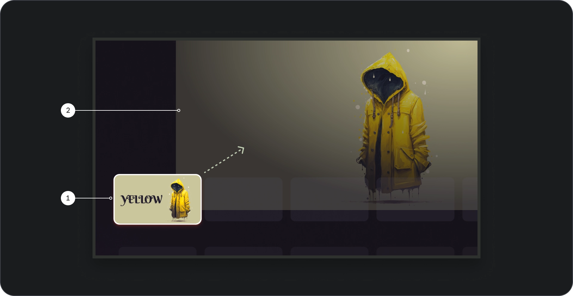
- تركيز البطاقة: أثناء تنقّل المستخدم في لوحة العرض الدوّارة، يتم التركيز عليها بصريًا، مع زيادة حجم البطاقة بمقدار 1.1، باستخدام حد، وإشارات مرئية أخرى كمسقط رأسي للإشارة إلى تحديده. ضمان ظهور المحتوى من العناوين داخل الصورة المصغّرة للبطاقة التي يتم التركيز عليها مرئية وأسهل في القراءة.
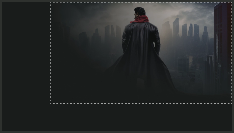
- صورة الخلفية: عند التركيز على بطاقة، يتم استخدام خلفية مقابلة تظهر الصورة في إطار العرض الأكبر. ننصح باستخدام هذه الخلفية الصورة ذات جودة عالية وجذابة بصريًا، حيث إنها توفر تجربة غامرة خلفية جذابة للمحتوى.
مقطوعة موسيقية
الإجراءات التي يُنصح بها
الإجراءات غير المُوصى بها
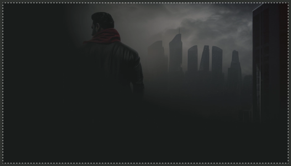
لضمان استخدام الصور كخلفيات في مكون القائمة المجسم أن تبدو جيدة، تأكد من تغيير حجمها بشكل مناسب حتى لا تكون ضبابية أو تشوّهه.
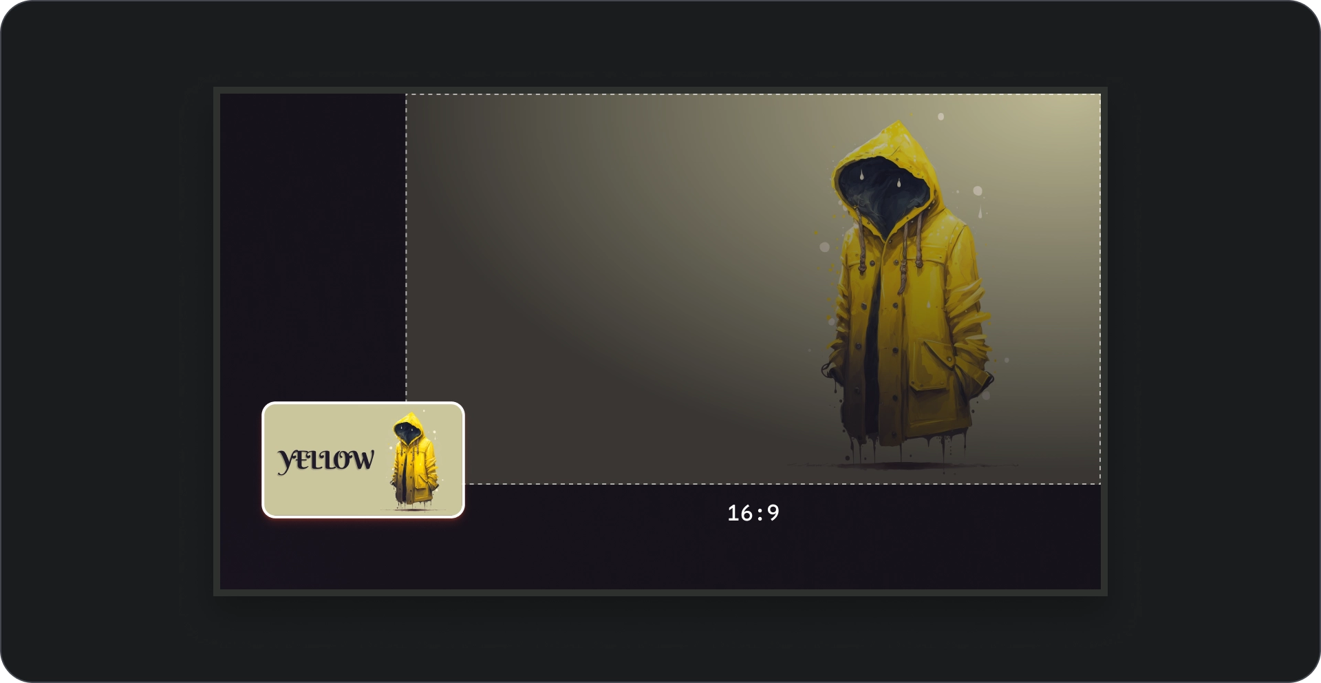
نسبة العرض إلى الارتفاع
استخدِم نسبة 16:9 لصور الخلفية كلما أمكن ذلك لضمان تخطيط جذاب ومتسق من الناحية المرئية.