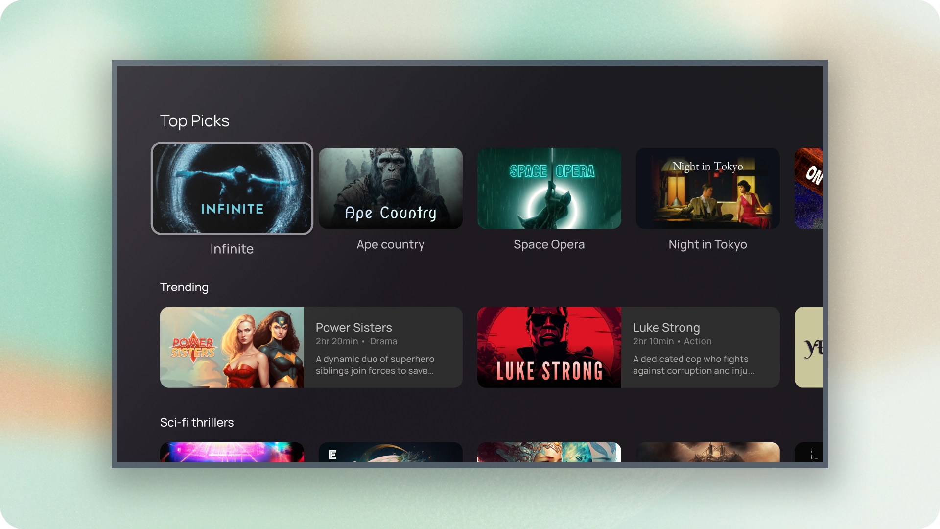
כרטיסים הם אבני הבניין הבסיסיות של האפליקציה לטלוויזיה.
משאבים
| סוג | קישור | סטטוס |
|---|---|---|
| עיצוב | עיצוב של מקור (Figma) | יש גישה |
| הטמעה | Jetpack פיתוח נייטיב | יש גישה |
המיטב
- אפשר להשתמש בכרטיס כדי להציג תוכן בנושא מסוים.
- כרטיס יכול להכיל כל דבר, מתמונות ועד כותרות, תמיכה בטקסט, בלחצנים, ברשימות וברכיבים אחרים של ממשק המשתמש.
- כרטיס לא יכול להתמזג עם כרטיס אחר או לפצל אותו לכמה כרטיסים.
- יש שש וריאציות של כרטיסים: רגילה, קלאסי, קומפקטית, inset, סטנדרטי רחב וקלאסי רחב.
וריאנטים
יש חמישה סוגים של כרטיסים, לכל אחד מהם יש תרחיש לדוגמה שונה:
- רגיל
- קלאסי
- קומפקטית
- תקן רחב
- רחבה קלאסית
חסימות תוכן
התוכן של הכרטיס מסודר לפי בלוקים נפרדים. העיצוב החזותי של הכרטיס כולל הדגשה מייצגת היררכיה. הפריסה של הכרטיסים עצמם להכיל את סוגי התוכן שהכרטיסים מכילים.
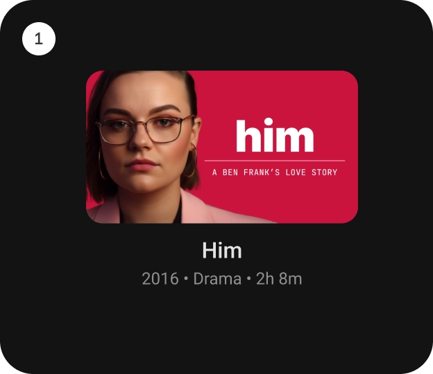
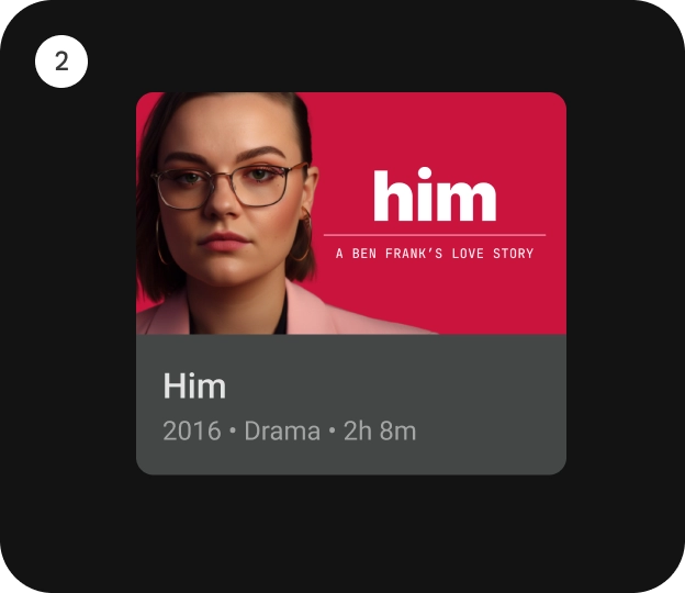
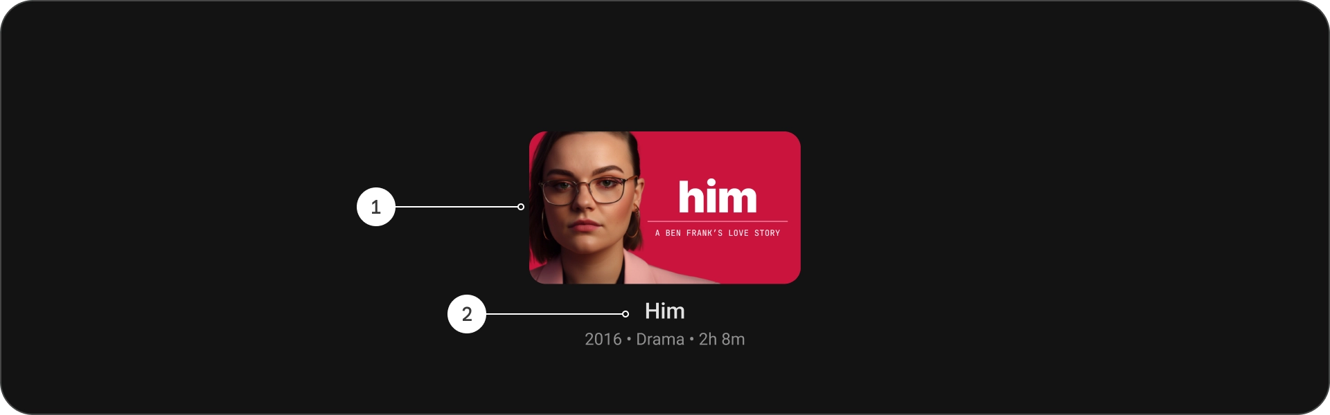
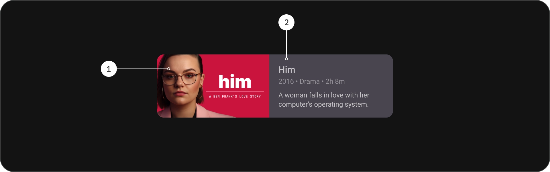
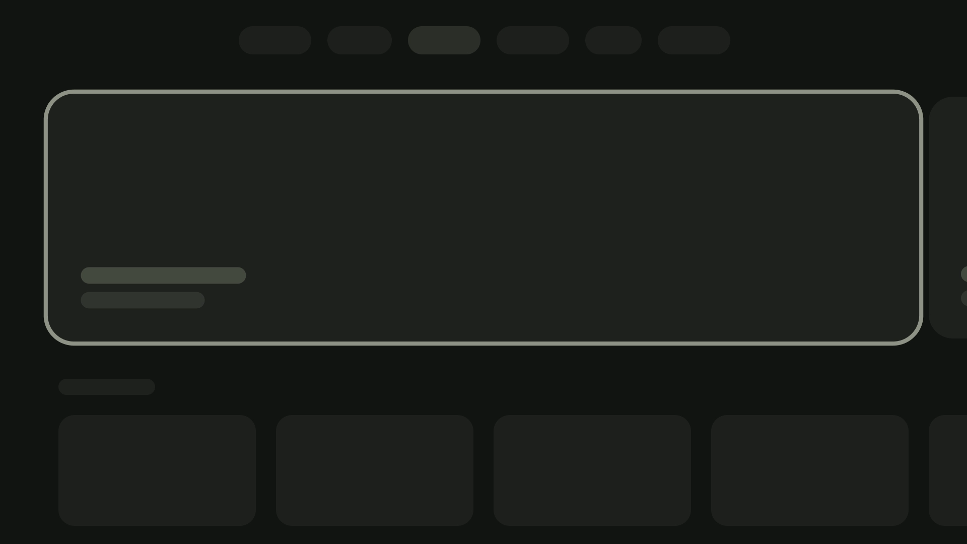
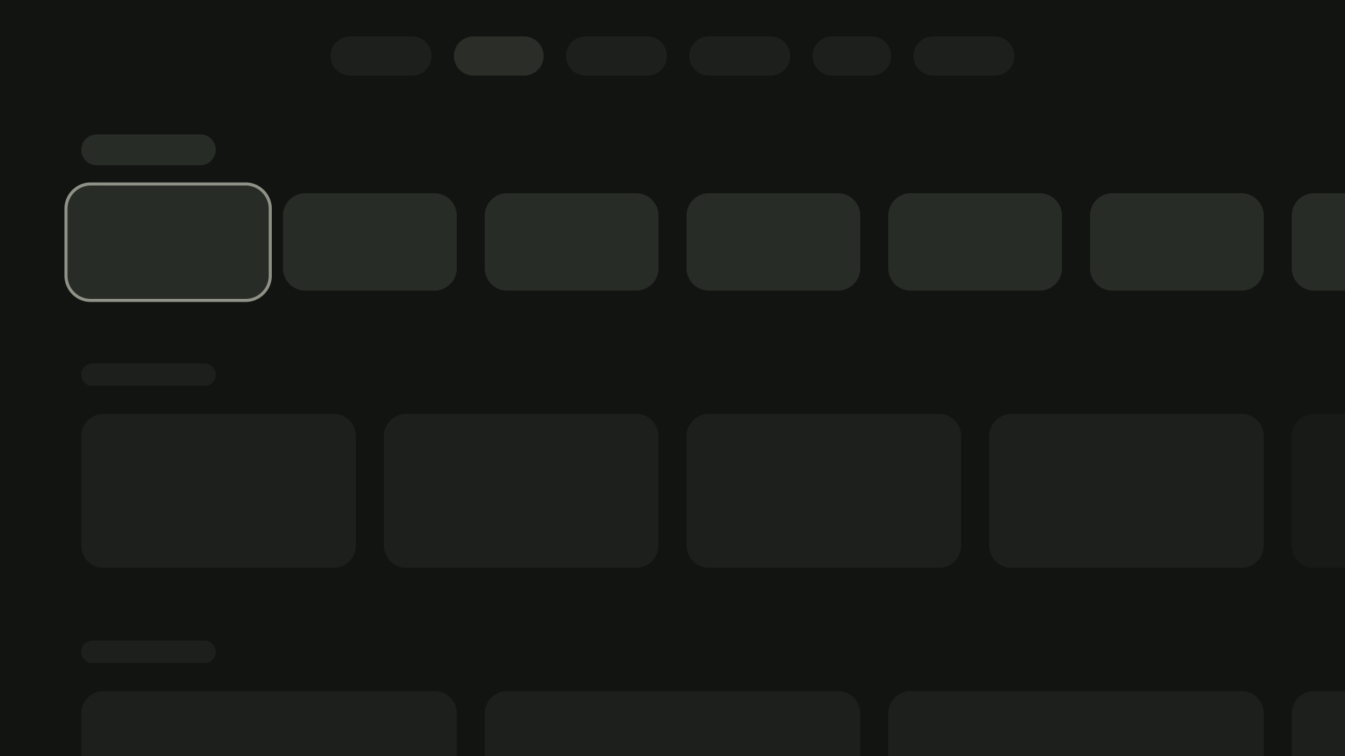
אנטומיה

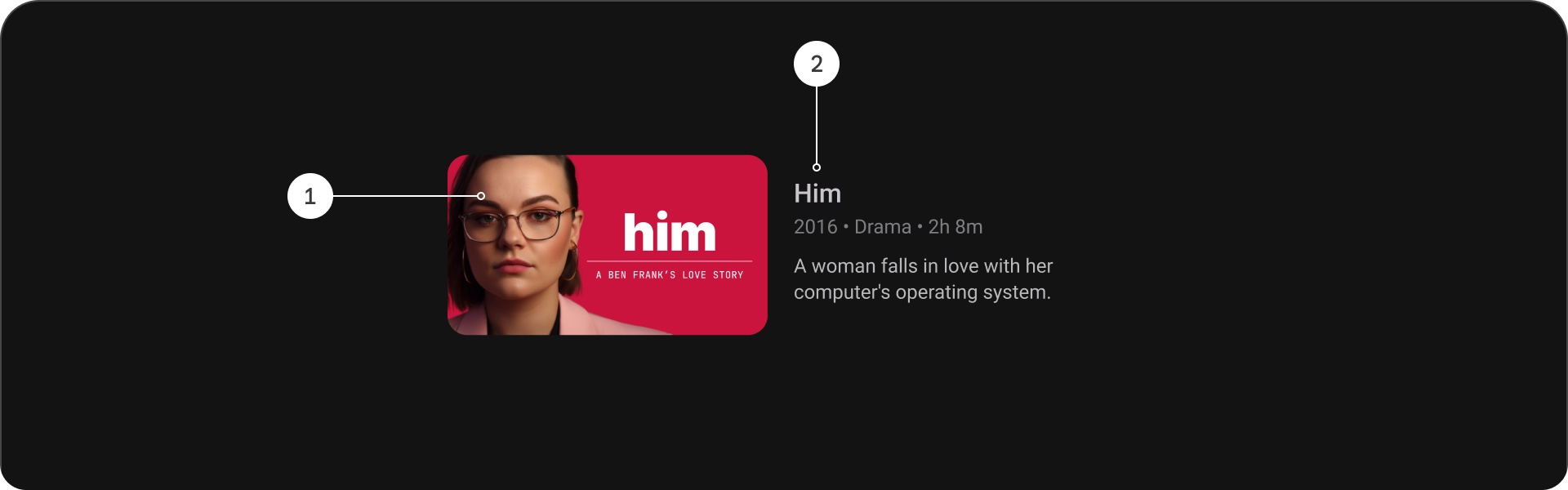
- כותרת
- כותרת משנה
- תיאור
- טקסט נוסף
מפרטים

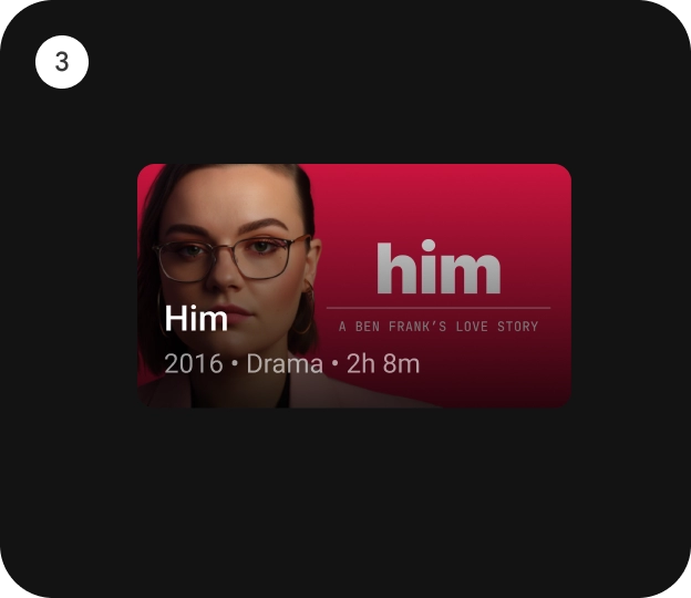
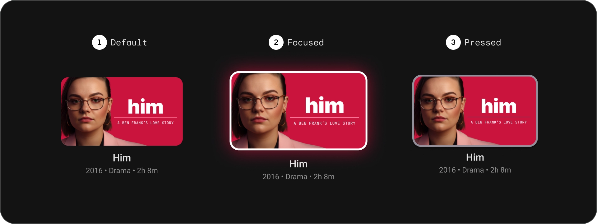
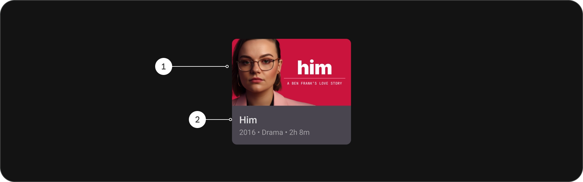
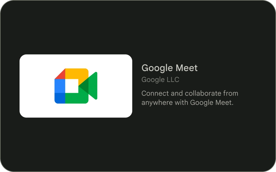
כרטיס רגיל
אנטומיה
- תמונה
- חסימת תוכן
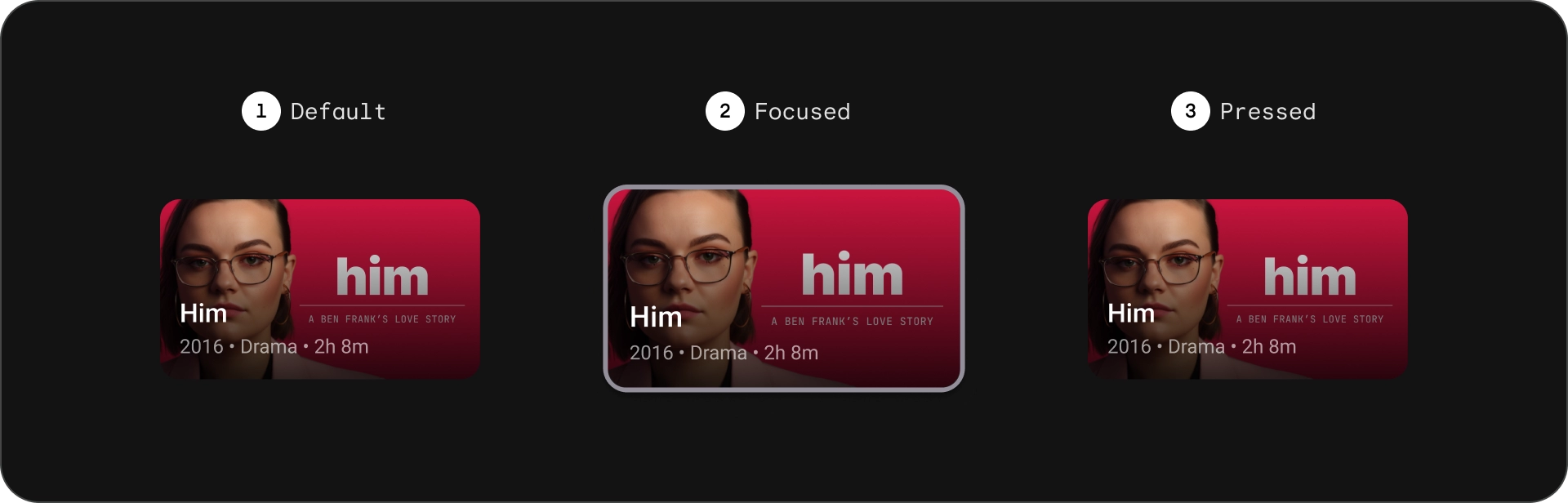
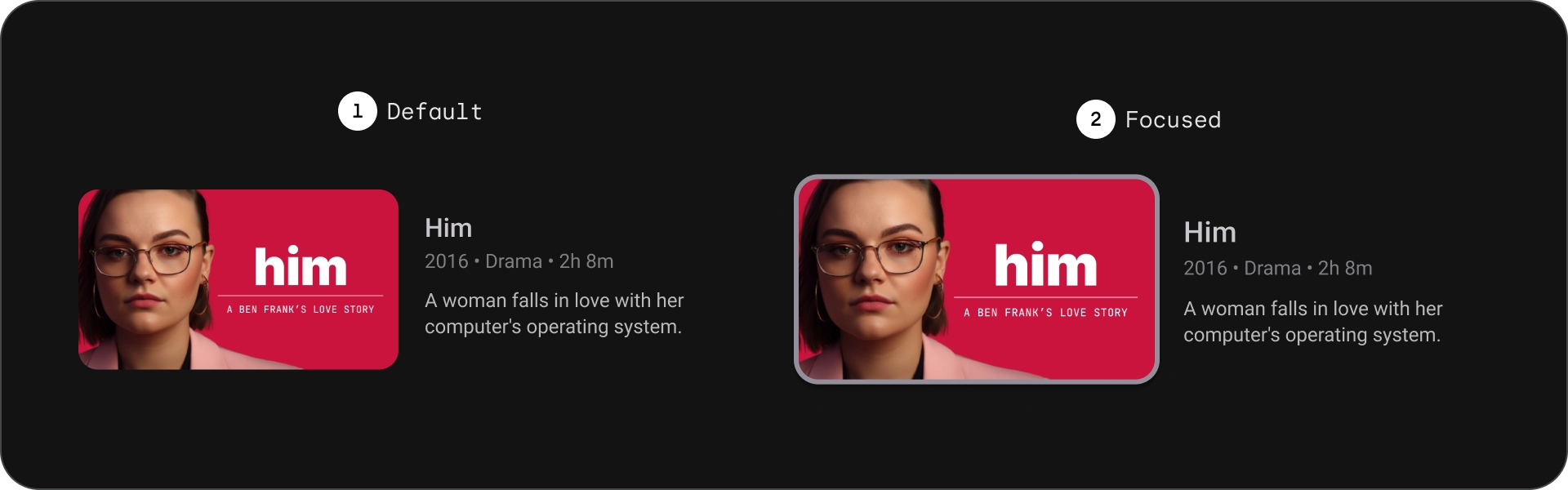
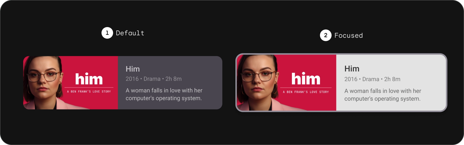
מדינות
מפרטים

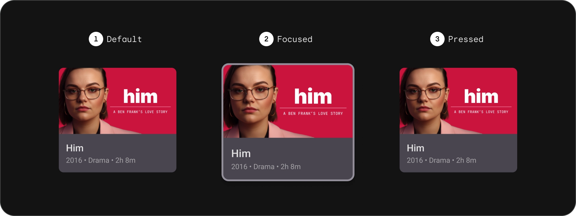
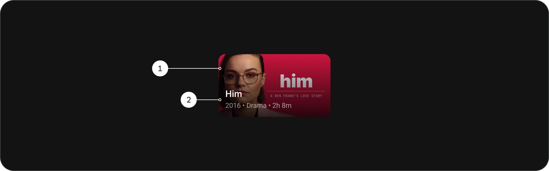
כרטיס קלאסי
אנטומיה
- תמונה
- חסימת תוכן
מדינות
מפרטים

כרטיס קומפקטי
אנטומיה
- תמונה
- חסימת תוכן
מדינות
מפרטים

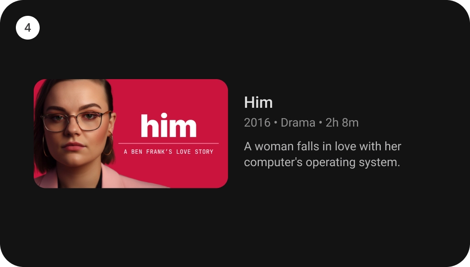
כרטיס רגיל רחב
אנטומיה
- תמונה
- חסימת תוכן
מדינות
מפרטים
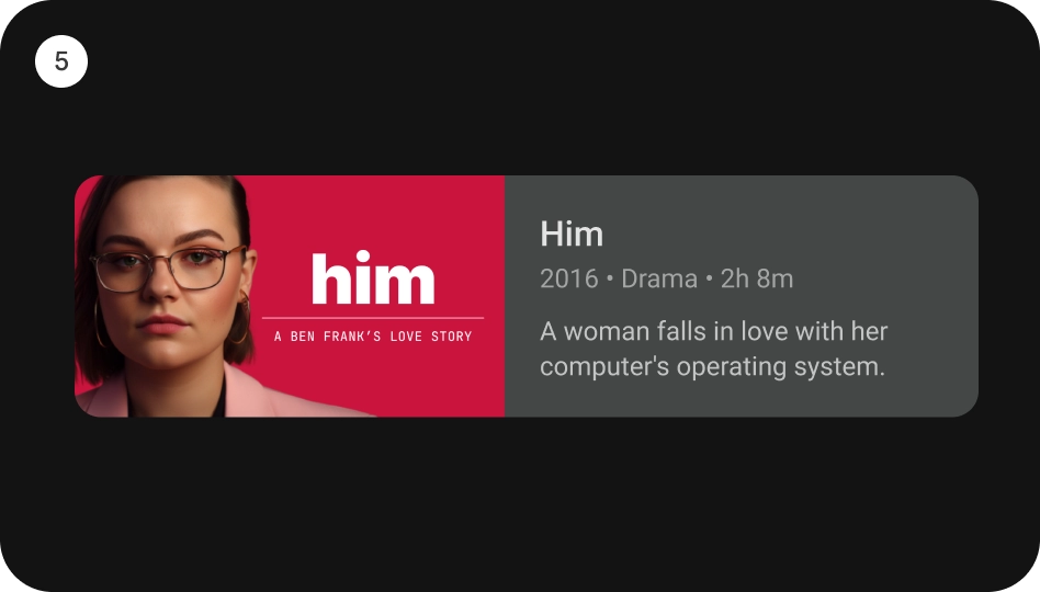
כרטיס קלאסי רחב
אנטומיה
- תמונה
- חסימת תוכן
מדינות
מפרטים
שימוש
כרטיסים הם אלמנטים עיצוביים מגוונים שאפשר להשתמש בהם כדי להציג מגוון של התוכן באופן מושך וידידותי למשתמש. הבאים בקטעים השונים בוחנים את השיקולים לעיצוב כרטיסים.
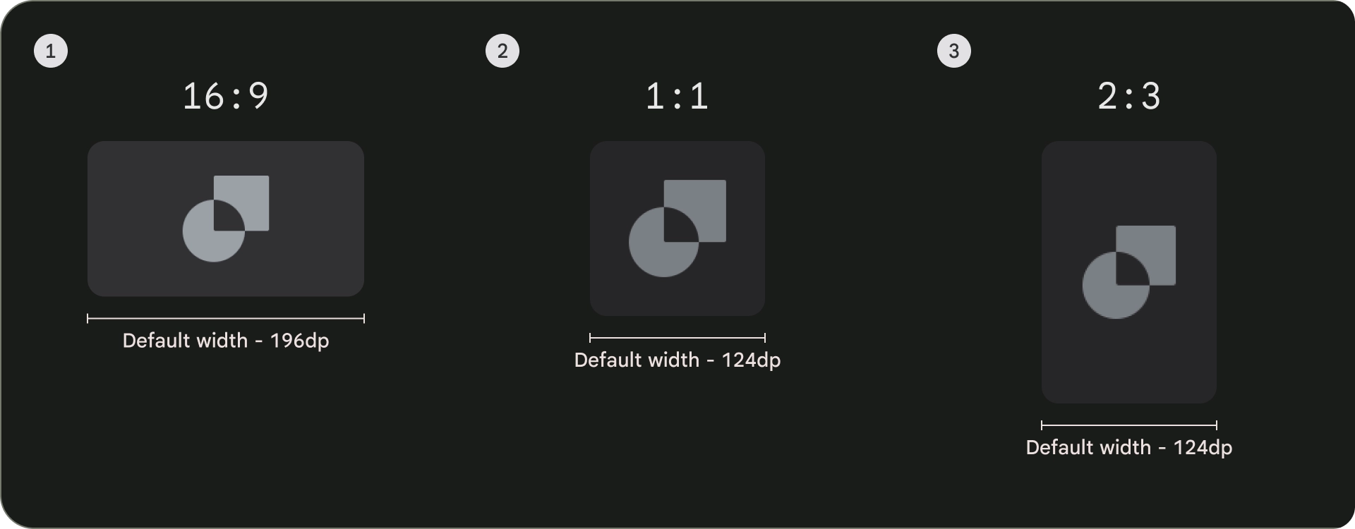
יחס גובה-רוחב
יש שלושה יחסי גובה-רוחב נפוצים לכרטיסים: 16:9, 1:1 ו-2:3. לכל יחס גובה-רוחב יש יתרונות משלו, אז הבחירה הטובה ביותר תלוי בצרכים הספציפיים שלכם.
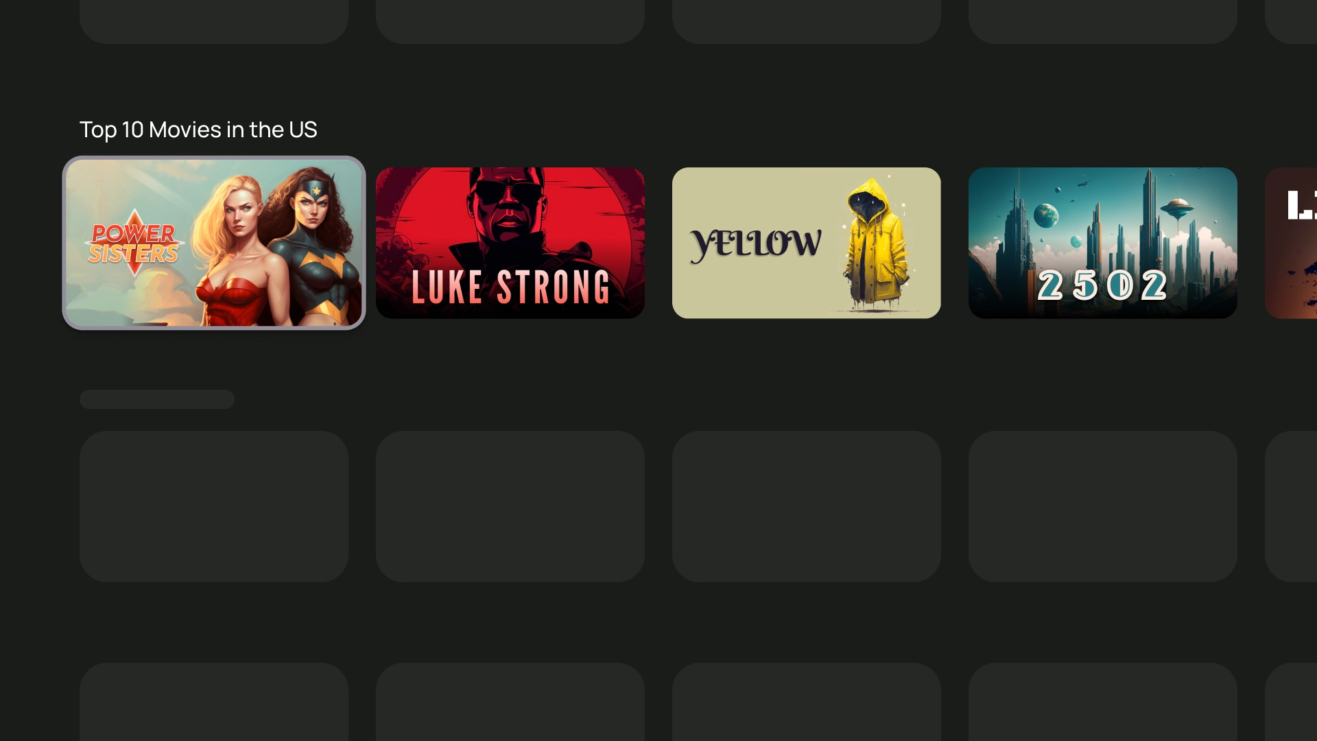
- 16:9 הוא יחס הגובה-רוחב הנפוץ ביותר לכרטיסים. זהו היבט רחב שמתאים היטב להצגת תמונות וסרטונים.
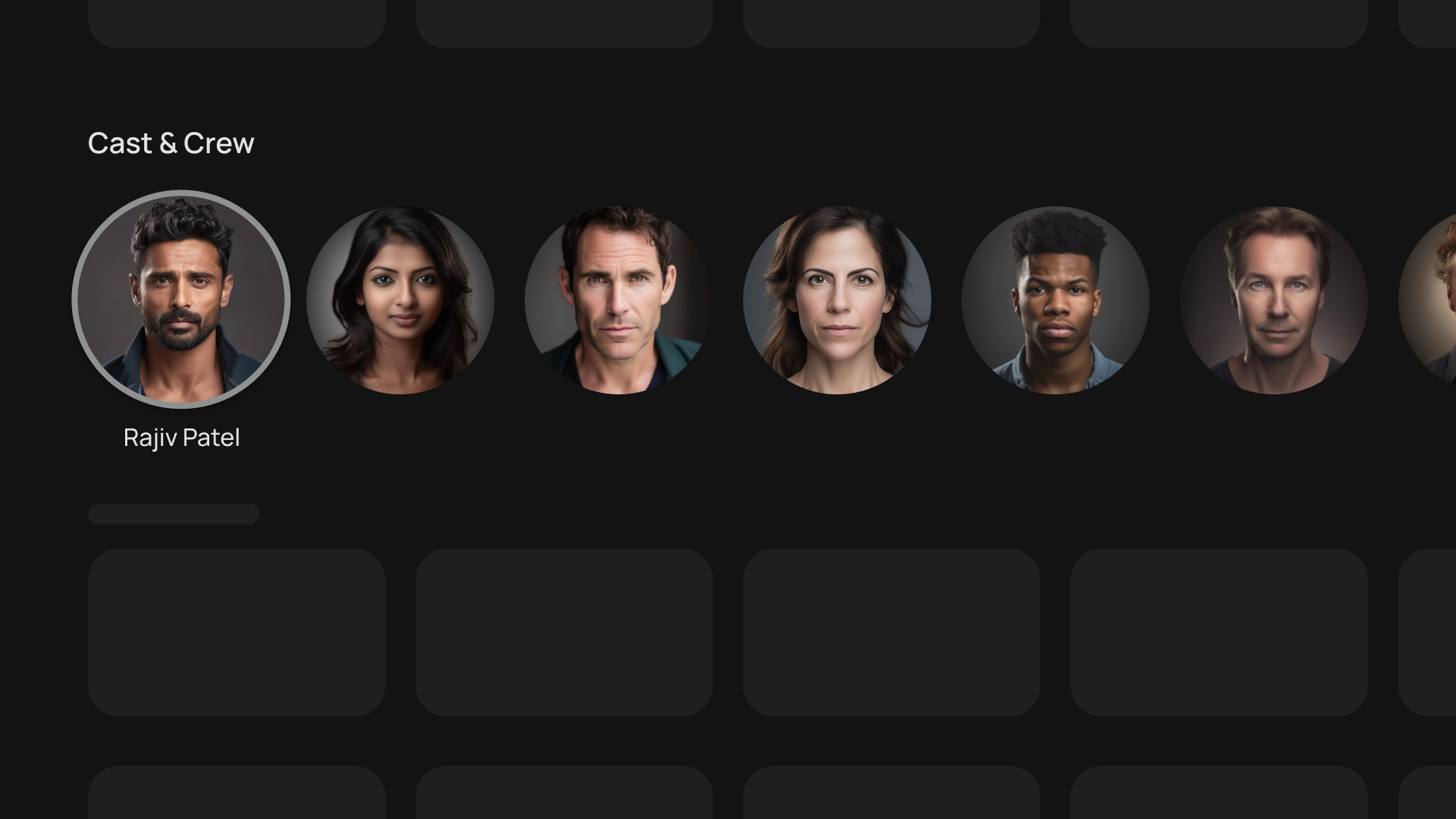
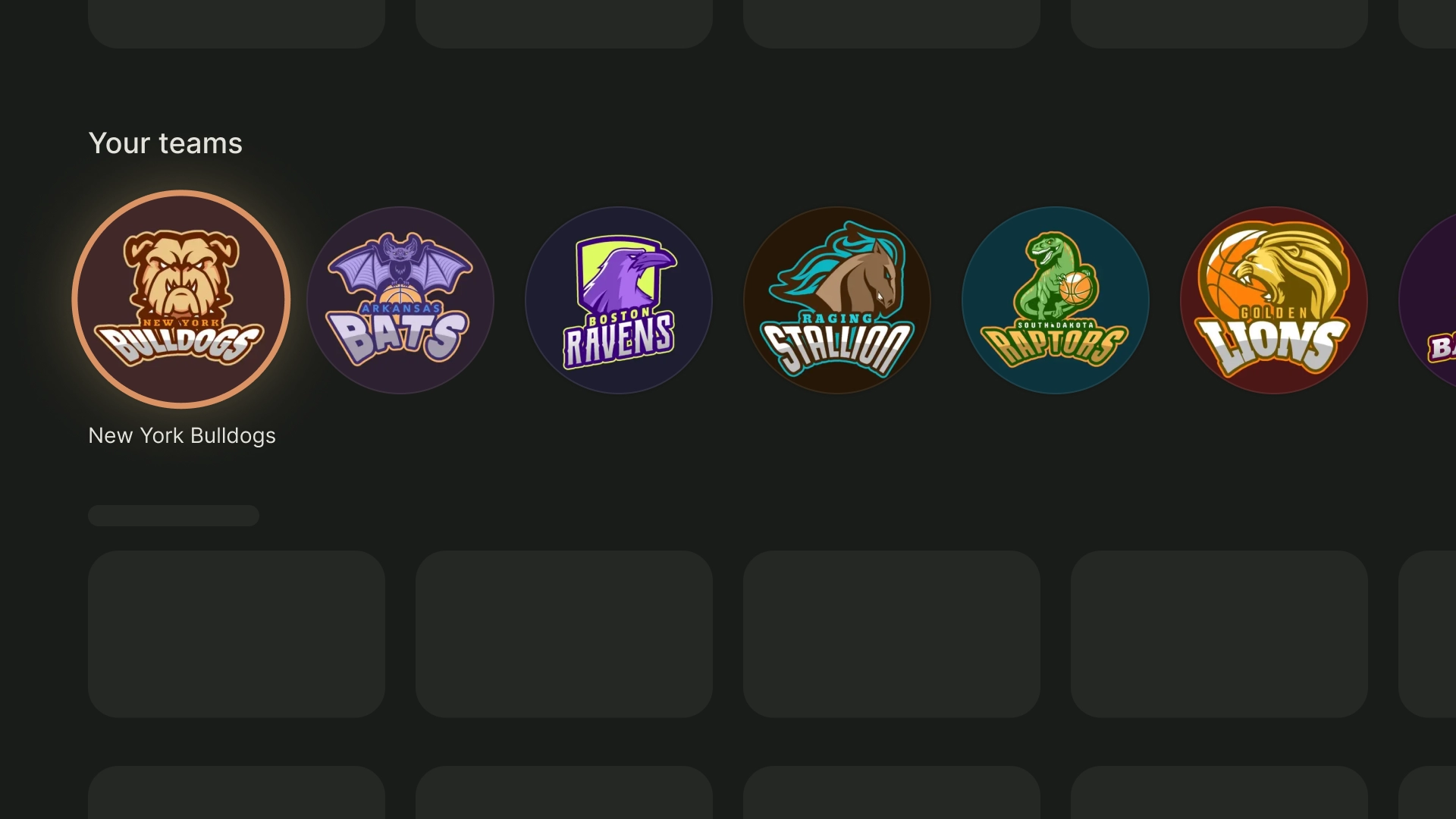
- 1:1 הוא יחס גובה-רוחב של ריבוע. זהו בחירה טובה לכרטיסים שצריכים להיות מאוזנת מבחינה חזותית, למשל: צוות השחקנים והצוות, סמלי לוגו של הערוץ או סמלי לוגו של הקבוצה.
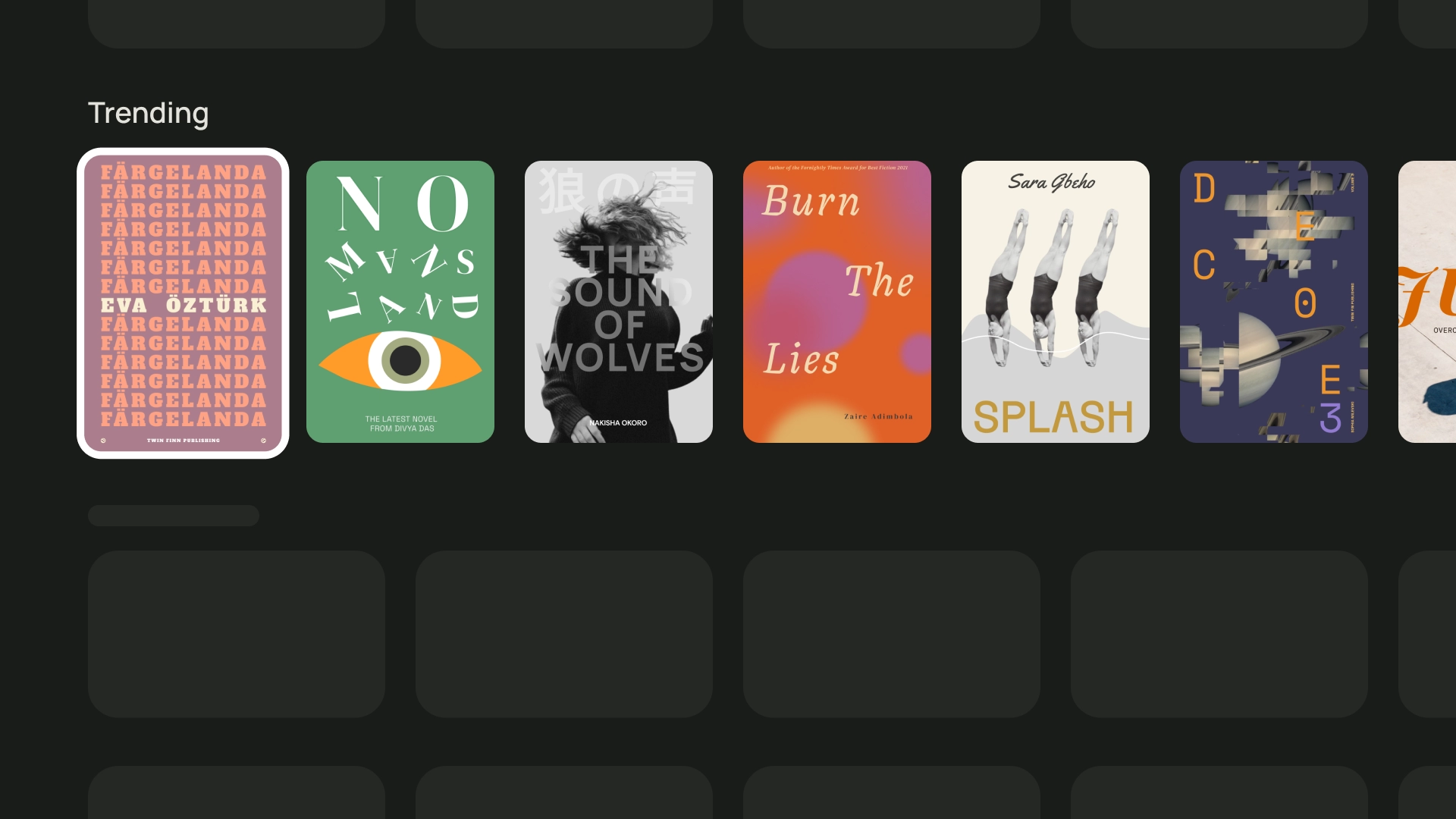
- 2:3 הוא יחס גובה-רוחב גבוה יותר. כדאי לבחור אם רוצים להפריד ולהדגיש את הרשת.
בסופו של דבר, הדרך הטובה ביותר לבחור יחס גובה-רוחב לכרטיסים שלכם היא לנסות אפשרויות שונות ולבדוק מה נראה הכי טוב.
הנה כמה דוגמאות לשימושים ביחסי גובה-רוחב שונים
1:1
השחקנים ושאר אנשי הצוות
סמלי לוגו של קבוצות ספורט
2:3
ספרים פופולריים
16:9
כרטיסי סרטים
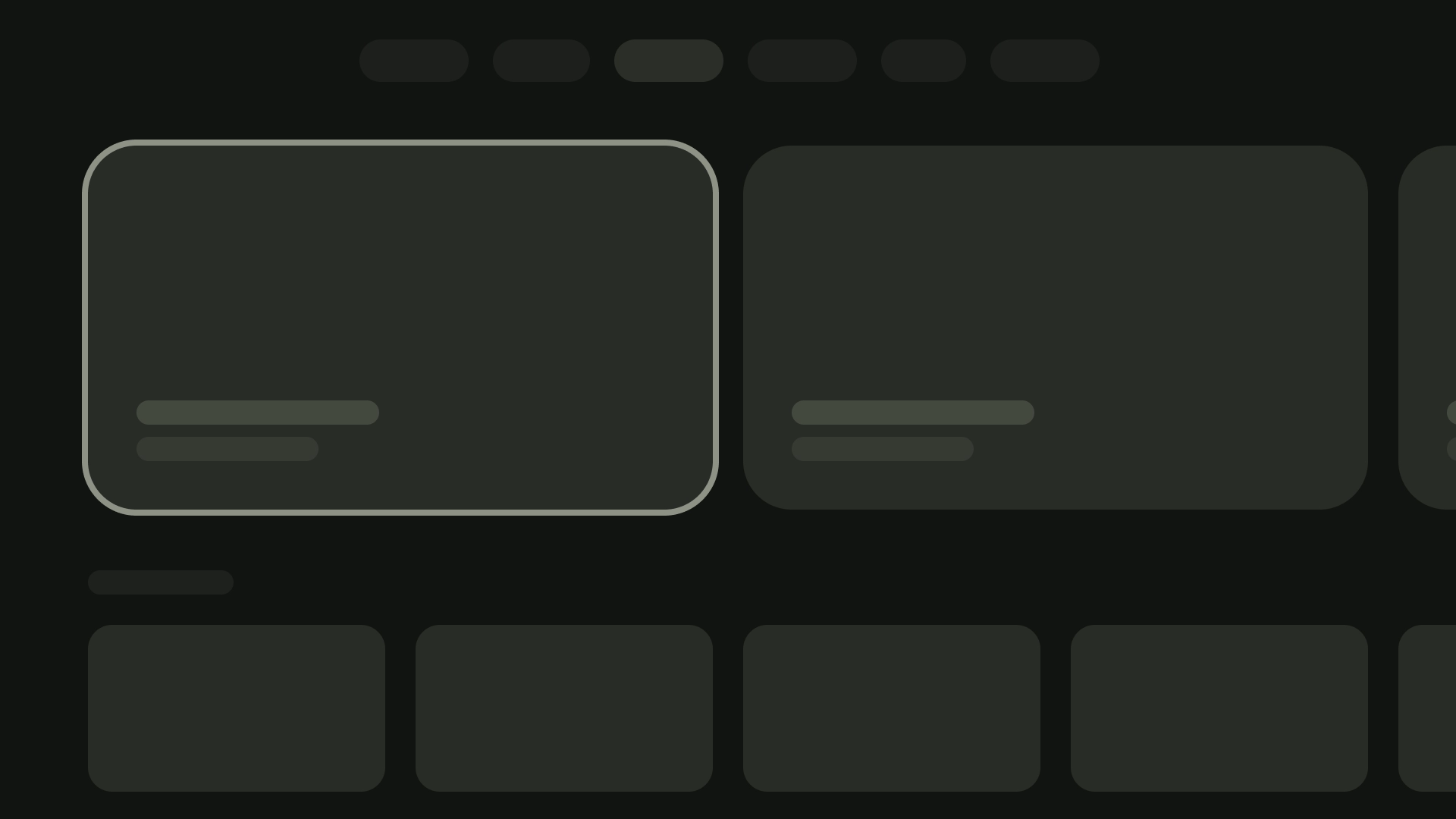
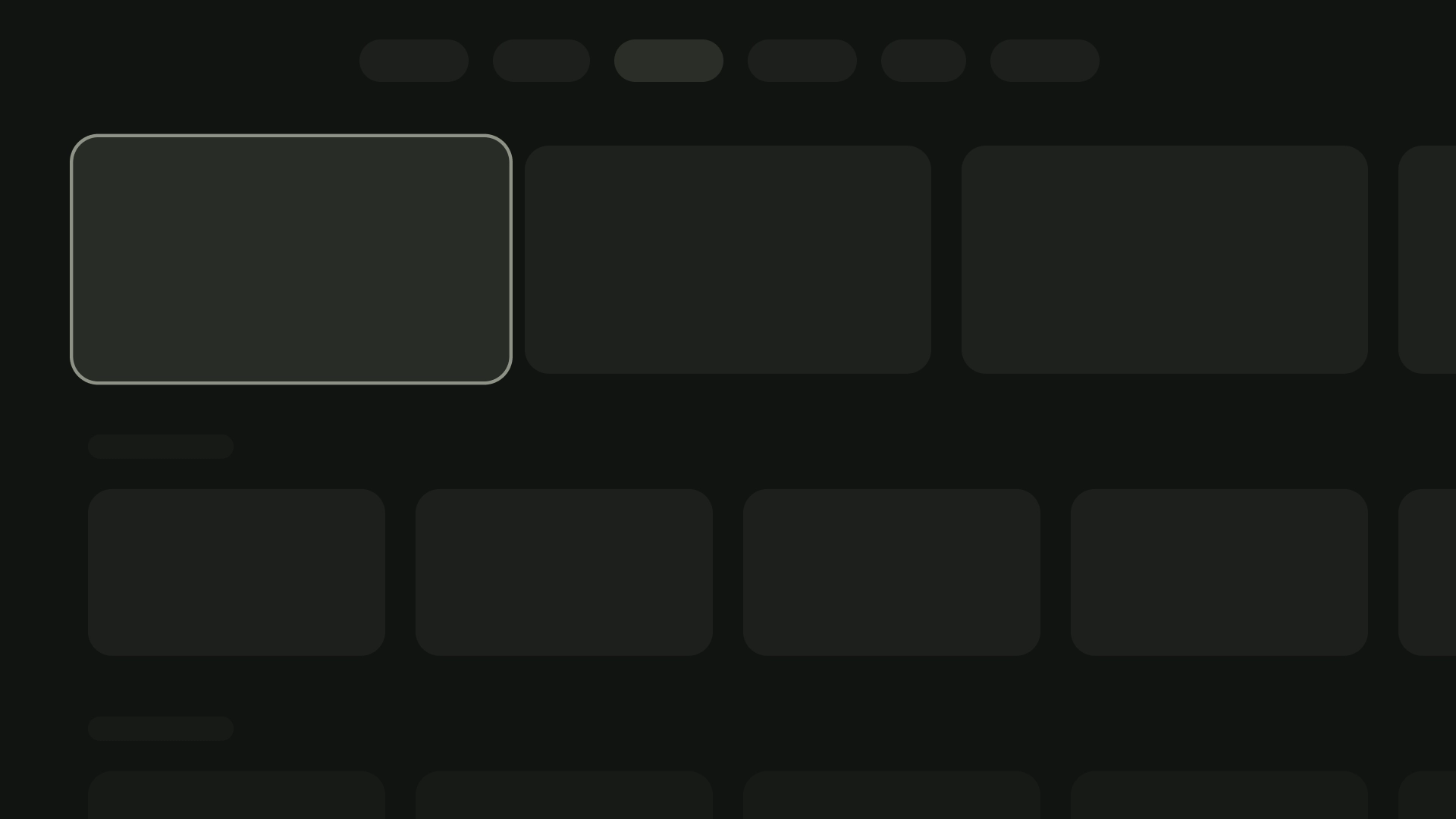
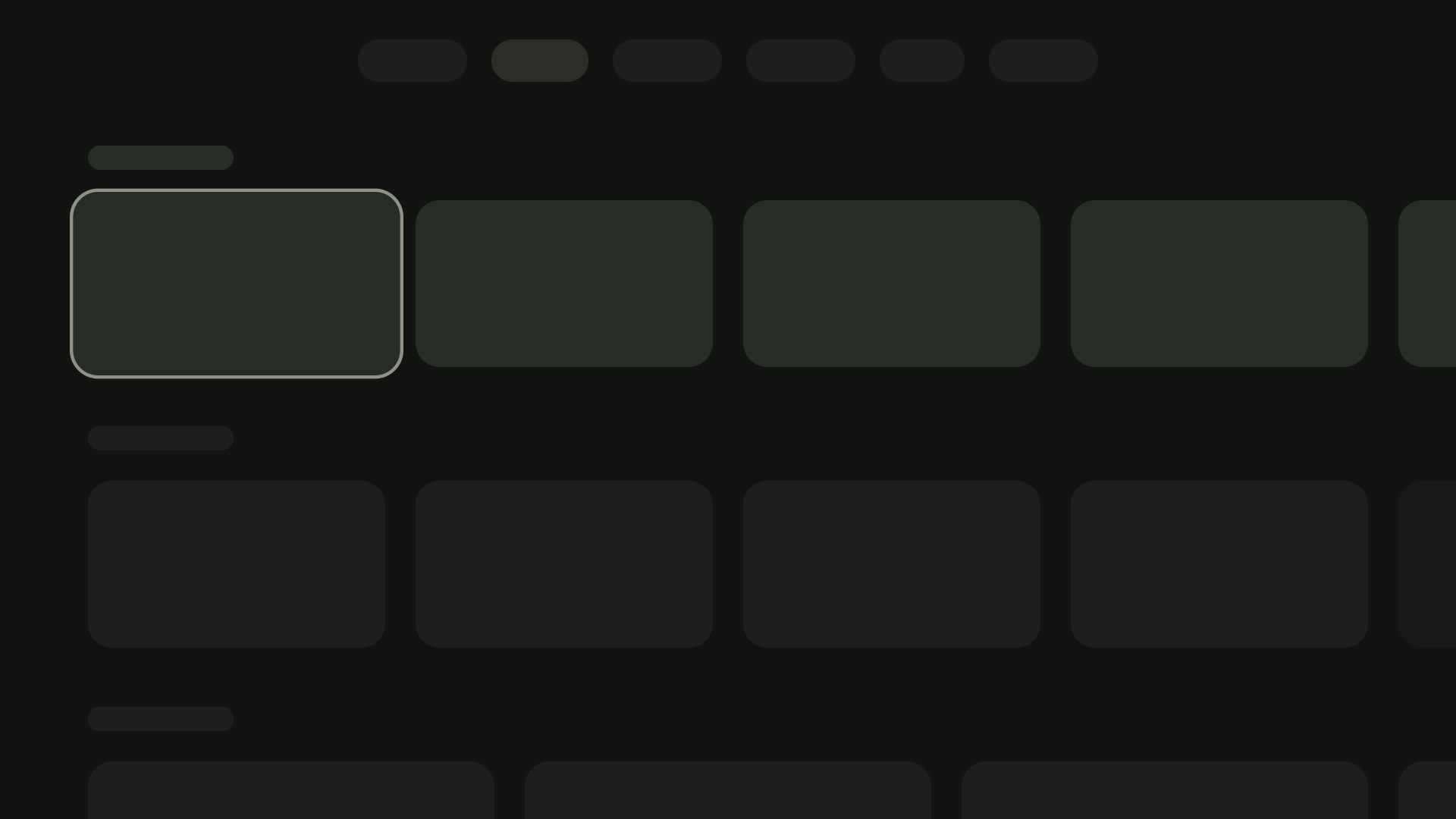
פריסה וריווח
שינוי רוחב הכרטיסים בהתאם למספר הכרטיסים שמוצגים במסך ניתן לעשות זאת על ידי הטמעה נכונה של שיא עם רווח של 20dp.
פריסה של כרטיס אחד
רוחב הכרטיס — 844dp
פריסה של 2 כרטיסים
רוחב הכרטיס — 412dp
פריסה של 3 כרטיסים
רוחב הכרטיס — 268dp
פריסה של 4 כרטיסים
רוחב הכרטיס — 196dp
פריסה של 5 כרטיסים
רוחב הכרטיס — 124dp
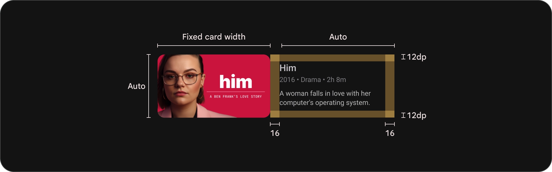
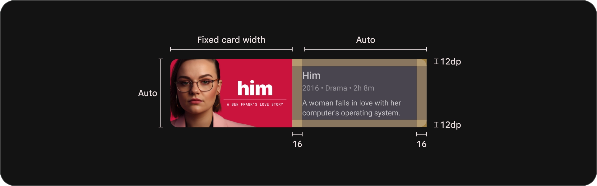
חסימת תוכן
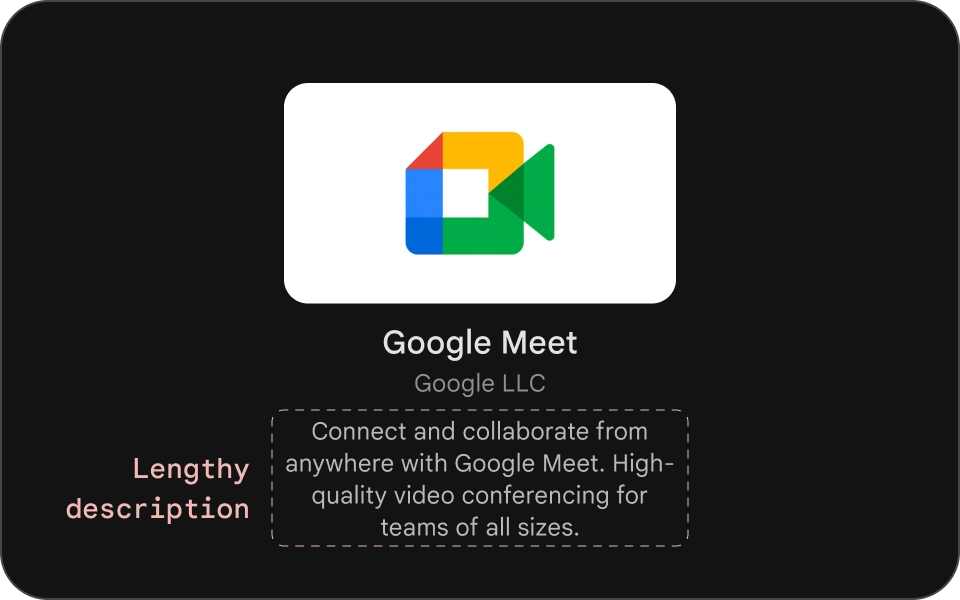
הרוחב של גוש התוכן בכרטיס צריך להיות זהה לרוחב התמונה. התמונה הממוזערת. אם אתם צריכים להציג טקסט נוסף בבלוק התוכן, להשתמש בווריאציה רחבה של כרטיס.
מה מותר לעשות
מה אסור לעשות
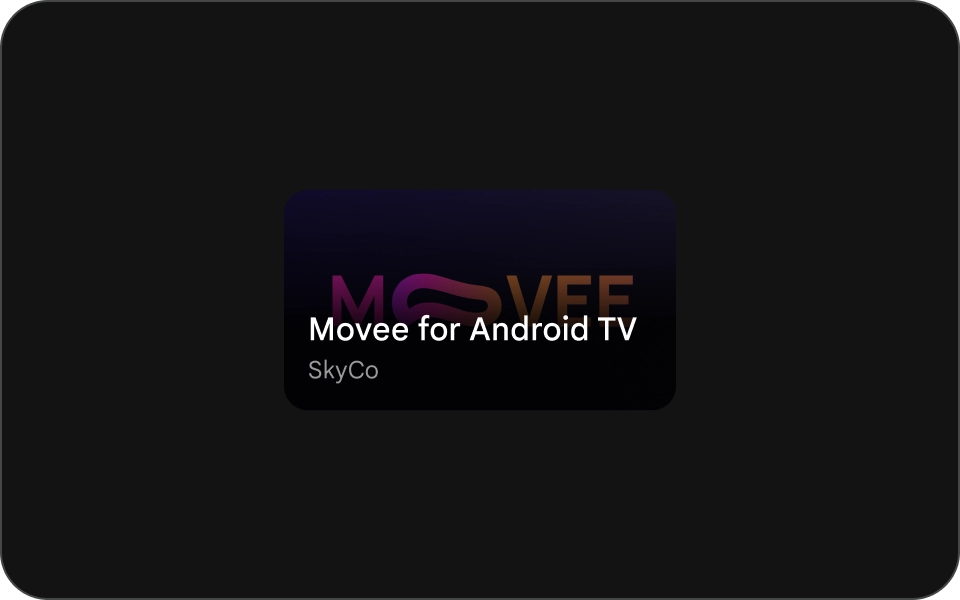
כרטיס קומפקטי
כרטיסים קומפקטיים צריכים להיות תמציתיים וקלים יותר לקריאה. התוכן שלפני תמונת הרקע צריכה להיות קצרה וממוקדת. הימנעו מכותרות ארוכות כתוביות או תיאורים. כך הכרטיסים שלך יהיו יותר מושכים מבחינה חזותית וקל יותר לסרוק אותם.
כדי להפוך טקסט לקריא יותר על תמונה, צריך להוסיף צבע שחור שקוף למחצה בשכבת-על הדרגתית. הפעולה הזו תכהה את הרקע בלי להסתיר את התמונה יותר מדי, וכך קל יותר לראות את הטקסט.
מה מותר לעשות