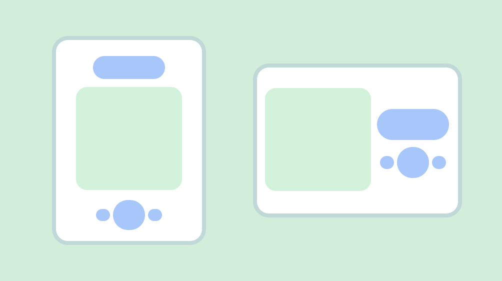
A layout defines the visual structure for a user to interface with your app, such as in an activity. Android provides a range of libraries, canonical starting points, and techniques to display and position content.
Takeaways
Honor device safe areas, which includes parts of the UI such as display cutouts, edge-to-edge insets, edge displays, software keyboards, and system bars.
Do: Provide a flexible layout for users to interact with the keyboard.
Video 1: Providing a flexible layout for users to interact
Keep essential interactions, like primary navigation, in a reachable screen area.
Use containment to group related content to guide the user through content and actions.
Provide consistent alignment between similar content and UI elements.
Don't: disrupt readability by inconsistently spacing like elements, which can make designs appear haphazard.
Do: Establish consistent spacing between like elements.
Don't stick to portrait or an idealized layout: Consider different aspect ratios, size classes, and resolutions that users may encounter.
Don't overwhelm your user with too many actions per view.
When building custom layouts, notate how content should sit within the layout using alignment, constraints, or gravity terms. Include how images should respond to their container to display properly.
Parts of a typical Android app screen
Most Android apps consist of regions referred to as the system bars, the navigation area, and the body.
System bars
The status bar and navigation bar–collectively known as the system bars–display important information such as battery level, the time, and notification alerts, and provide direct device interaction from anywhere. Read more about system bars.
Navigation region
Navigation represents the different affordances that allow a user to navigate within your app, access important actions, or across the Android platform.
Body region
The body region holds the screen content. Body content is composed of additional groupings and layout parameters. It must continue under navigation and system bar regions.
Declare WindowCompat.setDecorFitsSystemWindows(window, false)
for
edge-to-edge insets.
To determine the appropriate composition and navigation patterns for your layout, seek to understand how users interact with your content, and how they navigate your app's information architecture. This understanding can guide your design toward being more user-focused by creating UI that users can act on.
Content composition and structure
Build up a flexible flow and rhythm with a structure and containment methods for your content.
Base structure: use margins and columns for visual guardrails
To begin creating a solid structure with consistent guardrails, add margins and columns to your layouts.
Margins provide spacing on the left and right edges of the screen and content. A standard margin value for compact sizing is 16 dp, but margins should adapt to accommodate larger screens. Your app's body content and actions must stay within and align with these margins.
You can also ensure inset safe zones or insets at this step. System bar insets prevent crucial actions from falling under system bars. See Draw your content behind the system bars for details.
Use columns to build a flexible grid structure for consistent alignment, and to provide vertical definition to a layout by dividing content within the body area. Content goes in the areas of the screen containing columns. These columns lend structure to your layout, providing convenient structure to arrange elements.
Use a column grid to align content with an underlying grid but retain flexible sizing. The column grid can accommodate different form factors by changing the column sizes and number of columns as needed by the screen size at certain points while allowing content to also scale. Avoid being too granular with the column grid, this is what the baseline grid is for: providing consistent spacing units.
Be careful of establishing an accompanying grid of rows as it can restrict horizontal content scaling across orientations and form factors, typically establishing padding rules will provide the needed visual consistency.
Use containment to visually group elements
Containment refers to using white space and visible elements together to create a visual grouping. A container is a shape that represents an enclosed area. In a single layout, you can group together elements that share similar content or functionality and separate them from other elements using open space, typography, and dividers.
You can group similar items together with white space or visible division to help guide the user through content.
Implicit containment uses white space to visually group content to create container boundaries while explicit containment uses objects like divider lines and cards to group content together.
The following figure shows an example of using implicit containment to contain the header and primary copy. The column grid is used to align and create groupings. Highlights are explicitly contained within cards. Using iconography and type hierarchy for greater visual separation.
Positioning of content
Android has multiple ways to handle content elements in their respective containers that can help position them appropriately, including gravity, spacing, and scaling.
Gravity is a standard for placing an object within a potentially larger container for specific use cases. The following figure shows examples of positioning objects start and center (1), top and center horizontal (2), bottom left (3), and end and right (1).
Scaling
Scaling is crucial to accommodate dynamic content, device orientation, and screen sizes. Elements can remain fixed or be scaled.
Noting how images are displayed within their containers with scaling and position is important to ensure it appears how you want the image to look despite the device context, otherwise the image's primary focus could appear cut off, images could be too small or large for the layout, or other undesirable effects.
Content that is not notated can appear differently than you expect or want.
Pinned content
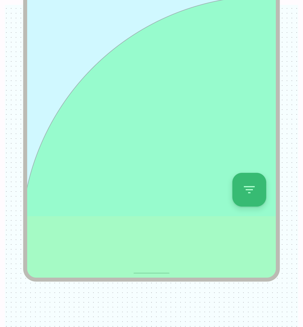
Many elements have built in interactions, scrolling, and positioning with slots or scaffolds. Some elements can be modified to stay fixed instead of reacting to scrolling, for example floating action buttons (FABs) that house critical actions.
Alignment
Use AlignmentLine
to create custom alignment lines, which parent layouts
can use to align and position their children.
Don't: disrupt readability by inconsistently spacing like elements, which can make designs appear haphazard.
Do: Establish consistent spacing between like elements.
Component layout
Material 3 components provide their own configurations and states for interaction and content.
Compose provides convenient layouts for combining Material Components into common screen patterns. Composables such as Scaffold provide slots for various components and other screen elements. Read more about Material Components and Layout.
Layouts and navigation patterns
If your app contains multiple destinations for users to traverse, we recommend employing layout and navigation pairings that are commonly used by other apps. Because many users already possess the mental models for these pairings, your app will be more intuitive for them.
Layout and navigation pairings
The navigation bar and modal navigation drawer are used as primary navigation patterns for parent layout views and primary navigation destinations.
The navigation bar can hold three to five navigation destinations across the same hierarchy level. This component translates to the navigation rail for large screens.
Although the navigation drawer can hold more than five navigation destinations, the pattern is not as ideal as the navigation bar due to the need to reach to the top bar on compact sizes.
Material 3 Tabs and the bottom app bar are secondary navigation patterns that you can can use to supplement primary navigation or appear on children views.
Layout actions
Provide controls to enable users to accomplish actions. Common patterns include top bar actions, floating action button (FAB), and menus.
For actions of the highest importance, a FAB provides a large
and prominent button for the user. Provide only one action at a time at this
level. A FAB can appear in multiple sizes and an expanded form, which includes a
label. Use Scaffold
to pin a FAB, making sure it's always
visible even on scroll by.
You can place secondary actions within the top bar or, if it's grouped near related content, within the page.
For any additional actions that aren't promptly or frequently needed, add those actions in an overflow menu.
Canonical layouts
Utilize canonical layouts as a starting point, ready-to-use compositions that help layouts adapt for common use cases and screen sizes. These layouts are aesthetic and functional, and derived from Material 3 guidance.
The Android framework includes specialized components that make implementation of the layouts straightforward and reliable using either Jetpack Compose or Views APIs.
List-detail layout
A list-detail layout enables users to explore lists of items that have descriptive, explanatory, or other supplementary information—the item detail. For compact screen sizes, only the list or detail view are visible. Displaying a collection of content in a row-based layout, lists make up the most common form of layouts for apps. List-detail is ideal for messaging apps, contact managers, file browsers, or any app where the content can be organized as a list of items that reveal additional information.
Content can be static or dynamic.
- Dynamic content is content that your app serves on-the-fly, and is ideal for showing user-generated content or reflect the user's preference or actions. For example, imagine a photo app with a scrollable list of user-generated photos, which is unique for each user and changes as the user uploads more images. These images are dynamic content.
- Static content represents hard-coded content, which is modifiable only by making changes directly to your app's code. Examples of static content are images and text that every user might see.
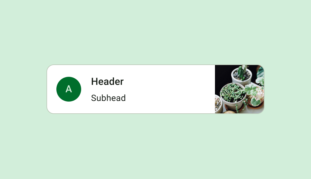
The Now in Android Figma file provides multiple layout examples. The following example shows a one-dimensional collection of content.
Explore Material 3 Lists for more design guidance on list components and specs.
Feed layout
A feed layout arranges equivalent content elements in a configurable grid for quick, convenient viewing of a large amount of content. (See Material 3 guidelines for using cards in a collection.) Feeds can be list- or grid- based configuration on compact displays, typically in cards or tiles. Content can be dynamic, meaning it is “fed in” from a dynamic external source such as an API.
A grid layout is composed of both rows and columns made up by implied or explicit containment principles. (See containment on this page for more information.) A grid layout can be more rigidly applied or staggered to vary the rows and columns. Both should have consistent application of spacing and logic to avoid confusing users. Explore Material 3 guidelines about designing feeds.
You can implement a feed layout in Compose with Lazy lists or lazy grids,
or in Views with RecyclerView
or CardView
.
Supporting pane layout
A mobile view may require supporting content or controls. Typically in the form of sheets or dialogs, they can help the primary view stay focused and uncluttered. Check out M3 guidance for using the supporting pane canonical layout.
Learn about M3 guidance for bottom sheets.
Relative layouts
Inputs, content, or other actions may appear relative to each other or constrained to a parent container. Layouts can be more custom, but make sure to follow consistent grouping, columns, and spacing.
Layouts can also use a combination of layout types. For example, you might pair a carousel or horizontal scroll with vertical cards. Or, you could present a custom chart with vertical list data.
You can present content in scrolling rows or columns with lazy rows and lazy columns.
Learn more about Compose layout basics and what makes up a composable.
Authentication is a common relative layout, as shown in the following figure.
Full-screen layout is another common layout, as used in immersive mode.
If you're working with Views instead of Compose, you can use
ConstraintLayout
to lay out views according to relationships between
sibling views and the parent layout, allowing for large and complex layouts.
ConstraintLayout
lets you build entirely by dragging and dropping instead of
editing the XML using the layout editor. Learn more about building a UI with
Layout Editor.
Adapt layouts
Adaptive design is the practice of designing layouts that adapt to specific breakpoints and devices. Usually we consider the width of the device to determine where the layout should change, or adapt. Both Web and Android utilize responsive design concepts, like flexible grids and images, to create layouts that better respond to their context.
For design guidelines about adapting layouts to expanded screen sizes, read the Support different screen sizes developer guide in Compose and the M3 Applying Layout page. You can also check out the Android large screen canonical gallery for inspiration and implementation of large screen layouts.
Although not every app needs to be available on every screen size, it does allow your users more freedom regarding ergonomics, usability, and app quality.
- You can design key screens (communicate the essential concepts or your app) with class sizes as breakpoints to act as guidelines.
- Or design content to act responsively by notating how content should be constrained, expand, or reflow.
For more on layouts, check out the Material Design 3 (M3) Understanding layout page.
Webviews
A Webview is a view that displays in-app web pages. In most cases, we recommend using a standard web browser, like Chrome, to deliver content to the user. To learn more about web browsers, read the guide for invoking a browser with an intent.