نجحت خدمة "صور Google" في زيادة عدد المستخدمين النشطين يوميًا من خلال إنشاء تطبيقات متوافقة مع الشاشات الكبيرة.
تنظيم صفحاتك في مجموعات
يمكنك حفظ المحتوى وتصنيفه حسب إعداداتك المفضّلة.
إنّ "صور Google" هي وجهتك الرئيسية للاحتفاظ بذكرياتك، ويؤمن فريق التطوير التابع لهم أنّ من حقهم الاستفادة من هذه الذكريات على جميع الأجهزة. للتأكد من أن ميزات التطبيق تعمل بشكل جيد عبر أجهزة Android اللوحية والأجهزة القابلة للطي وأجهزة ChromeOS، استثمروا في تطوير تنسيقات سريعة الاستجابة عبر جميع الشاشات.
الإجراءات التي اتخذتها الشركة
فكّر فريق التطوير في "صور Google" في كيفية تعديل تصميمهم ليناسب الشاشات الكبيرة. اعتمدوا على أفضل ممارسات الاستخدام والأبحاث لتحديد كيف يريدون تعديل تخطيطاتهم للشاشات الكبيرة. أولاً، قاموا بتحسين تخطيط الشبكة عن طريق تقليل الكثافة عندما تزيد الشاشات عن 600 بكسل مستقل الكثافة للأجهزة اللوحية و1008 بكسل مستقل الكثافة لأجهزة الكمبيوتر المحمول. وقد سهّل ذلك على المستخدمين عرض صورهم وتصفّحها على شكل جهاز أكبر.
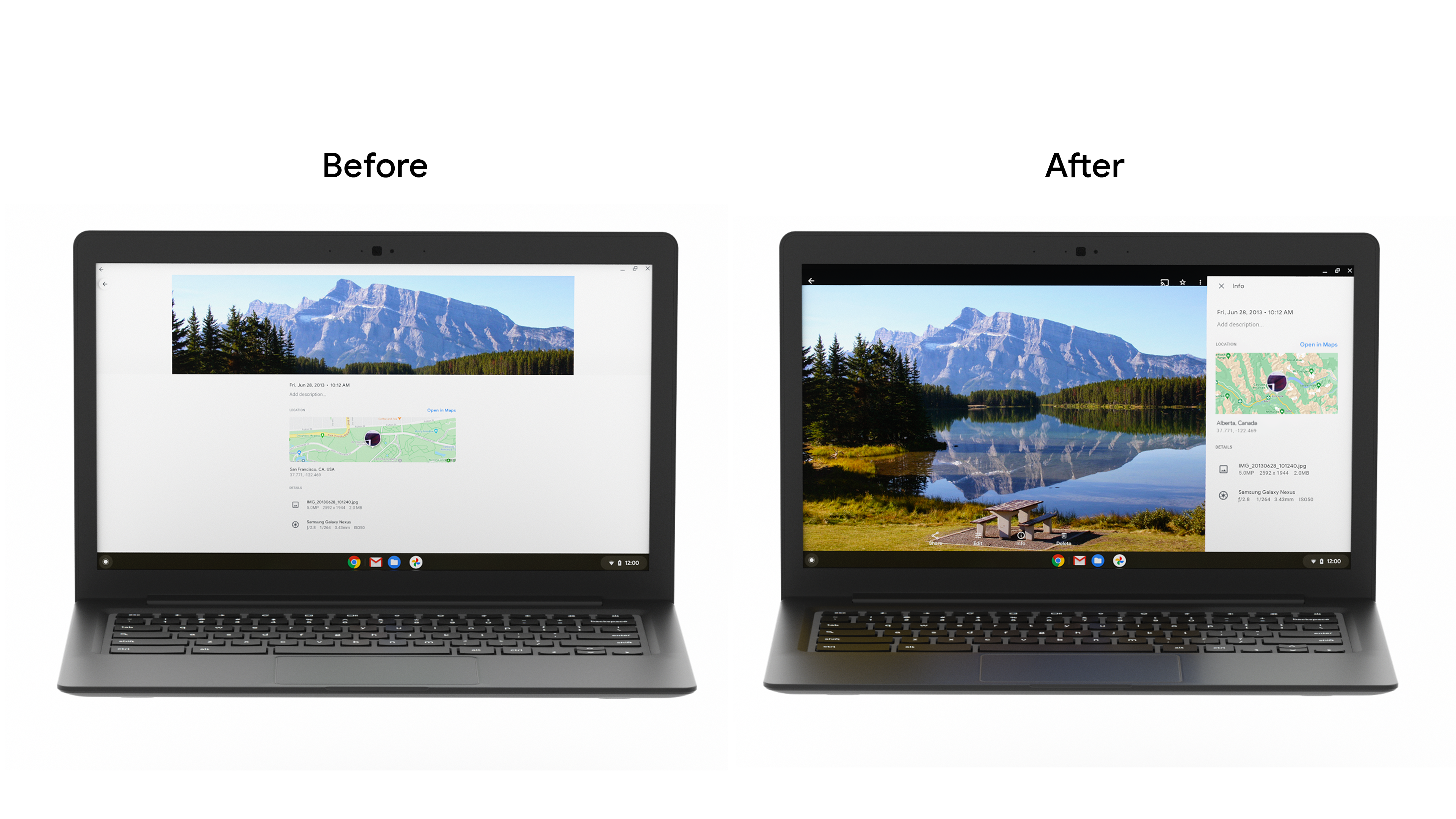
ثم استبدلوا الدرج السفلي للوحة المعلومات بشريط جانبي. نظرًا لأن الأجهزة اللوحية وشاشات سطح المكتب غالبًا ما تُستخدم في الوضع الأفقي، فإن تغيير النهج هذا يقلل من التمدّد عبر الشاشات الأوسع ويوفر بيئة أفضل لتسهيل الاستخدام للطريقة التي يحمل بها مستخدمو الأجهزة اللوحية الأجهزة. كما حسّنوا أيضًا مربع حوار الورقة السفلية، وأضفوا أشرطة إعلامية لعرض رسائل المستخدمين بسهولة أكبر على الشاشات الكبيرة.
لقد قام بتغيير مكون التنقل من شريط سفلي إلى شريط عمودي، لتسهيل التنقل على المستخدمين وإكمال المهام. وعلى الرغم من أنّ تطبيق "صور Google" أنشأ ذلك ضمن قاعدة رموز برمجية خاصة به، يمكن للمطوّرين إنشاء هذه الميزة باستخدام المكوِّن الجديد لمواد قطار التنقّل لتحسين سهولة الاستخدام وتقليل التوسعة وزيادة مساحة الشاشة لتطبيقات التمرير العمودي.
أنشأ فريق التطوير أيضًا تغيير حجم الشبكة بشكل ديناميكي لتسهيل الانتقال بين الأوضاع وأحجام الشاشات المختلفة، وتحسين الدعم الذي يقدمه للملحقات مثل لوحات المفاتيح وأقلام الشاشة. في ظل النمو الذي شهدناه بين المستهلكين الذين يستخدمون أجهزة ChromeOS لتحقيق الإنتاجية، تتزايد أهمية ضمان أنّ التطبيقات تتيح استخدام مجموعة متنوعة من أساليب الإدخال، بما في ذلك لوحة المفاتيح والماوس واللمس.
النتائج
طرح الفريق هذه التغييرات من خلال إجراء اختبار أ/ب، ولاحظ زيادة إجمالية في المستخدمين النشطين يوميًا في الميزات الرئيسية للمنتجات على الشاشات الكبيرة، مع ارتفاع في استخدام "الأرشيف" بنسبة تصل إلى% 53. سيواصل فريق "صور Google" الاستثمار في تحسين تجربة المستخدم على جميع أحجام الشاشات لضمان تجربة رائعة على جميع الأجهزة.
البدء
اطّلِع على مزيد من المعلومات حول كيفية البدء بتحسين تطبيقك ليتوافق مع الشاشات الأكبر.
يخضع كل من المحتوى وعيّنات التعليمات البرمجية في هذه الصفحة للتراخيص الموضحّة في ترخيص استخدام المحتوى. إنّ Java وOpenJDK هما علامتان تجاريتان مسجَّلتان لشركة Oracle و/أو الشركات التابعة لها.
تاريخ التعديل الأخير: 2021-09-02 (حسب التوقيت العالمي المتفَّق عليه)
[[["يسهُل فهم المحتوى.","easyToUnderstand","thumb-up"],["ساعَدني المحتوى في حلّ مشكلتي.","solvedMyProblem","thumb-up"],["غير ذلك","otherUp","thumb-up"]],[["لا يحتوي على المعلومات التي أحتاج إليها.","missingTheInformationINeed","thumb-down"],["الخطوات معقدة للغاية / كثيرة جدًا.","tooComplicatedTooManySteps","thumb-down"],["المحتوى قديم.","outOfDate","thumb-down"],["ثمة مشكلة في الترجمة.","translationIssue","thumb-down"],["مشكلة في العيّنات / التعليمات البرمجية","samplesCodeIssue","thumb-down"],["غير ذلك","otherDown","thumb-down"]],["تاريخ التعديل الأخير: 2021-09-02 (حسب التوقيت العالمي المتفَّق عليه)"],[],[],null,["# Google Photos increased daily active users by building for large screens\n\nGoogle Photos is the home for your memories, and their development team believes people should be able to enjoy those memories across all devices. To make sure the app's features worked well across Android tablet, foldable, and ChromeOS devices, they invested in developing responsive layouts across all screens.\n\nWhat they did\n-------------\n\nThe Google Photos development team thought through how to modify their layout for large screens. They leaned on [usability best practices](https://material.io/blog/material-design-for-large-screens) and research to determine how they wanted to modify their layouts for large screens. First they improved the grid layout by reducing the density when screens increase beyond 600dp for tablets, and 1008 dp for laptops. This made it easier for users to view and scroll through their photos on the larger form factor. \n\nThen they replaced the info panel bottom drawer with a sidebar. Since tablets and desktop screens are often used in landscape, this approach change reduces stretching across wider screens and provides better ergonomics for the way tablet users hold devices. They also improved the [bottom sheet dialog](https://developer.android.com/reference/com/google/android/material/bottomsheet/BottomSheetDialog), and added [snackbars](https://developer.android.com/reference/com/google/android/material/snackbar/Snackbar) to display user messages easier on large screens. \n\nThey changed the navigation component from a bottom bar to a vertical rail, to make it easier for users to navigate and complete tasks. While Google Photos built this within their own codebase, developers can build this using the new [Navigation rail material component](https://material.io/components/navigation-rail) to improve ergonomics, reduce stretching, and increase the screen real estate for vertical scrolling apps.\n\nThe development team also made grid resizing dynamic to streamline transitioning between different postures and screen sizes, and improved the support they provide for accessories such as keyboards and stylus pens. Given the growth we've seen amongst consumers using ChromeOS devices for productivity, it is increasingly important to ensure apps support a variety of input methods, including keyboard, mouse, and touch.\n\nResults\n-------\n\nThe team rolled out these changes through an A/B test, and noticed an overall **increase in DAU for key product features on large screens, with Archive seeing as much as a 53% usage increase**. The Google Photos team will continue investing in improving the user experience across all screen sizes to ensure a great experience on all devices.\n\nGet Started\n-----------\n\nLearn more about how you can get started with [optimizing your app for larger screens](https://developer.android.com/large-screens)."]]