
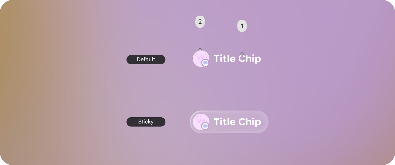
在 Jetpack Compose Glimmer 中,TitleChip 组件是一种非互动式组件,可为关联内容(例如 Card 或 VerticalList)提供简短的上下文或标签。
使用标题条状标签显示简明扼要的信息,例如短商品名、类别名称或状态指示器。通常,您应将标题 chip 放在其描述的内容上方,以建立清晰的结构关系。
基本示例:创建短商品名条状标签
以下代码会创建一个基本标题 chip:
@Composable fun TitleChipSample() { TitleChip { Text("Messages") } }
Example: Create a title chip with a card
To use a title chip with another component, place the title chip
TitleChipDefaults.associatedContentSpacing above the other component in
the composable. The following code creates a title chip with a card:
@Composable fun TitleChipWithCardSample() { Column(horizontalAlignment = Alignment.CenterHorizontally) { TitleChip { Text("Title Chip") } Spacer(Modifier.height(TitleChipDefaults.associatedContentSpacing)) Card( title = { Text("Title") }, subtitle = { Text("Subtitle") }, leadingIcon = { Icon(FavoriteIcon, "Localized description") }, ) { Text("Card Content") } } }
代码要点
- 标题 chip 水平居中,这是放置在卡片上方的标题 chip 的常规对齐方式。
Spacer的高度是固定的,可在两个组件之间提供适当的垂直间距。这是使用TitleChipDefaults.associatedContentSpacing定义的。- 使用可选的
leadingIcon在文本内容之前添加额外的视觉背景信息。 - 标题 chip 会自动为其文本使用
caption样式。 - 标题 chip 不可互动。如果您需要可点击的标签,请使用
Button或其他互动式组件。