
在元素的內容邊界超過尺寸上限時,使用 verticalScroll 和 horizontalScroll 修飾符可以讓使用者以最簡單的方式捲動元素。只要使用 verticalScroll 和 horizontalScroll 修飾符,就不必平移或偏移內容。
@Composable private fun ScrollBoxes() { Column( modifier = Modifier .background(Color.LightGray) .size(100.dp) .verticalScroll(rememberScrollState()) ) { repeat(10) { Text("Item $it", modifier = Modifier.padding(2.dp)) } } }
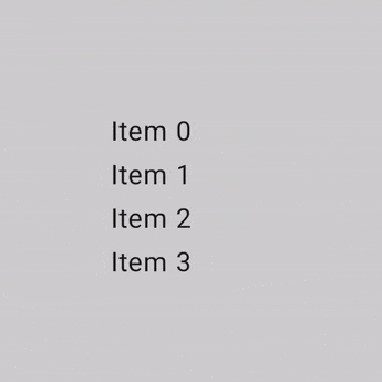
ScrollState 可讓您變更捲動位置或取得其目前狀態。如要使用預設參數建立,請使用 rememberScrollState()。
@Composable private fun ScrollBoxesSmooth() { // Smoothly scroll 100px on first composition val state = rememberScrollState() LaunchedEffect(Unit) { state.animateScrollTo(100) } Column( modifier = Modifier .background(Color.LightGray) .size(100.dp) .padding(horizontal = 8.dp) .verticalScroll(state) ) { repeat(10) { Text("Item $it", modifier = Modifier.padding(2.dp)) } } }
可捲動區域修飾符
scrollableArea 修飾符是建立自訂可捲動容器的基本構成元素。這個修飾符提供比 scrollable 修飾符更高的抽象層級,可處理手勢差異解讀、內容剪輯和過度捲動效果等常見需求。
雖然 scrollableArea 可用於自訂實作項目,但一般來說,您應該優先使用現成解決方案,例如 verticalScroll、horizontalScroll 或 LazyColumn 等可組合項,用於標準捲動清單。這些高階元件適用於常見用途,且本身是使用 scrollableArea 建構而成,因此較為簡單。
scrollableArea 和 scrollable 修飾符的差異
scrollableArea 和 scrollable 的主要差異在於解讀使用者捲動手勢的方式:
scrollable(原始差異):差異直接反映使用者在螢幕上輸入內容的實際移動情形 (例如指標拖曳)。scrollableArea(以內容為導向的差異):delta會經過語意反轉,代表所選捲動位置的變化,讓內容看起來會隨著使用者的手勢移動,通常與指標移動方向相反。
您可以這樣想:scrollable 會告訴您指標的移動方式,而 scrollableArea 則會將指標移動方式轉換為內容在一般可捲動檢視區塊中的移動方式。因此,實作標準可捲動容器時,scrollableArea
會感覺更自然。
下表摘要說明常見情境的差異符號:
使用者手勢 |
delta reported to |
delta reported to |
|---|---|---|
指標向上移動 |
負面 |
正面 |
指標會向下移動 |
正面 |
負面 |
指標向左移動 |
負面 |
正向 (由右至左語言為負向) |
指標向右移動 |
正面 |
負 (由右至左語言為正) |
(*) scrollableArea 增量符號注意事項:scrollableArea 的增量符號不只是簡單的倒置。系統會智慧地考量下列因素:
- 方向:直向或橫向。
LayoutDirection:LTR 或 RTL (對水平捲動特別重要)。reverseScrolling旗標:捲動方向是否反轉。
除了反轉捲動增量之外,scrollableArea 也會將內容裁剪至版面配置的界線,並處理過度捲動效果的算繪作業。根據預設,它會使用 LocalOverscrollFactory 提供的效果。您可以使用接受 OverscrollEffect 參數的 scrollableArea 多載,自訂或停用這項功能。
使用 scrollableArea 修飾符的時機
如果 horizontalScroll 或 verticalScroll 修飾符或 Lazy 版面配置無法充分滿足需求,您需要建構自訂捲動元件時,就應使用 scrollableArea 修飾符。這通常包括以下情況:
- 自訂版面配置邏輯:當項目的排列方式根據捲動位置動態變更時。
- 獨特的視覺效果:在子項捲動時套用變形、縮放或其他效果。
- 直接控制:需要精細控管捲動機制,超出
verticalScroll或 Lazy 版面配置公開的範圍。
使用 scrollableArea 建立自訂輪盤式清單
以下範例說明如何使用 scrollableArea 建構自訂直向清單,讓項目在遠離中心時縮小,營造「輪子」般的視覺效果。這類依捲動位置而定的轉換效果非常適合使用 scrollableArea。
scrollableArea 的自訂直向清單。
@Composable private fun ScrollableAreaSample() { // ... Layout( modifier = Modifier .size(150.dp) .scrollableArea(scrollState, Orientation.Vertical) .background(Color.LightGray), // ... ) { measurables, constraints -> // ... // Update the maximum scroll value to not scroll beyond limits and stop when scroll // reaches the end. scrollState.maxValue = (totalHeight - viewportHeight).coerceAtLeast(0) // Position the children within the layout. layout(constraints.maxWidth, viewportHeight) { // The current vertical scroll position, in pixels. val scrollY = scrollState.value val viewportCenterY = scrollY + viewportHeight / 2 var placeableLayoutPositionY = 0 placeables.forEach { placeable -> // This sample applies a scaling effect to items based on their distance // from the center, creating a wheel-like effect. // ... // Place the item horizontally centered with a layer transformation for // scaling to achieve wheel-like effect. placeable.placeRelativeWithLayer( x = constraints.maxWidth / 2 - placeable.width / 2, // Offset y by the scroll position to make placeable visible in the viewport. y = placeableLayoutPositionY - scrollY, ) { scaleX = scaleFactor scaleY = scaleFactor } // Move to the next item's vertical position. placeableLayoutPositionY += placeable.height } } } } // ...
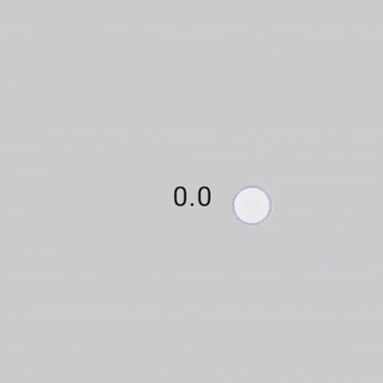
scrollable 修飾符
scrollable 修飾符和 scroll 修飾符不同,scrollable 會偵測捲動手勢並擷取增量,但不會自動位移內容。而是透過 ScrollableState 委派給使用者,這個修飾符需要這項權限才能正常運作。
建構 ScrollableState 時,您必須提供 consumeScrollDelta 函式,利用手勢輸入、順暢捲動或快速滑過執行每個捲動步驟時,系統都會叫用該函式,並以像素呈現差異。此函式必須傳回使用的捲動距離量,以確保事件在含有 scrollable 修飾符的巢狀元素時能正確傳播。
下列程式碼片段會偵測手勢並顯示位移數值,但不會使任何元素位移:
@Composable private fun ScrollableSample() { // actual composable state var offset by remember { mutableFloatStateOf(0f) } Box( Modifier .size(150.dp) .scrollable( orientation = Orientation.Vertical, // Scrollable state: describes how to consume // scrolling delta and update offset state = rememberScrollableState { delta -> offset += delta delta } ) .background(Color.LightGray), contentAlignment = Alignment.Center ) { Text(offset.toString()) } }
為您推薦
- 注意:系統會在 JavaScript 關閉時顯示連結文字
- 瞭解手勢
- 將
CoordinatorLayout遷移至 Compose - 在 Compose 中使用 View