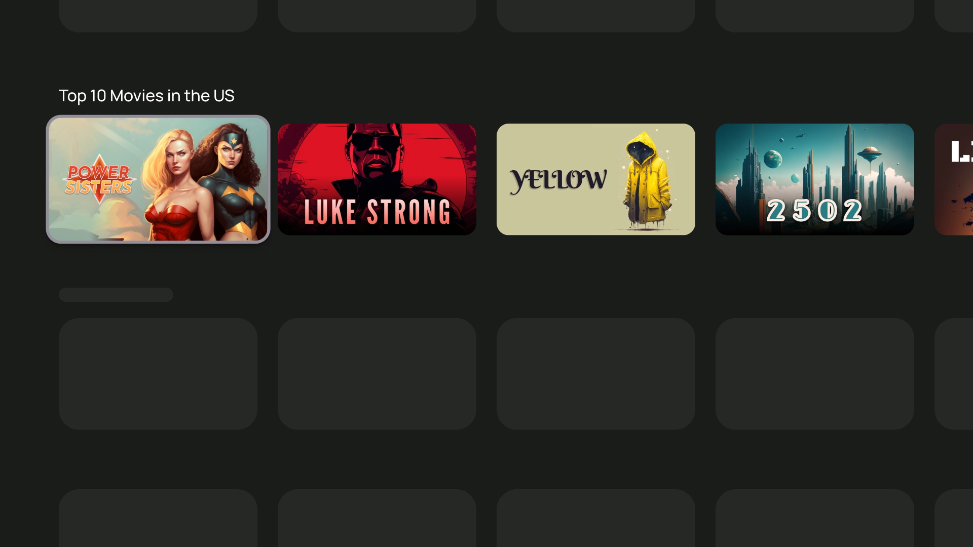
Cards are the basic building blocks of your TV app.
Resources
| Type | Link | Status |
|---|---|---|
| Design | Design source (Figma) | Available |
| Implementation | Jetpack Compose | Available |
Highlights
- Use a card to display content on a single topic.
- A card can hold anything from images to headlines, supporting text, buttons, lists, and other UI elements.
- A card cannot merge with another card or divide into multiple cards.
- There are six variations of cards: standard, classic, compact, inset, wide standard, and wide classic.
Variants
There are five types of cards, each with a different use case:
- Standard
- Classic
- Compact
- Wide standard
- Wide classic
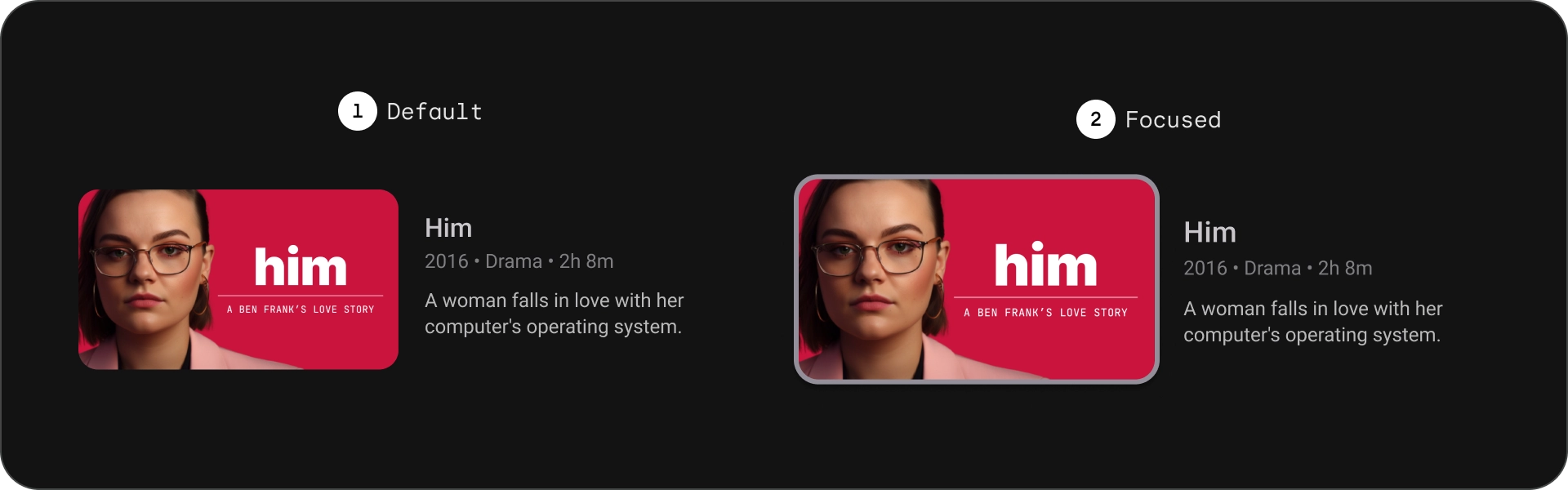
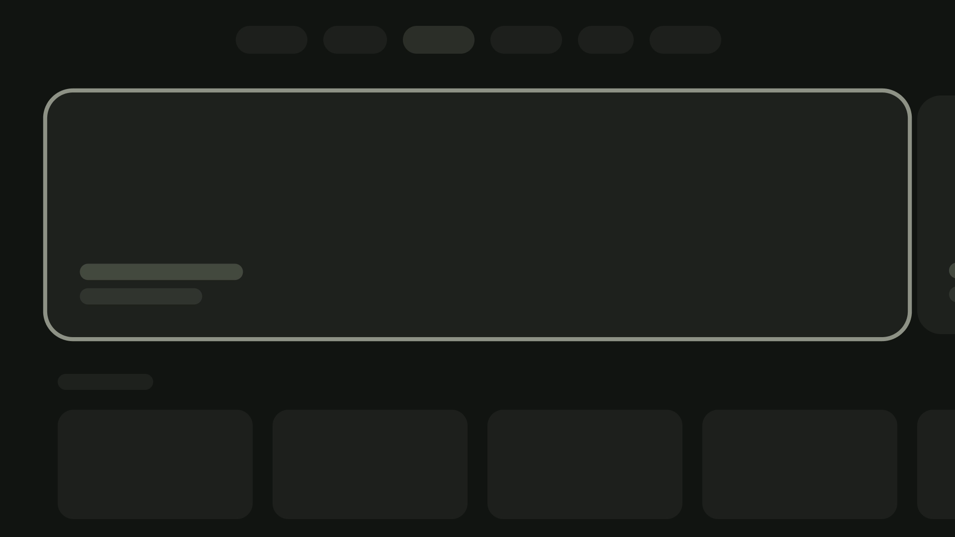
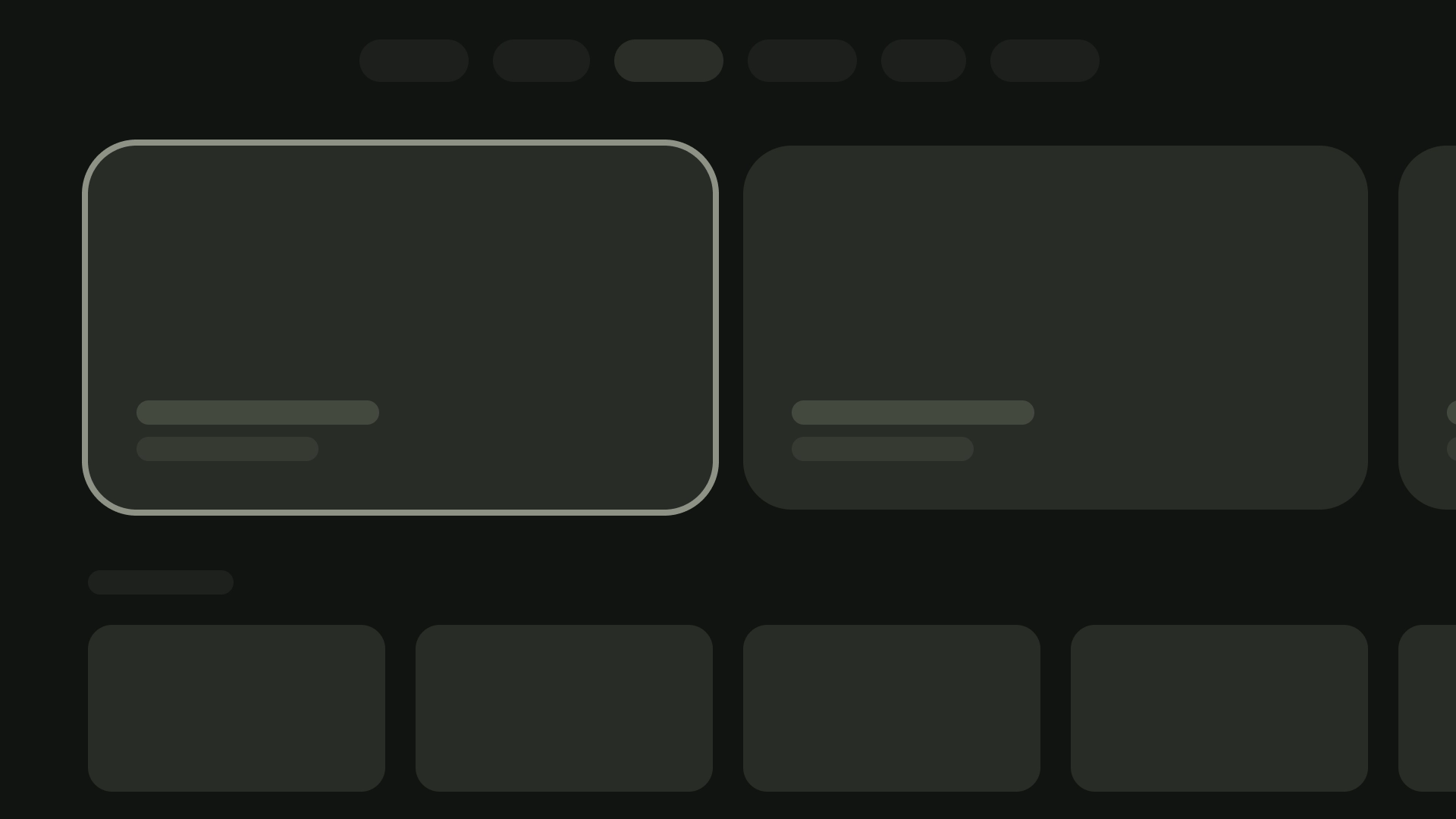
Content blocks
A card's contents are arranged in distinct blocks. The card visual design including emphasis denotes hierarchy. The layout of the cards themselves accommodates the types of content the cards contain.
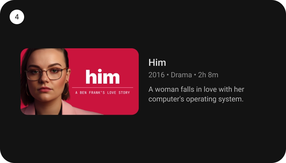
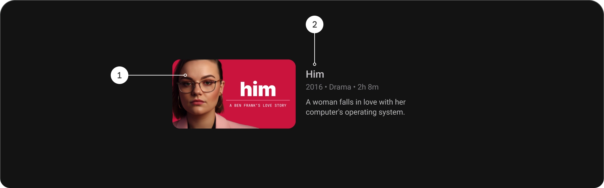
Anatomy

- Title
- Subtitle
- Description
- Extra text
Specs

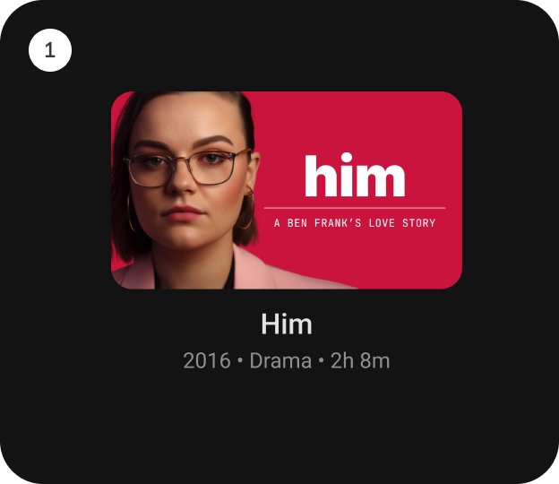
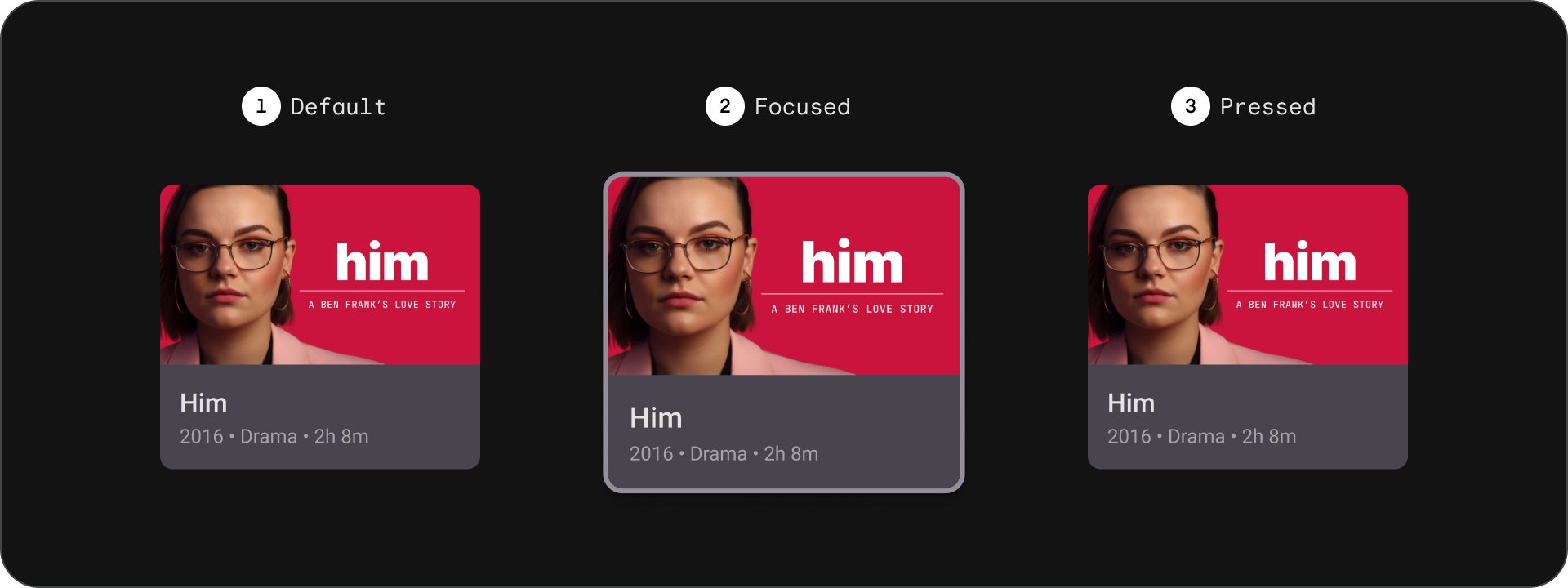
Standard card
Anatomy

- Image
- Content block
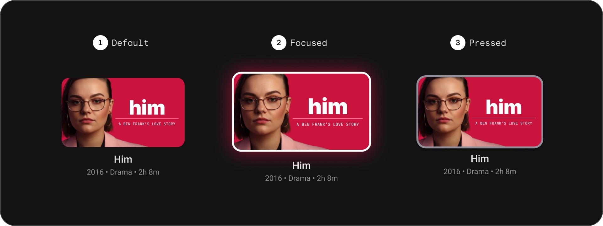
States
Specs

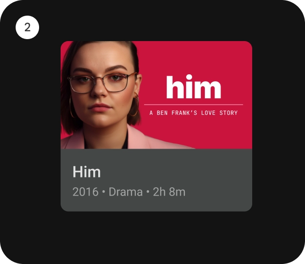
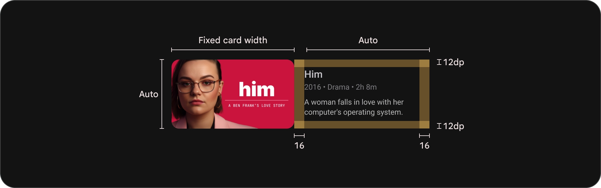
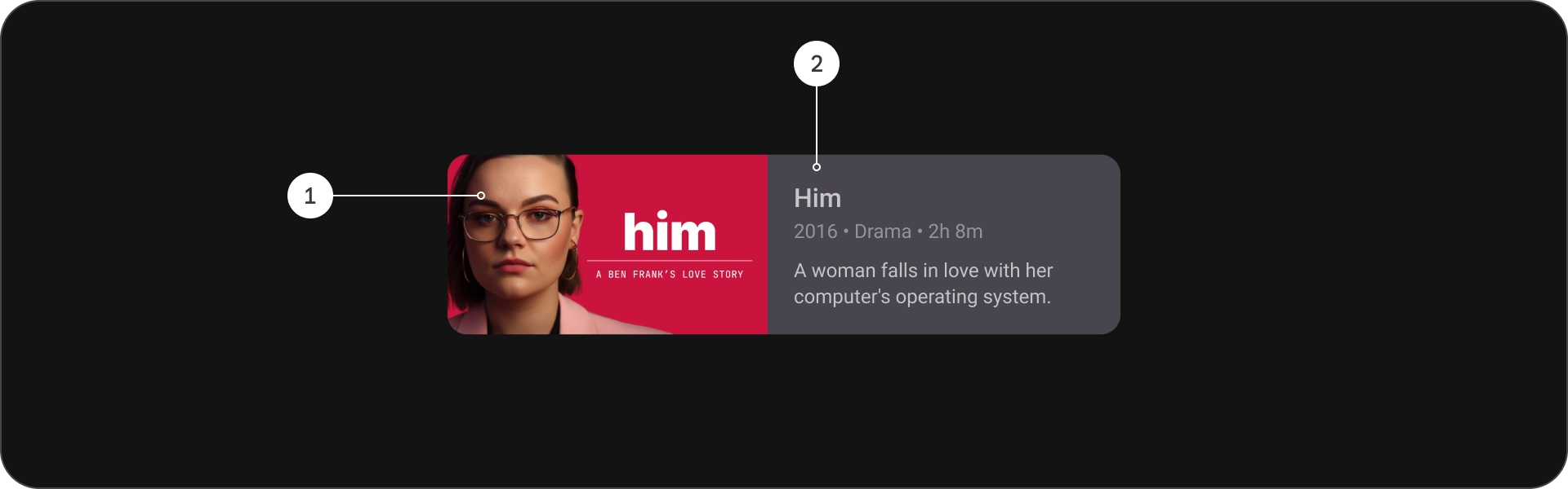
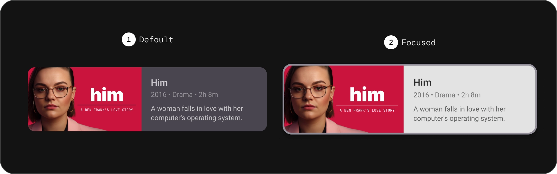
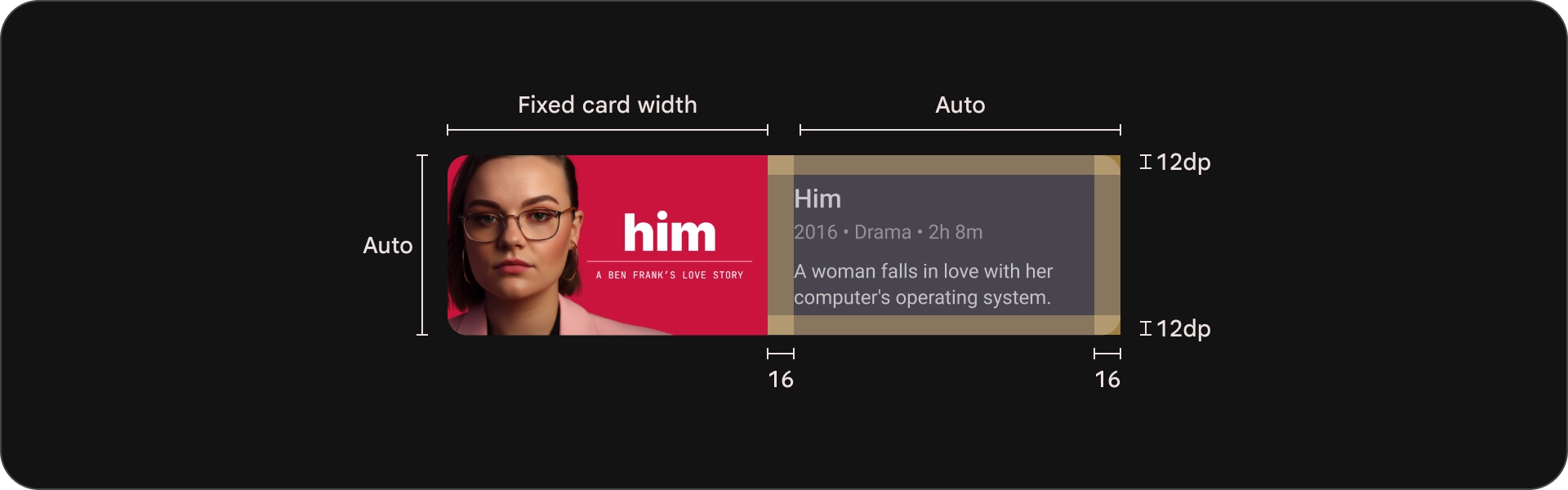
Classic card
Anatomy

- Image
- Content block
States
Specs

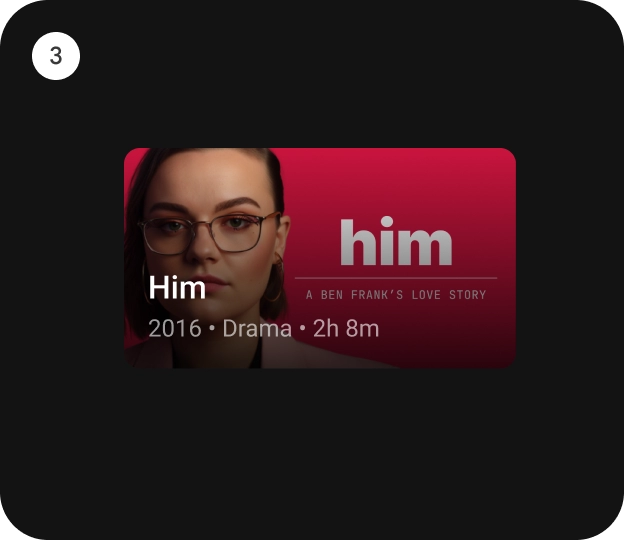
Compact card
Anatomy

- Image
- Content block
States
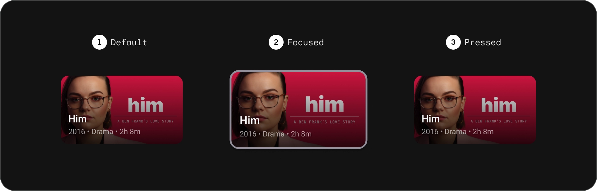
Specs

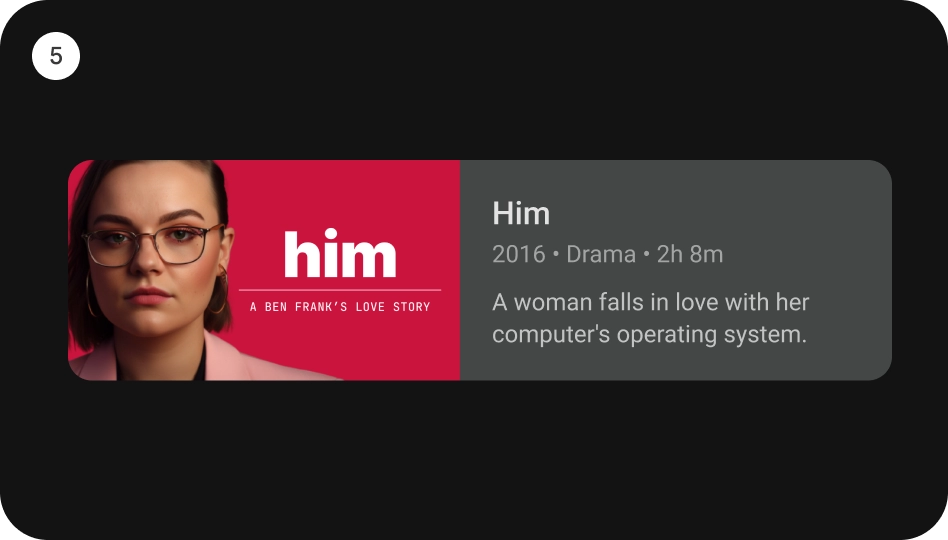
Wide standard card
Anatomy
- Image
- Content block
States
Specs
Wide classic card
Anatomy
- Image
- Content block
States
Specs
Usage
Cards are versatile design elements that can be used to display a variety of content in a visually appealing and user-friendly way. The following sections explore design considerations for cards.
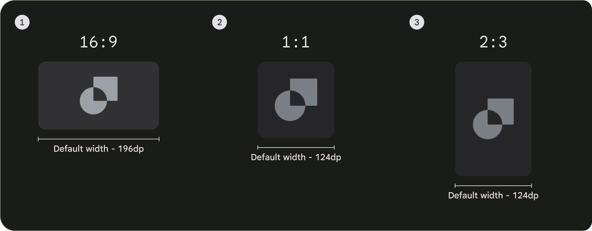
Aspect ratio
There are three common aspect ratios for cards: 16:9, 1:1, and 2:3. Each aspect ratio has its strengths, so the best choice for you depends on your specific needs.
- 16:9 is the most common aspect ratio for cards. It is a wide aspect ratio that is well-suited for displaying images and videos.
- 1:1 is a square aspect ratio. It is a good choice for cards that need to be visually balanced, such as cast and crew, channel logos, or team logos.
- 2:3 is a taller aspect ratio. It is a good choice if you want to break up the grid and bring more emphasis.
Ultimately, the best way to choose an aspect ratio for your cards is to experiment with different options and see what looks best.
Here are some examples usages of different aspect ratios
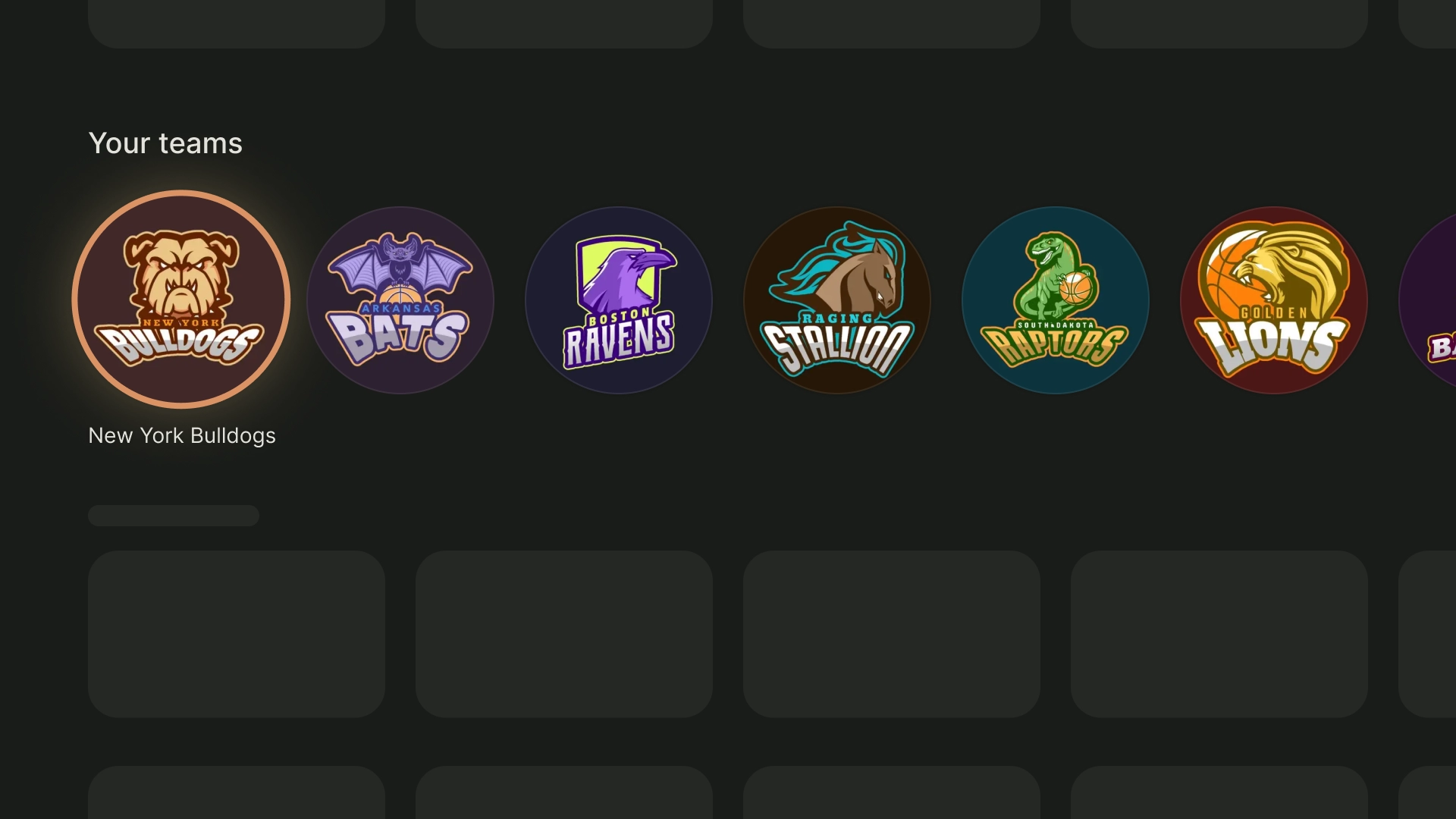
1:1
Cast and crew
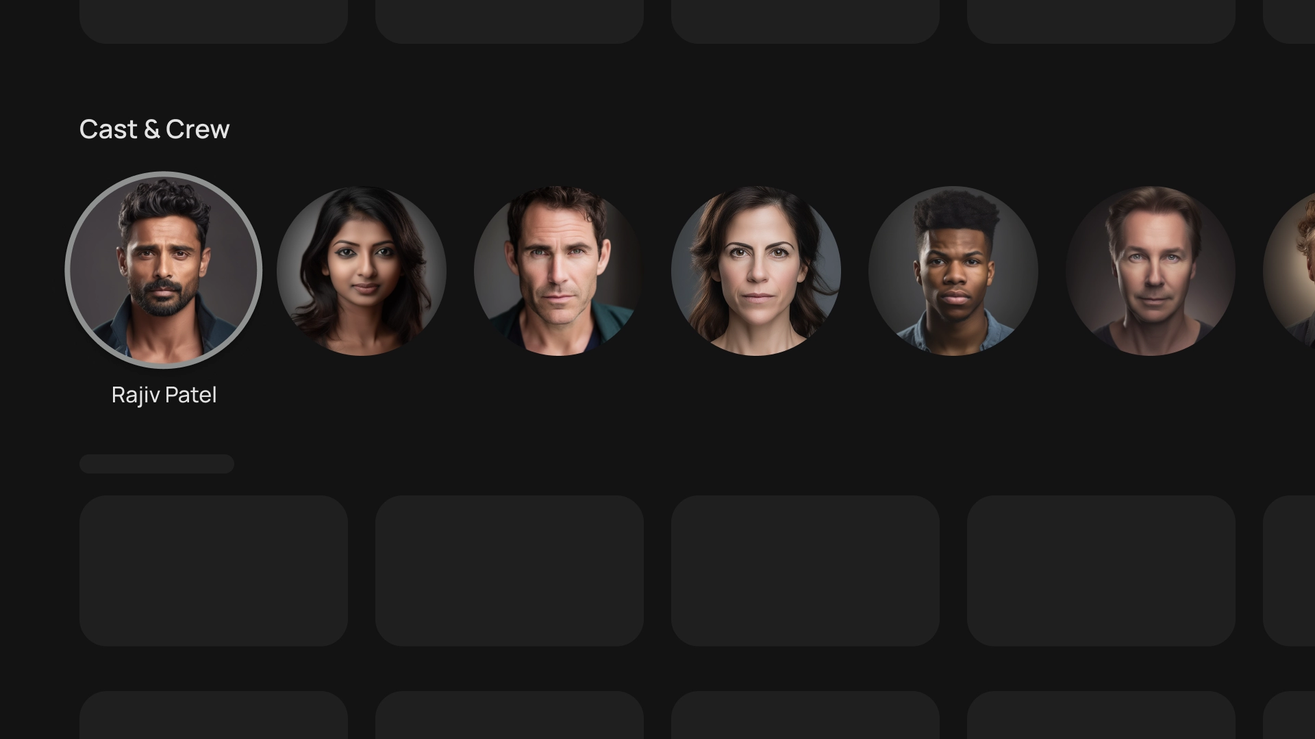
Sports teams logos
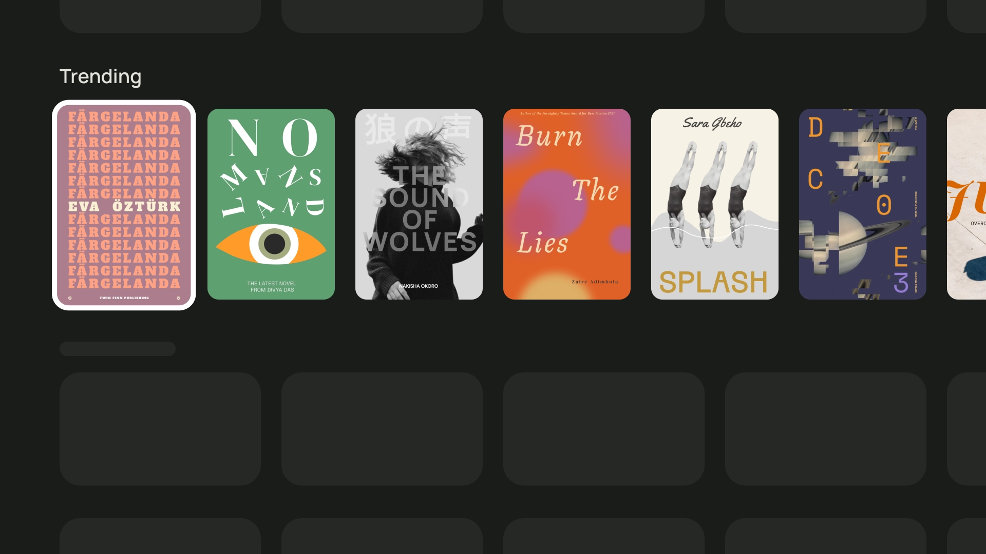
2:3
Trending books
16:9
Movie cards
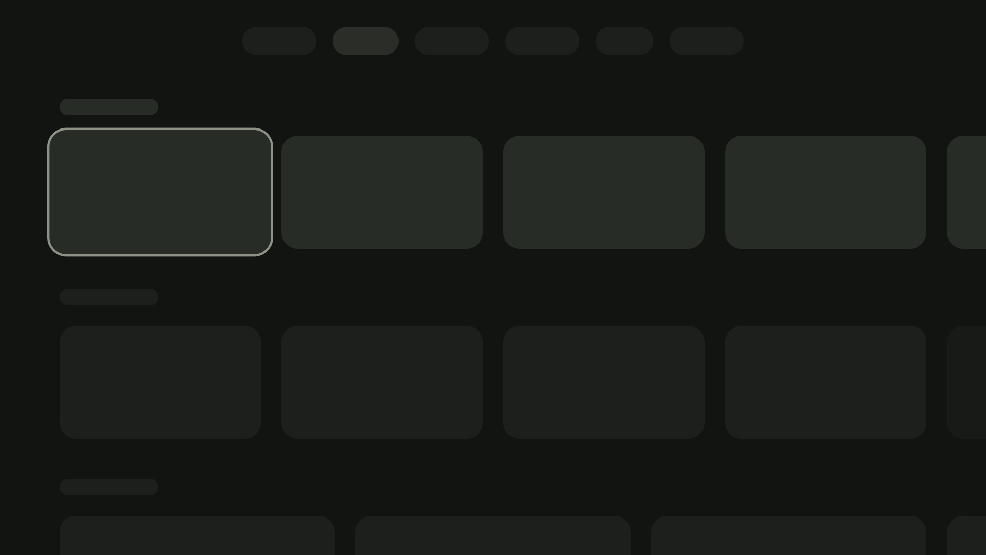
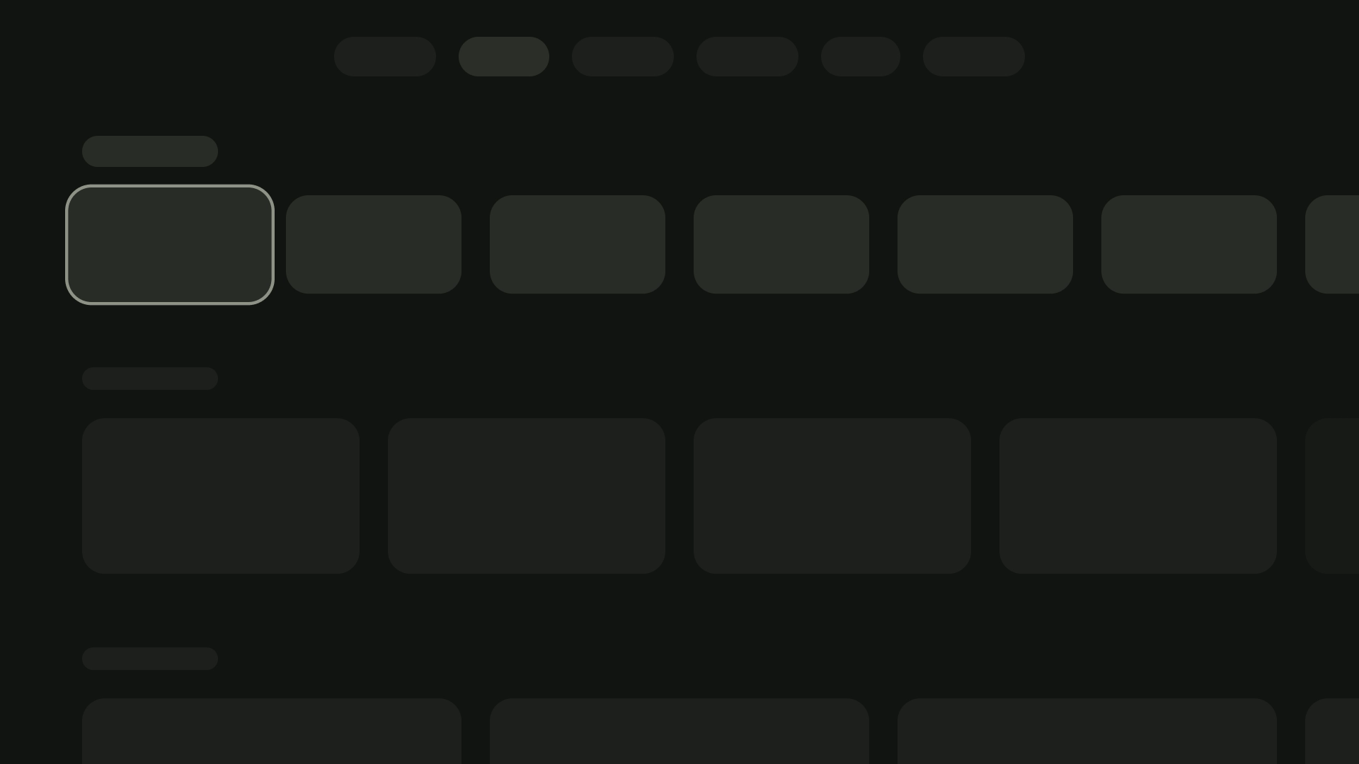
Layout and spacing
Varying card widths based on the number of cards visible on the screen can be achieved by implementing proper peaking with a spacing of 20dp.
1-card layout
Width of the card — 844dp
2-card layout
Width of the card — 412dp
3-card layout
Width of the card — 268dp
4-card layout
Width of the card — 196dp
5-card layout
Width of the card — 124dp
Content block
The width of the content block in a card should be the same width as the image thumbnail. If you need to display more text in the content block, use a wide card variation.
Do
Don't
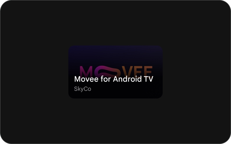
Compact card
Compact cards should be concise and easier to read. The content preceding the background image should be brief and to the point. Avoid long titles, subtitles, or descriptions. This makes your cards more visually appealing and easier to scan.
To make text more readable on an image, add a semi-transparent black gradient overlay. This darkens the background without obscuring the image too much, making the text easier to see.
Do