
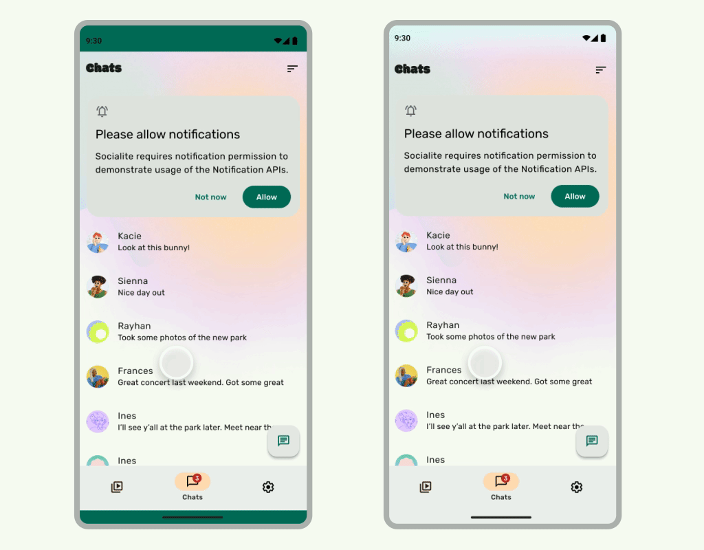
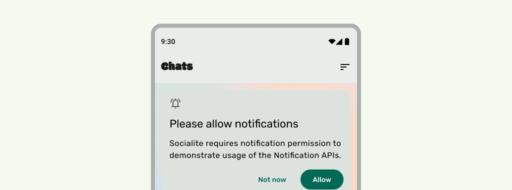
더 넓은 화면 앱은 시스템 표시줄 아래에 UI를 표시하여 전체 화면을 활용합니다.
요약
- 더 넓은 화면 환경을 위해 시스템 표시줄 아래에 배경 및 스크롤 콘텐츠를 표시합니다.
- 시스템 인셋 아래에 탭 동작 또는 드래그 타겟을 추가하지 마세요. 더 넓은 화면 및 동작 탐색과 충돌합니다.
시스템 표시줄 뒤에 콘텐츠 표시
더 넓은 화면 기능을 사용하면 몰입형 환경을 위해 시스템 표시줄 아래에 UI를 표시할 수 있습니다.
앱은 인셋 에 반응하여 콘텐츠의 겹침을 해결할 수 있습니다. 인셋은 시스템 표시줄 또는 디스플레이 컷아웃과 같은 실제 기기 기능과 겹치지 않도록 앱의 콘텐츠에 패딩을 추가해야 하는 정도를 설명합니다. Compose 및 뷰에서 더 넓은 화면을 지원하고 인셋을 처리하는 방법을 알아보세요.
더 넓은 화면 사용 사례를 설계할 때는 다음 유형의 인셋을 알고 있어야 합니다.
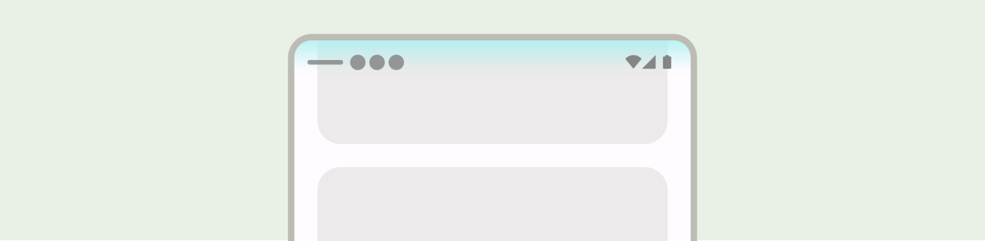
- 시스템 표시줄 인셋 은 탭할 수 있고 시스템 표시줄에 의해 시각적으로 가려지지 않아야 하는 UI에 적용됩니다.
- 시스템 동작 인셋 은 앱보다 우선순위가 높은 OS에서 사용하는 동작 탐색 영역에 적용됩니다.
- 디스플레이 컷아웃 인셋 은 카메라 컷아웃과 같이 디스플레이 노출 영역으로 확장되는 기기 영역에 적용됩니다.
상태 표시줄 고려사항
기본 시스템 표시줄 설계 가이드는 Android 시스템 표시줄을 참고하세요. 다음 섹션에서는 추가 상태 표시줄 고려사항을 설명합니다.
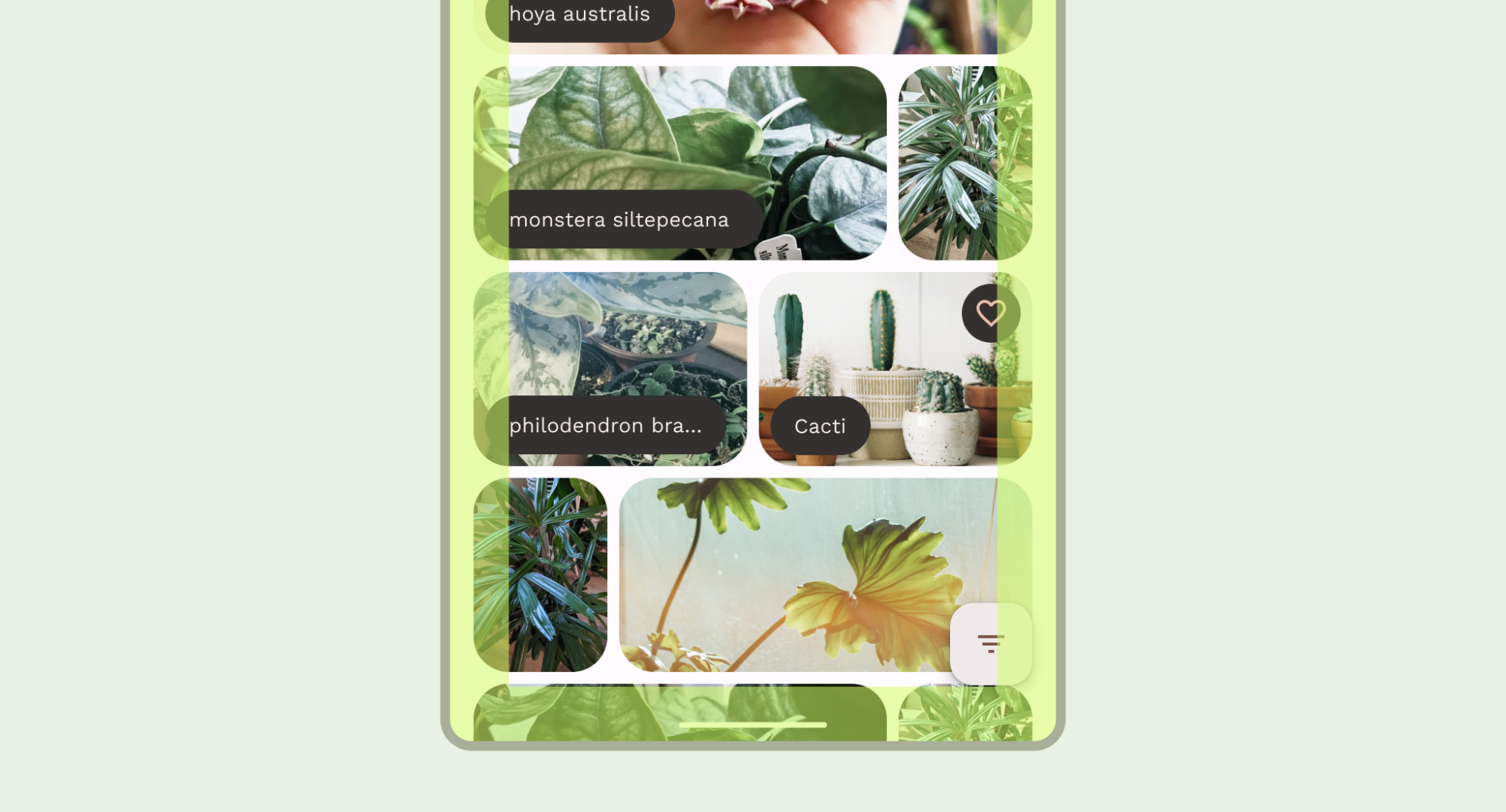
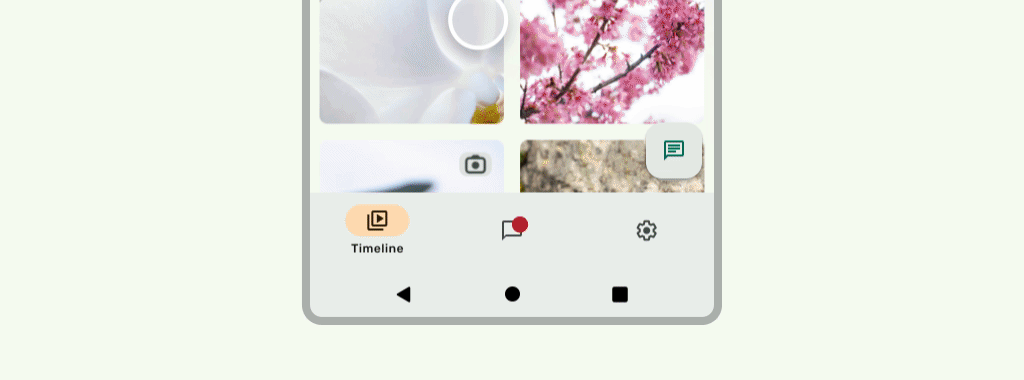
콘텐츠 스크롤
스크롤하는 동안 상단 앱 바가 접혀야 합니다. Material 3 TopAppBar를 접는 방법을 알아보세요. Material 3에서 작은 상단 앱 바는 상태 표시줄 높이로 접히거나 화면 밖으로 스크롤될 수 있습니다. 중간 및 큰 상단 앱 바는 더 작은 앱 바로 접힐 수 있습니다. Material 가이드를 참고하세요.
권장사항

권장사항
UI가 아래로 스크롤될 때 상태 표시줄 아이콘이 어수선해 보이지 않도록 상태 표시줄이 반투명해야 합니다. 이렇게 하려면 먼저 LazyColumn 또는 RecyclerView 문서의 단계에 따라 스크롤 가능한 UI를 더 넓은 화면으로 만듭니다. 그런 다음 다음 중 하나를 실행하여 시스템 표시줄이 반투명하도록 합니다.
- 해당하는 경우 스크롤할 때 Material 3 TopAppBar 자동 보호를 사용합니다.
- 커스텀 그라데이션 컴포저블을 만들거나 뷰에 GradientProtection을 사용합니다. Compose에서 이 작업을 실행하는 방법에 관한 자세한 내용은 시스템 표시줄 보호를 참고하세요.
적응형 레이아웃의 경우 배경 색상이 다른 창에 별도의 보호 기능이 있는지 확인합니다.
권장사항
권장사항
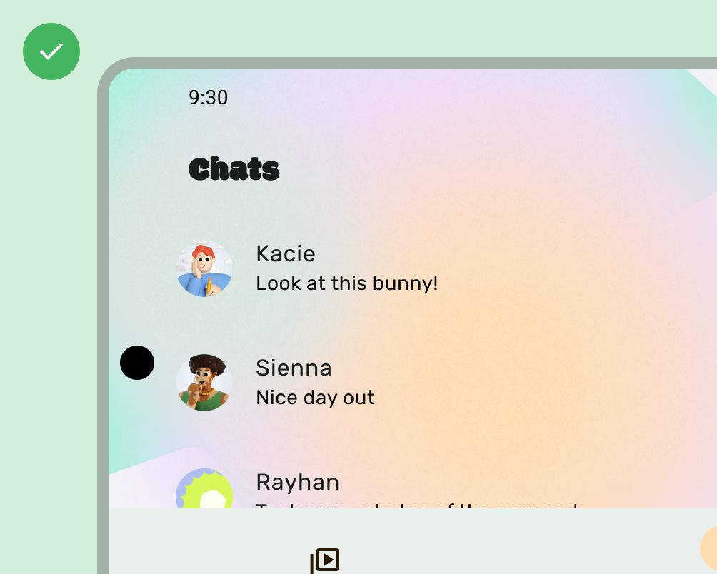
마찬가지로 탐색 창에도 앱의 나머지 부분과 별도의 보호 기능이 있어야 합니다.
예를 들어 Material 3 TopAppBar 기본 제공 보호 기능과 커스텀 보호 기능을 모두 사용하여 상태 표시줄 보호 기능을 쌓지 마세요.
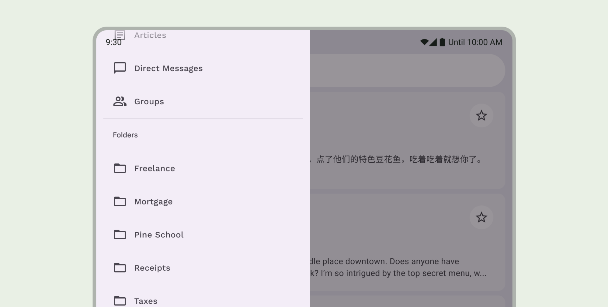
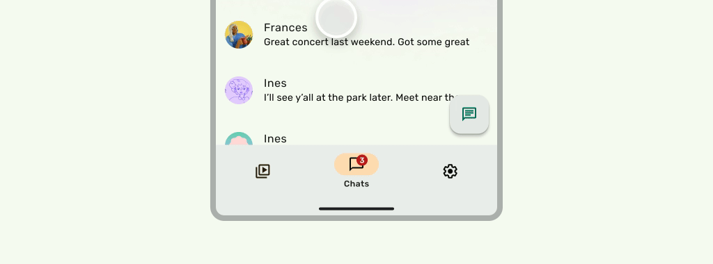
탐색 메뉴 고려사항
기본 탐색 메뉴 설계 가이드는 Android 시스템 표시줄을 참고하세요. 다음 섹션에는 추가 탐색 메뉴 고려사항이 포함되어 있습니다.
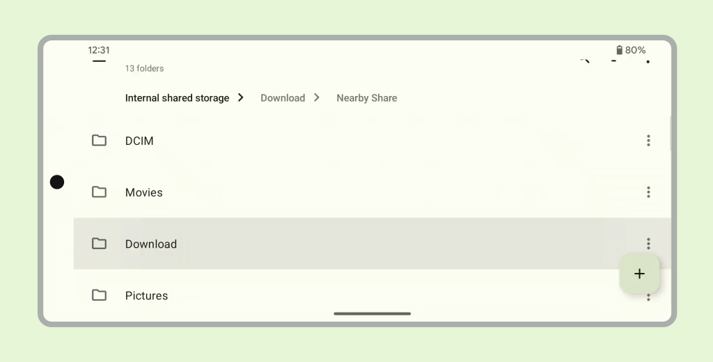
콘텐츠 스크롤
스크롤하는 동안 하단 앱 바가 접혀야 합니다.
권장사항
권장사항
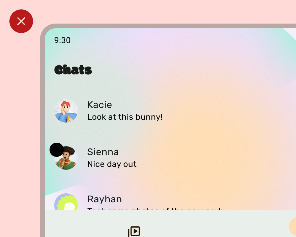
디스플레이 컷아웃
디스플레이 컷아웃은 UI의 모양에 영향을 줄 수 있습니다. 앱은 UI의 중요한 부분이 디스플레이 컷아웃 아래에 표시되지 않도록 디스플레이 컷아웃 인셋을 처리해야 합니다.
권장사항
권장사항
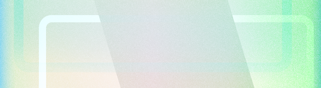
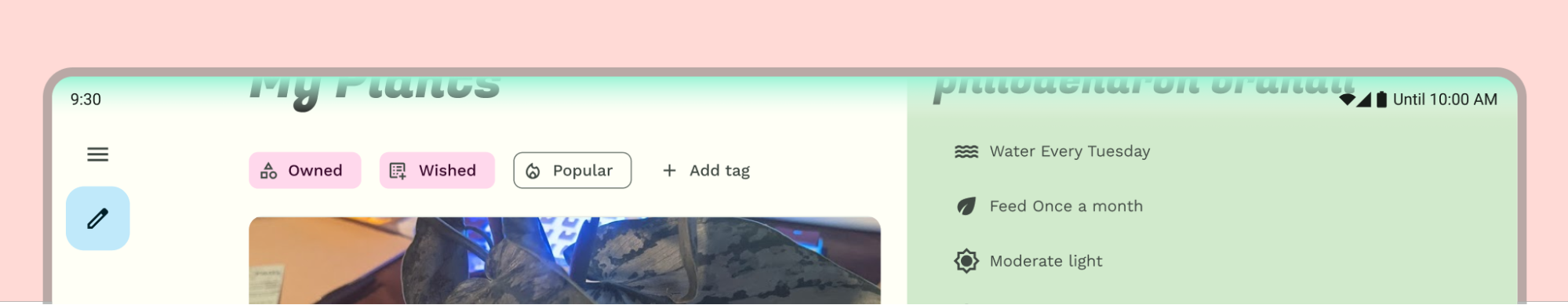
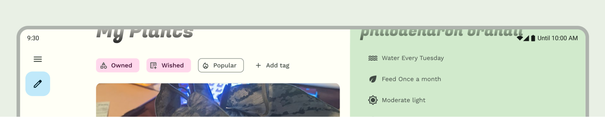
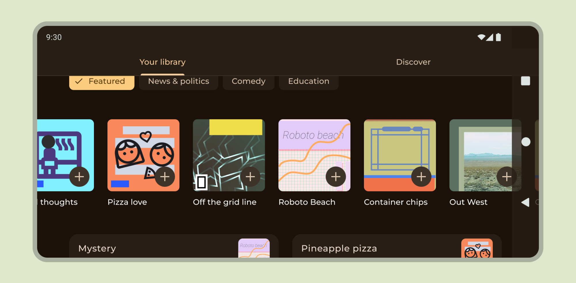
그러나 다음 이미지와 같이 단색 앱 바 배경은 디스플레이 컷아웃에 표시되어야 합니다.
가로 캐러셀이 디스플레이 컷아웃에 표시되는지 확인합니다.
Compose 및 Views에서 디스플레이 컷아웃을 지원하는 방법을 알아보세요.
기타 가이드
일반적으로 배경과 구분선도 더 넓은 화면으로 표시되어야 하는 반면 텍스트 및 버튼과 같은 콘텐츠는 시스템 UI 및 하드웨어 요소를 피하기 위해 인셋되어야 합니다.