Google Photos বড় স্ক্রিনের জন্য তৈরি করে দৈনিক সক্রিয় ব্যবহারকারী বাড়িয়েছে
সেভ করা পৃষ্ঠা গুছিয়ে রাখতে 'সংগ্রহ' ব্যবহার করুন
আপনার পছন্দ অনুযায়ী কন্টেন্ট সেভ করুন ও সঠিক বিভাগে রাখুন।
Google Photos হল আপনার স্মৃতির ঘর, এবং তাদের ডেভেলপমেন্ট টিম বিশ্বাস করে যে সমস্ত ডিভাইস জুড়ে সেই স্মৃতিগুলি উপভোগ করতে সক্ষম হওয়া উচিত৷ অ্যাপের বৈশিষ্ট্যগুলি অ্যান্ড্রয়েড ট্যাবলেট, ফোল্ডেবল এবং ক্রোমওএস ডিভাইস জুড়ে ভাল কাজ করেছে তা নিশ্চিত করতে, তারা সমস্ত স্ক্রীন জুড়ে প্রতিক্রিয়াশীল লেআউটগুলি বিকাশে বিনিয়োগ করেছে৷
তারা কি করেছিল
Google Photos ডেভেলপমেন্ট টিম চিন্তা করেছে কিভাবে বড় স্ক্রিনের জন্য তাদের লেআউট পরিবর্তন করা যায়। তারা বড় পর্দার জন্য তাদের লেআউটগুলি কীভাবে পরিবর্তন করতে চায় তা নির্ধারণ করতে তারা ব্যবহারযোগ্যতার সর্বোত্তম অনুশীলন এবং গবেষণার উপর ঝুঁকেছে। প্রথমে তারা যখন ট্যাবলেটের জন্য স্ক্রীন 600dp এবং ল্যাপটপের জন্য 1008 dp-এর বেশি বাড়ে তখন ঘনত্ব কমিয়ে গ্রিড লেআউট উন্নত করে। এটি ব্যবহারকারীদের বৃহত্তর ফর্ম ফ্যাক্টরে তাদের ফটোগুলি দেখতে এবং স্ক্রোল করা সহজ করে তুলেছে৷
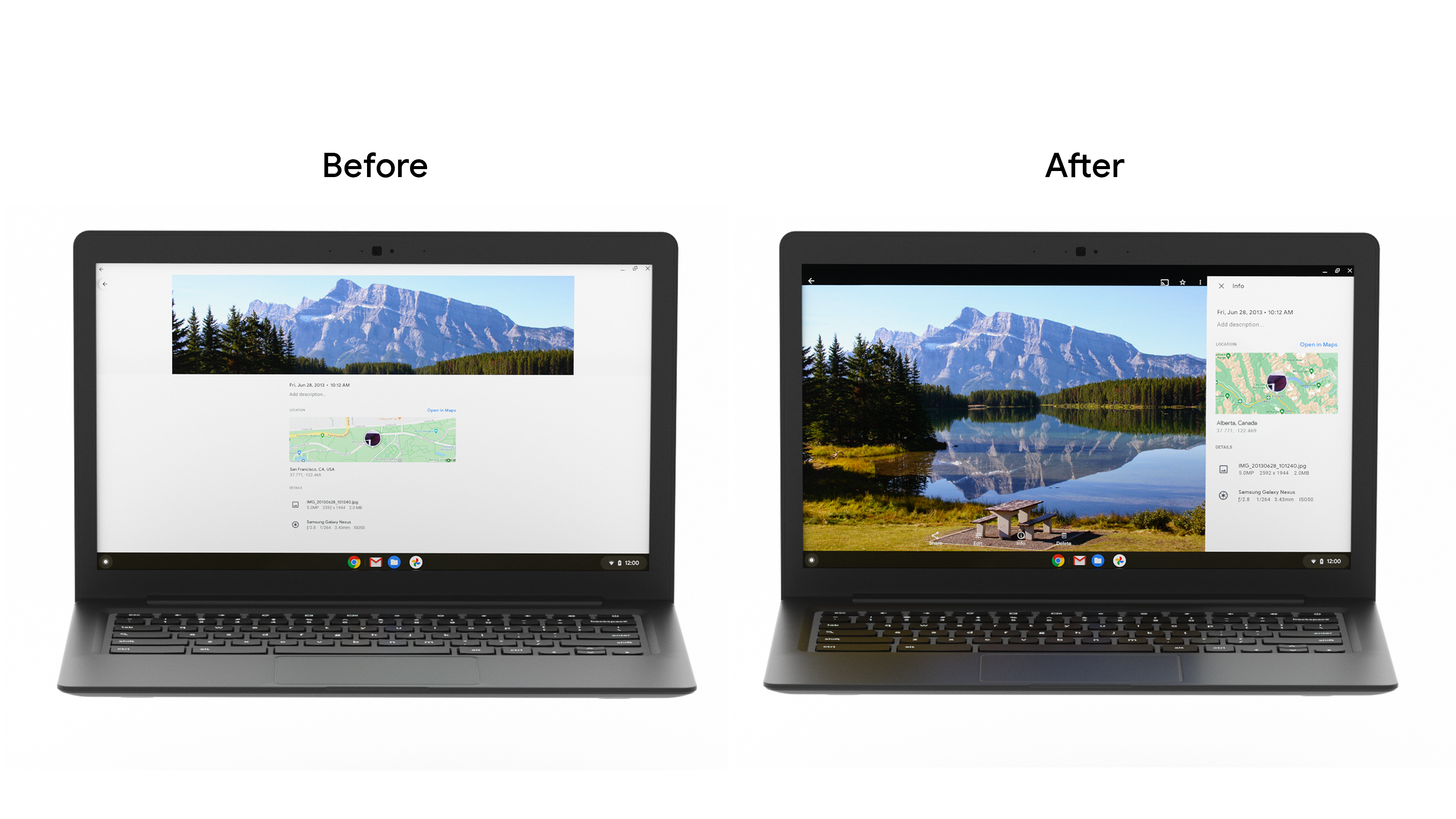
তারপরে তারা তথ্য প্যানেলের নীচের ড্রয়ারটিকে একটি সাইডবার দিয়ে প্রতিস্থাপন করেছে। যেহেতু ট্যাবলেট এবং ডেস্কটপ স্ক্রিনগুলি প্রায়শই ল্যান্ডস্কেপে ব্যবহার করা হয়, তাই এই পদ্ধতির পরিবর্তনটি বিস্তৃত স্ক্রীন জুড়ে প্রসারিতকে হ্রাস করে এবং ট্যাবলেট ব্যবহারকারীদের ডিভাইসগুলি যেভাবে ধারণ করে তার জন্য আরও ভাল ergonomics প্রদান করে। তারা নীচের শীট ডায়ালগ উন্নত করেছে, এবং বড় স্ক্রিনে ব্যবহারকারীর বার্তাগুলি সহজে প্রদর্শন করতে স্ন্যাকবার যোগ করেছে।
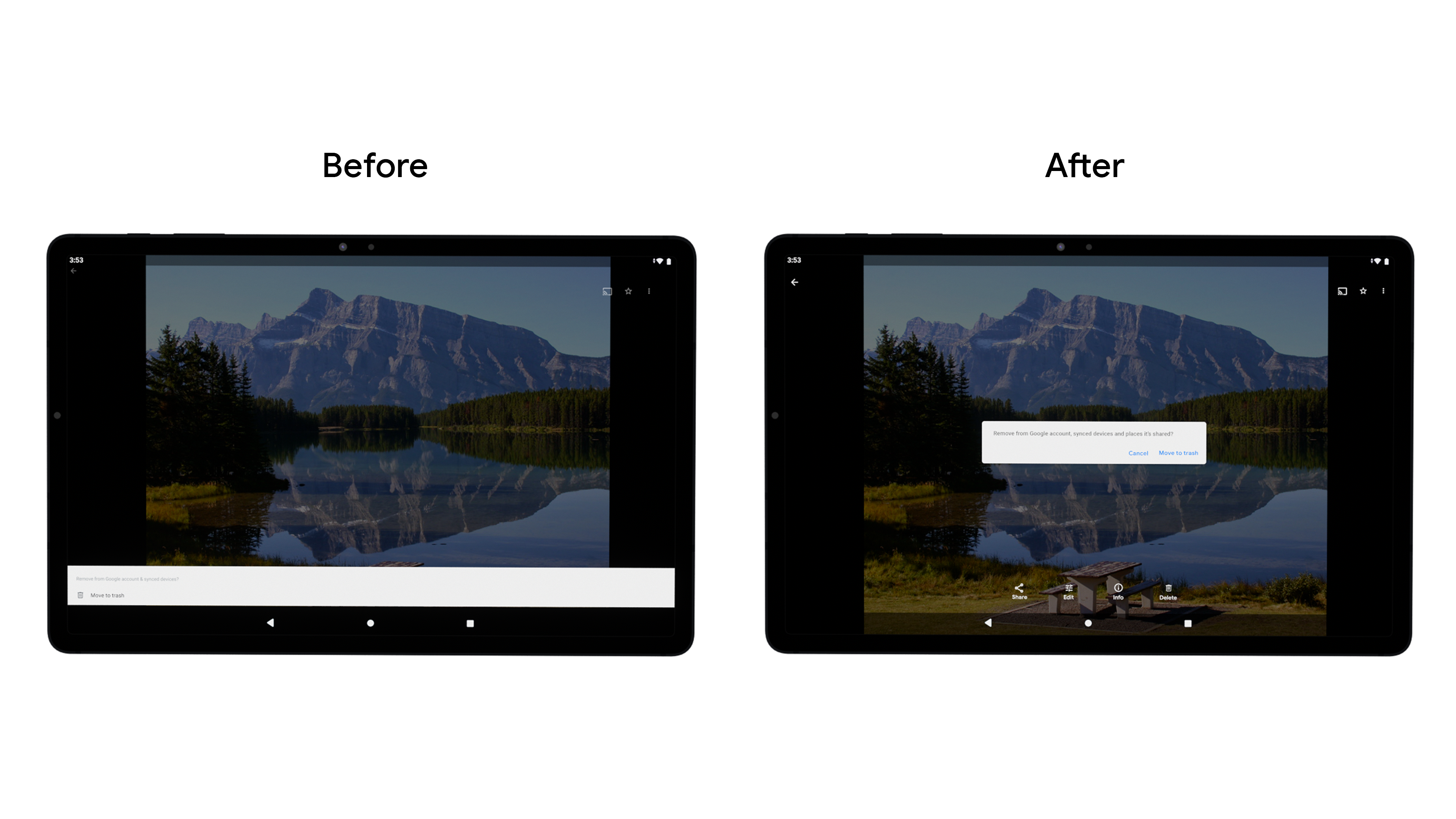
ব্যবহারকারীদের নেভিগেট করা এবং কাজগুলি সম্পূর্ণ করা সহজ করতে তারা একটি নীচের বার থেকে একটি উল্লম্ব রেলে নেভিগেশন উপাদান পরিবর্তন করেছে। যদিও Google Photos এটি তাদের নিজস্ব কোডবেসের মধ্যে তৈরি করেছে, ডেভেলপাররা নতুন নেভিগেশন রেল উপাদান উপাদান ব্যবহার করে এরগনোমিক্স উন্নত করতে, স্ট্রেচিং কমাতে এবং উল্লম্ব স্ক্রোলিং অ্যাপের জন্য স্ক্রীন রিয়েল এস্টেট বাড়ানোর জন্য এটি তৈরি করতে পারে।
ডেভেলপমেন্ট টিম বিভিন্ন ভঙ্গি এবং স্ক্রীন মাপের মধ্যে রূপান্তরকে স্ট্রিমলাইন করার জন্য গ্রিডের আকার পরিবর্তনকে গতিশীল করেছে এবং কীবোর্ড এবং স্টাইলাস কলমের মতো আনুষাঙ্গিকগুলির জন্য তারা যে সহায়তা প্রদান করে তা উন্নত করেছে। উত্পাদনশীলতার জন্য ChromeOS ডিভাইসগুলি ব্যবহার করে গ্রাহকদের মধ্যে যে বৃদ্ধি আমরা দেখেছি, তা নিশ্চিত করা ক্রমবর্ধমানভাবে গুরুত্বপূর্ণ যে অ্যাপগুলি কীবোর্ড, মাউস এবং স্পর্শ সহ বিভিন্ন ধরনের ইনপুট পদ্ধতি সমর্থন করে৷
ফলাফল
দলটি একটি A/B পরীক্ষার মাধ্যমে এই পরিবর্তনগুলিকে রোল আউট করেছে, এবং বড় স্ক্রিনে মূল পণ্য বৈশিষ্ট্যগুলির জন্য DAU-তে সামগ্রিক বৃদ্ধি লক্ষ্য করেছে, আর্কাইভের ব্যবহার 53% বৃদ্ধি পেয়েছে৷ Google Photos টিম সমস্ত ডিভাইসে একটি দুর্দান্ত অভিজ্ঞতা নিশ্চিত করতে সমস্ত স্ক্রিন আকার জুড়ে ব্যবহারকারীর অভিজ্ঞতা উন্নত করার জন্য বিনিয়োগ চালিয়ে যাবে৷
এবার শুরু করা যাক
বৃহত্তর স্ক্রিনের জন্য আপনার অ্যাপটি অপ্টিমাইজ করার সাথে আপনি কীভাবে শুরু করতে পারেন সে সম্পর্কে আরও জানুন৷
এই পৃষ্ঠার কন্টেন্ট ও কোডের নমুনাগুলি Content License-এ বর্ণিত লাইসেন্সের অধীনস্থ। Java এবং OpenJDK হল Oracle এবং/অথবা তার অ্যাফিলিয়েট সংস্থার রেজিস্টার্ড ট্রেডমার্ক।
2021-09-02 UTC-তে শেষবার আপডেট করা হয়েছে।
[[["সহজে বোঝা যায়","easyToUnderstand","thumb-up"],["আমার সমস্যার সমাধান হয়েছে","solvedMyProblem","thumb-up"],["অন্যান্য","otherUp","thumb-up"]],[["এতে আমার প্রয়োজনীয় তথ্য নেই","missingTheInformationINeed","thumb-down"],["খুব জটিল / অনেক ধাপ","tooComplicatedTooManySteps","thumb-down"],["পুরনো","outOfDate","thumb-down"],["অনুবাদ সংক্রান্ত সমস্যা","translationIssue","thumb-down"],["নমুনা / কোড সংক্রান্ত সমস্যা","samplesCodeIssue","thumb-down"],["অন্যান্য","otherDown","thumb-down"]],["2021-09-02 UTC-তে শেষবার আপডেট করা হয়েছে।"],[],[],null,["# Google Photos increased daily active users by building for large screens\n\nGoogle Photos is the home for your memories, and their development team believes people should be able to enjoy those memories across all devices. To make sure the app's features worked well across Android tablet, foldable, and ChromeOS devices, they invested in developing responsive layouts across all screens.\n\nWhat they did\n-------------\n\nThe Google Photos development team thought through how to modify their layout for large screens. They leaned on [usability best practices](https://material.io/blog/material-design-for-large-screens) and research to determine how they wanted to modify their layouts for large screens. First they improved the grid layout by reducing the density when screens increase beyond 600dp for tablets, and 1008 dp for laptops. This made it easier for users to view and scroll through their photos on the larger form factor. \n\nThen they replaced the info panel bottom drawer with a sidebar. Since tablets and desktop screens are often used in landscape, this approach change reduces stretching across wider screens and provides better ergonomics for the way tablet users hold devices. They also improved the [bottom sheet dialog](https://developer.android.com/reference/com/google/android/material/bottomsheet/BottomSheetDialog), and added [snackbars](https://developer.android.com/reference/com/google/android/material/snackbar/Snackbar) to display user messages easier on large screens. \n\nThey changed the navigation component from a bottom bar to a vertical rail, to make it easier for users to navigate and complete tasks. While Google Photos built this within their own codebase, developers can build this using the new [Navigation rail material component](https://material.io/components/navigation-rail) to improve ergonomics, reduce stretching, and increase the screen real estate for vertical scrolling apps.\n\nThe development team also made grid resizing dynamic to streamline transitioning between different postures and screen sizes, and improved the support they provide for accessories such as keyboards and stylus pens. Given the growth we've seen amongst consumers using ChromeOS devices for productivity, it is increasingly important to ensure apps support a variety of input methods, including keyboard, mouse, and touch.\n\nResults\n-------\n\nThe team rolled out these changes through an A/B test, and noticed an overall **increase in DAU for key product features on large screens, with Archive seeing as much as a 53% usage increase**. The Google Photos team will continue investing in improving the user experience across all screen sizes to ensure a great experience on all devices.\n\nGet Started\n-----------\n\nLearn more about how you can get started with [optimizing your app for larger screens](https://developer.android.com/large-screens)."]]