تنظيم صفحاتك في مجموعات
يمكنك حفظ المحتوى وتصنيفه حسب إعداداتك المفضّلة.
يمكن أن يكون تصميم الألوان على التلفزيون مصدر إلهام وتحديد الحالة المزاجية بل ويحث المستخدمين على اتخاذ القرارات. إنه عنصر قوي وملموس يلاحظه المستخدمون أولاً.
يشكّل اللون خطوة مهمة في تصميم واجهة تلفزيونية عالية الجودة، وذلك لأنّه طريقة فعّالة للتواصل مع جمهور عريض.
أهمّ الميزات
إنّ وضع الصورة "العادي" هو الإعداد الأكثر شيوعًا لعرض التلفزيون.
وتتيح معظم أجهزة التلفزيون استخدام sRGB.
عند اختيار الألوان، ضع في اعتبارك أن المستخدمين يشاهدون التلفزيون على مسافات متفاوتة،
وفي إضاءة منخفضة.
قد تختلف تقنية العرض وإعدادات مساحة اللون في أجهزة التلفزيون بشكل كبير.
تأكد من إجراء الاختبار مع أكبر عدد ممكن من الاختلافات في مساحة
الأجهزة والألوان على النحو العملي.
ضع في الاعتبار احتياجات المستخدم وتفضيلاته المختلفة عند استخدام الألوان.
انتبه إلى مشكلات التلفزيون الشائعة، مثل التباين، عند استخدام التدرجات.
ألوان التلفزيون وشاشات عرض التلفزيون
من المفاهيم الخاطئة الشائعة أنّ جميع الشاشات تُظهر جميع الألوان بالطريقة نفسها.
ربما لاحظت ذلك أثناء استخدام كمبيوتر محمول في العمل أو مشاهدة فيلم في
منزل أحد الأصدقاء. قد يختلف اللون نفسه بين طُرز التلفزيون وشاشات
الكمبيوتر والأجهزة المحمولة.
مساحة اللون
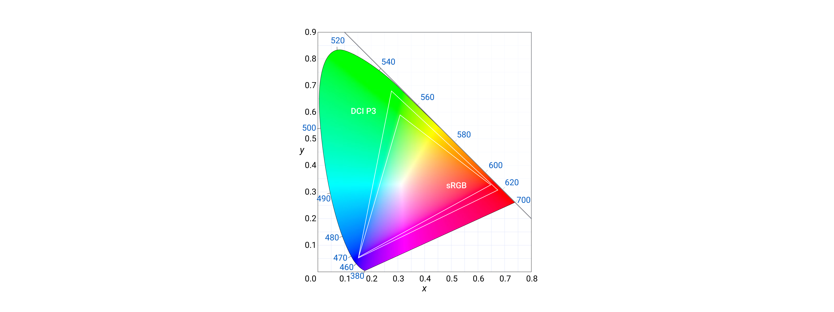
تشير مساحة اللون إلى مجموعة الألوان التي يمكن إعادة إنتاجها على شاشة التلفزيون.
وتشمل هذه المساحات مساحات الألوان sRGB وDCI-P3، علمًا بأنّ sRGB هي أكثر مساحات اللون استخدامًا على نطاق واسع، كما أنّها متوافقة مع أكبر مجموعة من طُرز التلفزيون.
وهو يُستخدم في أنظمة التشغيل والبرامج التلفزيونية والألعاب.
يمكن أن يؤدي اختيار مساحة اللون DCI-P3 إلى جعل الفيديوهات تبدو أكثر حيوية. بما أنّ المحتوى الذي تم إنشاؤه باستخدام DCI-P3 بإمكانه الوصول إلى نسبة أكبر من الألوان، قد يكون المحتوى متوافقًا فقط مع شاشات التلفزيون المتقدّمة.
وضع الصورة
قد تؤثر أوضاع الصور في جودة الألوان على التلفزيون من خلال تغيير طريقة
معالجة التلفزيون للصورة. على سبيل المثال، تحاول أوضاع الصور العادية عادةً إنتاج تمثيل لوني أكثر دقة، بينما تزيد أوضاع الصور الزاهية من تشبُّع الألوان
لجعلها أكثر حيوية.
يكون وضع الصورة التلقائي لمعظم لوحات التلفزيون هو وضع "عادي". تم تصميم هذا الوضع لتوفير
صورة متوازنة وألوان دقيقة. لكن المستخدم لديه العديد
من الخيارات للاختيار من بينها. يغير العديد من المستخدمين أوضاع الصورة لتحسين جودة الصورة
المتصورة.
لنلقِ نظرة على سبعة أوضاع شائعة للصورة:
عادي: وضع الصورة التلقائي. يوفر صورة متوازنة
بألوان دقيقة.
زاهية: تؤدي إلى زيادة تشبُّع الألوان، ما يجعلها أكثر حيوية.
ديناميكية: تؤدي هذه الميزة إلى زيادة تباين الصورة، ما يجعلها تبدو أكثر وضوحًا.
اللعبة: تحسين الصورة لتشغيل الألعاب، وتقليل تأخُّر الإدخال.
فيلم: يؤدي هذا الخيار إلى تحسين الصورة لمشاهدة الأفلام، ما يقلّل من تمويه الحركة.
الرياضة: لتحسين الصورة عند مشاهدة المباريات الرياضية، ما يؤدي إلى زيادة
درجة سطوع الصورة.
مخصص: يتيح للمستخدم ضبط إعدادات الصورة على تفضيلاته.
التباين
التباين هو أحد أهم جوانب جودة الصورة،
خاصةً مع الشاشات الحديثة ذات النطاق العالي الديناميكية. إنه الفرق بين أغمق وأغمق أبيض يمكن أن ينتجه التلفزيون.
تعني نسبة التباين الأعلى عادةً ألوانًا سوداء أغمق، مما
يحدث فرقًا كبيرًا في جودة الصورة بشكل عام.
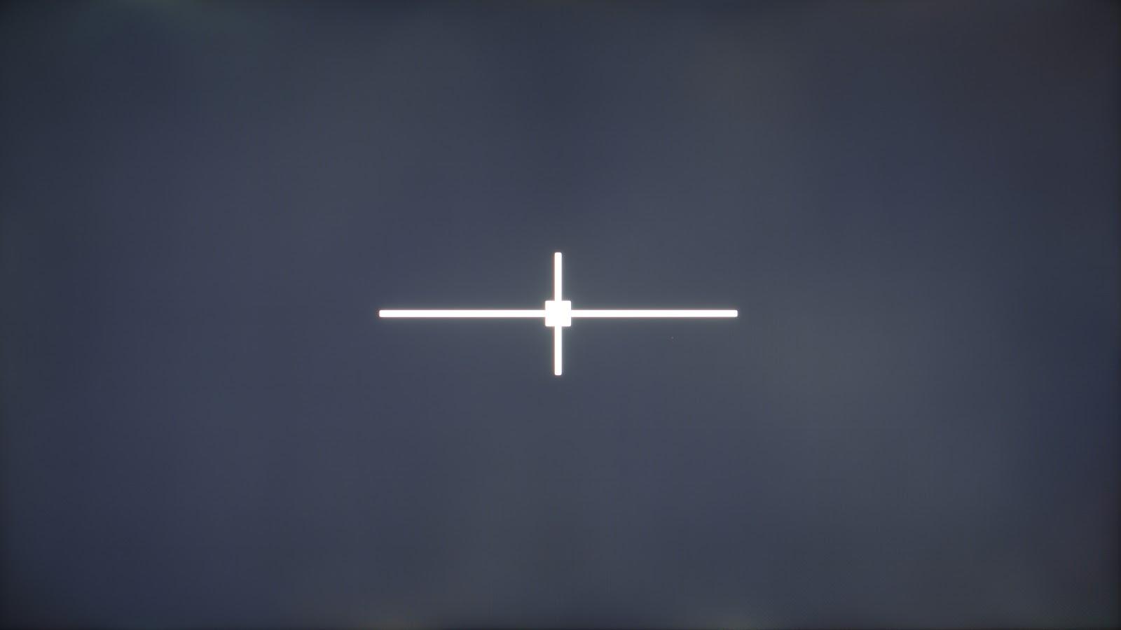
التباين: 562:1 (منخفض)
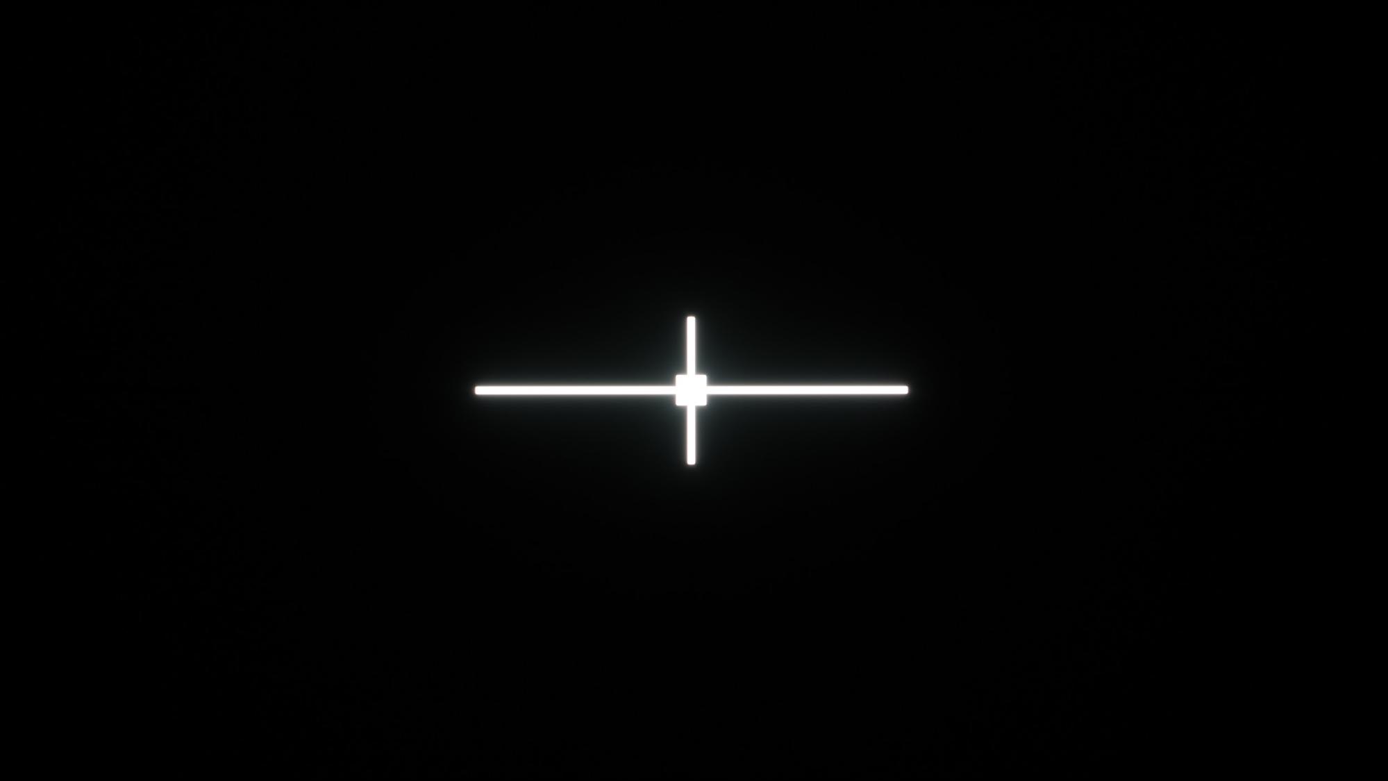
التباين: Inf: 1 (مثالي)
قد يبدو اللون نفسه على أجهزة التلفزيون المختلفة باهتًا على التلفزيون بنسبة تباين منخفضة. لضمان تجربة مستخدم جيدة، يجب على المصممين مراعاة
النصائح التالية عند إنشاء واجهة مستخدم لتطبيقات التلفزيون:
استخدام التباين العالي بين النص وألوان الخلفية.
اختَر خطوطًا واضحة ومقروءة ذات أحجام أكبر والمسافات بين الأسطر.
دمج ميزات إمكانية الوصول.
تجنب الاعتماد فقط على اللون لنقل المعلومات.
يمكنك تحسين الأداء لملاءمة مساحات الألوان المختلفة (SDR وHDR).
اختبِر سهولة قراءة النص في ظروف الإضاءة المختلفة.
تقنية العرض
يمكن أن تؤثر تقنيات العرض أيضًا في اللون المعروض على الشاشة. تتضمن بعض
الأنواع الشائعة ما يلي:
شاشة LCD: شاشات الكريستال السائل هي أكثر أنواع شاشات التلفزيون شيوعًا.
تعمل هذه الأجهزة باستخدام إضاءة خلفية لإضاءة لوحة بلورية سائلة، والتي تحجب بعد ذلك أو تسمح بمرور الضوء لإنشاء صورة.
أجهزة التلفزيون بشاشة LCD غير مكلفة نسبيًا وتتوفر فيها مجموعة كبيرة من الأحجام،
ولكنها قد تعاني من ضعف التباين وإعادة إنتاج الألوان.
LED: شاشات الصمام الثنائي الباعث للضوء هي من الأنواع الأحدث من أجهزة تلفزيون LCD التي تستخدم
مصابيح LED كإضاءة خلفية. تعد مصابيح LED أكثر توفيرًا للطاقة من شاشات LCD التقليدية
ويمكنها إنتاج صورة أكثر سطوعًا ووضوحًا. غالبًا ما تكون أجهزة تلفزيون LED أكثر
تكلفة من أجهزة تلفزيون LCD.
QLED: شاشات الصمام الثنائي الباعث للضوء ذات النقاط الكمية هي أحد أنواع شاشات LED التي تستخدم نقاطًا كمّية لإنتاج الضوء. النقاط الكميّة هي جسيمات صغيرة يمكنها
إنتاج نطاق أوسع من الألوان مقارنةً بمصابيح LED التقليدية.
شاشة OLED: شاشات الصمام الثنائي الباعث للضوء العضوية هي نوع من شاشات LED التي تستخدم مواد عضوية لإنتاج الضوء. تعد أجهزة التلفزيون OLED النوع الأغلى من أجهزة التلفزيون،
لكنها توفر أفضل التباين وإعادة إنتاج الألوان من أي نوع
من أجهزة التلفزيون.
ولكل نوع من أنواع تكنولوجيا عرض التلفزيون مزاياه وعيوبه الخاصة
عند عرض الألوان.
لمزيد من القراءات، يمكنك الاطّلاع على مبادئ لون المادة.
تسهيل الاستخدام أولاً: تضم واجهات التلفزيون جمهورًا متنوعًا. من الصغار إلى كبار السن إلى ضعاف البصر. ضع في الاعتبار دائمًا الاحتياجات
والتفضيلات عند استخدام الألوان. يمكن أن يؤدي وضع إمكانية الوصول أولاً في
واجهة المستخدم إلى منح المستخدمين تجربة فعالة. مثال على ذلك هو تلبية
معايير تباين الألوان. ملاحظة: ضع في اعتبارك دائمًا أشكال عرض الألوان
عبر نماذج التلفزيون المختلفة.
اللون مع الغرض: عند استخدام الألوان بشكل صحيح، يمكن أن يحسّن التواصل وينشئ تجارب هادفة وغامرة. إنه يعكس هوية منتجك عبر
واجهة التلفزيون.
اختيار أساس متباين: تساعد الخلفية المتباينة المستخدمين
على تفسير نص تطبيقك والعناصر المختلفة والتفاعل معه.
يضمن مستوى التباين الأعلى رؤية المحتوى.
تباين الشاشة
يشير تباين الشاشة على التلفزيون إلى مظهر الخطوط الأفقية أو العمودية أو النطاقات أو التدرجات المرئية على الشاشة التي لا تشكّل جزءًا من المحتوى الفعلي المعروض. يمكن أن تظهر هذه الأداة إما كخطوط مميزة أو كانتقال تدريجي في الألوان أو الظلال عبر الشاشة. يمكن أن ينتج هذا التباين عن عوامل مثل انخفاض عمق الألوان أو تأثير الضغط أو تداخل الإشارة أو مشاكل اللوحة أو وحدة معالجة الرسومات.
عند تصميم واجهة مستخدم للتلفزيون، خاصة عندما يتعلق الأمر
بالتدرّجات وتجنب التباين، ضع في اعتبارك النصائح التالية:
استخدام التدرجات ذات الألوان العالية: لتقليل مخاطر التباين،
استخدِم التدرجات ذات العمق الكبير للألوان (مثل 10 بت أو أعلى). يضمن ذلك انتقالاً أكثر سلاسة بين الألوان وتقليل احتمالية ظهور النطاقات المرئية.
تجنُّب الانتقالات الزائدة بين الألوان: عند إنشاء تدرّجات،
حاوِل تجنُّب الانتقالات الحادّة بين الألوان، لأنّها قد تكون أكثر عرضةً
للتباين. بدلاً من ذلك، استخدم انتقالات ألوان تدريجية
أكثر دقة تسمح بمظهر أكثر سلاسة على الشاشة.
الاختبار على أجهزة متعددة: نظرًا لأن أجهزة التلفزيون قد تختلف في عمق الألوان وجودة اللوحة، فمن المهم اختبار تصميم واجهة المستخدم على أجهزة متعددة للتأكد من أن التدرجات تظهر بسلاسة وخالية من التباين على جميع الشاشات.
استخدام تقنيات الاهتزاز: تقنية التردّد الصوتي هي تقنية يمكن أن تساعد في تقليل
التباين عن طريق مزج الألوان معًا بطريقة منقوشة تشبه التشويش.
يمكن أن يساعد ذلك في خلق الوهم بانتقالات ألوان أكثر سلاسة،
حتى على الشاشات ذات عمق الألوان الأقل.
اختيار ألوان خالصة أو أنماط دقيقة: إذا لم تكن التدرجات ضرورية لتصميمك، ننصحك باستخدام ألوان خالصة أو أنماط دقيقة بدلاً من ذلك.
هذه أقل عرضة للتباين ويمكنها إنشاء واجهة مستخدم
ممتعة من الناحية الجمالية.
يخضع كل من المحتوى وعيّنات التعليمات البرمجية في هذه الصفحة للتراخيص الموضحّة في ترخيص استخدام المحتوى. إنّ Java وOpenJDK هما علامتان تجاريتان مسجَّلتان لشركة Oracle و/أو الشركات التابعة لها.
تاريخ التعديل الأخير: 2025-07-27 (حسب التوقيت العالمي المتفَّق عليه)
[[["يسهُل فهم المحتوى.","easyToUnderstand","thumb-up"],["ساعَدني المحتوى في حلّ مشكلتي.","solvedMyProblem","thumb-up"],["غير ذلك","otherUp","thumb-up"]],[["لا يحتوي على المعلومات التي أحتاج إليها.","missingTheInformationINeed","thumb-down"],["الخطوات معقدة للغاية / كثيرة جدًا.","tooComplicatedTooManySteps","thumb-down"],["المحتوى قديم.","outOfDate","thumb-down"],["ثمة مشكلة في الترجمة.","translationIssue","thumb-down"],["مشكلة في العيّنات / التعليمات البرمجية","samplesCodeIssue","thumb-down"],["غير ذلك","otherDown","thumb-down"]],["تاريخ التعديل الأخير: 2025-07-27 (حسب التوقيت العالمي المتفَّق عليه)"],[],[],null,["# Color on TV design can inspire, set the mood and even drive users to make\ndecisions. It's a powerful and tangible element that users notice first.\nAs a rich way to connect with a wide audience, it's no wonder color is an\nimportant step in crafting a high quality TV interface.\n\nHighlights\n----------\n\n- The \"Standard\" picture mode is the most common TV display setting.\n- Most TVs support sRGB.\n- When choosing colors, consider that users watch TV at varying distances, and in low-light.\n- The display technology and the color space settings of TVs can vary greatly.\n- Make sure to test with as many device and color space variations as are practical.\n- Take into account different user needs and preferences when using color.\n- Pay attention to common TV problems, like banding, when using gradients.\n\nTV colors and TV displays\n-------------------------\n\nIt's a common misconception that all displays show all colors in the same way.\nMaybe you've noticed it while using a work laptop or watching a film at\na friend's. The same color may vary between TV models, computer\nmonitors, and mobile devices.\n\nColor space\n-----------\n\nColor space refers to the spectrum of colors that a TV display can reproduce.\nThese include the sRGB and the DCI-P3 color spaces. sRGB is the most widely\nused color space and is compatible with the largest range of TV models.\nIt is used in operating systems, TV shows, and games.\n\nChoosing the DCI-P3 color space can result in videos that appear more vivid\nand lifelike. Since content made in DCI-P3 has access to a larger percentage\nof colors, the content may only be compatible with advanced TV displays.\n| **Tip:** When designing basic UI elements, use the standard sRGB color space to maximize consistency across a range of TV models.\n\nPicture mode\n------------\n\nPicture modes can affect color quality on TV by changing the way that\nthe TV processes the image. For example, Standard picture modes\ntypically try to produce a more accurate color representation, while\nVivid picture modes increase the saturation of the colors to\nmake them more vibrant.\n\nThe default picture mode for most TV panels is Standard. This mode is designed\nto provide a balanced picture with accurate colors. But a user has many options\nto choose from. Many users change picture modes to improve perceived\npicture quality.\n\nLet's look at seven common picture modes:\n\n- **Standard**: Default picture mode. It provides a balanced picture with accurate colors.\n- **Vivid**: Increases the saturation of the colors, making them more vibrant.\n- **Dynamic**: Increases the contrast of the image, making it appear sharper.\n- **Game**: Optimizes the picture for gaming, reducing input lag.\n- **Movie**: Optimizes the picture for watching movies, reducing motion blur.\n- **Sports**: Optimizes the picture for watching sports, increasing the brightness of the image.\n- **Custom**: Lets the user to adjust the picture settings to their own preferences.\n\n| **Tip:** For the most consistent representation, design and test your colors for Standard picture mode.\n\nContrast\n--------\n\nContrast is one of the most important aspects of picture quality,\nespecially with modern HDR displays. It is the difference between\nthe darkest black and the brightest white that a TV can produce.\nA higher contrast ratio typically means deeper blacks, which makes\na big difference in overall picture quality.\n\n|-----------------------|----------------------------|\n| Contrast: 562:1 (Low) | Contrast: Inf: 1 (Perfect) |\n\nSame color on different TVs may look washed out on TV with a\nlow contrast ratio. To ensure a good user experience, designers\nshould consider the following tips when creating UI for TV applications:\n\n1. Use high contrast between text and background colors.\n2. Choose clear, readable fonts with larger sizes and line spacing.\n3. Incorporate accessibility features.\n4. Avoid relying solely on color to convey information.\n5. Optimize for different color spaces (SDR and HDR).\n6. Test legibility in different lighting conditions.\n\nDisplay technology\n------------------\n\nDisplay technologies can also impact the color displayed on the screen. Some\ncommon types include:\n\n- **LCD**: Liquid crystal displays are the most common type of TV display. They work by using a backlight to illuminate a liquid crystal panel, which then blocks or allows light to pass through to create an image. LCD TVs are relatively inexpensive and come in a wide range of sizes, but they can suffer from poor contrast and color reproduction.\n- **LED**: Light-emitting diode displays are a newer type of LCD TV that use LEDs as the backlight. LEDs are more energy-efficient than traditional LCDs and can produce a brighter, more vivid image. LED TVs tend to be more expensive than LCD TVs.\n- **QLED**: Quantum dot light-emitting diode displays are a type of LED display that use quantum dots to produce light. Quantum dots are tiny particles that can produce a wider range of colors than traditional LEDs.\n- **OLED**: Organic light-emitting diode displays are a type of LED display that use organic materials to produce light. OLED TVs are the most expensive type of TV, but they offer the best contrast and color reproduction of any type of TV.\n\nEach type of TV display technology has its own advantages and disadvantages\nwhen rendering color.\n| **Tip:** Consider testing your TV designs on different display technologies.\n\nTo learn more, watch\n[How a TV Works in Slow Motion](https://www.youtube.com/watch?v=3BJU2drrtCM)\nfrom The Slow Mo Guys.\n\nPrinciples\n----------\n\nFor more readings, see the\n[Material Color](https://m3.material.io/styles/color/overview) principles.\n\n- **Accessibility first**: TV interfaces have a diverse audience. From the young to the elderly to the visually impaired. Always take into account needs, and preferences when using color. Putting accessibility first in your UI can give users an efficient experience. An example of this is meeting color contrast standards. Note: Always consider color rendering variations across different TV models.\n- **Color with purpose**: When used correctly, color can enhance communication and create meaningful and immersive experiences. It reflects your product's identity across the TV interface.\n- **Choose a contrasting foundation**: A contrasting background helps users interpret and interact with your app's text and various elements. The higher contrast ensures the content is visible.\n\n| **Note:** Color choices can affect power consumption on TV. Using darker colors saves power. Avoid using white background unless necessary.\n\nScreen banding\n--------------\n\nScreen banding on a TV refers to the appearance of visible horizontal or\nvertical lines, bands, or gradients on the display that are not part of\nthe actual content being shown. This artifact can manifest as either\ndistinct lines or as a gradual transition in colors or shades across\nthe screen. Banding can be caused by factors such as low color depth,\ncompression artifacts, signal interference, or panel or GPU issues.\n\nWhen designing a user interface for TV, particularly when it comes\nto gradients and avoiding banding, consider the following tips:\n\n- **Use high-color-depth gradients**: To minimize the risk of banding, use gradients with a high color depth (e.g., 10-bit or higher). This ensures smoother transitions between colors and reduce the likelihood of visible bands.\n- **Avoid extreme color transitions**: When creating gradients, try to avoid sharp transitions between colors, as these can be more prone to banding. Instead, use more subtle, gradual color transitions that allow for a smoother appearance on the screen.\n- **Test on multiple devices**: As TVs can vary in color depth and panel quality, it's important to test your UI design on multiple devices to ensure that gradients appear smooth and banding-free across different screens.\n- **Use dithering techniques**: Dithering is a technique that can help reduce banding by blending colors together in a patterned, noise-like manner. This can help create the illusion of smoother color transitions, even on screens with lower color depth.\n- **Choose solid colors or subtle patterns**: If gradients are not essential for your design, consider using solid colors or subtle patterns instead. These are less prone to banding and can still create an aesthetically pleasing UI."]]