
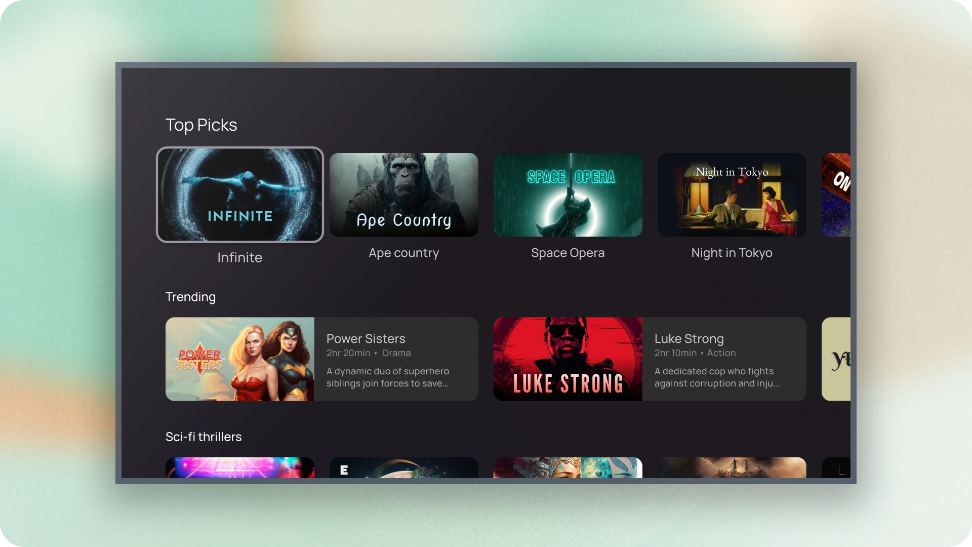
資訊卡是 TV 應用程式的基本構成要素。
資源
| 類型 | 連結 | 狀態 |
|---|---|---|
| 設計 | 設計來源 (Figma) | 可使用 |
| 導入作業 | Jetpack Compose | 可使用 |
重點特色
- 使用資訊卡顯示單一主題的內容。
- 資訊卡可以容納各種資訊,包括圖片、標題、支援文字、按鈕、清單和其他 UI 元素。
- 卡片無法與其他卡片合併或分割為多張。
- 資訊卡有六種變化版本:標準、經典、精簡、插邊、寬版和寬版。
變化版本
資訊卡分為五種類型,每一種用途都不同:
- 標準
- 經典
- 精簡
- 寬版標準
- 寬版經典
內容封鎖
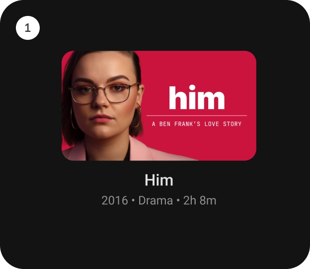
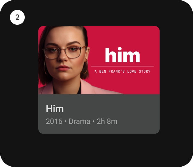
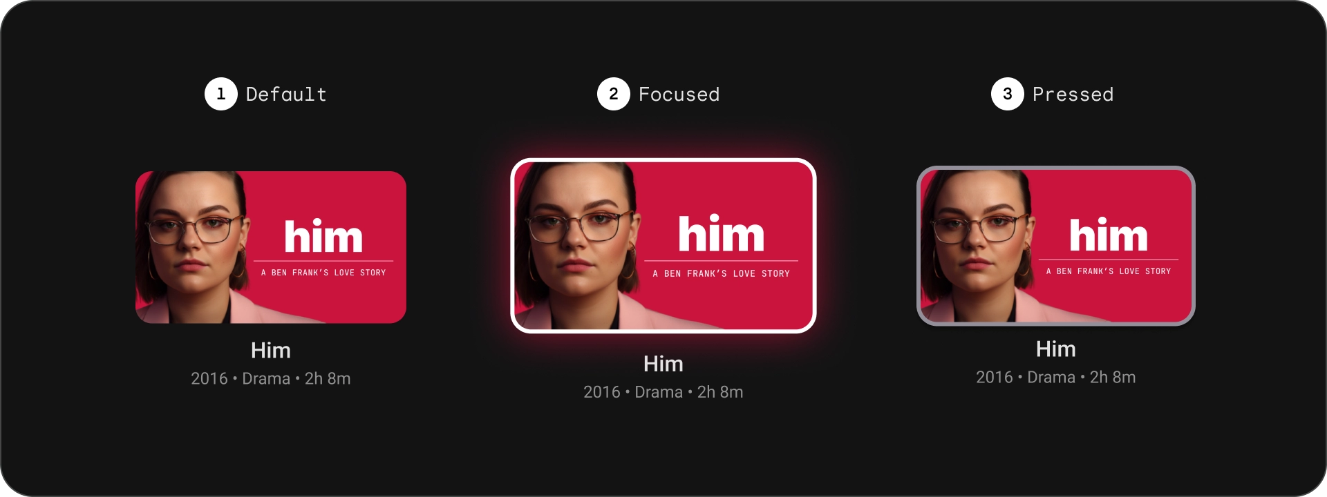
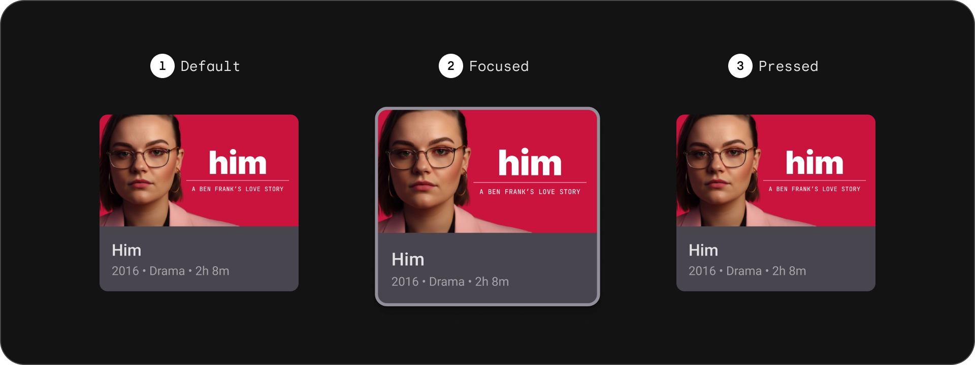
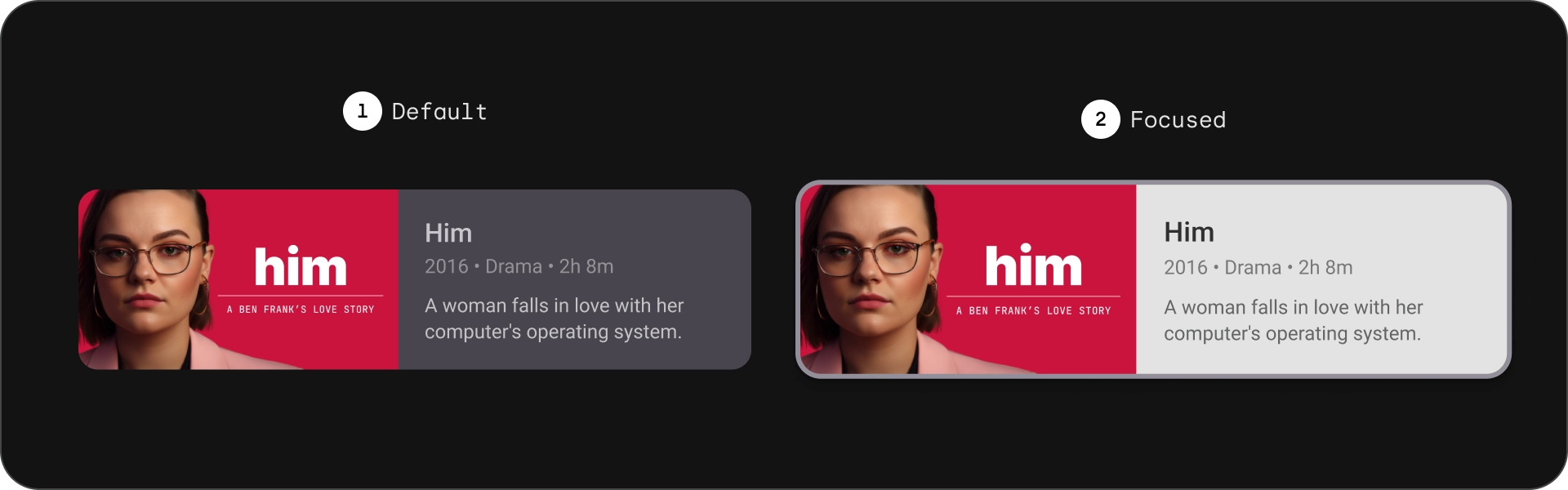
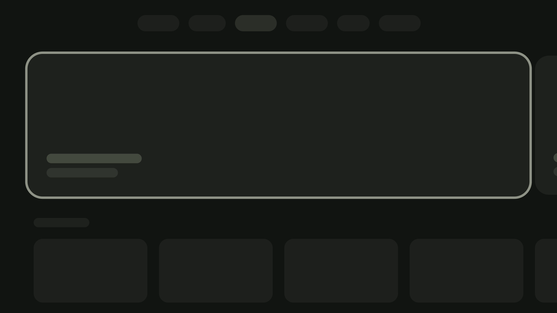
資訊卡的內容會按不同的區塊排列,資訊卡視覺設計 (包括強調) 表示階層。資訊卡的版面配置取決於資訊卡包含的內容類型。
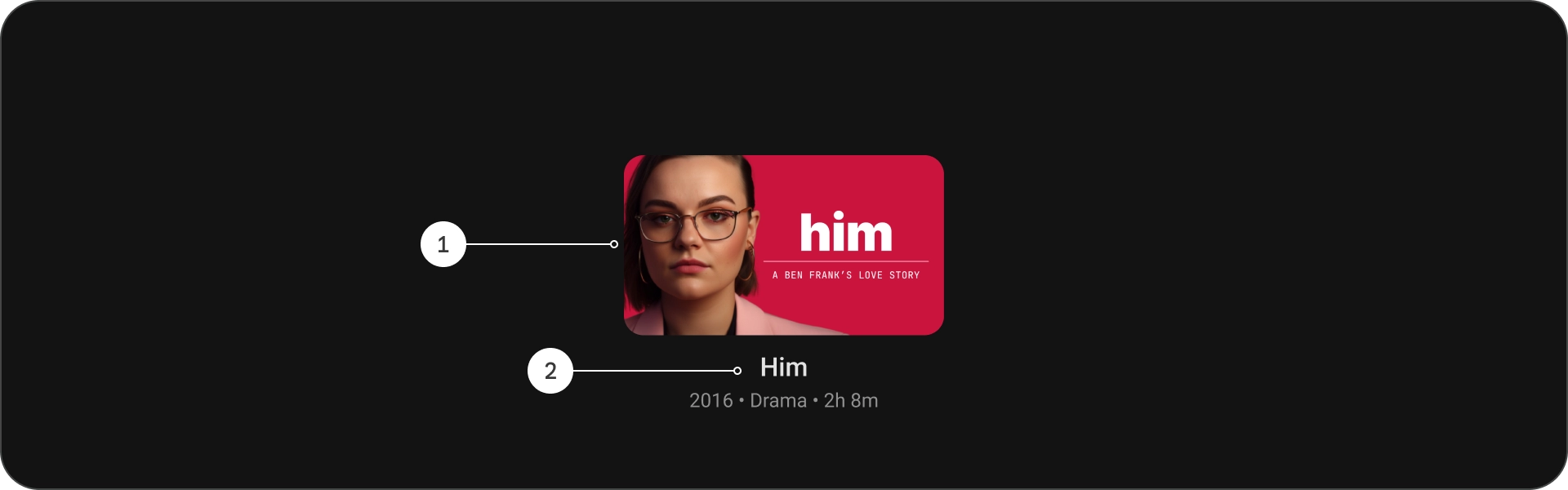
圖解

- 標題
- 副標題
- 說明
- 額外文字
規格

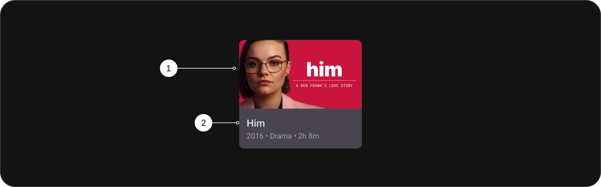
標準卡片
圖解
- 圖片
- 內容封鎖
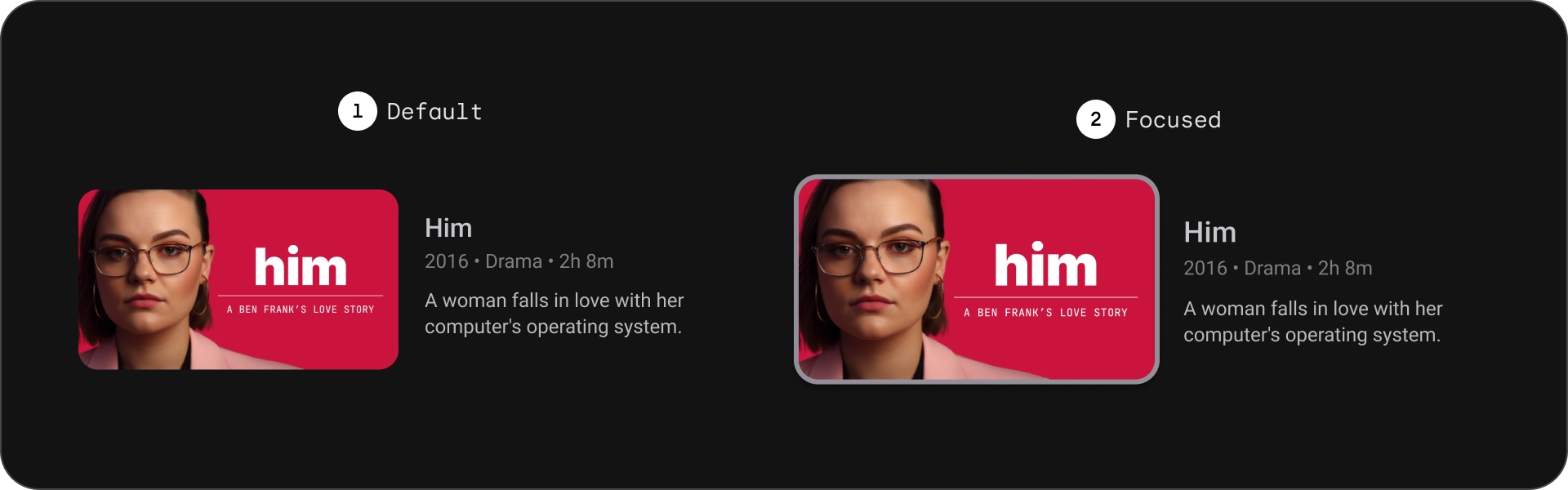
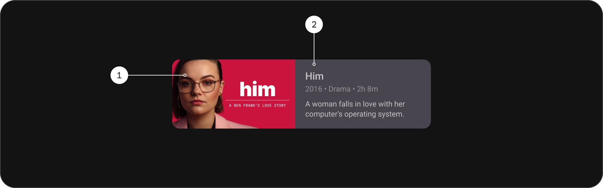
狀態
規格

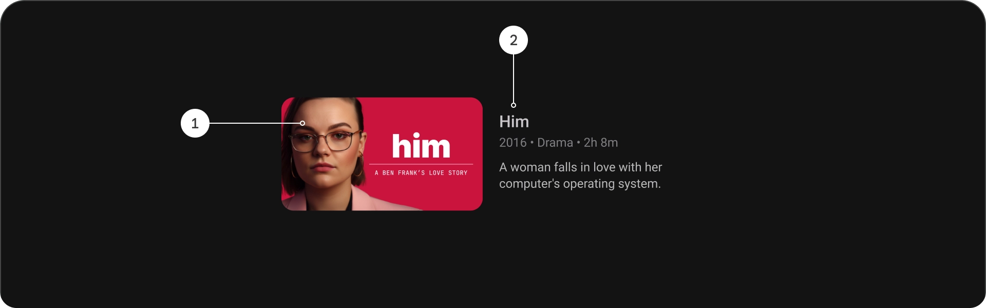
傳統版卡片
圖解
- 圖片
- 內容封鎖
狀態
規格

密集卡片
圖解
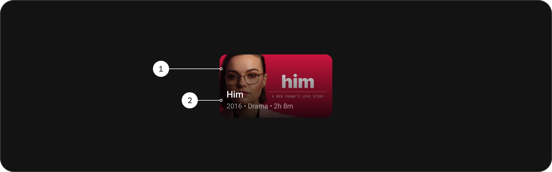
- 圖片
- 內容封鎖
狀態
規格

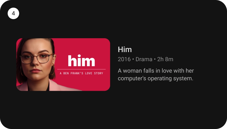
寬標準資訊卡
圖解
- 圖片
- 內容封鎖
狀態
規格
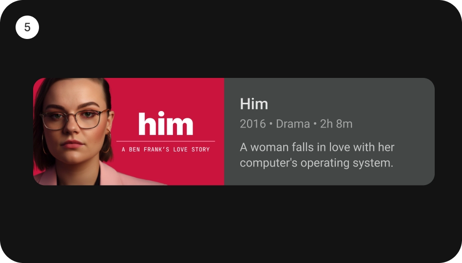
寬版經典卡片
圖解
- 圖片
- 內容封鎖
狀態
規格
使用方式
資訊卡是多功能的設計元素,能以賞心悅目且容易使用的方式顯示各種內容。以下各節將探索資訊卡的設計注意事項。
顯示比例
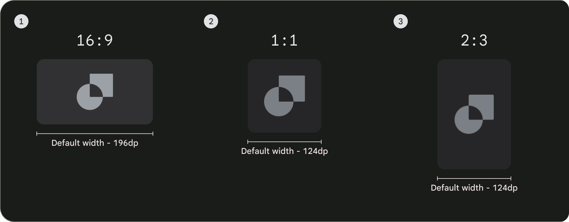
常見的資訊卡顯示比例有三種:16:9、1:1 和 2:3。 每種顯示比例各有優點,因此請根據您的具體需求選擇最適合的顯示比例。
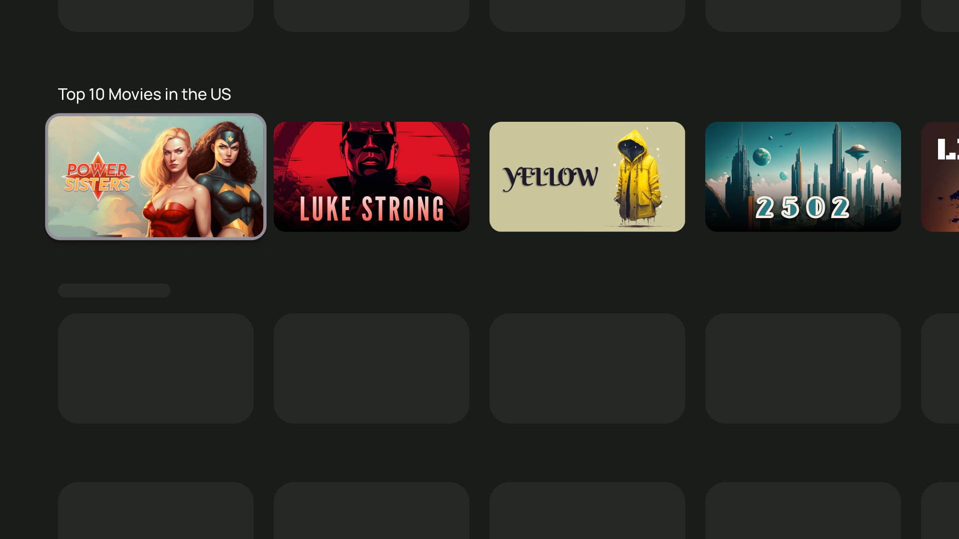
- 16:9 是資訊卡最常見的長寬比。這種長寬比適合用來顯示圖片和影片。
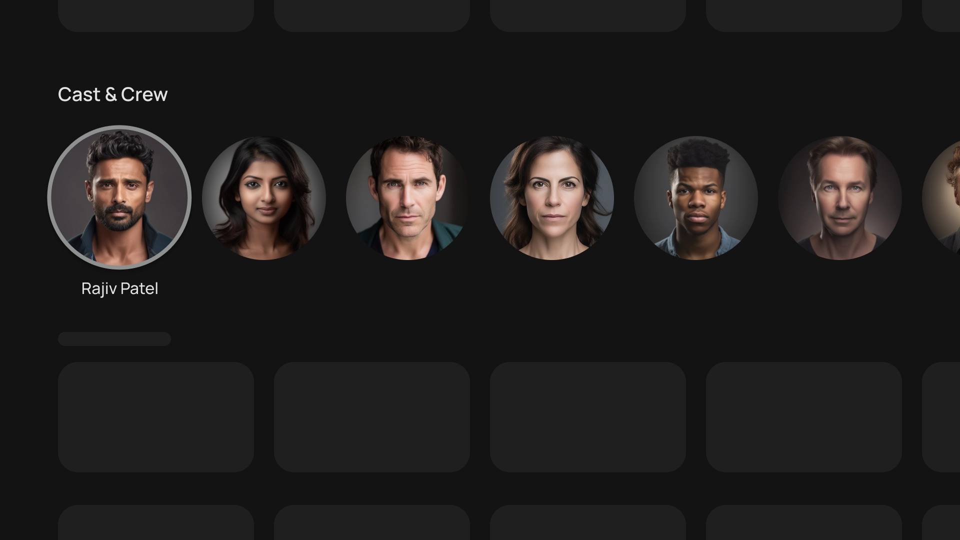
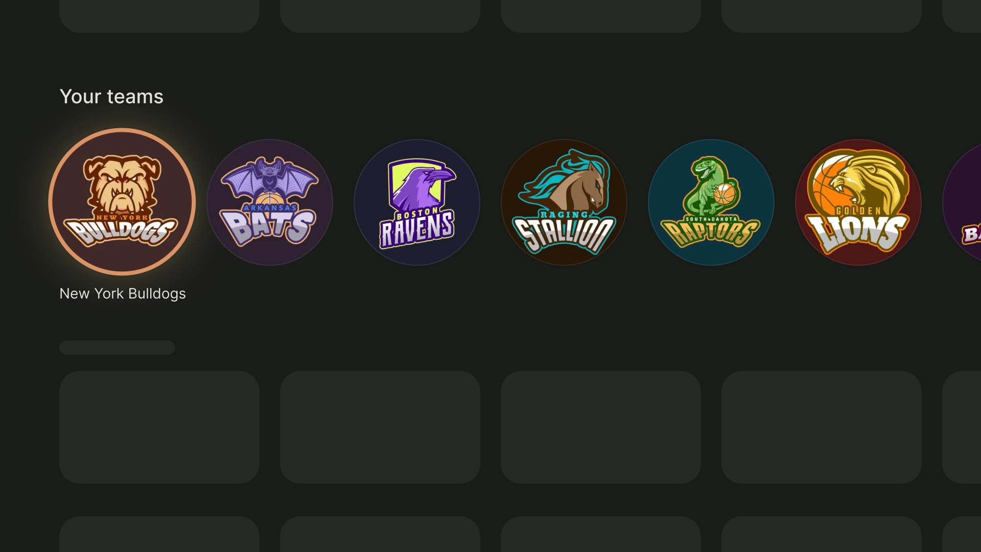
- 1:1 為正方形顯示比例。對於需要視覺平衡的資訊卡,像是演員和工作人員、頻道標誌,或團隊標誌等。
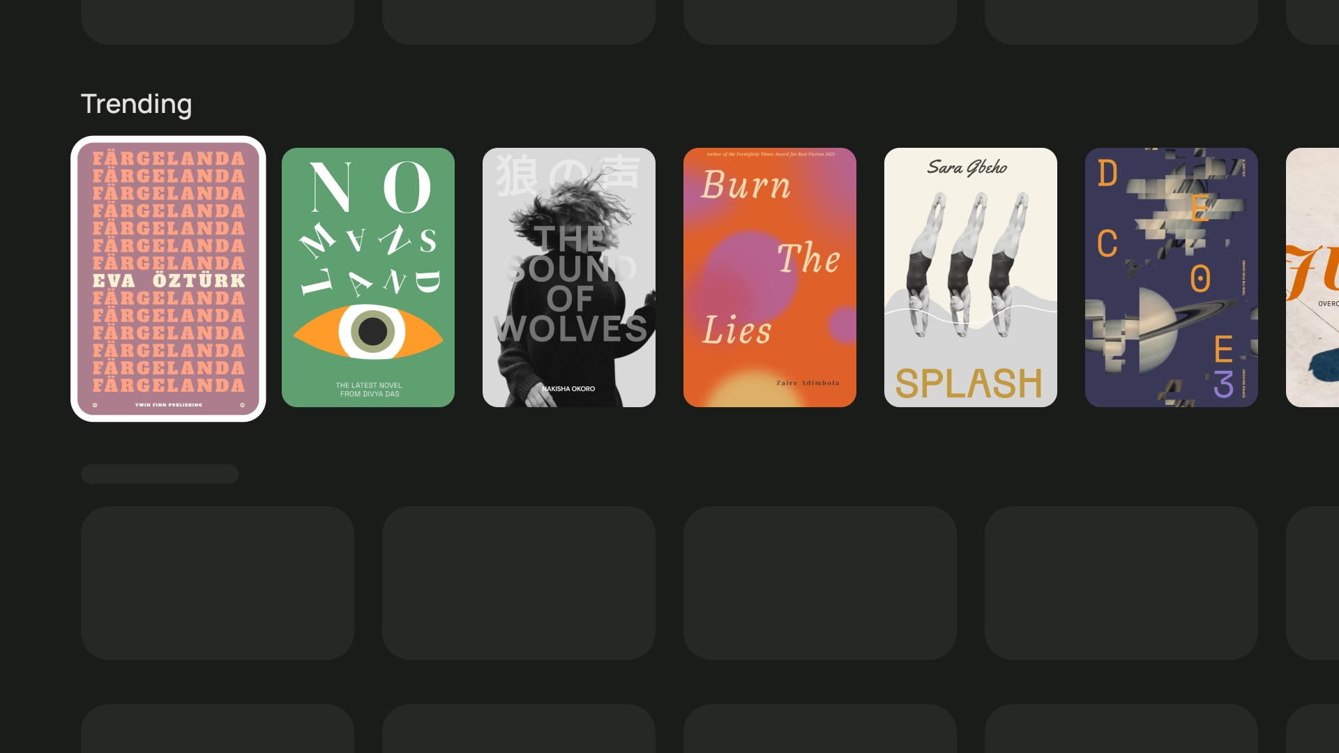
- 2:3 的顯示比例較高。如果您想分割網格並加強強調效果,這可能是最佳選擇。
最終,為資訊卡選擇顯示比例的最佳方式,就是嘗試不同選項,看看何者成效最佳。
以下列舉幾種不同顯示比例的用法
1:1
演員與工作人員
球隊標誌
2:3
熱門書籍
16:9
電影卡
版面配置和間距
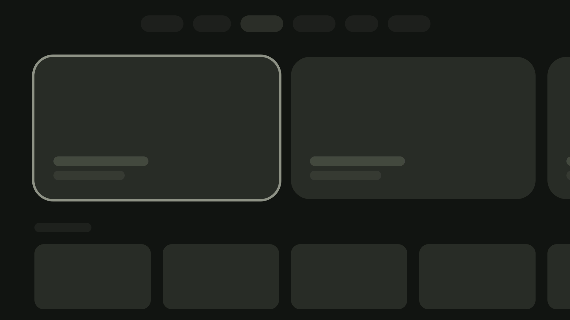
若是根據畫面顯示的資訊卡數量改變資訊卡寬度,可以實作適當的峰值並將間距設為 20dp。
單張資訊卡版面配置
資訊卡寬度 - 844dp
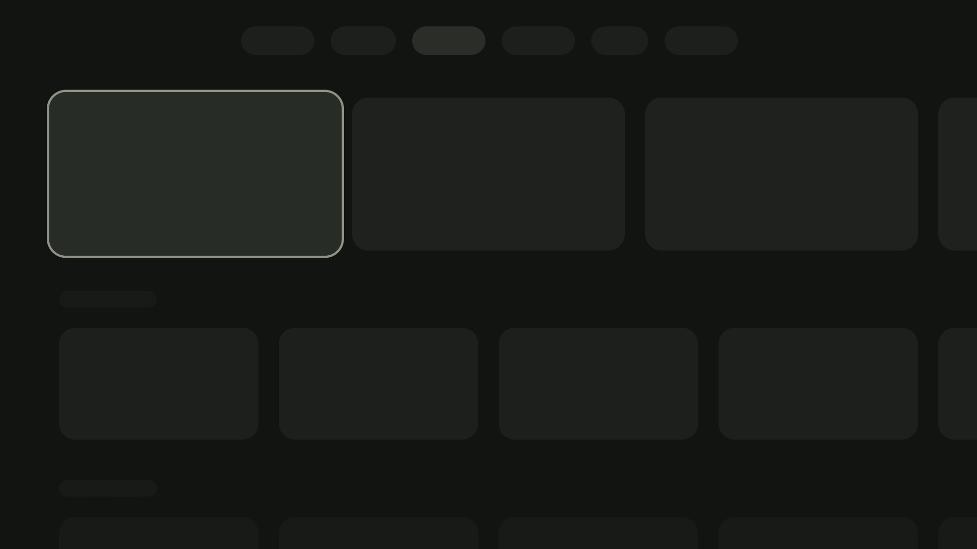
雙資訊卡版面配置
資訊卡寬度 - 412dp
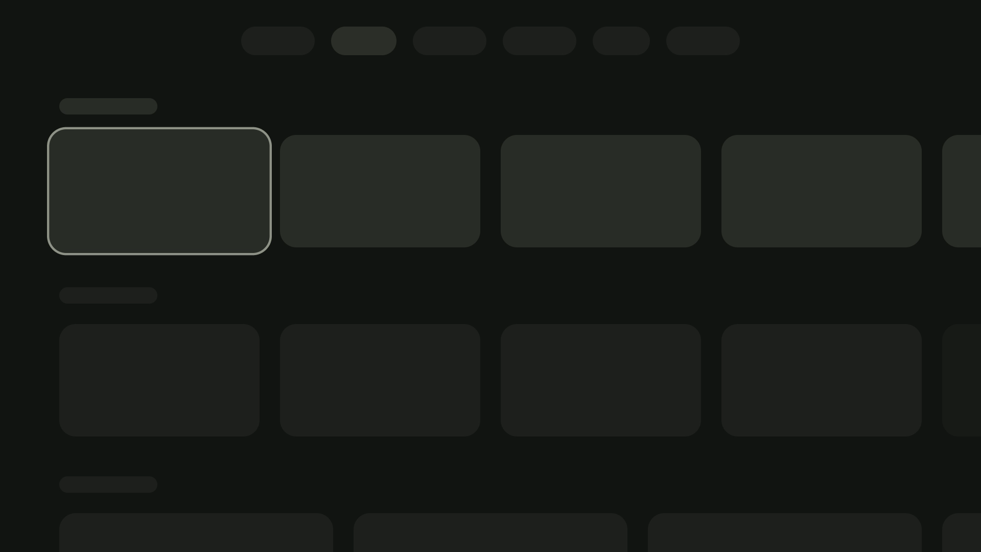
三張資訊卡版面配置
資訊卡寬度 - 268dp
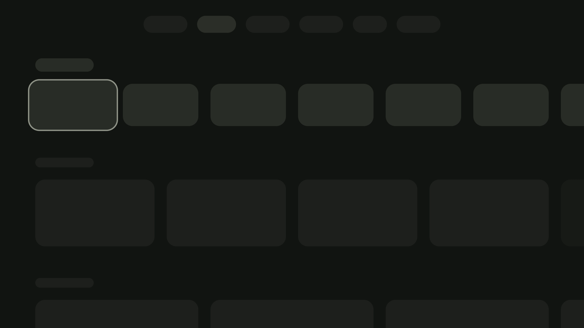
4 張資訊卡版面配置
資訊卡寬度 - 196dp
5 張資訊卡版面配置
資訊卡寬度 - 124dp
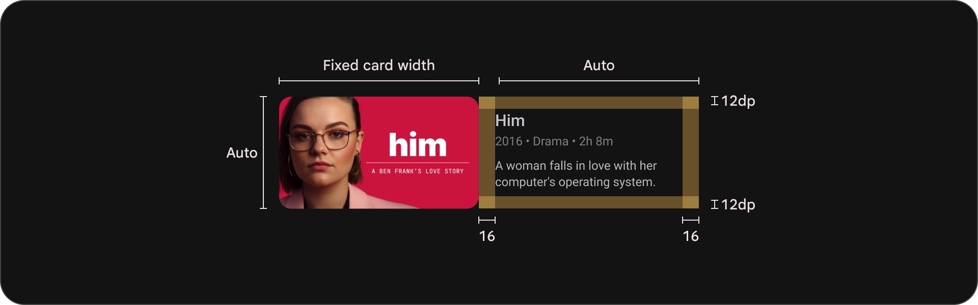
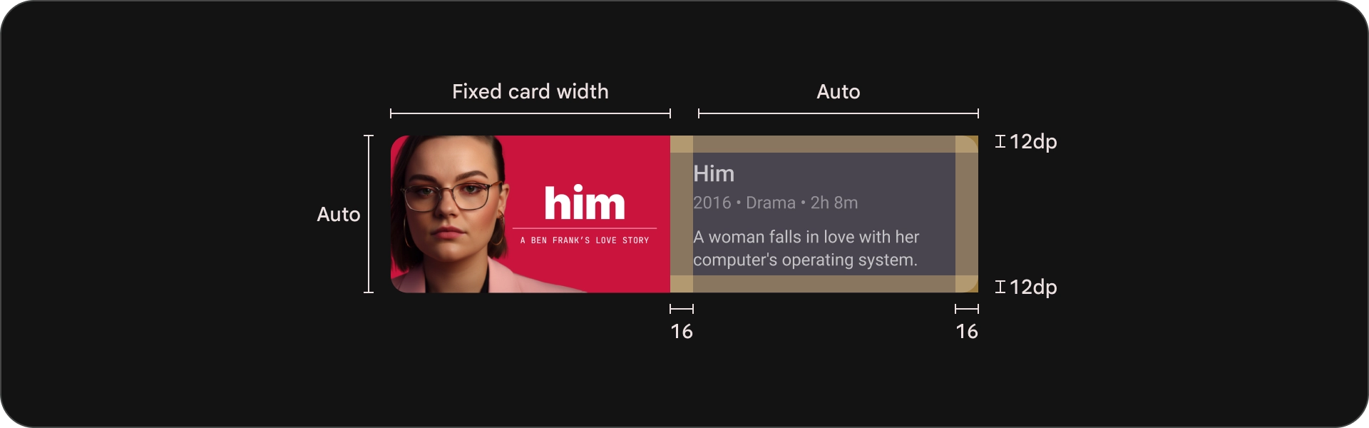
內容封鎖
資訊卡中的內容區塊寬度應與圖片縮圖相同。如果您需要在內容區塊中顯示更多文字,請使用寬版資訊卡變化。
正確做法
使用寬資訊卡可呈現簡短說明,但僅限在絕對必要時使用。說明長度應只有幾個字。

錯誤做法
避免在垂直堆疊的資訊卡上顯示詳細說明。
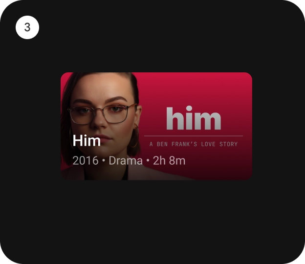
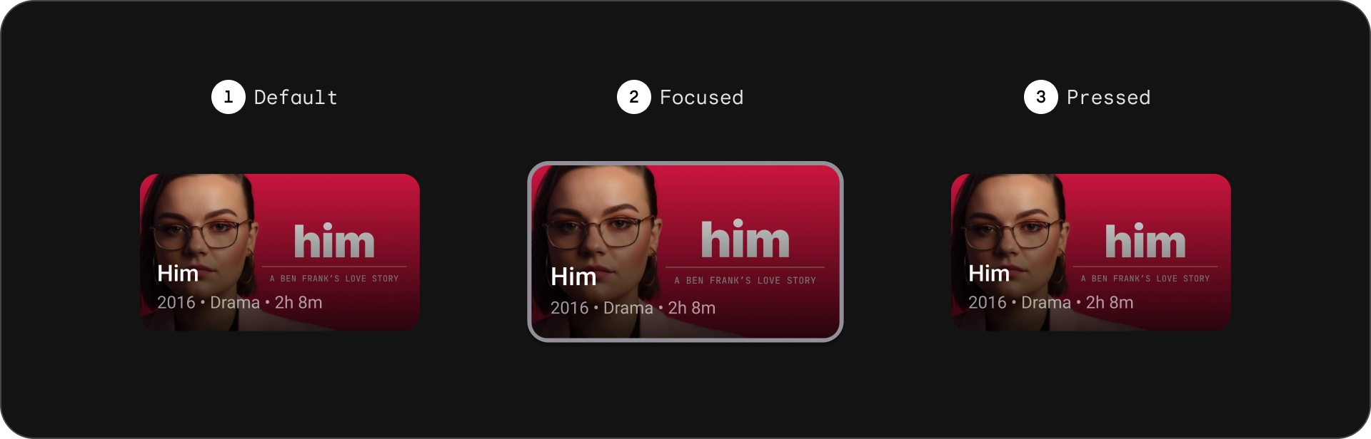
密集卡片
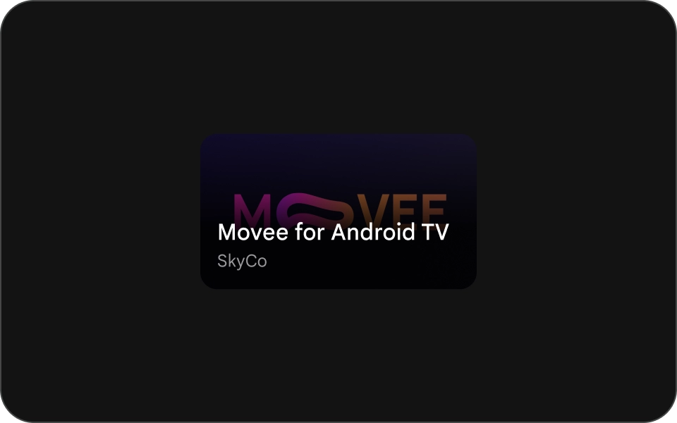
精簡的卡片應簡明扼要,且方便使用者閱讀。背景圖片前方的內容應簡短扼要,避免使用長標題、副標題或說明。這樣可讓卡片看起來更吸睛,也更容易掃描。
如要讓圖片上的文字更清晰易讀,請新增半透明黑色漸層重疊。這樣會調暗背景,而不會過度遮蔽圖片,讓文字更容易查看。
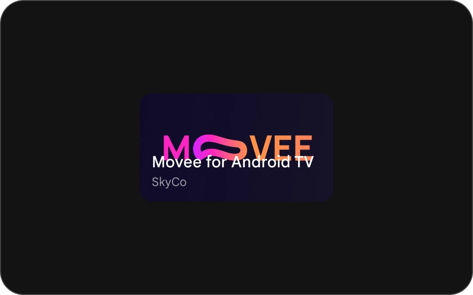
正確做法
在圖片背景上方使用 scrim 的精簡資訊卡。
錯誤做法
請勿使用小型資訊卡,且不要修剪在背景圖片上。