按鈕可協助使用者啟動動作或流程。選擇不同類型的按鈕,以便傳達強調效果。
資源
| 類型 | 連結 | 狀態 |
|---|---|---|
| 設計 | 設計來源 (Figma) | 可使用 |
| 實作 | Jetpack Compose | 可使用 |
重點特色
- 請根據動作的重要性選擇按鈕類型。動作越重要,按鈕就越醒目。
- 按鈕應附有清楚的標籤,指出所執行的動作。
- 在螢幕上以邏輯方式放置按鈕,也就是使用者可能會預期找到按鈕的位置。
- 請勿過度使用按鈕。畫面上的按鈕過多會破壞視覺階層。
版本
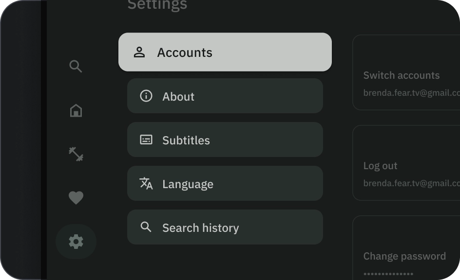
按鈕分為六種類型:
- 填滿型按鈕
- 外框按鈕
- 圖示按鈕
- 外框圖示按鈕
- 長按按鈕
- 圖片按鈕


請根據動作的重要性選擇按鈕類型。動作的重要性越高,按鈕的強調程度就應越高。
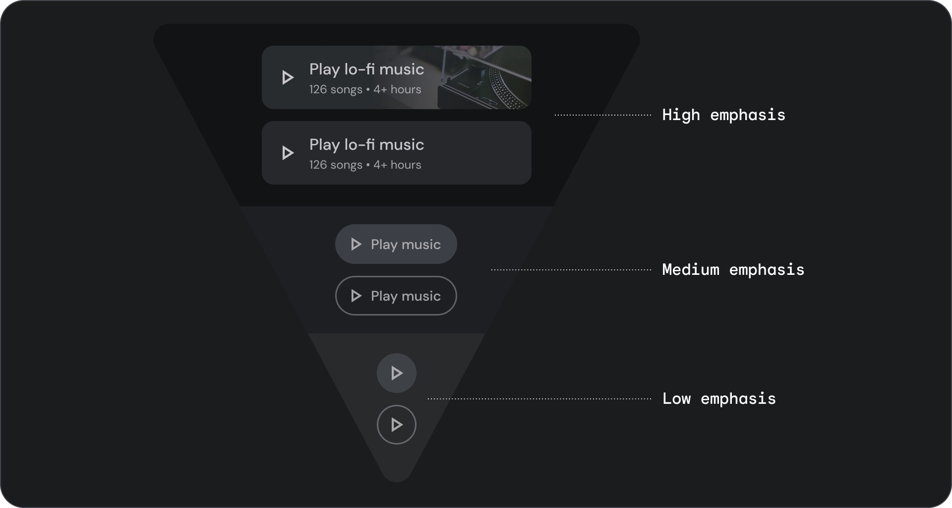
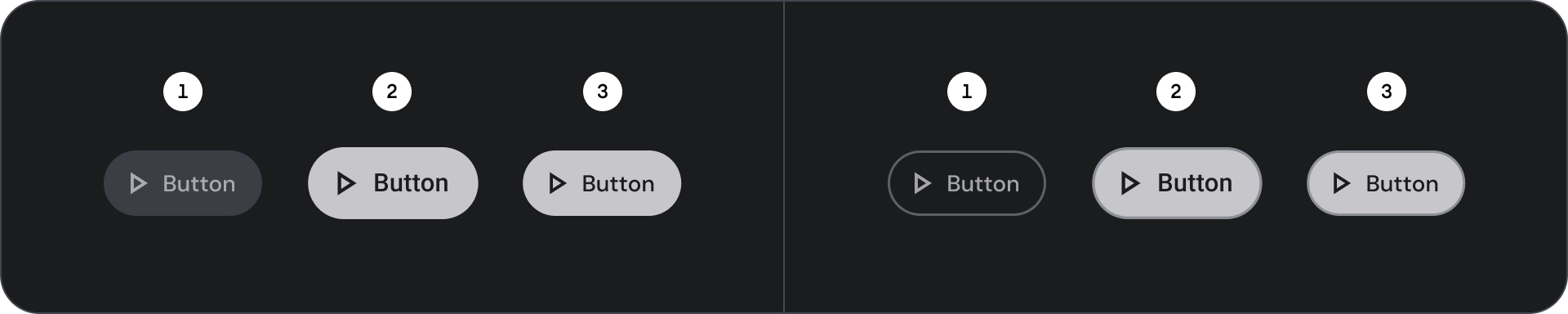
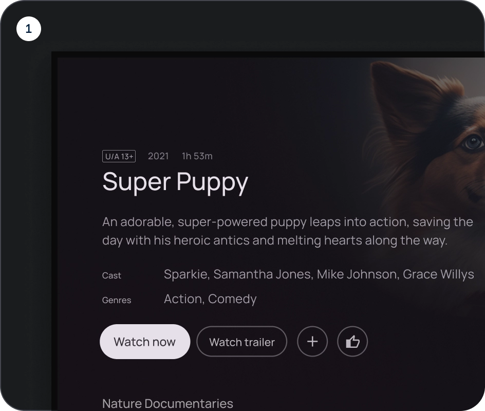
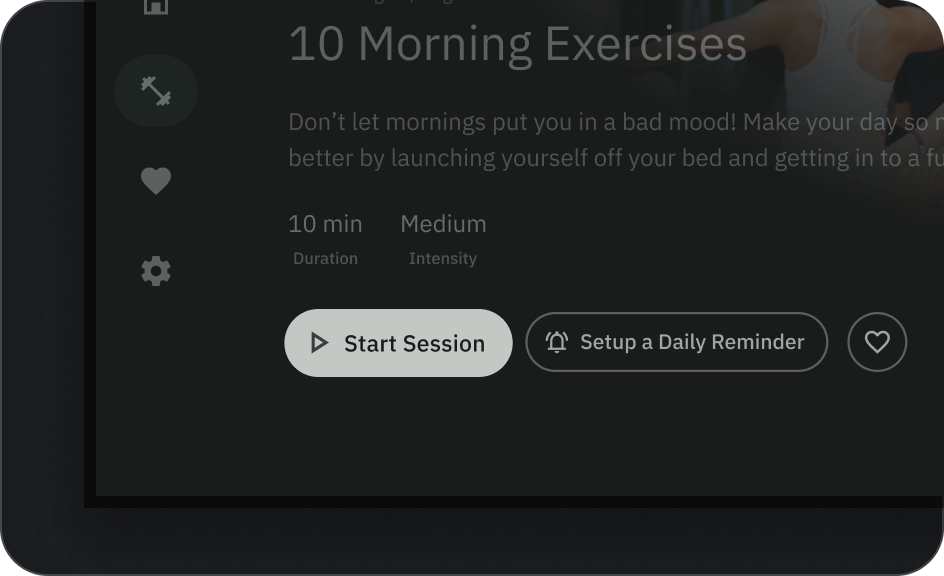
填滿和外框按鈕
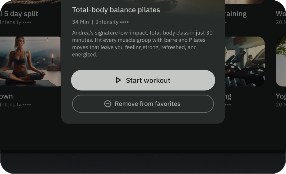
填滿的按鈕具有最強烈的視覺效果,應用於完成流程的重要最終動作,例如「儲存」、「立即加入」、「確認」或「下載」。
外框按鈕是指中強調按鈕。這些按鈕包含重要的動作,但不是應用程式中的主要動作。輪廓按鈕與填充按鈕搭配使用,可用於指出次要動作。
圖解
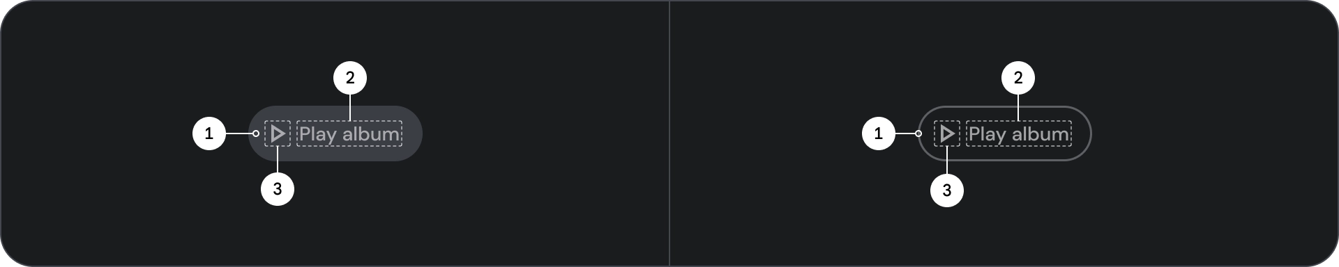
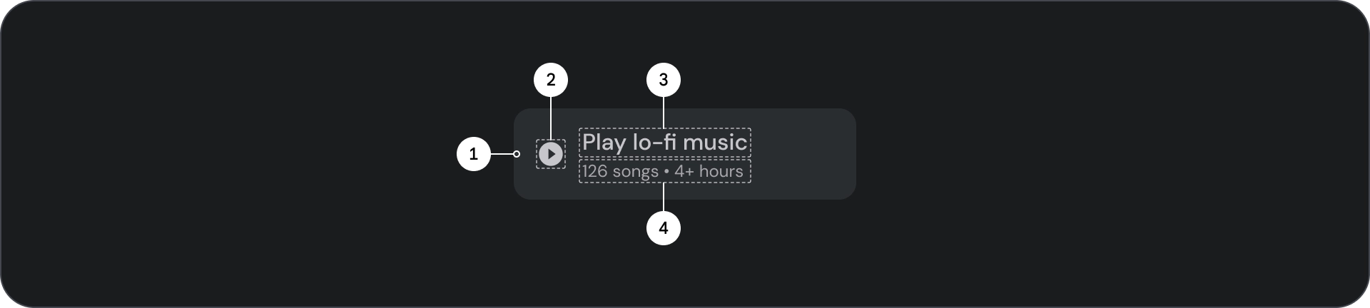
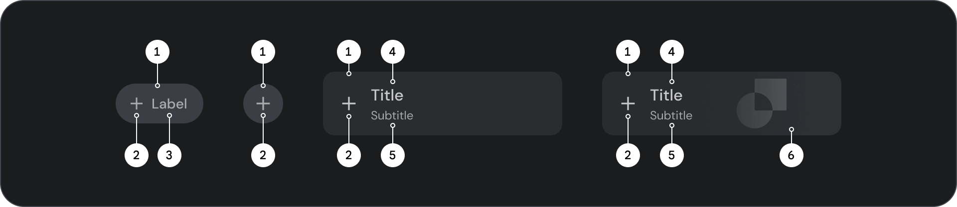
- 容器
- 標籤文字
- 圖示 (選用)
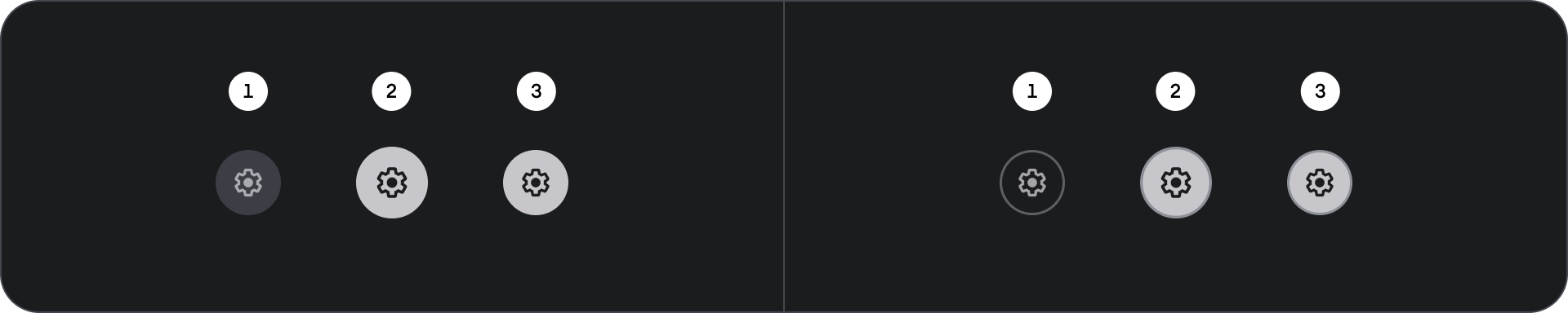
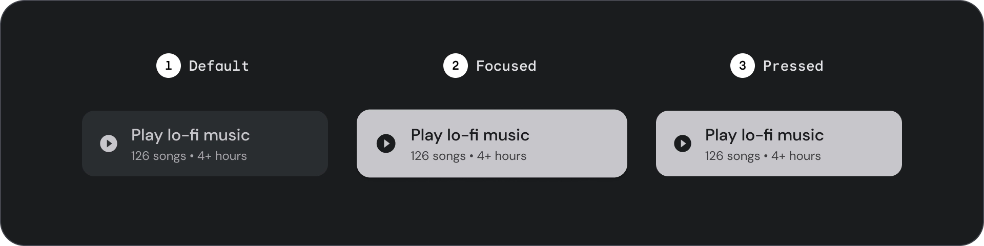
狀態
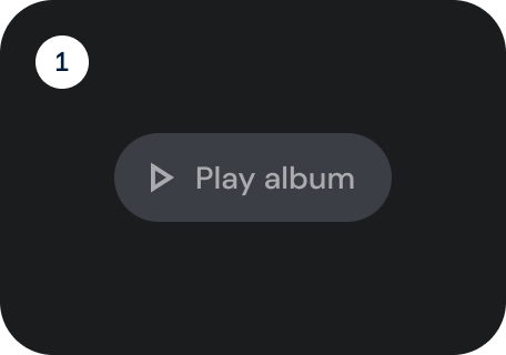
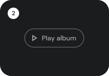
元件狀態的視覺呈現。
- 預設
- 專注
- 已按下
規格
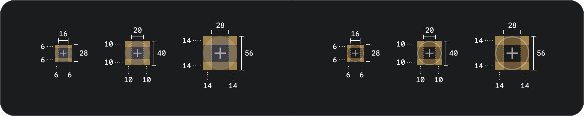
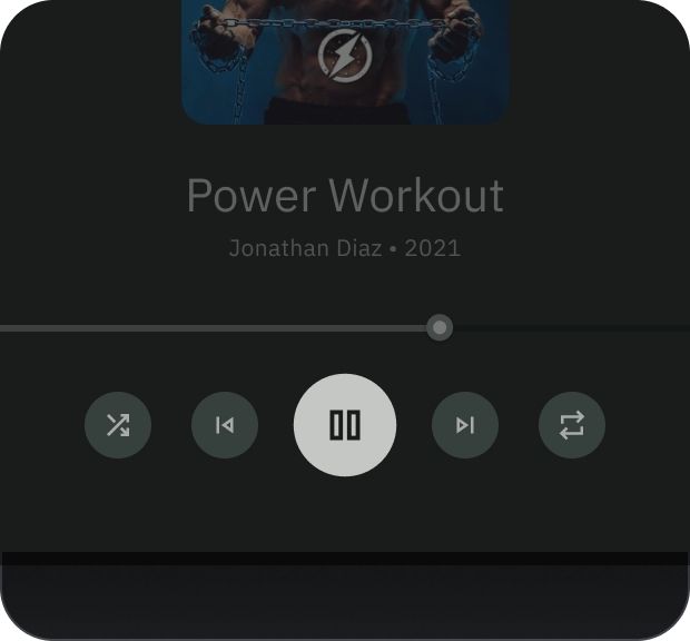
圖示和輪廓圖示按鈕
使用圖示按鈕,在緊湊的版面配置中顯示動作。圖示按鈕可代表開啟動作,例如開啟溢出選單或搜尋,或代表可切換開啟/關閉的二元動作,例如收藏或書籤。也用於播放或暫停媒體。
圖示按鈕可定義三種大小:小、中和大。
圖解
- 容器
- Icon
狀態
- 預設
- 專注
- 已按下
狀態是用來傳達元件或互動元素狀態的視覺化呈現方式。
規格
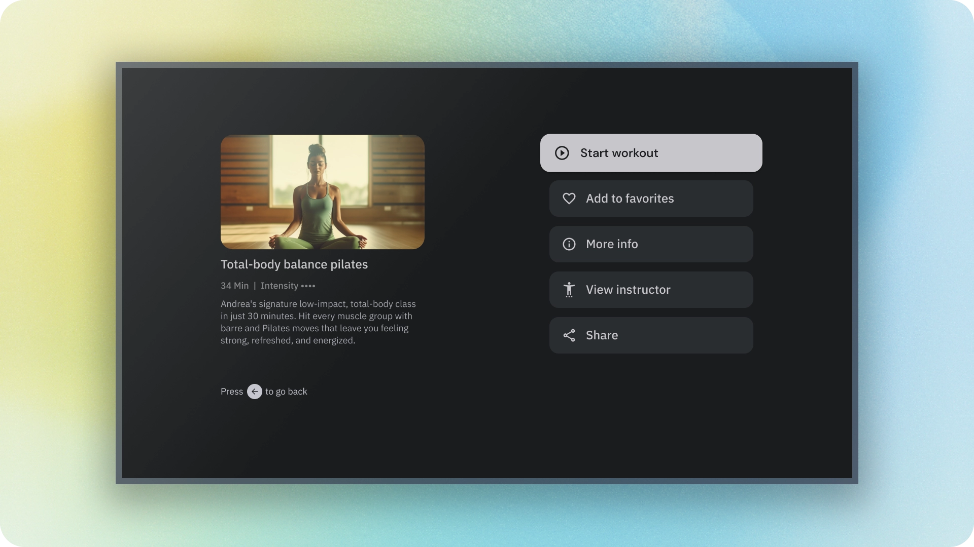
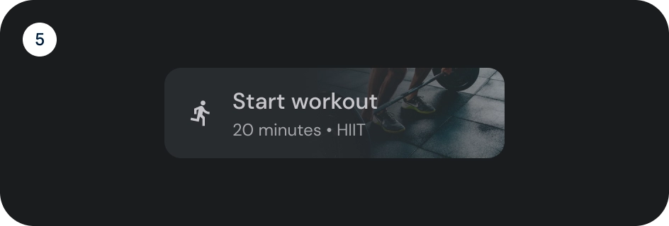
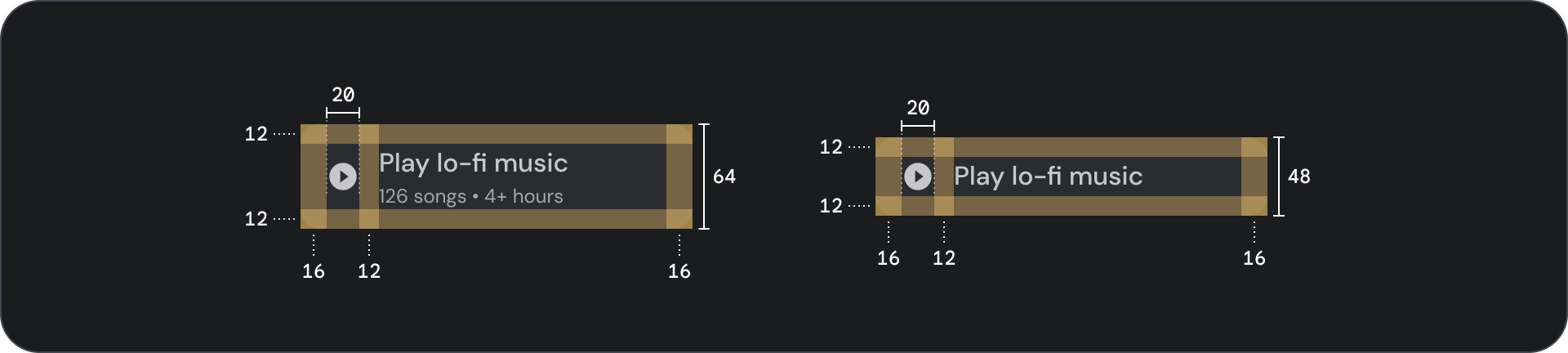
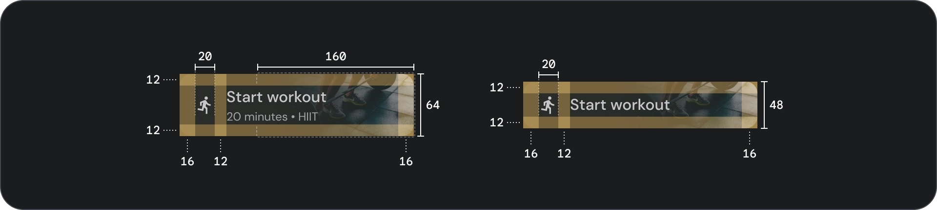
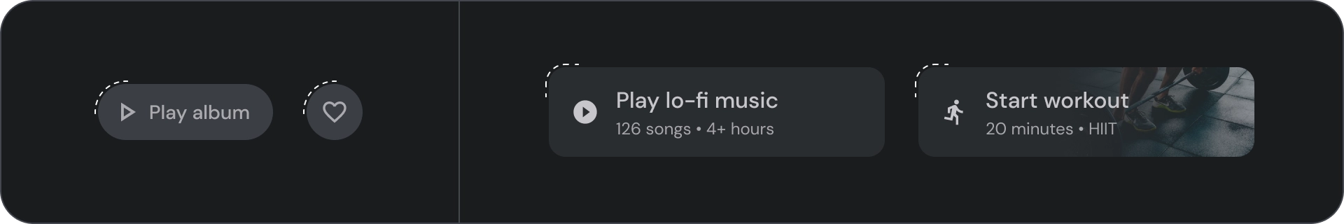
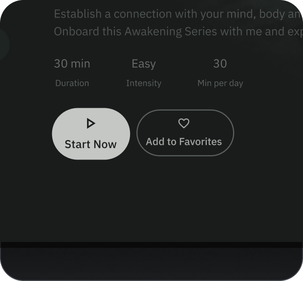
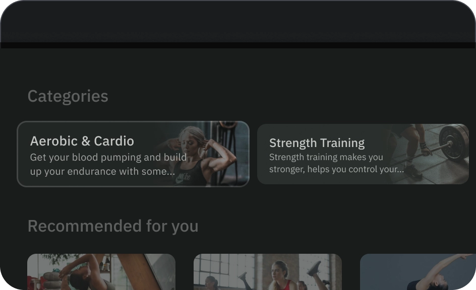
寬按鈕
寬按鈕比一般按鈕更強調。其中包含重要的動作。代表相關選項的按鈕會分組顯示。群組應共用相同的介面。
圖解
- 容器
- 前置圖示
- 標題
- 副標題
狀態
- 預設
- 專注
- 已按下
狀態是用來傳達元件或互動元素狀態的視覺化呈現方式。
規格
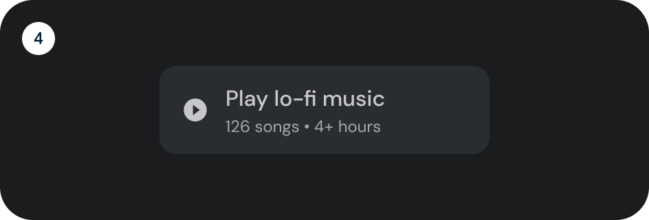
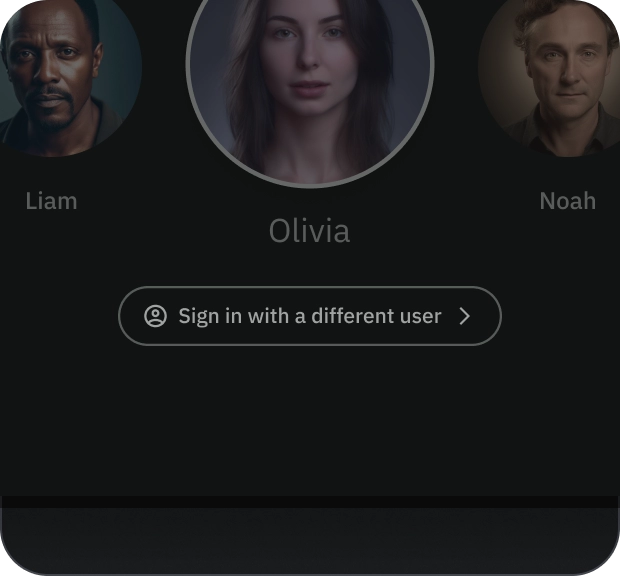
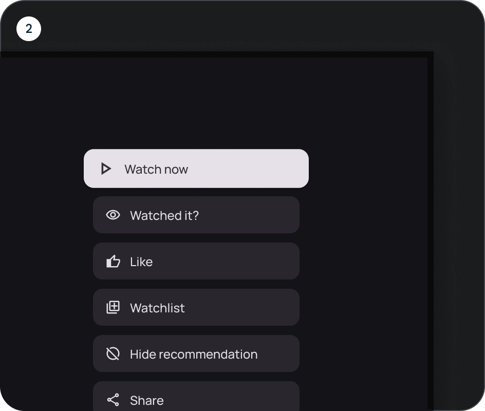
圖片按鈕
圖片按鈕通常用於顯示下一層級導覽中可用的內容縮圖。通常會與相關動作一同分組,且群組應共用相同的介面。
圖解
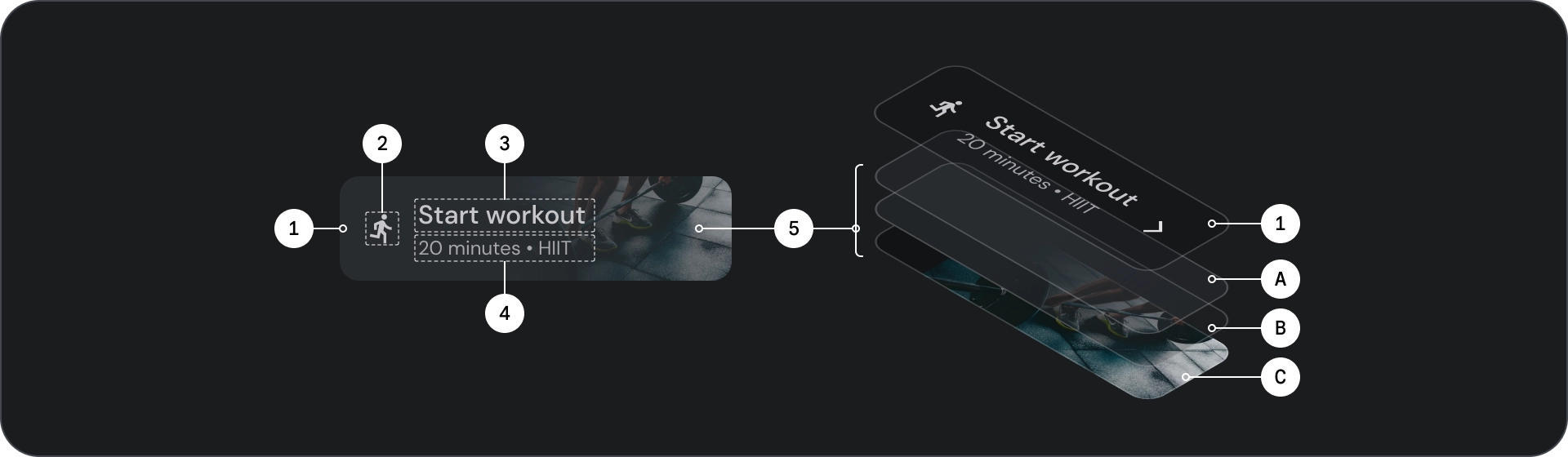
- 容器
- 前置圖示
- 標題
- 副標題
- 圖片圖層,包含:
- 紗罩 (狀態重疊)
- 漸層 (根據表面顏色)
- 圖片
狀態
- 預設
- 專注
- 已按下
狀態是用來傳達元件或互動元素狀態的視覺化呈現方式。
規格
用量
按鈕通常用於傳達使用者可採取的動作。這類元素經常出現在對話方塊、模式視窗、表單、資訊卡和工具列等 UI 元素中。
按鈕只是在 UI 中表示動作的一種方式。請勿過度使用。畫面上的按鈕過多會破壞視覺階層。
- 容器
- Icon
- 標籤文字
- 標題
- 副標題
- 圖片
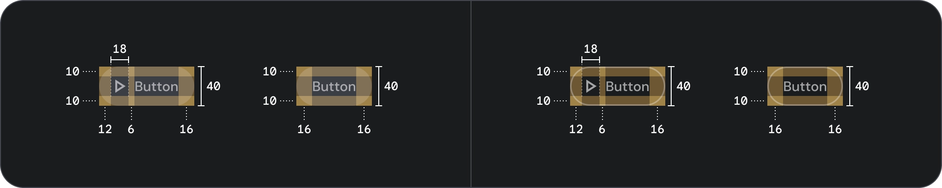
容器
按鈕會在內容周圍顯示容器。容器會在聚焦時縮放 1.1 倍,並保留內部邊框間距。以下是容器的幾點注意事項:
- 根據內容設定容器寬度,並維持一致的邊框間距。
- 將容器的相對位置設為回應式版面配置格狀。
- 請為填滿的按鈕使用單色容器。
- 請在聚焦時使用輪廓按鈕的筆觸和填充顏色。在聚焦時,容器會取得填滿顏色和外框。
- 對於寬和圖片按鈕,容器寬度會根據版面配置格線設定。
- 容器大小、位置和對齊方式會隨著父項容器的縮放而變更。
文字和圖示按鈕容器的圓角為完全圓角。寬型和圖片按鈕容器的圓角容器為 12dp。
正確做法
注意
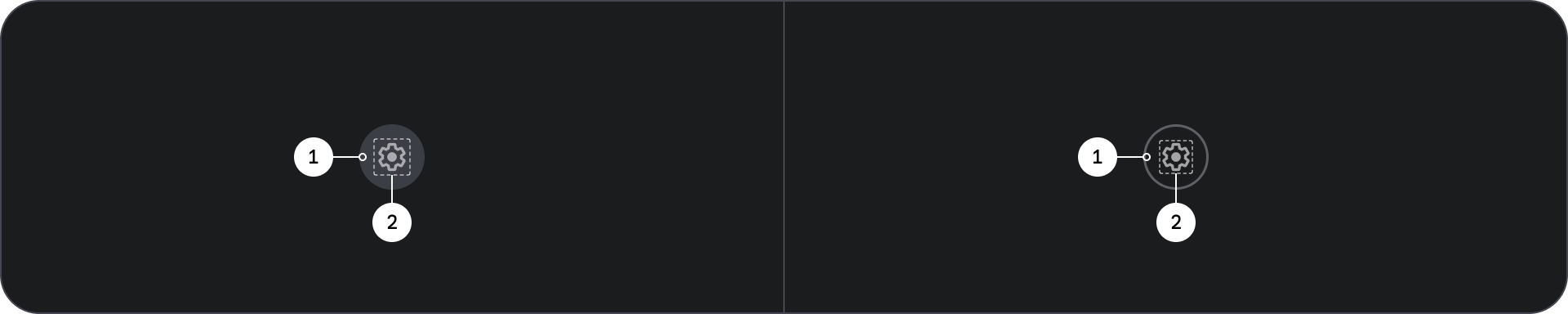
Icon
圖示可視覺化呈現按鈕的動作,並吸引使用者注意。應放置在按鈕的前端。圖示一律會在容器內垂直置中。
正確做法
錯誤做法
注意
標籤文字
標籤文字是按鈕最重要的元素。它會說明使用者輕觸按鈕時會發生的動作。
請使用句首大寫的格式輸入按鈕標籤文字,並將第一個字和專有名詞的首字母大寫。避免文字斷行。為確保最佳可讀性,標籤文字應保持在單一行。

正確做法
注意
圖片
圖片按鈕一律會在背景圖片上方顯示漸層疊加和遮罩。漸層疊加畫面會根據容器顏色設定。遮罩會根據狀態而變更。
按鈕群組
按鈕會在資料列或欄中一同顯示,以便在各項動作之間維持一致的導覽體驗。以下各節將說明相關注意事項。
告知階層
每個畫面都應有一個主要動作,並以醒目 (通常是寬廣) 的按鈕呈現。按鈕應更容易看見及理解。其他按鈕應較不顯眼,且不得分散使用者對主要動作的注意力。
群組中的第一個按鈕會做為主要動作,因為焦點會先落在該按鈕上。
維持線性版面配置
- 資料列版面配置
- 欄位版面配置
以邏輯方式使用變化版本
在欄式版面配置中,應保留單一按鈕變化版本。在資料列版面配置中,您可以在按鈕群組中將不同變化版本分組,但邏輯應明確。您可以在同一個群組中使用填滿和外框按鈕,但請確保動作的階層清楚。
正確做法
錯誤做法
注意