
طراحی مؤثر ویجتها برای دستیابی به یک تجربه کاربری جذاب و سازگار از نظر بصری بسیار مهم است. این بخش به مفاهیم و تکنیکهای کلیدی برای تعریف رنگ و تایپوگرافی برای ایجاد مفیدترین و جذابترین ویجتهای اندروید میپردازد.
رنگ
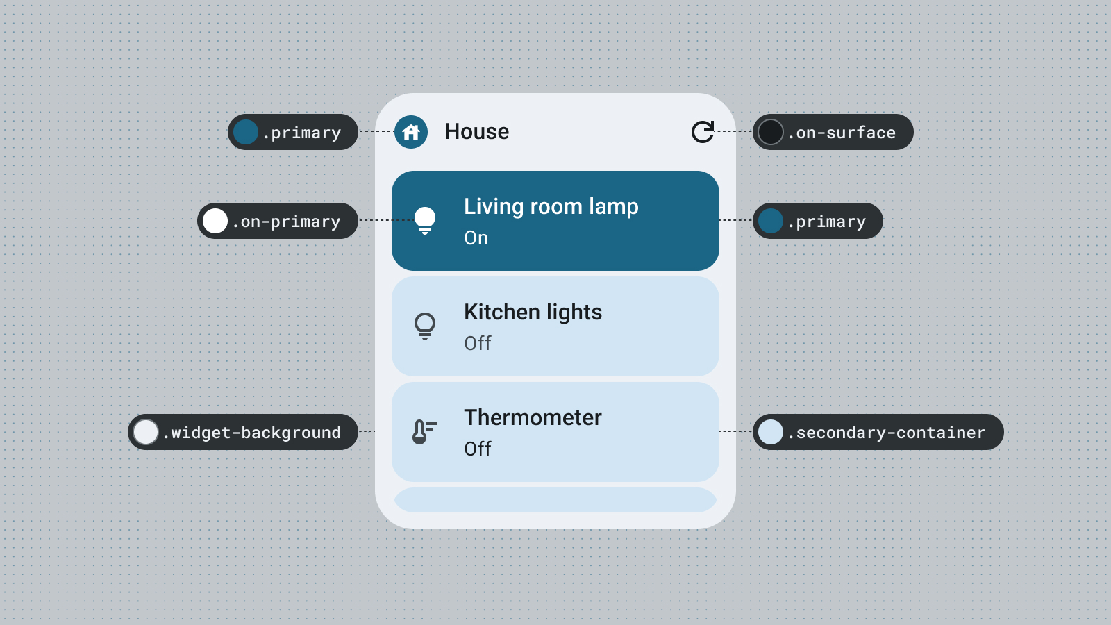
از رنگ برای بیان سبک و انتقال معنا استفاده کنید. تنظیم رنگهای مناسب برای ویجت شما، رنگها برای خوانایی، شخصیسازی و البته بیان هویت برند برنامه شما بسیار مهم هستند.
از نقشها و توکنهای رنگ متریال برای رعایت دستورالعملهای کنتراست دسترسی و پشتیبانی از ویژگیهای رنگ پویا، مانند رنگهای تولید شده توسط کاربر و تمهای تیره یا روشن، استفاده کنید.
سلسله مراتب بصری را از طریق نقشهای تأکیدی بررسی کنید تا تضاد پر جنب و جوشی در عناصر ایجاد کنید یا یک تم سفارشی سرزندهتر که بیانگر برند شما باشد را کشف کنید.

برای کسب اطلاعات بیشتر در مورد نقشهای رنگ، به راهنمای رنگ در طراحی متریال مراجعه کنید.
شکل
شکل ویجت شما، حال و هوای ویجت شما را تعیین میکند. برای ویجتهای مستطیلی، از ویژگی شعاع گوشه سیستم استفاده کنید. این ویژگی باعث ایجاد هماهنگی در دستگاههای مختلف میشود و به جلوگیری از بریده شدن محتوای ویجت کمک میکند.
اگر ویجت شما محتوای دادهای کمی مانند عکس، آب و هوا یا پخش آهنگ فعلی را نمایش میدهد، سعی کنید کل ویجت خود را به شکلی گویا تبدیل کنید تا انرژی هیجانانگیزی را به صفحه اصلی کاربر خود بیاورید. اگر طرحبندیها و دادههای پیچیدهتری دارید، استفاده از اشکال گویا را برای سلسله مراتب بصری، برجسته کردن محتوای جدید یا فراخوانی برای اقدام در نظر بگیرید.

برای کسب اطلاعات بیشتر، به بخش پیادهسازی گوشههای گرد مراجعه کنید.
تمهای پویا
از اندروید ۱۲ به بعد، یک ویجت میتواند از رنگهای تم دستگاه برای دکمهها، پسزمینهها و سایر اجزا استفاده کند. این امر باعث ایجاد هماهنگی بصری در ویجتهای مختلف، آیکونهای صفحه اصلی و تصاویر پس زمینه میشود و به کاربران اندروید تجربه کاربری منسجمتری ارائه میدهد. استفاده از توکنهای رنگی ارائه شده به ویجت شما کمک میکند تا در تمهای دستگاه ارائه شده توسط سازندگان مختلف دستگاه و تمهای پویای تنظیم شده توسط کاربر، یکپارچه به نظر برسد.
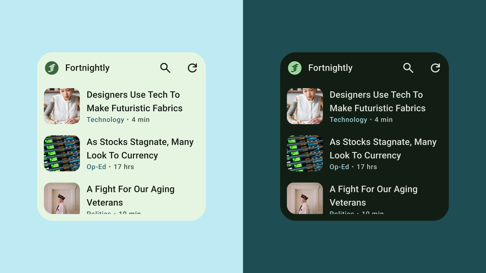
تم روشن و تیره
تم تاریک، نسخه کمنور رابط کاربری دستگاه است که عمدتاً رنگهای سطحی تیره را نمایش میدهد. کاربران به طور فزایندهای برای عمر باتری بهتر و راحتی چشم به تم تاریک روی میآورند. اگر ویجت شما با تم تاریک سازگار نشود، در جای نامناسبی ظاهر میشود و میتواند کاربران را ناامید کند.
تایپوگرافی
تایپوگرافی به خوانایی و زیبایی نوشته کمک میکند. از اندازه و وزن فونتها برای ایجاد سلسله مراتب واضح استفاده کنید و چشم کاربر را به سمت مهمترین عناصر هدایت کنید. به فاصله خطوط و فاصله حروف (kerning) توجه کنید تا خوانایی بهبود یابد، به خصوص برای نمایش متنهای کوچکتر در فضای محدود یک ویجت.
سلسله مراتب
سلسله مراتب از طریق تفاوت در وزن فونت، اندازه، ارتفاع خط و فاصله حروف منتقل میشود. مقیاس بهروز شدهی نوع، سبکهای متن را در پنج نقش سازماندهی میکند که برای توصیف اهدافشان نامگذاری شدهاند. پنج سبک متن عبارتند از نمایش، تیتر، عنوان، زیرنویس و بدنه. نقشهای جدید مستقل از دستگاه هستند و امکان کاربرد آسانتر را در موارد استفادهی متنوع فراهم میکنند.
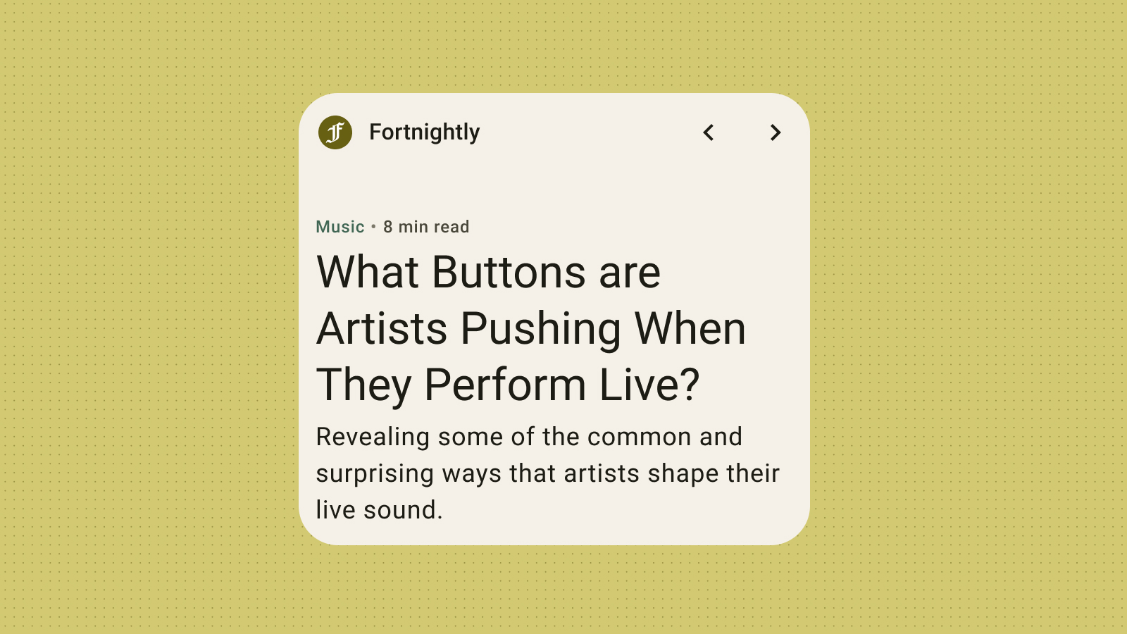
اگرچه ویجتها از فونتهای سیستم استفاده میکنند، اما همچنان میتوانید جزئیات گویایی را با مقیاسهای حروف چشمگیر اضافه کنید: با تیترها، برچسبها و دادهها جسورانهتر بنویسید.
