有效設定小工具樣式,是打造視覺吸引力和一致使用者體驗的關鍵。本節將深入探討定義顏色和字體排版的關鍵概念和技巧,以便建立最實用且吸引人的 Android 小工具。
顏色
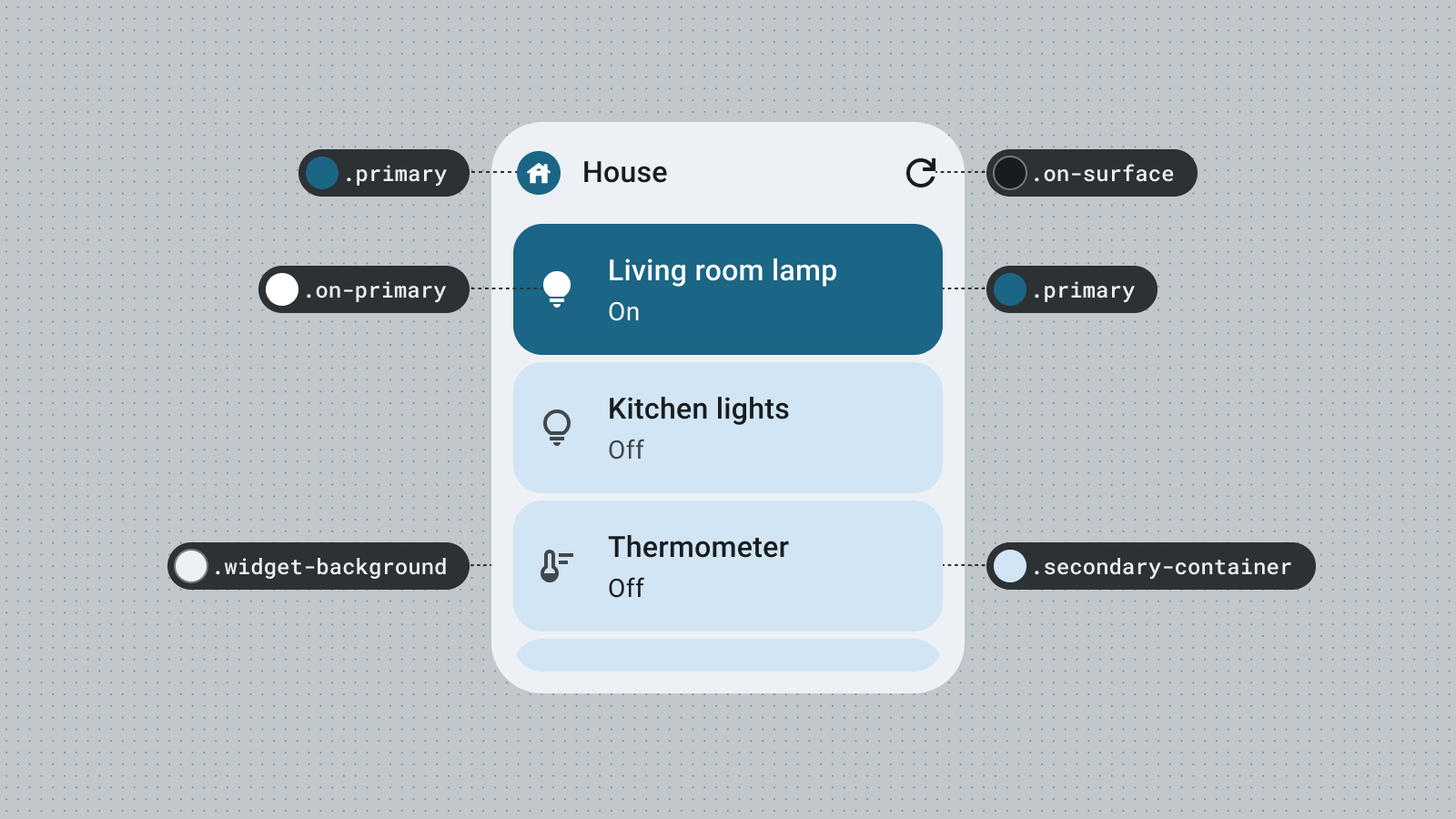
使用顏色來表達風格和傳達意義。為小工具設定適當的顏色,對於提高可讀性、提供個人化體驗,以及表達應用程式的品牌識別,都至關重要。
使用 Material 顏色角色和符記,滿足無障礙對比度規範,並支援動態色彩功能,例如使用者產生的顏色和深色或淺色主題。
詳情請參閱 Material Design 色彩指南。
形狀
小工具的形狀會設定小工具的氛圍。如果是矩形小工具,請使用系統圓角半徑屬性。這項屬性可在不同裝置上提供一致的體驗,並有助於避免小工具內容遭到裁剪。
詳情請參閱「實作圓角」。
動態主題
從 Android 12 開始,小工具可以使用裝置主題顏色,用於按鈕、背景和其他元件。這可讓不同小工具、主畫面圖示和桌布之間的視覺效果保持一致,為 Android 使用者提供更完整的使用者體驗。使用提供的顏色符記,可確保小工具在不同裝置製造商提供的裝置主題和使用者設定的動態主題中,都能呈現一致的樣式。
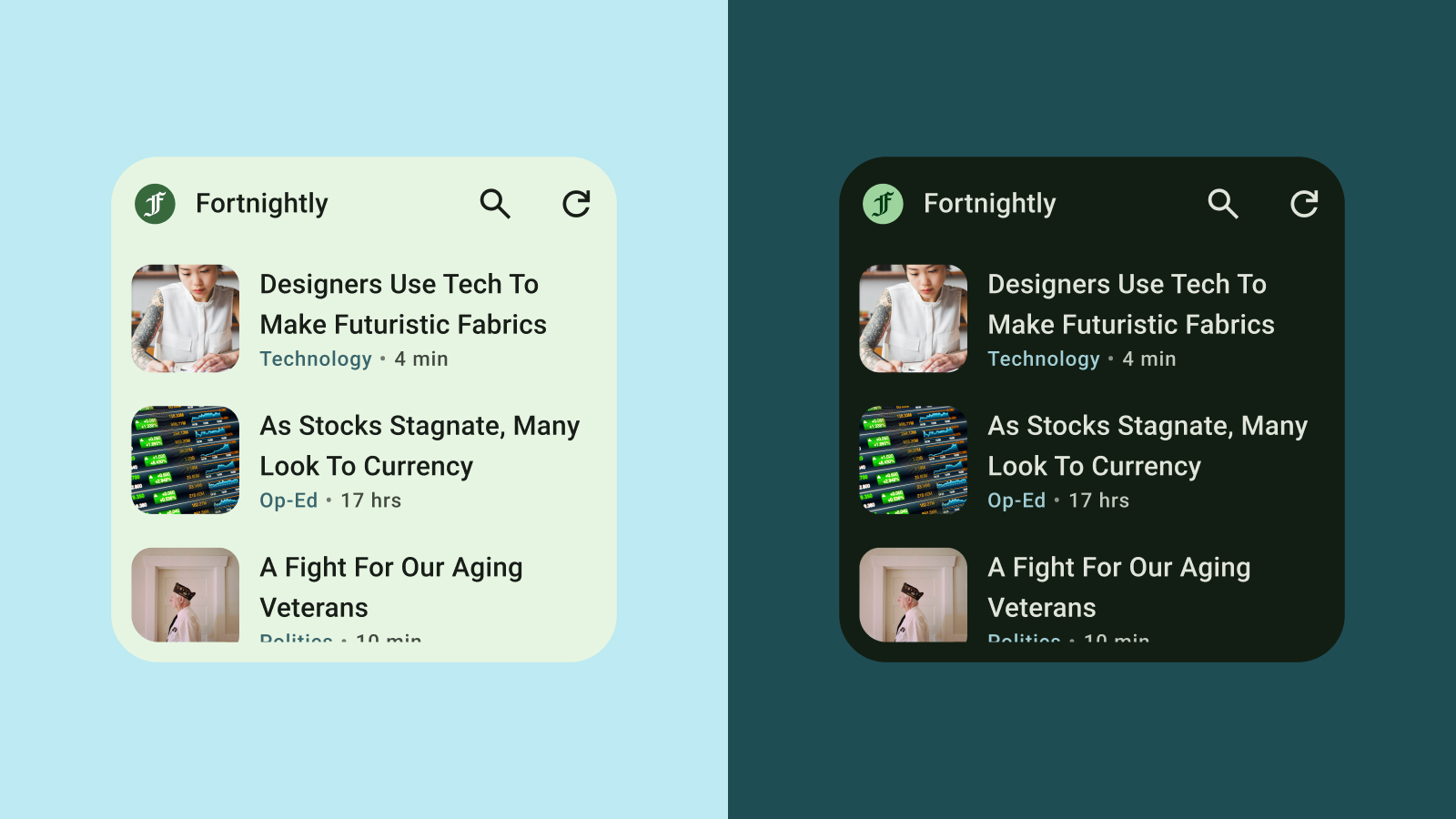
淺色和深色模式
深色模式是裝置 UI 的低光版本,主要顯示深色表面顏色。越來越多使用者會改用深色模式,以延長電池續航力並減輕眼睛負擔。如果小工具無法適應深色模式,就會顯示不當,可能會讓使用者感到不悅。
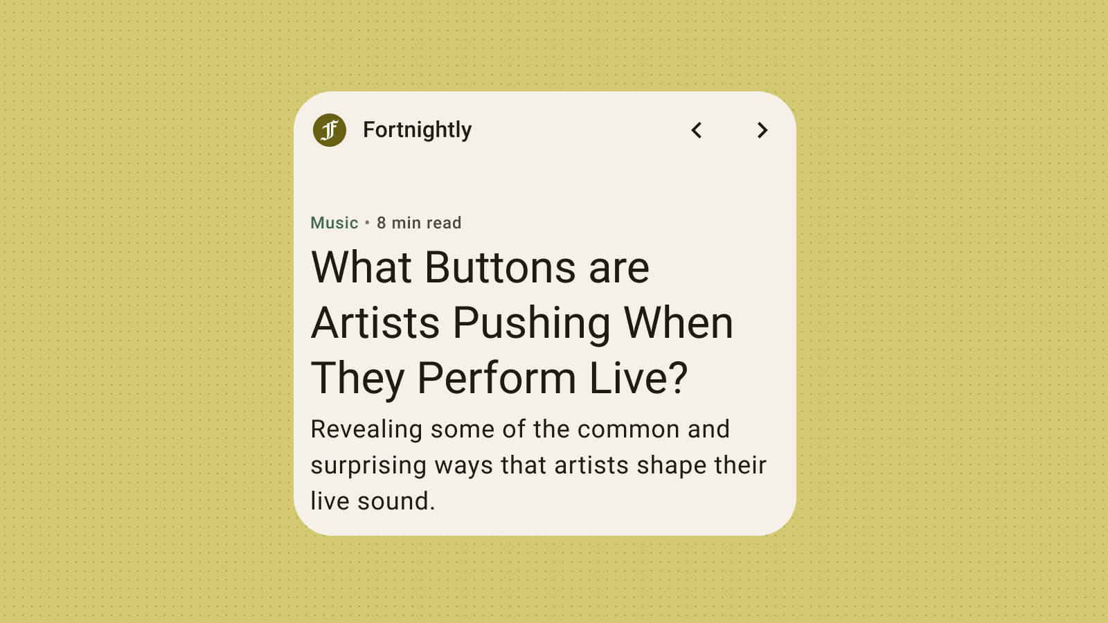
字體排版
排版可讓文字更易讀且更美觀。利用字型大小和粗細建立明確的階層,引導使用者將目光集中在最重要的元素上。請注意行距和字母間距 (字間距),以改善可讀性,特別是針對小型文字顯示在小工具的受限空間內。
階層
透過字型粗細、大小、文行高度和字母間距的差異,可以明確表現文字階層。更新後的字體比例將文字樣式整理出五種角色,並根據其用途描述加以命名。五種文字樣式分別是顯示、大標題、標題、副標題和內文。這些新角色不受裝置限制,易於應用在各種用途。