
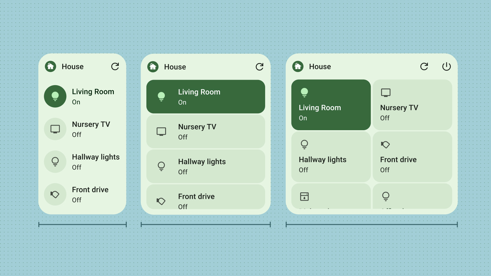
设计可无缝扩缩的自适应 Android 微件。以我们推荐的默认尺寸为起点,并在不同尺寸下测试布局,以确保最佳可读性和用户体验。
默认尺寸
针对至少一个我们推荐的尺寸优化布局,以提供精美的微件体验。通过为手持设备和平板电脑定义 targetCellWidth 和 targetCellHeight 属性,确保微件选择器中的位置和可见性正确。
这些值基于 Pixel 设备。将这些尺寸作为微件设计的起点。在不同尺寸和各种设备上全面测试微件,以确保提供优质的用户体验。
手持
| 尺寸 | 宽度下限 | 宽度上限 | 高度下限 | 高度上限 |
|---|---|---|---|---|
| 2x1 | 109 | 306 | 56 | 130 |
| 2x2 | 109 | 306 | 115 | 276 |
| 2x3 | 109 | 306 | 185 | 422 |
| 4x1 | 245 | 624 | 56 | 130 |
| 4x2 | 245 | 624 | 115 | 276 |
| 4x3 | 245 | 624 | 185 | 422 |
平板电脑
| 尺寸 | 宽度下限 | 宽度上限 | 高度下限 | 高度上限 |
|---|---|---|---|---|
| 2x1 | 180 | 304 | 64 | 120 |
| 2x2 | 180 | 304 | 184 | 304 |
| 2x3 | 180 | 304 | 304 | 488 |
| 3x1 | 328 | 488 | 64 | 120 |
| 3x2 | 298 | 488 | 184 | 304 |
| 3x3 | 298 | 488 | 304 | 488 |
| 3x4 | 298 | 488 | 424 | 672 |
Auto 上的微件
在 Auto 上创建微件时,微件会放大以适应较大的设备屏幕。2x2 网格在 Auto 上效果最佳。如需了解详情,请参阅 为 Cars 调整微件。
断点
断点对于制作自适应且便于用户调整大小的微件至关重要。通过测试设计,您可以确定需要调整布局的尺寸阈值。实现断点以触发这些更改,确保微件在任何尺寸下都能保持视觉吸引力和功能。
断点还提供了灵活地有条件地包含或排除补充内容的功能,从而根据微件的尺寸优化空间利用率。
填充边界
用户移除微件的主要原因之一是微件与其他主屏幕元素未对齐。为防止出现这种情况,请确保微件始终完全填充其分配的网格空间。
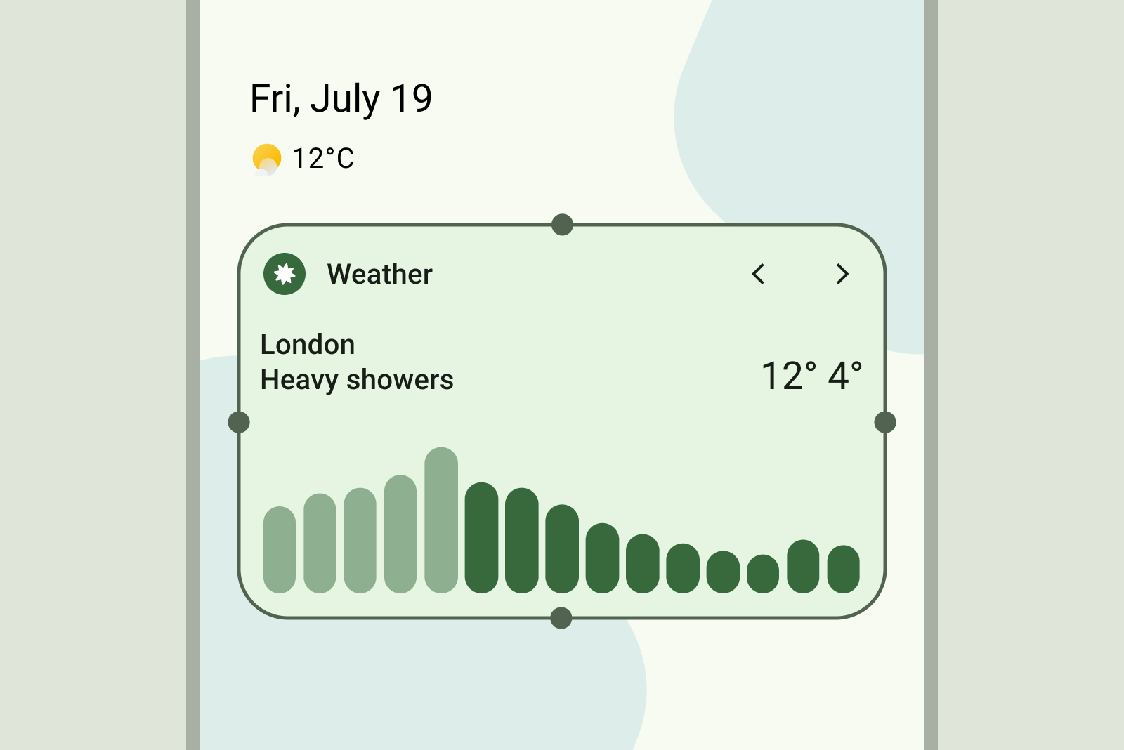
正确做法
确保容器在所有尺寸下都从边缘延伸到边缘。
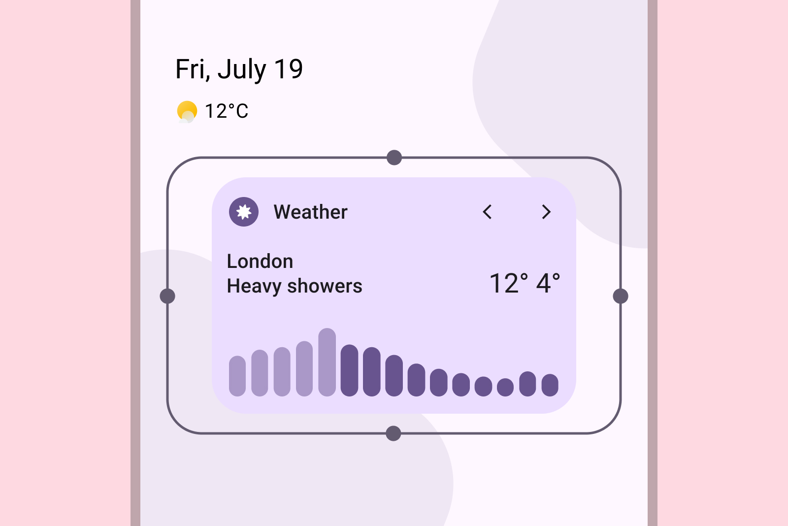
错误做法
添加自定义内边距。微件应从边缘无缝延伸到边缘。
正确做法
确保非矩形形状在垂直或水平轴上与网格接触,以实现视觉一致性。
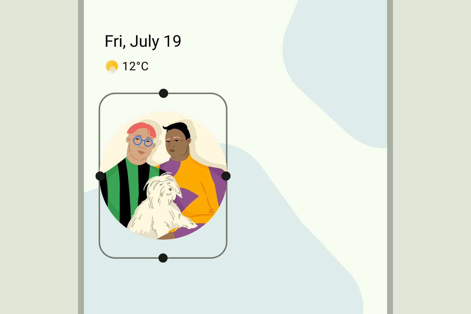
错误做法
使用固定正方形形状。请改用可适应各种网格尺寸的自适应矩形容器。