正規のウィジェット レイアウト
コレクションでコンテンツを整理
必要に応じて、コンテンツの保存と分類を行います。
効果的なウィジェット レイアウトを作成するには、まずコア コンテンツを特定します。レイアウトは、ウィジェット内で情報とインタラクティブな要素を整理する方法を示します。Android には、ツールバー、テキスト、リスト、グリッドタイプのウィジェット用に、このプロセスを効率化するためのいくつかのビルド済みレイアウトが用意されています。
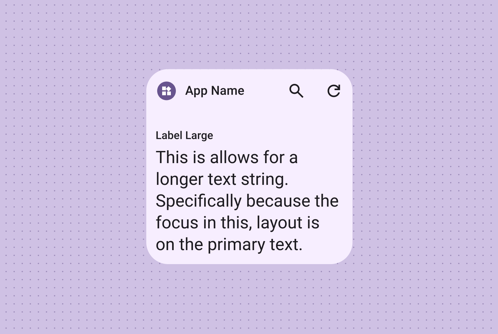
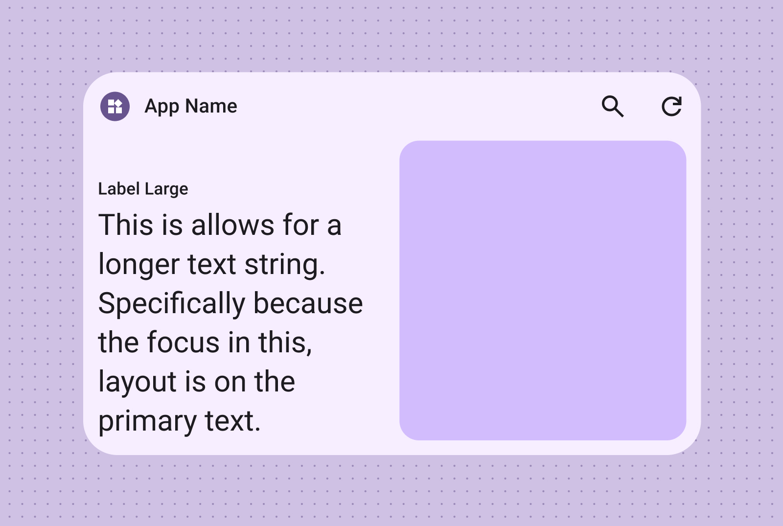
テキスト
テキスト レイアウトは、簡潔な情報を表示するのに適しています。必要に応じてテキストの横に画像を配置して、ウィジェットの視覚的な魅力を高めましょう。
テキストのみ
タイトル、ステータスの更新、簡単な説明、または 1 行のテキストで効果的にメッセージを伝える必要があるシナリオに適しています。ウィジェットのサイズに基づいてテキスト コンテンツを動的にスケーリングする方法については、標準レイアウトのサンプルをご覧ください。
テキストと画像
画像を追加して視覚的な効果を高めます。詳しくは、ブレークポイントで、このレイアウトをさまざまな画面サイズに合わせて調整する方法をご覧ください。
ツールバー レイアウトを使用すると、ウィジェットのサイズに応じて柔軟にレイアウトを調整し、アプリ内でよく使用されるタスクにすばやくアクセスできます。
検索ツールバー
検索ツールバーのレイアウトは、ツールバーのメイン アクションとして検索にフォーカスを当てるように意図的に設計されています。便利な追加ボタンを使用すると、よく使用する機能にすばやくアクセスできます。
ツールバー
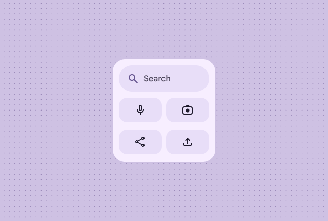
ツールバーには、アプリのブランディングの後に、切り替え可能な設定やタスクリンクに最適な、よく使用されるタスクのボタンが表示されます。サイズ変更時に、あまり使用されないオプションを非表示にして、より一般的なアクションを表示できます。ブレークポイントを使用して、スペースがある場合は、最小 48 dp のタップ可能な新しいボタンを追加します。
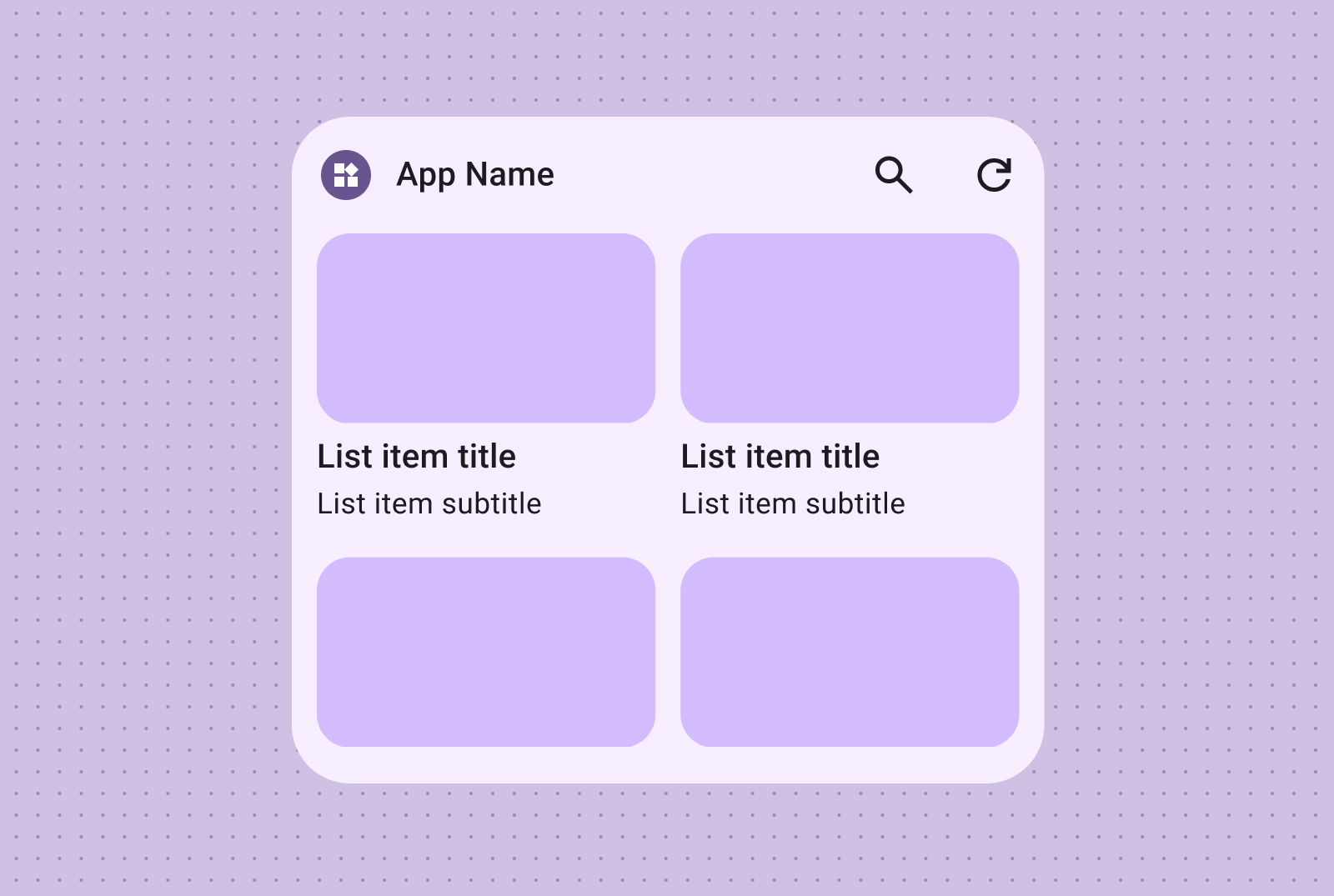
リスト
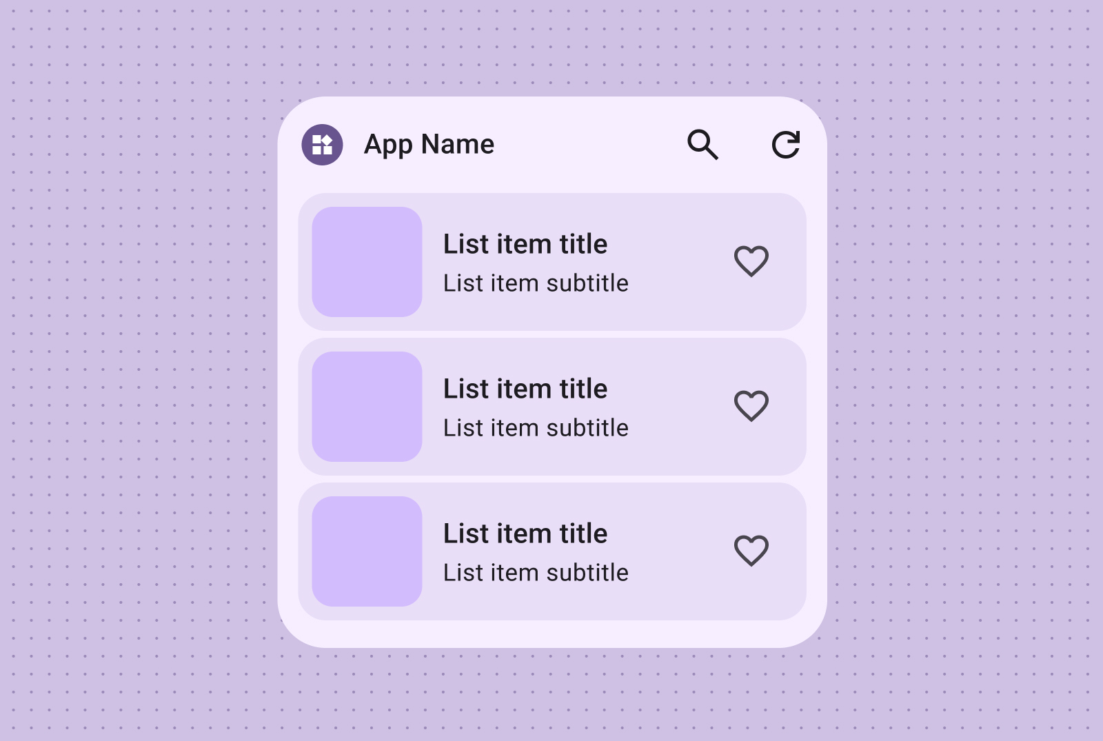
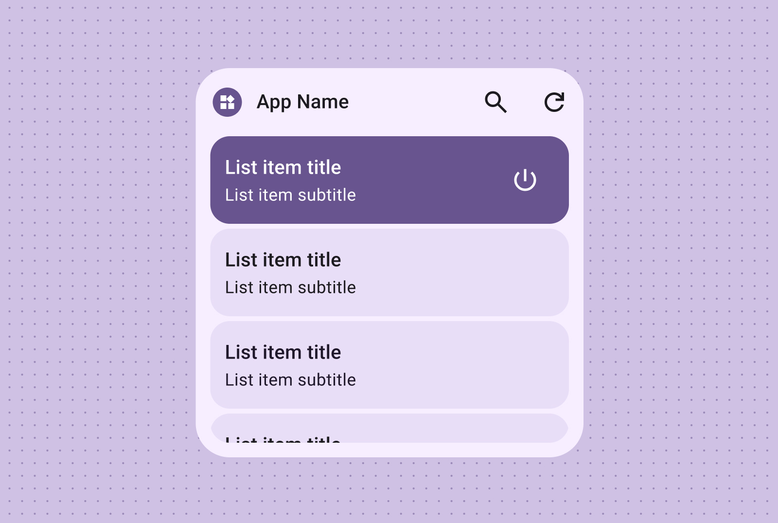
リスト レイアウトを使用すると、複数のアイテムをわかりやすくスキャン可能な形式で整理できます。ニュースの見出し、ToDo リスト、メッセージに最適です。コンテンツを整理して、簡単に閲覧できるリストにします。コンテンツのニーズに応じて、コンテナ化されたプレゼンテーションとコンテナレス プレゼンテーションのどちらかを選択します。
テキストと画像のリスト
簡単にスキャンできるテキストと画像のリストは、ニュースの見出し、アルバムアート付きのプレイリスト、メッセージなど、複数のコンテンツ タイプを表示するのに最適です。
チェックリスト
チェックリスト レイアウトは、タスクを表示するのに最適です。タップ ターゲットが明確に表示されるため、ユーザーはアイテムを簡単に完了としてマークできます。
アクション リスト
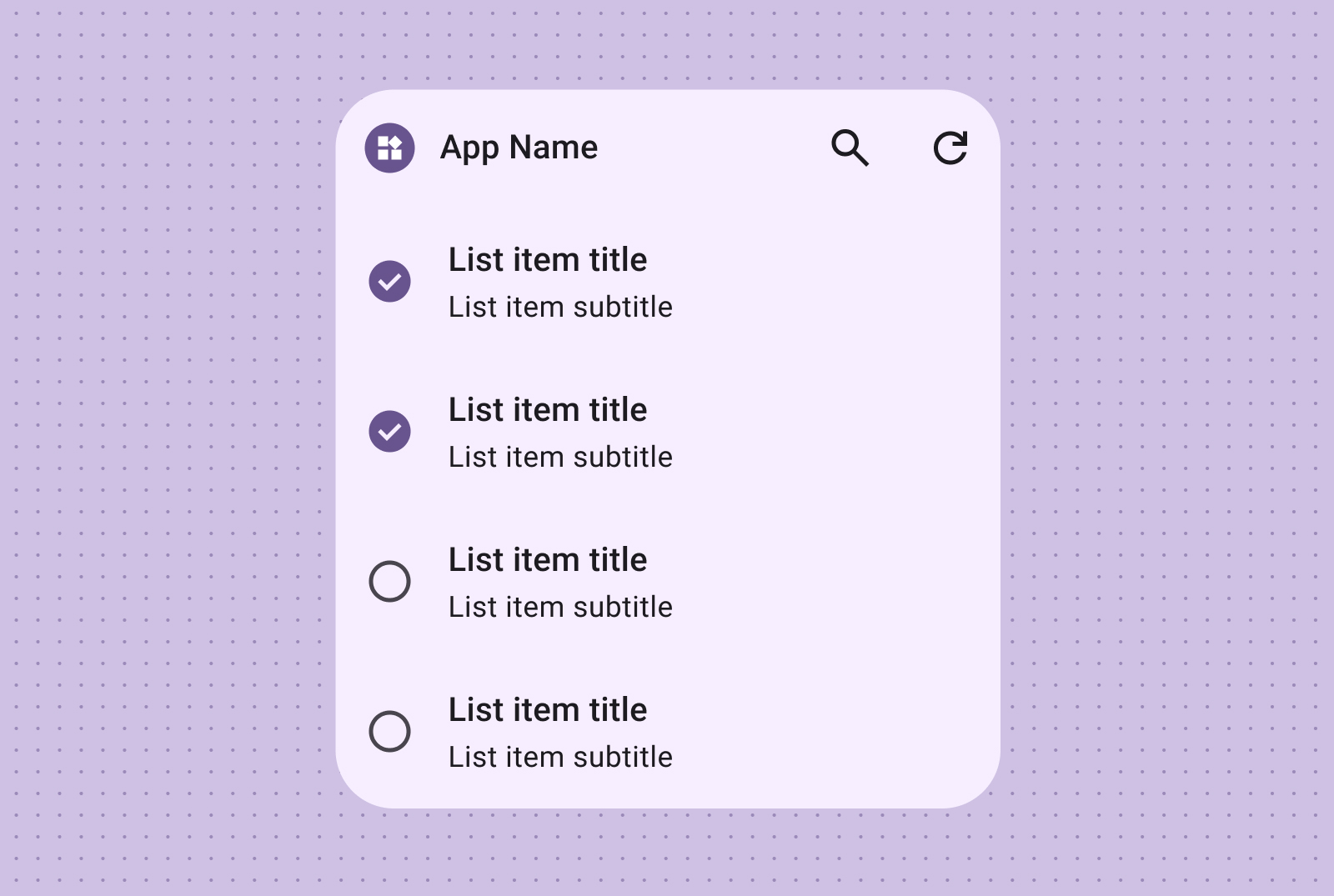
アクション リストを使用して直感的なコントロール グループ化を提供します。オン/オフの視覚的な状態により、アイテムのステータスに関するフィードバックをすぐに提供できます。
グリッド
画像をコンパクトで柔軟なビジュアル豊かなグリッドで表示します。ラベルはオプションです。さまざまな画面サイズに適応する列と行を使用する。
画像のみ
画像のみのグリッドを使用して、視覚的にインパクトのあるスクロール可能な画像ギャラリーを作成します。行と列は、最適な表示になるようにさまざまな画面サイズに自動的に適応します。
画像とテキスト
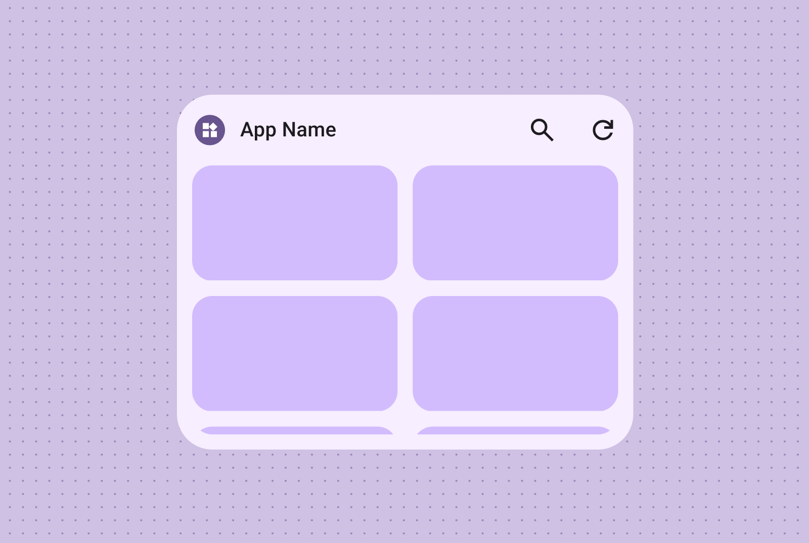
テキストのラベルや説明を組み込んで、画像グリッド コンテンツにコンテキストや情報を追加することもできます。
このページのコンテンツやコードサンプルは、コンテンツ ライセンスに記載のライセンスに従います。Java および OpenJDK は Oracle および関連会社の商標または登録商標です。
最終更新日 2025-07-27 UTC。
[[["わかりやすい","easyToUnderstand","thumb-up"],["問題の解決に役立った","solvedMyProblem","thumb-up"],["その他","otherUp","thumb-up"]],[["必要な情報がない","missingTheInformationINeed","thumb-down"],["複雑すぎる / 手順が多すぎる","tooComplicatedTooManySteps","thumb-down"],["最新ではない","outOfDate","thumb-down"],["翻訳に関する問題","translationIssue","thumb-down"],["サンプル / コードに問題がある","samplesCodeIssue","thumb-down"],["その他","otherDown","thumb-down"]],["最終更新日 2025-07-27 UTC。"],[],[],null,["# Canonical widget layouts\n\nCraft effective widget layouts by first identifying your core content. Your\nlayout dictates how information and interactive elements are organized within\nyour widget. Android offers several prebuilt layouts for toolbars, text, list\nand grid-type widgets to streamline this process.\n| **Note:** View detailed layout specs in our [Figma Widget Canonical Builder](https://goo.gle/widget-canonical), and find the code samples using Jetpack Glance in the [Android Platform Samples GitHub repository](https://github.com/android/platform-samples/tree/main/samples/user-interface/appwidgets/src/main/java/com/example/platform/ui/appwidgets/glance).\n\nText\n----\n\nText layouts are ideal for displaying concise information. Enhance the visual\nappeal of your widget by optionally including an image alongside the text. \n**Text only**\n\n\nIdeal for titles, status updates, short descriptions, or any scenario\nwhere a single line of text effectively conveys the message. Refer to the\n[Canonical layout sample](https://github.com/android/platform-samples/tree/main/samples/user-interface/appwidgets/src/main/java/com/example/platform/ui/appwidgets/glance)\nfor guidance on dynamically scaling text content based on widget size. \n**Text and image**\n\n\nInclude an image for added visual impact. For more information, see\n[Breakpoints](/design/ui/mobile/guides/widgets/sizing#breakpoints)\nto learn how to adapt this layout for different screen sizes.\n\nToolbars\n--------\n\nUse toolbar layouts to provide users with quick access to frequently used tasks\nin your app, in a flexible layout that adapts across widget sizes. \n**Search Toolbar**\n\n\nA search toolbar layout is intentionally designed to draw focus to search\nas a primary action in the toolbar. Additional handy buttons can provide\nquick access to frequently used functions.\n\n\n**Toolbar**\n\n\nToolbars presents app branding followed by buttons for the most used tasks\nthat are ideal for toggleable settings or task links. When resizing, less\ncommonly used options can be hidden in favor of more common actions. Use\n[Breakpoints](/design/ui/mobile/guides/widgets/sizing#breakpoints)\nto add a new minimum 48dp tappable button when there's room.\n\n\u003cbr /\u003e\n\nLists\n-----\n\nUse list layouts to organize multiple items in a clear, scannable format. This\nis ideal for news headlines, to-do lists or messages. Organize content into a\nstructured, easily scannable list. Choose between containerized or containerless\npresentation based on your content needs. \n**Text and image list**\n\n\nEasily scannable text and image lists are perfect for showcasing multiple\ncontent types, such as news headlines, playlists with album art, or\nmessages. \n**Checklist**\n\n\nThe checklist layout is perfect for displaying tasks, providing clear tap\ntargets for users to easily mark items as done. \n**Action list**\n\n\nProvide intuitive control grouping with action lists, where visual on/off\nstates offer immediate feedback on item statuses.\n\nGrid\n----\n\nPresent images in a compact, flexible, visually rich grid with optional labels.\nUse columns and rows that adapt to different screen sizes. \n**Image only**\n\n\nCreate visually impactful, scrollable image galleries using image-only\ngrids. Rows and columns automatically adapt to various screen sizes for\noptimal presentation. \n**Image and text**\n\n\nYou can also incorporate text labels and descriptions, enriching your\nimage grid content with additional context and information."]]